
 100% Security Verified | No Subscription Required | No Malware


 ChatGPT
 Perplexity
 Gemini
 Claude
 Grok
Grok
Green Burgundy mixes the grounded calm of green with the depth and drama of wine toned burgundy. Together they feel organic yet luxurious, perfect for moods that are romantic, cinematic, or slightly mysterious. On screen, this pairing can suggest evening gardens, forest retreats, vineyard celebrations, or high end editorial style, depending on how bright or muted you keep the tones.
For video creators, designers, and YouTube thumbnail artists, Green Burgundy is a powerful combo for titles, lower thirds, brand kits, and color grading. It works beautifully in wedding highlights, travel vlogs, beauty content, and dramatic intros. Below you will find ready made Green Burgundy color palettes with HEX codes so you can match them easily in Filmora, keep your visuals consistent, and build a recognizable aesthetic across thumbnails, intros, and full edits.
In this article
Soft & Romantic Green Burgundy Color Palettes
Forest Cabernet Harmony
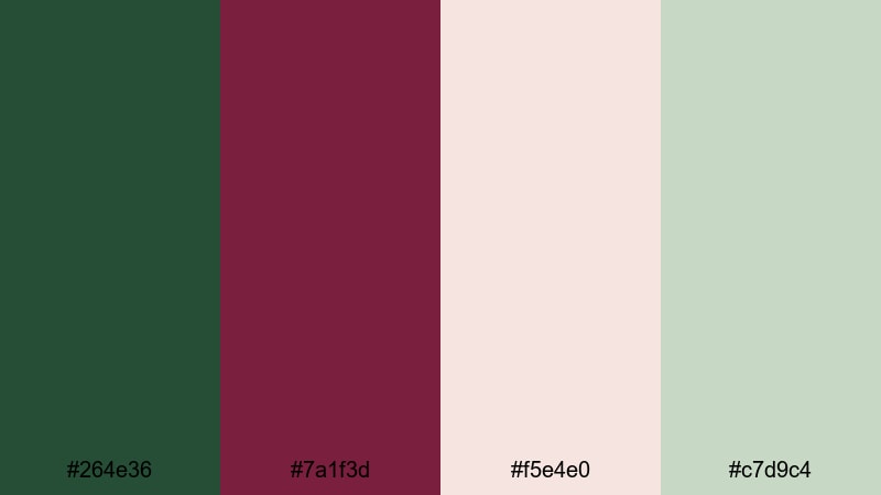
- HEX Codes: #264e36, #7a1f3d, #f5e4e0, #c7d9c4
- Mood: Calm, romantic, and organic with a cozy woodland feel.
- Use for: Use for wedding highlight reels, nature vlogs, and softly lit lifestyle thumbnails.
Forest Cabernet Harmony blends deep forest green (#264e36) and cabernet burgundy (#7a1f3d) with creamy blush and soft sage neutrals. It feels like golden hour in the woods: grounded, intimate, and quietly romantic. The neutrals stop the palette from feeling heavy, so it stays airy enough for soft storytelling.
Use the green and burgundy as your main accents for titles, lower thirds, and logo marks, and let the light neutrals hold backgrounds or frames. In Filmora, this palette works beautifully for wedding highlight reels, gentle nature vlogs, or lifestyle thumbnails where you want warmth without oversaturation. Add subtle color grading to your footage so greens and reds lean toward these HEX values, creating a cohesive, timeless look from intro to end screen.
Pro Tip: Build a Romantic Green Burgundy Look in Filmora
To keep this soft woodland romance consistent, sample the HEX codes from Forest Cabernet Harmony and reuse them across your entire Filmora project. Color your title text in burgundy, use the forest green for shape overlays behind captions, and keep b roll more neutral by leaning into the beige tones for a calm base.
For wedding or nature edits, create a simple style guide inside Filmora: one color for main headings, one for subtitles, and one for call to action buttons or subscribe animations. By repeating these tones, your thumbnails, intros, and reels will all feel like they belong to the same quiet, romantic world.
AI Color Palette
If you have a favorite still frame or mood board that already captures this Green Burgundy feeling, you can let Filmora handle the matching for you. Filmora's AI Color Palette feature reads the colors from a reference image and applies that style across your entire timeline.
Drop in a shot with rich forest green and cabernet tones, use it as your reference, and let AI Color Palette harmonize the rest of your clips. This keeps your highlights, mids, and shadows in the same family of greens and burgundies, so everything from A roll to b roll looks like it was planned as one cohesive aesthetic.
 secure download

HSL, Color Wheels & Curves
To fine tune your Green Burgundy look, use Filmora's HSL, color wheels, and curves. Slightly desaturate greens and reds for a softer, filmic feel, and warm up the midtones so skin looks flattering next to deep cabernet and forest hues. You can follow Filmora's guide to color correction in Filmora if you need a quick refresher.
On the color wheels, push shadows a touch toward green and mids slightly toward burgundy to echo this palette without overpowering the image. Then use curves to lift the blacks just a little, creating that dreamy, romantic fade that suits weddings, proposal videos, and intimate lifestyle edits.
secure download1000+ Video Filters & 3D LUTs
Once your core Green Burgundy balance feels right, you can add character fast with Filmora's filters and LUTs. Filmora's video filters and 3D LUTs make it easy to push this palette toward vintage, matte, glossy, or cinematic styles in a couple of clicks.
Try a warm cinematic LUT on top of your graded footage to intensify the burgundy tones, or a soft film filter to give greens and neutrals a dreamy haze. Save your favorite combination as a preset so every wedding, nature vlog, or romantic reel you edit keeps the same Forest Cabernet Harmony vibe.
secure downloadGarden Wine Whisper
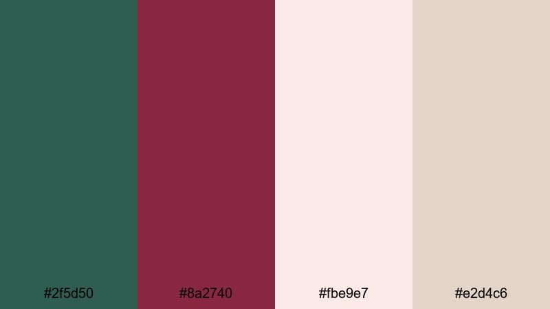
- HEX Codes: #2f5d50, #8a2740, #fbe9e7, #e2d4c6
- Mood: Soft, floral, and slightly nostalgic.
- Use for: Use for dreamy travel diaries, garden walkthroughs, and aesthetic reel covers.
Garden Wine Whisper pairs muted garden green (#2f5d50) and wine red (#8a2740) with blush and parchment like neutrals. The result is floral, hazy, and a bit nostalgic, like an old rose garden captured on modern cameras.
It is ideal for dreamy travel diaries, slow garden walkthroughs, or aesthetic reels with gentle music. In thumbnails and intros, keep backgrounds in the light neutrals and use burgundy sparingly for key text, subscribe buttons, or logo accents, so your visuals feel romantic but still easy to read.
Blush Ivy Evening
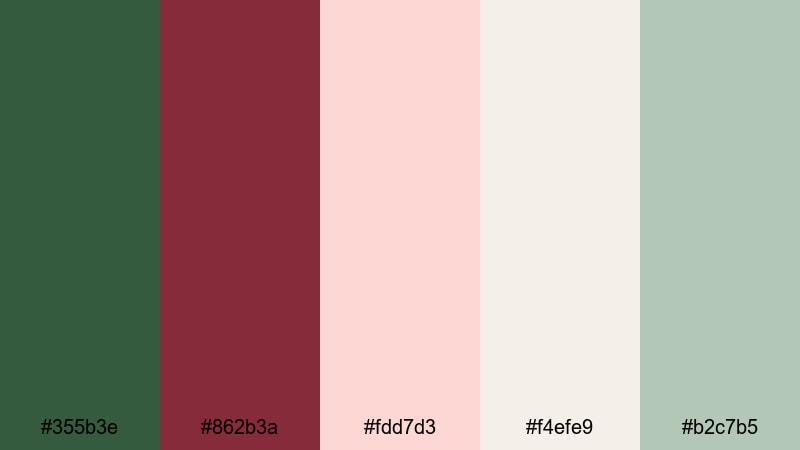
- HEX Codes: #355b3e, #862b3a, #fdd7d3, #f4efe9, #b2c7b5
- Mood: Delicate, evening-lit, and quietly luxurious.
- Use for: Use for beauty tutorials, cozy evening vlogs, and cinematic intro cards.
Blush Ivy Evening blends ivy greens and deep burgundy with blush, off white, and misty sage. It feels like candlelight reflecting on leaves at dusk, delicate and slightly luxurious without becoming too formal.
Use the darker tones for text and outlines, and let the blush and off white carry your backgrounds in beauty tutorials, cozy evening vlogs, or cinematic intro cards. In Filmora, you can tint highlights slightly toward blush and shadows toward green to echo this palette in your footage while keeping skin tones flattering.
Vintage Rose Vineyard
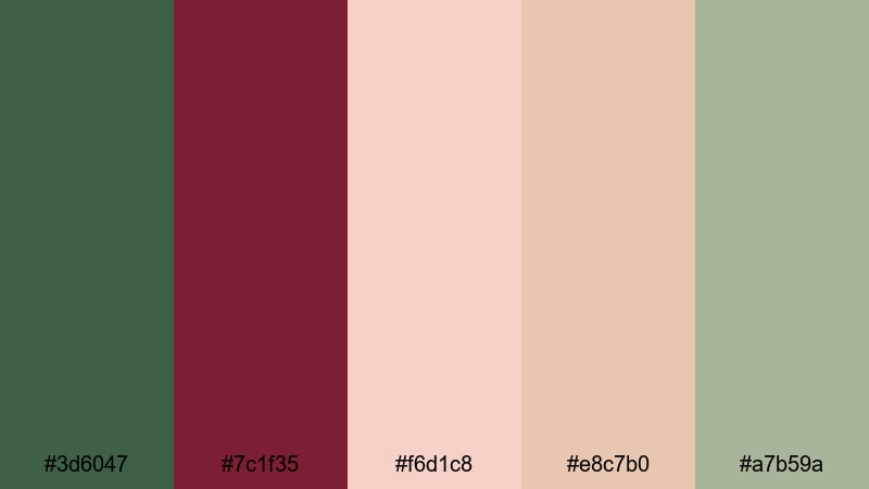
- HEX Codes: #3d6047, #7c1f35, #f6d1c8, #e8c7b0, #a7b59a
- Mood: Warm, vintage, and storybook romantic.
- Use for: Use for nostalgic montage sequences, engagement videos, and soft brand lookbooks.
Vintage Rose Vineyard mixes earthy greens and wine reds with rose toned and sepia inspired neutrals. It instantly gives footage a storybook, countryside feeling, like a faded postcard from a vineyard holiday.
For engagement videos and nostalgic montages, color your titles in burgundy, frame them with soft green details, and let the rose and beige tones sit in the background. A subtle fade or grain effect in Filmora will push this palette even further into a timeless, film like aesthetic that feels perfect for love stories and gentle brand lookbooks.
Bold & Dramatic Green Burgundy Color Palettes
Emerald Merlot Spotlight
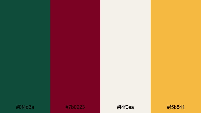
- HEX Codes: #0f4d3a, #7b0223, #f4f0ea, #f5b841
- Mood: Bold, glamorous, and high contrast.
- Use for: Use for channel trailers, dramatic title cards, and bold logo animations.
Emerald Merlot Spotlight is all about impact: a punchy emerald green (#0f4d3a) and rich merlot (#7b0223) lit by champagne gold and soft ivory. It feels luxurious and cinematic, like stage lights on velvet curtains.
Use the ivory for clean backgrounds, emerald for frames or accent lines, and reserve merlot and gold for titles, buttons, and logo reveals. This palette works especially well in Filmora for intense channel trailers, bold intro sequences, and animated lower thirds that need to hook viewers in the first seconds.
Neon Vineyard Nights
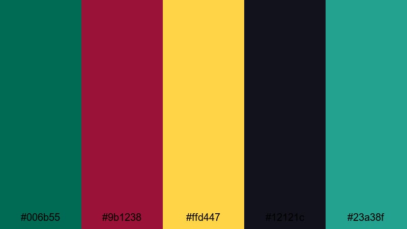
- HEX Codes: #006b55, #9b1238, #ffd447, #12121c, #23a38f
- Mood: Electric, edgy, and nightlife inspired.
- Use for: Use for music videos, party recaps, and energetic social ads.
Neon Vineyard Nights charges deep green and burgundy with neon yellow and teal over a nearly black base (#12121c). It feels like club lights flashing over a dark dance floor, energetic and slightly rebellious.
Use the dark base as your background color, highlight key words in neon yellow, and let teal accents move across the frame in shapes or motion graphics. This palette is perfect for high energy music videos, festival recaps, and social ads where you want viewers to feel the beat before they even hit play.
Regal Laurel Crush
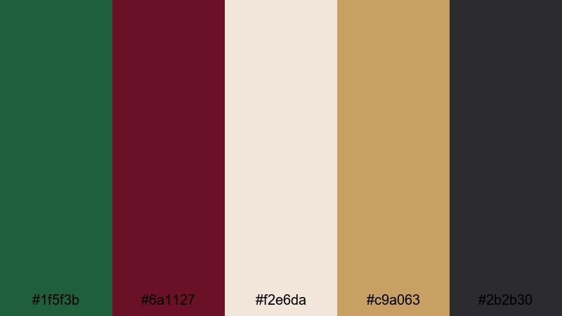
- HEX Codes: #1f5f3b, #6a1127, #f2e6da, #c9a063, #2b2b30
- Mood: Regal, intense, and confident.
- Use for: Use for luxury product promos, fashion lookbooks, and dramatic lower thirds.
Regal Laurel Crush brings laurel green and rich burgundy together with ivory, antique gold, and charcoal. It feels high end and confident, like a modern luxury brand campaign.
Let ivory be your canvas, charcoal your grounding color for shadows or borders, and use gold sparingly for logos and key icons. In Filmora, this palette is ideal for premium product reveals, fashion lookbooks, and dramatic lower thirds that need to look editorial and expensive without heavy effects.
Festival Canopy Lights
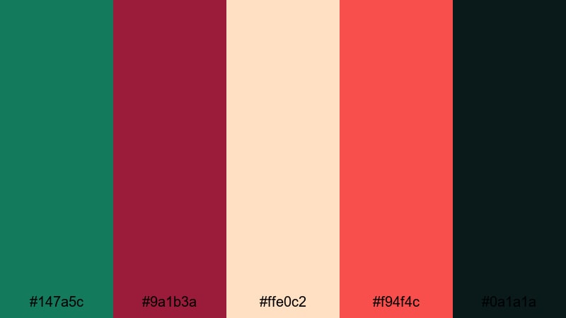
- HEX Codes: #147a5c, #9a1b3a, #ffe0c2, #f94f4c, #0a1a1a
- Mood: Festive, energetic, and crowd pleasing.
- Use for: Use for festival recaps, travel vlogs, and eye catching thumbnail text blocks.
Festival Canopy Lights mixes vibrant green and burgundy with peach, bright red, and deep near black. It captures the feel of string lights, food stalls, and crowded streets at night.
Use the dark tone as your base and the warm peach for background panels behind text. Highlight important words in bright red or green to make thumbnails and titles instantly readable, even on small mobile screens. This palette suits travel vlogs, festival recaps, and dynamic montage edits where you want to showcase color and movement.
Modern & Minimal Green Burgundy Color Palettes
Sage Port Minimalist
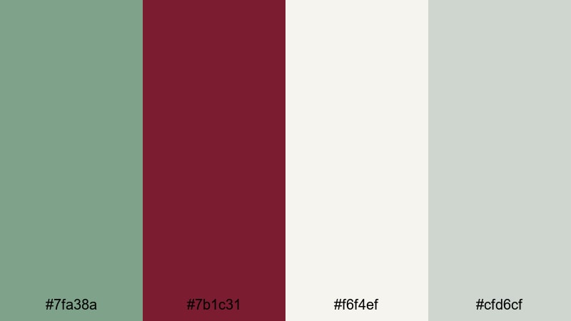
- HEX Codes: #7fa38a, #7b1c31, #f6f4ef, #cfd6cf
- Mood: Clean, modern, and subtly luxurious.
- Use for: Use for brand intros, UI mockups, and minimalist title screens.
Sage Port Minimalist softens green into sage (#7fa38a) and pairs it with port wine burgundy over calm off whites and cool grays. It feels modern and refined, with just enough color to stay memorable.
Use the off white as your primary background, the gray for dividers or UI style panels, and let sage and burgundy handle logos, icons, and headings. In Filmora, this palette works perfectly for clean brand intros, app or website mockup videos, and minimalist title screens that focus on clarity and professionalism.
Moss Brick Balance
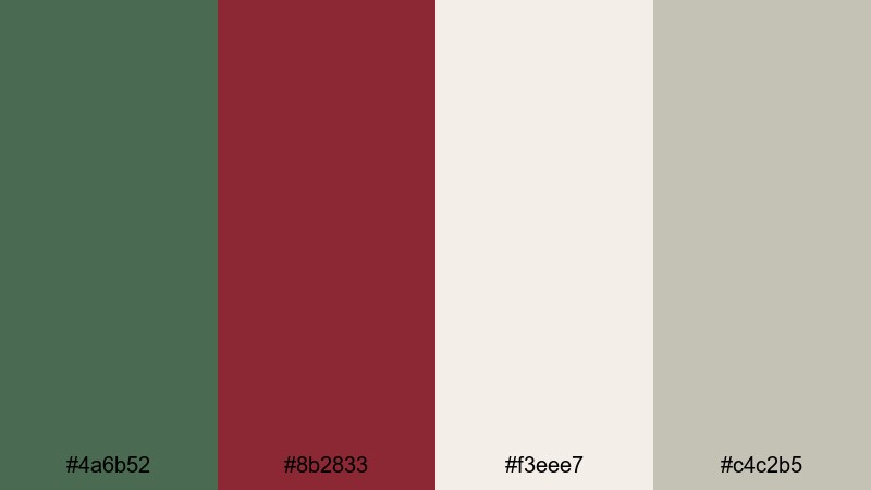
- HEX Codes: #4a6b52, #8b2833, #f3eee7, #c4c2b5
- Mood: Balanced, grounded, and design forward.
- Use for: Use for studio tour videos, creator brands, and understated logo stings.
Moss Brick Balance combines moss green and brick burgundy with warm stone neutrals. It feels grounded and design forward, like a well styled studio or creative workspace.
It is a strong choice for studio tour videos, brand identity overviews, and channel branding that aims to look mature but approachable. Keep backgrounds in the stone neutrals, use moss for subtle accents, and apply burgundy only to key elements like callouts or logos so the frame never feels busy.
Clean Berry Contrast
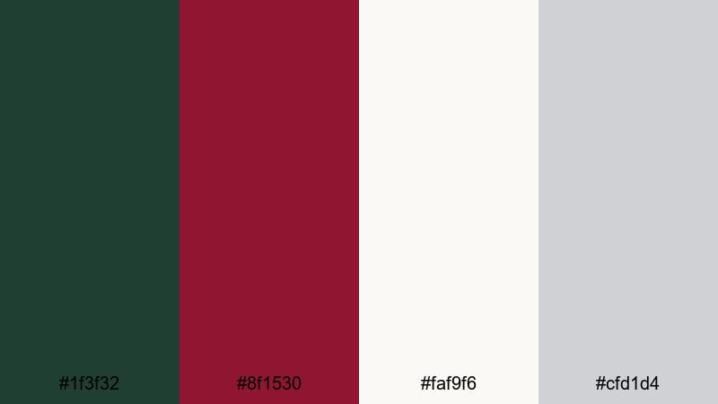
- HEX Codes: #1f3f32, #8f1530, #faf9f6, #cfd1d4
- Mood: Crisp, confident, and editorial.
- Use for: Use for tech explainers, portfolio reels, and clean motion graphics.
Clean Berry Contrast uses dark green and berry burgundy as anchors against bright whites and cool grays. The mood is crisp and editorial, excellent for content that needs to look sharp and trustworthy.
Make #faf9f6 your main canvas for slides, infographics, and overlays, and save the darker tones for bold headlines and key icons. This palette fits tech explainers, portfolio reels, and motion graphics templates in Filmora where you want strong contrast and easy readability without clutter.
Moody & Cinematic Green Burgundy Color Palettes
Midnight Cedar Noir
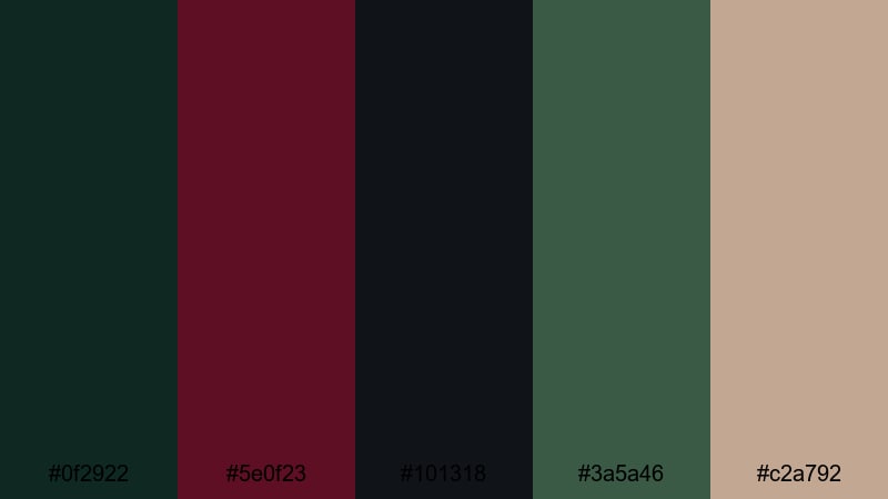
- HEX Codes: #0f2922, #5e0f23, #101318, #3a5a46, #c2a792
- Mood: Dark, cinematic, and mysterious.
- Use for: Use for narrative shorts, moody b-roll, and thriller style trailers.
Midnight Cedar Noir layers inky greens and burgundy on top of near black with a soft beige highlight. It feels shadowy and cinematic, perfect for moody storytelling and thriller inspired edits.
Use the darkest tones as your main background and shadow colors, letting cedar green and burgundy peek through in titles, overlays, or key props. The beige highlight is ideal for small text or icons that must remain readable. In Filmora, combine this palette with subtle vignettes and contrast adjustments to deepen the sense of mystery.
Stormy Pine Garnet
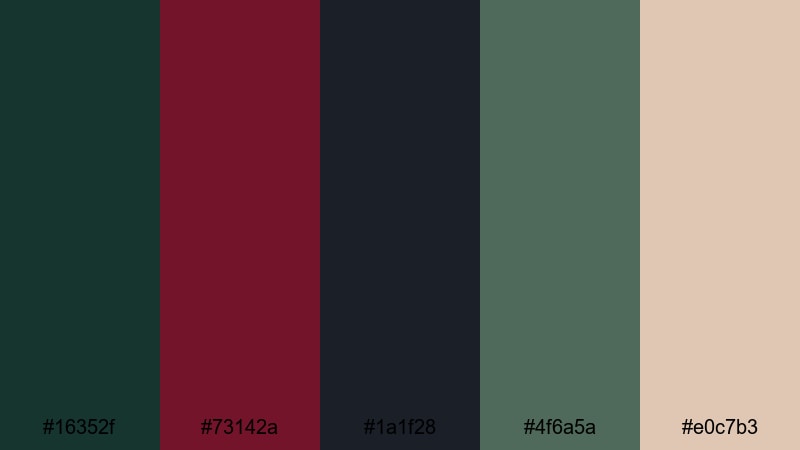
- HEX Codes: #16352f, #73142a, #1a1f28, #4f6a5a, #e0c7b3
- Mood: Stormy, introspective, and atmospheric.
- Use for: Use for dramatic travel films, cinematic timelapses, and emotional storytelling.
Stormy Pine Garnet weaves pine greens and garnet burgundy between charcoal and soft sand neutrals. It feels like a storm passing over a forest, heavy at first and then slowly clearing.
In video, you can start with more of the dark charcoal and garnet for tense or emotional scenes, then gradually introduce the lighter sand tone as the story resolves. This palette is great for travel films, timelapses, and personal stories in Filmora where you want the color to mirror the emotional shift in your narrative.
Twilight Orchard Fade
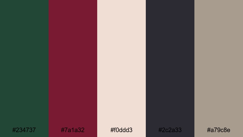
- HEX Codes: #234737, #7a1a32, #f0ddd3, #2c2a33, #a79c8e
- Mood: Twilight toned, reflective, and softly dramatic.
- Use for: Use for sunset vlogs, slow cinematic b-roll, and reflective montage edits.
Twilight Orchard Fade balances orchard greens and wine tones with dusk grays and warm cream. It feels like the last light fading from a hillside, reflective and gently dramatic.
Use the warm cream and taupe shades for backgrounds in titles or quote cards, and let the green and burgundy frame your subject or highlight important on screen text. In Filmora, this palette shines in sunset vlogs, slow b roll of nature or cityscapes, and reflective montages where color should soften rather than shout.
Deep Grove Reverie
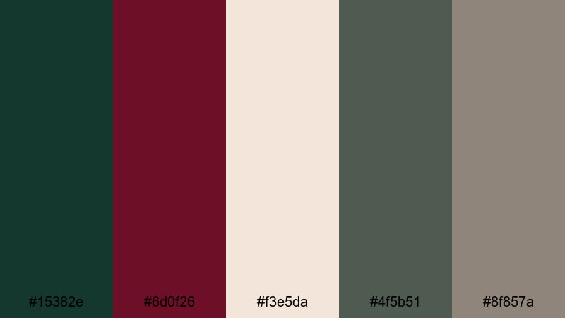
- HEX Codes: #15382e, #6d0f26, #f3e5da, #4f5b51, #8f857a
- Mood: Dreamy, grounded, and cinematic.
- Use for: Use for documentary style edits, forest scenes, and mood driven title cards.
Deep Grove Reverie sets dark grove greens and burgundy against soft ivory and muted stone tones. It feels grounded yet dreamy, like wandering through a quiet forest with a story unfolding in the background.
This palette is perfect for documentary style edits, especially those featuring nature, crafts, or slow living themes. Use ivory for text blocks and captions, while the deeper hues appear in your color grading and graphic shapes. The result is a cinematic atmosphere that supports your story without overpowering it.
Tips for Creating Green Burgundy Color Palettes
Green Burgundy palettes can shift from soft and romantic to bold or mysterious depending on the tones you pair them with. When you build your own combinations for video and design, a few practical rules will help keep your visuals beautiful, readable, and on brand.
- Decide on the mood first. Softer, desaturated greens and burgundies feel romantic; darker and more saturated versions feel dramatic or cinematic.
- Always pair Green Burgundy with at least one light neutral (ivory, beige, or pale gray) so text and UI elements have a clean space to breathe.
- Maintain contrast in thumbnails. Use light backgrounds with dark Green Burgundy text, or dark backgrounds with light text, to avoid readability issues on mobile.
- Keep a consistent role for each color across projects: one tone for headlines, one for accents, and one for backgrounds. This builds instant brand recognition.
- Match your color grading to your palette. In Filmora, nudge green and red tones toward your chosen HEX values and save the grade as a preset for future edits.
- Test palettes on real frames. Drop title cards or lower thirds over actual footage to check how Green Burgundy interacts with skin tones and ambient colors.
- Use bright accent colors sparingly. A touch of gold, peach, or neon can add energy to Green Burgundy, but overusing them will dilute the core aesthetic.
- Create platform specific variants: a higher contrast version for tiny social thumbnails and a softer, more detailed version for full screen video titles.
Green Burgundy color palettes are versatile enough to support wedding films, tech explainers, fashion lookbooks, and moody cinematic edits. By choosing the right mix of greens, burgundies, and neutrals, you can shape how viewers feel about your brand and content before you say a single word.
Use these 15 palettes as ready made starting points, then tweak saturation, warmth, and contrast in Filmora until they match your story and style. With AI Color Palette, HSL controls, and filters, it is easy to keep your Green Burgundy aesthetic consistent across intros, b roll, and social cutdowns.
The more you reuse a signature palette, the more recognizable your channel or brand becomes. Experiment, save your favorite looks as presets, and let Green Burgundy become a visual thread that holds all your videos together.
secure downloadNext: Beige Blue Color Palette
