
 100% Security Verified | No Subscription Required | No Malware


 ChatGPT
 Perplexity
 Gemini
 Claude
 Grok
Grok
Heliotrope is a vivid, slightly electric shade of purple that sits between magenta and violet. It feels creative, imaginative, and just a bit otherworldly. In color psychology, heliotrope can suggest mystery, femininity, and futuristic energy all at once, which makes it powerful for storytellers, designers, and video creators who want their visuals to feel memorable and distinct.
On screen, heliotrope works beautifully for YouTube thumbnails, opening titles, channel branding, and color grading accents. It pairs well with both soft pastels and bold neons, so you can use it for romantic vlogs, gaming intros, cinematic trailers, or polished brand content. Below are 15 curated heliotrope color palettes with HEX codes you can copy directly into your design tools or use when grading and designing inside Filmora.
In this article
Soft & Romantic Heliotrope Color Palettes
Twilight Blossom Glow
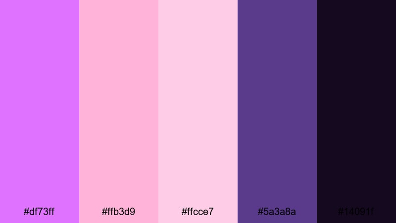
- HEX Codes: #df73ff, #ffb3d9, #ffcce7, #5a3a8a, #14091f
- Mood: Romantic and dreamy with a gentle evening glow.
- Use for: Perfect for wedding highlight reels, romantic vlogs, and soft-focus title cards.
Twilight Blossom Glow mixes bright heliotrope with blush pinks and deep violet, like the last warm light over a flower garden. The darker indigo tones (#5a3a8a and #14091f) ground the palette, so your frames feel dreamy without losing depth or contrast.
Use this palette for proposal edits, engagement highlight reels, or romantic travel vlogs. Put the lighter pinks in subtitles and lower thirds, let heliotrope guide your title graphics, and reserve the darkest shades for letterbox bars or background blocks. In thumbnails, combine heliotrope text with a soft pink background to make couples shots and sunset b-roll instantly stand out.
Pro Tip: Build a Dreamy Heliotrope Look in Filmora
When you build a soft heliotrope look in Filmora, keep the color story consistent from the intro to the final frame. Use the bright heliotrope for your main titles and key shapes, then tint your b-roll with gentle magenta and violet shifts so everything feels like it lives in the same twilight world.
Save your favorite text styles, overlays, and color presets inside Filmora so you can reuse this palette across wedding edits, romantic vlogs, and social cutdowns. That way your brand keeps a recognizable heliotrope signature, even when the footage comes from different cameras or locations.
AI Color Palette
If you already have a reference image that nails this Twilight Blossom Glow mood, you can turn it into a full video look in a few clicks. Filmora's AI Color Palette feature analyzes the colors of a still frame or clip, then applies that palette across the rest of your timeline.
Drop in a shot with rich heliotrope skies or pastel blossoms, run AI Color Palette, and match the rest of your footage to it. This keeps skin tones soft, highlights warm, and shadows gently violet, so your titles, overlays, and footage all share the same romantic glow.
 secure download

HSL, Color Wheels & Curves
To refine your heliotrope tones, open Filmora's color tools and gently adjust HSL, color wheels, and curves. You can push purples slightly toward magenta for warmth, or cool them toward blue to make your night scenes feel more cinematic. Lift the midtones to keep skin flattering while letting the shadows drift into deep indigo for drama.
If you want to go deeper into grading, you can follow this Filmora color grading tutorial on YouTube while you experiment. Use curves to create a soft S-shape contrast so highlights shimmer without crushing detail in dark violet areas, and use the color wheels to keep whites and blacks neutral while letting heliotrope stay rich and saturated.
secure download1000+ Video Filters & 3D LUTs
Once your base heliotrope palette is in place, you can stylize it quickly using Filmora's filters and LUTs. Filmora's video filters and 3D LUTs make it easy to push your edit toward a soft pastel romance, a dreamy film look, or a more saturated music video style without rebuilding your grade from scratch.
Try stacking a subtle glow or diffusion filter over your romantic b-roll, then add a LUT that keeps purples rich while softening contrast. This keeps the twilight heliotrope feeling cohesive, whether you are editing long-form wedding films, 60-second reels, or teasers for social media.
secure downloadLavender Letter Love

- HEX Codes: #e38cff, #ffd1ea, #fff2fb, #8c6bbf, #403054
- Mood: Nostalgic and intimate, like handwritten love notes.
- Use for: Ideal for journal-style vlogs, poetry reels, and delicate lower thirds.
Lavender Letter Love combines soft heliotrope with powdery pinks and dusky plum tones. The palette feels like late-night journaling under fairy lights, with a warm, confessional atmosphere that invites viewers into your inner world.
Use the lightest shades for backgrounds on text cards or notebook-style overlays, then bring heliotrope and plum into your titles, bullet points, and icons. This palette works especially well for diary vlogs, spoken word, or ASMR content where you want subtitles, date stamps, and chapter headings to look gentle but still readable on both desktop and mobile.
Moonlit Garden Whispers

- HEX Codes: #c264ff, #ffb2c9, #f6e8ff, #355c7d, #14213d
- Mood: Calm, soulful, and slightly mysterious.
- Use for: Great for cinematic b-roll, nature montages, and lyrical music videos.
Moonlit Garden Whispers sets glowing heliotrope and rose tones against deep inky blues, echoing petals and shadows under moonlight. The gentle contrast between the soft pinks and the serious navy shades creates a quiet, reflective mood.
Use this palette for slow, emotional edits with lots of b-roll: water ripples, trees, street lights, or city skylines. The lighter colors are perfect for delicate captions and song lyrics, while the dark blues and midnight tones can frame your footage in letterbox bars, transitions, or gradient overlays that guide the viewer's eye toward the subject.
Blush Heliotrope Serenade
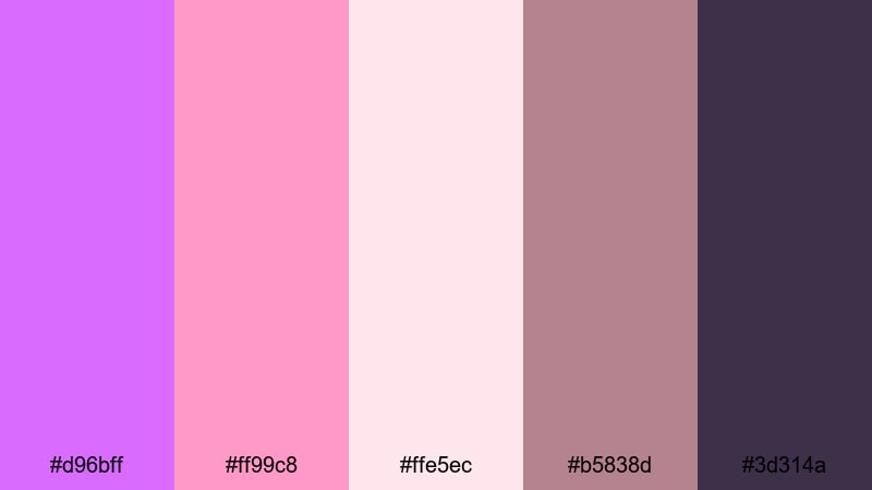
- HEX Codes: #d96bff, #ff99c8, #ffe5ec, #b5838d, #3d314a
- Mood: Warm, tender, and serenely feminine.
- Use for: Use for beauty channels, self-care edits, and brand intro animations with a soft flair.
Blush Heliotrope Serenade blends bright heliotrope with warm blush, mauve browns, and a dark plum accent. It feels cozy and melodic, like a self-care evening with candles, music, and skincare.
This palette suits beauty tutorials, GRWMs, and wellness routines where you want overlays, titles, and UI elements to echo rose-gold packaging and soft lighting. Use the light blush tones behind product callouts, the heliotrope for key buttons or subscribe CTAs, and the darker mauves for subtle shadows that add depth without turning the frame too moody.
Bold & Electric Heliotrope Color Palettes
Neon Studio Haze
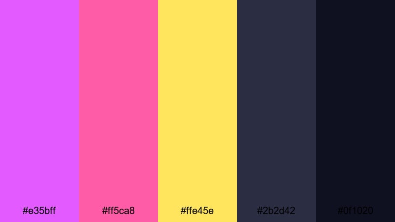
- HEX Codes: #e35bff, #ff5ca8, #ffe45e, #2b2d42, #0f1020
- Mood: Energetic, neon-lit, and high-contrast.
- Use for: Perfect for gaming intros, hype reels, and reactive motion graphics.
Neon Studio Haze is all about impact: vivid heliotrope and hot pink jump out against electric yellow and charcoal blacks. It feels like being in a neon-lit studio or an esports stage with glowing signs and fast motion.
Use the dark shades as your base for text blocks and backgrounds, then let heliotrope and yellow handle titles, animated outlines, and waveform-reactive graphics. This palette is ideal for gaming montages, beat-synced edits, and shorts where you want the thumbnail to explode with color and instantly signal energy and excitement.
Electric Night Pulse
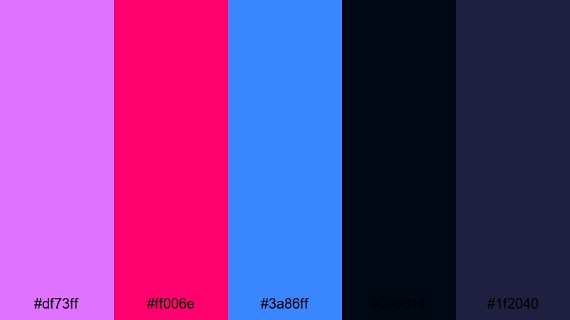
- HEX Codes: #df73ff, #ff006e, #3a86ff, #000814, #1f2040
- Mood: Intense, futuristic, and full of motion.
- Use for: Great for sports edits, fast-cut trailers, and glitch transitions.
Electric Night Pulse combines heliotrope with punchy magenta and cobalt blue over deep midnight tones. It feels like city lights blurred by speed, perfect for edits that live on the edge of sci-fi and nightlife.
Use heliotrope and magenta for bold kinetic typography, streaks, and glitch elements; let cobalt highlight key stats or scores in sports edits. The almost-black blues make perfect backgrounds for text heavy frames, giving you strong contrast for white or neon-colored fonts in thumbnails and opening cards.
Retro Arcade Heliotrope
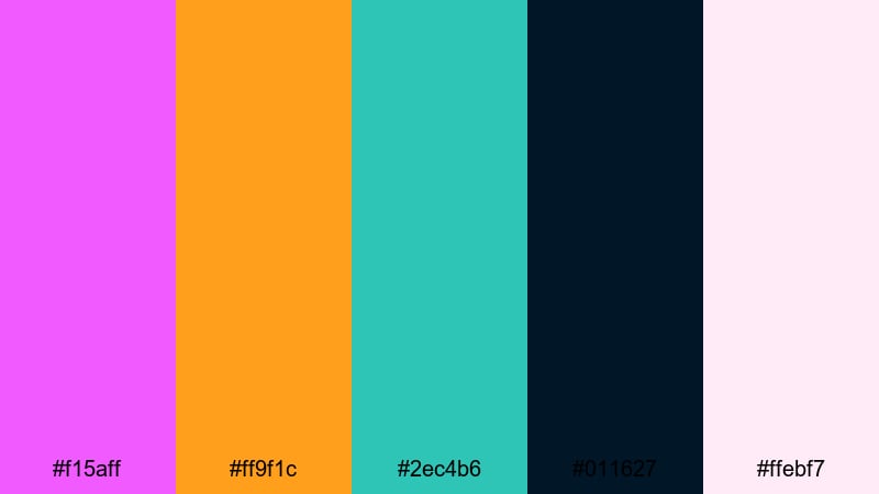
- HEX Codes: #f15aff, #ff9f1c, #2ec4b6, #011627, #ffebf7
- Mood: Playful, nostalgic, and arcade-inspired.
- Use for: Ideal for retro gaming channels, tech explainers, and quirky motion graphics.
Retro Arcade Heliotrope throws vibrant purple into a mix of teal, bright orange, and deep navy, echoing the colors of classic arcade cabinets and pixel art. It is playful and nostalgic, with just enough contrast to keep your designs crisp.
Use the neon hues in pixel-style transitions, score counters, and 8-bit badges for your channel branding. The deep navy works as a clean background for overlays, while the soft pinkish white tone keeps UI elements and subtitles readable. This palette is great for throwback intros, tech explainers with a retro twist, or channels built around vintage gaming.
Viral Thumbnail Pop
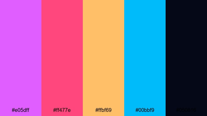
- HEX Codes: #e05dff, #ff477e, #ffbf69, #00bbf9, #050816
- Mood: Click-worthy, bold, and irresistibly bright.
- Use for: Made for YouTube thumbnails, shorts covers, and call-to-action screens.
Viral Thumbnail Pop is engineered for attention. Heliotrope, hot pink, citrus orange, and bright aqua burst against a nearly black background, delivering extreme contrast even on small mobile screens.
Use the darkest shade behind close-up faces, reaction shots, or product images, then outline your subject with neon borders in aqua or heliotrope. Add big, bold text in white or yellow and accent important words with pink or purple. This palette is ideal for challenge videos, commentary, and shorts covers where the goal is to stop the scroll instantly.
Pastel Heliotrope Color Palettes
Cotton Candy Heliotrope
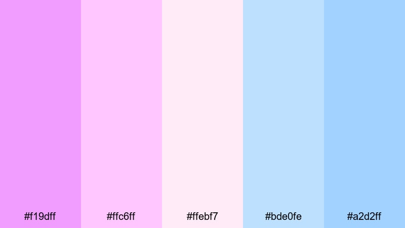
- HEX Codes: #f19dff, #ffc6ff, #ffebf7, #bde0fe, #a2d2ff
- Mood: Sweet, airy, and softly playful.
- Use for: Perfect for lifestyle vlogs, kid-friendly content, and lighthearted intros.
Cotton Candy Heliotrope blends sugary purples with baby pinks and airy sky blues, creating a light, cloudlike aesthetic. It feels friendly and innocent, ideal for content that should feel safe, optimistic, and fun.
Use this palette to design channel banners and end screens for lifestyle, family, or kid-friendly channels. The pastel blues balance the sweet purples and pinks, keeping the frame from feeling too sugary, while still delivering an on-trend pastel aesthetic for overlays, stickers, and animated icons.
Dreamy Studio Pastels
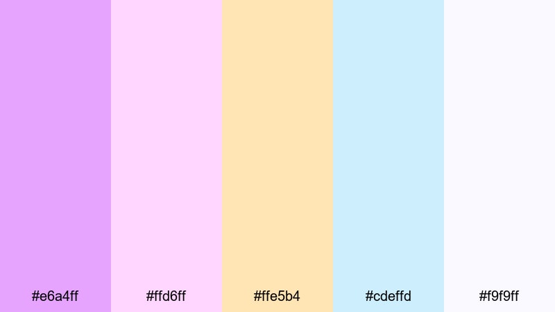
- HEX Codes: #e6a4ff, #ffd6ff, #ffe5b4, #cdeffd, #f9f9ff
- Mood: Light, optimistic, and studio-chic.
- Use for: Great for creator branding, channel banners, and course intros.
Dreamy Studio Pastels pairs heliotrope with soft peach and pale sky tones, giving your visuals a modern but approachable feel. The near-white shade (#f9f9ff) works like a clean studio backdrop for text and UI elements.
Use the purples and peaches for accent shapes, buttons, and logo reveals, while the blues and whites hold your background and negative space. This palette is excellent for online courses, productivity channels, and personal brands that want to feel polished yet welcoming across intros, lower thirds, and slide-style video sections.
Soft Fade Storyboard

- HEX Codes: #e8b3ff, #fcd5ff, #fde2ff, #cddafd, #f1faee
- Mood: Feather-light, calming, and cinematic.
- Use for: Use for chapter cards, end screens, and gentle transitions in narrative edits.
Soft Fade Storyboard layers pastel heliotrope with pale lilacs and powder blues, recreating the feel of a slow dissolve between scenes. The almost-white greenish tone (#f1faee) keeps everything feeling fresh and breathable.
Use this palette to design chapter cards, act breaks, and storyboard-style frames that separate key moments in your video. The subtle color shifts help viewers understand the structure of your story without distracting from the footage. It works especially well in long vlogs, documentaries, or series where you need clear but gentle visual signposts.
Morning Mist Highlights
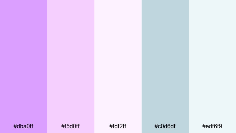
- HEX Codes: #dba0ff, #f5d0ff, #fdf2ff, #c0d6df, #edf6f9
- Mood: Fresh, airy, and reassuring.
- Use for: Great for productivity vlogs, morning routines, and wellness explainers.
Morning Mist Highlights pairs soft heliotrope with muted blues and clean whites, capturing the feel of early daylight through a window. It is calm and reassuring, ideal for content that focuses on routines, planning, or mental health.
Use heliotrope as an accent color for checklists, progress bars, and key labels, while the light blues and whites carry background panels and text cards. This palette works well for productivity dashboards on screen, habit trackers, and minimal lower thirds that keep the focus on your tips and narration.
Elegant & Modern Heliotrope Color Palettes
Heliotrope Tech Minimal
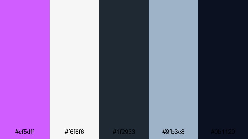
- HEX Codes: #cf5dff, #f6f6f6, #1f2933, #9fb3c8, #0b1120
- Mood: Clean, futuristic, and professional.
- Use for: Perfect for SaaS promos, UI mockup overlays, and tech explainers.
Heliotrope Tech Minimal uses a refined purple accent against neutral grays, slate, and deep navy. It suggests modern interfaces and dashboards, making it ideal for tech-forward content and brands.
Use the light gray as your main background, letting heliotrope highlight buttons, timelines, and key data points. The darker blues can frame screen recordings, app demos, or browser windows in your edit. This palette works especially well in explainer videos, SaaS promos, and UI walk-throughs where clarity and professionalism matter.
Editorial Luxe Violet
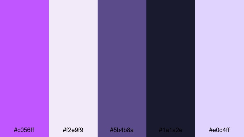
- HEX Codes: #c056ff, #f2e9f9, #5b4b8a, #1a1a2e, #e0d4ff
- Mood: Sophisticated, glossy, and editorial.
- Use for: Great for fashion lookbooks, portfolio reels, and premium brand intros.
Editorial Luxe Violet combines rich heliotrope and deep indigo with soft lilac highlights, echoing high-end magazine layouts. The contrast between the dark base tones and light pastel accents feels expensive and curated.
Use the soft lilacs for background blocks and negative space, while the darker shades support bold typography and slow, confident camera moves. This palette suits fashion lookbooks, design portfolios, and luxury product showcases, especially when you use heliotrope as the accent for logos, animated underlines, and subtle highlight glows.
Cinematic Title Noir

- HEX Codes: #ba4bff, #f3e8ff, #4b4b6a, #11111b, #868e96
- Mood: Moody, cinematic, and polished.
- Use for: Use for opening titles, credit sequences, and dramatic trailers.
Cinematic Title Noir lets heliotrope glow subtly against charcoal, navy, and soft gray. The result is a sophisticated, filmic palette that works especially well for title cards and credits.
Use the darkest tones as your main background for minimalist titles and end credits. Let heliotrope handle key words, animated strokes, and logo marks, while the light lavender and gray tones soften sidebars, subtitles, and UI elements. This palette is perfect for narrative shorts, fan edits, and trailers that aim for a festival-ready look without sacrificing readability.
Tips for Creating Heliotrope Color Palettes
Heliotrope is flexible enough to feel romantic, futuristic, or professional depending on what you pair it with. These tips will help you combine it with other colors in a way that works well for video, thumbnails, and overall brand design.
- Choose your mood first: pair heliotrope with blush and cream for romantic content, with neon accents for hype edits, or with grays and navy for tech and business topics.
- Watch contrast and legibility: when using heliotrope for text, put it on soft light backgrounds; when it is the background, use white or near-black text for clear readability.
- Limit your accents: pick one or two supporting accent colors (such as aqua or citrus) so your palette feels intentional rather than chaotic.
- Keep branding consistent: reuse the same HEX codes for your logos, lower thirds, and end screens across videos so your channel is instantly recognizable.
- Match your grade to your graphics: if your overlays are heliotrope-heavy, nudge your shadows or midtones slightly toward purple in Filmora so footage and graphics live in the same color world.
- Test on mobile: preview your thumbnails and overlays at small sizes to confirm that heliotrope still pops and text remains legible on phones.
- Use dark anchors: balance bright heliotrope and neons with at least one deep, almost-black shade to anchor your frames and protect viewers from visual fatigue.
- Save presets: once you dial in a heliotrope look you love, save color presets and title templates in Filmora so you can apply them instantly in future projects.
Heliotrope is one of those colors that can define a visual identity: it can be soft and romantic, bold and neon, or sleek and editorial depending on your palette. By choosing the right combinations and reusing them in your thumbnails, intros, lower thirds, and color grading, you help your audience recognize your work at a glance.
Try a few of these 15 heliotrope palettes in Filmora, then tweak them until they fit your story, niche, and personality. Whether you are editing a wedding highlight, a gaming montage, or a tech explainer, a thoughtful color palette will make your project feel more cinematic and more on brand.
Save your favorite looks as presets, experiment with different grades on copies of your timeline, and let heliotrope become a signature color that ties your content together across platforms.
secure downloadNext: Winter Color Palette
