
 100% Security Verified | No Subscription Required | No Malware


 ChatGPT
 Perplexity
 Gemini
 Claude
 Grok
Grok
Light color palettes instantly make video and design work feel clean, open, and approachable. Soft whites, creams, and pale tints give viewers a sense of calm and clarity, which is why they show up so often in lifestyle vlogs, productivity channels, and minimalist brand identities. Used well, light tones can make your footage look more premium while still feeling friendly and easy to watch.
Below are 15 ready-made Light color palettes with HEX codes you can copy straight into your thumbnails, intros, overlays, and brand kits. Whether you edit in Filmora or design your assets elsewhere, these combinations will help you build a consistent light-themed look across YouTube videos, Reels, TikToks, and more.
In this article
Soft & Airy Light Color Palettes
Morning Window Glow
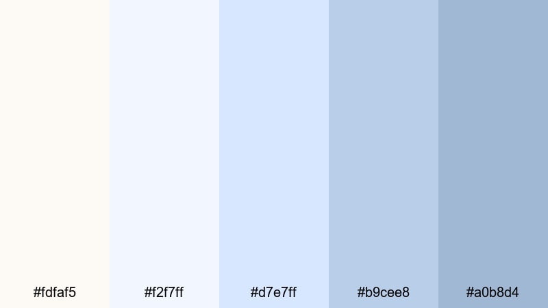
- HEX Codes: #fdfaf5, #f2f7ff, #d7e7ff, #b9cee8, #a0b8d4
- Mood: Calm, optimistic, and gently energizing, like the first light of day.
- Use for: Great for soft lifestyle vlogs, morning routine intros, and minimal thumbnails that need a fresh, welcoming feel.
Pale creams and sky blues in Morning Window Glow feel like soft daylight spilling through sheer curtains. It is bright enough to look clean and modern, but the gentle blue gradients keep the mood relaxed instead of harsh or clinical.
Use this palette for morning routines, wellness content, and productivity videos where you want to communicate clarity and a fresh start. In Filmora, you can pull these HEX codes into text, lower thirds, and simple shapes behind your titles so your thumbnails, intro screens, and end cards all share the same airy look.
Pro Tip: Enhance Your Light Visuals With Filmora
Light palettes like this rely on subtle contrast and carefully controlled highlights. In Filmora, you can balance exposure, whites, and shadows so your whites stay soft instead of blown out. Apply the same color adjustments to your A-roll, B-roll, and overlay graphics to keep that gentle morning glow consistent from the first frame to the last.
Build a simple brand kit inside Filmora by saving title templates and lower thirds that use these HEX codes. Then you can quickly drop them into new edits for YouTube, Shorts, and Reels without having to recreate your light look every time.
AI Color Palette
If you have a screenshot, thumbnail, or mood board that already captures this light, airy vibe, Filmora's AI Color Palette feature can match it across your entire edit. Just pick a reference frame that shows your favorite soft whites and blues, then let Filmora transfer that palette to other clips.
This is especially helpful when your footage comes from different cameras or shooting days. With AI Color Palette, you can unify everything to the same calm Morning Window Glow style in a few clicks, so your intro, main content, and outro all feel like part of one polished visual story.
 secure download

HSL, Color Wheels & Curves
Once you have a base light palette, use Filmora's HSL sliders, color wheels, and curves to fine-tune it. You can gently desaturate blues in the shadows, lift the highlights for a clean white background, or nudge midtones toward warmer or cooler light depending on your brand. Filmora's color correction guide walks through how these tools shape mood without ruining skin tones.
For a more cinematic light look, try adding a subtle S-curve to increase contrast while keeping your brightest whites under control. Then adjust the temperature and tint in the color wheels so all your clips share the same soft daylight feel, even if they were shot in slightly different lighting conditions.
secure download1000+ Video Filters & 3D LUTs
To speed up your workflow, start from Filmora's built-in filters and LUTs, then tweak them to fit your light palette. Filmora's video filters and 3D LUTs make it easy to add a soft, airy grade to your clips and then adjust the intensity so your whites, blues, and creams stay on brand.
Apply a subtle pastel or cinematic LUT to your footage, and then overlay titles and graphic elements using the Morning Window Glow HEX codes. This combination gives you a cohesive light style in minutes, perfect for creators who want a professional aesthetic without spending hours on manual grading.
secure downloadFeather Cloud Daybreak
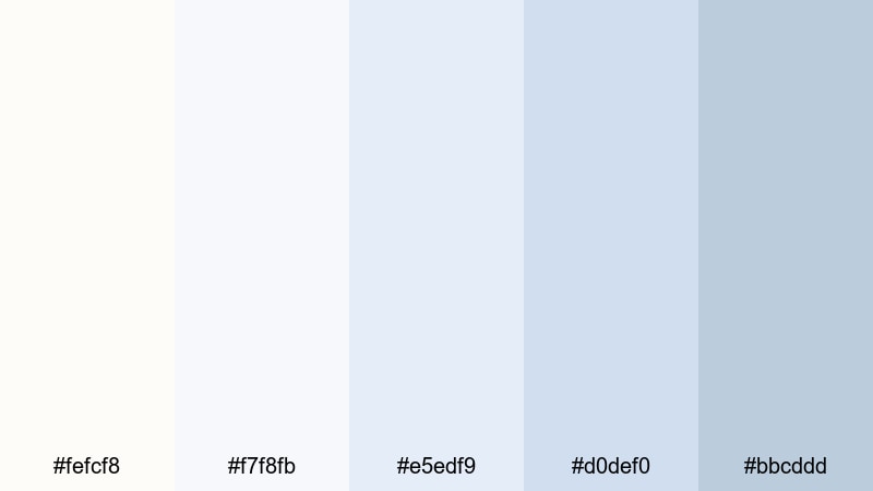
- HEX Codes: #fefcf8, #f7f8fb, #e5edf9, #d0def0, #bbcddd
- Mood: Weightless, dreamy, and quiet, like drifting clouds at sunrise.
- Use for: Perfect for calm cinematic b-roll, voiceover backdrops, and channel art that aims for a dreamy, airy aesthetic.
Feather Cloud Daybreak layers whites and powdery blues to create a weightless, cloud-like atmosphere. Nothing is too saturated, so your frames feel quiet and spacious, ideal for reflective voiceovers and soft-focus B-roll.
Use it as a base for title cards, end screens, or chapter markers in Filmora by combining pale background shapes with simple sans serif text. It works especially well for meditation clips, study ambience videos, or dreamy travel edits where you want light visuals that never distract from the audio.
Quiet Library Dust
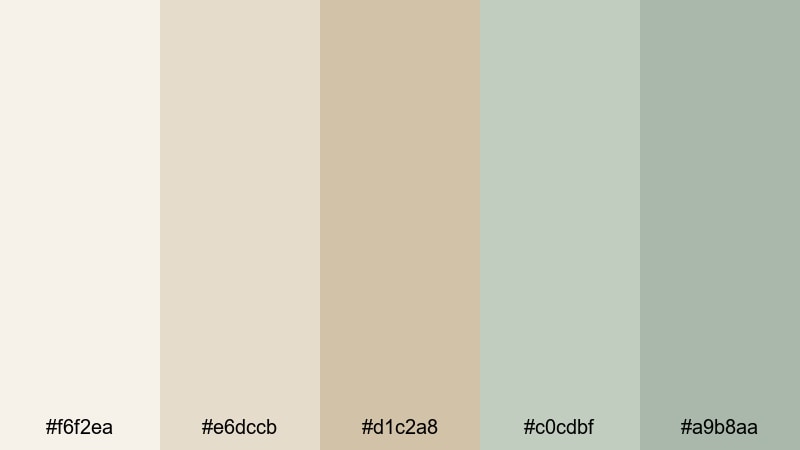
- HEX Codes: #f6f2ea, #e6dccb, #d1c2a8, #c0cdbf, #a9b8aa
- Mood: Reflective, nostalgic, and softly intellectual.
- Use for: Works well for study-with-me videos, educational explainers, and documentary-style thumbnails with a calm academic tone.
Quiet Library Dust mixes muted beige and soft green tones, evoking old books, sunlit shelves, and worn paper. It feels thoughtful and grounded, so it supports more serious or educational content without looking dull.
Use these colors for lower thirds, highlight boxes, and timeline graphics in tutorials or essay-style videos. In thumbnails, combine a warm beige background with muted green accents around key text or subject cutouts to suggest intelligence and calm focus.
Linen Breeze Studio
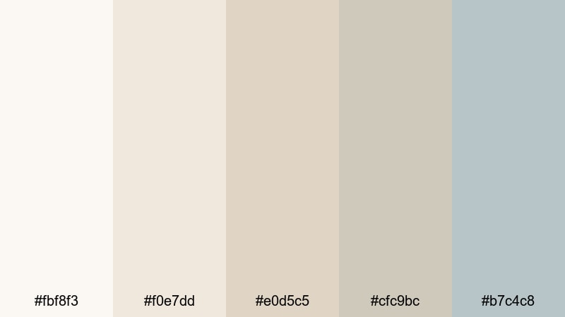
- HEX Codes: #fbf8f3, #f0e7dd, #e0d5c5, #cfc9bc, #b7c4c8
- Mood: Clean, natural, and lightly creative, like an artist loft.
- Use for: Ideal for creator studios, behind-the-scenes content, and brand intros that mix craft, lifestyle, and design.
Linen Breeze Studio is full of creams and greige tones that resemble linen, canvas, and soft daylight. The muted blue-grey accent stops the palette from feeling too beige, giving you a subtle modern edge.
Use it on creator studio tours, DIY tutorials, and workspace makeovers. In Filmora, pair these colors with simple motion graphics: sliding panels, minimal frames around your shots, and chapter titles that float over light neutral backgrounds. It keeps your visuals gentle, but still clearly designed.
Minimal & Modern Light Color Palettes
Scandi Loft Whites
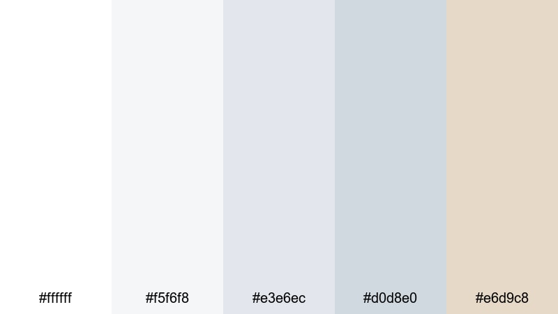
- HEX Codes: #ffffff, #f5f6f8, #e3e6ec, #d0d8e0, #e6d9c8
- Mood: Minimal, spacious, and stylish with a hint of warmth.
- Use for: Great for tech reviews, productivity channels, and modern brand openers that want a clean Scandinavian look.
Scandi Loft Whites pairs crisp whites and cool greys with a soft wood-toned accent. The result is minimal and almost monochrome, but that touch of beige keeps everything from feeling cold or clinical.
This palette is perfect for tech channels and productivity brands that want to look modern and premium. Use the warm beige as a subtle highlight for buttons, subscribe CTAs, or icons in your overlays, while keeping most backgrounds and text areas in the pale grey range for maximum readability.
Frosted Glass UI
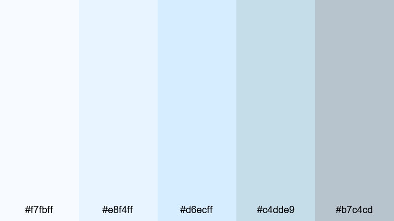
- HEX Codes: #f7fbff, #e8f4ff, #d6ecff, #c4dde9, #b7c4cd
- Mood: Techy, polished, and futuristic yet gentle on the eyes.
- Use for: Perfect for app promos, software walkthroughs, and motion graphics with glassmorphism or soft UI elements.
Frosted Glass UI uses icy blues and cool greys to mimic translucent glass surfaces and soft gradients. It feels high-tech and polished, but the light tones prevent any strain on the eyes during longer videos.
Use it in product demos, SaaS explainers, and UI animations. In Filmora, combine semi-transparent shapes, blur effects, and these HEX colors to fake a glass panel behind your text or screen captures, giving your video a sleek interface style.
Marble Desk Flatlay
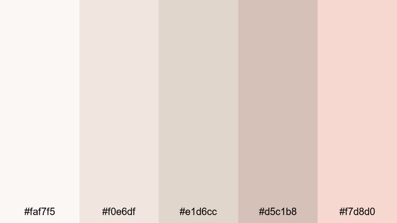
- HEX Codes: #faf7f5, #f0e6df, #e1d6cc, #d5c1b8, #f7d8d0
- Mood: Sophisticated, feminine, and editorial with a soft luxury touch.
- Use for: Great for beauty channels, stationery hauls, and brand photography inspired thumbnails.
Marble Desk Flatlay combines creamy neutrals with a gentle blush accent, echoing marble surfaces and lifestyle flatlay shots. It communicates subtle luxury without loud gold or heavy dark tones.
This palette works beautifully for beauty, planning, or stationery content. Use the blush tone to highlight key words in your titles or to frame product shots in thumbnails. Against the soft beige background, icons and text look polished and editorial, perfect for Instagram-ready branding.
Soft Grid Blueprint
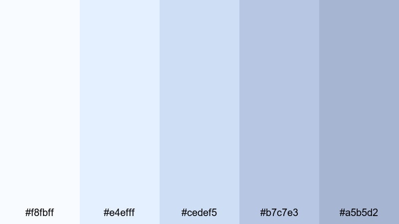
- HEX Codes: #f8fbff, #e4efff, #cedef5, #b7c7e3, #a5b5d2
- Mood: Orderly, thoughtful, and lightly technical without feeling harsh.
- Use for: Ideal for how-to breakdowns, UI wireframes, and explainer animations that rely on diagrams or charts.
Soft Grid Blueprint layers different shades of light blue, calling back to traditional blueprints but with a softer twist. It suggests structure, planning, and logic while still looking friendly.
Use it for breakdown graphics, step-by-step overlays, and animated diagrams in Filmora. Build simple line icons and boxes in the darker blues, then keep backgrounds in the very light tones so text remains readable and the whole frame feels clean and professional.
Pastel Light Color Palettes
Pastel Cotton Candy
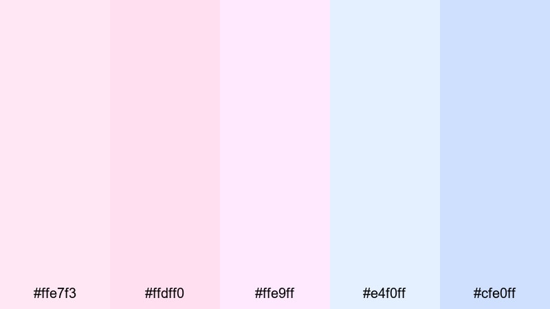
- HEX Codes: #ffe7f3, #ffdff0, #ffe9ff, #e4f0ff, #cfe0ff
- Mood: Playful, sweet, and nostalgic, like a pastel fairground.
- Use for: Perfect for channel rebrands, playful intros, and K-pop or fandom edits with a cute, dreamy style.
Pastel Cotton Candy blends pink and blue pastels into a sugary, dreamlike mix. It instantly reads as cute and upbeat, making it ideal for fun edits, stan videos, and whimsical intros.
Use it on animated titles, emoji-style stickers, and character cutouts. In thumbnails, combine a soft pink background with blue accent swirls or frames around your subject to nail that playful cotton candy aesthetic without overwhelming the viewer.
Macaron Storyboard
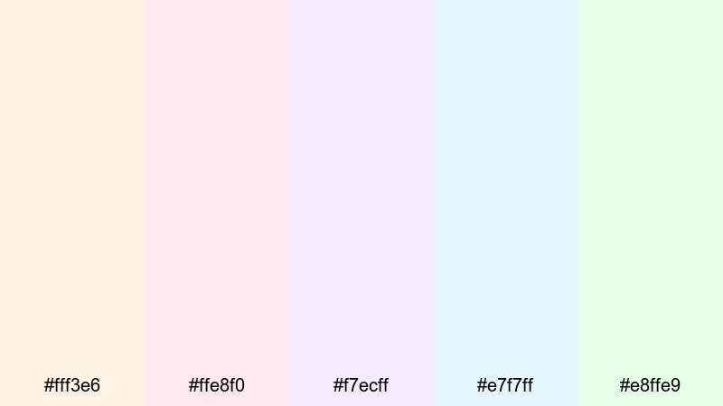
- HEX Codes: #fff3e6, #ffe8f0, #f7ecff, #e7f7ff, #e8ffe9
- Mood: Gentle, creative, and cheerful, like a box of pastel treats.
- Use for: Great for storytelling reels, creative portfolios, and brand kits that need soft color variety without loud saturation.
Macaron Storyboard offers five light pastel hues: peach, pink, lilac, blue, and mint. Each color is soft enough to sit in the background, but together they give you lots of accent options.
Use this palette to color-code chapters, sections, or content types in your videos. For example, assign one pastel to tips, another to Q&A, and another to behind-the-scenes segments, so viewers can instantly recognize what type of moment they are watching just from the overlay color.
Bubble Tea Dreams
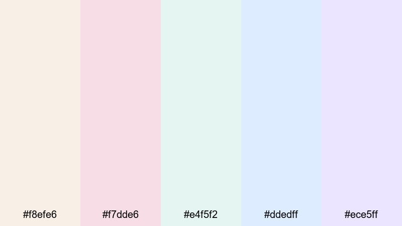
- HEX Codes: #f8efe6, #f7dde6, #e4f5f2, #ddedff, #ece5ff
- Mood: Cozy, trendy, and comforting, like a slow afternoon cafe visit.
- Use for: Perfect for cafe vlogs, study content, and lifestyle shorts that want a gentle pastel look with a modern twist.
Bubble Tea Dreams mixes cream, blush, mint, and lavender pastels, evoking cafe drinks and soft neon signage. It feels relaxed and trendy at the same time, great for vlogs and lo-fi edits.
Use it to tint background shapes behind your timestamps, captions, or subtitles. In Filmora, you can add simple rounded rectangles or pill-shaped labels in these colors to introduce locations, song titles, or chapter names in a subtle but stylish way.
Easter Sunset Fade
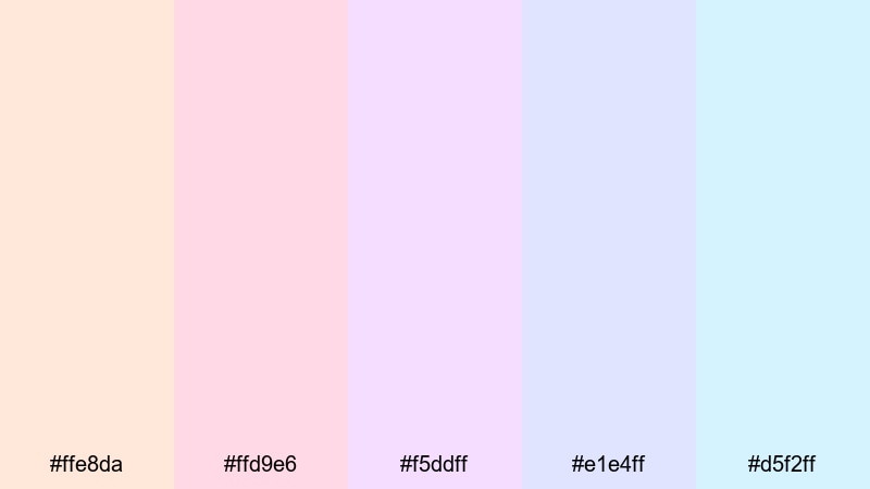
- HEX Codes: #ffe8da, #ffd9e6, #f5ddff, #e1e4ff, #d5f2ff
- Mood: Softly celebratory, hopeful, and serene, like a calm evening sky.
- Use for: Great for seasonal bumpers, holiday cards in motion, and heartfelt announcement videos.
Easter Sunset Fade moves gently from warm peach and pink into cooler lilac and sky blues, like a pastel sunset gradient. It feels celebratory without relying on bright primaries or metallic tones.
Use this palette for seasonal content such as holiday intros, announcement reels, or thank-you messages for your community. Try using simple vertical or horizontal gradients in Filmora as backgrounds for your titles, letting these colors blend softly across the frame.
Warm & Cozy Light Color Palettes
Candlelit Workspace
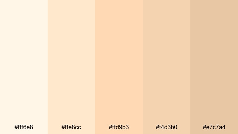
- HEX Codes: #fff6e8, #ffe8cc, #ffd9b3, #f4d3b0, #e7c7a4
- Mood: Warm, inviting, and focused, like working beside a candle or lamp.
- Use for: Ideal for study sessions, productivity vlogs, and podcast visuals that should feel cozy but still professional.
Candlelit Workspace wraps your visuals in soft amber and cream tones that resemble lamp light on a wooden desk. It feels intimate and focused, perfect for long-form content where you want viewers to settle in and stay.
Use it as a color base for background plates, waveform overlays, or simple frames around your talking head. In thumbnails, this palette can help your face or subject stand out warmly against a light, comfortable backdrop, giving your channel an inviting study or podcast vibe.
Vanilla Chai Break
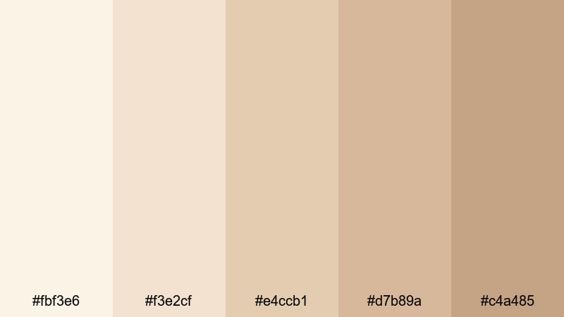
- HEX Codes: #fbf3e6, #f3e2cf, #e4ccb1, #d7b89a, #c4a485
- Mood: Comforting, grounded, and slow-paced, like a warm drink on a quiet day.
- Use for: Great for slow living vlogs, journaling content, and channel trailers that emphasize comfort and routine.
Vanilla Chai Break combines creams and soft browns to deliver a cozy, grounded mood. It is warm without being too orange, making it a flexible base for lifestyle and slow living content.
Use it in journaling videos, morning and evening routines, or channel trailers. Design your title cards with a pale cream background and deeper chai-colored text or borders, and keep motion graphics gentle and slow to match the relaxed feel of the palette.
Sunwashed Terracotta
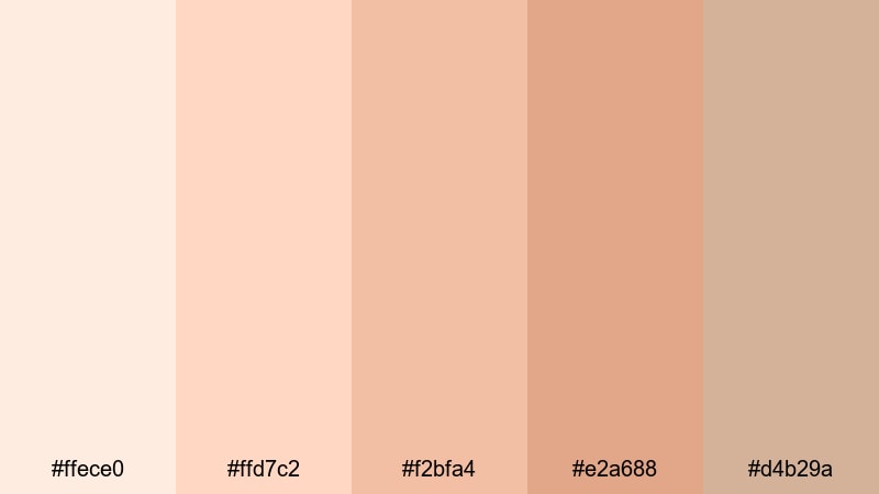
- HEX Codes: #ffece0, #ffd7c2, #f2bfa4, #e2a688, #d4b29a
- Mood: Earthy, sunlit, and creative, like clay drying in warm light.
- Use for: Perfect for travel diaries, outdoor creatives, and brand visuals tied to craft, wellness, or sustainable living.
Sunwashed Terracotta uses soft, earthy oranges and peaches that feel like sun-faded walls, rooftops, and clay. It combines the warmth of desert or Mediterranean scenes with a lightness that keeps your visuals bright.
Use it for travel diaries, pottery or craft channels, and wellness brands that want an earthy but minimal look. In Filmora, you can tint overlays and text backgrounds with these tones, then mix in natural textures like paper or subtle grain to reinforce the handmade, sunlit atmosphere.
Tips for Creating Light Color Palettes
Light color palettes look simple, but getting them right for video and design means balancing contrast, readability, and mood. Here are practical tips to help you combine light tones effectively in Filmora and across your branding.
- Pair light backgrounds with slightly darker accents for text and icons so everything stays readable, even on mobile screens.
- Choose one or two key accent colors from your palette for buttons, subscribe CTAs, or important labels, and keep the rest of the frame neutral.
- Check your thumbnails in small size to make sure text and subject outlines still stand out against pale backgrounds.
- Match your palette to your footage: if your video is warm and golden, lean into cream and beige lights; if it is cooler and techy, use blue or grey light tones.
- Use Filmora's color tools to gently lower saturation in backgrounds so skin tones and focal subjects remain the strongest colors in the frame.
- Keep branding consistent by reusing the same HEX codes for titles, lower thirds, and end screens across all your uploads.
- Add soft gradients or light vignettes to give depth to very pale designs so they do not feel flat or washed out.
- Test your palette in both light and dark environments by viewing your video on different devices and adjusting contrast if details disappear.
Light color palettes are powerful tools for shaping how your channel feels: calm, minimal, playful, or cozy. By choosing the right combination of whites, creams, pastels, and warm accents, you can design a visual identity that viewers recognize instantly in their feed.
Try these 15 palettes as starting points, then customize them inside Filmora to match your own style and footage. Save your favorite combinations as presets, reuse them in templates, and keep your intros, titles, and B-roll all aligned to the same light, cohesive look.
Whether you are building a clean productivity brand, a dreamy pastel vlog, or a warm study channel, consistent light colors will help your edits feel more cinematic and professional, without adding complexity to your workflow.
secure downloadNext: Gaming Color Palette
