
 100% Security Verified | No Subscription Required | No Malware


 ChatGPT
 Perplexity
 Gemini
 Claude
 Grok
Grok
Lighthouse inspired color palettes mix clean whites, soft coastal blues, and warm beacon tones that feel safe, calm, and guiding. They naturally suggest clarity and direction, which makes them perfect for creators who want their videos to feel organized, uplifting, or cinematic without looking overly saturated.
Whether you are designing channel branding, YouTube thumbnails, vlog intros, or subtle overlays, Lighthouse colors can keep your visuals consistent across every upload. Below are 15 ready made Lighthouse color palettes with HEX codes so you can quickly copy them into Filmora, apply them to your footage, and build a memorable aesthetic for your creative projects.
In this article
Soft Coastal Lighthouse Color Palettes
Harbor Dawn Glow
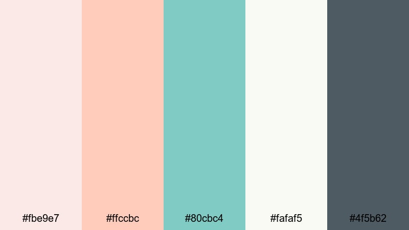
- HEX Codes: #fbe9e7, #ffccbc, #80cbc4, #fafaf5, #4f5b62
- Mood: Calm, hopeful, and softly romantic, like first light over a quiet harbor.
- Use for: Use for dreamy travel vlogs, cinematic b roll, and soft lifestyle thumbnails that need a gentle sunrise feel.
Harbor Dawn Glow wraps your visuals in peachy skies, seafoam water, and a clean lighthouse white that feels nostalgic and gentle. The soft teal and muted charcoal keep the palette from becoming too pastel, giving your scenes enough depth to stay cinematic.
Use this palette in Filmora to build cohesive travel intros, match your lower thirds to your thumbnail background, or tint overlays for romantic vlogs. It works especially well for morning routines, coastal walks, or memory filled edits where you want every frame to feel like the first light of day.
Pro Tip: Build A Soft Lighthouse Glow In Filmora
When grading with Harbor Dawn Glow, keep your highlights warm and your shadows cool. In Filmora, you can pick the peach and seafoam HEX codes for titles, subtitles, and graphic elements so your text, frames, and b roll all share the same Lighthouse glow.
Create a custom preset in Filmora using these tones for your intro, then reuse it on reels, Shorts, and full length videos. This way your channel art, end screens, and even chapter cards always feel like different shots from the same sunrise by the harbor.
AI Color Palette
If you already have a photo of a soft harbor sunrise or a color card with these HEX codes, you can turn it into a video wide look using Filmora's AI Color Palette feature. Import the reference image, apply AI Color Palette to a clip, and let Filmora automatically map those Lighthouse tones across your footage.
This is perfect when you shoot on different days or cameras but want your whole edit to feel like one continuous dawn. AI Color Palette keeps skin tones natural while still pushing the whites, blues, and peaches into the same soft coastal family.
 secure download

HSL, Color Wheels & Curves
To push your Lighthouse tones a little more cinematic, use Filmora's HSL controls to gently desaturate blues in the shadows while keeping the peach highlights rich. With the color wheels, you can cool the midtones toward teal and warm the highlights toward apricot so your footage feels like golden hour, even if it was shot later in the day.
Curves let you add subtle contrast without crushing the soft coastal vibe: lift the blacks slightly, raise the midtones, and keep your whites clean to preserve that lighthouse white. For more inspiration on grading, explore Filmora's color correction tools in the color correction guide and adapt them to your own harbor footage.
secure download1000+ Video Filters & 3D LUTs
Once your Lighthouse colors are in place, you can quickly stylize them using Filmora's video filters and 3D LUTs. Warm film LUTs can make Harbor Dawn Glow feel more nostalgic, while clean modern filters keep it bright and minimal for lifestyle or productivity content.
Try stacking a soft glow filter on top of your color grade for dreamy b roll, or use a subtle vignette LUT to focus attention on your subject without darkening the palette too much. With so many presets available, it is easy to test different Lighthouse looks until you find the one that fits your channel.
secure downloadSalt Air Serenity
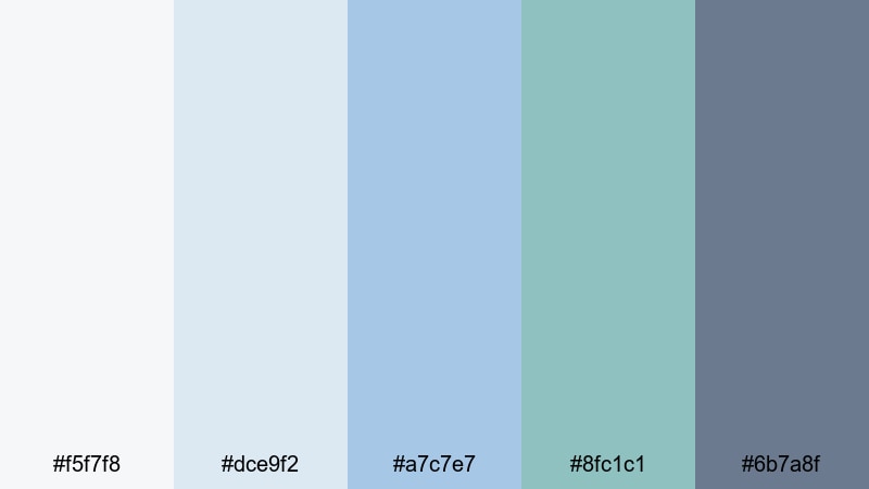
- HEX Codes: #f5f7f8, #dce9f2, #a7c7e7, #8fc1c1, #6b7a8f
- Mood: Fresh, airy, and cleansing with a cool sea breeze feel.
- Use for: Use for relaxed beach vlogs, wellness content, and montage sequences that need clarity and calm.
Salt Air Serenity combines misty whites, powdery blues, and soft teal for a palette that feels like breathing in clean ocean air. The medium slate tone adds just enough weight so your scenes stay readable without losing that spacious, minimal quality.
Use it as a base for wellness vlogs, ASMR videos, or calm productivity content. In your thumbnails and titles, pair the lightest shades for backgrounds with the darkest blue for text so everything stays crisp while still looking soft and coastal.
Seaside Linen Light

- HEX Codes: #faf7f2, #ede1d1, #d4c2aa, #b0a58f, #64727b
- Mood: Earthy, relaxed, and tactile, like sun warmed linen in a coastal cottage.
- Use for: Use for lifestyle channels, cozy home tours, and branding that mixes organic texture with subtle seaside influences.
Seaside Linen Light leans into warm creams and sand toned browns, anchored by a muted blue gray accent. It feels grounded and tactile, like natural fabrics and weathered wood near the sea, with a Lighthouse hint coming from the cool accent shade.
This palette is ideal for home tours, DIY, and slow living content. Use the neutrals for backgrounds, frames, and lower thirds, and reserve the blue gray for logo marks, buttons, and key callouts so your branding stays soft but still clearly tied to a coastal theme.
Clifftop Pastel Beacon
- HEX Codes: #fce4ec, #f8bbd0, #b3e5fc, #cfd8dc, #455a64
- Mood: Romantic and whimsical with a slightly cool, windswept edge.
- Use for: Use for travel diaries, couples stories, and title cards that balance softness with cinematic contrast.
Clifftop Pastel Beacon blends blush pinks, powder blue, and weathered gray to capture a pastel lighthouse perched above open water. The dark blue gray adds a dramatic note that keeps all those light tones from feeling washed out.
Use the pinks and light blues across your thumbnails, vertical covers, and text highlights for a dreamy look, then rely on the deepest shade for outlines, drop shadows, and key titles. It is a great choice for couples vlogs or romantic getaways where you want both softness and a sense of adventure.
Moody Nautical Lighthouse Color Palettes
Stormwatch Beacon
- HEX Codes: #f4f5f7, #cfd8dc, #455a64, #263238, #ff5252
- Mood: Dramatic, suspenseful, and cinematic with a sharp warning light accent.
- Use for: Use for trailers, dramatic storytelling, or urban night sequences that need tension and contrast.
Stormwatch Beacon builds a brooding base with layered grays and navy, then cuts through it all with a bold signal red. It feels like a lighthouse in rough weather, where the beam of light is both a warning and a guide.
Use this palette for story driven edits, urban night b roll, or intense commentary videos. Let the grays and deep blues handle your backgrounds and grading, then reserve the red for subscribe buttons, progress bars, and key text lines that must stand out even on a small phone screen.
Midnight Harbor Signal
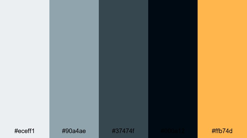
- HEX Codes: #eceff1, #90a4ae, #37474f, #000a12, #ffb74d
- Mood: Mysterious and introspective with a warm glimmer on the horizon.
- Use for: Use for night cityscapes, dockside sequences, and cinematic vlogs with reflective narration.
Midnight Harbor Signal moves from soft steel gray into deep ink black, then adds a muted amber highlight that feels like a distant harbor light. It is moody without being too harsh, which suits late night reflections and storytime content.
Grade your footage toward the blue grays for an atmospheric base, then use the amber tone sparingly in titles, lamps, or bokeh overlays. This contrast draws attention to faces, quotes, and chapter headings while preserving an overall introspective Lighthouse mood.
Foggy Breakwater

- HEX Codes: #f5f5f5, #e0e0e0, #b0bec5, #78909c, #37474f
- Mood: Muted, quiet, and introspective like a harbor swallowed by fog.
- Use for: Use for documentary style edits, reflective voiceovers, and minimal title designs.
Foggy Breakwater is all about soft, desaturated grays and blue grays that mimic fog rolling over a pier. It feels minimal, quiet, and slightly distant, making it ideal for serious topics or documentary style storytelling.
Use the lightest shades as canvas backgrounds in your overlays and end screens, and the darker blue grays for text and subtle framing. Because the palette is low contrast and low saturation, it keeps attention on your story and narration instead of the colors themselves.
Deep Tide Lantern
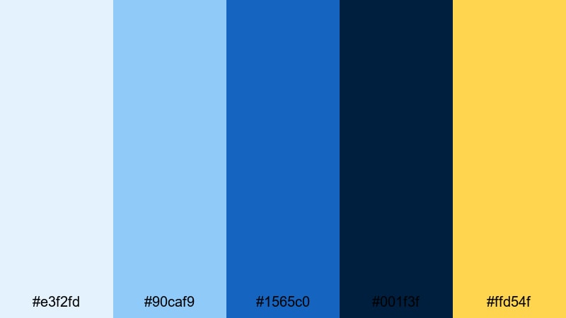
- HEX Codes: #e3f2fd, #90caf9, #1565c0, #001f3f, #ffd54f
- Mood: Bold, adventurous, and oceanic with a golden guiding light.
- Use for: Use for sailing footage, adventure vlogs, and dynamic openers that move from light to dark.
Deep Tide Lantern stacks bright sky blue, mid ocean blue, and almost black navy to suggest moving from day into deep water. A warm lantern yellow rides on top as a clear focal point, like a beam from a lighthouse or ship.
For action heavy edits or travel intros, use the blues across overlays, map graphics, and transitions, then drop the golden yellow on call to action text, arrows, and icons. The strong contrast between blue and yellow makes this palette pop on mobile, especially in Shorts and Reels.
Bright Daybreak Lighthouse Color Palettes
Sunrise Over The Sound
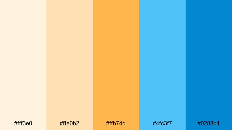
- HEX Codes: #fff3e0, #ffe0b2, #ffb74d, #4fc3f7, #0288d1
- Mood: Optimistic, energetic, and uplifting like a clear sunrise over open water.
- Use for: Use for upbeat channel intros, travel reels, and announcement graphics that must grab attention fast.
Sunrise Over The Sound moves from pale apricot to bright gold and clear sky blue, capturing that moment when the sun clears the horizon. It is cheerful and high energy, perfect for creators who want a positive, welcoming Lighthouse feel.
Use the warm tones for background gradients and key frames, then layer in the blues for contrast in buttons, badges, and lower thirds. This palette is excellent for channel trailers, launch videos, and upbeat vlog series branding.
Golden Pier Beacon
- HEX Codes: #fff8e1, #ffecb3, #ffd54f, #ffb300, #0277bd
- Mood: Warm, sunny, and welcoming with a crisp ocean accent.
- Use for: Use for creator branding, intro cards, and lifestyle thumbnails that lean into cheerful coastal vibes.
Golden Pier Beacon layers buttery yellows and honey golds with a strong pier blue accent. It feels like standing on a sunlit dock, with a clear blue channel cutting through all that warmth.
Apply the yellows to your frames, subscribe banners, and highlight boxes, then let the blue handle logos, titles, and icons. This combination reads clearly even at small sizes, making it ideal for bold, high contrast thumbnails and social headers.
Festival Harbor Lights

- HEX Codes: #fff9c4, #ffcc80, #ff8a65, #4dd0e1, #00838f
- Mood: Playful, festive, and social with a mix of warm and cool highlights.
- Use for: Use for event recaps, party highlights, and social media teasers that need colorful energy.
Festival Harbor Lights mixes creamy yellow, apricot, coral, and bright aqua to echo lanterns strung along a marina at night. The deeper teal keeps it from feeling too light, adding a confident base for text and graphics.
Use the warm tones for confetti overlays, transitions, and animated stickers, while the aquas become your title bars and call to action buttons. This palette suits party recaps, festival coverage, and lively community content where you want to signal fun at a glance.
Crisp Ocean Morning
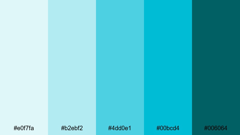
- HEX Codes: #e0f7fa, #b2ebf2, #4dd0e1, #00bcd4, #006064
- Mood: Clean, refreshing, and invigorating like a cold dip at sunrise.
- Use for: Use for fitness vlogs, travel intros, and techy lower thirds that call for clarity and freshness.
Crisp Ocean Morning is a stack of aquas and teals, from almost white water to deep sea. It feels fresh, modern, and energizing, like jumping into cold waves beside a white lighthouse.
Use it for clean, techy layouts, fitness overlays, or productivity channels that want a bright but not childish look. The deepest teal is perfect for readable text and icons, while the lighter shades make excellent panel backgrounds and motion graphic shapes.
Minimalist Lighthouse Color Palettes
Ivory Lantern Minimal
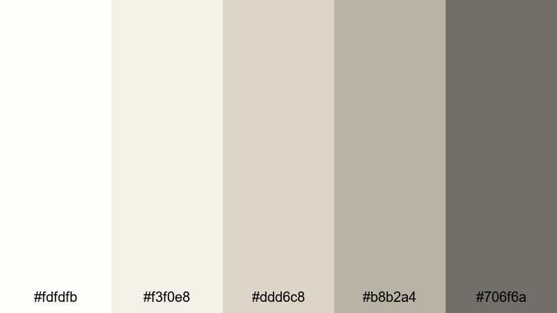
- HEX Codes: #fdfdfb, #f3f0e8, #ddd6c8, #b8b2a4, #706f6a
- Mood: Quiet, refined, and understated with a warm, lived in edge.
- Use for: Use for talking head videos, productivity channels, and branding where content should feel calm and focused.
Ivory Lantern Minimal is built from soft ivory, stone, and warm beige neutrals with a muted metal gray accent. It feels like whitewashed lighthouse walls and worn lantern hardware, giving your visuals a timeless and unobtrusive backdrop.
This palette is perfect when you want your message to stand out more than your colors. Use it in Filmora for channel frames, chapter cards, or simple lower thirds, and rely on the darkest gray for clean, high contrast text that still looks gentle on the eyes.
Slate And Foam Lines
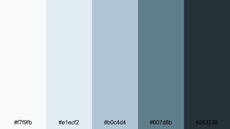
- HEX Codes: #f7f9fb, #e1ecf2, #b0c4d4, #607d8b, #263238
- Mood: Cool, structured, and modern with a hint of industrial pier metal.
- Use for: Use for tech explainers, tutorials, and channel branding that needs to look sleek and professional.
Slate And Foam Lines pairs pale foam whites and soft mist blues with strong slate accents. It has a clean, structured feel that hints at industrial pier metal without losing the calm of a coastal scene.
Use the lighter hues as panels, backgrounds, and interface style elements, then deploy the dark slate shades for headings, icons, and timeline labels. This palette works especially well for tutorials, tech explainers, and productivity videos where clarity and professionalism matter.
Clean Marina Grid

- HEX Codes: #ffffff, #f2f5f7, #cfd8dc, #90a4ae, #455a64
- Mood: Balanced, organized, and neutral with a cool dockside influence.
- Use for: Use for channel rebrands, overlays, and UI inspired frames where content thumbnails and text must stay readable.
Clean Marina Grid mixes bright white with a range of cool grays, plus a blue gray accent that gives a subtle dockside feel. It is a flexible everyday palette that can adapt to many content styles while keeping everything consistent.
Use it as your base look for playlists, video frames, and end screens, then layer one accent color from your logo on top if you want. Because it is so neutral, it plays well with footage of any Lighthouse palette you apply in grading, from soft coastal to moody nautical.
Tips for Creating Lighthouse Color Palettes
Lighthouse color palettes usually balance clean whites, coastal blues, and one or two warm beacon tones. When you combine them thoughtfully, you get visuals that are calm, readable, and distinctive across all your videos and designs.
- Pick one base white or light neutral that you reuse everywhere for consistency in titles, backgrounds, and frames.
- Choose 1 to 2 accent colors (often a blue and a warm beacon tone) for calls to action, icons, and key text so viewers quickly recognize your brand.
- Maintain strong contrast between text and background, especially in thumbnails and mobile layouts; dark navy on soft white is a Lighthouse classic.
- Keep saturation moderate in your grade; let the palette feel airy and clean, then use brighter colors only for buttons or important overlays.
- Match your color palette to your footage by adjusting white balance first, then nudging hues slightly toward your chosen blues or creams.
- Use consistent colors across lower thirds, intros, and end screens so people can recognize your videos at a glance in their feed.
- Test your palette on both light and dark scenes; tweak shadow colors so your Lighthouse look stays readable in night shots and cloudy weather.
- Create and save presets in Filmora so you can apply the same Lighthouse color treatment to new projects in a single click.
Lighthouse color palettes are powerful storytelling tools: they can make your channel feel calm and trustworthy, adventurous and nautical, or clean and professional. By choosing a small set of whites, blues, and warm accents, you shape how viewers feel the moment your thumbnail or intro appears.
Use the HEX codes in this guide as a starting point, then refine them inside Filmora until they match your footage, brand, and niche. Once you lock in a Lighthouse look you love, apply it across thumbnails, overlays, intros, and b roll so every upload feels like part of the same world.
The more consistently you use these palettes, the stronger your visual identity becomes. Open Filmora, test a few of these Lighthouse combinations on your next edit, and let your colors quietly guide viewers back to your channel over and over.
secure download