
 100% Security Verified | No Subscription Required | No Malware


 ChatGPT
 Perplexity
 Gemini
 Claude
 Grok
Grok
Mid Century Modern color palettes mix warm woods, mustard yellow, teal, and soft neutrals into a look that feels both nostalgic and timeless. These hues were born in the 1950s and 60s, but they still work beautifully for modern branding and cinematic visuals because they balance playfulness with sophistication. In video, this style can instantly suggest design-savvy taste, vintage charm, and a calm, confident mood.
For creators, choosing the right Mid Century Modern color combinations is crucial for thumbnails, intros, lower thirds, and even full video color grading. The palettes below give you ready-made HEX codes you can plug into titles, overlays, and brand kits, especially when editing in Filmora. Whether you want warm retro vibes, cool minimalism, playful pastels, or moody cinematic looks, you will find 15 Mid Century Modern color palettes you can apply directly to your creative projects.
In this article
Warm Retro Mid Century Modern Color Palettes
Atomic Sunset Lounge
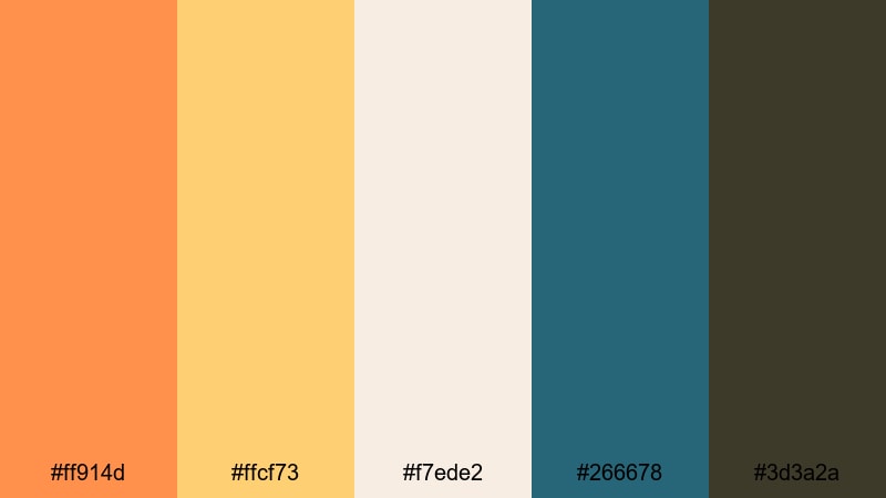
- HEX Codes: #ff914d, #ffcf73, #f7ede2, #266678, #3d3a2a
- Mood: Sunny, nostalgic, and energized with a classic 1950s living room warmth.
- Use for: Perfect for lively vlog intros, retro travel montages, or upbeat product promos in Filmora.
Atomic Sunset Lounge is a glowing mix of tangerine, golden yellow, and muted teal that feels like a sunset over a vintage motel sign. The bright oranges and yellows create instant warmth and optimism, while the teal and deep brown keep everything grounded so it never feels too loud.
Use this palette for high-energy vlog openings, throwback vacation edits, or YouTube thumbnails that need to pop without looking neon or harsh. The soft cream is ideal for text backgrounds and lower thirds, while the teal and brown can frame your logo or subscribe buttons so they read clearly across social platforms.
Pro Tip: Build a Warm Mid Century Modern Look in Filmora
When you base your whole edit on Atomic Sunset Lounge, your channel starts to feel like a cohesive Mid Century Modern brand. In Filmora, you can input these HEX codes into titles, subtitles, and shapes so your intro, B-roll labels, and end screen all share the same warm tangerine and teal accents.
Save your favorite combinations as custom presets in Filmora so every vlog intro, chapter card, and social cutdown keeps the same Atomic Sunset feeling. This consistency makes your content look curated and intentional, even when you shoot in different locations or lighting conditions.
AI Color Palette
If you have a photo of a real Mid Century Modern interior or a custom color card that uses this palette, you can turn it into a grading style for your entire video. Filmora's AI Color Palette feature analyzes the colors in a reference image and applies that mood across your sequence.
Import a still frame using these oranges, yellows, and teals, then use AI Color Palette to match your A-roll, B-roll, cutaways, and thumbnails. This keeps your skin tones and highlights natural while gently pushing the overall project toward that warm Atomic Sunset Lounge atmosphere.
 secure download

HSL, Color Wheels & Curves
Once you match the overall palette, you can fine-tune each color channel using Filmora's HSL controls, color wheels, and curves. Slightly deepen the oranges in the midtones, lift the warm highlights, and cool down shadows to give your footage even more of that retro, cinematic glow without crushing details.
If you are new to grading, start with the color wheels to balance shadows, midtones, and highlights, then move to HSL for precise tweaks on oranges, yellows, and teals. You can explore more color correction ideas in Filmora's video editing tips hub and refine your look with confidence.
secure download1000+ Video Filters & 3D LUTs
To push Atomic Sunset Lounge even further, combine your custom colors with Filmora's built-in filters and LUTs. Vintage, cinematic, and retro film looks can add grain, halation, and tonal shifts that work perfectly with warm Mid Century Modern palettes.
Filmora's video filters and 3D LUTs make it easy to test different moods in one click and then dial back the intensity until your footage feels just right. This is ideal for keeping your thumbnails, intros, and shorts visually consistent without spending hours on manual grading.
secure downloadWalnut Record Player Glow
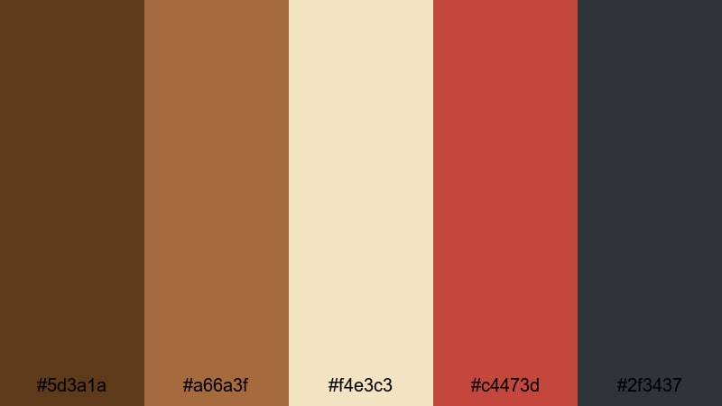
- HEX Codes: #5d3a1a, #a66a3f, #f4e3c3, #c4473d, #2f3437
- Mood: Cozy, analog, and sophisticated like a dim room lit by tube amps and vinyl sleeves.
- Use for: Great for storytelling edits, lifestyle channels, and branded intros that lean into warm, vintage aesthetics.
Walnut Record Player Glow combines rich wood browns, creamy beige, and a muted brick red accent, echoing the feel of vintage speakers and vinyl collections. It is warm without being too yellow, giving your visuals a cinematic, tobacco-and-walnut depth.
Use this palette for storytelling videos, product B-roll on wood desks, or talking-head setups with soft, moody lighting. The cream tone is perfect for legible titles and subtitles, while the brick red works well for subscribe buttons, icons, or logo highlights in your Filmora projects.
Mustard Sofa Scene
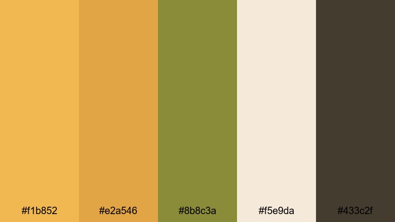
- HEX Codes: #f1b852, #e2a546, #8b8c3a, #f5e9da, #433c2f
- Mood: Inviting and lived-in, with a hint of vintage sitcom nostalgia.
- Use for: Use for commentary videos, cozy room tours, or podcast clips that need a comfortable, approachable feel.
Mustard Sofa Scene feels like a classic Mid Century living room with a statement couch, patterned rug, and warm lamp light. Golden mustard tones mix with olive green and soft cream, creating a palette that is both friendly and stylish.
Apply these colors to your background graphics, chapter markers, and thumbnail text for content that feels relaxed and relatable. The deep brown is perfect for drop shadows or outlines that keep titles readable on busy footage, especially when editing commentary or podcast clips in Filmora.
Olive Martini Evening
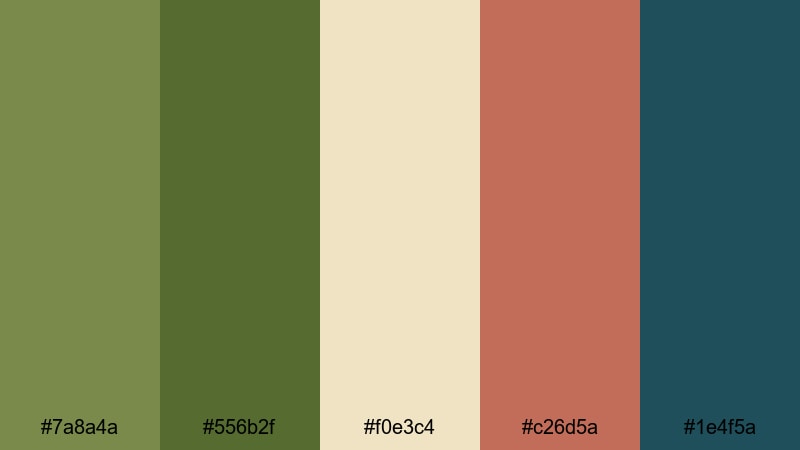
- HEX Codes: #7a8a4a, #556b2f, #f0e3c4, #c26d5a, #1e4f5a
- Mood: Relaxed, smoky, and slightly glamorous, like a cocktail bar in a design hotel.
- Use for: Ideal for title cards, cinematic B-roll, and brand intros where you want laid-back luxury.
Olive Martini Evening blends earthy olive greens with muted coral and cream, tied together by an inky teal. It feels like a stylish cocktail hour, with just enough color contrast to feel premium but not flashy.
Use the olives and teal for backgrounds or frames, reserve the coral for key callouts or buttons, and let the cream support your text and logos. This palette is especially strong for bar content, restaurant promos, or luxury lifestyle edits graded in Filmora.
Cool Minimal Mid Century Modern Color Palettes
Eames Studio Teal
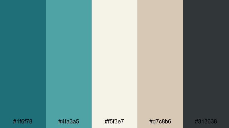
- HEX Codes: #1f6f78, #4fa3a5, #f5f3e7, #d7c8b6, #313638
- Mood: Clean, focused, and creative with a designer studio atmosphere.
- Use for: Perfect for tutorial overlays, UI mockups, and minimalist channel branding.
Eames Studio Teal captures the feel of a sunlit design studio with cool teals, off-white walls, and soft beige details. It looks polished and modern while still nodding to Mid Century Modern graphic design.
The teal tones are excellent for accent bars, transitions, and icons, while the warm neutrals keep your backgrounds calm and easy on the eyes. Use this palette for educational content, tech explainers, or UI case studies where clarity and design-conscious branding matter.
Glass House Morning
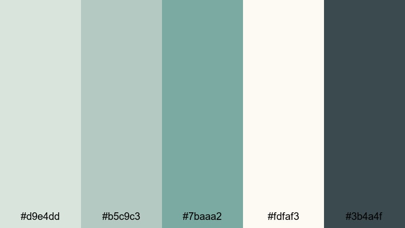
- HEX Codes: #d9e4dd, #b5c9c3, #7baaa2, #fdfaf3, #3b4a4f
- Mood: Airy, calm, and reflective like soft daylight through floor-to-ceiling windows.
- Use for: Use for productivity vlogs, workspace tours, and brand content focused on calm clarity.
Glass House Morning uses soft greens, warm whites, and a deep cool accent to recreate the feeling of light streaming into a modernist home. It is low contrast but very clean, which makes it ideal for content that should feel slow, thoughtful, and organized.
Apply the pale greens and whites to your lower thirds and background cards so your footage remains the star. The dark slate accent is perfect for text, icons, or timeline markers when editing productivity vlogs and workspace tours in Filmora.
Slate Planter Grid
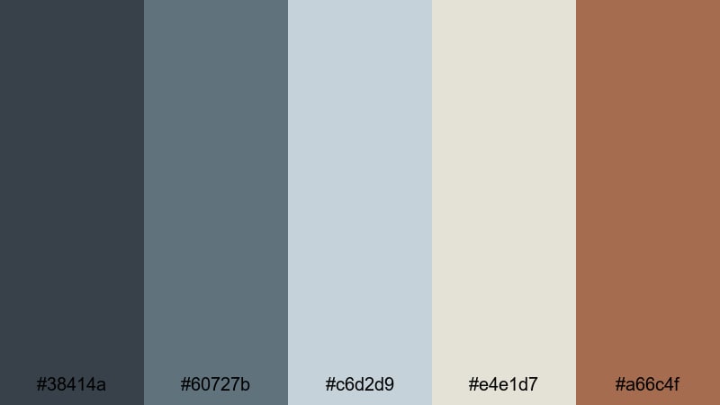
- HEX Codes: #38414a, #60727b, #c6d2d9, #e4e1d7, #a66c4f
- Mood: Structured, refined, and slightly industrial with a warm accent.
- Use for: Great for tech reviews, design breakdowns, and motion graphics overlays in Filmora.
Slate Planter Grid balances cool slate blues and greys with a terracotta accent that recalls ceramic planters in a minimal office. It feels precise and slightly industrial, but the warm accent keeps it from becoming cold or sterile.
Use the cool tones as your main UI color in on-screen graphics, then deploy terracotta for progress bars, important labels, or CTA buttons. This palette suits channels focused on gear reviews, design critiques, and data-driven explainers.
Steel Frame Skyline
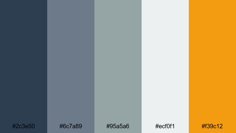
- HEX Codes: #2c3e50, #6c7a89, #95a5a6, #ecf0f1, #f39c12
- Mood: Urban, confident, and modernist with a pop of optimistic yellow.
- Use for: Perfect for channel trailers, brand bumpers, and dynamic lower thirds for business or tech content.
Steel Frame Skyline mixes deep steel blue, concrete grey, and bright amber yellow to echo city lights on metal structures. It has a professional, urban feel with just enough color to keep things engaging.
Build strong openers and lower thirds using the blues and greys as your base, then drop in the yellow as a highlight for logos, subscribe prompts, or analytic numbers. This palette works especially well for business channels, tech news, and startup stories edited in Filmora.
Playful Pastel Mid Century Modern Color Palettes
Mint Radio Waves
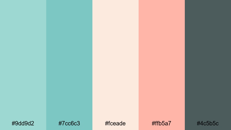
- HEX Codes: #9dd9d2, #7cc6c3, #fceade, #ffb5a7, #4c5b5c
- Mood: Fresh, playful, and optimistic with a hint of retro diner energy.
- Use for: Ideal for lifestyle vlogs, creator intros, and animated callouts that should feel friendly and upbeat.
Mint Radio Waves combines cool mint and aqua tones with peachy pastels and a grounding charcoal. It is soft and nostalgic, with a subtle nod to pastel diners and portable radios from the 60s.
Use the mints for backgrounds and overlays, peach for highlight text and badges, and charcoal for readable typography. This palette is strong for lifestyle channels, hauls, and lighthearted intros that need to feel bright but not childish.
Taffy Diner Booth
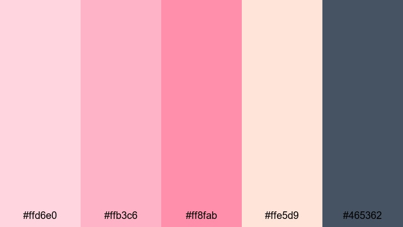
- HEX Codes: #ffd6e0, #ffb3c6, #ff8fab, #ffe5d9, #465362
- Mood: Sweet, flirty, and fun like milkshakes and neon signs at a corner diner.
- Use for: Use this palette for beauty channels, fashion reels, and playful sponsor segments.
Taffy Diner Booth stacks soft pinks and blush tones against a cool slate accent, evoking candy wrappers, lipstick tubes, and vinyl booths. It feels energetic but stays refined thanks to the deep grey-blue anchor.
Let the pinks dominate your banners, text highlights, and frame borders, while the slate shade carries body text and icons. This combination is perfect for beauty tutorials, product features, and sponsor segments where you want a clearly feminine yet polished aesthetic.
Aqua Starburst Clock
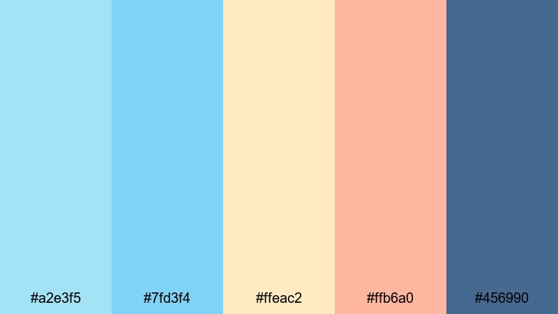
- HEX Codes: #a2e3f5, #7fd3f4, #ffeac2, #ffb6a0, #456990
- Mood: Cheerful, quirky, and dynamic like graphic starburst clocks and wall art.
- Use for: Perfect for animated transitions, countdown timers, and playful title cards.
Aqua Starburst Clock plays with bright aqua and sky tones, creamy beige, and soft coral, anchored by a deep blue. It feels graphic and kinetic, much like the wall clocks and abstract art that defined Mid Century interiors.
Use the aquas for animated shapes and motion graphics, coral for accents on countdowns or timer overlays, and deep blue for essential text. This palette is ideal for energetic intros, event announcements, and YouTube Shorts where quick, cheerful visuals perform best.
Apricot Formica Dreams

- HEX Codes: #ffcba4, #ffb49a, #f7ede2, #d4a373, #2f3e46
- Mood: Soft, nostalgic, and dreamy with a warm kitchen table glow.
- Use for: Great for cooking videos, cozy home content, and brand storytelling with a gentle retro edge.
Apricot Formica Dreams uses apricot and peach tones over creamy neutrals, grounded by a deep blue-grey. It feels like a warm kitchen table at golden hour, with vintage dishes and handwritten recipes.
Apply the soft oranges and creams to recipe cards, ingredient lists, and lower thirds in your cooking videos. The deep blue-grey works well for legible titles and logo locks, especially when you want a hint of nostalgia without going full sepia.
Moody Cinematic Mid Century Modern Color Palettes
Night Drive Neon
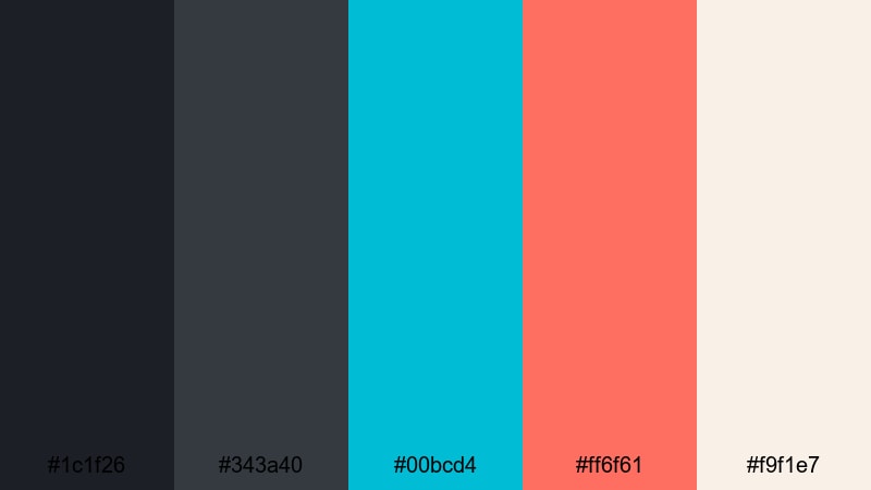
- HEX Codes: #1c1f26, #343a40, #00bcd4, #ff6f61, #f9f1e7
- Mood: Dramatic, stylish, and slightly mysterious like cruising past neon signs after dark.
- Use for: Ideal for music videos, cinematic b-roll sequences, and edgy channel trailers.
Night Drive Neon pairs inky blues and charcoal greys with cyan and coral neon accents, softened by a pale cream. It captures the contrast of glowing signage against a dark city night.
Use the deep shades for backgrounds, letterboxing bars, and credit screens, then slice through with cyan and coral for titles, waveform graphics, or equalizer animations. This palette is perfect when you want retro noir energy but still need colors to feel sharp and punchy.
Velvet Cinema Seat

- HEX Codes: #2b1b2f, #513252, #b56576, #f1dec9, #3c4f65
- Mood: Luxurious, intimate, and theatrical like sinking into a velvet theater chair.
- Use for: Use for narrative shorts, film essays, and any edit that aims for a rich, dramatic tone.
Velvet Cinema Seat layers plum, wine, dusty rose, and warm cream with a slate blue accent. It feels lush and immersive, like an art-house cinema with heavy curtains and low lighting.
Use the dark purples and blues for background panels and credits, keep the rose for subtle accents or chapter headings, and rely on cream for readable text. This palette is especially strong for essays about film history, mood pieces, and story-driven projects.
Tobacco Lounge Titles

- HEX Codes: #231f20, #4a342e, #8b5e3c, #d0b49f, #f4efe6
- Mood: Smoky, mature, and refined with an old-school lounge sophistication.
- Use for: Perfect for title sequences, credit rolls, and branded visuals that aim for classic elegance.
Tobacco Lounge Titles layers charcoal, tobacco brown, caramel, and ivory to create a timeless, cinematic mood. It feels like an upscale cocktail lounge or an old movie house with wood paneling and brass fixtures.
Use the darkest tones for letterbox bars, credit backgrounds, and logo reveals; keep caramel and ivory for main titles and lower thirds. This palette works beautifully for brand films, documentary openers, and any project that needs a subtle, classy Mid Century Modern edge.
Tips for Creating Mid Century Modern Color Palettes
Mid Century Modern color palettes work best when they balance warmth, contrast, and readability while still reflecting your personal brand. Use the tips below to mix and adapt these palettes for video, thumbnails, and social graphics in Filmora.
- Start with 1 or 2 hero colors (such as teal or mustard) and support them with 3 to 4 neutrals so your frames never feel overloaded.
- Check contrast between text and background using dark anchors (charcoal, deep blue, tobacco brown) to keep titles readable on phone screens.
- Assign roles to colors: one for CTAs, one for titles, one for accents, and neutrals for backgrounds and overlays to maintain branding consistency.
- Match your footage to the palette by warming or cooling highlights and shadows in Filmora until your scene colors sit comfortably beside your graphics.
- Use softer pastels for talking-head content and bolder combinations for trailers, intros, and thumbnails where you need maximum impact.
- Test your palette on multiple devices and platforms to ensure your key hues still look balanced and recognizable in different environments.
- Save favorite HEX combinations as presets or style guides so you can reuse them across intros, end screens, and social cutdowns.
- Do not be afraid to slightly desaturate strong colors in grading; a softer vintage tone often reads more cinematic and more Mid Century Modern.
Mid Century Modern color palettes are a powerful way to shape mood, build a recognizable visual identity, and make your channel feel thoughtfully designed. Warm retro combinations add comfort and nostalgia, cool minimal tones signal clarity and focus, while moody cinematic palettes bring drama and depth to your storytelling.
Use the HEX codes in this guide as starting points for your overlays, titles, and color grading, then refine them inside Filmora to match your footage and niche. By keeping your colors consistent across intros, thumbnails, and social edits, you can make even simple videos look polished and memorable.
Experiment with a few favorite palettes, save what works as reusable presets, and let your Mid Century Modern style evolve as your content grows.
secure download