
 100% Security Verified | No Subscription Required | No Malware

Midnight Blue sits between classic navy and deep space, carrying a sense of mystery, trust, and quiet power. It feels cinematic and polished, which is why it shows up everywhere from luxury branding to movie posters and sci-fi user interfaces. Used well, it can make your titles feel important, your thumbnails pop, and your intros look instantly more professional.
For video creators and designers, Midnight Blue works as a flexible backdrop for neon highlights, elegant gold accents, or soft pastel glows. Below you will find 15 ready-made Midnight Blue color palettes with HEX codes, perfect for Filmora users who want consistent colors across intros, vlogs, thumbnails, overlays, and brand assets.
In this article
Cinematic Midnight Blue Color Palettes
Neon Harbor Night
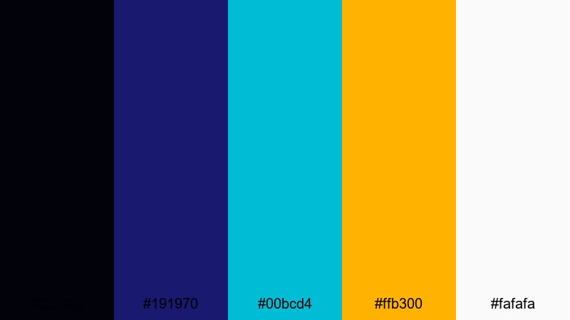
- HEX Codes: #02030a, #191970, #00bcd4, #ffb300, #fafafa
- Mood: Electric and cinematic with a futuristic harbor-at-night feel.
- Use for: Great for YouTube intros, cyberpunk gaming overlays, and high-energy channel trailers that need glowing contrast against deep Midnight Blue.
Neon Harbor Night feels like a city port lit by billboards and reflections in dark water. The inky Midnight Blue base (#02030a, #191970) gives you a solid, shadowy backdrop, while the cyan and amber highlights (#00bcd4, #ffb300) slice through with bright, techy energy. The soft white (#fafafa) keeps text and UI elements clean and readable.
This palette is perfect when you want your intros, lower thirds, and thumbnails to feel cinematic without losing clarity. Use the darkest blues for backgrounds or letterbox bars, then pull the cyan and amber into titles, call-to-action buttons, and HUD-style frames around your footage. It works especially well for gaming, tech reviews, and futuristic B-roll in Filmora.
Pro Tip: Build A Cinematic Midnight Blue Look In Filmora
To get a cohesive Neon Harbor Night look, set your deep Midnight Blue as the base for your project: use it in your title cards, solid-color backgrounds, and overlay shapes. Then, in Filmora, match your text, icons, and accent graphics to the cyan and amber HEX codes so every scene carries the same futuristic glow.
Keep your footage consistent by adding a subtle vignette in Midnight Blue and using the same font styles for all on-screen text. This way, your intros, gameplay segments, and outros feel like one unified visual world instead of separate pieces.
AI Color Palette
You can turn a single Neon Harbor Night image or color card into a style that runs through your whole video. Filmora's AI Color Palette feature lets you grab the mood from a reference frame and apply it to the rest of your clips with just a few clicks.
Import a still that already uses these HEX codes, set it as your reference, and let AI push your other shots toward the same deep Midnight Blue shadows and neon highlights. It is an easy way to keep your harbor-at-night aesthetic steady across intros, gameplay, and cinematic cutscenes.
 secure download

HSL, Color Wheels & Curves
Once your base look is set, use Filmora's HSL and color wheels to fine-tune the Midnight Blue tones. You can deepen the blues in the shadows, push midtones slightly toward teal for a cyberpunk edge, or warm up the highlights so skin tones still look natural against a cool background.
If you want more control, adjust the curves to slightly lift the blacks and add a gentle S-curve contrast. Guides on Filmora's advanced color correction tools can help you refine your style so your harbor-night footage looks cinematic without crushing detail.
secure download1000+ Video Filters & 3D LUTs
To speed up your grading, combine this palette with Filmora's built-in looks. Filmora's video filters and 3D LUTs make it easy to add glow, grain, and contrast that complement your Midnight Blue base while keeping the neon accents sharp.
Stack a cinematic LUT on top of your base grade, then dial back the intensity until your cyan and amber highlights sit comfortably in the frame. This workflow gives you a polished, stylized harbor-night aesthetic in minutes instead of hours.
secure downloadMoonlit City Frames
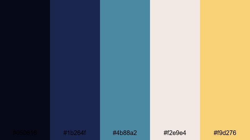
- HEX Codes: #050816, #1b264f, #4b88a2, #f2e9e4, #f9d276
- Mood: Calm, atmospheric, and slightly nostalgic, like a quiet city under moonlight.
- Use for: Perfect for cinematic vlog sequences, aerial city shots, and reflective travel montages with a soft filmic mood.
Moonlit City Frames leans into cool Midnight Blue and teal with gentle, creamy highlights. The dark blues (#050816, #1b264f) feel like distant high-rises at night, while the teal and warm gold (#4b88a2, #f9d276) add just enough light to guide the viewer's eye.
Use the deepest shades behind text and as letterbox bars, then apply the soft off-white and gold (#f2e9e4, #f9d276) to titles, date stamps, and map pins in travel vlogs. This palette works beautifully for slow city B-roll, storytelling shorts, and thumbnails that hint at romance or nostalgia.
Starfield Title Sequence
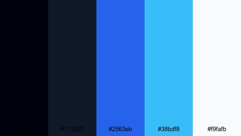
- HEX Codes: #02020f, #111827, #2563eb, #38bdf8, #f9fafb
- Mood: Expansive and celestial, with a clean sci-fi edge.
- Use for: Ideal for space-themed title cards, tech explainers, and logo animations that need polished, modern Midnight Blue gradients.
Starfield Title Sequence combines deep cosmic blues (#02020f, #111827) with radiant space blues (#2563eb, #38bdf8) and crisp white (#f9fafb). It feels sleek and futuristic, like a UI from a spacecraft or a tech startup brand.
Fade from the darkest blue into brighter gradients behind your titles, then use the white for sharp typography and minimal icons. This palette suits tech explainers, space channels, sci-fi intros, and clean, modern overlays in Filmora.
Noir Studio Lights

- HEX Codes: #050b16, #0f172a, #64748b, #e5e7eb, #f97316
- Mood: Dramatic and cinematic with a noir studio vibe and a spark of energy.
- Use for: Use for documentary titles, interview lower thirds, and podcast visuals where contrast and readability are key.
Noir Studio Lights layers dark Midnight Blue (#050b16, #0f172a) with neutral grays (#64748b, #e5e7eb) and a hit of saturated orange (#f97316). It feels like a studio lit by a single warm lamp in a sea of shadows.
Use the blues and grays for backgrounds, frames, and waveform bars, and reserve the orange for key words, live indicators, or subscribe buttons. This palette is excellent for serious topics, documentary intros, and podcast thumbnails where you want drama without sacrificing legibility.
Elegant Midnight Blue Color Palettes
Midnight Velvet Branding
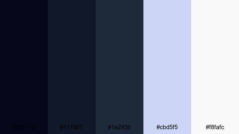
- HEX Codes: #05071a, #111827, #1e293b, #cbd5f5, #f8fafc
- Mood: Softly luxurious and composed, like velvet under studio lights.
- Use for: Great for premium brand intros, minimalist logo stings, and channel branding that should feel refined and trustworthy.
Midnight Velvet Branding is all about subtle layers of Midnight Blue (#05071a, #111827, #1e293b) softened by airy blue-grays (#cbd5f5, #f8fafc). It suggests quiet luxury rather than loud glamour, ideal for brands that want to feel calm, confident, and high-end.
Use the darkest shade as your primary background, with lighter blues for card-style overlays, lower thirds, and info boxes. This palette works especially well for business channels, beauty brands, design studios, and any YouTube identity that needs a polished, consistent look.
Sapphire Gala Invite
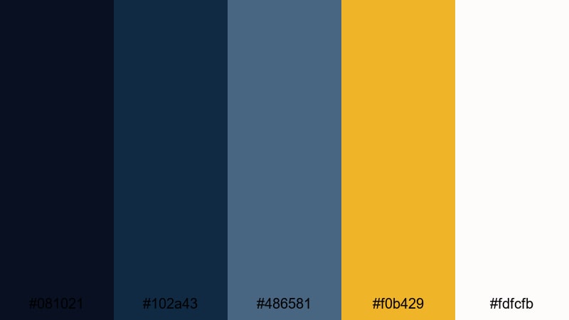
- HEX Codes: #081021, #102a43, #486581, #f0b429, #fdfcfb
- Mood: Formal, polished, and slightly festive with jewel-like depth.
- Use for: Perfect for event promos, wedding films, and brand videos that call for elegant Midnight Blue with a golden accent.
Sapphire Gala Invite pairs deep sapphire blues (#081021, #102a43, #486581) with warm gold (#f0b429) and soft white (#fdfcfb). It feels like an evening event invitation, refined but still celebratory.
Design your title cards with the darkest blue as the base, then apply gold to key lines, initials, or logos. This palette is ideal for wedding highlight reels, luxury product launches, conferences, and any announcement graphics you build in Filmora.
Royal Midnight Monogram

- HEX Codes: #020617, #0b1120, #1d4ed8, #e5e7eb, #facc15
- Mood: Regal and confident with a modern royal blue edge.
- Use for: Use for luxury logo reveals, signature lower thirds, and authority-building content like thought-leadership videos.
Royal Midnight Monogram combines ink-dark Midnight Blue (#020617, #0b1120) with bold royal blue (#1d4ed8) and rich gold (#facc15). The light gray (#e5e7eb) keeps typography soft and readable against the dark base.
Think of this as your go-to palette for signature marks: monograms, channel logos, and on-screen nameplates. It suits consultants, educators, finance channels, and any creator building authority and trust.
Luxe Midnight Marble
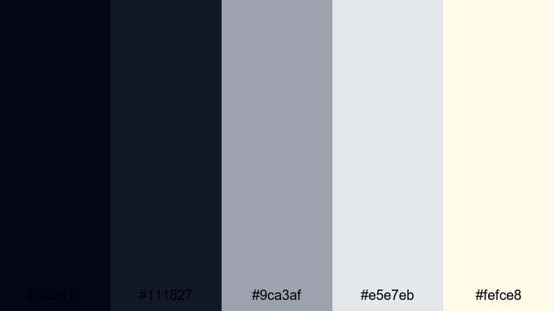
- HEX Codes: #020617, #111827, #9ca3af, #e5e7eb, #fefce8
- Mood: Minimal, airy, and luxurious, echoing marble and soft stone textures.
- Use for: Great for lifestyle channels, product showcases, and UI elements where Midnight Blue supports a bright, premium look.
Luxe Midnight Marble balances deep blues (#020617, #111827) with neutral grays (#9ca3af, #e5e7eb) and a hint of warm cream (#fefce8). It feels like a marble countertop photographed at night, minimal yet upscale.
Use the dark tones for navigation bars, frames, and device mockups, while reserving the cream for backgrounds and product callouts. This palette fits skincare, home decor, tech lifestyle, and any channel where Midnight Blue supports a clean, premium atmosphere.
Dreamy Midnight Blue Color Palettes
Ocean Nebula Drift

- HEX Codes: #020617, #1d3557, #457b9d, #a8dadc, #f1faee
- Mood: Dreamy, expansive, and calming, like floating between sea and sky.
- Use for: Ideal for travel vlogs, nature B-roll, and ambient background graphics with a soothing Midnight Blue base.
Ocean Nebula Drift transitions from dark Midnight Blue (#020617, #1d3557) into oceanic teals and soft mints (#457b9d, #a8dadc, #f1faee). It feels weightless and calm, perfect for slow pans over water or clouds.
Use the darker hues for top and bottom bars or overlays, and let the lighter tones wash through titles, line art, and animated shapes. This palette fits meditation content, travel diaries, relaxing timelapses, and looping backgrounds for streams.
Starlit Storytime

- HEX Codes: #020617, #1e3a8a, #6366f1, #fbbf24, #fee2e2
- Mood: Whimsical and cozy, like an illustrated bedtime story under starry skies.
- Use for: Use for animated explainers, kids content, and storytelling intros that mix Midnight Blue depth with playful highlights.
Starlit Storytime mixes rich blues (#020617, #1e3a8a, #6366f1) with warm yellow (#fbbf24) and soft blush (#fee2e2). It feels like a picture book sky dotted with stars and lantern light.
Apply the darkest blue as your night sky backdrop, use the brighter blues for illustrated characters or icons, and let the yellow pick out important text or buttons. This palette works wonderfully for story-based intros, kids' educational videos, and animated explainers made in Filmora.
Quiet Cabin Night
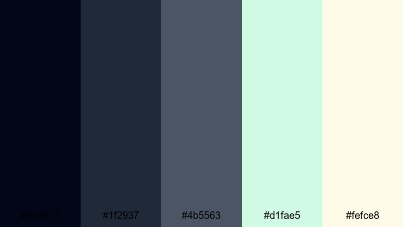
- HEX Codes: #020617, #1f2937, #4b5563, #d1fae5, #fefce8
- Mood: Peaceful and grounded, like a quiet cabin wrapped in night air.
- Use for: Perfect for slow vlogs, productivity content, and background frames that feel calm and focused.
Quiet Cabin Night combines muted blues and charcoals (#020617, #1f2937, #4b5563) with gentle mint and cream (#d1fae5, #fefce8). The effect is cozy, grounded, and slightly rustic.
Use the darker shades as low-contrast backgrounds for text overlays, to-do lists, and study timers. The mint and cream can highlight progress bars, timers, or key words. This palette feels right for productivity vlogs, journaling videos, nighttime routines, and focus-friendly thumbnails.
Deep Lofi Dreams

- HEX Codes: #020617, #111827, #ec4899, #22d3ee, #fdf2f8
- Mood: Moody yet playful, with a lofi, late-night playlist feel.
- Use for: Great for music visuals, lofi study streams, and social loops where Midnight Blue sets a chill backdrop with neon accents.
Deep Lofi Dreams matches dark Midnight Blue (#020617, #111827) with saturated pink and aqua (#ec4899, #22d3ee) and a soft pastel base (#fdf2f8). It feels like a neon sign glowing in a bedroom at 2 a.m.
Use the dark tones for window silhouettes, city skylines, or desk setups, then pull the pink and aqua into waveform animations, equalizers, and text. This is a strong choice for lofi mixes, lyric videos, study-with-me streams, and looping social content.
Bold Midnight Blue Color Palettes
Cyber Midnight Glitch

- HEX Codes: #020617, #1e40af, #22c55e, #e11d48, #f9fafb
- Mood: Energetic and edgy, inspired by glitch art and esports graphics.
- Use for: Ideal for gaming intros, tech promos, and bold thumbnails where Midnight Blue anchors vivid accent colors.
Cyber Midnight Glitch sets a dark Midnight Blue base (#020617, #1e40af) and blasts through it with neon green and crimson (#22c55e, #e11d48). The white (#f9fafb) keeps UI elements and text clean.
Use the blue tones as your main background, then introduce green and red as opposing accents in glitch transitions, kill feeds, and subscribe calls. This palette is made for esports highlights, FPS montages, tech promos, and attention-grabbing YouTube thumbnails.
Electric Midnight Pop
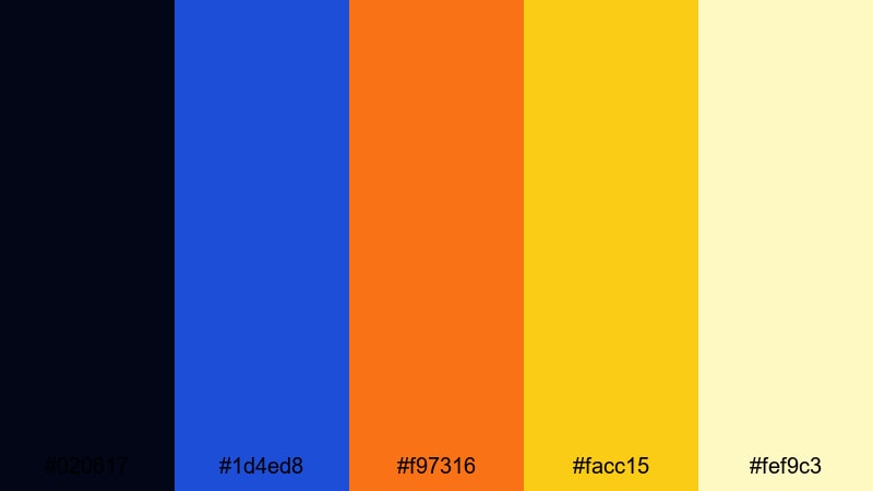
- HEX Codes: #020617, #1d4ed8, #f97316, #facc15, #fef9c3
- Mood: Upbeat and modern, glowing like city billboards at night.
- Use for: Use for lifestyle vlogs, channel rebrands, and social ads where Midnight Blue supports bright, click-worthy accents.
Electric Midnight Pop combines inky blue (#020617, #1d4ed8) with vivid orange and yellow (#f97316, #facc15) and a pale warm base (#fef9c3). It feels energetic and urban, like colorful billboards against the night sky.
Let the dark blue hold your backgrounds and frames, then use the warm colors to highlight titles, price tags, and key phrases. This palette works well for lifestyle vlogs, challenges, shorts, and any content that needs bold, clickable thumbnails.
Storm Surge Graphics

- HEX Codes: #020617, #1f2937, #0ea5e9, #22c55e, #f8fafc
- Mood: Dynamic and powerful, like a storm rolling over the ocean.
- Use for: Great for action trailers, sports edits, and motion graphics where Midnight Blue meets crisp, energetic accents.
Storm Surge Graphics uses stormy blues and charcoals (#020617, #1f2937) with bright cyan and green (#0ea5e9, #22c55e) on clean white (#f8fafc). It feels like waves crashing in slow motion, full of power and motion.
Use the darkest tones for backgrounds and speed lines, then punch in cyan and green for stats, scores, and kinetic typography. This palette fits sports edits, fitness promos, product launches, and dynamic motion graphics in Filmora.
Tips for Creating Midnight Blue Color Palettes
When you build your own Midnight Blue color palettes for video and design, focus on balance: dark enough to feel cinematic, but with strong accents so text, buttons, and faces still stand out.
- Pair Midnight Blue with one primary accent color (gold, cyan, or orange) and one secondary neutral (gray or off-white) to keep your designs focused.
- Check readability by previewing your thumbnails at very small sizes; ensure text on dark blue backgrounds has enough contrast using light or warm tones.
- Use the darkest Midnight Blue only for backgrounds and vignettes, and keep mid-blues for shapes, frames, and gradients so you do not crush detail.
- Choose accent colors that match your niche: neons for gaming and tech, pastels for lifestyle and wellness, metallic golds for luxury and events.
- Match your palette to your footage in Filmora by adjusting white balance and saturation so skin tones look natural against cool Midnight Blue scenes.
- Keep branding consistent across intros, lower thirds, overlays, and end screens by reusing the same 3 to 5 HEX codes in all your templates.
- Use gradients that fade from Midnight Blue into a lighter blue or teal for subtle motion in backgrounds without distracting from your main subject.
- Test your palettes in both light and dark modes if you design overlays or UI elements that might sit over different types of footage.
Midnight Blue palettes can change how your channel or brand feels: from calm and thoughtful to bold and electric. With the right mix of accents, they help your thumbnails stand out, your intros feel cinematic, and your entire video identity look more intentional.
Try dropping these HEX codes straight into Filmora for titles, shapes, and backgrounds, then use color tools to match your footage. When you edit a few projects with a consistent Midnight Blue scheme, your viewers will recognize your style instantly.
Experiment with different palettes from this list, save the ones that fit your niche as Filmora presets, and refine them over time as your brand and content evolve.
secure downloadNext: Space Color Palette
