
 100% Security Verified | No Subscription Required | No Malware


 ChatGPT
 Perplexity
 Gemini
 Claude
 Grok
Grok
Minimalist color palettes rely on soft neutrals, controlled contrast, and generous negative space. Psychologically, they signal clarity, calm, and intention, which is why they suit productivity creators, wellness and lifestyle brands, tech channels, and clean portfolio work so well.
For editors and designers, especially Filmora users, a Minimalist look means choosing a small set of colors and repeating them across intros, titles, lower thirds, YouTube thumbnails, end screens, and social posts. Below are 15 Minimalist color palettes with ready to use HEX codes so you can build modern, cohesive visuals for video and design without guessing.
In this article
Soft & Serene Minimalist Color Palettes
Morning Studio Light
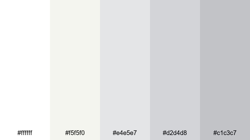
- HEX Codes: #ffffff, #f5f5f0, #e4e5e7, #d2d4d8, #c1c3c7
- Mood: airy, calm, and quietly optimistic
- Use for: Ideal for vlog intros, clean lifestyle thumbnails, and airy product showcases that need a bright but gentle look.
Morning Studio Light is all about bright whites and soft dove grays, like sunlight bouncing off a clean desk or photo studio. It feels spacious, uncluttered, and quietly optimistic, making viewers feel as if they have room to breathe and focus.
Use this palette in Filmora for productivity or wellness intros, minimalist YouTube channel branding, and thumbnails that rely on clear typography over a light background. It also works beautifully for overlay graphics on product shots, lookbooks, or workspace tours where you want the footage to feel fresh but never harsh.
Pro Tip: Enhance Soft Minimalist Visuals in Filmora
With a light palette like Morning Studio Light, subtle contrast is everything. In Filmora, you can keep your whites bright without blowing them out by slightly lowering highlights and lifting shadows, then using minimalist lower thirds in #e4e5e7 or #d2d4d8 instead of pure white.
Build a cohesive Minimalist style by reusing this palette across your whole edit: intros, b roll captions, chapter cards, and end screens. Set consistent text and background colors in your title presets so every future video keeps the same clean, studio like identity.
AI Color Palette
If you have a reference photo that already uses these whites and soft grays, you can let Filmora do the heavy lifting. Filmora's AI Color Palette feature can analyze that still and apply a matching look across your whole timeline, from A roll to b roll and cutaways.
Import a frame from your favorite airy lifestyle video, apply AI Color Palette to your current project, and Filmora will harmonize tones so skin tones, backgrounds, and overlays all share the same Minimalist mood. It is an easy way to keep your YouTube thumbnails, reels, and long form content feeling like they belong to one clear brand.
 secure download

HSL, Color Wheels & Curves
To keep this Minimalist palette looking polished, use Filmora's HSL, color wheels, and curves controls. Slightly desaturate strong colors in your footage so they do not fight your whites and grays, then use curves to add a gentle S shape for a premium, editorial contrast.
Color wheels are great for pushing shadows a touch cooler and highlights a touch warmer, which adds depth while preserving that soft studio atmosphere. Once you dial in a look you love, save it as a custom preset and reuse it across future projects to maintain a consistent Minimalist brand.
secure download1000+ Video Filters & 3D LUTs
If you want a Minimalist base with a cinematic twist, start with this palette and then layer on Filmora's filters or LUTs at low intensity. Filmora's video filters and 3D LUTs make it easy to add film like softness, gentle fade, or a subtle matte look without breaking your clean color scheme.
Test a few looks on a short clip, then apply the one that fits your brand across your whole sequence. Because your palette is already neutral and consistent, even a slight filter will feel intentional, not overdone.
secure downloadQuiet Gallery Walls

- HEX Codes: #fdfbf7, #f1eee7, #d4cec3, #b0aaa0, #4b4d52
- Mood: understated, refined, and contemplative
- Use for: Perfect for cinematic b roll sequences, art portfolio reels, and documentary style titles.
Quiet Gallery Walls uses warm whites, stone neutrals, and a charcoal accent to mirror the feel of a modern art space. It feels curated and timeless, encouraging viewers to slow down and pay attention to the details in your shots.
Use the lighter tones for backgrounds and full frame slides, then reserve the darker #4b4d52 for titles, lower thirds, and logo locks. This palette is ideal for design portfolios, documentary style storytelling, case study videos, and calm channel trailers where you want the work itself to stand out against a soft Minimalist canvas.
Mist Over Concrete
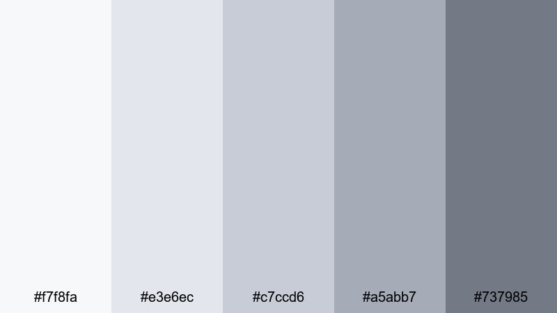
- HEX Codes: #f7f8fa, #e3e6ec, #c7ccd6, #a5abb7, #737985
- Mood: cool, peaceful, and slightly distant
- Use for: Works well for tech explainers, aesthetic study vlogs, and subtle lower thirds that should not distract from the footage.
Mist Over Concrete combines cool, misty grays with a hint of blue, creating a polished urban calm. It feels like a quiet morning in a modern city, with soft light wrapping around concrete and glass.
Apply this palette in your UI overlays, diagrams, chapter cards, and callouts so your main footage stays center stage. It is especially strong for tech explainers, Notion or app tutorials, aesthetic study vlogs, and any Minimalist themed video where you want a clean, slightly futuristic tone without bold color distractions.
Paper And Porcelain
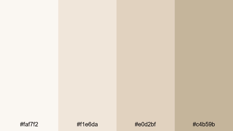
- HEX Codes: #faf7f2, #f1e6da, #e0d2bf, #c4b59b
- Mood: soft, tactile, and warmly neutral
- Use for: Great for stationery themed videos, craft tutorials, and gentle text overlays on slow paced content.
Paper And Porcelain is built from creamy off whites and porcelain beiges that recall sketchbooks, ceramics, and handmade objects. It feels tactile and warm while still staying Minimalist and uncluttered.
Use it for stationery hauls, journaling or planning videos, DIY and craft tutorials, and any branding that leans into analog textures. In Filmora, you can combine these tones with subtle grain or soft vignette effects, keeping titles readable and gentle over top down shots, reels, or Pinterest inspired story content.
Modern Monochrome Minimalist Color Palettes
Ink And Ivory
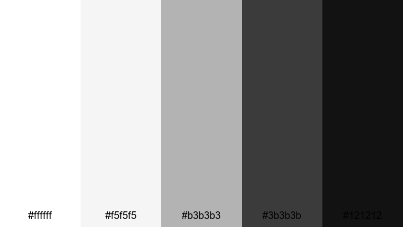
- HEX Codes: #ffffff, #f5f5f5, #b3b3b3, #3b3b3b, #121212
- Mood: high contrast, confident, and crisp
- Use for: Ideal for bold title cards, logo stings, and high impact YouTube thumbnails with strong readability.
Ink And Ivory is a classic black and white Minimalist palette with a smooth gradient of mid grays. It instantly feels premium, editorial, and confident, like a high end magazine layout translated into motion.
Use white and light gray for backgrounds, mid gray for secondary text, and #121212 for bold headlines and logo marks. This palette is perfect for channel rebrands, cinematic opening titles, kinetic typography, and YouTube thumbnails where strong contrast and instant readability are key.
Architect Sketchboard
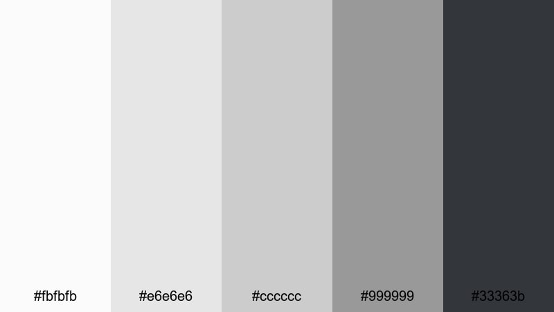
- HEX Codes: #fbfbfb, #e6e6e6, #cccccc, #999999, #33363b
- Mood: structured, professional, and precise
- Use for: Use for UI overlays, app demos, and design portfolio edits where structure and clarity matter.
Architect Sketchboard mimics pencil and ink lines on smooth paper, with a stepped gradient of cool grays. It feels technical and reliable, ideal when you need visuals that look thoughtfully engineered.
It works especially well for UX case studies, wireframe walkthroughs, software demos, or CAD and 3D portfolios. In Filmora, you can build clean lower thirds, callouts, and grid overlays using these tones so your annotations feel intentional and never fight with your main footage.
Foggy City Skyline
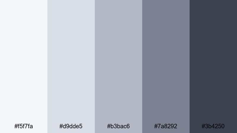
- HEX Codes: #f5f7fa, #d9dde5, #b3bac6, #7a8292, #3b4250
- Mood: urban, moody, and sophisticated
- Use for: Great for travel vlogs in modern cities, time lapse sequences, and subtle end screens.
Foggy City Skyline uses blue toned grays that feel like skyscrapers disappearing into low clouds. It is urban and cinematic but still very controlled and Minimalist.
Use the lighter tones for overlays and motion graphics, reserving the darker grays for text and logo frames. This palette suits architecture tours, city travel vlogs, rooftop b roll, and moody timelapses, as well as sleek end screens that echo the atmosphere of your footage.
Midnight Minimal Studio
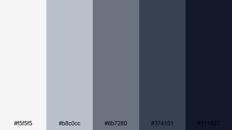
- HEX Codes: #f5f5f5, #b8c0cc, #6b7280, #374151, #111827
- Mood: sleek, focused, and slightly dramatic
- Use for: Perfect for desk setups, productivity channels, and gear reviews that lean into a dark mode vibe.
Midnight Minimal Studio blends soft grays with deep, inky blues to create a dark mode inspired look. It feels focused and modern, with just enough drama for tech and productivity content.
Use the darkest shades as background plates for titles and product callouts, then highlight key elements like cursors, icons, or interface details with the mid tones. This palette fits desk setup tours, monitor and keyboard reviews, coding or editing workflows, and any channel branding that leans into a night time studio aesthetic.
Warm & Cozy Minimalist Color Palettes
Muted Oat Latte
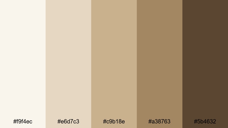
- HEX Codes: #f9f4ec, #e6d7c3, #c9b18e, #a38763, #5b4632
- Mood: comforting, relaxed, and earthy
- Use for: Ideal for morning routine vlogs, cafe b rolls, and lifestyle thumbnails that should feel inviting.
Muted Oat Latte mixes oat milk creams with soft latte browns for a cozy, grounded Minimalist feel. It suggests slow mornings, warm mugs, and quiet conversations.
Use the light tones as backgrounds for text or chapter cards, and the deeper browns for key accents or handwritten style fonts. This palette is a natural fit for lifestyle channels, coffee shop b roll, morning or evening routines, and Instagram and TikTok covers that need warmth without loud saturation.
Autumn Apartment Glow
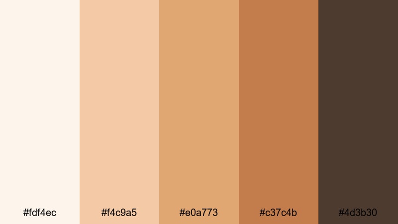
- HEX Codes: #fdf4ec, #f4c9a5, #e0a773, #c37c4b, #4d3b30
- Mood: warm, nostalgic, and intimate
- Use for: Best for home makeovers, reading corners, and cinematic lifestyle edits centered around golden hour light.
Autumn Apartment Glow brings together soft peach lights, caramel midtones, and deep brown shadows that feel like golden hour streaming through big windows. It is warm and nostalgic but still simple enough for a Minimalist feed.
Use it to color grade home makeover videos, reading nook montages, cozy weekend vlogs, and room tours. In your thumbnails and intro cards, lean on the lighter oranges for backgrounds and the darkest shade for typography so everything feels cinematic yet easy to read.
Candlelit Reading Nook
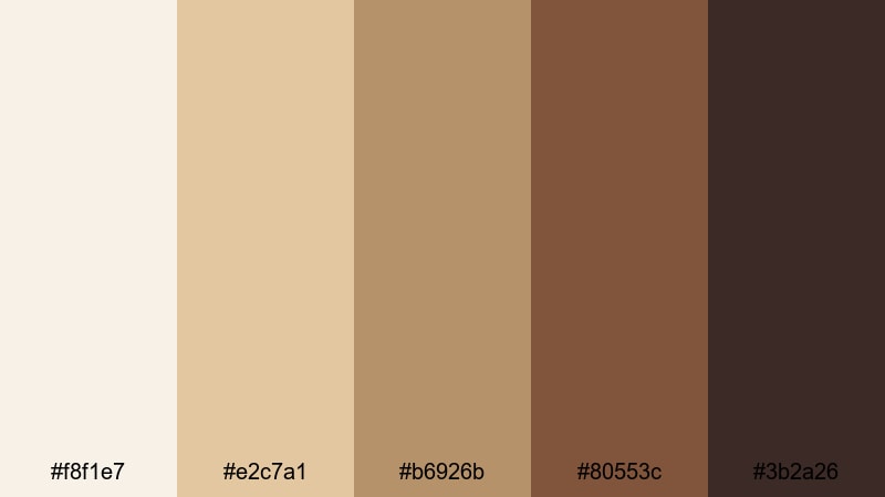
- HEX Codes: #f8f1e7, #e2c7a1, #b6926b, #80553c, #3b2a26
- Mood: intimate, slow, and story driven
- Use for: Great for book content, study with me videos, and calm evening scenes with subtle motion graphics.
Candlelit Reading Nook uses cream, amber, and rich browns to mimic candlelight on worn pages. The palette feels intimate and story driven, ideal for content that invites viewers to slow down.
Use the lighter colors for text backgrounds and soft frames, while the darker browns handle typography, page like textures, or corner overlays. This works wonderfully for booktube intros, reading vlogs, slow study with me content, journaling videos, and podcast style uploads with simple, warm visuals.
Warm Sand Loft
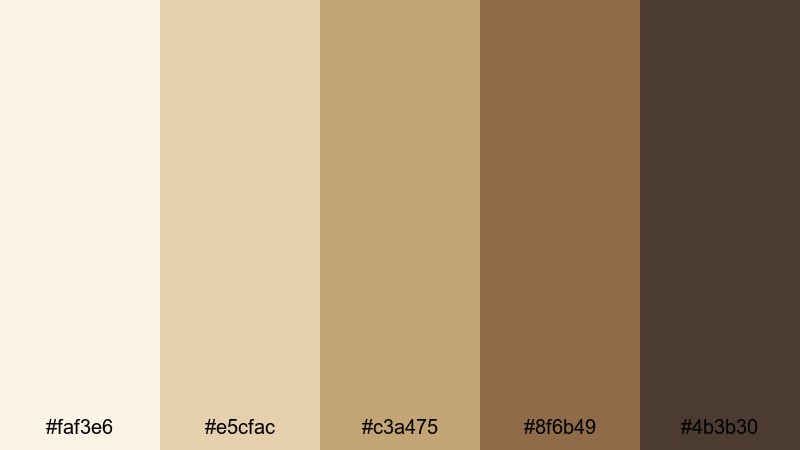
- HEX Codes: #faf3e6, #e5cfac, #c3a475, #8f6b49, #4b3b30
- Mood: sunlit, relaxed, and modern organic
- Use for: Use for interior design tours, travel apartments, and branding for sustainable or handmade products.
Warm Sand Loft pairs sandy beiges with soft browns that feel like sunlight bouncing off wood floors and linen furniture. It is relaxed and modern, perfect for organic, design forward content.
Use the lightest shades for backgrounds on before and after cards, and the deeper browns for line art icons, logos, and minimalist illustrations. This palette suits interior design tours, Airbnb and apartment showcases, sustainable product brands, and portfolio reels for architecture or decor creators.
Bold Accent Minimalist Color Palettes
Nordic Workspace Calm
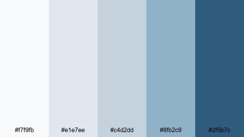
- HEX Codes: #f7f9fb, #e1e7ee, #c4d2dd, #8fb2c9, #2f5b7c
- Mood: fresh, focused, and lightly invigorating
- Use for: Perfect for productivity setups, workspace tours, and SaaS explainers needing a clean accent color.
Nordic Workspace Calm mixes cool whites and dusty blues with two stronger blue accents. It borrows from Scandinavian interiors, feeling fresh and focused with a hint of sea air.
Use the soft tones as your base for backgrounds and frames, and let #8fb2c9 or #2f5b7c handle buttons, arrows, and key callouts. This palette is ideal for productivity setups, office tours, cloud software explainers, and user onboarding videos where you want one calm but noticeable accent color.
Charcoal Accent Pop

- HEX Codes: #f6f6f6, #d9d9d9, #a3a3a3, #ff6b35, #222222
- Mood: modern, energetic, and sharp
- Use for: Great for channel branding, dynamic lower thirds, and call to action screens that must stand out instantly.
Charcoal Accent Pop sets up a field of neutral grays and charcoal, then jolts it with a bright orange accent. The result is modern and energetic while staying Minimalist everywhere except that single, powerful pop.
Use #ff6b35 sparingly for subscribe buttons, arrows, progress bars, or key words in your titles. Keep everything else in the gray and charcoal range so that when viewers see the orange, they know it signals action. It works perfectly for channel branding, SaaS or startup explainers, course promos, and end screens with strong calls to action.
Graphite And Lime Edge
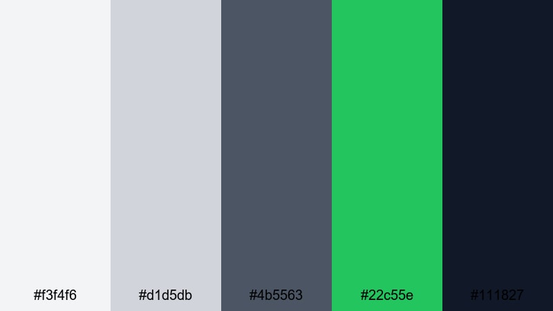
- HEX Codes: #f3f4f6, #d1d5db, #4b5563, #22c55e, #111827
- Mood: edgy, digital, and forward looking
- Use for: Ideal for tech reviews, motion graphics overlays, and modern brand intros that need a subtle neon feel.
Graphite And Lime Edge combines cool grays and dark graphite tones with a fresh lime accent. It feels digital and forward looking, like a minimalist UI with just a touch of neon energy.
Use the lime #22c55e to highlight interactive elements, key numbers, or progress indicators while keeping most of the interface in gray and deep blue gray. This palette suits tech reviews, gaming setups with a clean UI, motion graphic overlays, and modern brand intros that want a tech inspired look without overwhelming color.
Tips for Creating Minimalist Color Palettes
Minimalist color palettes work best when they blend restraint with clarity. Whether you are grading video in Filmora or designing thumbnails and graphics, a few simple rules will keep your Minimalist combinations clean, modern, and on brand.
- Limit your core palette to 3 to 5 colors: a light background, 1 to 2 neutrals, one dark for text, and optionally one accent for calls to action.
- Prioritize readability: always check your title and subtitle colors on both mobile and desktop thumbnails to ensure enough contrast against the background.
- Choose one accent color and use it consistently for buttons, arrows, and subscribe or follow prompts so viewers instantly recognize points of focus.
- Match your palette to your footage: warm scenes pair best with beige or latte neutrals, while cool tech or city footage works better with blue or gray based Minimalist palettes.
- Keep saturation low to medium: Minimalist palettes rely more on brightness and contrast than intense color, which helps your footage look modern and timeless.
- Reuse colors across platforms: apply the same HEX codes to your Filmora titles, YouTube channel art, Instagram covers, and website so your brand feels cohesive.
- Test in grayscale: quickly check how your design looks in black and white to verify that hierarchy and contrast still make sense without color.
- Create presets in Filmora: once you lock in a Minimalist look, save color and title presets so you do not have to rebuild your palette for every new video.
Minimalist color palettes are powerful tools for shaping mood, clarity, and brand identity. With just a few carefully chosen neutrals and a controlled accent, you can make your videos feel cleaner, more professional, and easier to recognize across platforms.
Use the HEX codes in this guide as starting points, then refine them inside Filmora until they match your footage, niche, and personal style. Apply your chosen palette to intros, titles, lower thirds, and end screens so every upload adds to a consistent visual story.
The more you test these palettes in real projects, the faster you will find a Minimalist look that feels like your own. Open a project in Filmora, try out a few of these combinations, and save the ones that make your channel or brand feel instantly clearer and more intentional.
secure downloadNext: Scarlet Color Palette
