
 100% Security Verified | No Subscription Required | No Malware


 ChatGPT
 Perplexity
 Gemini
 Claude
 Grok
Grok
Museum-inspired color palettes are all about calm, timeless elegance. Think marble whites, parchment beiges, deep burgundies, and soft shadowy blues. These hues suggest quiet galleries, classic frames, and thoughtful curation, which makes them perfect for videos and designs that feel intelligent, premium, and cinematic rather than loud or trendy.
For creators and Filmora users, Museum color combinations work beautifully in YouTube thumbnails, brand intros, educational explainers, cinematic vlogs, and aesthetic shorts. Below you will find 15 Museum color palettes with HEX codes so you can match your footage, overlays, and text styles precisely and keep a consistent visual identity across your whole edit.
In this article
Classic Museum Gallery Palettes
Marble Hallway Light
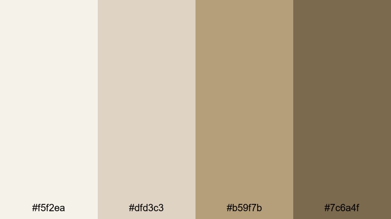
- HEX Codes: #f5f2ea, #dfd3c3, #b59f7b, #7c6a4f
- Mood: calm, airy, and timeless
- Use for: Ideal for minimalist vlog intros, gallery tour videos, and clean documentary titles.
This palette layers soft marble whites with warm stone browns, just like walking through a quiet, sunlit museum corridor. It feels clean and refined without being cold, which makes it easy to pair with both photos and text overlays.
Use Marble Hallway Light for YouTube thumbnails, title cards, and lower thirds where you want a neutral backdrop that lets your artwork, b-roll, or talking-head footage stand out. In Filmora, you can apply these HEX codes to text, shapes, and backgrounds to keep your intros, chapter cards, and end screens visually cohesive.
Pro Tip: Build a Timeless Museum Look in Filmora
To keep this marble-inspired palette feeling consistent, start by setting your main background color to the lightest tone (#f5f2ea) in Filmora. Then use the mid browns (#b59f7b and #7c6a4f) for titles, captions, and simple line accents so your whole video feels like it belongs in the same grand hallway.
Reuse these tones across your thumbnail design, lower thirds, and end screens. When you copy and paste color values between text layers, overlays, and motion graphics in Filmora, you create a museum-style brand look that feels curated instead of random.
AI Color Palette
If you have a reference image of a real marble gallery or a still frame that perfectly captures this Museum mood, you can turn it into a universal look for your edit. Filmora's AI Color Palette feature lets you analyze that image and apply its tones to other clips, so everything shares the same soft whites and stone browns.
Import your reference, pick it as the source, and let AI transfer the color mood onto your vlog, b-roll, or cinematic sequences. This keeps your Museum color palette stable from the opening shot to the final outro without manual tweaking on every clip.
 secure download

HSL, Color Wheels & Curves
Once your Museum palette is in place, you can fine-tune it using HSL, color wheels, and curves inside Filmora. Slightly lift the highlights to keep whites feeling like real marble, reduce saturation in the yellows and oranges to avoid a too-warm cast, and use color wheels to nudge shadows toward a gentle, neutral brown.
These tools, along with the color tools in Filmora, help you dial in a more cinematic look: softer contrast for calm documentaries, or deeper curves for dramatic museum walk-throughs and moody talking-head shots.
secure download1000+ Video Filters & 3D LUTs
If you want a faster workflow, you can start with a Filmora filter or LUT that already leans toward neutral, slightly warm tones and then tweak it to match your Museum palette. Filmora's video filters and 3D LUTs make it easy to build a signature grade and reuse it across episodes, reels, and shorts.
Apply a subtle filmic LUT, then adjust opacity until it supports, but does not overpower, your marble whites and stone browns. Save your settings as a custom preset so every new project can instantly adopt your Museum-inspired look.
secure downloadGilded Frame Elegance
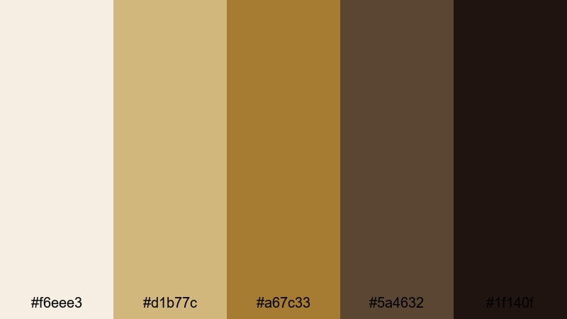
- HEX Codes: #f6eee3, #d1b77c, #a67c33, #5a4632, #1f140f
- Mood: luxurious, historic, and refined
- Use for: Works well for luxury brand openers, exhibition promos, and cinematic lower thirds.
Creamy off-whites and antique golds anchored by deep browns capture the feeling of ornate frames surrounding classic artworks. It gives your visuals a sense of heritage and value, like content that deserves to be taken seriously.
Use this palette for premium intros, sponsor bumpers, or gallery announcement posts. In Filmora, apply the lighter tones to backgrounds and overlays while reserving the darkest brown for bold titles, logo reveals, and call-to-action buttons in thumbnails.
Old Masters Warmth
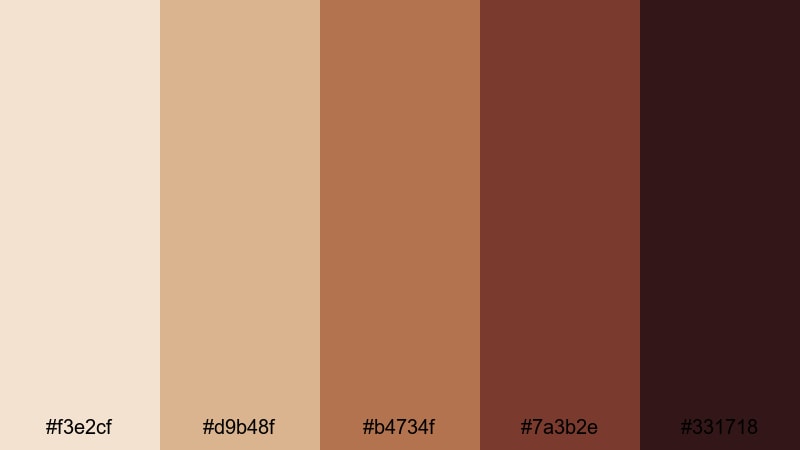
- HEX Codes: #f3e2cf, #d9b48f, #b4734f, #7a3b2e, #331718
- Mood: warm, nostalgic, and artistic
- Use for: Great for narrative films, painterly title cards, and art history explainer videos.
Burnt sienna, warm umbers, and soft highlights echo the tones of classical oil paintings. The palette feels intimate and story-driven, with enough depth to make shadows look rich instead of flat.
Apply Old Masters Warmth when you want your video essays, historical explainers, or short films to feel like pages from an illustrated storybook. Color captions, masks, and lower thirds in Filmora with the mid browns, and let the darkest hue frame important text for strong readability.
Velvet Rope Classics
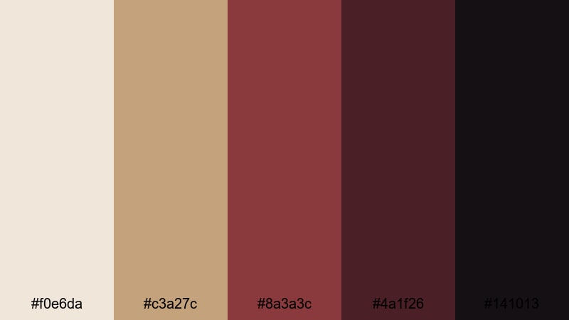
- HEX Codes: #f0e6da, #c3a27c, #8a3a3c, #4a1f26, #141013
- Mood: exclusive, intimate, and dramatic
- Use for: Perfect for teaser trailers, ticket sale promos, and moody event recaps.
This palette blends muted creams and tans with deep wine and espresso tones, like velvet ropes and dark gallery corners. It immediately signals exclusivity and night-time events.
Use the lighter shades for background cards and subtitle bars, and the burgundy (#8a3a3c) for key phrases, price tags, or countdown timers in your Filmora promos. It works beautifully in short vertical trailers and carousel thumbnails for exhibitions or performances.
Soft Museum Neutrals & Pastels
Quiet Gallery Morning
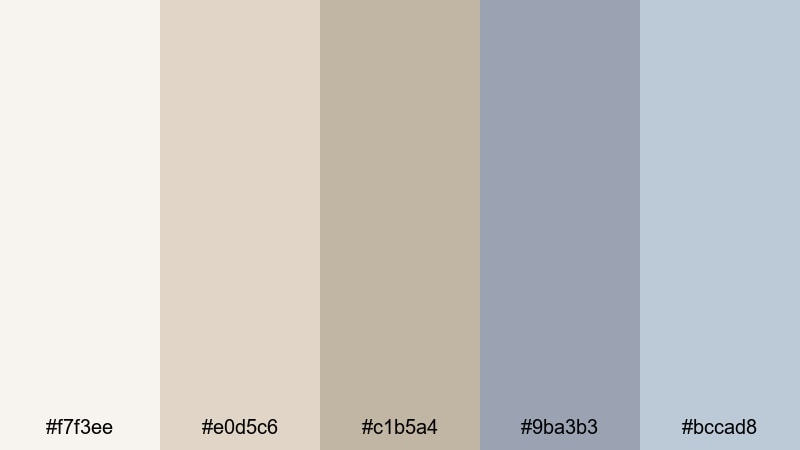
- HEX Codes: #f7f3ee, #e0d5c6, #c1b5a4, #9ba3b3, #bccad8
- Mood: soft, contemplative, and serene
- Use for: Ideal for study-with-me vlogs, calm walkthroughs, and minimalist channel branding.
Gentle creams, taupes, and powdery blues suggest early light filtering through high windows. The overall mood is relaxed and reflective, great for slow panning shots and quiet narration.
In Filmora, pair this palette with soft transitions and low-contrast grades. Use the warmer neutrals for backgrounds and the cooler blues for chapter headers, progress bars, or playlist thumbnails to create a soothing, cohesive study or productivity brand.
Archived Paper Tones
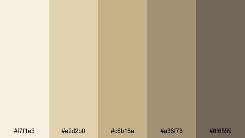
- HEX Codes: #f7f1e3, #e2d2b0, #c6b18a, #a38f73, #6f6559
- Mood: scholarly, cozy, and nostalgic
- Use for: Great for educational channels, history explainers, and text-heavy motion graphics.
The soft parchment hues and muted browns feel like flipping through old archives and research notes. This palette is perfect when you want to frame information as thoughtful and well-researched.
Use Archived Paper Tones for slides, bullet lists, and animated infographics built in Filmora. Apply the paler shades to full-screen info cards and use the darkest tone for text, icons, and underlines, ensuring your educational content stays clear and easy to read.
Stone Courtyard Mist
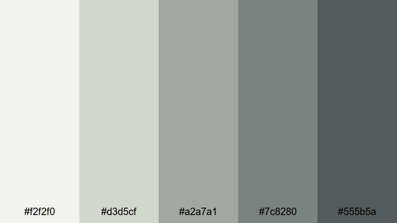
- HEX Codes: #f2f2f0, #d3d5cf, #a2a7a1, #7c8280, #555b5a
- Mood: cool, architectural, and balanced
- Use for: Use for architecture reels, travel shorts, and clean UI overlays on footage.
Cool grays and stone greens mirror an overcast courtyard surrounded by classical columns. It is neutral but not boring, adding a sense of structure and design awareness.
Try this palette when showcasing buildings, interiors, or product design. In Filmora, create semi-transparent panels in these tones behind your on-screen text to keep everything legible while your footage remains visible and clean.
Sunlit Sculpture Nudes

- HEX Codes: #faefe8, #f2d4c3, #e1b39a, #c58b73, #9b6a60
- Mood: warm, intimate, and graceful
- Use for: Ideal for lifestyle content, behind-the-scenes studio clips, and beauty edits.
Blush creams and terracotta nudes suggest sculptures bathed in warm light. The tones are flattering on skin and lend a curated, editorial feel to lifestyle content.
Use this palette on fashion lookbooks, studio diaries, and portrait-based shorts. In Filmora, match filters and title cards to these HEX codes to create a soft, cohesive grid on your YouTube channel, Instagram Reels, and TikTok covers.
Dramatic Museum Accent Palettes
Burgundy Velvet Night
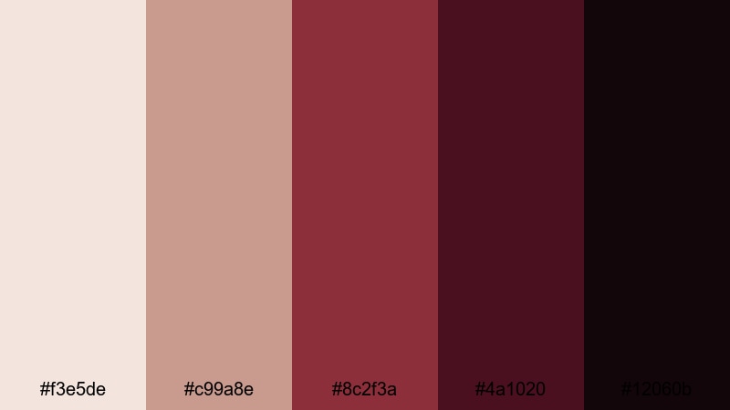
- HEX Codes: #f3e5de, #c99a8e, #8c2f3a, #4a1020, #12060b
- Mood: mysterious, cinematic, and passionate
- Use for: Great for trailers, dramatic title sequences, and fashion or performance reels.
Rosy neutrals paired with deep burgundy and near-black plum create powerful contrast. It feels like an after-hours private tour or a secret performance held in a grand hall.
Use the lighter shades as subtle backgrounds, then let the darkest reds and plums drive your title screens, masks, and spotlight effects in Filmora. This palette is ideal for fashion films, dance reels, and dramatic channel trailers that need a strong emotional punch.
Indigo Exhibit Shadows
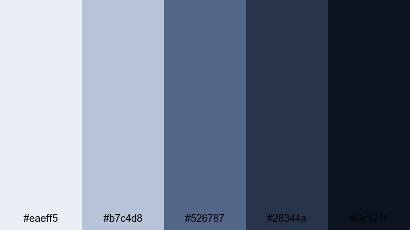
- HEX Codes: #eaeff5, #b7c4d8, #526787, #28344a, #0c121f
- Mood: cool, moody, and sophisticated
- Use for: Perfect for tech art showcases, night museum scenes, and moody music videos.
Soft slate blues fade into inky indigo and midnight navy, just like exhibits lit by spotlights in otherwise dark rooms. It has a futuristic, gallery-tech vibe.
Use this palette for glitchy motion graphics, light-trail overlays, and music video titles. In Filmora, you can color your lower thirds, spectrum visualizers, or animated shapes in these blues to tie concert footage and B-roll into one coherent, cool-toned aesthetic.
Emerald Atrium Glow
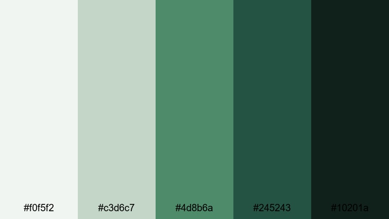
- HEX Codes: #f0f5f2, #c3d6c7, #4d8b6a, #245243, #10201a
- Mood: lush, hopeful, and elevated
- Use for: Use for museum garden segments, sustainability campaigns, and brand stories about growth.
Soft mint and pale stone are contrasted with rich emerald and forest shadows, suggesting greenery flooding into a bright atrium. It feels fresh while still being classic and grounded.
Apply this palette when telling stories about nature, sustainability, or brand growth. In Filmora, use the lighter greens for backgrounds and the darker emeralds for key icons, arrows, and callouts in your explainer videos or CSR highlights.
Charcoal Curator Chic
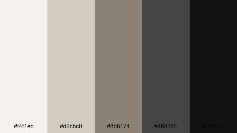
- HEX Codes: #f4f1ec, #d2cbc0, #8b8174, #464344, #141417
- Mood: minimal, stylish, and editorial
- Use for: Great for talking-head interviews, curator spotlights, and sleek YouTube channel branding.
Bone white and soft taupe sit against layered charcoals, echoing a curator in a tailored suit standing in front of a clean wall. It keeps focus on the subject while signaling taste and professionalism.
Use these tones for interview frames, Q&A videos, or thought-leadership content. In Filmora, set your lower thirds and title blocks in these neutrals so your channel thumbnails and playlist covers look like a unified, editorial brand.
Modern Curated Museum Palettes
Minimal White Cube
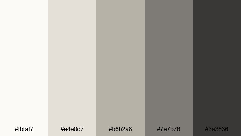
- HEX Codes: #fbfaf7, #e4e0d7, #b6b2a8, #7e7b76, #3a3836
- Mood: clean, contemporary, and understated
- Use for: Ideal for modern art features, portfolio reels, and sleek motion graphics titles.
This palette is inspired by white cube gallery spaces: soft off-whites, gentle greiges, and understated graphite accents. It is minimal on purpose, giving your artwork or footage all the attention.
Use Minimal White Cube as your base when you have bold visuals or typography that needs a neutral stage. In Filmora, build your intro and outro templates around these hues so every new upload feels curated and modern by default.
Interactive Light Install
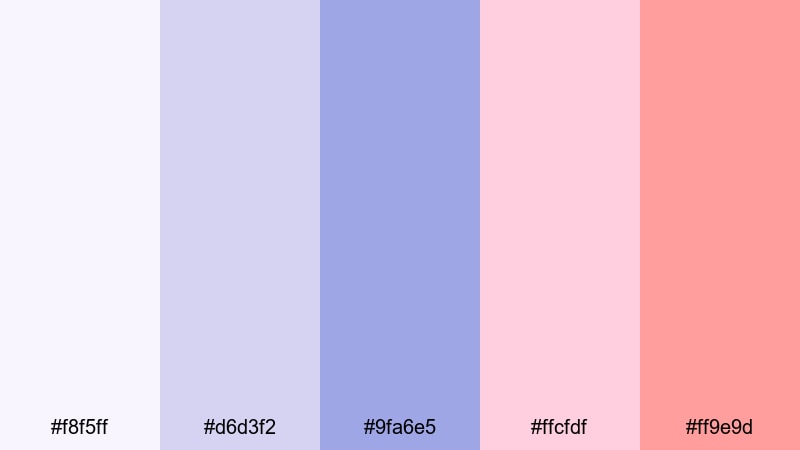
- HEX Codes: #f8f5ff, #d6d3f2, #9fa6e5, #ffcfdf, #ff9e9d
- Mood: playful, futuristic, and artistic
- Use for: Perfect for creative channel intros, motion graphics, and social media teasers.
Soft lilac and periwinkle paired with neon pink accents capture the energy of immersive light-based installations. It feels experimental and digital, great for creative or tech-savvy brands.
Use this palette for animated titles, glitchy transitions, and kinetic typography in Filmora. It is also ideal for bright, eye-catching YouTube thumbnails and Stories covers that still feel connected to a Museum-inspired art world.
Contemporary Bronze Detail
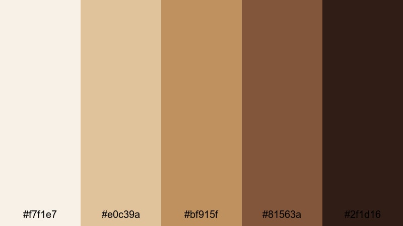
- HEX Codes: #f7f1e7, #e0c39a, #bf915f, #81563a, #2f1d16
- Mood: earthy, polished, and confident
- Use for: Great for brand stories, product showcases, and cinematic b-roll of interiors.
Warm ivory and sand combine with polished bronze and deep brown, echoing metal details against stone or concrete. It brings together industrial design and classic warmth.
Use this palette for product shots, showroom tours, and interior design edits where you want to highlight texture and craftsmanship. In Filmora, color your titles, callout boxes, and graphical lines with these hues to create a confident, upscale Museum-meets-modern brand identity.
Tips for Creating Museum Color Palettes
Museum color palettes work best when they balance calm neutrals with a few strong accents. Use these tips to build your own combinations and apply them smoothly in video editing and design.
- Start with a neutral base: pick 2–3 soft beiges, creams, or grays that will carry most backgrounds, overlays, and UI elements.
- Add one deep accent color (burgundy, indigo, emerald, or charcoal) for titles, key icons, and important calls to action.
- Check contrast for readability: dark text on light backgrounds works best for subtitles, lower thirds, and info cards.
- Limit your palette in each project to 4–6 colors so your branding feels curated instead of chaotic.
- Match your grade to your palette: warm Museum tones pair well with slightly lowered contrast and warm highlights, while cooler palettes suit subtle blue or teal shadows.
- Re-use the same HEX codes across thumbnails, intros, and end screens to build instant brand recognition.
- Use Filmora presets and custom color presets to save your favorite Museum combinations and apply them to future edits in one click.
- Test your palette on mobile: preview titles and thumbnails at small sizes to make sure key text still pops against your chosen colors.
Museum color palettes can transform your videos and designs from casual to carefully curated. Whether you lean toward soft marble whites, curated neutrals, or dramatic burgundies and indigos, these combinations help you tell stories that feel timeless and intentional.
Try dropping a few of these HEX codes into your next Filmora project for titles, overlays, and color grading, then save your favorite looks as presets. Over time, your channel or brand will develop a signature Museum-inspired style that viewers recognize instantly.
Open Filmora, pick one palette from this guide, and experiment with it across your intro, main content, and outro. A consistent color story can make even simple edits feel cinematic and professional.
secure downloadNext: Modern Color Palette
