
 100% Security Verified | No Subscription Required | No Malware


 ChatGPT
 Perplexity
 Gemini
 Claude
 Grok
Grok
Orange is one of the most expressive colors on screen. It sits between red and yellow, combining energy and optimism with a feeling of warmth. In video and design, orange can suggest creativity, confidence, and friendliness, which is why it pops up so often in brand logos, YouTube banners, thumbnails, and intro animations.
For editors and creators, an intentional orange color palette can turn random shots into a cohesive visual story. Whether you are grading sunset b-roll, designing a vlog thumbnail, or building a minimalist brand for your channel in Filmora, the right orange color combinations and HEX codes help you stay consistent from frame to frame and platform to platform. The palettes below give you ready-made orange schemes with HEX codes you can use directly in Filmora or your favorite design tool.
In this article
Soft & Sunset Orange Color Palettes
Apricot Daydream
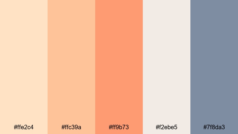
- HEX Codes: #ffe2c4, #ffc39a, #ff9b73, #f2ebe5, #7f8da3
- Mood: Gentle, nostalgic, and airy with a soft sunset warmth.
- Use for: Ideal for lifestyle vlogs, morning routine videos, and soft brand intros that need a cozy yet polished look.
Apricot Daydream layers light apricot and warm orange tones over misty neutrals, with a subtle steel blue accent to keep everything balanced. It feels like golden hour coming through a sheer curtain: calm, flattering, and slightly nostalgic.
Use this palette for vlog thumbnails, aesthetic Reels covers, or intro titles where you want warmth without harsh contrast. In Filmora, you can sample these HEX codes for text, overlays, and lower thirds so your talking-head clips, b-roll, and channel branding all share the same dreamy, cinematic orange glow.
Pro Tip: Build a Cinematic Orange Glow in Filmora
To keep the Apricot Daydream look consistent, treat orange as your hero color and use creams and soft blues as supporting tones. In Filmora, you can color pick these HEX values for titles, shapes, and even background solids, then reuse them in presets or custom templates so every video in a series feels connected.
Combine warm orange skin tones with gentle, apricot-tinted highlights in your footage. Add matching warm gradients behind text in your intro, then echo the same orange accent in outros and end screens for a cohesive visual journey from first frame to last.
AI Color Palette
If you have a reference still from a perfect sunset, a moodboard, or a color card using the Apricot Daydream tones, you can turn it into a global look in seconds. Filmora's AI Color Palette feature analyzes your reference and transfers those orange, cream, and blue relationships onto the rest of your clips.
Import your reference image, apply the AI Color Palette to your sequence, and Filmora will match the warmth and softness across all scenes. This is a quick way to align A-roll, B-roll, and overlay footage so everything shares that same apricot sunset atmosphere without manual tweaking on each clip.
 secure download

HSL, Color Wheels & Curves
Once you have the basic palette in place, refine your oranges so they always look flattering. In Filmora, use HSL controls to gently desaturate bright oranges in shadows and push them slightly toward apricot in the midtones. Color wheels let you warm highlights while keeping blacks neutral, so the image feels cinematic instead of overly orange.
You can also shape the mood with curves: lift the lower midtones for a hazy, dreamy feel or deepen contrast for a more polished commercial look. For more guidance on these tools, check out this Filmora color grading tutorial that walks through practical examples using wheels and curves.
secure download1000+ Video Filters & 3D LUTs
If you prefer faster workflows, Filmora’s video filters and 3D LUTs make it easy to get soft, warm orange looks without building a grade from scratch. Apply a cinematic LUT, then fine tune intensity so the apricot tones stay delicate rather than overpowering.
Stack subtle glow or haze filters on top of your grade for dreamy morning routines or sunset vlogs. Saving your favorite combinations as presets means you can apply the same orange signature look to future thumbnails, shorts, and long-form episodes with one click.
secure downloadPeach Cloud Horizon
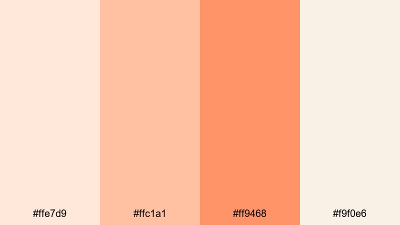
- HEX Codes: #ffe7d9, #ffc1a1, #ff9468, #f9f0e6
- Mood: Soft, uplifting, and serene like a pastel evening sky.
- Use for: Perfect for travel reels, timelapse sunsets, and romantic highlight videos needing delicate warmth.
Peach Cloud Horizon blends light peach and airy orange shades with creamy whites, mimicking the gentle fade of daylight after sunset. It feels calm, optimistic, and romantic, without any heavy contrast or harsh saturation.
It works beautifully on travel vlogs, engagement slideshows, or vacation highlight reels. Use the lighter tones as backgrounds for text and the deeper peach for titles and call-to-action buttons so your thumbnails and lower thirds feel like part of the same soft sky.
Coral Blush Breeze
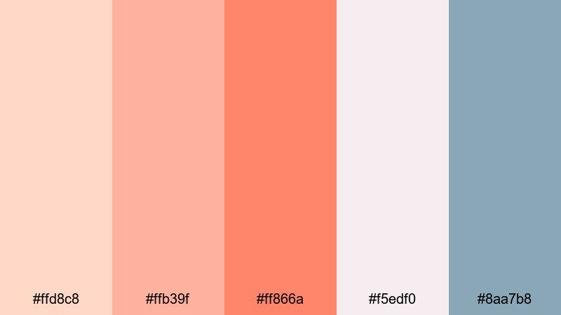
- HEX Codes: #ffd8c8, #ffb39f, #ff866a, #f5edf0, #8aa7b8
- Mood: Romantic, breezy, and subtly playful.
- Use for: Use in wedding highlight films, engagement announcement edits, and soft product promos on social media.
Coral Blush Breeze pairs coral oranges with blush neutrals and a dusty blue accent for an elegant yet approachable mood. The coral gives your visuals warmth and emotion, while the cool blue keeps everything feeling airy and modern rather than overly sweet.
Apply the coral tones to floral accents, text, and callouts in wedding highlight videos, while using the blush and blue for backgrounds and overlays. This palette also works for beauty or skincare branding where you want romantic warmth with a clean, cinematic finish.
Soft Tangerine Glow
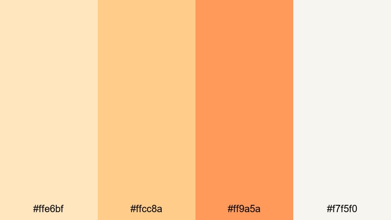
- HEX Codes: #ffe6bf, #ffcc8a, #ff9a5a, #f7f5f0
- Mood: Cozy, optimistic, and gently radiant.
- Use for: Great for cooking videos, cozy home tours, and family vlog thumbnails that need friendly warmth.
Soft Tangerine Glow brings together creamy lights and tangerine oranges for a welcoming, homely look. The palette feels like morning sunlight in a kitchen or living room, bright but not overpowering.
Use the deeper orange for key elements like video titles, subscribe buttons, and important callouts. Let the pale creams dominate in backgrounds and overlays so text stays readable on thumbnails and end screens while still carrying that warm, friendly tangerine vibe.
Bold & Energetic Orange Color Palettes
Neon Tangerine Pop
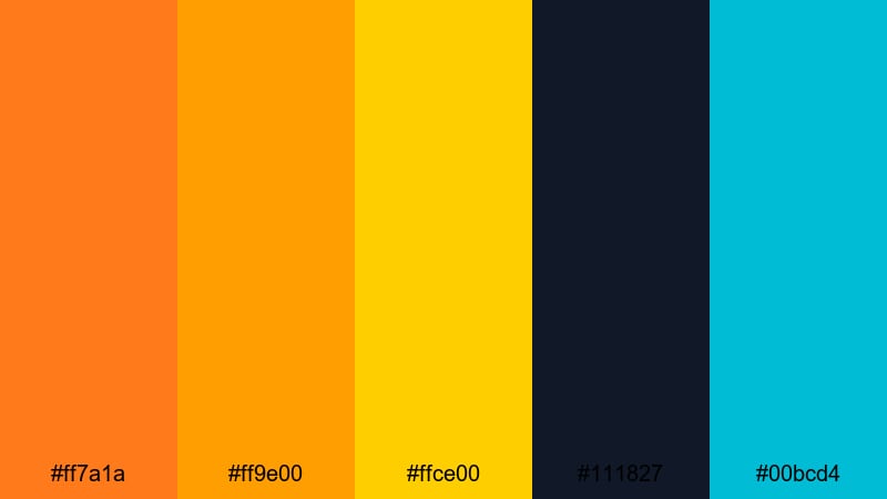
- HEX Codes: #ff7a1a, #ff9e00, #ffce00, #111827, #00bcd4
- Mood: Electric, high energy, and attention grabbing.
- Use for: Designed for gaming thumbnails, hype promos, and energetic intros that must stand out in crowded feeds.
Neon Tangerine Pop is loud, bright, and built for attention. Vivid tangerine and neon yellow jump out against deep navy and bright teal, creating a strong gaming or tech aesthetic.
Use the dark navy as a base for YouTube thumbnails and overlays, then punch in neon orange and yellow for titles, streaks, and icons. On intros and motion graphics, quick flashes of teal and orange together create a digital, futuristic feel that works especially well for esports, reaction content, or high-tempo edits.
Lava Burst Impact
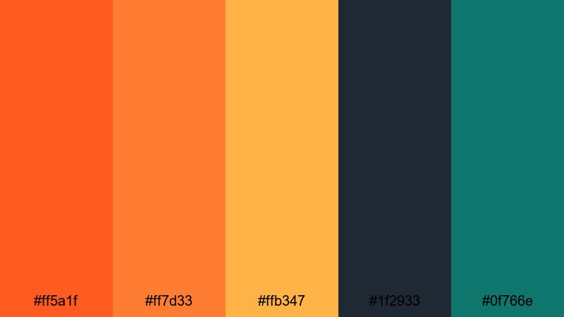
- HEX Codes: #ff5a1f, #ff7d33, #ffb347, #1f2933, #0f766e
- Mood: Fiery, dynamic, and powerful with a cinematic edge.
- Use for: Ideal for sports edits, fitness promos, and dramatic title cards that need intense focus on action.
Lava Burst Impact combines hot lava oranges with deep charcoal and teal accents for a powerful, cinematic look. It feels like stadium lights on a dark field or city lights reflecting on wet asphalt.
Use this palette when you want your subject to feel unstoppable. Let the dark tones dominate the background and frame, while orange highlights outline athletes, dancers, or products. The teal accent is great for subtle details like progress bars, stats, or secondary text on highlight reels.
Citrus Stadium Lights
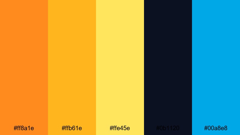
- HEX Codes: #ff8a1e, #ffb61e, #ffe45e, #0b1120, #00a8e8
- Mood: Thrilling, sporty, and bright like a night match under stadium lights.
- Use for: Use for highlight reels, event recaps, and energetic ad spots that mix action with modern flair.
Citrus Stadium Lights pairs glowing orange and yellow with deep midnight navy and electric blue. It immediately suggests arena spotlights, scoreboards, and fast-paced movement.
Use this palette for sports, concerts, or live event recaps where you want viewers to feel the adrenaline. Place white or light yellow text over the dark background for crisp readability, and reserve the vibrant orange for scores, logos, and subscribe CTAs to command attention.
Vintage Poster Orange
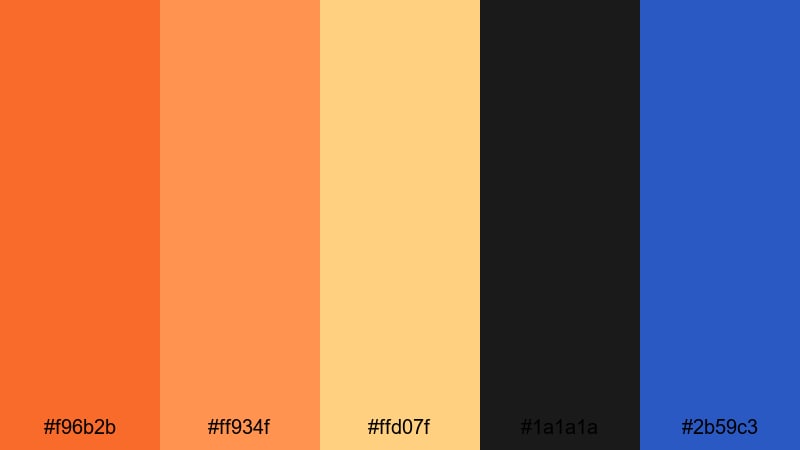
- HEX Codes: #f96b2b, #ff934f, #ffd07f, #1a1a1a, #2b59c3
- Mood: Retro, bold, and graphic with poster like contrast.
- Use for: Perfect for retro title sequences, bold YouTube branding, and social ads inspired by vintage print design.
Vintage Poster Orange mixes classic orange and butter yellow with solid black and a punchy blue accent. It feels like an old movie poster or retro product ad brought into HD.
Lean into graphic, flat shapes and blocky typography when you use this palette in Filmora. It works well for commentary channels, retro gaming, or any brand that nods to analog design. Let black be your base, then use orange for main titles and blue for supporting labels or tags.
Earthy & Rustic Orange Color Palettes
Burnt Terra Trail
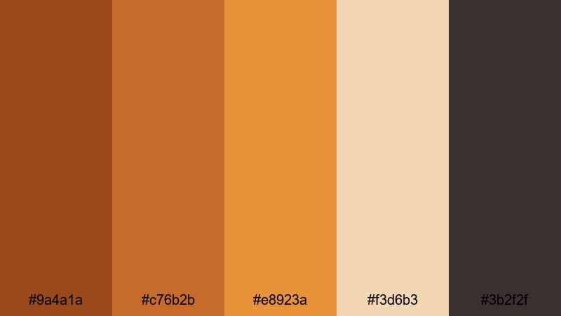
- HEX Codes: #9a4a1a, #c76b2b, #e8923a, #f3d6b3, #3b2f2f
- Mood: Grounded, adventurous, and rugged.
- Use for: Great for outdoor travel films, hiking vlog series, and brand stories for eco or adventure products.
Burnt Terra Trail combines deep burnt oranges and terra cotta with warm sand and rich brown. It feels sun-baked, dusty, and authentic, like worn leather gear and desert landscapes.
Use the lighter sand tone for titles and information panels so they stay legible over darker footage. The deeper oranges are perfect for logo marks, map graphics, or chapter cards in travel documentaries and outdoor vlogs where you want a grounded, cinematic mood.
Harvest Pumpkin Market
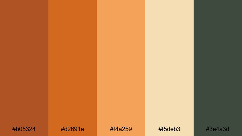
- HEX Codes: #b05324, #d2691e, #f4a259, #f5deb3, #3e4a3d
- Mood: Cozy, seasonal, and comforting like autumn markets.
- Use for: Ideal for fall themed vlogs, recipe videos, and small business promos focused on handmade or organic goods.
Harvest Pumpkin Market leans into classic pumpkin tones, paired with wheat creams and muted greens. It instantly reads as autumn, making it perfect for seasonal content or cozy storytelling.
Use the darker green and pumpkin shades for headings, price tags, or product labels in small business promos, while creams carry the background. This palette is also great for baking and recipe videos where ingredients and plating already feature warm oranges and browns.
Clay Pot Courtyard
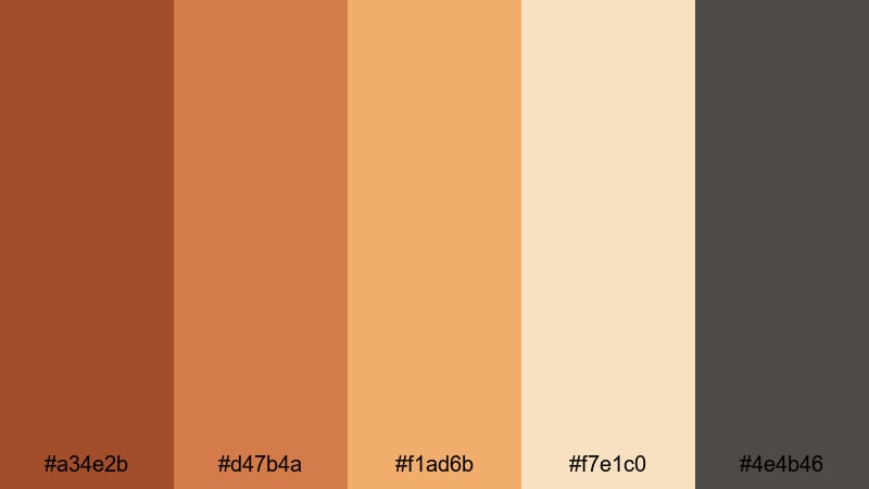
- HEX Codes: #a34e2b, #d47b4a, #f1ad6b, #f7e1c0, #4e4b46
- Mood: Artisanal, sun baked, and relaxed.
- Use for: Use in interior design tours, slow living content, and product clips for ceramics or handmade decor.
Clay Pot Courtyard layers terracotta oranges with sunlit creams and a smoky gray to evoke handmade ceramics and stone courtyards. It feels handcrafted, calm, and timeless.
Use this palette when your footage already contains warm surfaces like wood, clay, or linen. In your branding, let the terracotta shades carry logos and icons, while the pale cream and gray handle text blocks, captions, and info cards for a soft, editorial look.
Spiced Chai Studio
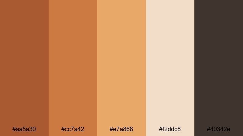
- HEX Codes: #aa5a30, #cc7a42, #e7a868, #f2ddc8, #40342e
- Mood: Warm, intimate, and subtly luxurious.
- Use for: Perfect for cafe b roll, podcast set design, and branding for wellness or lifestyle channels.
Spiced Chai Studio blends spiced orange tones with creamy beige and deep cocoa brown. It feels like the color of a latte in a dim, cozy cafe, giving your visuals a relaxed yet premium atmosphere.
Use this palette to brand podcast covers, wellness channels, or studio-style talking head setups. Keep the darker brown and mid oranges in your lower thirds and transitions, while soft beige takes care of backgrounds and text boxes for a comfortable, readable result.
Modern & Minimal Orange Color Palettes
Clean Tangerine UI
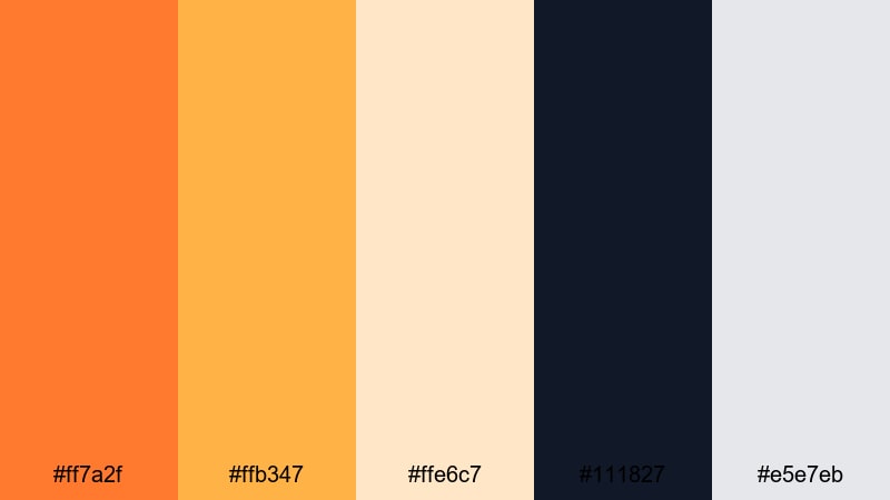
- HEX Codes: #ff7a2f, #ffb347, #ffe6c7, #111827, #e5e7eb
- Mood: Fresh, modern, and streamlined.
- Use for: Great for app style overlays, lower thirds, and UI focused explainer videos that need a bright but minimal accent.
Clean Tangerine UI uses crisp tangerine accents against deep navy and soft gray. It feels like a polished app interface: clean, minimal, and easy to read.
This palette works especially well for tech explainers, SaaS product demos, or productivity channel branding. Use navy as your base canvas, tangerine for key actions and buttons, and light creams and grays for panels and labels so your information stays clear on any screen size.
Muted Amber Grid
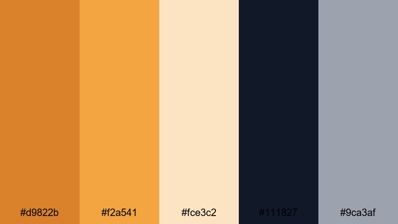
- HEX Codes: #d9822b, #f2a541, #fce3c2, #111827, #9ca3af
- Mood: Professional, understated, and warm.
- Use for: Ideal for business explainers, portfolio reels, and minimalist logo animations that still feel approachable.
Muted Amber Grid tones down orange into refined amber shades, supported by navy and cool gray. The result is professional and clean, but less cold than pure blue and gray branding.
Use amber for key metrics, icons, and logos in your business content, while navy and gray handle charts, grids, and text backgrounds. This palette keeps your brand looking serious and trustworthy while still bringing warmth and personality to your videos and decks.
Solar Accent Neutrals
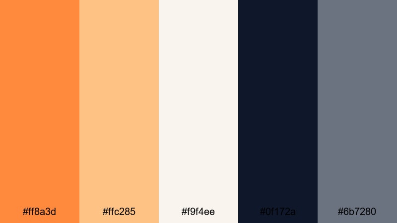
- HEX Codes: #ff8a3d, #ffc285, #f9f4ee, #0f172a, #6b7280
- Mood: Minimal, confident, and contemporary.
- Use for: Use for tech intros, modern portfolio showcases, and channel branding where orange is a sharp accent, not the whole story.
Solar Accent Neutrals treats orange as a precise highlight rather than a dominant wash. Bright solar orange sits on top of calm neutrals and deep navy, giving you a sleek, editorial feel.
Use orange sparingly for keyframes, logos, and subscribe prompts while neutrals handle backgrounds and typography. This approach is great for creators who want a distinctive accent color that stands out in feeds without overwhelming footage or layouts.
Tips for Creating Orange Color Palettes
Orange can quickly shift from warm and inviting to loud and overwhelming, so a thoughtful palette helps you control mood, readability, and brand identity across videos and designs.
- Pair bright orange with soft neutrals (cream, beige, light gray) to keep thumbnails readable and avoid eye strain.
- Use dark blues, charcoals, or deep greens as grounding colors when you want high contrast and a cinematic feel.
- Reserve your most saturated orange for key actions and calls to action, such as subscribe buttons, arrows, and important labels.
- Check text overlays at small sizes to ensure orange-on-white or white-on-orange remains legible on mobile screens.
- Match your grade to real-world elements in your footage (sunset skies, wood, skin tones) so the palette feels natural and not overly filtered.
- Limit your palette to 3–5 main colors plus a neutral so your brand and channel visuals stay consistent over time.
- In Filmora, save custom colors and export LUTs or presets so you can reuse the same orange mood across vlogs, shorts, and social clips.
- Test your orange palette on both light and dark backgrounds; adjust brightness and saturation until it works in both intro cards and end screens.
Orange palettes are powerful tools for shaping how your audience feels about your content. Soft apricot and peach tones can make your channel feel calm and intimate, while neon or lava-inspired oranges create urgency, speed, and hype. Earthy and minimal oranges sit in between, giving brands a warm but professional signature.
Use these ready-made HEX codes as starting points, then refine them inside Filmora to suit your footage, niche, and personality. With tools like AI Color Palette, HSL, curves, filters, and LUTs, you can turn simple orange color combinations into a recognizable visual identity for your channel.
Experiment with a few of these palettes on your next intro, thumbnail set, or full video edit, and save your favorites as presets so every new upload carries the same confident orange aesthetic.
secure download