
 100% Security Verified | No Subscription Required | No Malware


 ChatGPT
 Perplexity
 Gemini
 Claude
 Grok
Grok
Pastel blue green sits between mint and seafoam, blending the calm of blue with the freshness of green. It feels clean, modern, and gentle, which is why it is so popular for wellness brands, tech startups, and aesthetic vlog channels. On screen, this color reads as soft and friendly rather than harsh, making it perfect for thumbnails, lower thirds, and intro titles that invite viewers in instead of shouting at them.
For video creators and designers, a consistent pastel blue green color palette can tie together your branding across YouTube thumbnails, channel art, intros, and social edits. Below you will find 15 curated pastel blue green color combinations with HEX codes, plus ideas on how to use them in Filmora for grading, graphics, and motion design.
In this article
Soft & Dreamy Pastel Blue Green Palettes
Seafoam Morning Glow
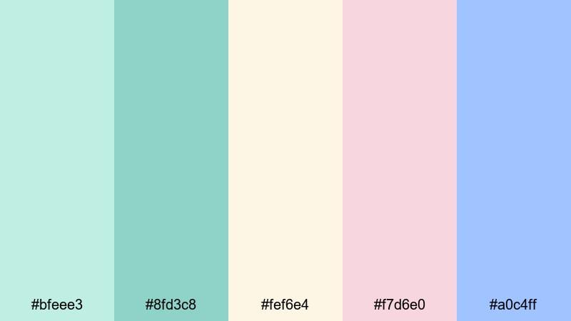
- HEX Codes: #bfeee3, #8fd3c8, #fef6e4, #f7d6e0, #a0c4ff
- Mood: Calm, uplifting, and softly illuminated like an early beach sunrise.
- Use for: Ideal for vlog openings, travel reels, and channel banners that need a fresh, optimistic feel.
Seafoam Morning Glow blends airy pastel blue green with warm pearl-like cream, blush, and periwinkle accents. It feels like standing on a quiet shore just after sunrise, when the light is soft and everything looks slightly hazy in the best way.
Use this palette for lifestyle or travel vlog thumbnails, opening title cards, and subtle lower thirds. The gentle contrast keeps text readable while maintaining a dreamy, pastel aesthetic. It also works beautifully for branding elements like logo stings, subscribe animations, and channel headers that aim for a calm but cheerful first impression.
Pro Tip: Keep Your Pastel Blue Green Brand Consistent in Filmora
When you fall in love with a palette like Seafoam Morning Glow, consistency is everything. In Filmora, you can reuse the same HEX codes for your titles, elements, and overlays so your pastel blue green tone feels identical from intro to outro. Save your favorite color combinations inside text presets or graphic templates and apply them across all your vlog episodes or reels.
You can also build a simple brand kit inside Filmora by reusing this palette for transitions, subscribe buttons, and end screens. That repetition helps viewers instantly recognize your content in their feed, even when the footage itself changes from beach trips to desk setups.
AI Color Palette
Instead of manually matching every clip, Filmora's AI Color Palette feature lets you use a single reference image or frame that already has your perfect pastel blue green look. The AI then analyzes that source and transfers its tones to the rest of your footage.
Take a screenshot of your favorite Seafoam Morning Glow frame or your custom thumbnail design, feed it into AI Color Palette, and apply the result across your timeline. This keeps your soft seafoam shadows and warm highlights cohesive in intros, B-roll, talking head segments, and shorts.
 secure download

HSL, Color Wheels & Curves
Pastel palettes are sensitive to small shifts, so fine-tuning with HSL, Color Wheels, and Curves inside Filmora can make a huge difference. Adjust the hue and saturation of cyan, teal, and blue channels to keep your pastel blue green from drifting too neon or too gray, while protecting skin tones in your shots.
You can use Filmora's color correction tools to cool down the shadows with a touch of teal, warm the midtones for a sunrise glow, and gently lift the highlights for a soft, pearl-like finish. This kind of targeted grading helps you craft a polished pastel look similar to professional color grading tutorials without needing a complex node setup.
secure download1000+ Video Filters & 3D LUTs
If you want a fast way to stylize your pastel blue green footage, Filmora's video filters and 3D LUTs make it easy to add a cinematic or dreamy finish. Soft film LUTs can introduce subtle grain and contrast, while pastel-friendly filters keep your highlights creamy and your shadows gentle.
Stack filters lightly over your graded footage to preserve your Seafoam Morning Glow palette while giving it a unique identity. You can save custom LUT combinations that match your brand colors, then reuse them on every vlog, intro sequence, and short-form edit to keep your channel looking cohesive.
secure downloadMint Cloud Whispers
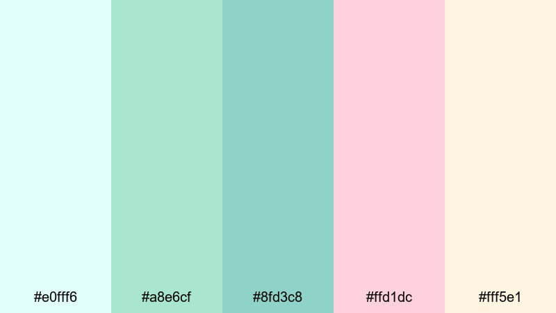
- HEX Codes: #e0fff6, #a8e6cf, #8fd3c8, #ffd1dc, #fff5e1
- Mood: Airy, sweet, and delicate with a spa-like softness.
- Use for: Perfect for self-care content, ASMR videos, and soothing intro screens.
Mint Cloud Whispers wraps your visuals in ultra-soft mints, pastel blue green, cotton candy pink, and creamy whites. The overall effect is light, soothing, and almost weightless, like slow-moving clouds in a calm sky.
This palette is ideal for self-care or ASMR channels, wellness tutorials, and calming productivity videos. Use the deeper pastel blue green for text and icons, keep backgrounds in pale mint and cream, and save the blush pink for subtle highlight elements in thumbnails, chapter markers, or subscribe reminders.
Lagoon Cotton Candy
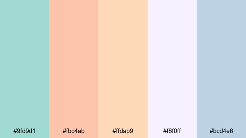
- HEX Codes: #9fd9d1, #fbc4ab, #ffdab9, #f6f0ff, #bcd4e6
- Mood: Nostalgic, sugary, and whimsical like a seaside carnival at dusk.
- Use for: Great for playful travel vlogs, summer recap montages, and fun channel art.
Lagoon Cotton Candy mixes lagoon-inspired blue greens with peach, soft apricot, lilac, and gentle blue. The palette feels nostalgic and candy-like, calling back to retro postcards and carnival lights reflected on water.
Try this for upbeat travel edits, beach-day recaps, or playful lifestyle channels. Use the lagoon blue green as your main accent for titles and frames, while the peaches and lilac dress up backgrounds, stickers, and thumbnail borders. A subtle grain filter in Filmora will push the retro vibe even further without overpowering your pastel tones.
Tidal Breeze Pastels

- HEX Codes: #c1edea, #8fd3c8, #f1f8ff, #ffe5ec, #e4f9f5
- Mood: Refreshing, weightless, and gently romantic.
- Use for: Use for wedding highlight films, engagement reels, and dreamy B-roll overlays.
Tidal Breeze Pastels combines cool tidal aqua with soft blush, off-white, and pale teal for a gently romantic feeling. It keeps the scene light and airy while adding a hint of storybook romance.
This palette is perfect for wedding highlights, engagement reels, and proposal stories. Use pastel blue green and pale teal for lower thirds and captions, while the blush tones frame your footage in overlays, frames, or floral graphics. It also looks beautiful on YouTube channel banners for photographers and filmmakers who specialize in love stories.
Spring Spa Serenity

- HEX Codes: #b9f3e4, #8fd3c8, #f7f7ff, #ffe9c7, #d1e8ff
- Mood: Clean, restorative, and gently luxurious.
- Use for: Perfect for wellness channels, skincare promos, and calm tutorial backgrounds.
Spring Spa Serenity leans into clean blue green tones, creamy neutrals, and pale blues that feel like a boutique spa interior. It gives your visuals a polished, high-end look without losing the calming character of pastel blue green.
Use this palette for skincare commercials, wellness brand intros, or calm step-by-step tutorials. Keep backgrounds in soft white and light blue, overlay gentle pastel blue green boxes for text, and use the warm cream accent to draw attention to product shots, discount codes, or call-to-action buttons in your thumbnails.
Modern & Minimal Pastel Blue Green Palettes
Nordic Studio Mist
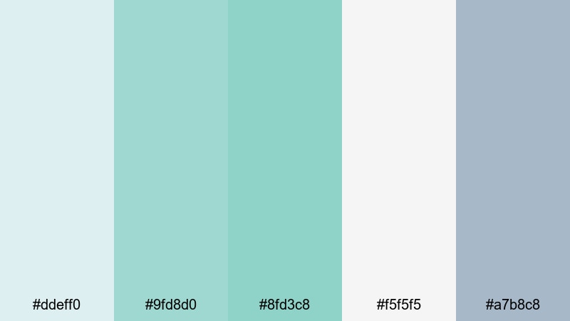
- HEX Codes: #ddeff0, #9fd8d0, #8fd3c8, #f5f5f5, #a7b8c8
- Mood: Minimal, cool, and design-forward with a Scandinavian touch.
- Use for: Great for productive desk setups, tech reviews, and branding for creative studios.
Nordic Studio Mist pairs muted aqua with soft greys and off-white for a calm, editorial minimalism. It hints at Scandinavian interiors and clean product photography, making your visuals feel modern and uncluttered.
This is a strong choice for tech review channels, desk setup tours, and creative studio brands. Use pastel blue green as your accent for buttons, highlights, and icons, while the greys and whites form a clean canvas behind your footage and screen recordings. It works especially well in side-by-side comparison frames and infographic-style overlays inside Filmora.
Glass UI Aqua
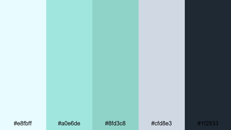
- HEX Codes: #e8fbff, #a0e6de, #8fd3c8, #cfd8e3, #1f2933
- Mood: Sleek, futuristic, and quietly energetic.
- Use for: Perfect for app promos, SaaS explainers, and UI-style lower thirds.
Glass UI Aqua looks like a modern app interface brought to life: bright aqua highlights, pastel blue green, cool neutrals, and a deep charcoal anchor. The palette feels clean yet energetic, with enough contrast to stay readable on smaller screens.
Use it to design lower thirds that mimic UI elements, clickable-style buttons in your tutorials, or animated app walkthroughs. Keep backgrounds light, use the dark navy charcoal for text, and let the aqua tones indicate active states, key numbers, or important steps in your explainer videos.
Urban Coastal Calm
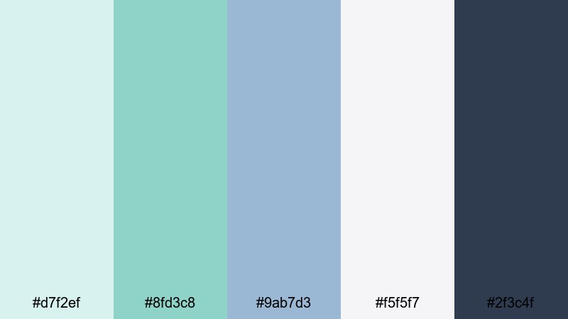
- HEX Codes: #d7f2ef, #8fd3c8, #9ab7d3, #f5f5f7, #2f3c4f
- Mood: Balanced, polished, and coastal-meets-city chic.
- Use for: Use for lifestyle channels, apartment tours, and city travel diaries.
Urban Coastal Calm balances pastel blue green with slate blue, soft off-white, and a deep navy accent. It feels like an airy apartment with ocean views and city lights in the distance.
This palette suits lifestyle vloggers, interior tours, and city travel diaries that still want a relaxed coastal mood. Blue green can highlight section titles and map pins, while the darker navy is perfect for important text overlays. Use the softer tones in thumbnail backgrounds and Instagram-style story frames to keep everything looking modern and cohesive.
Minimal Mint Interface

- HEX Codes: #f3fffb, #b8f0e6, #8fd3c8, #e1e4eb, #3b4252
- Mood: Fresh, organized, and productivity-focused.
- Use for: Great for tutorials, productivity content, and clean overlay templates.
Minimal Mint Interface combines crisp mints, gentle pastel blue green, cool greys, and a grounded dark accent. It feels like a tidy project management app or a stripped-back dashboard.
For productivity channels, coding tutorials, or Notion-style workflows, this palette keeps everything looking sharp and uncluttered. Use the dark slate for titles and timeline labels, mint tones for highlights around key steps or shortcuts, and off-white as your base background in split-screen layouts.
Soft Tech Neo

- HEX Codes: #e7f7ff, #9ee2d7, #8fd3c8, #f4f4f5, #6b7280
- Mood: Contemporary, light, and slightly futuristic.
- Use for: Perfect for tech explainer videos, startup pitches, and sleek logo animations.
Soft Tech Neo is a contemporary mix of pale blue, teal-tinted pastel blue green, soft neutrals, and a cool gray anchor. It signals tech and innovation without resorting to harsh neon or deep blacks.
Use this palette for startup pitch decks turned into video, motion-graphic explainers, or logo animations. The soft tones are easy on the eyes for long watch times, while the darker gray ensures your text, UI callouts, and diagrams stay legible on both mobile and desktop screens.
Bold & Cinematic Pastel Blue Green Palettes
Tropical Film Grade
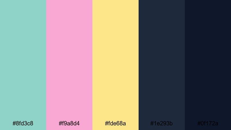
- HEX Codes: #8fd3c8, #f9a8d4, #fde68a, #1e293b, #0f172a
- Mood: Cinematic, warm, and vacation-ready with punchy contrast.
- Use for: Ideal for travel films, cinematic vlogs, and bold thumbnail text blocks.
Tropical Film Grade turns pastel blue green into a star player alongside peachy pink, warm yellow, and two deep, moody blues. It mimics a stylized cinematic grade where colors feel rich but still playful.
Use the dark blues as your base for titles and letterbox bars, then let the aqua, pink, and yellow pop in overlays, location labels, and thumbnail text. This palette is powerful for travel films, beach adventures, and dramatic B-roll sequences that still want a pastel heart.
Neon Surf Title
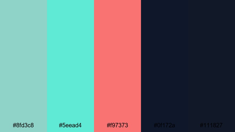
- HEX Codes: #8fd3c8, #5eead4, #f97373, #0f172a, #111827
- Mood: Energetic, edgy, and ready for fast-paced edits.
- Use for: Great for sports clips, surfing reels, and punchy YouTube intros.
Neon Surf Title pushes pastel blue green toward an electric, surf-ready look by pairing it with bright aqua, vivid coral, and inky dark blues. It has strong contrast and a hint of neon sign energy.
This palette is made for high-energy edits: surfing, skating, mountain biking, or fast-paced montage reels. Use the darkest shades for background panels and the neon tones for strokes, glow effects, and animated title cards. It will also grab attention on YouTube homepages, making your thumbnails stand out in a sea of flat designs.
Aqua Retro Vlog
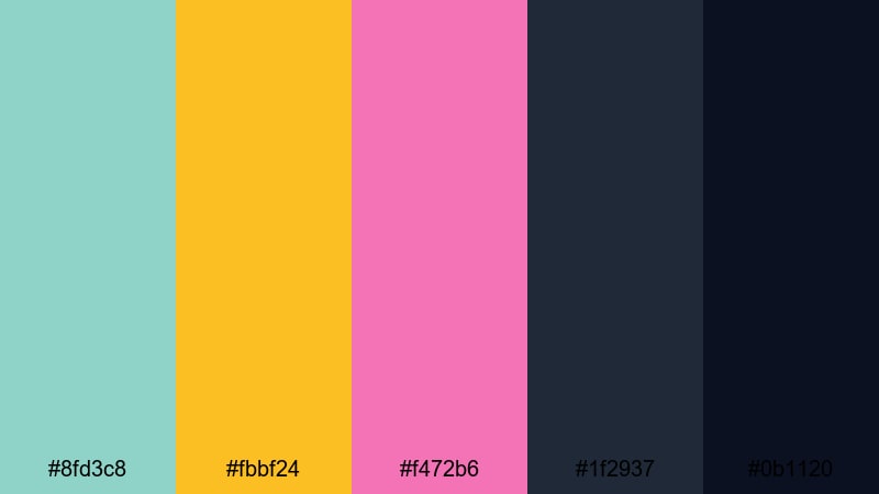
- HEX Codes: #8fd3c8, #fbbf24, #f472b6, #1f2937, #0b1120
- Mood: Playful, nostalgic, and slightly grainy-analog inspired.
- Use for: Perfect for daily vlogs, retro edits, and stylized social shorts.
Aqua Retro Vlog contrasts soft aqua with golden yellow, bubblegum pink, and deep teal blacks. It feels like a modern twist on VHS-era color, especially when combined with grain and light leaks.
Try it for personality-driven daily vlogs, throwback edits, or stylized TikTok and Reels cuts. Use the dark tones as a backdrop for bold titles and time stamps, while aqua and yellow highlight key phrases or emojis in your graphics. A light fade or retro LUT in Filmora will complete the analog-inspired look.
Dreamwave Gradient

- HEX Codes: #8fd3c8, #a5b4fc, #f9a8d4, #0f172a, #020617
- Mood: Surreal, synthwave-inspired, and dreamy yet dramatic.
- Use for: Use for music videos, lyric visuals, and aesthetic montage sequences.
Dreamwave Gradient blends pastel blue green with lavender, soft pink, and deep midnight blues. The mix feels dreamy and slightly surreal, echoing synthwave and vaporwave aesthetics but in a gentler pastel register.
Use this for music videos, lyric visualizers, and aesthetic montages. Build gradient backgrounds that shift between aqua, purple, and pink, then overlay dark text and glowing shapes. In thumbnails, dark blues help your typography stand out while the pastel tones create a moody, clickable atmosphere.
Moody Harbor Teal
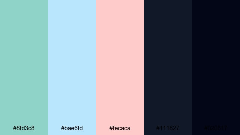
- HEX Codes: #8fd3c8, #bae6fd, #fecaca, #111827, #020617
- Mood: Moody, reflective, and cinematic with a coastal edge.
- Use for: Great for emotional travel stories, documentary-style vlogs, and outro screens.
Moody Harbor Teal keeps pastel blue green at the center but grounds it with charcoal blacks and midnight tones, plus touches of baby blue and soft blush. It feels like a quiet harbor at night, lit by scattered reflections.
This palette is ideal for slower, more emotional edits: reflective travel stories, mini-documentaries, or thoughtful vlogs. Use the darkest shades for backgrounds and end screens, keep titles in light blue or blush for gentle contrast, and reserve aqua for important details like locations or key phrases in your storytelling.
Tips for Creating Pastel Blue Green Color Palettes
Pastel blue green is incredibly versatile, especially when paired with pearl-like neutrals, soft pinks, or deep contrasting blues. These tips will help you build palettes that look great on screen and stay practical for thumbnails, intros, and branding.
- Balance light and dark: combine pastel blue green with at least one darker shade (navy, charcoal, or deep teal) so your titles and UI elements remain readable.
- Use neutrals for breathing room: white, off-white, pearl, and light gray keep your layouts from feeling overcrowded by color.
- Protect skin tones: when color grading in Filmora, push teal into the shadows and midtones carefully so people do not look too green or cyan.
- Limit accent colors: 1 to 2 accent shades (like peach or lavender) are usually enough to add personality without breaking your pastel blue green aesthetic.
- Design thumbnails first: pick your caption, background, and accent colors for thumbnails, then reuse the same palette inside your titles and overlays in the video.
- Check mobile readability: zoom out or preview on a phone to ensure pastel text does not disappear against light backgrounds.
- Save presets in Filmora: once you dial in a color grade and title style, save them as presets so every new episode of your vlog or series uses the same palette.
- Match footage and graphics: if your footage leans warm or cool, adjust your graphic colors slightly in Filmora so they feel like part of the same world.
Pastel blue green palettes can shift your content from plain to polished, setting a clear mood that ranges from spa-level calm to bold cinematic travel stories. When you use these HEX-based color combinations consistently, your channel or brand starts to feel instantly recognizable and visually trustworthy.
Whether you are designing soothing self-care intros, clean tech explainers, or neon-tinged surf edits, Filmora gives you practical tools to keep your pastel blue green aesthetic consistent. Combine the palettes above with Filmora's color controls, templates, and effects to test, refine, and lock in a visual identity that truly fits your style.
Download Filmora, drop in your favorite pastel blue green palette, and start building intros, lower thirds, and color grades that you can reuse across every platform you post on.
secure downloadNext: Pearl Color Palette
