
 100% Security Verified | No Subscription Required | No Malware


 ChatGPT
 Perplexity
 Gemini
 Claude
 Grok
Grok
Pearl sits between white and soft beige, carrying a quiet glow that feels clean, elegant, and reassuring. In color psychology, Pearl is linked to calm, purity, and gentle luxury, which makes it perfect for creators who want visuals that feel polished but not loud. On screen, Pearl softens harsh contrast, flatters skin tones, and gives thumbnails, intros, and lower-thirds a refined, premium finish.
For video editors, designers, and YouTube creators using Filmora, Pearl is a powerful base color for branding, vlog aesthetics, cinematic edits, and social posts. Below you will find ready-made Pearl color palettes with HEX codes so you can match your titles, overlays, filters, and thumbnails to one consistent look across your whole project.
In this article
Soft & Romantic Pearl Color Palettes
Blush Morning Pearl
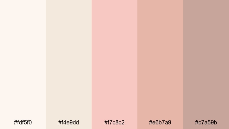
- HEX Codes: #fdf5f0, #f4e9dd, #f7c8c2, #e6b7a9, #c7a59b
- Mood: Gentle, hopeful, and softly romantic.
- Use for: Lovely for wedding highlight videos, morning routine vlogs, and dreamy lifestyle thumbnails.
Blush Morning Pearl wraps a warm Pearl base in soft peach and rose tones, like sunlight slipping through sheer curtains. The palette feels cozy, feminine, and reassuring, perfect when you want your visuals to suggest a slow, beautiful start to the day.
Use this scheme for wedding highlight films, GRWM and morning routine vlogs, or lifestyle thumbnails where skin tones need to look smooth and flattering. Apply these HEX codes to titles, lower-thirds, background cards, and overlay graphics in Filmora so your intros, B-roll, and end screens all share the same gentle glow.
Pro Tip: Build a Romantic Pearl Aesthetic in Filmora
To keep this soft Pearl look consistent, start with clean, neutral footage and warm it slightly with Filmora color tools. Then match your text, frames, and graphics to the lighter HEX values (#fdf5f0 and #f4e9dd) so nothing feels too harsh against the delicate blush tones. Using the mid-tones (#f7c8c2 and #e6b7a9) for buttons or callouts will keep key elements visible without breaking the romantic mood.
Create a style preset in Filmora that combines your preferred color correction, font, and overlay design. Apply it to your intros, B-roll sequences, YouTube Shorts, and Instagram reels to maintain a recognizable Pearl-based brand without redoing your look from scratch every time.
AI Color Palette
If you have a favorite photo that captures this Blush Morning Pearl mood, you can turn it into a reference for your whole edit. Filmora's AI Color Palette feature analyzes the colors in a still frame or clip and transfers that aesthetic to other shots in your timeline.
Drop a Pearl-toned image or clip on the timeline, run AI Color Palette, and let Filmora harmonize exposure, temperature, and tint across your entire video. This is an easy way to make all your scenes feel like they were shot in the same dreamy, early-morning light, even if they came from different days or cameras.
 secure download

HSL, Color Wheels & Curves
To refine a Pearl-based palette, use Filmora HSL controls to gently desaturate any colors that feel too intense and push oranges slightly warmer for flattering skin. Then use the color wheels to keep shadows neutral while adding a touch of warmth to mid-tones and highlights, preserving that soft morning atmosphere. For more control, the curves tool lets you lift shadows very slightly so Pearl never looks muddy or gray.
If you want a deeper walkthrough on creating polished color grades, check out the Filmora color correction tools overview and follow along while you tweak your own Pearl aesthetic. Once you like the result, save it as a custom preset and reuse it across your channel.
secure download1000+ Video Filters & 3D LUTs
If you want to stylize your Pearl palettes fast, start from Filmora presets and then fine-tune. Filmora's video filters and 3D LUTs make it easy to push your Pearl tones toward vintage blush, airy lifestyle, or cinematic romance with just a few clicks.
Layer a soft cinematic LUT over your footage, dial down the intensity, then adjust your text and graphics to the palette HEX codes so everything still feels cohesive. You can mix filters for glow, slight blur, or film grain to give your Blush Morning Pearl projects a signature, high-end finish.
secure downloadRose Veil Pearl

- HEX Codes: #f8ece7, #f2d3d6, #e7b8c7, #c99aa8, #8f6b74
- Mood: Romantic, intimate, and nostalgic.
- Use for: Perfect for engagement films, slow cinematic b-roll, and soft product promos for beauty or skincare.
Rose Veil Pearl feels like looking through a rosy filter at your favorite memories. Muted rose, mauve, and Pearl tones combine into a subtle, velvety warmth that never feels over-saturated. The deeper mauve accents (#c99aa8 and #8f6b74) add depth and emotion without losing the softness.
Use this palette for engagement highlight reels, slow-motion B-roll, and beauty or skincare promos where you want to hint at romance and care. In Filmora, pull these HEX codes into your thumbnail backgrounds, logo lockups, and social lower-thirds so your couple shots, text overlays, and end cards feel like one cohesive story.
Seaside Whisper Pearl
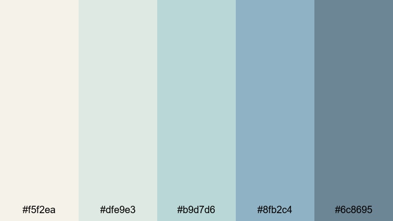
- HEX Codes: #f5f2ea, #dfe9e3, #b9d7d6, #8fb2c4, #6c8695
- Mood: Calm, airy, and reflective.
- Use for: Works beautifully for travel vlogs, coastal B-roll, and calming YouTube channel banners.
Seaside Whisper Pearl blends warm sand-like Pearl with seafoam and muted blues, capturing the feeling of an overcast beach day. It is breezy and refined, with enough color in the aquas and blues to feel alive, but soft enough to remain relaxing.
Apply this palette to titles, location tags, and subtle gradient overlays in your travel and coastal vlogs. In thumbnails, use the lighter tones for backgrounds and the richer blues for text or borders to keep everything easy to read while maintaining a calm, ocean-inspired Pearl aesthetic.
Cotton Cloud Pearl
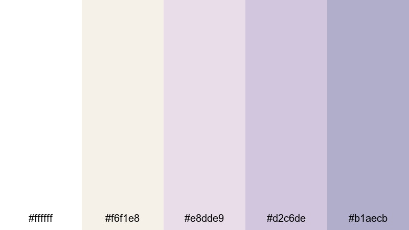
- HEX Codes: #ffffff, #f6f1e8, #e8dde9, #d2c6de, #b1aecb
- Mood: Dreamy, airy, and innocent.
- Use for: Ideal for cozy vlog aesthetics, stationery promos, and channel art aimed at a gentle, whimsical audience.
Cotton Cloud Pearl floats between crisp white, warm Pearl, and lilac pastels to create a weightless, dreamy mood. It feels clean but playful, like sketching in a pastel notebook or filming under soft, diffused daylight.
Use this palette for cozy study vlogs, stationery or journal promos, and whimsical channel branding. In Filmora, combine white and Pearl for your primary UI elements and sprinkle the lilac shades into icons, progress bars, and end-screen buttons for a gentle pop of color that still feels on-brand.
Modern Minimal Pearl Color Palettes
Clean Studio Pearl
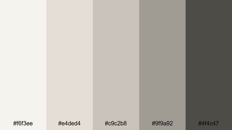
- HEX Codes: #f6f3ee, #e4ded4, #c9c2b8, #9f9a92, #4f4c47
- Mood: Minimal, polished, and professional.
- Use for: Best for tech reviews, studio tours, and minimalist brand identities on YouTube or social.
Clean Studio Pearl stacks soft neutrals from off-white to charcoal, keeping everything sleek and uncluttered. The Pearl core keeps frames bright and approachable, while the darker grays add just enough contrast for readability and structure.
Use this palette for tech reviews, productivity channels, and studio tour content where you want your gear and message to stand out. In Filmora, use the mid-grays for lower-thirds and info bars, reserve the darkest tone for key text, and keep backgrounds in the lighter Pearl range for a high-end, minimalist layout.
Glass Interface Pearl
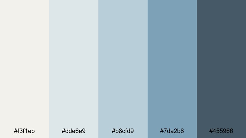
- HEX Codes: #f3f1eb, #dde6e9, #b8cfd9, #7da2b8, #455966
- Mood: Cool, crisp, and tech-forward.
- Use for: Great for app promos, UI explainers, lower-thirds, and motion graphics with a clean tech vibe.
Glass Interface Pearl brings together Pearl whites and frosted blues to mimic a translucent interface look. The palette feels structured and modern, with the deeper blue-gray (#455966) adding clarity and authority for key labels or metrics.
Use it when designing overlays for app demos, UI walkthroughs, or SaaS explainer videos. In your Filmora projects, pair the pale tones with blurred backgrounds and line icons, then use the mid and dark blues for buttons, progress bars, and highlight text to emphasize important steps or features.
Monochrome Drift Pearl
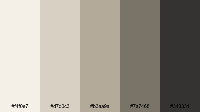
- HEX Codes: #f4f0e7, #d7d0c3, #b3aa9a, #7a7468, #343331
- Mood: Grounded, understated, and editorial.
- Use for: Perfect for documentary titles, fashion lookbooks, and minimalist brand openers.
Monochrome Drift Pearl slides from warm Pearl into greige and deep charcoal, creating a sophisticated, almost print-editorial vibe. It is restrained but confident, letting your footage carry the story while the palette frames everything with subtle style.
Use this set for documentary title cards, fashion reels, or portfolio intros where you want a quiet, premium edge. In Filmora, build simple text-on-Pearl cards, then use the darkest shade for typography and the mid tones for thin borders or divider lines to keep things crisp and legible.
Soft Tech Pearl
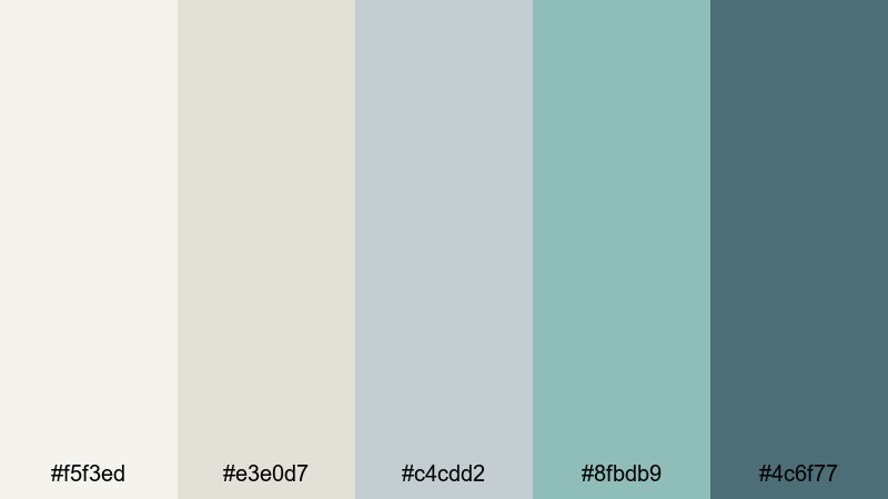
- HEX Codes: #f5f3ed, #e3e0d7, #c4cdd2, #8fbdb9, #4c6f77
- Mood: Light, innovative, and balanced.
- Use for: Suited for SaaS walkthroughs, startup pitch videos, and modern portfolio sites.
Soft Tech Pearl merges neutral Pearls with digital mint and muted teal, balancing a human, approachable base with subtle tech energy. It does not shout like neon; instead, it feels like a calm, modern dashboard.
Use it in startup pitch decks, SaaS tutorials, or personal portfolio videos where you want to look innovative but warm. In Filmora, assign the aqua and teal shades to data points, icons, and call-to-action buttons, while using the Pearl tones for main backgrounds and content areas.
Vintage Glow Pearl Color Palettes
Old Film Pearl
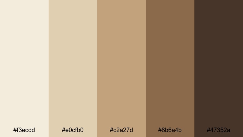
- HEX Codes: #f3ecdd, #e0cfb0, #c2a27d, #8b6a4b, #47352a
- Mood: Warm, nostalgic, and cinematic.
- Use for: Ideal for retro title cards, analog-inspired LUTs, and memory-filled travel edits.
Old Film Pearl combines creamy Pearl with dusty gold and rich brown, echoing the warmth of aged film stock. The palette instantly suggests nostalgia, like flipping through old photo albums or watching Super 8 footage.
Try it for memory-driven travel edits, family montages, or retro-themed opening titles. In Filmora, you can use the lighter tones as background plates, the mid browns as frame accents or film borders, and the darkest shade for typography to keep everything readable over textured footage or grain.
Sepia Letter Pearl
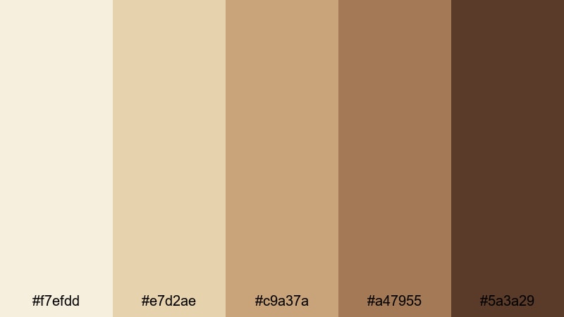
- HEX Codes: #f7efdd, #e7d2ae, #c9a37a, #a47955, #5a3a29
- Mood: Sentimental, cozy, and bookish.
- Use for: Great for journaling videos, study vlogs, and typography-driven openers.
Sepia Letter Pearl feels like handwritten notes on old paper. Pearl paper tones and sepia browns produce a soft, literary mood that is ideal for thoughtful, introspective content.
Use it in journaling or study vlogs, writing tutorials, or typography-heavy openers. In Filmora, combine paper-texture backgrounds with these HEX colors in your text, headings, and highlight boxes to give your channel art and overlays a warm, notebook-inspired style.
Art Deco Pearl
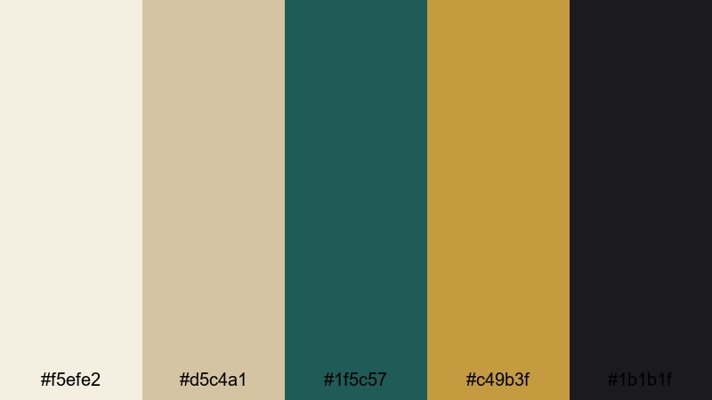
- HEX Codes: #f5efe2, #d5c4a1, #1f5c57, #c49b3f, #1b1b1f
- Mood: Glamorous, bold, and retro-chic.
- Use for: Use for title sequences, luxury brand reels, and stylized fashion lookbooks.
Art Deco Pearl pairs champagne Pearl and soft gold with deep teal and inky black for a bold, vintage statement. It feels like a movie poster from a golden-age cinema, combining luxury with strong geometry.
Use this palette for stylized fashion lookbooks, luxury product reels, or bold opening titles. In Filmora, set your backgrounds in Pearl and champagne, use the teal (#1f5c57) for accents or graphic shapes, and reserve gold and black for typographic highlights to create a glamorous, eye-catching hierarchy.
Luxe Cinematic Pearl Color Palettes
Gilded Pearl Premiere
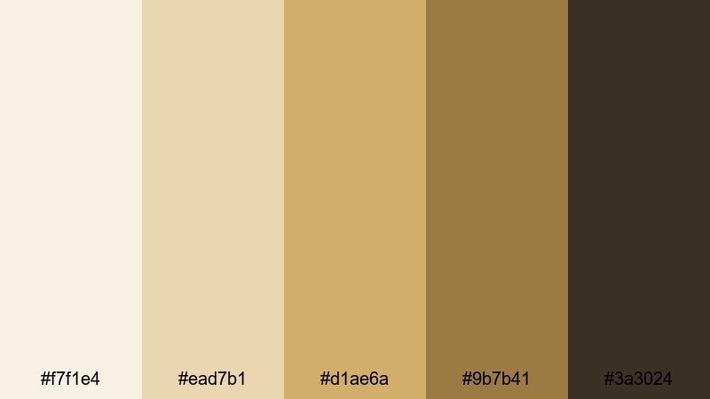
- HEX Codes: #f7f1e4, #ead7b1, #d1ae6a, #9b7b41, #3a3024
- Mood: Opulent, warm, and cinematic.
- Use for: Perfect for film festival bumpers, luxury product trailers, and dramatic title cards.
Gilded Pearl Premiere moves from soft Pearl ivory into molten gold and dark bronze, creating an instant red-carpet feel. It is warm and indulgent, with enough depth in the darker tones to handle dramatic lighting and bold typography.
Use it for festival bumpers, award intros, product launches, or any video that needs to scream premium. In Filmora, lean on the light Pearl for backgrounds, use the mid golds for frames or accent lines, and let the darkest bronze carry your titles and logo reveals.
Black Tie Pearl
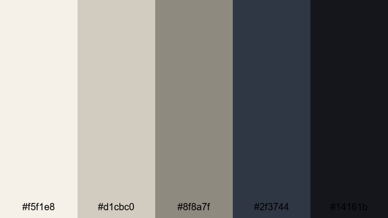
- HEX Codes: #f5f1e8, #d1cbc0, #8f8a7f, #2f3744, #14161b
- Mood: Sophisticated, cool, and dramatic.
- Use for: Great for cinematic trailers, channel rebrands, and logo reveals with a formal edge.
Black Tie Pearl contrasts soft Pearl neutrals with navy and near-black accents for a sharp, formal aesthetic. It has the energy of a gala night or high-end premiere, without feeling harsh or over-contrasted.
Use this palette for channel rebrands, cinematic trailers, or corporate openers. In Filmora, try light Pearl backgrounds, dark navy bars or shapes, and pure near-black for logos and titles to keep your visuals striking and easy to read.
Champagne Screen Pearl
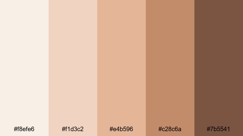
- HEX Codes: #f8efe6, #f1d3c2, #e4b596, #c28c6a, #7b5541
- Mood: Festive, warm, and celebratory.
- Use for: Ideal for event recaps, holiday campaigns, and launch countdowns.
Champagne Screen Pearl mixes champagne blush, Pearl, and caramel gold for a cozy, celebratory glow. It feels like warm lights and clinking glasses, perfect for any content built around milestones or events.
Use it for wedding or event recaps, holiday promos, and countdown timers. In Filmora, you can apply the lighter tones to countdown backgrounds, the mid golds to number frames or icons, and the richest browns to calls to action or key text for a warm, cinematic finish.
Midnight Gala Pearl
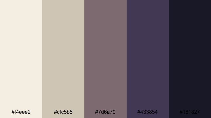
- HEX Codes: #f4eee2, #cfc5b5, #7d6a70, #433854, #181827
- Mood: Moody, elegant, and mysterious.
- Use for: Best for dramatic trailers, music videos, and dark luxury branding.
Midnight Gala Pearl starts with luminous Pearl and fades into plum and midnight blue, delivering a rich, after-dark atmosphere. The palette is dramatic yet refined, ideal for projects that need intrigue and sophistication.
Use it in music videos, dark luxury campaigns, or thriller-style trailers. In Filmora, let the light Pearl guide your highlights and on-screen text, and use the deep blues and plums for backgrounds, vignettes, and accent shapes to frame your subject with a cinematic, night-time feel.
Tips for Creating Pearl Color Palettes
When you build your own Pearl color palette for video and design, think about how Pearl will behave as a background, a highlight, or a supporting neutral so your footage, titles, and branding all stay clear and consistent.
- Pair Pearl with one deeper accent color (navy, plum, charcoal, or teal) to keep text readable on thumbnails, titles, and lower-thirds.
- Use warmer Pearls (with a hint of beige or blush) for lifestyle, beauty, and vintage edits, and cooler Pearls (with gray or blue) for tech, minimal, and modern aesthetics.
- Check your palette on both light and dark devices: export a test frame from Filmora and view it on phone and desktop to make sure your Pearl tones do not look washed out.
- Limit yourself to 3 or 4 active colors per screen (one background Pearl, one main text color, one highlight accent, plus optional subtle secondary) to avoid visual clutter.
- Match your Pearl palette to your footage: if your video is already warm, choose a warmer Pearl; if it is cool or blue-toned, shift Pearl slightly cooler so overlays feel natural.
- Keep brand elements consistent by always using the same HEX values for logos, titles, and buttons across intros, outros, and social clips.
- Use contrast carefully: light Pearl text on pure white can be hard to read, so combine light Pearl with darker backgrounds or add subtle drop shadows for clarity.
- Save your favorite Pearl looks as presets or template projects in Filmora so you can apply the same style quickly to new edits and maintain a strong visual identity.
Pearl color palettes are powerful tools for shaping mood, clarity, and brand identity. From soft romantic blushes to high-contrast gala tones, Pearl gives you a flexible base that flatters skin, softens harsh frames, and makes your edits feel more intentional and cinematic.
Experiment with the HEX codes above inside Filmora, mixing palettes with your own footage to see which combinations fit your channel or brand best. Once you lock in a Pearl aesthetic, use Filmora features like AI Color Palette, HSL, and LUTs to roll that look out across intros, B-roll, thumbnails, and social cuts.
The more consistently you use Pearl across your videos and graphics, the faster viewers will start to recognize your style at a glance in their feeds and recommendations.
secure download