
 100% Security Verified | No Subscription Required | No Malware

Pastel brown is one of the most versatile colors you can use on screen. It blends the warmth of classic brown with a soft, muted touch, creating feelings of comfort, trust, and calm. In color psychology, it often suggests stability, intimacy, and nostalgia, which is why you see it so often in lifestyle branding, cozy YouTube channels, and soft cinematic grading.
For video creators, vloggers, and designers, a pastel brown color palette is perfect for thumbnails, intros, channel art, title cards, and overlays that feel gentle but still professional. Below are 15 curated pastel brown color palettes with HEX codes you can plug directly into your branding or apply in Filmora to keep your visuals consistent across intros, b-roll, and social edits.
In this article
Soft & Romantic Pastel Brown Palettes
Blush Latte Morning
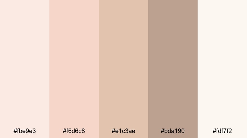
- HEX Codes: #fbe9e3, #f6d6c8, #e1c3ae, #bda190, #fdf7f2
- Mood: Gentle, dreamy, and intimate.
- Use for: Perfect for romantic vlogs, morning routines, and soft lifestyle thumbnails that need a warm, welcoming glow.
Blush Latte Morning feels like soft sunlight coming through a cafe window. The blend of blush pinks, latte browns, and creamy beige creates a hazy, slow-morning atmosphere that is tender and comforting without being overly sweet.
This palette works beautifully for romantic storytelling, GRWM videos, and aesthetic morning routines. Use the lighter tones for backgrounds, titles, and lower thirds, while the deeper latte shade adds just enough contrast for text and key elements in your thumbnails or intro screens.
Pro Tip: Keep Your Pastel Brown Aesthetic Consistent in Filmora
When you find a pastel brown palette you love, consistency across all your videos is what makes your channel look intentional and on brand. In Filmora, you can save your chosen HEX codes as custom colors and reuse them in text, overlays, shapes, and transitions so that every intro, B-roll sequence, and end screen shares the same Blush Latte Morning mood.
Combine these soft browns with gentle motion graphics and subtle fades in Filmora. Use the lightest color as a background for your titles, the medium browns for buttons or callouts, and the deepest shade for text or icons. This simple structure keeps your branding cohesive from YouTube thumbnails to Instagram reels.
AI Color Palette
If you already have a photo or mood board that captures your ideal pastel brown look, you can turn it into a full video style with Filmora. Filmora's AI Color Palette feature lets you sample colors from a reference image and apply that same tone across your entire edit.
Import a still frame with your Blush Latte Morning tones, use AI Color Palette to extract the color mood, and then match other clips to that reference. It is an easy way to keep your A-roll, B-roll, and cutaway shots in the same soft, romantic color family without manual tweaks on every clip.
 secure download

HSL, Color Wheels & Curves
Even within a pastel brown palette, different cameras and lighting conditions can shift your tones. With Filmora's HSL controls, color wheels, and curves, you can nudge oranges and yellows toward softer latte tones, lift the shadows to avoid harsh contrast, and gently warm up midtones for skin-friendly, romantic color grading.
If you want a slightly more cinematic take on pastel brown, adjust the curves to add a soft S-curve, lowering the blacks just a little and boosting highlights for a dreamy glow. You can dive deeper into grading workflows in Filmora's color correction tutorials and then apply those ideas to your own pastel brown projects.
secure download1000+ Video Filters & 3D LUTs
If you want to move fast, Filmora's built in looks can help you stylize any pastel brown palette in seconds. Filmora’s video filters and 3D LUTs make it easy to add warmth, vintage softness, or subtle matte contrast to your footage while still respecting your base colors.
Try stacking a gentle warm filter with a light vignette and reduced contrast to give your Blush Latte Morning palette a dreamy, cinematic feel. Once you like the result, save it as a custom preset and reuse it on thumbnails, reels, and future videos to keep your whole channel feeling like one cohesive pastel brown world.
secure downloadRosewood Macaron Dream
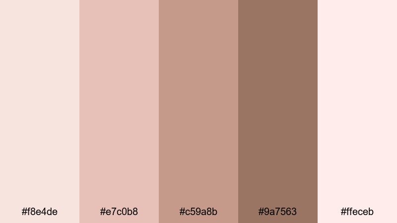
- HEX Codes: #f8e4de, #e7c0b8, #c59a8b, #9a7563, #ffeceb
- Mood: Delicate, nostalgic, and sweet.
- Use for: Use in beauty tutorials, wedding recap videos, and dreamy Instagram reels with soft, feminine branding.
Rosewood Macaron Dream mixes rose tinted browns with soft macaron pinks for a delicate, almost edible aesthetic. It has a nostalgic, film photograph feel that is perfect for romantic storytelling and feminine brands.
Use the pale pinks as background colors for titles or product callouts, and the deeper rosewood shade for text, icons, or logo accents. This palette fits beauty tutorials, bridal recaps, and Instagram reels where you want a sweet, polished look without loud saturation.
Dusty Cocoa Bouquet
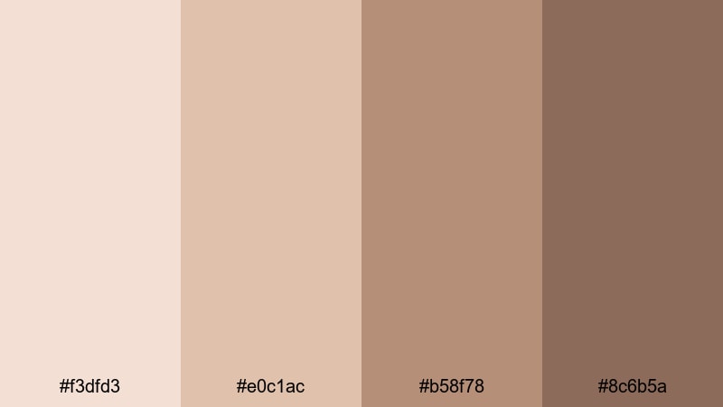
- HEX Codes: #f3dfd3, #e0c1ac, #b58f78, #8c6b5a
- Mood: Warm, grounded, and romantic.
- Use for: Ideal for cinematic B-roll, cozy date-night vlogs, and title cards that need subtle depth without harsh contrast.
Dusty Cocoa Bouquet leans into muted cocoa tones blended with soft floral neutrals. It feels grounded and romantic at the same time, adding depth without any stark or heavy contrast.
Use this palette when grading cinematic B-roll or date night vlogs where you want a warm, moody atmosphere that still looks soft. The mid and deep cocoa shades are great for text on overlays, while the lighter tones work for backgrounds in lower thirds, title cards, or chapter markers.
Champagne Mocha Whisper
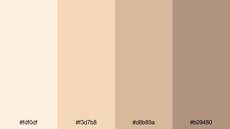
- HEX Codes: #fdf0df, #f3d7b8, #d8b89a, #b09480
- Mood: Elegant, airy, and refined.
- Use for: Great for luxe brand intros, product flatlays, and subtle lower-thirds in elegant tutorials or reviews.
Champagne Mocha Whisper pairs champagne beige with light mocha browns for an upscale, airy look. It feels refined and quietly luxurious, ideal for content that wants to communicate quality without shouting.
Apply this palette to product flatlays, beauty reviews, or luxury lifestyle intros. The lightest champagne shade is perfect for clean backgrounds, while the mid mocha tones can highlight prices, product names, or call to action buttons in thumbnails and overlays.
Minimal & Modern Pastel Brown Palettes
Clean Studio Taupe
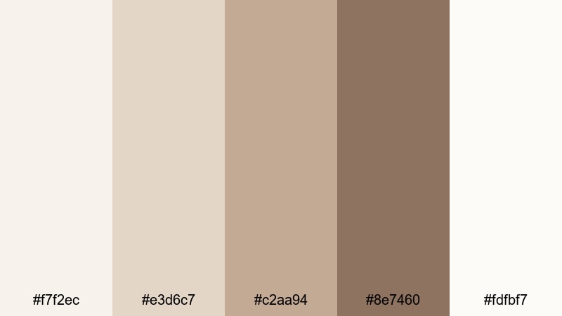
- HEX Codes: #f7f2ec, #e3d6c7, #c2aa94, #8e7460, #fdfbf7
- Mood: Minimal, professional, and calm.
- Use for: Perfect for channel branding, tech explainers, and on-screen UI elements that need a modern, neutral look.
Clean Studio Taupe feels like a bright, neutral photo studio. Soft taupes and off whites create a calm, focused environment where your content stands out without visual noise.
This palette is ideal for tech explainers, productivity videos, and modern channel branding. Use the light neutrals as full frame backgrounds, and rely on the darker taupe for text, buttons, and UI style graphics in your tutorials or product demos.
Muted Sand Interface
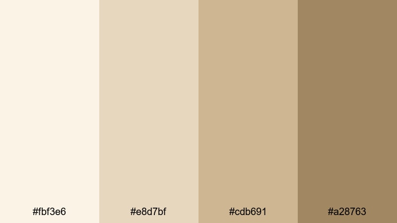
- HEX Codes: #fbf3e6, #e8d7bf, #cdb691, #a28763
- Mood: Balanced, neutral, and UI-friendly.
- Use for: Use for app mockups, lower-thirds, and infographic elements where clarity and warmth both matter.
Muted Sand Interface moves from pale cream to sandy browns, giving you a neutral base that still feels warm and human. It is designed to keep text readable and layouts clean.
Apply this palette to overlays, data callouts, and lower thirds in educational or UX focused videos. The mid sand tones are great for icons and diagrams, while the lightest cream can sit behind text or charts without stealing attention from your main footage.
Minimal Latte Grid
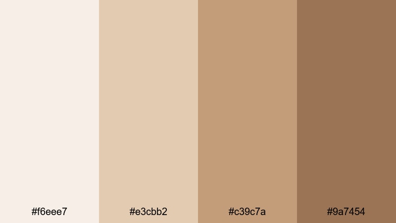
- HEX Codes: #f6eee7, #e3cbb2, #c39c7a, #9a7454
- Mood: Structured, stylish, and cozy-modern.
- Use for: Ideal for Instagram carousels, grid-based layouts, and minimalist channel art with a touch of warmth.
Minimal Latte Grid lines up latte inspired browns from pale foam to deep roast, which works especially well in structured layouts. It feels both modern and cozy, like a tidy workspace with a hot coffee nearby.
Use this palette for grid based Instagram posts, YouTube channel banners, and thumbnail templates. Alternate the lighter and darker tiles to create visual rhythm, and keep text mostly on the lightest shade for maximum readability.
Soft Stone Branding
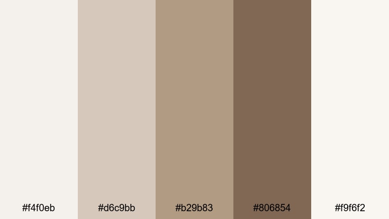
- HEX Codes: #f4f0eb, #d6c9bb, #b29b83, #806854, #f9f6f2
- Mood: Sophisticated, stable, and brand-ready.
- Use for: Best for logos, watermark designs, and cohesive brand kits across intros, outros, and overlays.
Soft Stone Branding is built from stone like neutrals and muted browns that feel solid and dependable. It is a strong choice for channels that want to look professional and timeless rather than trendy.
Use the deeper brown for your logo mark, watermark, or signature lower third, and rely on the lighter tones for backgrounds and frames. This palette works especially well when you want to build a full brand kit inside Filmora, from intro animations to end screen cards.
Cozy Lifestyle Pastel Brown Palettes
Autumn Cafe Corner
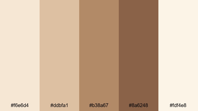
- HEX Codes: #f6e6d4, #ddbfa1, #b38a67, #8a6248, #fdf4e8
- Mood: Cozy, inviting, and story-rich.
- Use for: Perfect for cafe vlogs, journaling videos, and lo-fi study streams that need a warm, autumnal feel.
Autumn Cafe Corner blends cafe creams with rich autumn browns, instantly evoking the feeling of a quiet corner table and a warm drink. It is inviting and narrative friendly, great for slow paced, story driven content.
Use the lighter creams as background shades for text overlays or chapter titles, and the mid to deep browns for key accents and typography. This palette is ideal for vlogs, lo fi study streams, and cozy desk shots where you want viewers to feel they are right there with you.
Warm Blanket Story
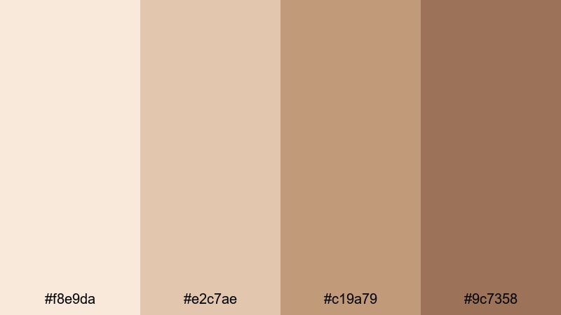
- HEX Codes: #f8e9da, #e2c7ae, #c19a79, #9c7358
- Mood: Comforting, intimate, and homely.
- Use for: Use in bedtime routines, home tours, and voiceover story videos for a comforting backdrop.
Warm Blanket Story layers gentle browns from pale cream to rich caramel, wrapping your visuals in a soft, comforting feel. It immediately suggests home, safety, and intimate moments.
Apply this palette to bedtime routines, home tour videos, or voiceover storytelling content. The lighter tones are perfect behind subtitles and captions, while the deeper browns can highlight important words, timestamps, or calls to action on screen.
Vintage Scrapbook Desk
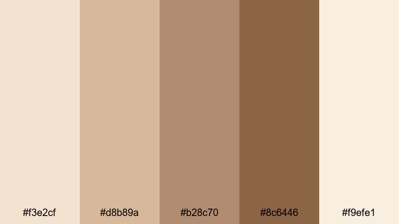
- HEX Codes: #f3e2cf, #d8b89a, #b28c70, #8c6446, #f9efe1
- Mood: Nostalgic, crafty, and tactile.
- Use for: Perfect for journaling reels, DIY videos, and scrapbook-style motion graphics or transitions.
Vintage Scrapbook Desk uses paper like creams and worn browns to recreate the look of an old desk covered in notes, photos, and tape. It has a handmade, tactile charm that suits creative and nostalgic content.
Use this palette in journaling reels, DIY tutorials, and motion graphics that mimic scrapbook layouts. The deeper browns are ideal for frames, borders, and faux tape, while the light creams can act as background for handwritten style fonts or Polaroid style overlays.
Caramel Cloud Afternoon
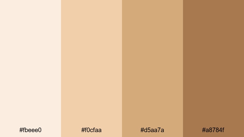
- HEX Codes: #fbeee0, #f0cfaa, #d5aa7a, #a8784f
- Mood: Sunlit, mellow, and comforting.
- Use for: Great for afternoon vlog sequences, recipe videos, and lifestyle thumbnails that feel warm but light.
Caramel Cloud Afternoon mixes caramel browns with soft golden tones to capture the glow of a slow, sunny afternoon. It feels mellow and uplifting, perfect for relaxed lifestyle content.
Use the lighter golds and creams for sky like or background elements, and the richer caramel shades for text, dividers, and highlight boxes on your thumbnails. It is especially effective in recipe videos, afternoon vlogs, or sunlit room tours.
Cinematic Pastel Brown Palettes
Desert Haze Frame
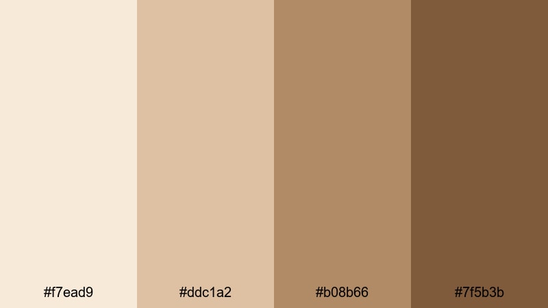
- HEX Codes: #f7ead9, #ddc1a2, #b08b66, #7f5b3b
- Mood: Cinematic, sun-baked, and adventurous.
- Use for: Use in travel vlogs, drone shots, and cinematic B-roll that needs a gentle desert-inspired grade.
Desert Haze Frame draws from dusty beiges and warm browns that echo sunlit desert scenes. It feels adventurous but still gentle, giving you cinematic warmth without harsh colors.
Apply this palette to travel vlogs, drone footage, and landscape B roll. Use the lighter hues for titles and location tags, and let the deeper browns guide your grading so shadows stay rich while highlights remain softly sun kissed.
Sepia Daylight Fade
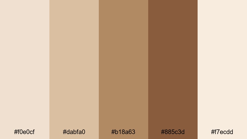
- HEX Codes: #f0e0cf, #dabfa0, #b18a63, #885c3d, #f7ecdd
- Mood: Retro, emotional, and filmic.
- Use for: Ideal for memory montages, family videos, and vintage-style edits that echo old film photography.
Sepia Daylight Fade uses soft sepia browns that step from pale to deep, recreating the warmth of aged film photographs. It carries a gentle, emotional tone suited to memories and storytelling.
Use this palette in family videos, memory montages, or story driven edits. The faded light browns are perfect for date stamps, subtitles, and chapter titles, while the deeper sepia shades can frame your footage with borders, vignettes, or film strip style overlays.
Smoky Toffee Credits
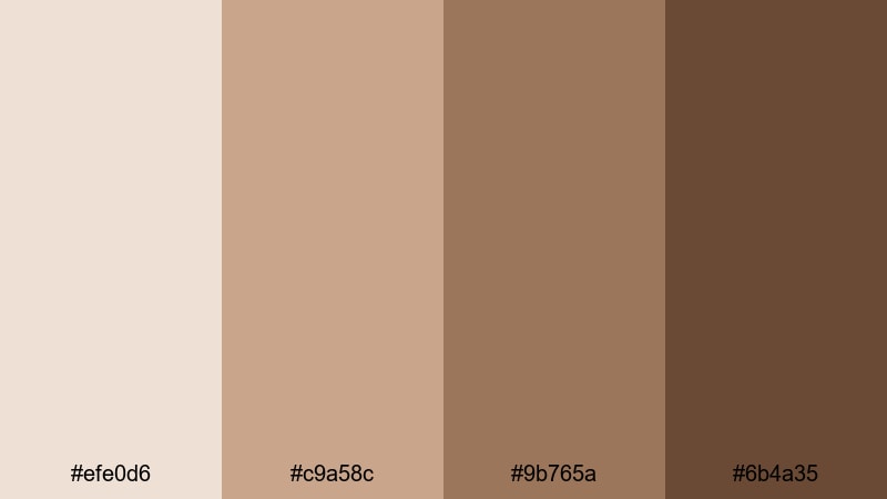
- HEX Codes: #efe0d6, #c9a58c, #9b765a, #6b4a35
- Mood: Moody, refined, and cinematic.
- Use for: Great for end credits, title cards, and dramatic thumbnails with a soft but serious tone.
Smoky Toffee Credits layers toffee browns with smoky, desaturated tones. It feels moody and refined, giving your video a serious, cinematic finish while staying softer than pure black and white.
Use this palette for opening titles, end credits, and dramatic thumbnails. The darkest shade works well as a background for white or light beige text, while the mid browns can highlight names, section titles, or key phrases in a stylish, understated way.
Tips for Creating Pastel Brown Color Palettes
Pastel brown looks simple, but small shifts in warmth, brightness, and contrast can change the mood of your whole video or design. Use these tips to combine pastel brown shades in a way that stays beautiful, readable, and on brand.
- Pair pastel brown with one or two accent colors only, such as soft blush, muted sage, or dusty blue, so your visuals stay calm and focused.
- Always check text readability: place dark brown or charcoal text on light beige backgrounds, and avoid mid tone on mid tone combinations that reduce contrast.
- Use the lightest pastel brown as a base for backgrounds, frames, and empty space, and reserve the darkest shade for key text, icons, and logos.
- Match your palette to your footage by slightly warming or cooling browns in Filmora until skin tones and backgrounds feel natural and cohesive.
- For thumbnails, add a small amount of contrast or a darker accent color so titles pop even when the overall palette is soft.
- Keep branding consistent: reuse the same 3 to 5 HEX codes across intros, lower thirds, subtitles, and end screens instead of picking new shades each time.
- When grading video, push saturation gently; pastel brown should look soft and creamy, not muddy or gray.
- Create presets in Filmora for your favorite pastel brown looks so you can apply them in one click to new clips, shorts, and social cutdowns.
Pastel brown color palettes are a powerful way to shape the mood of your videos and designs. From romantic vlogs to minimal branding and cinematic travel edits, these soft browns can make your channel feel warm, trustworthy, and instantly recognizable.
Experiment with the HEX codes in this guide, test different combinations in your thumbnails and overlays, and then refine the look with Filmora's color tools. Once you land on a signature pastel brown style, save it as a preset so every new upload carries the same cozy, professional aesthetic.
Whether you are editing a full length vlog, a short reel, or a looping background for live streams, Filmora makes it easy to keep your pastel brown theme consistent from your first frame to your final credits.
secure downloadNext: Fawn Color Palette
