
 100% Security Verified | No Subscription Required | No Malware

Pastel Gray sits in a sweet spot between warm neutrals and cool modern tones. It feels calm, balanced, and quietly sophisticated, which is why you see it so often in minimalist branding, lifestyle feeds, and cinematic vlogs. On screen, Pastel Gray does not fight for attention; instead, it lets your subject, story, and typography stand out while still giving everything a soft, curated look.
For video creators, Pastel Gray works beautifully in intros, lower thirds, YouTube thumbnails, overlays, and even full color grades. It pairs well with blush, lavender, sage, beige, and deep charcoal, so you can shift the mood from dreamy and romantic to edgy and cinematic without losing harmony. Below you will find 15 Pastel Gray color palettes with HEX codes, designed for editors, designers, and Filmora users who want consistent, aesthetic visuals across their projects.
In this article
Soft & Romantic Pastel Gray Palettes
Blush Cloud Morning
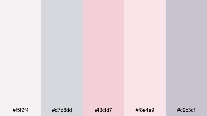
- HEX Codes: #f5f2f4, #d7d8dd, #f3cfd7, #f8e4e9, #c9c3cf
- Mood: Gentle, airy, and intimate, like a quiet sunrise through sheer curtains.
- Use for: Perfect for wedding highlight reels, engagement vlogs, and dreamy storytelling thumbnails.
Soft blush tones resting on calm Pastel Gray give this palette a light, romantic glow. The subtle pinks (#f3cfd7, #f8e4e9) feel like skin tones and petals, while the grays (#f5f2f4, #d7d8dd, #c9c3cf) keep everything balanced and modern instead of overly sweet.
Use Blush Cloud Morning when you want your videos to feel intimate and heartfelt: wedding films, proposal montages, couple travel vlogs, or poetic B-roll sequences. It also works beautifully for YouTube thumbnails, elegant title cards, and channel banners where you want soft contrast that still leaves plenty of space for text overlays and logos.
Pro Tip: Build a Cinematic Pastel Gray Romance in Filmora
To keep a romantic Pastel Gray vibe consistent, try designing all your key elements in Filmora with this palette in mind. Sample #f3cfd7 or #f8e4e9 for lower thirds and subscriber buttons, then use the lighter grays for intro backgrounds and end screens. Adjust your footage with a gentle color grade so skin tones lean slightly toward blush while whites and shadows stay in the Pastel Gray family.
Once your main look is set, save custom presets in Filmora so you can reuse the same tones in wedding teasers, Instagram Reels, and longer highlight edits without rebuilding the grade each time. This makes your entire storytelling series feel like one cohesive visual world.
AI Color Palette
You can quickly turn Blush Cloud Morning into a full video look using Filmora's AI Color Palette feature. Import a reference still that shows this palette clearly (for example a thumbnail concept or color card), then let AI analyze it and transfer the mood to your clips.
This is especially useful for wedding and lifestyle creators who work with multiple cameras or different lighting conditions. Instead of grading every shot from scratch, you can harmonize color across intros, vows, B-roll, and closing titles so everything shares the same soft Pastel Gray and blush atmosphere.
 secure download

HSL, Color Wheels & Curves
For fine-tuning Pastel Gray palettes like this one, use Filmora's HSL and color wheels to nudge your hues gently. You can desaturate blues and greens so backgrounds slide toward soft gray, or lift magenta and red in midtones to enhance that blushy, romantic feel without breaking skin tones. Curves let you keep highlights airy while keeping blacks slightly lifted, which matches the dreamy, low-contrast look of Pastel Gray.
If you are new to grading, follow along with a step-by-step guide in a video like this color grading tutorial for Filmora, then customize the same techniques for your own pastel aesthetic. Save your curves and wheel settings as presets so you can apply the same mood instantly across a whole playlist or brand series.
secure download1000+ Video Filters & 3D LUTs
Filmora's video filters and 3D LUTs make it easy to push your Pastel Gray palette toward a specific style. Try soft film LUTs to add gentle grain and contrast, or pastel-friendly filters that mute saturated colors while protecting skin tones. This is perfect when you want to turn ordinary footage into a cohesive romantic brand look in just a few clicks.
Combine LUTs with subtle adjustments to brightness and vignette to keep your viewer's eye on faces and details while the Pastel Gray background quietly supports the story. You can also apply filters just to adjustment layers, so your text overlays and animated graphics inherit the same pastel mood as your footage.
secure downloadDusty Rose Whisper
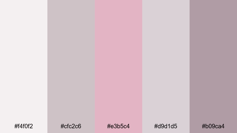
- HEX Codes: #f4f0f2, #cfc2c6, #e3b5c4, #d9d1d5, #b09ca4
- Mood: Nostalgic and tender, like an old love letter kept in a linen box.
- Use for: Ideal for storytelling shorts, soft product promos, and feminine lifestyle channels.
Dusty Rose Whisper combines muted rose, mauve, and hazy Pastel Gray for a palette that feels nostalgic and poetic. The muted pink (#e3b5c4) and mauve browns (#b09ca4) echo vintage prints, while the grays (#f4f0f2, #cfc2c6, #d9d1d5) keep the look soft and modern.
Use this palette for feminine product promos, stationery brands, journaling content, or lifestyle channels that lean into slow, intentional living. It is a strong choice for YouTube thumbnails, Instagram highlight covers, and lower thirds where you want gentle contrast but no harsh whites or blacks.
Lavender Veil Dream
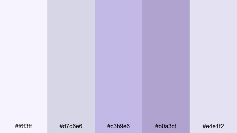
- HEX Codes: #f6f3ff, #d7d6e6, #c3b9e6, #b0a3cf, #e4e1f2
- Mood: Ethereal and soothing, with a hint of fantasy and magical calm.
- Use for: Use for self-care reels, dreamy lookbooks, and chill lo-fi music visuals.
Lavender Veil Dream floats between misty lilac and cool Pastel Gray, creating a palette that feels clean yet slightly otherworldly. The lavenders (#c3b9e6, #b0a3cf) add a gentle fantasy note, while the pale grays and whites (#f6f3ff, #d7d6e6, #e4e1f2) keep the frame bright and soothing.
Apply this palette to self-care content, meditation loops, ASMR videos, or fashion lookbooks with soft, flowing fabrics. It also works well for channel intros, lyric videos, and lo-fi visuals where you want a calm, dreamy backdrop for text, waveforms, or animations.
Powder Petal Glow
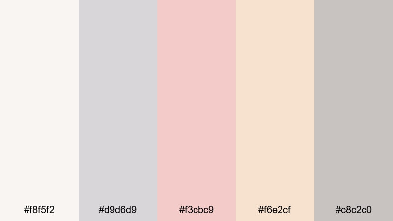
- HEX Codes: #f8f5f2, #d9d6d9, #f3cbc9, #f6e2cf, #c8c2c0
- Mood: Warm, powdery, and affectionate with a subtle editorial polish.
- Use for: Great for beauty tutorials, skincare reviews, and soft product flat lays.
Powder Petal Glow leans into warm creams and peachy pinks supported by soft Pastel Gray. Shades like #f3cbc9 and #f6e2cf feel like powder and blush, while the neutral grays (#f8f5f2, #d9d6d9, #c8c2c0) add an editorial, studio-like finish.
Use this palette when designing beauty thumbnails, skincare review lower thirds, or product flat lays where packaging should look clean and high-end. In Filmora, you can pick these tones for background plates behind text, animated callouts, and transitions to keep your whole channel identity light, warm, and approachable.
Minimal & Modern Pastel Gray Palettes
Urban Loft Haze
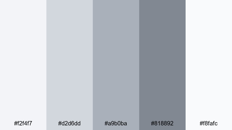
- HEX Codes: #f2f4f7, #d2d6dd, #a9b0ba, #818892, #f8fafc
- Mood: Sleek, urban, and understated, like a sunlit studio apartment.
- Use for: Perfect for tech reviews, workspace tours, and minimalist brand intros.
Urban Loft Haze is all about layered grays that feel clean, architectural, and refined. The cool midtones (#a9b0ba, #818892) suggest concrete and steel, while the near whites (#f2f4f7, #f8fafc) keep frames bright and minimal.
Use this palette for tech review channels, productivity content, and workspace tours where you want your gear and typography to pop against a neutral backdrop. In intros, titles, and thumbnail text, Urban Loft Haze gives a modern, clutter-free impression that suggests reliability and pro-level focus.
Clean Slate Interface
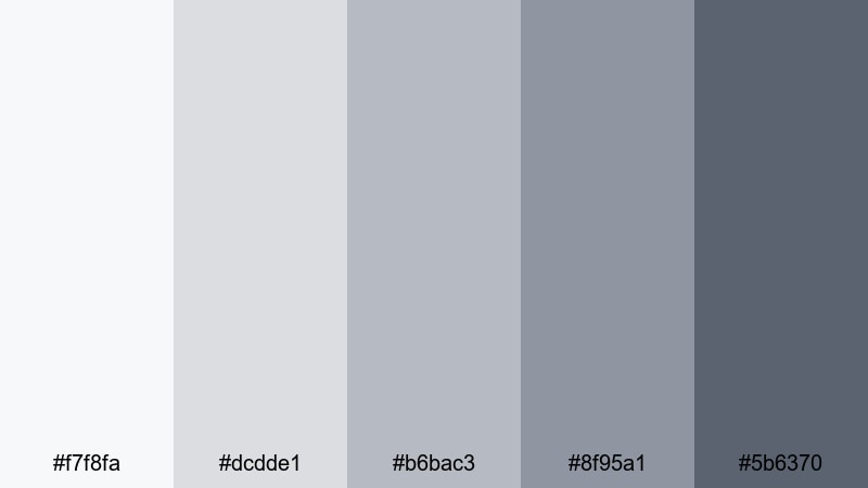
- HEX Codes: #f7f8fa, #dcdde1, #b6bac3, #8f95a1, #5b6370
- Mood: Crisp, efficient, and professional with a UI-inspired clarity.
- Use for: Best for app demos, tutorials, motion UI graphics, and SaaS explainers.
Clean Slate Interface looks like a well-designed dashboard: clean whites, structured Pastel Gray, and a darker accent (#5b6370) for emphasis. The progression of grays gives you easy steps for hierarchy: backgrounds, panels, and headline text.
This palette is ideal for screen-record tutorials, product explainers, and motion graphics showing mockups or flow diagrams. Use the lightest shades for backgrounds, mid grays for cards and overlays, and the darkest tone for icons, CTAs, or subtitles to ensure maximum readability on any device.
Nordic Concrete Calm
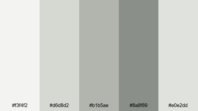
- HEX Codes: #f3f4f2, #d6d8d2, #b1b5ae, #8a8f89, #e0e2dd
- Mood: Natural, grounded minimalism inspired by Scandinavian interiors.
- Use for: Ideal for home decor vlogs, architectural edits, and brand lookbooks.
Nordic Concrete Calm puts soft concrete grays together with subtle, green-leaning neutrals. Shades like #b1b5ae and #8a8f89 feel like stone, plants, and linen, giving a grounded yet minimal atmosphere.
Use this palette for interior design tours, slow-living vlogs, eco-friendly brands, and architecture-focused edits. It makes titles, room labels, and callouts feel calm and intentional while letting natural materials and textures stay in the spotlight.
High Key Studio Light
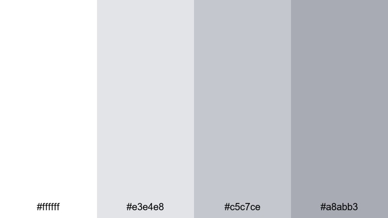
- HEX Codes: #ffffff, #e3e4e8, #c5c7ce, #a8abb3
- Mood: Bright, high-key, and editorial, like a photo studio cyclorama.
- Use for: Great for clean product shots, unboxings, and YouTube channel branding.
High Key Studio Light uses almost pure white with a few carefully chosen grays. The brightest tone (#ffffff) dominates, while #e3e4e8, #c5c7ce, and #a8abb3 add just enough depth to frame products and text.
This palette shines in unboxing videos, product hero shots, and channel branding where you want maximum clarity and minimal distraction. It is also ideal for overlay cards and info panels in tutorials, because dark text on these soft grays remains clear and easy to read even on mobile.
Cozy Lifestyle Pastel Gray Palettes
Soft Knit Sunday
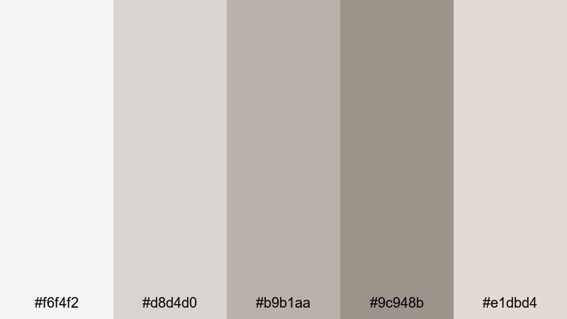
- HEX Codes: #f6f4f2, #d8d4d0, #b9b1aa, #9c948b, #e1dbd4
- Mood: Comforting and homely, like a slow morning wrapped in blankets.
- Use for: Perfect for cozy vlogs, reading nooks, and morning routine videos.
Soft Knit Sunday mixes warm taupes and Pastel Gray to mimic the look of knitted sweaters, blankets, and warm light. Midtones like #b9b1aa and #9c948b bring a gentle, coffee-colored warmth, while the lighter grays keep the palette soft and breathable.
Use this palette in morning routines, slow weekend vlogs, and cozy home content. It works well for journaling overlays, chapter cards, and end screens that should feel like part of the same inviting home environment viewers see in your footage.
Herbal Tea Steam
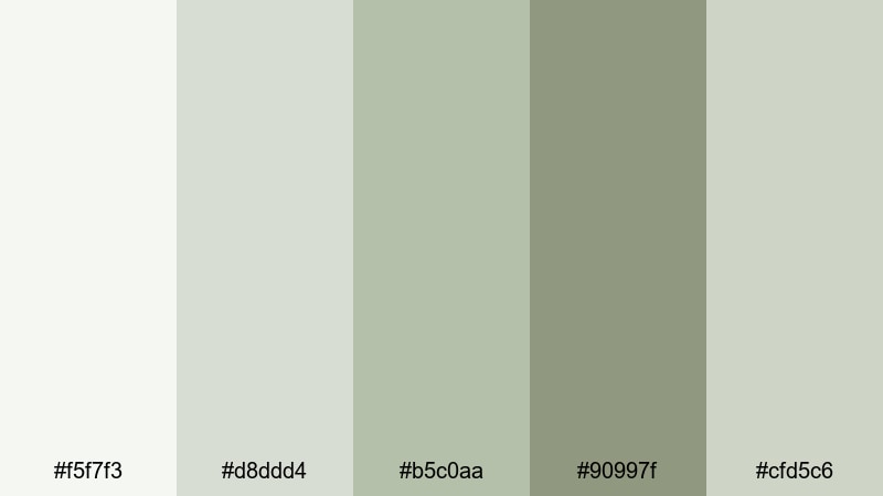
- HEX Codes: #f5f7f3, #d8ddd4, #b5c0aa, #90997f, #cfd5c6
- Mood: Clean yet organic, with a gentle wellness and spa-like feeling.
- Use for: Use for self-care routines, wellness brands, and calm recipe videos.
Herbal Tea Steam blends gentle greens with misty Pastel Gray, evoking plants, steam, and natural light. Tones like #b5c0aa and #90997f give an herbal, botanical feel, while #f5f7f3 and #cfd5c6 keep the palette light and airy.
Choose this palette for wellness-focused channels, yoga or meditation content, and cooking videos featuring fresh ingredients. It makes recipe titles, ingredient lists, and wellness tips feel soothing and trustworthy, especially when paired with relaxed pacing and soft background music.
Rainy Window Journals
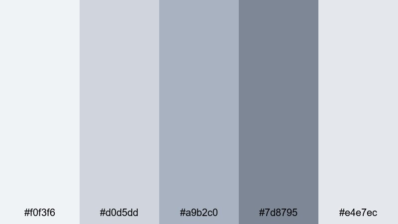
- HEX Codes: #f0f3f6, #d0d5dd, #a9b2c0, #7d8795, #e4e7ec
- Mood: Reflective, quiet, and slightly moody like a rainy afternoon indoors.
- Use for: Ideal for study-with-me streams, journaling content, and lo-fi edits.
Rainy Window Journals layers soft blues and Pastel Gray to mimic the look of rain on glass and open notebooks. The cooler midtones (#a9b2c0, #7d8795) introduce a calm, introspective mood, while the very light grays and blues keep visuals gentle and non-distracting.
This palette is perfect for study-with-me streams, time-lapse journaling shots, and lo-fi playlists. Use the darker shade #7d8795 for titles and timers, and the lighter tones for background plates behind playlists, to-do lists, and soft motion graphics.
Vanilla Smoke Kitchen
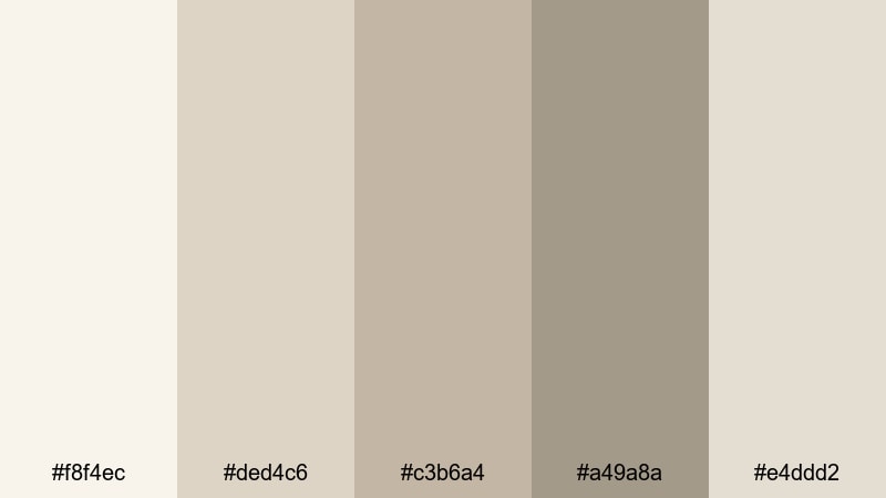
- HEX Codes: #f8f4ec, #ded4c6, #c3b6a4, #a49a8a, #e4ddd2
- Mood: Warm, inviting, and slightly rustic, like a slow bake in a tiny kitchen.
- Use for: Great for cooking channels, bake-with-me shorts, and lifestyle reels.
Vanilla Smoke Kitchen is full of creamy neutrals and smoky grays that feel like vanilla, flour, wood, and steam. The warm browns (#c3b6a4, #a49a8a) add rustic depth, while the lighter tones (#f8f4ec, #e4ddd2) keep everything bright enough for appetizing food shots.
Use this palette for baking videos, kitchen makeovers, or cozy lifestyle reels around food and family. It supports legible text for recipes and tips, while giving thumbnails and intro cards a cinematic, homey tone that feels authentic rather than overly polished.
Moody Cinematic Pastel Gray Palettes
Foggy Harbor Frame
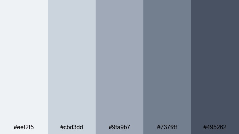
- HEX Codes: #eef2f5, #cbd3dd, #9fa9b7, #737f8f, #495262
- Mood: Cinematic and misty, like an indie film opening on a foggy pier.
- Use for: Perfect for travel films, atmospheric b-roll, and narrative shorts.
Foggy Harbor Frame uses deeper sea-grays and mist tones to create a coastal, filmic mood. The darker shades (#737f8f, #495262) offer strong contrast for text and silhouettes, while the lighter tones (#eef2f5, #cbd3dd, #9fa9b7) keep the visuals from feeling too heavy.
This palette suits travel films, narrative vlogs, and story-driven shorts where you want emotion and atmosphere without pure black. Use it in Filmora for subtle vignettes, lower thirds, and chapter cards that feel like stills from an indie movie.
Noir Pastel Overture
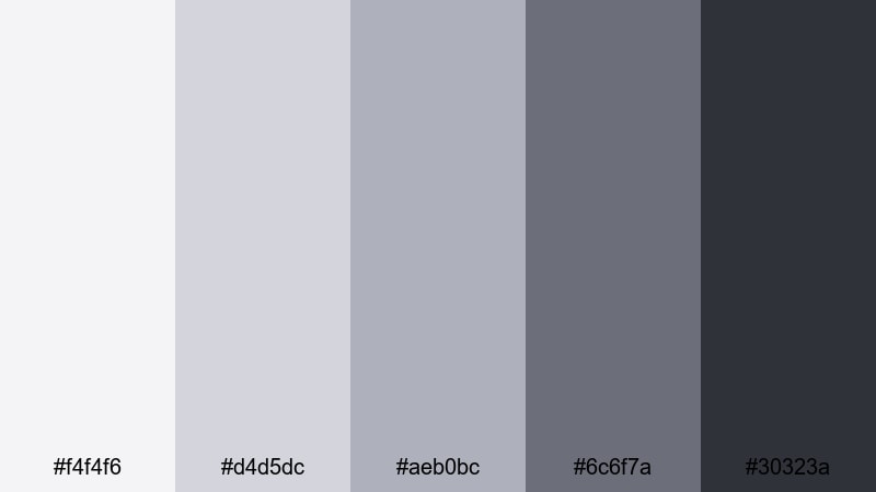
- HEX Codes: #f4f4f6, #d4d5dc, #aeb0bc, #6c6f7a, #30323a
- Mood: Subtly mysterious, merging softness with a touch of noir drama.
- Use for: Best for title cards, teasers, trailers, and stylized commentary videos.
Noir Pastel Overture moves from pale Pastel Gray into rich charcoal, creating a soft-noir gradient. The darker base (#30323a) adds cinematic drama, while mid grays (#aeb0bc, #6c6f7a) give you flexible tones for backgrounds and overlays.
Use this palette for teasers, trailers, and commentary videos with a slightly mysterious or analytical tone. It is a solid choice for bold text-driven thumbnails, especially when you want to highlight white or light gray typography against darker frames without going full black.
Midnight Alley Mist
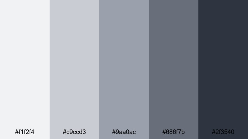
- HEX Codes: #f1f2f4, #c9ccd3, #9aa0ac, #686f7b, #2f3540
- Mood: Edgy yet soft, like city lights diffused through late-night fog.
- Use for: Use for urban b-roll, fashion editorials, and moody vlog chapters.
Midnight Alley Mist pairs smoky blues and deep grays with a soft Pastel Gray base. The dark accent (#2f3540) suggests alley shadows, while midtones (#9aa0ac, #686f7b) feel like concrete under streetlights. The lighter tones keep enough air in the frame to avoid a heavy, crushed look.
Use this palette for fashion editorials, urban B-roll, and moody segments in your vlogs or short films. It works especially well when you add neon or warm light accents in the footage, since the cool Pastel Gray background lets those highlights glow without clashing.
Tips for Creating Pastel Gray Color Palettes
Pastel Gray is a powerful base for balanced, cinematic visuals, especially when you combine it thoughtfully with accent colors, typography, and light. These tips will help you build and apply your own Pastel Gray color schemes for video and design.
- Start with one anchor gray: choose a main Pastel Gray and build 2 lighter and 2 darker tones around it for backgrounds, panels, and text.
- Add 1 to 2 accent colors: pair Pastel Gray with blush, lavender, sage, or deep charcoal, and reserve accents for CTAs, icons, and key details.
- Check text readability: always test white, black, and dark-gray text over your Pastel Gray shades to make sure subtitles and titles are easy to read on mobile.
- Match your footage temperature: if your clips are warm (golden hour, interior lamps), lean into warmer grays; for cooler cityscapes or tech content, pick blue-leaning grays.
- Keep brand consistency: reuse the same HEX codes in your thumbnails, titles, lower thirds, and end screens so your channel feels like one unified brand.
- Use gradients sparingly: gentle gradients between two grays or gray plus an accent can add depth, but avoid strong, multi-color gradients that fight your footage.
- Test on different screens: preview your palette in Filmora on light and dark UI backgrounds and export short clips to see how the colors look on phones and laptops.
- Save presets and templates: once you find a Pastel Gray look you like, save color presets, title templates, and thumbnail layouts so you can recreate it quickly for every new video.
Pastel Gray palettes are versatile enough to support romantic stories, minimal tech edits, cozy lifestyle content, and moody cinematic sequences. By choosing the right combination of grays and soft accent colors, you can shape how your audience feels about your channel and your brand in just a few frames.
Use these 15 palettes as starting points, then refine them inside Filmora with color tools, filters, and templates that match your own style. The more consistently you apply your Pastel Gray scheme, the more recognizable and professional your videos will look across YouTube, Instagram, TikTok, and beyond.
Take a few of your favorite palettes from this guide, drop them into Filmora, and experiment with intros, thumbnails, and short edits. You will quickly see how a cohesive Pastel Gray color story can turn simple footage into a polished, cinematic experience.
secure downloadNext: Circus Color Palette
