
 100% Security Verified | No Subscription Required | No Malware


 ChatGPT
 Perplexity
 Gemini
 Claude
 Grok
Grok
Pharmacy colors sit in a calming space between mint, teal, white, and soft blue. They instantly signal cleanliness, safety, and modern healthcare, which is why you see them in hospitals, clinics, health apps, and pharmacy chains around the world. Used well, a pharmacy color palette can make your videos, thumbnails, and graphics feel more trustworthy and easier to understand.
This guide brings together 15 pharmacy color palettes with HEX codes you can copy straight into your brand kit, motion graphics, or YouTube edits. Whether you edit in Filmora or design thumbnails, intros, explainers, or UI mockups, these pharmacy color combinations give you ready-made looks for clean medical branding, soothing patient stories, and cinematic hospital scenes.
In this article
Clean & Clinical Pharmacy Color Palettes
Sterile Lab Light
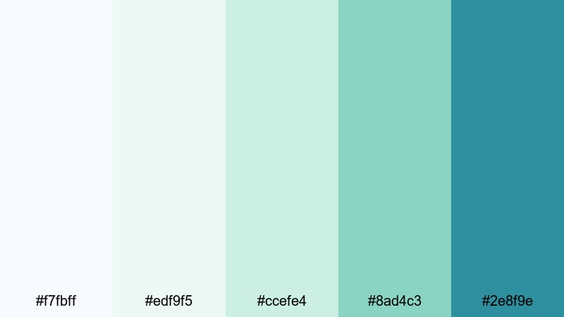
- HEX Codes: #f7fbff, #edf9f5, #ccefe4, #8ad4c3, #2e8f9e
- Mood: Ultra-clean, professional, and reassuring.
- Use for: Ideal for medical explainer videos, health app interfaces, and sterile title cards that need maximum clarity.
Sterile Lab Light is a crisp mix of almost-white, soft aqua, and mint that instantly feels hygienic and precise. The bright highlights keep everything feeling open and breathable, while the deeper teal adds just enough contrast for buttons, titles, and data overlays.
Use this palette for hospital promo videos, pharma brand intros, and lower thirds that need to look clinical but still approachable. In video thumbnails and YouTube channel art, it works well with clean product shots, line icons, and simple typography to signal a serious, science-forward approach.
Pro Tip: Enhance Your Pharmacy Visuals With Filmora
When you build a clean palette like Sterile Lab Light, consistency is everything. In Filmora, you can reuse this teal and mint look across intros, explainer sections, and end screens by saving titles, lower thirds, and overlays as presets. That way, every video on your health channel carries the same recognizable pharmacy aesthetic.
Color tools in Filmora also make it easy to subtly cool down your footage so that whites, walls, and lab coats match the soft blue-greens in this palette. A slight temperature and tint adjustment, combined with consistent overlays, keeps your brand looking unified even when clips come from different cameras or locations.
AI Color Palette
If you already created a reference image or brand card using Sterile Lab Light, you can let Filmora spread that pharmacy look across your entire edit. Filmora's AI Color Palette feature analyzes the colors in your reference and applies a matching grade to other clips in just a few clicks.
Drop your lab B-roll, talking head shots, and product close-ups into the same timeline, then use AI Color Palette to keep the whites neutral, the aquas soft, and the teals consistent. This is especially useful for YouTube series, ad campaigns, and social cutdowns where every piece should feel like part of the same medical brand story.
 secure download

HSL, Color Wheels & Curves
To refine a pharmacy palette, HSL, color wheels, and curves are your best friends in Filmora. You can gently desaturate skin tones while boosting teal accents, cool the midtones for a more clinical feel, or lift the highlights so whites stay bright and clean without blowing out details.
Use the HSL panel to target cyan, aqua, and green precisely, shifting them toward your HEX references and dialing in saturation to avoid harsh neon. Then, in the color wheels and curves, you can give the shadows a subtle teal push for a cinematic hospital vibe, similar to techniques shown in Filmora's advanced color correction tutorials.
secure download1000+ Video Filters & 3D LUTs
Once your pharmacy palette is balanced, you can stylize it in seconds with Filmora. Filmora's video filters and 3D LUTs make it easy to add a soft glow, vintage medical drama feel, or slightly futuristic teal tint while keeping your HEX colors recognizable.
Try stacking a clean base grade with a light cinematic LUT to give your pharmacy greens and aquas more depth. You can save this stack as a custom preset and apply it across entire video series, ensuring that your thumbnails, talking heads, and B-roll always share the same polished medical look.
secure downloadWhite Coat Clarity
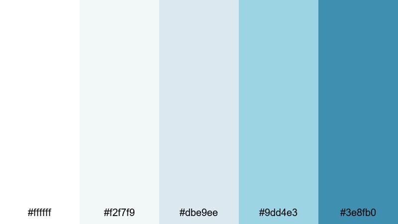
- HEX Codes: #ffffff, #f2f7f9, #dbe9ee, #9dd4e3, #3e8fb0
- Mood: Pure, trustworthy, and precise.
- Use for: Great for clean brand kits, whiteboard animations, and medical how-to content on YouTube.
White Coat Clarity leans into bright whites and pale, technical blues that feel like polished steel and new lab equipment. It is perfect when you want your visuals to scream precision, cleanliness, and no-nonsense information.
Apply this palette in whiteboard explainer videos, channel branding, and step-by-step how-to thumbnails. Use the deep blue as your primary accent for titles and icons, while the softer blues and whites build understated backgrounds that keep viewers focused on text and diagrams.
Prescription Counter Glow

- HEX Codes: #fefaf4, #f3f8ff, #cde8ff, #7bc0ff, #28a6ba
- Mood: Orderly, welcoming, and lightly energetic.
- Use for: Best for storefront bumpers, product shelves in motion graphics, and pharmacy commercial openers.
Prescription Counter Glow mixes warm cream with cool pharmacy blues, recreating the feeling of a bright, tidy counter under soft fluorescent lights. The light tones keep things approachable and friendly, while the stronger blues add structure and emphasis.
Use this palette in retail-focused intros, animated shelf tours, and offer banners. The deeper aqua is excellent for price tags and call-to-action buttons in thumbnails, while the pale blues work behind product shots and testimonials without stealing attention.
Antiseptic Mint Breeze
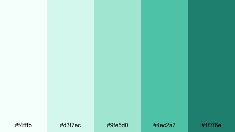
- HEX Codes: #f4fffb, #d3f7ec, #9fe5d0, #4ec2a7, #1f7f6e
- Mood: Refreshing, hygienic, and soothing.
- Use for: Use in product demo overlays, ingredient callouts, and packaging mockups that must feel ultra fresh and safe.
Antiseptic Mint Breeze layers light mint, aqua, and teal to give a cool, just-cleaned feeling. The colors are soft enough not to look harsh but still clearly associated with disinfectants, skincare, and wellness products that promise purity.
In video, this palette works beautifully for ingredient breakdowns, animated labels, and overlay graphics on top of white backgrounds. Use the darker teal for key text and icons, the mid mints for badges and panels, and keep the palest shades for backgrounds and subtle glows around products.
Fluorescent Aisle Shine
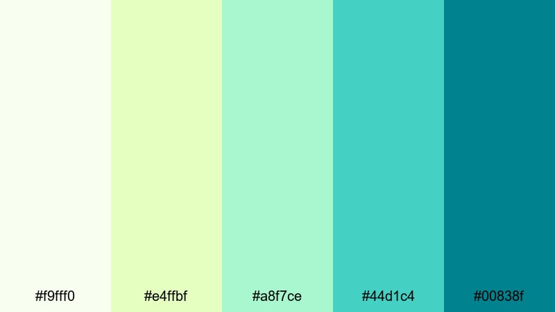
- HEX Codes: #f9fff0, #e4ffbf, #a8f7ce, #44d1c4, #00838f
- Mood: Bright, lively, and modern-clinical.
- Use for: Perfect for retail-focused ads, in-store promo screens, and animated price tags in pharmacy videos.
Fluorescent Aisle Shine blends citrus-tinted whites with minty greens to echo brightly lit rows of pharmacy shelves. The subtle yellow-greens add a hint of energy, while the teal anchor keeps things grounded in a trustworthy medical context.
Use this palette in animated sales graphics, loyalty-program promos, and in-store displays. The bold teal is perfect for CTAs, while the fresher greens make discounts and percentages pop in thumbnails and short-form social clips.
Soft & Calming Pharmacy Color Palettes
Pastel Pill Comfort
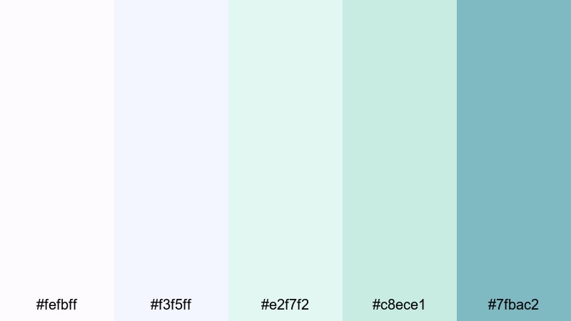
- HEX Codes: #fefbff, #f3f5ff, #e2f7f2, #c8ece1, #7fbac2
- Mood: Gentle, reassuring, and patient-centered.
- Use for: Ideal for patient journey stories, recovery montages, and empathetic educational content.
Pastel Pill Comfort feels like a handful of soft capsules in lavender-tinted white and mint. It instantly lowers visual tension thanks to its hushed tones and slightly dreamy atmosphere.
Use this palette for recovery vlogs, guided meditations around health, and sensitive topics like chronic illness or mental wellness. Soft gradients between the pale blues and mints make soothing backgrounds for lower thirds, captions, and friendly thumbnails where empathy is the main message.
Quiet Waiting Room
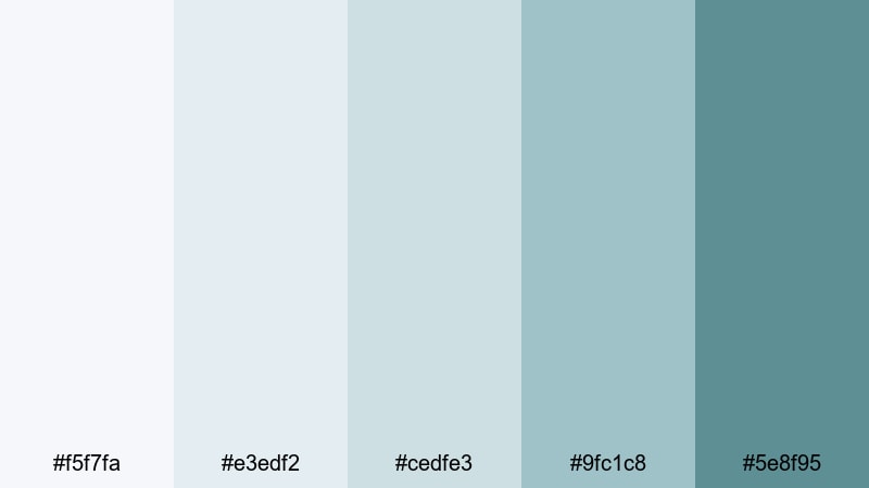
- HEX Codes: #f5f7fa, #e3edf2, #cedfe3, #9fc1c8, #5e8f95
- Mood: Subdued, calm, and contemplative.
- Use for: Great for testimonial videos, long-form health explainers, and backgrounds for on-screen text.
Quiet Waiting Room uses muted blues and soft greys to create a calm, almost neutral space. It feels like sitting in a softly lit lobby with a low background hum, making it ideal when you want visuals that support, not distract from, the message.
Use the lighter tones as backdrop colors for long text sections, closed captions, or data overlays in health documentaries and interviews. The mid and dark blues can then carry logos, lower thirds, and chapter markers while keeping the overall look understated and professional.
Gentle Recovery Ward

- HEX Codes: #fff8f5, #f2f9f7, #dbeee8, #b1ddd2, #6ea79b
- Mood: Hopeful, nurturing, and restorative.
- Use for: Use for recovery timelines, wellness vlogs, and post-surgery care guides where warmth and optimism matter.
Gentle Recovery Ward mixes warm off-whites with soft greens to show healing, not just treatment. It has a subtle sunrise quality that conveys progress, caring staff, and slow but steady improvement.
Use this palette in before-and-after sequences, patient success stories, and lifestyle B-roll about healthier routines. The warm whites suit skin tones, while the green shades work well for overlay shapes, checkmarks, and step-by-step guidance graphics.
Infusion Drip Serenity
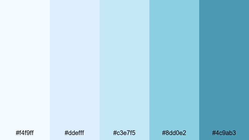
- HEX Codes: #f4f9ff, #ddefff, #c3e7f5, #8dd0e2, #4c9ab3
- Mood: Cool, steady, and quietly optimistic.
- Use for: Best for motion graphics around treatments, dosage timelines, and calm explainer lower thirds.
Infusion Drip Serenity is built from transparent-feeling blues that recall IV fluids and clear solutions. It delivers a sense of order and precision while still holding a thread of empathy and hope.
Use this palette for treatment animations, dosage charts, and step-by-step explainer sequences. The darker blue is ideal for key milestones and title cards, while the lighter shades make great backgrounds for subtle animated lines, arrows, and progress indicators in your Filmora edits.
Calm Dosage Chart
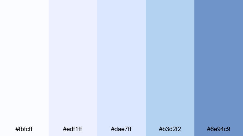
- HEX Codes: #fbfcff, #edf1ff, #dae7ff, #b3d2f2, #6e94c9
- Mood: Organized, gentle, and reassuringly structured.
- Use for: Great for chart animations, infographics, and step-by-step adherence guides in health content.
Calm Dosage Chart uses soft periwinkles and blue-violets to make complex medical information feel less intimidating. It transforms rigid tables into visually friendly graphics while preserving a serious, data-driven tone.
Apply this palette to animated bar charts, timelines, and adherence checklists in tutorials and healthcare explainer videos. Use the deepest blue-violet for axes and titles, with the lighter blues filling bars, segments, and icons so viewers can follow instructions easily.
Bold & Professional Pharmacy Color Palettes
Pharma Brand Impact
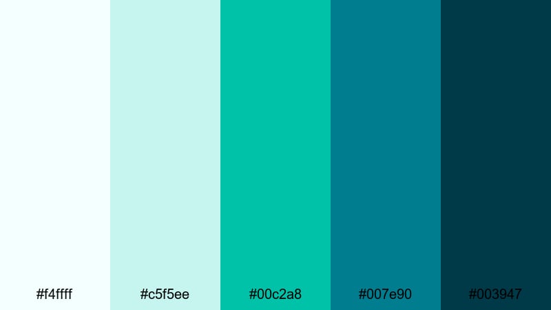
- HEX Codes: #f4ffff, #c5f5ee, #00c2a8, #007e90, #003947
- Mood: Confident, innovative, and brand-forward.
- Use for: Ideal for logo stings, channel branding, and launch campaigns for modern pharmaceutical or health-tech brands.
Pharma Brand Impact combines bright aqua accents with deep teal foundations for a sharp, tech-savvy look. It feels modern and forward-thinking, making it ideal for startups, biotech innovations, and digital health platforms.
Use the darkest teal as a strong background for logo animations and hero titles, while the vivid aqua highlights motion graphics, UI elements, and key stats. In thumbnails, this palette pops against white or black devices, lab gear, or doctor portraits.
Emergency Cross Signal

- HEX Codes: #fff9f9, #ffd6d7, #ff5a6b, #008f9b, #004b55
- Mood: Urgent, decisive, yet controlled.
- Use for: Best for emergency care content, alert banners, and call-to-action frames in health videos.
Emergency Cross Signal marries soft medical reds with cool teals to communicate urgency without triggering panic. The red draws instant attention, while the teal palette pulls the mood back into a calm, professional zone.
Use this palette for on-screen alerts, emergency service promos, and high-priority CTAs at the end of educational content. Let red handle warning icons and buttons, while teal backgrounds, lower thirds, and titles keep everything readable and balanced.
Urban Apothecary Chic
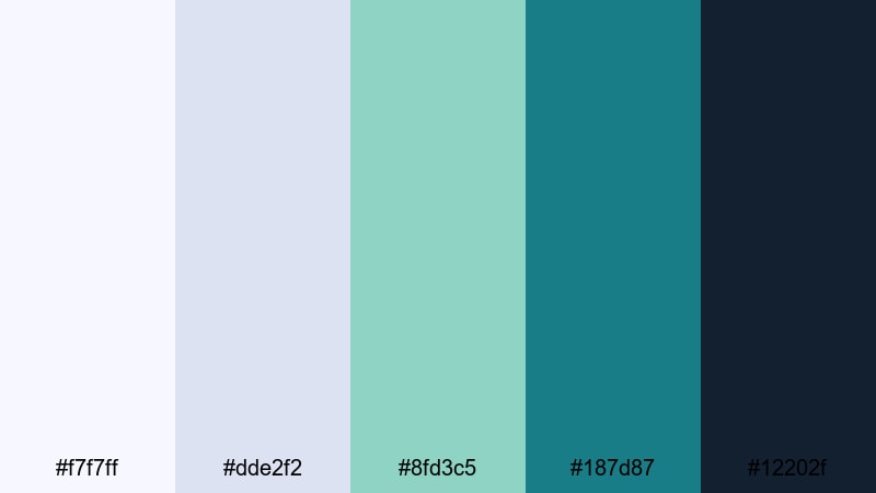
- HEX Codes: #f7f7ff, #dde2f2, #8fd3c5, #187d87, #12202f
- Mood: Trendy, upscale, and boutique-clinical.
- Use for: Great for aesthetic pharmacy vlogs, skincare promos, and lifestyle-infused health content on social media.
Urban Apothecary Chic pairs cool indigo whites and seafoam greens with inky navy, creating a boutique pharmacy look. It feels premium and Instagram-ready, while still clearly tied to cleanliness and wellness.
Use this palette in skincare campaigns, aesthetic vlogs shot in stylish clinics, and social media shorts. The dark navy grounds text and logos, the teal and seafoam colors highlight products, and the pale indigo tones soften backgrounds and titles for a high-end but approachable vibe.
Night Shift Neon
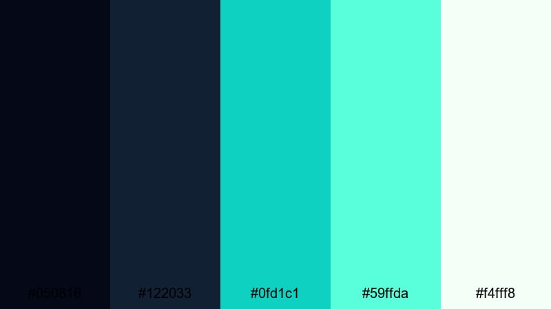
- HEX Codes: #050816, #122033, #0fd1c1, #59ffda, #f4fff8
- Mood: Futuristic, energetic, and cinematic.
- Use for: Perfect for B-roll of night shifts, tech-heavy diagnostics, and dramatic cinematic sequences in hospital dramas.
Night Shift Neon throws glowing teal and mint accents onto a bed of deep midnight blues. It is packed with contrast and drama, ideal for cinematic edits that focus on overnight shifts, high-tech labs, or critical care environments.
Use the darkest blues for backgrounds and letterboxing, then let the neon teals pick out heart monitors, HUD-style graphics, and animated data lines. In thumbnails, strong diagonal shapes in teal against a dark frame can instantly signal intensity and high stakes.
Clinical Tech Interface
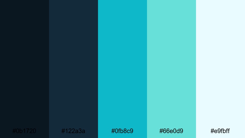
- HEX Codes: #0b1720, #122a3a, #0fb8c9, #66e0d9, #e9fbff
- Mood: High-tech, analytical, and precise.
- Use for: Best for UI mockups, dashboard animations, and data-heavy sequences in health-tech explainers.
Clinical Tech Interface combines deep interface blues with luminous cyans, echoing professional dashboards and smart pharmacy systems. It looks analytical and advanced, but the light aqua and off-white keep it user-friendly.
Use this palette to build animated dashboards, app previews, and data visualizations within your Filmora projects. The darker blues make excellent backplates for charts and widgets, while the cyans and pale blue-whites highlight active states, alerts, and key performance metrics on screen.
Tips for Creating Pharmacy Color Palettes
Pharmacy color palettes work best when they balance cleanliness, readability, and emotional tone. Use these tips to adapt the HEX codes above to your own brand, videos, and design projects.
- Keep whites and off-whites dominant to preserve a clean, clinical base; use mints, teals, and blues as supporting accents rather than overwhelming the frame.
- Maintain strong contrast between text and background (especially for subtitles, titles, and UI labels) by pairing dark teal or navy with very light blues or creams.
- Limit bold accent colors like red or neon teal to CTAs, warnings, and key data points so viewers instantly know where to look.
- Match your grade to your palette: cool down footage slightly for a more clinical feel, or add a touch of warmth for empathy-focused patient stories.
- Use gradients between closely related pharmacy tones (for example mint to aqua, or light blue to white) to add depth without cluttering the design.
- Test your palette on multiple devices and in thumbnail size to ensure icons, logos, and text remain readable at small scales.
- Build a simple style guide in Filmora: choose one background color, one main text color, and one accent color, then reuse them across templates and presets.
- When combining pharmacy colors with brand colors outside this range, make sure the additional hues do not undermine the sense of cleanliness or safety (avoid muddy or overly saturated clashes).
Pharmacy color palettes are powerful tools for shaping trust, clarity, and emotion in health-related content. From gentle recovery vlogs to bold health-tech launches, the right mix of teal, mint, and clean white can make your brand instantly recognizable and your message easier to absorb.
Use the HEX codes in this guide as starting points, then refine them inside Filmora to match your footage and storytelling style. With AI Color Palette, HSL controls, and LUTs, you can keep your pharmacy aesthetics consistent across intros, tutorials, shorts, and full-length videos.
The more you experiment with these combinations, the faster you will discover a signature pharmacy look that fits your channel, clinic, or campaign. Save your favorite grades and presets in Filmora so every new edit feels on-brand from the first frame.
secure downloadNext: Fall Color Palette
