
 100% Security Verified | No Subscription Required | No Malware


 ChatGPT
 Perplexity
 Gemini
 Claude
 Grok
Grok
Pink maroon sits between gentle blush and deep wine, mixing the sweetness of pink with the confidence of dark red. It feels romantic, warm, and slightly mysterious, which makes it perfect for telling emotional stories, hinting at luxury, or adding a cinematic edge to everyday content.
For video creators, YouTubers, and brand designers, pink maroon works beautifully in thumbnails, title cards, intros, lower thirds, overlays, and social media graphics. Below are 15 pink maroon color palettes with exact HEX codes, tailored for Filmora users and other creators who want consistent, aesthetic color across edits and branding.
In this article
Soft & Romantic Pink Maroon Color Palettes
Blush Velvet Romance
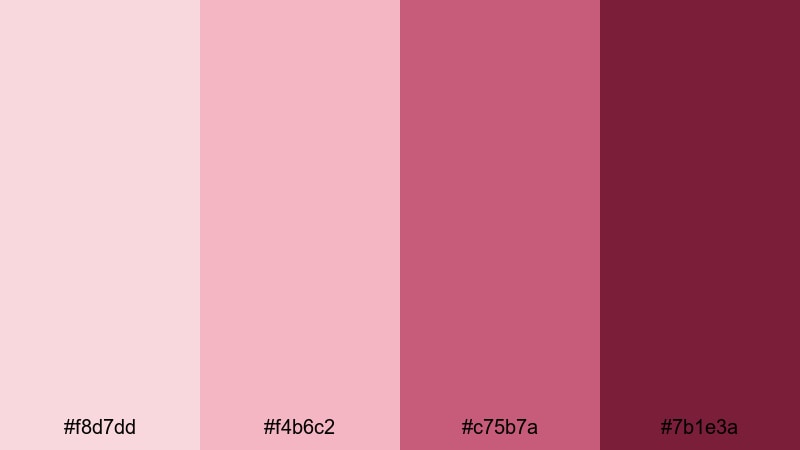
- HEX Codes: #f8d7dd, #f4b6c2, #c75b7a, #7b1e3a
- Mood: Tender, intimate, and warmly nostalgic.
- Use for: Ideal for wedding highlight videos, engagement reels, and romantic title cards that need a soft yet grounded touch.
Blush Velvet Romance layers light, airy pinks over rich maroon, like velvet ribbon over a vintage love letter. The gentle top tones keep your visuals soft and approachable, while the deep maroon anchor shade adds maturity and depth so the look never feels childish.
Use the lighter HEX codes for backgrounds, lower thirds, and text boxes in wedding highlight films or proposal edits. Reserve the darkest maroon for key titles, logo accents, and thumbnail borders to pull the viewer in. This palette works especially well for romantic intros, anniversary slideshows, and heartfelt brand storytelling where emotion and elegance are the focus.
Pro Tip: Build a Cinematic Pink Maroon Look in Filmora
To keep this romantic pink maroon mood consistent, create a simple brand kit inside Filmora. Use Blush Velvet Romance for your intro title, lower thirds, and end screen, then copy those presets across your timeline so every clip feels like part of the same story.
Combine soft blush backgrounds with subtle vignette effects, and use the deepest maroon for bold typography or logo reveals. This helps your wedding reels, reels-style shorts, and long-form videos all share the same polished, cinematic identity.
AI Color Palette
If you have a photo from a wedding bouquet, invitation suite, or fabric swatch that already matches this palette, you can turn it into a grading reference. Filmora's AI Color Palette feature lets you sample colors from that image and apply the same tones across your entire edit.
Import the reference frame, match the color style to your clips, and Filmora will push your footage toward those blush and maroon values automatically. This keeps skin tones flattering while giving the whole video a soft, cohesive, pink maroon glow.
 secure download

HSL, Color Wheels & Curves
After matching the overall mood, fine-tune your pink maroon tones with Filmora's color tools. Use HSL to gently desaturate any overly bright pinks, or to enrich the maroon shadows for a more cinematic, evening feel. Color wheels are perfect for warming highlights toward blush and cooling shadows into deeper wine tones.
If some shots feel flat, add a soft S-curve in the Curves panel to increase contrast while protecting skin tones. For a deeper dive into these tools, explore Filmora's color correction workflow and adapt the steps to your pink maroon aesthetic.
secure download1000+ Video Filters & 3D LUTs
Once your base colors are set, you can speed up styling with ready-made looks. Filmora's video filters and 3D LUTs make it easy to push your pink maroon palette toward soft pastel romance, glossy luxury, or moody cinema with just a few clicks.
Apply a gentle film LUT on top of Blush Velvet Romance to mimic analog wedding footage, or stack glow and vignette filters to highlight rings, bouquets, and close-up moments. Save your favorite combinations as presets so future romantic edits keep the same signature pink maroon style.
secure downloadRosy Dawn Whisper
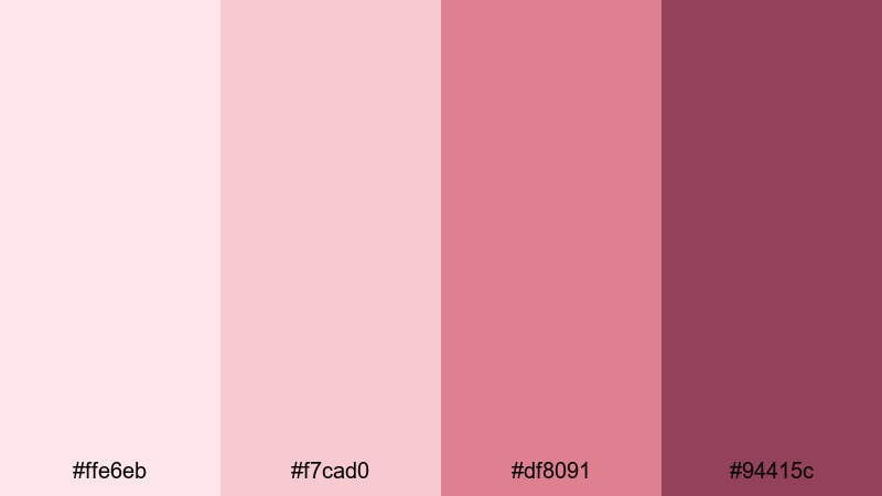
- HEX Codes: #ffe6eb, #f7cad0, #df8091, #94415c
- Mood: Airy, hopeful, and softly cinematic.
- Use for: Great for morning routine vlogs, lifestyle intros, and dreamy channel branding that feels uplifting and calm.
Rosy Dawn Whisper feels like early light coming through sheer curtains. The palest tones are perfect for clean backgrounds, minimalist frames, and space around your subjects, while the mid pink and maroon add gentle definition without breaking the tranquil mood.
Use this palette to design soft lifestyle thumbnails, productivity vlog intros, and subtle lower thirds. Apply the deeper maroon shade only to key accents like subscribe buttons, callouts, or logo marks so they stand out while still blending into the overall rosy aesthetic.
Petal Ink Letters
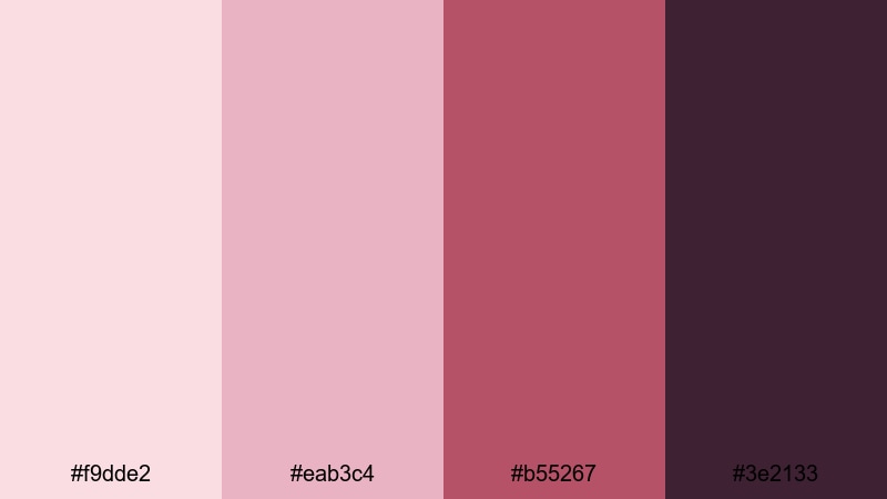
- HEX Codes: #f9dde2, #eab3c4, #b55267, #3e2133
- Mood: Poetic, sentimental, and slightly vintage.
- Use for: Use for lyric videos, journaling reels, and on-screen quotes where you want emotion without feeling too bright.
Petal Ink Letters blends dusty pinks with an inky maroon, like dried petals pressed between journal pages. It feels intimate and reflective, ideal for slower edits, lyric overlays, or storytelling voiceovers.
Use the lighter HEX codes behind handwritten-style fonts or animated captions. The dark inky maroon (#3e2133) is great for text, borders, and frame lines in YouTube chapters or TikTok quote screens, helping your words stay readable while keeping the aesthetic soft and nostalgic.
Mauve Champagne Glow
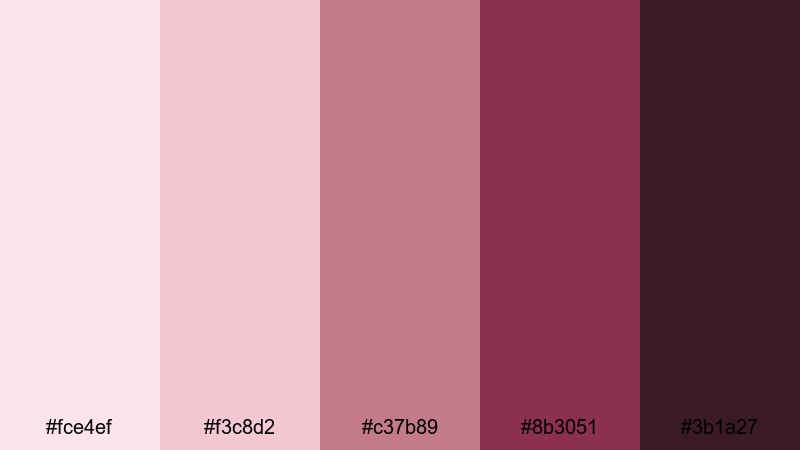
- HEX Codes: #fce4ef, #f3c8d2, #c37b89, #8b3051, #3b1a27
- Mood: Luxurious, celebratory, and subtly glamorous.
- Use for: Perfect for event recaps, beauty tutorials, and elegant product promos needing a soft glam mood.
Mauve Champagne Glow feels like clinking glasses under soft studio lights. The upper mauve and blush tones create a luminous base, while the deeper maroons add sophistication and contrast, ideal for beauty and fashion content.
Use the lightest shades for gradient backgrounds behind product shots or get-ready-with-me sequences. Bring in the darker maroon tones for lipstick callouts, palette names, and end-screen CTAs so your glam edits look consistent across thumbnails, reels, and full-length YouTube videos.
Bold & Dramatic Pink Maroon Color Palettes
Neon Night Bloom
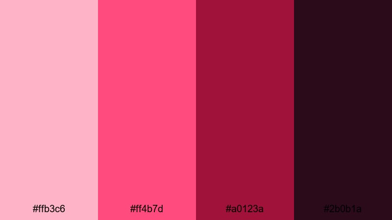
- HEX Codes: #ffb3c6, #ff4b7d, #a0123a, #2b0b1a
- Mood: High energy, electric, and nightlife inspired.
- Use for: Use for music videos, dance reels, and bold YouTube thumbnails that need to pop in dark mode.
Neon Night Bloom turns pink maroon into a club-ready glow. Hot pink highlights sit against inky maroon shadows, giving you instant contrast that looks great on dark interfaces and mobile screens.
Use the brightest pinks for light streaks, animated accents, and bold text in your thumbnails or lyric cards. The near-black maroon is perfect for backgrounds, drop shadows, and overlays, making dancers, performers, and gear stand out in concert edits, party recaps, and DJ promo visuals.
Electric Rose Studio
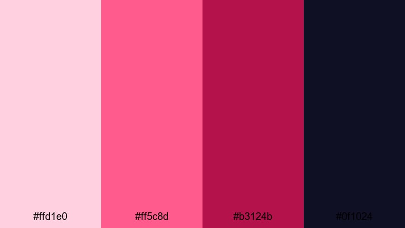
- HEX Codes: #ffd1e0, #ff5c8d, #b3124b, #0f1024
- Mood: Edgy, creative, and studio-lit.
- Use for: Great for creator intros, podcast visuals, and motion graphics where you want a modern, edgy rose look.
Electric Rose Studio mixes glowing rose tones with a midnight navy base, perfect for content that feels like it was shot in a pro studio. The vibrant pinks draw the eye, while the deep maroon and navy create a dramatic frame.
Use the darker tones for card backgrounds, waveform overlays, and full-screen podcast titles. Layer the bright rose for animated lower thirds, chapter labels, and subscribe animations so your channel intro, episode thumbnails, and shorts all share the same bold pink maroon identity.
Crimson Spotlight Flair
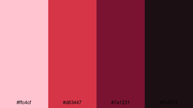
- HEX Codes: #ffc4cf, #d63447, #7a1231, #1c0f13
- Mood: Confident, theatrical, and intense.
- Use for: Ideal for trailers, announcement cards, and hero banners that need a powerful focal point.
Crimson Spotlight Flair feels like stepping into a theater, with bright stage lights fading into deep curtains. The vivid crimson and maroon core give your visuals a performance feel that demands attention.
Use the lighter pink as a soft spotlight behind your main titles or product hero shots. Let the deep maroon and near-black background push focus to bold white or pale pink text in trailers, channel announcement cards, or cinematic teaser thumbnails.
Fuchsia Noir Pulse
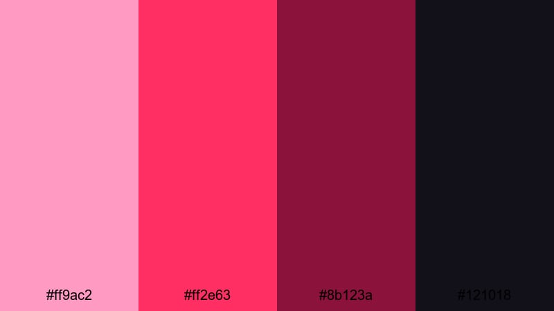
- HEX Codes: #ff9ac2, #ff2e63, #8b123a, #121018
- Mood: Modern, daring, and pulse-pounding.
- Use for: Use for gaming overlays, tech promos, and fashion campaigns that lean into a bold, neon noir vibe.
Fuchsia Noir Pulse pushes pink maroon into neon territory. Bright fuchsia highlights sit over almost-black shadows, giving you a cyberpunk, nightlife, and gamer-friendly look that pops on any device.
Use the bold fuchsia for kill feeds, score counters, or animated borders in gaming overlays. The dark maroon and near-black shades are ideal for HUD backgrounds, caption boxes, and sleek fashion title cards where you want a strong, neon noir edge without sacrificing readability.
Modern & Minimal Pink Maroon Color Palettes
Dusty Blush Interface
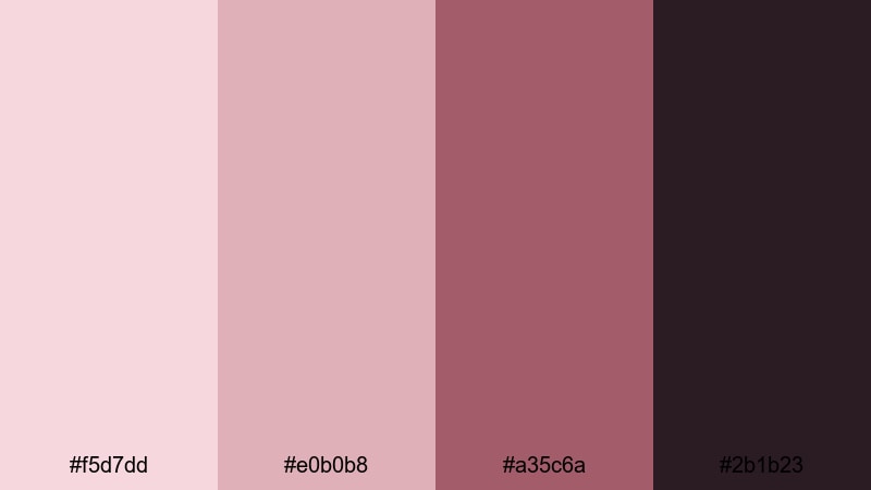
- HEX Codes: #f5d7dd, #e0b0b8, #a35c6a, #2b1b23
- Mood: Clean, soft, and user-friendly.
- Use for: Great for app-style overlays, UI mockups in videos, and minimalist branding where readability matters.
Dusty Blush Interface softens pink maroon into muted, UX-friendly tones. It feels modern and approachable, ideal for tech explainers, app demos, and dashboard-style graphics inside your videos.
Use the lighter hues for panels, cards, and chart backgrounds so information is easy to scan. The deeper maroon is perfect for icons, buttons, and text labels in your tutorial overlays, making your interface-inspired graphics feel cohesive from intro to outro.
Marble Rose Grid
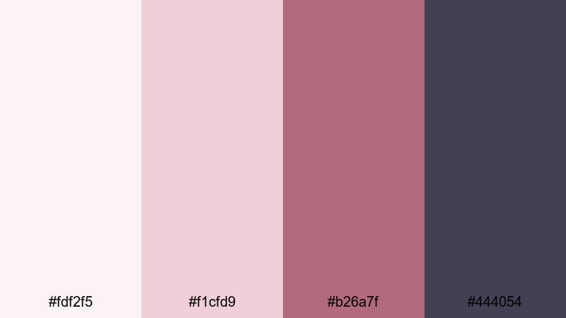
- HEX Codes: #fdf2f5, #f1cfd9, #b26a7f, #444054
- Mood: Refined, structured, and editorial.
- Use for: Perfect for lookbooks, grid-based Instagram reels, and typography-led layouts.
Marble Rose Grid combines pale marble pinks with structured maroon and slate, giving your visuals an editorial, magazine-style feel. It works especially well for fashion, lifestyle lookbooks, and carousel or grid-style reels.
Use the softest pink as a clean base for split screens, photo grids, and text-heavy layouts. The maroon and slate accents can frame images, underline text, or separate sections in your thumbnails and chapter screens, helping your brand look curated and high-end.
Latte Rose Workspace
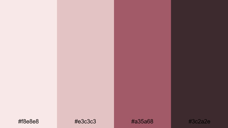
- HEX Codes: #f8e8e8, #e3c3c3, #a35a68, #3c2a2e
- Mood: Cozy, productive, and balanced.
- Use for: Use for study vlogs, workspace tours, and productivity channels aiming for a soft yet focused aesthetic.
Latte Rose Workspace mixes creamy neutrals with warm pink maroon accents, like coffee on rose stationery. It feels calm but not sleepy, making it a great choice for productivity content and study aesthetics.
Use the neutrals for background plates, note-style overlays, and to-do list graphics. Drop in the maroon tones for tick boxes, progress bars, timers, and subtle highlights in your thumbnails so your channel looks both cozy and organized.
Clean Brand Maroon
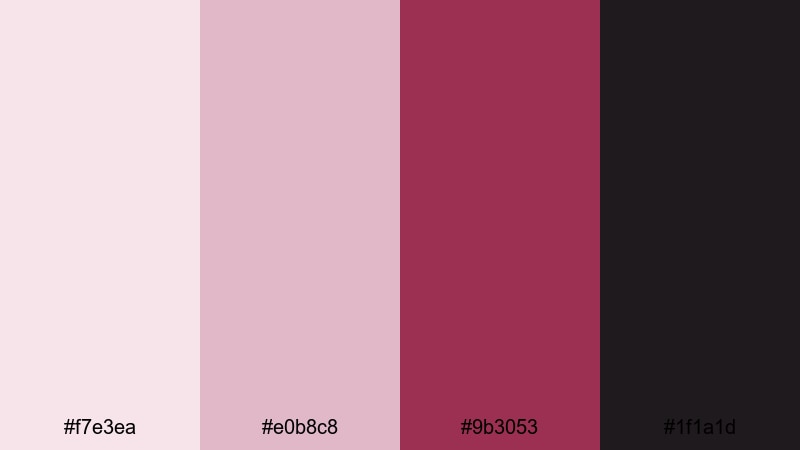
- HEX Codes: #f7e3ea, #e0b8c8, #9b3053, #1f1a1d
- Mood: Professional, sleek, and brand ready.
- Use for: Ideal for logo reveals, channel branding kits, and lower thirds in polished corporate or creator content.
Clean Brand Maroon blends soft, brand-safe pinks with a decisive maroon accent and deep charcoal. It feels professional enough for corporate content but still distinct and stylish for personal brands.
Use the lighter hex values as backgrounds in your logo stings, intros, and end screens. Add the maroon for highlight elements such as icons, signatures, or important text. The charcoal shade can ground your layouts in headers, footers, and thumbnail borders so the overall look stays sharp and consistent across your entire channel.
Vintage & Cinematic Pink Maroon Color Palettes
Old Film Rosegrain
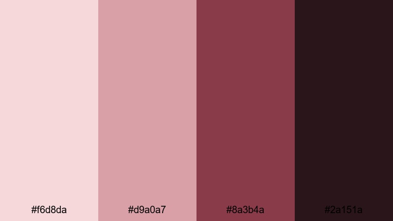
- HEX Codes: #f6d8da, #d9a0a7, #8a3b4a, #2a151a
- Mood: Nostalgic, grainy, and filmic.
- Use for: Use for travel diaries, family archives, and retro title cards paired with film grain effects.
Old Film Rosegrain echoes the faded look of aged prints, with softened rose highlights and worn maroon shadows. It instantly brings a sense of memory and time, especially when paired with grain and subtle overlays.
Use the lighter tones for title cards, date stamps, and map overlays in travel diaries or family montages. Let the darker maroon and near-black sit in borders, letterbox bars, or transition slides to complete the cinematic, throwback mood.
Retro Velvet Theater
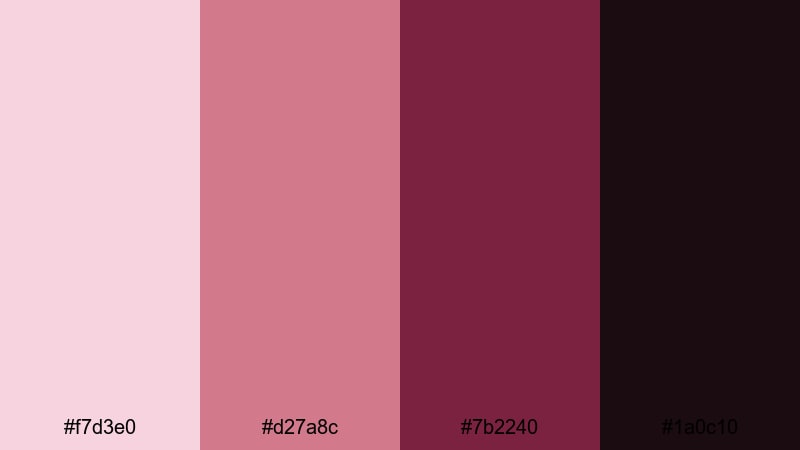
- HEX Codes: #f7d3e0, #d27a8c, #7b2240, #1a0c10
- Mood: Dramatic, nostalgic, and velvet-rich.
- Use for: Great for movie review channels, title sequences, and poster-style thumbnails.
Retro Velvet Theater feels like plush cinema seats and old posters. The soft stage pinks lead into velvet maroon shadows, perfect for film review channels, theater-inspired edits, and classic title sequences.
Use the mid and deep maroons for marquee-style text, rating badges, and star graphics. The paler shades can sit behind critic quotes, episode titles, or release dates in thumbnails and intro screens, giving your content a cohesive, big-screen personality.
Baroque Wine Portrait
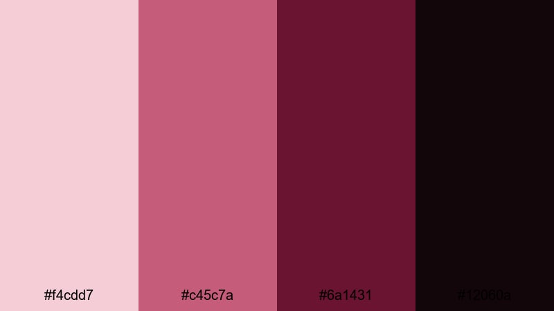
- HEX Codes: #f4cdd7, #c45c7a, #6a1431, #12060a
- Mood: Opulent, moody, and artful.
- Use for: Perfect for fashion films, portrait reels, and dramatic grading presets.
Baroque Wine Portrait combines rich wine maroon with gallery-soft pinks, creating a painterly, high-art atmosphere. It suits dramatic portrait reels, editorial fashion films, and any footage you want to feel curated and luxurious.
Use the lighter pink for frame mats, minimal captions, and gallery-style label cards. Let the deep maroon and almost-black tone dominate backgrounds, vignettes, and shadows so your subject stands out like a painting on a dark wall, especially in vertical reels and cinematic shorts.
Tips for Creating Pink Maroon Color Palettes
Pink maroon is versatile, but it looks best when you balance warmth, contrast, and readability across your videos and designs. Use these tips to combine pink maroon with other shades in a way that feels intentional and on-brand.
- Pair pink maroon with light neutrals (cream, soft gray, pale blush) to keep thumbnails and overlays airy while letting deep maroon accents stand out.
- For text, always check contrast: use the darkest maroon or near-black for body copy and key titles, and reserve softer pinks for backgrounds or highlight words.
- Choose one main maroon accent and 2 to 3 supporting light tones to avoid visual clutter. This keeps intros, lower thirds, and end screens clean and consistent.
- Match your grade to your palette: warm your footage slightly if your pink maroon leans rosy, or cool the shadows if you want a noir or nightlife feel.
- Use gradients (light pink to deep maroon) in title cards and transitions to create depth without adding extra elements.
- Keep branding consistent across platforms: reuse the same HEX codes for your logo lockup, YouTube banner, thumbnail frames, and Instagram cover highlights.
- When mixing with other accent colors, stick to one contrasting hue (like lemon, teal, or navy) so pink maroon remains the hero of the palette.
- Test your designs on both light and dark mode backgrounds to ensure buttons, captions, and icons remain visible and on-brand.
Pink maroon color palettes can make your content feel romantic, bold, modern, or cinematic, depending on how you combine the tones. With the right HEX codes and a clear structure, you can turn this color family into a recognizable signature for your channel or brand.
Try these 15 palettes inside Filmora for your intros, transitions, overlays, and thumbnails. Save them as presets, combine them with your favorite filters and LUTs, and build a complete visual identity that viewers recognize at a glance.
Whether you are editing wedding highlights, lifestyle vlogs, tech promos, or retro reviews, pink maroon offers a rich base you can adapt to almost any mood. Experiment, adjust, and let Filmora help you keep your aesthetic consistent from first frame to final export.
secure downloadNext: Lemon Color Palette
