
 100% Security Verified | No Subscription Required | No Malware

Platinum sits between soft silver and cool gray, which makes it feel premium, minimal, and quietly confident. In color psychology, it suggests luxury without shouting, a calm sense of authority, and a polished, modern mindset. That is why platinum tones are so popular for tech brands, beauty intros, cinematic grading, and minimalist social feeds.
For video creators and designers, platinum is a flexible base color that works beautifully in thumbnails, titles, overlays, and color grading. Below you will find 15 platinum color palettes with HEX codes you can drop straight into your branding, YouTube thumbnails, intros, and cinematic edits. Every idea works great inside Filmora, whether you are building a full channel identity or just giving your next video a sleek platinum look.
In this article
Elegant & Modern Platinum Color Palettes
Urban Chrome Minimalism
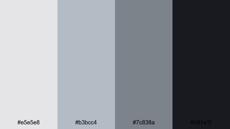
- HEX Codes: #e5e5e8, #b3bcc4, #7c838a, #181a1f
- Mood: Clean, sleek, and urban with a cool metallic edge.
- Use for: Perfect for tech review intros, minimalist channel branding, and modern lower thirds.
This platinum palette layers soft chrome grays over a deep charcoal anchor. It feels like glass, metal, and concrete in one frame: subtle highlights, balanced midtones, and a strong dark accent for typography or icons. The overall vibe is calm and ultra-modern, without any distracting color noise.
Use this combination for tech reviews, productivity channels, and design-focused vlogs. It works especially well in Filmora for lower thirds, clean title cards, app UI overlays, and YouTube thumbnails where you want the product or face to stand out against a neutral, sophisticated backdrop.
Pro Tip: Build a Cinematic Platinum Look in Filmora
To keep an Urban Chrome Minimalism look across your edit, set your light platinum shade (#e5e5e8) as the main background for titles and end screens, and use the darkest tone (#181a1f) for text and logo marks. In Filmora, you can save these colors in your custom palette and re-use them for intros, subtitles, and lower thirds so every video feels part of the same series.
When grading your footage, gently cool down the temperature and reduce saturation to let the natural platinum tones take over. Add subtle vignettes and soft shadows so the charcoal accent color ties your footage, overlays, and thumbnail design into one cohesive metallic story.
AI Color Palette
If you have a reference still or style frame that captures this chrome-platinum mood, you can use Filmora to spread that look across your entire timeline. Filmora's AI Color Palette feature analyzes the colors from your reference clip and auto-matches other shots to it, so A-roll, B-roll, and cutaways all share the same refined metallic balance.
Simply choose your best-graded shot with clean platinum highlights and deep charcoal shadows, then apply AI Color Palette to the rest of the clips. This keeps your tech reviews, product sequences, and YouTube intros visually consistent, even if they were shot in different lighting or on different days.
 secure download

HSL, Color Wheels & Curves
Once you have the base palette, fine-tune the platinum feel with Filmora's HSL, color wheels, and curves controls. Slightly lower saturation in the blues and greens to avoid color distractions, and push midtones towards a cooler hue so metals, walls, and screens look more chrome than beige. Curves can deepen the contrast between #e5e5e8 and #181a1f, giving your frames that crisp editorial punch.
If you want a more cinematic tone, lift the shadows just a touch so the charcoal never crushes to pure black, then add a gentle S-curve for soft yet impactful contrast. Filmora's color correction tools make it easy to save this platinum grade as a preset and apply it across different projects or series playlists.
secure download1000+ Video Filters & 3D LUTs
To go beyond a neutral chrome style, you can build signature platinum looks using Filmora's filters and LUTs. Start with a clean base grade that respects your HEX codes, then stack a subtle cinematic filter or soft matte LUT on top. This keeps your grays and charcoals consistent while adding texture and atmosphere for intros, transitions, or channel trailers.
Filmora's video filters and 3D LUTs make it easy to test different moods on the same platinum palette: colder and sharper for tech reviews, softer and more diffused for lifestyle content. Save your favorite combinations so you can apply them in one click across thumbnails, shorts, and long-form videos.
secure downloadPlatinum Office Suite
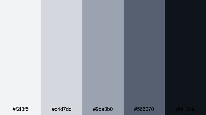
- HEX Codes: #f2f3f5, #d4d7dd, #9ba3b0, #566070, #0f131a
- Mood: Corporate, trustworthy, and quietly luxurious.
- Use for: Ideal for business explainers, SaaS product demos, and LinkedIn video content.
Platinum Office Suite layers soft off-whites with structured cool grays and muted blue-greens. It feels like a modern office tower at sunrise: bright but not harsh, professional yet comfortable. The darkest tone grounds charts, UI elements, and call-to-action text, while the lighter shades keep slides and overlays airy.
This palette is perfect for B2B branding, pitch decks converted to video, and product tutorials. Use it for thumbnail frames, lower thirds with job titles, subtle background gradients in Filmora, and end-screen layouts that look polished enough for LinkedIn or company websites.
Tech Startup Sheen
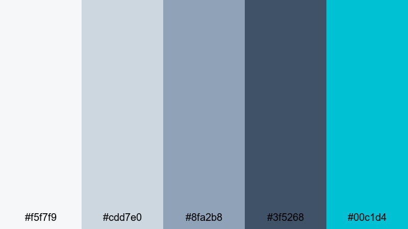
- HEX Codes: #f5f7f9, #cdd7e0, #8fa2b8, #3f5268, #00c1d4
- Mood: Innovative, optimistic, and high-tech.
- Use for: Great for startup pitch videos, app promos, and animated explainer graphics.
Tech Startup Sheen starts with cool, misty platinum tones and layers in a fresh teal accent. The grays and blues make everything feel trustworthy and data-driven, while the bright #00c1d4 hit brings life to buttons, icons, and calls to action. Overall it balances clean UX aesthetics with a friendly, future-ready personality.
Use this palette in dashboard-style motion graphics, product walkthroughs, and SaaS promos made in Filmora. Keep the background in soft platinum, color UI elements with the mid blues, and reserve the teal for key touchpoints like Subscribe buttons, app badges, or feature highlights in your video thumbnails.
Luxury Product Unboxing
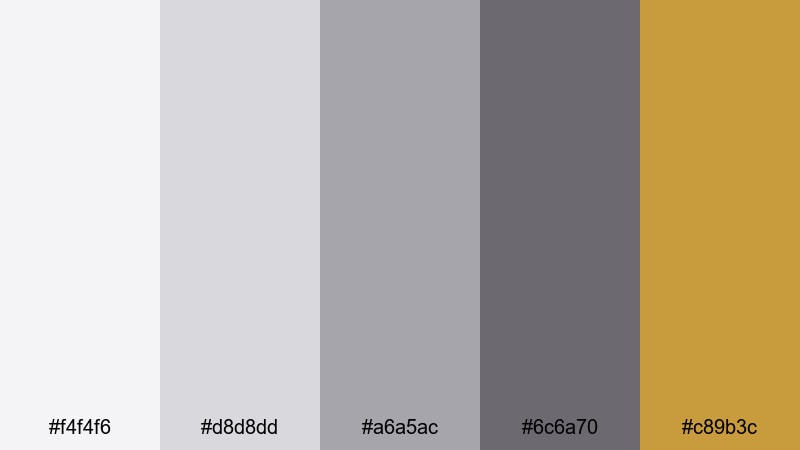
- HEX Codes: #f4f4f6, #d8d8dd, #a6a5ac, #6c6a70, #c89b3c
- Mood: Premium, sophisticated, and subtly glamorous.
- Use for: Designed for product unboxing videos, beauty channels, and premium brand intros.
This palette mixes soft platinum grays with a restrained gold accent. The neutrals echo high-end packaging and magazine editorials, while the warm metallic #c89b3c adds a hint of luxury without overpowering the frame. It feels like opening a designer box on a marble counter.
Apply the neutral tones to your background, tabletop, and text, then let the gold appear in logo reveals, key phrases, or animated accents in Filmora. It is ideal for beauty unboxings, fragrance promos, jewelry close-ups, and thumbnails where you want viewers to feel they are about to see something special and exclusive.
Soft & Romantic Platinum Color Palettes
Platinum Blush Whisper
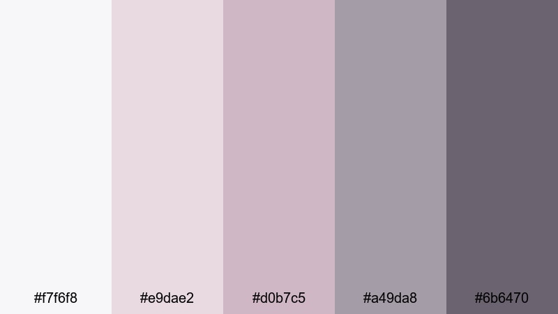
- HEX Codes: #f7f6f8, #e9dae2, #d0b7c5, #a49da8, #6b6470
- Mood: Gentle, romantic, and dreamy.
- Use for: Perfect for wedding highlight films, engagement reels, and soft lifestyle vlogs.
Platinum Blush Whisper wraps delicate pinks in a veil of misty gray. It feels light, dreamy, and intimate, like soft daylight through sheer curtains. The blush notes flatter skin tones, while the cooler platinums keep everything from becoming overly sweet.
Use this palette in wedding highlight reels, couple portraits, or cozy lifestyle vlogs. In Filmora, apply the softest platinum to text panels and overlays, keep blusher shades for callouts and lower thirds, and use the darker gray for legible titles on Reels, TikToks, and YouTube thumbnails.
Moonlit Wedding Aisle
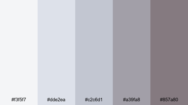
- HEX Codes: #f3f5f7, #dde2ea, #c2c6d1, #a39fa8, #857a80
- Mood: Ethereal, calm, and sentimental.
- Use for: Ideal for cinematic wedding edits, save-the-date videos, and anniversary slideshows.
Moonlit Wedding Aisle leans into cool platinum blues and muted mauves. It feels like a quiet ceremony lit by soft fairy lights, emphasizing tenderness over drama. The gentle gradient from pale gray-blue to soft shadow creates a natural backdrop for white dresses and floral details.
Color grade your wedding footage in Filmora with this palette in mind: soften highlights to #f3f5f7 territory, keep midtones cool and airy, and let the darker mauves support text and monograms. For save-the-date slideshows and Instagram stories, this palette keeps everything elegant and timeless.
Frosted Champagne Glow
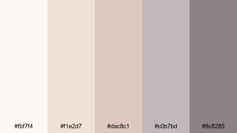
- HEX Codes: #fbf7f4, #f1e2d7, #dac8c1, #c0b7bd, #8c8285
- Mood: Warm, celebratory, and softly glamorous.
- Use for: Great for party recaps, bridal content, lifestyle branding, and cozy product shoots.
Frosted Champagne Glow blends warm beiges with cool platinum undertones. It feels like candlelight bouncing off champagne glasses: celebratory but still refined. The palette is gentle on skin tones and creates a soft halo effect around highlights.
Use it for party recaps, engagement dinners, and lifestyle branding where you want warmth without harsh orange hues. In Filmora, you can design thumbnails with champagne tones as backgrounds, then layer platinum accents on titles and badges to keep the overall look fresh and premium.
Soft Studio Portrait
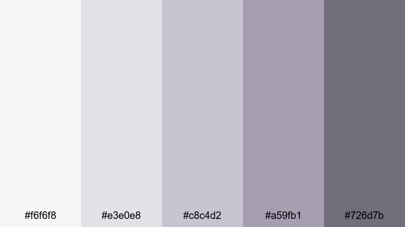
- HEX Codes: #f6f6f8, #e3e0e8, #c8c4d2, #a59fb1, #726d7b
- Mood: Quiet, intimate, and polished.
- Use for: Perfect for studio portraits, talking-head videos, and beauty or skincare channels.
Soft Studio Portrait mixes lavender tints with powdered platinum grays. It brings a calm, editorial softness to portraits, making backgrounds recede gently and faces stand out. The hues feel like a modern photo studio backdrop rather than a harsh white wall.
Apply this palette to talking-head YouTube videos, beauty tutorials, and skincare explainers. Grade your background towards the cooler platinums and lavenders, then keep text and graphic frames in darker gray so they are readable on desktop and mobile thumbnails without stealing attention from the subject.
Bold & High-Contrast Platinum Color Palettes
Neon Night Skyline
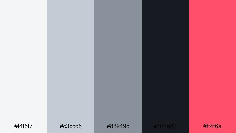
- HEX Codes: #f4f5f7, #c3ccd5, #88919c, #181a22, #ff4f6a
- Mood: Energetic, urban, and cinematic.
- Use for: Ideal for nightlife vlogs, travel montages, and dynamic channel intros.
Neon Night Skyline pairs cool city-platinum tones with a punchy neon pink accent. The grays create a moody urban base, while #ff4f6a slices through with bold, cinematic energy. It feels like walking through a rainy city street lit by billboards and signs.
Use the neutral tones for your footage grade and backgrounds, and reserve the neon accent for titles, transitions, and key shapes in Filmora. This palette is powerful for travel vlogs, nightlife recaps, or dynamic intros where you want viewers to immediately feel the rush of the city.
Platinum Game Stream
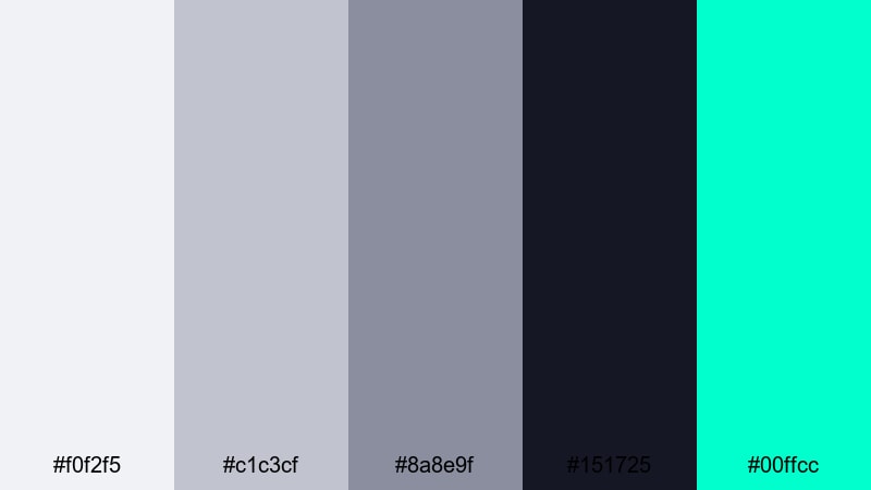
- HEX Codes: #f0f2f5, #c1c3cf, #8a8e9f, #151725, #00ffcc
- Mood: Edgy, futuristic, and attention grabbing.
- Use for: Made for gaming overlays, e-sports intros, and stream branding packages.
Platinum Game Stream uses icy grays and deep navy to frame an electric aqua accent. The base tones feel like steel and glass, while #00ffcc instantly reads as cyber, neon, and high tech. It is strong enough to stand out even against busy game footage.
Design overlays, alerts, and webcam frames in Filmora or your design tool with the darker shade as the main background, mid-platinums for panels, and aqua for key states like Live, New Subscriber, or Donate. Use the lightest platinum for clean text on darker areas to keep your HUD readable across all devices.
Monochrome Impact Title
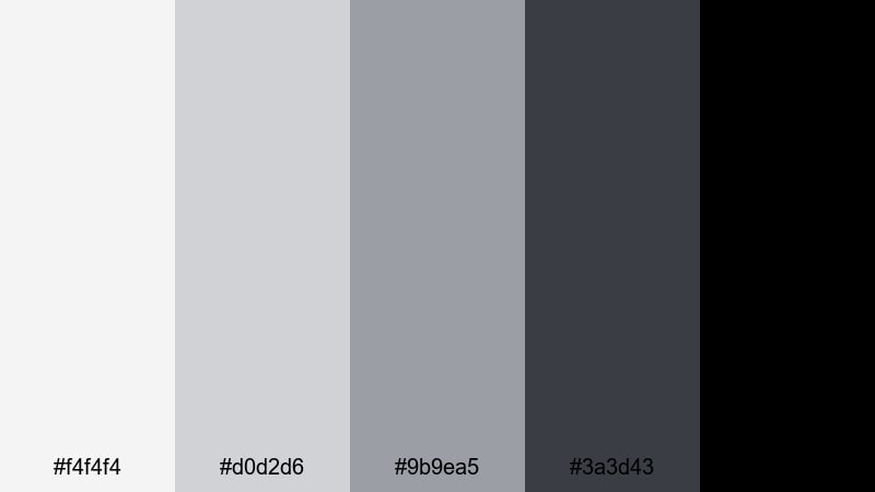
- HEX Codes: #f4f4f4, #d0d2d6, #9b9ea5, #3a3d43, #000000
- Mood: Powerful, minimalist, and highly legible.
- Use for: Great for bold title cards, end screens, and high-impact typography sequences.
Monochrome Impact Title strips color back to a pure platinum-to-black gradient. The varying grays let you build depth and hierarchy, while the deep black gives instant punch to typography and logos. It feels strong, serious, and timeless.
Use this palette when you want your words or logos to be the hero: channel trailers, quote cards, video essays, and end screens. In Filmora, combine a light platinum background with bold black or dark gray type, and add motion (like subtle zooms or slide-ins) to create impact without needing any extra color.
Cinematic & Moody Platinum Color Palettes
Rainy Window Bokeh
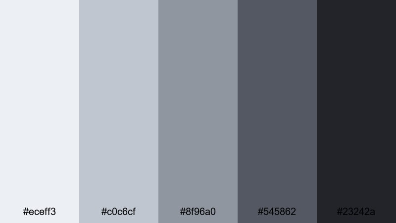
- HEX Codes: #eceff3, #c0c6cf, #8f96a0, #545862, #23242a
- Mood: Melancholic, reflective, and atmospheric.
- Use for: Perfect for cinematic vlogs, slow travel films, and emotional storytelling edits.
Rainy Window Bokeh combines misty platinums with deeper stormy grays. It feels like watching city lights through a rain-streaked window, with soft highlights and moody shadows. The palette naturally adds drama and introspection to everyday scenes.
Use this in Filmora for reflective vlogs, narrative montages, or slow travel edits. Grade your footage towards the cooler grays, darken the shadows slightly, and use the midtones for subtle overlays and captions that blend into the mood rather than cutting through it.
Industrial Loft Grade
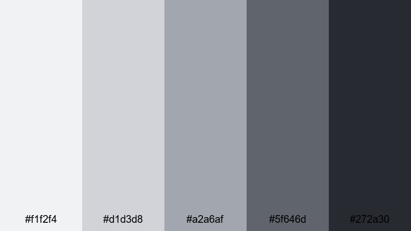
- HEX Codes: #f1f2f4, #d1d3d8, #a2a6af, #5f646d, #272a30
- Mood: Raw, modern, and grounded.
- Use for: Ideal for documentary pieces, maker studio tours, and architecture or design content.
Industrial Loft Grade is inspired by concrete, steel, and soft daylight from big windows. The lighter platinums echo painted walls and overcast skies, while the deeper charcoals feel like metal beams and shadows. It creates a grounded, honest visual tone.
Apply this palette to studio tours, behind-the-scenes videos, and design documentaries. In Filmora, use mid-platinums for lower thirds and labels, darker shades for section titles, and keep overall saturation low to emphasize texture, structure, and craft rather than bright color.
Noir Platinum Thriller
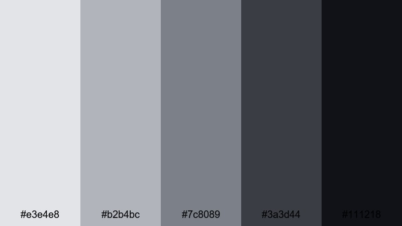
- HEX Codes: #e3e4e8, #b2b4bc, #7c8089, #3a3d44, #111218
- Mood: Tense, dramatic, and cinematic.
- Use for: Great for short films, mystery trailers, and narrative title sequences.
Noir Platinum Thriller dives into smoky platinums and inky shadows. It calls back to classic noir cinema, with enough tonal range to show detail while still feeling dark and mysterious. Highlights stay cool and controlled rather than bright and cheerful.
Use this palette in Filmora for mystery trailers, moody short films, or dramatic title sequences. Push your footage towards desaturated cool grays, keep blacks rich but not crushed, and design titles in the darker mid-gray range on lighter platinum backgrounds to echo vintage film posters.
Sci Fi Control Room
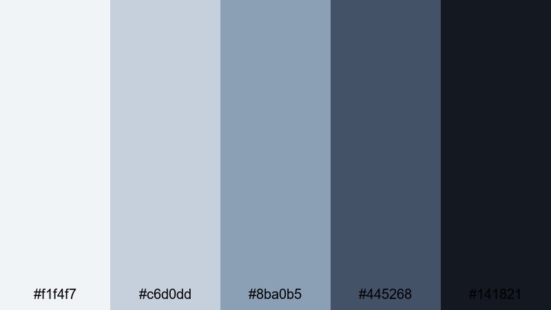
- HEX Codes: #f1f4f7, #c6d0dd, #8ba0b5, #445268, #141821
- Mood: Futuristic, focused, and slightly ominous.
- Use for: Perfect for tech explainers, sci-fi edits, and UI motion graphics in HUD-style videos.
Sci Fi Control Room blends icy platinum blues with deep navy and near-black. It feels like a spaceship bridge or high-security lab: clean, intelligent, and a little intimidating. The lighter tones work well for screens and holograms, while the darker shades anchor the environment.
Use this palette for UI motion graphics, HUD overlays, and sci-fi edits built in Filmora. Put data, grids, and graphs in mid-blues, keep main backgrounds in deep navy or near-black, and reserve the brightest platinum for key highlights and glows so your interface looks believable and cinematic.
Tips for Creating Platinum Color Palettes
Platinum is a powerful neutral that can shift warm, cool, soft, or intense depending on what you pair it with. Use these tips to design platinum palettes that look great on video, thumbnails, and branding, and stay consistent inside Filmora.
- Choose a base platinum: start with one light neutral HEX code as your main background and then add darker and midtone companions for depth.
- Limit bold accents: pick one strong accent color (like teal, pink, or gold) and use it sparingly for CTAs, key icons, or important words so it truly stands out.
- Test readability: always preview text over your lightest and darkest platinum shades to make sure titles and subtitles are readable on phones and desktops.
- Match your footage: in Filmora, adjust white balance and saturation so your footage naturally leans toward your chosen platinum temperature (cooler or warmer).
- Keep brand consistency: save your HEX codes and export Filmora presets so intros, overlays, and thumbnails always use the same platinum range.
- Use gradients carefully: soft platinum gradients are great for backgrounds, but keep them subtle so they do not fight with faces or product shots.
- Balance warm and cool: for human-centric content, mix a slightly warm platinum for skin with a cooler platinum for backgrounds to avoid lifeless or overly blue tones.
- Check in grayscale: if your design still works in pure grayscale, your contrast between platinum shades is strong enough for most screens.
Platinum color palettes can make your channel feel premium, cinematic, or quietly minimalist without relying on loud colors. Whether you are crafting tech reviews, wedding films, game overlays, or short films, the right mix of platinum tones shapes mood and brand identity in a subtle but powerful way.
Use the HEX codes above as starting points, then refine them in Filmora using AI Color Palette, HSL controls, and LUTs until they match your footage and personal style. The more consistently you apply your chosen platinum palette across intros, overlays, and thumbnails, the faster viewers will recognize your work.
Open a new project, pick one of these platinum families, and try it on your next edit. With a few saved presets and templates in Filmora, your neutral metallic look can become a signature visual language for your channel or brand.
secure download