
 100% Security Verified | No Subscription Required | No Malware


 ChatGPT
 Perplexity
 Gemini
 Claude
 Grok
Grok
Portfolio is a rich, creative shade of purple that instantly feels premium but still modern. It is often linked with imagination, high-end services, art, and digital culture, which makes it perfect for creators who want their work to look cinematic and distinctive without feeling too cold or corporate.
Used well, Portfolio color can tie together your thumbnails, intros, lower thirds, and brand elements across YouTube, TikTok, Reels, and portfolio sites. Below you will find ready-made Portfolio color palettes with HEX codes, designed for Filmora users and content creators who want consistent, aesthetic color grading and graphics for video and design.
In this article
Elegant Portfolio Color Palettes
Studio Spotlight Sheen
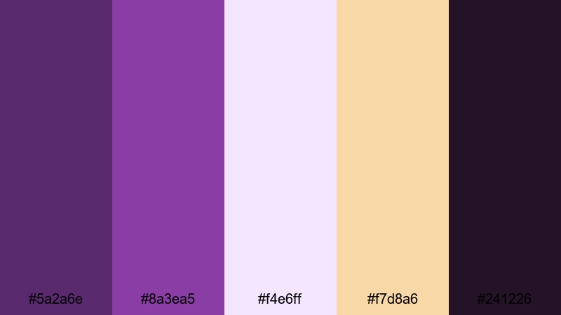
- HEX Codes: #5a2a6e, #8a3ea5, #f4e6ff, #f7d8a6, #241226
- Mood: Polished, cinematic, and refined.
- Use for: Perfect for cinematic intros, logo reveals, and premium course trailers that need a professional yet creative look.
Studio Spotlight Sheen combines deep Portfolio purples with soft lilac and warm highlight tones, echoing the glow of a perfectly lit studio. The darker shades (#5a2a6e, #241226) create a strong base for backgrounds and frames, while the lighter accents (#f4e6ff, #f7d8a6) act like controlled spotlights on your subject.
Use this palette for high-end service promos, sleek logo stings, or filmic portfolio reels. In thumbnails, let the darker tones form the canvas and reserve the light lilac and warm beige for faces, product shots, and bold typography, so your visuals stay luxurious without feeling overwhelming.
Pro Tip: Build a Cinematic Portfolio Studio Look in Filmora
In Filmora, you can recreate this studio-inspired Portfolio palette by using the deep purples for solid-color backgrounds, adjustment layers, and title cards, while keeping the lighter HEX codes for your text and accent shapes. Save your color choices as custom presets so every intro, b-roll segment, and social cut maintains the same polished aesthetic.
Try pairing this palette with Filmora title templates and lower thirds, then swap their default colors to your chosen Portfolio tones. This keeps your brand look consistent from the first frame of your intro to the final call-to-action card.
AI Color Palette
If you have a still frame, brand board, or screenshot that uses Studio Spotlight Sheen, you can turn it into a video-wide look with Filmora. Filmora's AI Color Palette feature lets you analyze the colors from one reference clip and match that style across the rest of your timeline.
Import your hero shot, apply the AI Color Palette match to other clips, and your entire edit will inherit the same Portfolio purples, soft highlights, and warm glow. It is a quick way to keep thumbnails, intros, and talking-head footage visually aligned without manual grading on every clip.
 secure download

HSL, Color Wheels & Curves
Once your base palette is in place, refine the look using Filmora's HSL sliders, color wheels, and curves. Slightly deepening the shadows and cooling the highlights can make Portfolio tones feel more cinematic, while targeted HSL tweaks keep skin tones natural against your purple backgrounds.
If you are new to grading, follow a step-by-step Filmora color correction tutorial and use your HEX codes as a visual guide. Balance your midtones so text remains legible over dark purples, and use curves to add a gentle S-curve contrast for that studio-quality finish.
secure download1000+ Video Filters & 3D LUTs
To move even faster, you can layer Filmora's filters and LUTs over your Portfolio palette for a finished, stylized look. Filmora's video filters and 3D LUTs make it easy to push your purples toward a warmer, vintage feel or a cooler, techy tone while keeping your brand colors recognizable.
Drop a LUT on an adjustment layer above all your clips, then fine-tune opacity and basic color settings until it complements your Studio Spotlight Sheen colors. This workflow keeps your intros, b-roll, and outro cards visually cohesive with minimal manual tweaking.
secure downloadVelvet Pitch Deck
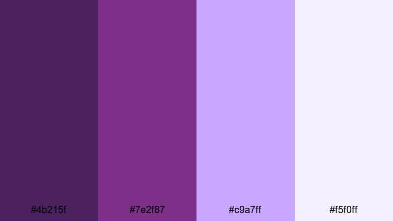
- HEX Codes: #4b215f, #7e2f87, #c9a7ff, #f5f0ff
- Mood: Confident, luxurious, and persuasive.
- Use for: Best for pitch decks, portfolio explainers, and investor videos that need authority with a creative edge.
Velvet Pitch Deck leans into deep, velvety Portfolio tones supported by soft lavender and near-white. The darker shades ground your frames and slides, signaling seriousness and confidence, while the lighter pastels keep everything approachable and easy on the eyes.
This palette is ideal for video pitch decks, case study explainers, and channel trailers that speak to clients or investors. Use the darkest purple for slide backgrounds or full-screen graphics, and reserve the pale tones for text, graphs, and UI callouts so your information is legible on laptops and mobile screens.
Gallery Opening Glow
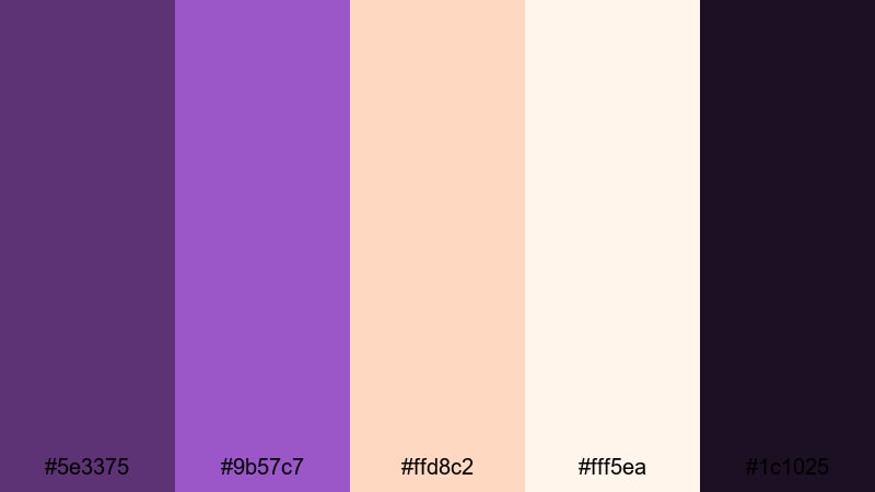
- HEX Codes: #5e3375, #9b57c7, #ffd8c2, #fff5ea, #1c1025
- Mood: Artistic, inviting, and sophisticated.
- Use for: Ideal for art reels, photography showcases, and gallery-style video portfolios.
Gallery Opening Glow pairs saturated Portfolio purple with soft peach, cream, and a deep night accent. It feels like walking into a warmly lit exhibition where spotlights highlight each artwork against a rich, moody backdrop.
Use the darkest shade (#1c1025) for full-bleed backgrounds and letterboxing, then layer your photos or artwork framed by the Portfolio purple. The peach and cream tones are perfect for captions, lower thirds, and subtle gradient bars in thumbnails or Instagram Reels covers.
Editorial Portfolio Noir
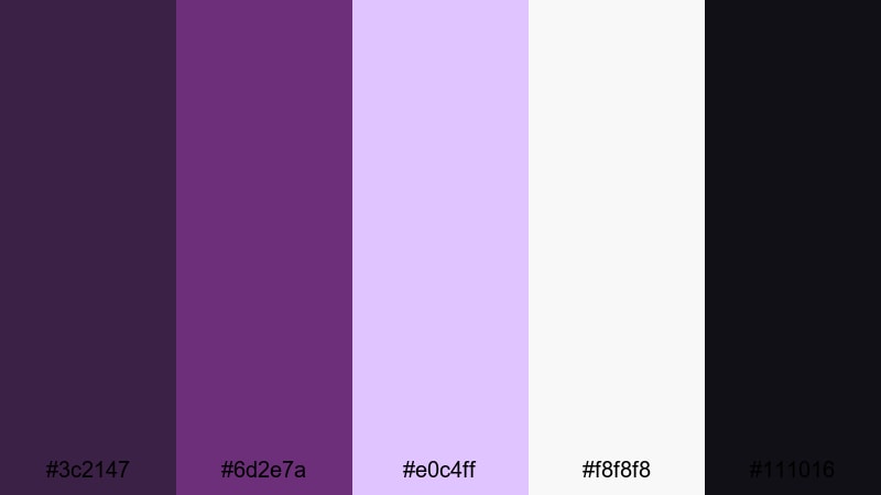
- HEX Codes: #3c2147, #6d2e7a, #e0c4ff, #f8f8f8, #111016
- Mood: Minimal, editorial, and confident.
- Use for: Use in lookbooks, fashion edits, and typography-led portfolio videos.
Editorial Portfolio Noir mixes inky violets with crisp neutrals, creating a fashion-magazine feel. The high contrast between deep blacks, clean whites, and the Portfolio accent adds structure and makes bold typography stand out.
Use this palette for lookbooks, style reels, or minimalist portfolio websites. Let the near-white and soft lilac backgrounds host your text and still frames, while the darker tones frame title sequences or chapter cards to give your content a sharp, editorial personality.
Bold & Modern Portfolio Color Palettes
Neon Review Reel

- HEX Codes: #7a1f83, #c13add, #00f5ff, #111827
- Mood: Energetic, techy, and attention-grabbing.
- Use for: Great for product review intros, gaming overlays, and high-impact thumbnails.
Neon Review Reel throws electric Portfolio magenta against bright cyan and a deep slate background for a tunnel-of-light vibe. It is loud, high contrast, and designed to slice through crowded recommendation feeds.
Use the dark slate for your canvas, then let the magenta and cyan outline shapes, HUD elements, and rating badges. This palette works especially well for tech and gaming thumbnails, animated lower thirds, and countdown bumpers where you want instant impact.
Viral Creator Energy
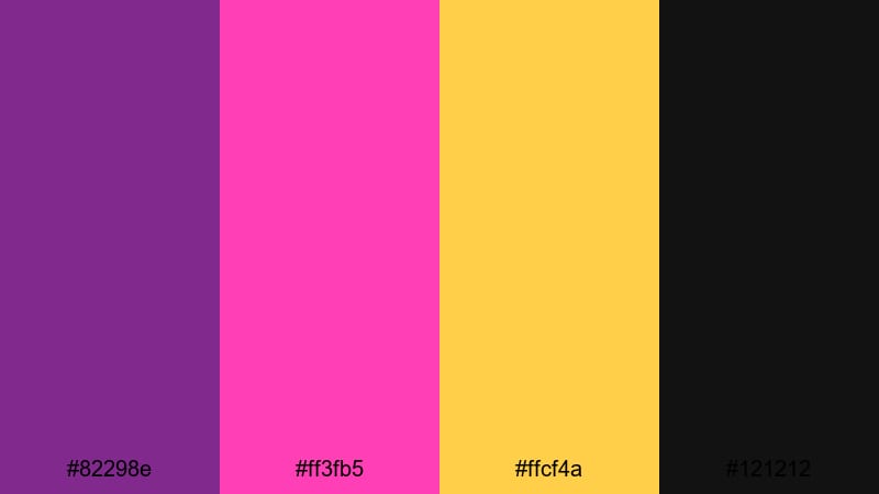
- HEX Codes: #82298e, #ff3fb5, #ffcf4a, #121212
- Mood: Playful, bold, and social-first.
- Use for: Perfect for TikTok compilations, Reels covers, and creator brand intros.
Viral Creator Energy is built for scroll-stopping graphics. The strong Portfolio base pairs with hot pink and bright yellow, all grounded by a dark neutral, so your visuals feel fun but still read clearly on small screens.
Use Portfolio and black for backgrounds and text outlines, then layer pink and yellow on emojis, stickers, and subscribe buttons. This palette shines in TikTok-style edits, meme cuts, and high-tempo YouTube intros where bright color is part of your personality.
Tech Portfolio Pop
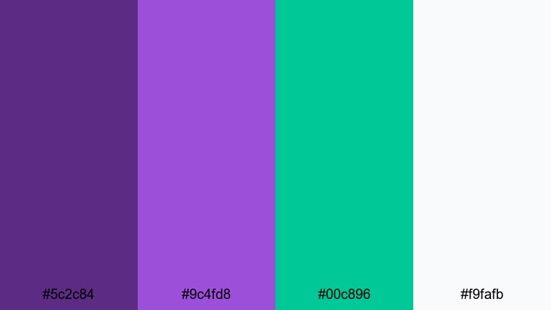
- HEX Codes: #5c2c84, #9c4fd8, #00c896, #f9fafb
- Mood: Innovative, digital, and upbeat.
- Use for: Great for SaaS demos, app walkthroughs, and startup portfolio videos.
Tech Portfolio Pop mixes vivid Portfolio purples with a fresh teal accent and airy white. The result feels like a modern app interface or a clean product website translated into motion.
Use Portfolio as your primary brand color for UI elements and title cards, teal for buttons and key metrics, and white for background panels and text areas. This palette fits perfectly into SaaS explainer videos, animated dashboards, and LinkedIn-friendly case studies.
Luxe Gradient Crush
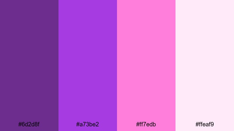
- HEX Codes: #6d2d8f, #a73be2, #ff7edb, #ffeaf9
- Mood: Trendy, dreamy, and expressive.
- Use for: Use in gradient backgrounds, motion graphics, and stylish intro sequences.
Luxe Gradient Crush is all about smooth transitions between rich Portfolio purples and candy pinks. It feels modern and expressive, like the gradients used by music apps and creative brands.
Apply this palette as full-screen gradient backgrounds, animated blobs, or flowing shapes behind your titles. It is perfect for music videos, channel intros, and social media bumpers where a soft, dreamy color wash helps your text and logo feel alive.
Soft & Moody Portfolio Color Palettes
Dusk Edit Session
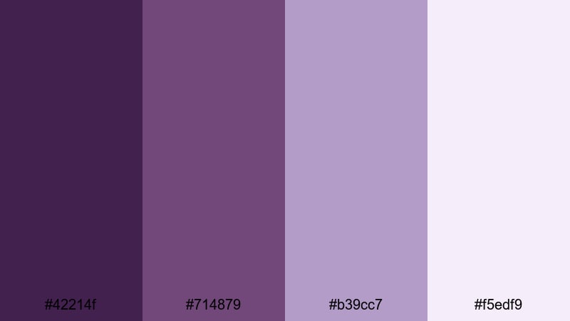
- HEX Codes: #42214f, #714879, #b39cc7, #f5edf9
- Mood: Calm, introspective, and cinematic.
- Use for: Ideal for behind-the-scenes edits, study vlogs, and moody storytelling.
Dusk Edit Session captures the quiet vibe of late evening with muted Portfolio shades and hazy mauves. It is soft and cinematic, giving your footage a thoughtful, reflective quality rather than high energy.
Use the darker tones for subtle vignette overlays or letterboxing, and let the lighter colors guide your titles, timestamps, and chapter markers. This palette works beautifully for behind-the-scenes sequences, study-with-me vlogs, and narrative edits set to lo-fi or ambient soundtracks.
Quiet Client Proof
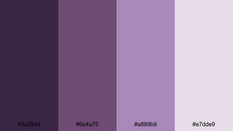
- HEX Codes: #3a2644, #6e4a75, #a889b9, #e7dde9
- Mood: Trustworthy, gentle, and focused.
- Use for: Best for client review links, testimonial videos, and case study explainers.
Quiet Client Proof softens Portfolio into gentle purples and powdery highlights, creating a calm, professional look. It communicates reliability and care without feeling stiff or corporate.
Use this palette on client review videos, testimonial compilations, and screen-recorded walkthroughs. The lighter tones make excellent backgrounds for subtitles and annotations, while the deeper purples can highlight key stats, quotes, or logos.
Misty Lens Haze

- HEX Codes: #4f305d, #845c93, #d6bfdc, #f9f4ff
- Mood: Dreamy, nostalgic, and cinematic-soft.
- Use for: Use for wedding highlights, memory montages, and aesthetic B-roll.
Misty Lens Haze brings together hazy violets and washed lilacs that feel like a soft-focus lens flare. The palette is gentle, airy, and emotional, perfect for romantic or nostalgic storytelling.
Use the darker tones sparingly in shadows and gradients while letting the lighter hues dominate backgrounds, overlays, and text boxes. It is especially effective in wedding highlight films, memory montages, and aesthetic B-roll sequences where you want a subtle, emotional color wash.
Ambient Portfolio Room

- HEX Codes: #361f40, #65446b, #a570a9, #f0e2f5
- Mood: Cozy, creative, and introspective.
- Use for: Great for desk setups, editing diaries, and ambient productivity videos.
Ambient Portfolio Room feels like a late-night editing session lit by soft purple LEDs. The warm, muted Portfolio tones and lavender highlights create a cozy but focused atmosphere.
Use this palette for desk setup tours, deep-work timelapses, and ambient productivity loops. Let the darker shades frame your workspace shots and use the lighter tones for timestamp overlays, playlists, and subtle UI elements on screen.
Digital Portfolio Branding Color Palettes
Personal Brand Signature
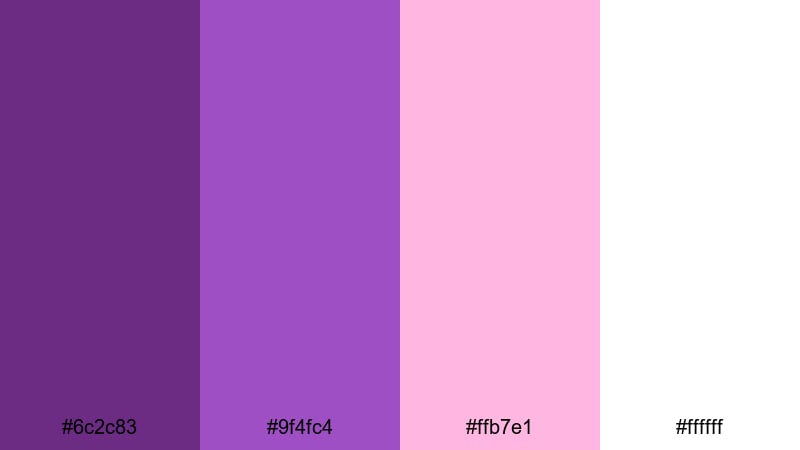
- HEX Codes: #6c2c83, #9f4fc4, #ffb7e1, #ffffff
- Mood: Friendly, polished, and memorable.
- Use for: Ideal for personal brand logos, channel banners, and end cards.
Personal Brand Signature combines a confident Portfolio purple with softer blush accents and pure white. It is versatile enough for logos and channel art while still feeling fresh and creator-friendly.
Use the deep Portfolio tone for your logo mark and main headings, the mid-tone for accents and icons, and the blush for buttons, badges, or avatar frames. White keeps everything clean and easy to read across YouTube banners, end screens, and social media profile graphics.
Creator Media Kit
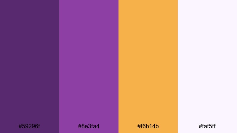
- HEX Codes: #59296f, #8e3fa4, #f6b14b, #faf5ff
- Mood: Professional, upbeat, and media-ready.
- Use for: Best for one-sheet PDFs, portfolio websites, and sponsor pitch videos.
Creator Media Kit anchors your visuals with strong Portfolio purple, then lifts the mood with warm golden accents and soft neutrals. It feels like a well-designed press kit: serious about numbers but still vibrant and creative.
Use Portfolio for headers, section titles, and icons, the gold for key stats and CTAs, and the soft off-white as your background. This palette translates easily from static PDFs and Notion pages to sponsor pitch videos and story-style media kit reels.
Minimal Case Study
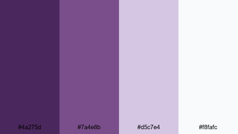
- HEX Codes: #4a275d, #7a4e8b, #d5c7e4, #f8fafc
- Mood: Clean, analytical, and calm.
- Use for: Use for UX case studies, motion design breakdowns, and portfolio walkthroughs.
Minimal Case Study keeps Portfolio tones reserved and balanced with pale lilac and near-white. It is intentionally restrained so that your work, data, and process remain the focus.
Use the darker purples sparingly on section headers, progress bars, and highlights, while the light neutrals handle most backgrounds. This palette is ideal for UX breakdown videos, motion design walkthroughs, and step-by-step portfolio presentations where clarity matters more than drama.
Tips for Creating Portfolio Color Palettes
Portfolio is flexible enough to feel premium, playful, or calm depending on what you pair it with. Use these practical tips to build your own Portfolio color combinations for video and design while keeping everything legible and on-brand.
- Combine Portfolio with a dark neutral (charcoal, near-black, or deep navy) to anchor thumbnails and intros, then use lighter tints for text and icons.
- Always check contrast between your Portfolio background and white or light text using mobile-sized previews to avoid unreadable titles on phones.
- Limit bright accent colors (like cyan or yellow) to small elements such as buttons, stickers, and progress bars so Portfolio remains the hero.
- Match your color palette to your footage by sampling colors from scenes in Filmora, then nudging them toward your chosen HEX values with HSL controls.
- Keep branding consistent by reusing the same Portfolio shades across your logo, lower thirds, end screens, and channel banner art.
- Use gradients that move from deep Portfolio to softer lilac or blush instead of random multi-color blends to maintain a coherent aesthetic.
- Create a light and dark version of your Portfolio palette so you can switch depending on the footage, while still staying within the same brand family.
- Test your palette in black-and-white mode or with reduced saturation to ensure important UI elements and calls to action are distinguishable by brightness, not just color.
Portfolio color palettes can give your videos and designs a distinct identity, from glossy studio promos to soft, introspective vlogs. By pairing rich purples with the right neutrals and accents, you can control mood, readability, and how professional your work feels at a glance.
Use these 15 palettes as starting points, then refine them in Filmora so your intros, overlays, transitions, and end cards all share the same visual language. Whether you are building a personal brand or polishing a client portfolio, consistent color is one of the fastest ways to look more cinematic and put-together.
Experiment with different combinations, save your favorite looks as presets, and keep iterating until your Portfolio aesthetic feels like a natural extension of your creative style.
secure download