
 100% Security Verified | No Subscription Required | No Malware

Prism Yellow is the kind of yellow that feels like a spotlight: bright, focused, and impossible to ignore. It instantly adds optimism, energy, and clarity to your visuals, which is why it is so powerful for intros, titles, and any on screen element that needs to catch the eye in a split second. Used well, Prism Yellow can make your brand feel confident, modern, and full of momentum without looking childish or harsh.
In video content, thumbnails, YouTube overlays, logo stings, and social posts, Prism Yellow works best in carefully planned color palettes, not on its own. Below you will find ready made Prism Yellow color palettes with HEX codes that you can copy straight into your design tools or apply in Filmora. Each palette is tuned for specific moods and use cases, so you can move from idea to edited video faster while keeping your color story consistent.
In this article
Bright And Playful Prism Yellow Color Palettes
Sunlit Studio Pop

- HEX Codes: #ffd64a, #ff9f1c, #ff6b6b, #2ec4b6
- Mood: Energetic, youthful, and creative with a fun studio vibe.
- Use for: Ideal for upbeat YouTube intros, creator logos, and animated lower thirds that need to grab attention fast.
Sunlit Studio Pop feels like turning on all the lights in a colorful creator studio. The vivid Prism Yellow (#ffd64a) is supported by juicy orange and coral, while teal keeps everything feeling fresh instead of overwhelming. Together, they create a playful, high impact look that feels perfect for fast paced edits and personality driven channels.
Use this palette for YouTube intros, channel branding, motion graphics packs, and social thumbnails where you want the viewer to feel instant excitement. Let Prism Yellow carry your titles or icons, and use the orange, coral, and teal for background blocks, callout shapes, and subtle gradients so your visuals stay bold but balanced.
Pro Tip: Enhance Your Prism Yellow Visuals With Filmora
When you build an energetic palette like Sunlit Studio Pop, consistency is everything. In Filmora, you can save this Prism Yellow plus its accent colors as presets and reuse them across titles, transitions, and overlays so your intro, B roll captions, and end screens all feel like parts of the same brand.
Apply your main Prism Yellow to title cards and lower thirds, then repeat the orange and teal in elements like shapes, borders, and callouts. By using the same HEX values throughout your Filmora project, you create a recognizable color language that makes your channel instantly identifiable in the feed.
AI Color Palette
If you already have this Prism Yellow palette in a style frame, thumbnail, or branding card, you can turn it into a look for your entire video using Filmora's AI Color Palette feature. Import a reference image that shows your preferred mix of yellow, orange, coral, and teal, and let Filmora analyze it automatically.
AI Color Palette can then apply that same color mood to the rest of your clips, so your A roll, B roll, overlays, and even reaction shots all keep the same bright, studio ready feel. It saves you from manually matching every single shot while still keeping your Prism Yellow accents front and center.
 secure download

HSL, Color Wheels & Curves
To keep Prism Yellow punchy without blowing out your highlights, use Filmora's HSL and color wheels controls to fine tune the yellow and orange ranges. You can slightly desaturate skin tones while increasing saturation on yellows and teals so key graphics pop but faces stay natural. Curves let you deepen shadows for more contrast while preserving that bright, studio look.
If you want a more cinematic twist, adjust the midtone color wheel to push a hint of teal into the shadows and warmth into the highlights, creating a modern teal and gold vibe where Prism Yellow becomes the hero accent. For a deeper walkthrough, you can follow along with Filmora's advanced color grading tutorials on YouTube and apply the same principles to your Prism Yellow schemes.
secure download1000+ Video Filters & 3D LUTs
Once your Prism Yellow palette is in place, Filmora's video filters and 3D LUTs make it easy to add a final layer of style. You can choose looks that slightly soften the yellows for a pastel feel, or go for high contrast, punchy LUTs that make your Sunlit Studio Pop palette feel even more electric.
Apply filters to entire sequences to keep your thumbnails, intros, and reels visually linked. If a LUT makes your yellow too strong, just dial back the intensity slider so Prism Yellow stays bright without distracting from your subject. It is a quick way to keep your content on brand while experimenting with different moods.
secure downloadCreator Candy Splash
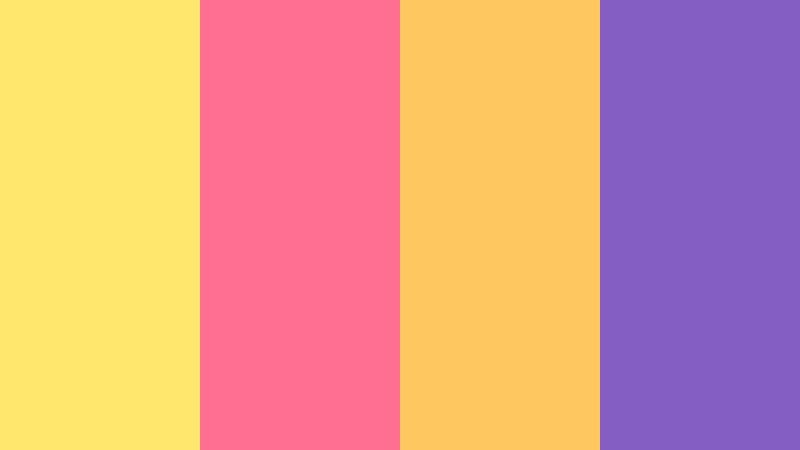
- HEX Codes: #ffe66d, #ff6f91, #ffc75f, #845ec2
- Mood: Candy-bright and bubbly with a modern creator energy.
- Use for: Great for vlogs, TikTok overlays, and channel banners that lean into fun, colorful storytelling.
Creator Candy Splash layers a soft Prism Yellow (#ffe66d) with bubblegum pink, warm coral yellow, and a rich violet accent. It feels like a candy shop for creators: bright, sweet, and full of personality. The violet shade grounds the palette so it stays modern instead of too childish.
Use Prism Yellow and coral for your main titles, then reserve pink and violet for badges, calls to action, and animated stickers in TikTok overlays. This palette suits lifestyle vlogs, GRWM content, and fun channel banners where you want your personality to feel approachable and upbeat at first glance.
Neon City Highlight

- HEX Codes: #ffdf3a, #00f5d4, #ff7b00, #1a1a2e
- Mood: High-contrast and electric, like neon lights against a night sky.
- Use for: Perfect for gaming intros, tech explainers, and bold kinetic typography sequences.
Neon City Highlight throws Prism Yellow (#ffdf3a) into a dark digital cityscape of deep navy, neon teal, and searing orange. The contrast is intense and graphic, echoing neon signs and LED screens against midnight skies, which makes this palette ideal for screens-first content.
Let the navy serve as your main background in thumbnails or title cards, then use Prism Yellow and neon teal for bold typography and HUD style elements. The orange accent can emphasize critical words, alerts, or swipe prompts in gaming edits, tech explainers, and kinetic type animations.
Summer Festival Lights

- HEX Codes: #ffd447, #ff8fab, #ffb347, #46c2cb
- Mood: Warm, festive, and carefree like a music festival at golden hour.
- Use for: Use for event promos, travel vlogs, and recap reels that celebrate sunshine and crowds.
Summer Festival Lights mixes a warm Prism Yellow (#ffd447) with rosy pink, melon orange, and a splash of aqua. The palette feels like stage lights, cotton candy, and sun flares all at once, giving your footage a carefree festival atmosphere.
Use yellow and melon for light leaks, transitions, or animated confetti, while pink and aqua appear in titles, stickers, and location tags. It works especially well for recap reels, travel vlogs, and event promos where you want to emphasize joy, movement, and shared experiences.
Playground Motion Graphics
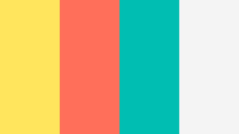
- HEX Codes: #ffe45e, #ff6f59, #00bfb2, #f4f4f4
- Mood: Cheerful, bouncy, and friendly with a clean finish.
- Use for: Great for kid-friendly channels, educational explainers, and playful motion graphics packs.
Playground Motion Graphics blends a bright Prism Yellow (#ffe45e) with a warm red, fresh turquoise, and a soft white base. The result is cheerful and easy to read, which is ideal for animated shapes, icons, and captions that need to be understood quickly.
Use white or light gray as your primary background in explainers, then introduce Prism Yellow in simple icons, arrows, and labels. The red and turquoise bring contrast for key points or callouts in kid friendly content, educational shorts, and playful infographics.
Soft And Cozy Prism Yellow Color Palettes
Morning Oat Latte

- HEX Codes: #f6e27f, #f8f1e7, #c89f7b, #7b6f63
- Mood: Calm, cozy, and gently motivating, like a slow morning routine.
- Use for: Ideal for productivity vlogs, aesthetic study videos, and calm lifestyle intros.
Morning Oat Latte softens Prism Yellow into a creamy oatmeal tone (#f6e27f) wrapped in beige and latte browns. It feels like quiet mornings, planners, and coffee foam, giving your visuals a warm yet focused atmosphere.
Use the light yellow and cream tones as backgrounds for minimalist titles, lower thirds, and journaling prompts. The deeper browns work well for text, icons, or frame lines in productivity vlogs, aesthetic study with me videos, and lifestyle intros where you want gentle motivation instead of loud hype.
Sunrise Bedroom Glow

- HEX Codes: #ffeaa7, #fdebd3, #d2bba0, #8c7a6b
- Mood: Dreamy, intimate, and soothing with a soft sunrise haze.
- Use for: Use in room makeover videos, home decor reels, and gentle voiceover content.
Sunrise Bedroom Glow combines a muted Prism Yellow (#ffeaa7) with blush beige, warm taupe, and a soft brown accent. The palette looks like sunlight slipping past curtains, creating a dreamy, intimate feeling that flatters interiors and skin tones.
Use the lighter shades for background gradients and text blocks in room makeovers, home decor tours, and softly spoken voiceover content. The deeper taupe and brown can frame product shots, highlight captions, or underline titles without stealing attention from your footage.
Lemon Chiffon Study Desk

- HEX Codes: #fff4a3, #fdfdf6, #c5d5cb, #7a9e9f
- Mood: Fresh, tidy, and quietly optimistic for focused days.
- Use for: Perfect for study with me videos, digital planner templates, and minimalist channel branding.
Lemon Chiffon Study Desk features a pale Prism Yellow (#fff4a3) against off white and sage toned greens. It has a fresh, organized feel, like a clean desk with natural light and a minimalist layout.
Use the light yellow as a background for to do lists, pop up notes, and timers in study with me edits. The muted greens are ideal for icons, progress trackers, and subtle dividers in digital planner templates or minimalist branding for educational channels.
Rainy Window Warmth
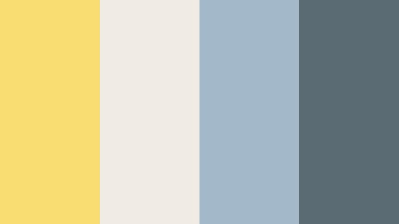
- HEX Codes: #f7dd72, #f0ebe3, #a3b9c9, #5b6b73
- Mood: Comforting and reflective, with a gentle contrast of warm and cool.
- Use for: Great for lo-fi music loops, journal-style storytelling, and reflective mini documentaries.
Rainy Window Warmth places a soft Prism Yellow (#f7dd72) alongside misty neutrals and blue grays. The warm yellow feels like a lamp or candle against a rainy window, creating a cozy but slightly melancholic mood.
Use yellow sparingly for highlights on titles, chapter cards, or key phrases, and let the blue grays drive your backgrounds and overlays. This palette works beautifully in lo fi music visuals, journal style storytelling, and reflective mini documentaries where mood and memory matter.
Soft Lemon Film Grain

- HEX Codes: #ffe699, #f7f2e7, #d4c2aa, #6a655e
- Mood: Nostalgic and cinematic with a gentle vintage tint.
- Use for: Use for film-style color grading, nostalgic reels, and aesthetic b roll sequences.
Soft Lemon Film Grain turns Prism Yellow into a washed, creamy tone (#ffe699) surrounded by warm neutrals and a deep gray brown. It looks like faded photo paper or Super 8 footage, adding subtle retro warmth without heavy filters.
Apply the cream and beige tones to backgrounds, frames, or overlay shapes, and keep Prism Yellow as a gentle highlight on text or light leaks. This palette is excellent for nostalgic reels, aesthetic B roll, and film style edits where you want emotion and memory without loud, saturated colors.
Bold And Cinematic Prism Yellow Color Palettes
Noir Spotlight Contrast
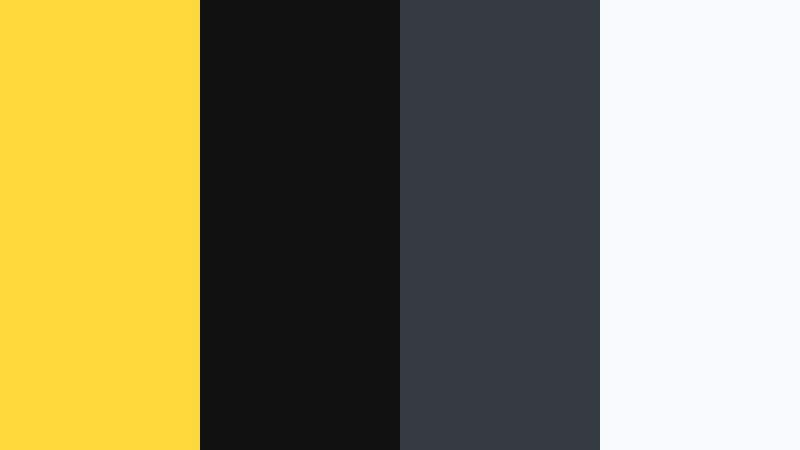
- HEX Codes: #ffd93b, #111111, #343a40, #f8f9fa
- Mood: Dramatic and high-impact with a strong graphic punch.
- Use for: Perfect for bold title cards, channel trailers, and cinematic teasers that need strong contrast.
Noir Spotlight Contrast sets a sharp Prism Yellow (#ffd93b) against deep charcoal blacks and crisp white. The contrast is extreme, giving your frames a graphic novel or poster like impact that reads perfectly on small screens.
Use black or dark gray as your base, Prism Yellow for titles and key icons, and white for supporting text and subtle lines. This palette shines in channel trailers, bold openers, and cinematic teasers where legibility and drama are top priorities.
Cyber Caution Frame

- HEX Codes: #ffde3b, #151a1f, #00c6ff, #ff3b3f
- Mood: Edgy, futuristic, and tense like a cyberpunk warning signal.
- Use for: Great for tech reviews, cybersecurity content, and glitchy motion graphics.
Cyber Caution Frame throws Prism Yellow (#ffde3b) into a dark, futuristic mix of deep slate, electric blue, and danger red. It feels like a warning HUD or system alert in a sci fi interface.
Frame your shots with dark backgrounds, then use yellow and red for caution labels, glitch effects, and animated borders. Electric blue can handle data visuals, progress bars, and tech icons in reviews, cybersecurity explainers, or glitchy intros.
Adrenaline Sports Streak

- HEX Codes: #ffe100, #00509d, #f21b3f, #f0f3f5
- Mood: Fast, competitive, and high-energy with stadium-level intensity.
- Use for: Use in sports montages, fitness trailers, and dynamic highlight reels.
Adrenaline Sports Streak pushes an electric Prism Yellow (#ffe100) against bold blue, intense red, and clean off white. It feels like stadium lights, scoreboards, and team jerseys, built for speed and competition.
Use yellow and red for speed lines, score flashes, and dynamic lower thirds, while blue anchors text and stats. The off white keeps everything readable in highlight reels, fitness trailers, and sports montages packed with fast cuts and motion blur.
Trailer Hazard Tape

- HEX Codes: #ffd32a, #101820, #ff6b35, #e0e0e0
- Mood: Tense, alert, and industrial with a trailer-ready edge.
- Use for: Ideal for crime, thriller, or urban documentary titles and lower thirds.
Trailer Hazard Tape takes Prism Yellow (#ffd32a) into industrial territory with near black, a searing orange, and neutral gray. It echoes warning stripes and hazard tape, instantly signaling tension and urgency.
Build dark backgrounds with gray accents, then bring in yellow and orange for diagonal stripes, key phrases, and animated borders. This palette is a natural fit for crime or thriller titles, urban documentary lower thirds, and teaser trailers that need to feel gritty and alert.
Modern And Minimal Prism Yellow Color Palettes
Clean UI Accent Strip
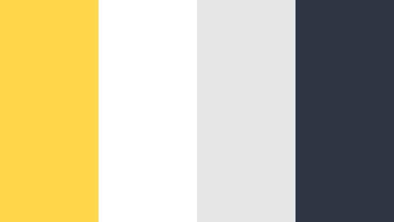
- HEX Codes: #ffd84d, #ffffff, #e5e5e5, #2f3542
- Mood: Minimal, polished, and professional with a bright accent.
- Use for: Perfect for app promos, UI mockups, and clean explainer videos that need a single bold highlight.
Clean UI Accent Strip keeps Prism Yellow (#ffd84d) as a focused accent against white, soft gray, and a slate text color. It feels like a modern interface or landing page, simple and uncluttered.
Use white and light gray for most of the frame, and reserve Prism Yellow for key buttons, progress bars, and attention grabbing labels in app promos or product explainers. The dark slate shade ensures text and iconography stay crystal clear on thumbnails and on screen graphics.
Brand Deck Spotlight

- HEX Codes: #ffdf5a, #f7f7f7, #b0b8c5, #222831
- Mood: Confident, contemporary, and presentation ready.
- Use for: Use in pitch decks, logo stings, and brand identity videos that want a warm but modern touch.
Brand Deck Spotlight presents a refined Prism Yellow (#ffdf5a) with light gray, steel blue gray, and a deep charcoal. It feels like a modern brand system: warm, approachable, but still professional enough for clients and sponsors.
Use the soft light gray as the main canvas, with Prism Yellow highlighting your logo, key numbers, or CTAs in pitch decks and brand identity videos. The muted blue gray and charcoal handle headlines, body copy, and icon outlines, keeping everything sleek and presentation ready.
Tips for Creating Prism Yellow Color Palettes
Prism Yellow is powerful, so pairing it thoughtfully with neutrals and accents will keep your videos and designs bright but controlled. Here are practical tips to shape palettes that work across intros, thumbnails, overlays, and branding.
- Use Prism Yellow as an accent, not a flood color. Reserve it for titles, buttons, and key icons while letting whites, grays, or muted tones handle most backgrounds.
- Check contrast on small screens. Pair Prism Yellow with very dark text colors (navy, charcoal, black) for headlines to keep everything readable on mobile thumbnails.
- Balance warm and cool tones. Combine Prism Yellow with cool blues or teals to avoid an overly hot frame and to create a cinematic teal and gold style.
- Match your footage lighting. If your clips are low light or moody, choose softer, desaturated Prism Yellow palettes; for bright daytime vlogs, you can push saturation higher.
- Stay consistent across assets. Reuse the exact same HEX values in your intros, lower thirds, channel banners, and end screens so your brand feels cohesive.
- Limit your palette size. Most Prism Yellow schemes work best with 3 to 5 colors: a hero yellow, 1 to 2 neutrals, and 1 to 2 accents.
- Test on both light and dark backgrounds. Some Prism Yellow shades glow on dark UI but wash out on white, so adjust brightness and saturation based on your primary background.
- Use overlays and gradients lightly. A subtle yellow gradient or vignette on footage can reinforce your brand without overpowering skin tones or product colors.
Prism Yellow is one of the fastest ways to add energy, clarity, and personality to your videos and designs. Whether you lean into bright and playful, soft and cozy, or bold and cinematic moods, a well planned Prism Yellow palette can make your channel, brand, or series instantly recognizable.
Try these 15 palettes as starting points, then refine them in Filmora so they match your footage, lighting, and story. With tools like AI Color Palette, HSL, and LUTs, you can keep your Prism Yellow consistent from thumbnail to final frame while still exploring different moods and styles.
The more you reuse your favorite Prism Yellow combinations across intros, lower thirds, and social edits, the stronger your visual identity becomes. Experiment, save your favorite looks, and let your colors work as hard as your content.
secure download