
 100% Security Verified | No Subscription Required | No Malware

Purple Red sits between sensual magenta and deep wine, which makes it perfect for visuals that feel emotional, bold, and a little cinematic. It suggests passion, mystery, and creativity at the same time, so it works beautifully for romantic storytelling, dramatic intros, and thumbnails that need to pop without looking childish.
For video creators and brands, a well-chosen Purple Red color palette can tie together your logo, lower thirds, titles, overlays, and YouTube thumbnails so everything feels intentional. Below you will find 15 Purple Red color palettes with HEX codes you can plug straight into your branding, edits, and Filmora projects to keep your style consistent across vlogs, promos, and social content.
In this article
Soft & Romantic Purple Red Color Palettes
Rose Twilight Blush
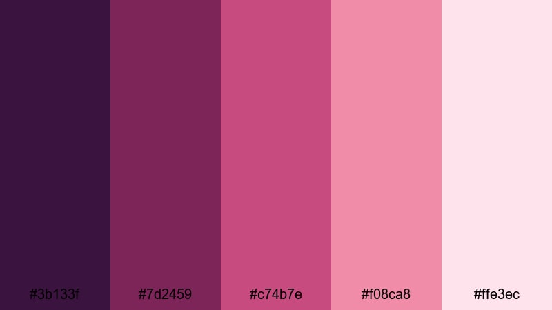
- HEX Codes: #3b133f, #7d2459, #c74b7e, #f08ca8, #ffe3ec
- Mood: Tender, dreamy, and intimate with a soft evening glow.
- Use for: Perfect for wedding highlight reels, proposal stories, and romantic vlog sequences.
Rose Twilight Blush layers deep plum with gentle rose and blush highlights, creating a dreamy Purple Red atmosphere that feels like golden hour after sunset. The darker tones give depth and contrast, while the pale pinks soften everything, flattering skin and adding a glow that feels emotional, not flashy.
Use this palette for wedding films, couple shoots, engagement announcement thumbnails, or any love-story B-roll. In Filmora, you can use the darker shades for text and frames, then keep the lighter blush tones for backgrounds, overlays, and lower thirds to maintain a cohesive romantic brand look across intros, shorts, and Reels.
Pro Tip: Build a Cinematic Purple Red Romance Look in Filmora
When you edit with a delicate palette like Rose Twilight Blush, consistency is everything. Set the deeper Purple Red tones for your titles and logo, then repeat the mid-rose colors in lower thirds, subscribe buttons, and chapter cards so your audience instantly recognizes your style across every video.
In Filmora, save your favorite Purple Red values in custom color presets and reuse them in text, shapes, and filters. This keeps your proposal stories, wedding highlights, and romantic vlogs visually tied together, even when you mix indoor candlelight with outdoor sunset footage.
AI Color Palette
If you have a reference still from your shoot or a color card featuring these Purple Red tones, you can use Filmora's AI Color Palette feature to match the look across your entire project. The AI analyzes the colors in your reference frame and applies the same mood to all your clips, so your B-roll, A-roll, and cutaways feel like one cohesive film.
This is especially useful for romantic content, where subtle shifts in red and pink can change the emotional tone. Instead of manually grading every clip, let the AI carry over that soft twilight blush to all your scenes, thumbnails, and vertical edits.
 secure download

HSL, Color Wheels & Curves
To perfect your Purple Red look, fine-tune it with HSL, color wheels, and curves inside Filmora. Slightly desaturate the reds while lifting the magentas in HSL to avoid harsh skin tones, then use the color wheels to push shadows toward plum and highlights toward blush for a more cinematic gradient.
For more control, adjust the curves to gently lift the blacks and roll off the highlights, giving your romantic footage a soft, filmic contrast. You can combine these adjustments with the techniques shown in Filmora's advanced color grading tools guide to lock in a signature Purple Red style you can reuse on future projects.
secure download1000+ Video Filters & 3D LUTs
If you want to stylize your Purple Red palette faster, Filmora's video filters and 3D LUTs make it easy to test different moods. Try soft film LUTs to add grainy romance, or use glow and vignette filters to emphasize faces and details while keeping the Rose Twilight Blush tones intact.
You can stack subtle filters over your core color grade to create variations for trailers, shorts, or TikToks without rebuilding the look from scratch. Save your favorite combinations as presets and apply them in one click to any new romantic project that uses Purple Red as its signature.
secure downloadVelvet Orchid Whisper
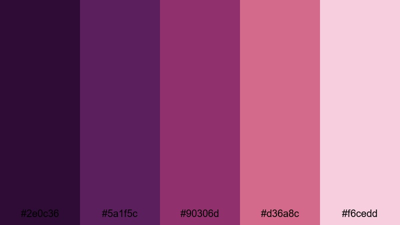
- HEX Codes: #2e0c36, #5a1f5c, #90306d, #d36a8c, #f6cedd
- Mood: Luxurious, soft, and quietly passionate.
- Use for: Use for slow-motion beauty shots, luxury product intros, and soft-focus cinematic titles.
Velvet Orchid Whisper leans into rich orchid purples and silky rose tones to create a luxurious Purple Red story. The deep bases feel like velvet studio backdrops, while the lighter pinks add gloss and softness that are perfect for beauty and fashion content.
Apply this palette to product close-ups, perfume ads, or skincare routines where you want glamour without harsh neon. Use the darkest hue for backgrounds or title bars, the medium magentas for buttons and icons, and the pale pinks for soft overlays and beauty-themed thumbnails.
Blush Wine Reverie
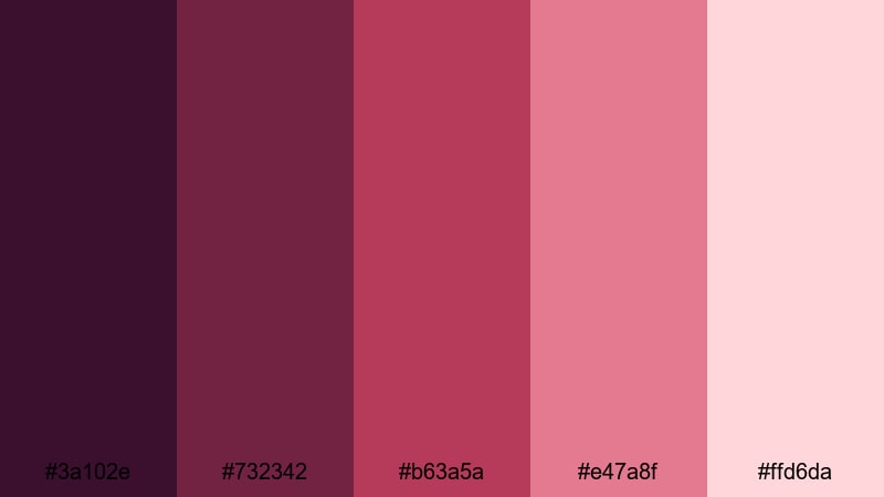
- HEX Codes: #3a102e, #732342, #b63a5a, #e47a8f, #ffd6da
- Mood: Warm, nostalgic, and slightly dramatic like a candlelit evening.
- Use for: Great for story-driven vlogs, date-night montages, and intimate short films.
Blush Wine Reverie combines wine-inspired reds with soft blush tones to evoke candlelit dinners and retro romance. The gradient from deep berry to pale rose creates a cinematic contrast that makes faces and details stand out against darker scenes.
Use this palette in date-night vlogs, cozy restaurant B-roll, or storytelling shorts where nostalgia matters. In thumbnails and titles, pair the darker wine hues with light blush backgrounds for strong readability while keeping the overall mood warm and intimate.
Evening Pomegranate Glow
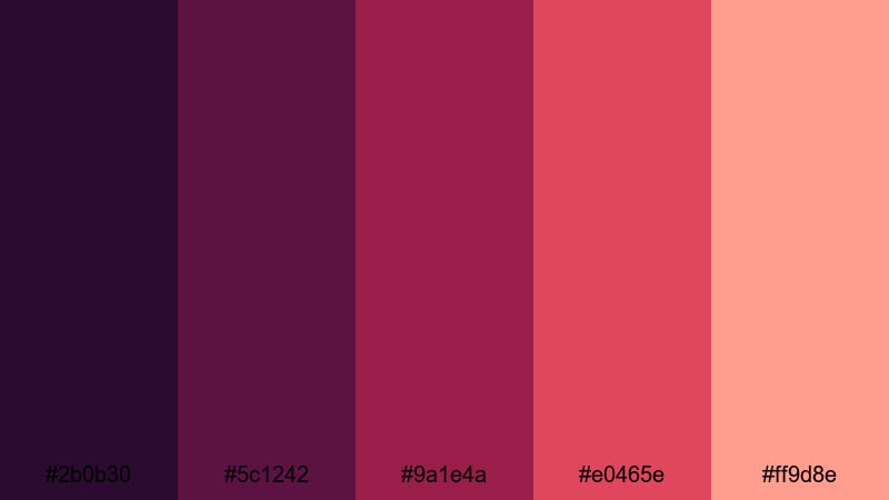
- HEX Codes: #2b0b30, #5c1242, #9a1e4a, #e0465e, #ff9d8e
- Mood: Glowing, passionate, and slightly playful.
- Use for: Perfect for travel sunsets, food videos, and warm lifestyle b-roll overlays.
Evening Pomegranate Glow leans into juicy reds and coral highlights that feel like late-summer sunsets. The darker Purple Red tones ground the palette, while the bright coral and peach shades add energy and playfulness.
It is ideal for sunset travel montages, food videos with rich sauces and cocktails, or lifestyle vlogs filmed at golden hour. Use the deeper colors for text and frames, and draw attention to key elements with the bright pomegranate and coral tones in badges, callouts, and overlay gradients.
Bold & Cinematic Purple Red Color Palettes
Crimson Neon Dream
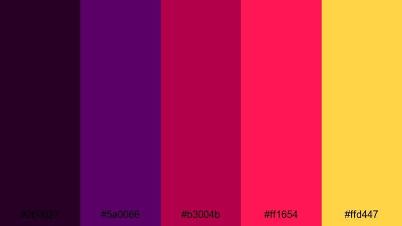
- HEX Codes: #260027, #5a0066, #b3004b, #ff1654, #ffd447
- Mood: Energetic, rebellious, and ultra-modern.
- Use for: Ideal for gaming intros, urban night edits, and high-energy YouTube thumbnails.
Crimson Neon Dream is all about impact: electric purples collide with neon crimson and hot gold accents. This palette delivers a cyberpunk, arcade-like feel that instantly grabs attention in crowded feeds.
Use it for gaming intros, tech channel branding, or night-city b-roll where signs and LEDs dominate the frame. In thumbnails, pair the dark purples as backgrounds with screaming red titles and gold accents on arrows, frames, or shock emojis to drive clicks.
Electric Magenta Theatre
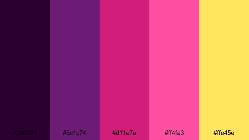
- HEX Codes: #2b0031, #6c1c74, #d11e7a, #ff4fa3, #ffe45e
- Mood: Show-stopping, theatrical, and vibrant.
- Use for: Use for announcement cards, premiere trailers, and short-form promo videos.
Electric Magenta Theatre feels like stage lights hitting a velvet curtain: deep purples, blinding magentas, and spotlight gold. It delivers a showtime vibe that works perfectly for premieres, announcements, and special event promotions.
Design your title cards and countdown screens with the darkest purple as a base, then layer bold magenta gradients and gold accents on text or borders. In Filmora, this palette works well with light flares and glow effects to amplify that theatrical, live-show energy.
Cyber Royal Inferno
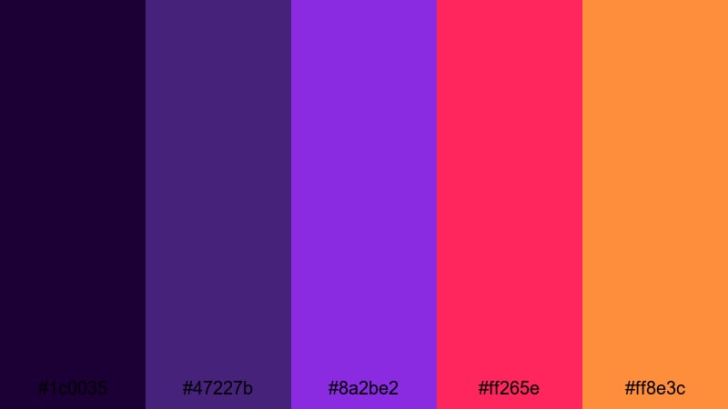
- HEX Codes: #1c0035, #47227b, #8a2be2, #ff265e, #ff8e3c
- Mood: Futuristic, fiery, and dramatic like a sci-fi trailer.
- Use for: Great for tech content, app promos, and edgy motion graphics in intros or outros.
Cyber Royal Inferno blends royal purple with blazing red and orange accents, delivering a cinematic sci-fi feel. The cooler purples give a techy, digital base, while the warm highlight colors feel like energy bursts or UI warnings.
Use this palette for app promo videos, futuristic HUD overlays, glitchy motion graphics, and channel intros that need a high-tech identity. Build interfaces and callouts using the purples, then reserve the bright reds and oranges for key actions, CTAs, or impact text.
Festival Lights Ember
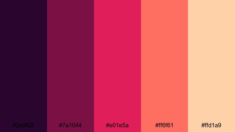
- HEX Codes: #2a062f, #7a1044, #e01e5a, #ff6f61, #ffd1a9
- Mood: Festive, warm, and full of movement.
- Use for: Perfect for concert recaps, festival vlogs, and energetic travel edits.
Festival Lights Ember feels like standing in front of a stage, with berry reds, coral lights, and warm peach flares. The palette captures the heat and excitement of concerts, bonfires, and street festivals.
Use the deep Purple Red tones for backgrounds and lower thirds, while the bright corals and peaches become light leaks, animated lines, or accent text. It is great for energetic montage sequences, recap reels, and thumbnails showcasing crowds, fireworks, or performers.
Modern & Minimal Purple Red Color Palettes
Plum Accent Clean
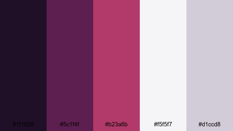
- HEX Codes: #1f1028, #5c1f4f, #b23a6b, #f5f5f7, #d1ccd8
- Mood: Sophisticated, clean, and quietly confident.
- Use for: Use for minimalist logo reveals, lower thirds, and sleek tutorial layouts.
Plum Accent Clean balances rich plum and berry accents with airy off-whites and soft grays. The result is a modern Purple Red palette that feels premium but not overwhelming, ideal for professional content and personal brands that want a polished look.
Use the light neutrals as main backgrounds in your tutorials and explainer videos, then apply the darker plum tones to headlines, icons, and borders. This keeps your layouts readable and minimalist while still giving your channel a distinct Purple Red signature.
Linear Merlot Gradient
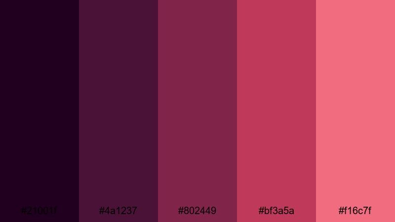
- HEX Codes: #21001f, #4a1237, #802449, #bf3a5a, #f16c7f
- Mood: Smooth, polished, and subtly dramatic.
- Use for: Ideal for animated gradient backgrounds, title cards, and sleek transitions.
Linear Merlot Gradient moves from deep plum to warm rose, creating a smooth, cinematic wash of Purple Red. Because the palette is built as a gradient, it is perfect for animated backgrounds, sliding panels, and wipes that feel cohesive and high-end.
In Filmora, apply these HEX codes to gradient fills for title cards, subscribe screens, and transitions between scenes. The darkest shades can frame your content at the edges, while the brighter merlot and rose hues pull the viewer toward the center where your subject or text sits.
Muted Berry Interface
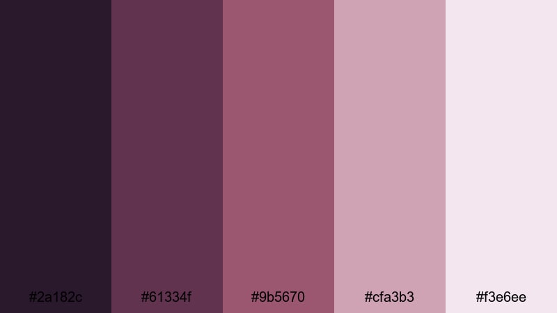
- HEX Codes: #2a182c, #61334f, #9b5670, #cfa3b3, #f3e6ee
- Mood: Calm, professional, and gently feminine.
- Use for: Great for UI mockups, app explainer videos, and clean educational content.
Muted Berry Interface softens Purple Red into desaturated berry tones mixed with light neutrals. This keeps the overall feel calm and professional while still hinting at creativity and warmth.
Use this palette for UI overlays, software walkthroughs, or productivity channel branding where you want a soft, approachable aesthetic. Let the pale pinks and off-whites handle backgrounds and panels, while the muted berries define buttons, highlights, and key information blocks.
Minimal Sangria Studio
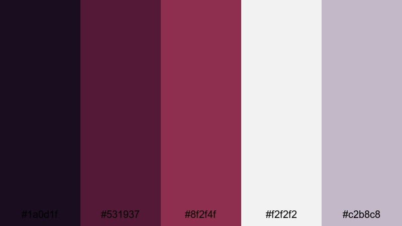
- HEX Codes: #1a0d1f, #531937, #8f2f4f, #f2f2f2, #c2b8c8
- Mood: Creative, focused, and studio-chic.
- Use for: Use for channel branding, studio set mockups, and minimalist title sequences.
Minimal Sangria Studio pairs dark sangria tones with pale grays and whites, giving a chic, editorial studio vibe. The contrast between the deep Purple Red accents and the neutral base keeps focus on your subject and typography.
It works well for channel intros, podcast visuals, or design-focused content where you want clean lines and a serious tone. Use the whites and light grays for most of the frame, then drop in sangria headlines, corner badges, and subtle borders for a recognizable brand identity.
Vintage & Moody Purple Red Color Palettes
Retro Velvet Cinema
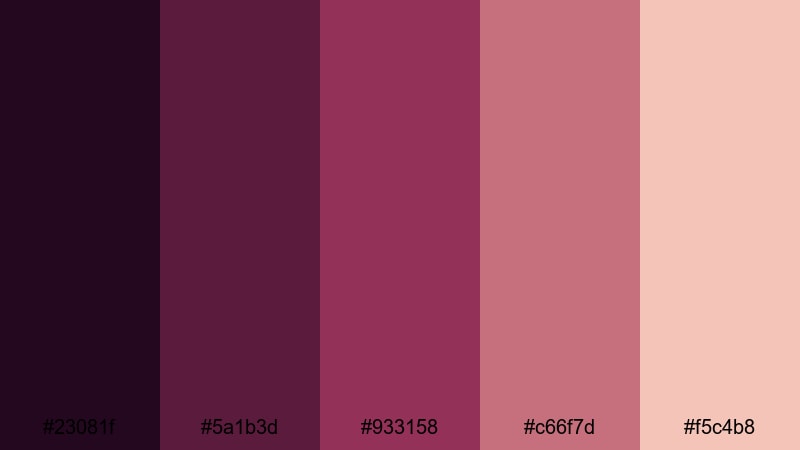
- HEX Codes: #23081f, #5a1b3d, #933158, #c66f7d, #f5c4b8
- Mood: Nostalgic, cinematic, and softly grainy in feel.
- Use for: Perfect for retro film edits, storytelling shorts, and title card overlays with a vintage vibe.
Retro Velvet Cinema uses velvety purples and faded reds that mimic old film prints. The lighter peach tone feels like aged paper or sun-faded posters, adding instant nostalgia to your footage.
Apply this palette to narrative shorts, memory sequences, or retro-inspired vlogs. Add subtle grain in Filmora and use the deeper shades for letterbox bars, with the softer hues in titles and overlays to complete the vintage Purple Red aesthetic.
Gothic Berry Noir
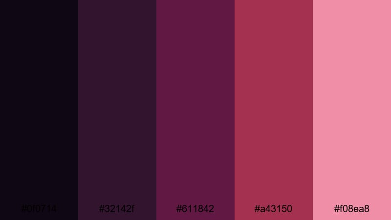
- HEX Codes: #0f0714, #32142f, #611842, #a43150, #f08ea8
- Mood: Dark, mysterious, and dramatic with a romantic edge.
- Use for: Great for music videos, dark academia edits, and moody narrative teasers.
Gothic Berry Noir dives into inky purples and rich berry reds to create a dark, romantic atmosphere. The palette feels like candlelight in an old library or a music video lit with a single spotlight.
Use the nearly black purples for backgrounds, borders, and letterboxing, while the brighter berry tones highlight faces, typography, and key props. It is a strong fit for dark academia edits, alternative fashion lookbooks, and moody teasers or trailers.
Dusky Garnet Fade
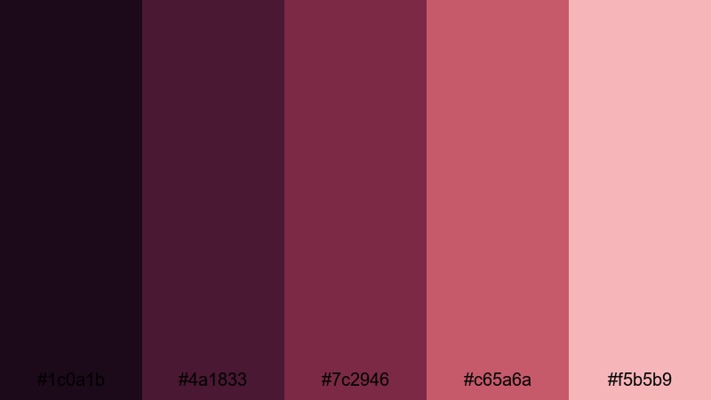
- HEX Codes: #1c0a1b, #4a1833, #7c2946, #c65a6a, #f5b5b9
- Mood: Softly melancholic, reflective, and cinematic.
- Use for: Ideal for closing montages, reflective travel diaries, and end-credit sequences.
Dusky Garnet Fade transitions from dark garnet to warm blush, creating a bittersweet, reflective Purple Red gradient. It feels like the last light after sunset, perfect for endings and reflective moments.
Use this palette for closing montages, goodbye scenes, or reflective travel diaries that mix joy and nostalgia. The deeper shades can anchor end-credit backgrounds, while the softer pinks support gentle typography, quotes, and outro graphics.
Tips for Creating Purple Red Color Palettes
Purple Red is powerful, so building the right palette is about balancing intensity, contrast, and readability while matching the mood of your footage and brand.
- Pair Purple Red with soft neutrals (off-white, light gray, beige) to give the eye a place to rest and keep your layouts from feeling too heavy.
- Use the darkest Purple Red tones for text only when they sit on very light backgrounds; for dark backgrounds, switch to white or pale pink text for better readability.
- Limit yourself to one or two strong accent colors in addition to Purple Red to avoid visual noise, especially in thumbnails and intro screens.
- Match your color temperature: use warmer Purple Red palettes for candlelight, sunsets, and indoor tungsten scenes, and cooler ones for neon, night city, or tech content.
- Keep branding consistent by reusing the same HEX codes for your logo, lower thirds, subscribe buttons, and end screens across all projects.
- Test your palette on both desktop and mobile screens; what looks rich purple on a monitor can shift toward red on some phones, so adjust saturation and contrast accordingly.
- Use gradients of Purple Red instead of flat blocks when you want a more cinematic, premium feel for backgrounds, transitions, and overlays.
- In Filmora, save your favorite Purple Red combinations as presets in titles, filters, and LUT adjustments so you can apply your brand look with one click.
Used well, Purple Red color palettes can shape the entire mood of your videos, from soft romance and vintage nostalgia to bold neon and futuristic tech. The right combination of deep plums, magentas, and warm highlights helps your brand feel recognizable and intentional on every platform.
Try these 15 palettes as starting points: drop the HEX codes into your titles, overlays, and graphics in Filmora, then adapt them with gradients, filters, and LUTs until they match your own style. Once you lock in a Purple Red look that fits your channel, use it consistently across intros, thumbnails, and social edits to build a strong visual identity.
Open a new Filmora project, experiment with a couple of these palettes on your next edit, and see how quickly a cohesive color story can transform the way your audience experiences your content.
secure download