
 100% Security Verified | No Subscription Required | No Malware


 ChatGPT
 Perplexity
 Gemini
 Claude
 Grok
Grok
Pastel pink sits in a sweet spot between playful and calm. It suggests warmth, gentleness, and approachability without feeling too intense or overwhelming. In color psychology, pastel pink is often linked to romance, softness, and care, which makes it a go to choice for wedding visuals, lifestyle branding, and personal content that aims to feel safe and welcoming.
On screen, pastel pink works beautifully for YouTube thumbnails, vlog intros, overlays, lower thirds, and even full branding systems. It can soften tech content, elevate beauty or fashion videos, and give gaming or streaming layouts a cozy aesthetic. Below you will find ready to use pastel pink color palettes with HEX codes so creators and Filmora users can keep their visuals consistent across intros, B roll, social cutdowns, and channel art.
In this article
Soft And Romantic Pastel Pink Palettes
Blush Morning Light
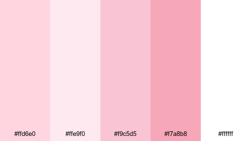
- HEX Codes: #ffd6e0, #ffe9f0, #f9c5d5, #f7a8b8, #ffffff
- Mood: Gentle, hopeful, and quietly romantic, like the first light of day.
- Use for: Ideal for wedding highlight videos, engagement announcements, and dreamy Instagram reels.
Blush Morning Light layers soft, milky pinks with pure white to create an airy, optimistic atmosphere. It feels like sunlight through sheer curtains, perfect for gentle storytelling where emotion matters more than contrast. The pastels keep everything light and flattering on skin tones while still adding a subtle rosy glow.
Use this palette for romantic title cards, animated lower thirds, and clean YouTube thumbnails for couple vlogs or love stories. In Filmora, you can keep your intros, transitions, and end screens on brand by sampling these HEX codes for text, shapes, and background overlays so your entire edit feels cohesive and softly cinematic.
Pro Tip: Keep Your Pastel Pink Storytelling Consistent In Filmora
When you build a romantic look like Blush Morning Light, consistency is everything. In Filmora, you can pick one or two main pastel pinks from this palette for your titles and callouts, then reserve the lightest tones as soft background washes or subtle gradient overlays. Reusing the same HEX values across your intro, B roll captions, and end screen keeps the whole video feeling intentionally designed.
Try creating a simple style guide inside Filmora: save your favorite pastel pink as a custom color, then apply it to text presets, shapes, and motion graphics. This way, every new video in a series of wedding highlights, engagement recaps, or romantic reels will share the same gentle pink identity.
AI Color Palette
If you already have a reference image with this kind of soft blush look, you can turn it into a full video aesthetic using Filmora. Filmora's AI Color Palette feature analyzes your reference frame and automatically transfers its tones to other clips, so your entire timeline inherits the same pastel pink atmosphere.
Import a still from your favorite romantic shot, then use AI Color Palette to match your A roll, B roll, and even slow motion details. This keeps your whites creamy, your pinks soft, and your highlights gentle, without manually color grading every single clip.
 secure download

HSL, Color Wheels & Curves
Pastel pink looks best when highlights stay soft and shadows never turn too muddy. With Filmora's HSL sliders and color wheels, you can gently desaturate harsh reds, nudge magentas toward blush, and warm up skin tones so they sit naturally inside this palette. Curves let you lift the blacks slightly for a dreamy, film like softness instead of heavy contrast.
If you are new to grading, a step by step guide like this Filmora color correction tutorial can help you understand how hue, saturation, and luminance work together. Once you get the hang of it, you can dial in your custom pastel pink look and then reuse the settings as a base grade for future projects.
secure download1000+ Video Filters & 3D LUTs
Sometimes you want a pastel pink mood without spending much time on manual grading. Filmora's video filters and 3D LUTs make it easy to add soft film looks, warm glows, and subtle color casts that complement palettes like Blush Morning Light. A gentle vintage LUT or pastel filter can instantly push your footage toward a romantic, airy vibe.
Apply a filter as a starting point, then fine tune opacity and stack a soft vignette or glow effect to complete the look. This approach works well for editors who want a consistent pastel pink branding style across multiple videos, but do not want to build a custom grade from scratch every time.
secure downloadRose Petal Whisper
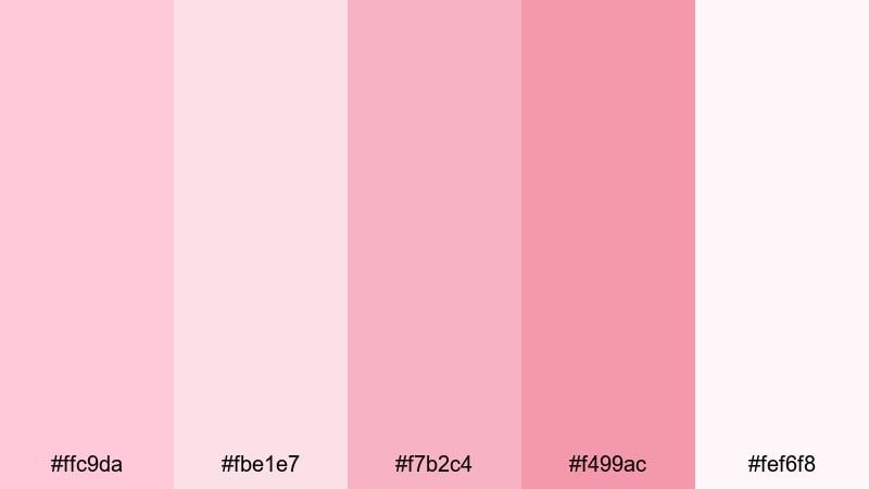
- HEX Codes: #ffc9da, #fbe1e7, #f7b2c4, #f499ac, #fef6f8
- Mood: Tender and intimate, like a quiet love note.
- Use for: Use in save the date edits, proposal clips, or soft beauty tutorials with a romantic tone.
Rose Petal Whisper leans into delicate rose tones with a touch more depth than pure blush. The gradient from pale pink to warmer, slightly richer pinks feels like layered petals, making it ideal for soft focus visuals and emotional storytelling.
Use this palette for save the date animations, proposal highlight reels, or beauty tutorials that celebrate soft glam. In thumbnails and titles, pair the lighter shades as backgrounds with the deeper rose for text and icons so everything stays legible but still dreamy.
Cotton Candy Skies
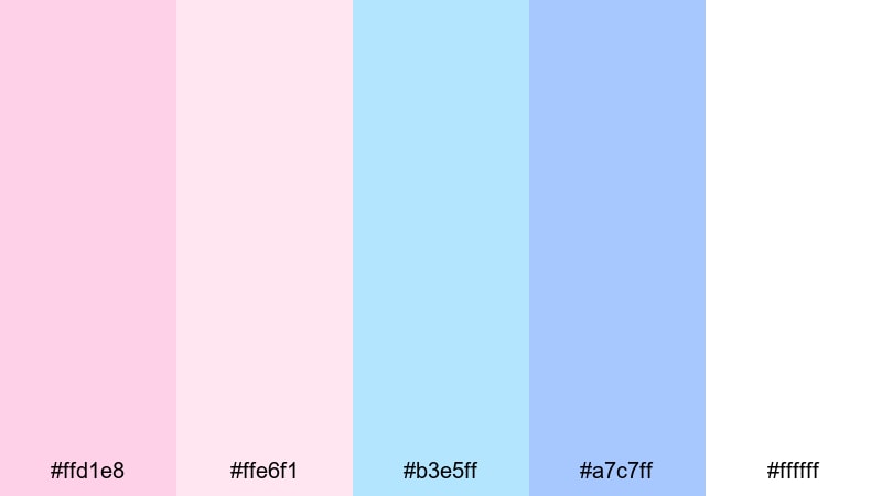
- HEX Codes: #ffd1e8, #ffe6f1, #b3e5ff, #a7c7ff, #ffffff
- Mood: Dreamy and nostalgic, like pastel clouds at sunset.
- Use for: Perfect for travel vlogs, dreamy B-roll transitions, and whimsical YouTube intros.
Cotton Candy Skies mixes pastel pinks with airy sky blues, instantly evoking sunset clouds and amusement park nostalgia. The balance of warm pink and cool blue gives you flexibility: you can push a frame to feel sweeter or more calm depending on which tones dominate.
Transform travel vlogs or whimsical intros by using pink and blue gradients as animated backgrounds, with white text floating on top. This palette also works well for playful lower thirds, location tags, and chapter cards that separate different parts of your video.
Soft Bridal Glow
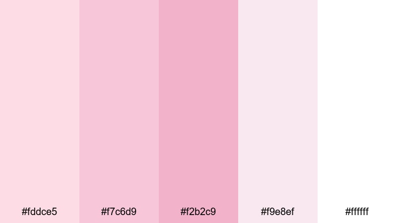
- HEX Codes: #fddce5, #f7c6d9, #f2b2c9, #f9e8ef, #ffffff
- Mood: Elegant, graceful, and ceremonial, like a bridal suite filled with flowers.
- Use for: Great for wedding films, luxury product reveals, and bridal makeup tutorials.
Soft Bridal Glow layers muted pinks and soft whites for a polished, luxurious aesthetic. It feels graceful and ceremonial, ideal for capturing wedding mornings, bridal details, or any scene where you want a touch of quiet luxury.
Use the deeper pinks for monograms, name titles, and logo reveals, while the palest tones create invitation style frames or overlays. In Filmora, you can build a simple title template with these colors and reuse it across full wedding films, teaser trailers, and social reels.
Modern Minimal Pastel Pink Palettes
Dusty Blush Minimal
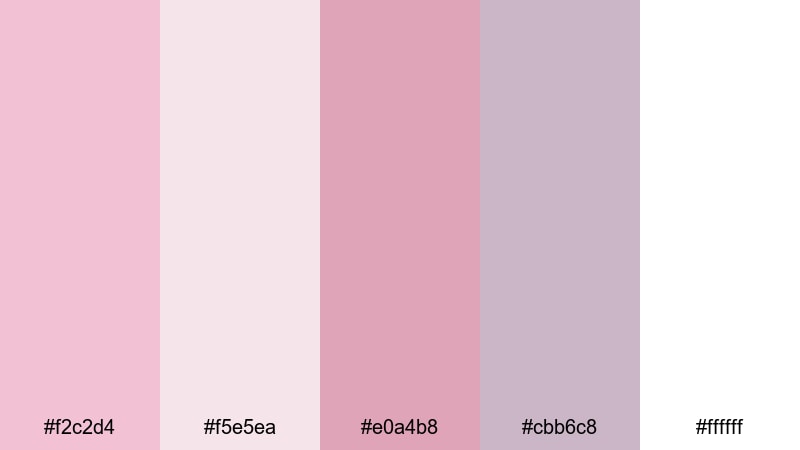
- HEX Codes: #f2c2d4, #f5e5ea, #e0a4b8, #cbb6c8, #ffffff
- Mood: Modern, understated, and stylish with a soft editorial feel.
- Use for: Ideal for minimalist intros, portfolio reels, and clean title screens for design or fashion content.
Dusty Blush Minimal tones down pastel pink into a more mature, editorial palette. The dusty hues and muted mauves feel sophisticated rather than cute, echoing modern magazine layouts and high end branding.
Use this combination for clean portfolio reels, UX design case studies, or fashion lookbooks where you want elegance without harsh contrast. Create minimalist lower thirds, slide in captions, and logo bumpers that rely on negative space, using white and the lightest pink as your base and the deeper tones for accents.
Blush And Concrete
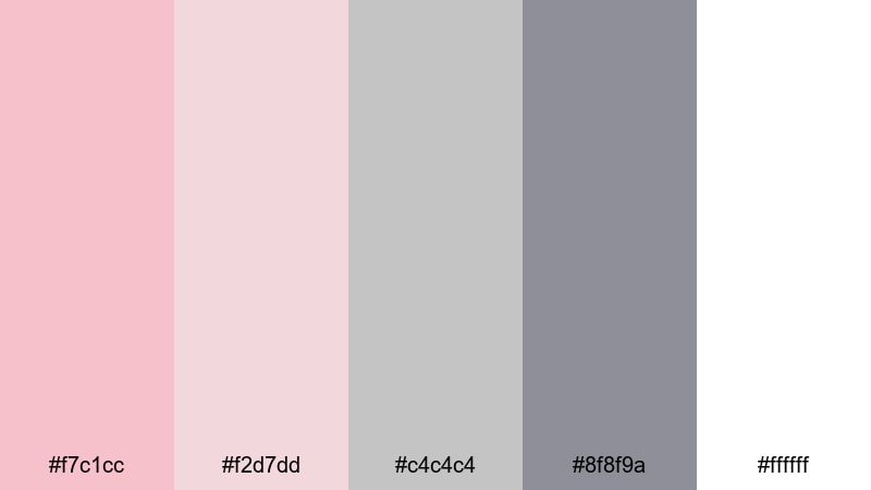
- HEX Codes: #f7c1cc, #f2d7dd, #c4c4c4, #8f8f9a, #ffffff
- Mood: Urban chic, blending soft romance with cool industrial calm.
- Use for: Use for tech reviews, studio tour videos, or lifestyle channels that mix soft aesthetics with modern design.
Blush And Concrete pairs gentle pinks with cool grays, creating a look that feels both soft and architectural. The contrast between blush and concrete like neutrals is perfect for creators who want a balance of warm personality and modern structure.
Apply this palette to tech review overlays, gear comparison charts, or studio tour labels. Use gray bars or frames for structure, then highlight important text and icons in blush so key information stands out without clashing with your footage.
Pastel Pink Tech UI
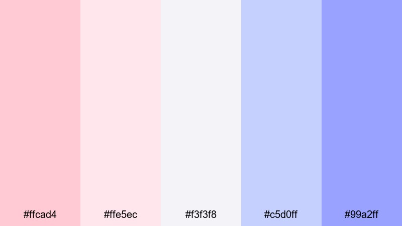
- HEX Codes: #ffcad4, #ffe5ec, #f3f3f8, #c5d0ff, #99a2ff
- Mood: Fresh, digital, and friendly with a soft tech aesthetic.
- Use for: Perfect for app demos, UI mockups, SaaS explainers, and motion graphics in tutorials.
Pastel Pink Tech UI blends soft pinks with periwinkle blues and light neutrals, creating a clean and friendly digital look. It feels like a modern app interface where everything is approachable and easy to read.
Use these tones for screen mockup frames, dashboard overlays, and animated callouts in your SaaS explainers or tutorial videos. Pink can highlight key CTAs or buttons, while the cool blues define sections, charts, or feature lists without overpowering your footage.
Scandinavian Blush
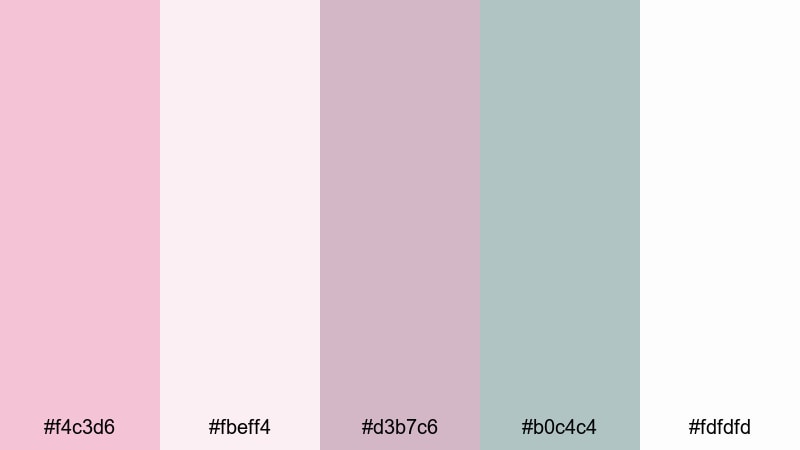
- HEX Codes: #f4c3d6, #fbeff4, #d3b7c6, #b0c4c4, #fdfdfd
- Mood: Calm, airy, and design forward with Nordic simplicity.
- Use for: Use in interior design tours, productivity vlogs, and aesthetic workspace edits.
Scandinavian Blush brings together blush, greige, and muted teal in a palette that feels like a thoughtfully curated apartment. It is calm, bright, and minimal, with just enough color to stay interesting.
For interior tours, workspace vlogs, or productivity content, use this palette to label rooms, add minimal lower thirds, and build clean thumbnail layouts. White and off white can be your base, while blush and teal act as subtle accents around text, icons, or progress bars.
Playful Aesthetic Pastel Pink Palettes
Kawaii Desk Setup
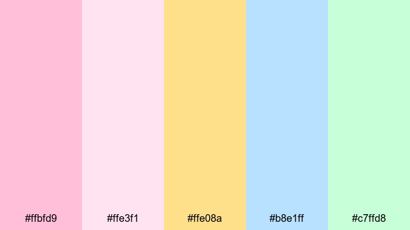
- HEX Codes: #ffbfd9, #ffe3f1, #ffe08a, #b8e1ff, #c7ffd8
- Mood: Cute, bubbly, and energetic with a playful kawaii charm.
- Use for: Perfect for study vlogs, desk makeovers, stationery hauls, and cozy gaming setups.
Kawaii Desk Setup mixes sweet pinks with pastel yellow, blue, and mint to create a candy shop of colors. It is playful and bubbly, perfect for content that feels cozy, creative, and slightly nostalgic.
Use this palette to design sticker style graphics, fun animated arrows, and pastel frames around your clips. In thumbnails, stack these colors in blocks or doodles around your subject to give study vlogs, stationery hauls, or desk makeover videos an instantly recognizable kawaii identity.
Bubblegum Pop Stream
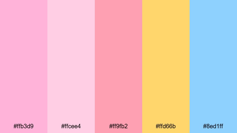
- HEX Codes: #ffb3d9, #ffcee4, #ff9fb2, #ffd66b, #8ed1ff
- Mood: Lively and upbeat, like a bubblegum pop playlist.
- Use for: Use for streaming overlays, subscriber alerts, and energetic channel intros.
Bubblegum Pop Stream leans into bold, candy like pinks supported by sunny yellow and bright blue. It is still pastel, but much more energetic, ideal for fast paced content and animated layouts.
Build full streaming overlays, alert pop ups, and animated transition screens with these colors. Let pinks dominate your frames and chat boxes, then use yellow and blue sparingly to highlight important events like new followers, donations, or big gameplay moments.
Pastel Gamer Aesthetic
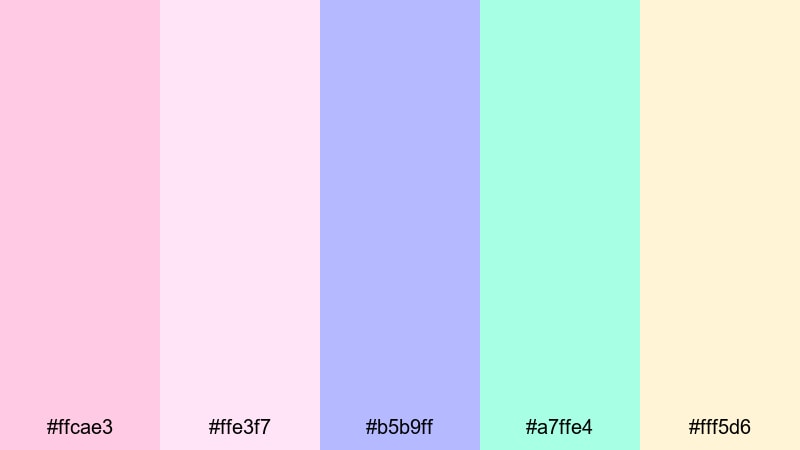
- HEX Codes: #ffcae3, #ffe3f7, #b5b9ff, #a7ffe4, #fff5d6
- Mood: Soft yet dynamic, mixing cozy gamer vibes with pastel neon.
- Use for: Perfect for gaming highlights, Twitch panels, and animated intro cards.
Pastel Gamer Aesthetic blends soft pinks with electric lavender, mint, and warm cream. It feels like a cozy RGB setup turned down to pastel, giving gaming content a softer, more inviting edge.
Use this palette for HUD style overlays, kill feed graphics, and animated intro cards for highlights or stream recaps. Pink and lavender can shape your main interface elements, while mint and cream brighten buttons, icons, and badges without tiring your viewers eyes.
Vintage Dreamy Pastel Pink Palettes
Retro Milk Bar
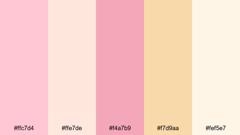
- HEX Codes: #ffc7d4, #ffe7de, #f4a7b9, #f7d9aa, #fef5e7
- Mood: Nostalgic and sweet, like an old diner or milk bar sign.
- Use for: Use in retro themed edits, recipe videos, or nostalgic travel stories.
Retro Milk Bar combines creamy pinks, peach, and vanilla tones for a dessert inspired look. It feels like neon diner signs, milkshakes, and sunlit tabletops, perfect for creators who love retro flair without strong contrast.
Apply this palette to recipe title cards, menu style lower thirds, and travel segments that highlight vintage cafes or bakeries. Add light grain and a slight vignette in Filmora to push the nostalgic mood even further while keeping the colors soft and appetizing.
Faded Postcard Blush
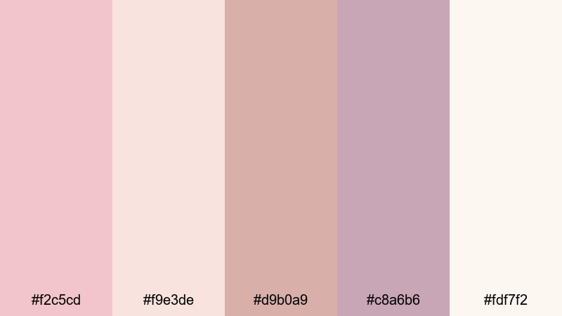
- HEX Codes: #f2c5cd, #f9e3de, #d9b0a9, #c8a6b6, #fdf7f2
- Mood: Softly nostalgic, like a sun-faded postcard from a past summer.
- Use for: Great for storytelling vlogs, family archives, and cinematic travel edits.
Faded Postcard Blush uses muted pinks and warm browns to mimic the look of sun worn prints and old photo albums. It feels intimate and timeless, making it perfect for memory focused content.
Use these tones as inspiration for your color grade in Filmora, then match your titles, frames, and overlays to the same palette. This works especially well for family archive edits, story driven vlogs, or travel films that revisit meaningful places from the past.
Antique Rose Studio
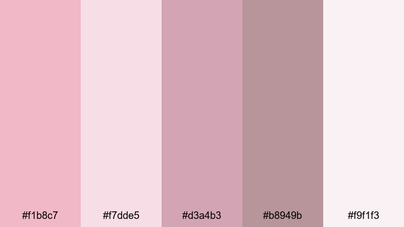
- HEX Codes: #f1b8c7, #f7dde5, #d3a4b3, #b8949b, #f9f1f3
- Mood: Artful and nostalgic, like painting in a sunlit attic studio.
- Use for: Use for art timelapses, poetry videos, or cinematic B-roll sequences.
Antique Rose Studio layers rose tones, mauve, and soft ivory to create an artsy, introspective atmosphere. It feels like old canvases, paper, and dried flowers, ideal for creative or poetic content.
Pair this palette with slow motion B roll, brush stroke overlays, or handwritten style fonts in your titles. It suits art timelapses, journaling videos, and spoken word edits where you want viewers to sink into a reflective mood.
Pastel Pink Film Grain
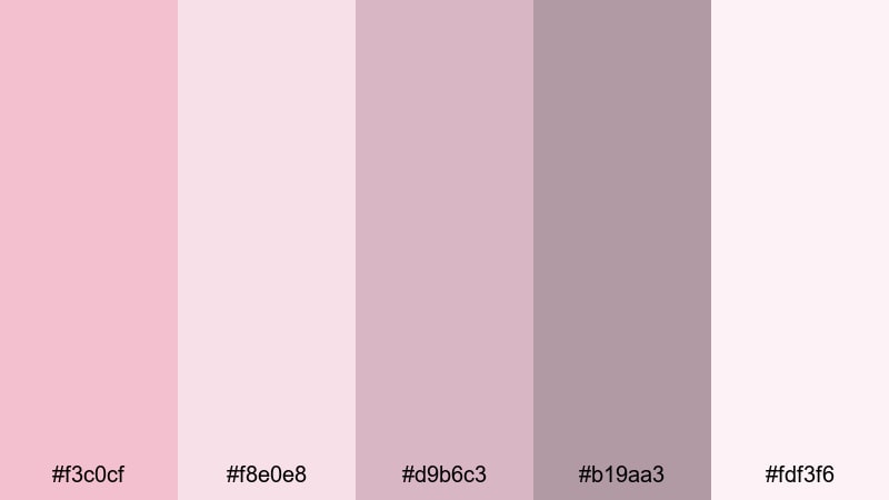
- HEX Codes: #f3c0cf, #f8e0e8, #d9b6c3, #b19aa3, #fdf3f6
- Mood: Cinematic and dreamy, like soft film grain on old footage.
- Use for: Perfect for nostalgic edits, lyric videos, and mood boards with a retro twist.
Pastel Pink Film Grain combines dusty pinks with muted mauves and off white to echo the look of gently aged film. It is cinematic yet soft, perfect for mood pieces and stylized edits.
Use this palette as your guide for both color grading and graphic elements. Add subtle grain, slow transitions, and simple typography inside Filmora to build lyric videos, mood boards, or aesthetic compilations that feel delicate and film inspired.
Tips for Creating Pastel Pink Color Palettes
Pastel pink works well with many other tones, from cool blues to warm creams. The key is to balance softness with contrast so your visuals stay readable and on brand across video, thumbnails, and social posts.
- Pair pastel pink with at least one neutral (white, off white, gray, or beige) to give text and icons a clean base.
- Use deeper or slightly saturated accents (darker pink, mauve, or charcoal) for headlines so they stay readable on light backgrounds.
- Limit your palette to 3 to 5 main colors in each project to avoid a cluttered, chaotic look.
- Test your thumbnail designs at a very small size to make sure pastel pink text or icons are still clear on mobile screens.
- Match your color grade to your graphics: if your footage is warm and rosy, avoid pairing it with very cool blues that fight the mood.
- Keep branding consistent by reusing the same few HEX codes for logos, lower thirds, and end screens across your channel.
- When adding overlays or gradients in Filmora, lower opacity so pastel pink enhances your footage instead of washing it out.
- Create presets for text styles and graphics using your chosen pastel pink palette so you can apply them quickly to future edits.
Pastel pink color palettes can shift your content from ordinary to memorable, whether you are telling a love story, showing your workspace, or streaming your favorite games. Soft pink tones signal warmth, care, and personality, helping viewers recognize your style in thumbnails, intros, and overlays.
Use these 15 palettes and HEX codes as starting points, then tweak shades inside Filmora to match your footage and brand. Once you lock in a pastel pink aesthetic that feels like you, saving it as a repeatable look will make every future video faster to build and more visually consistent.
Open Filmora, drop in your clips, and start testing these pastel pink combinations in your titles, transitions, and color grade. With AI tools, HSL controls, and ready made filters, you can turn a simple palette into a signature visual style your audience instantly recognizes.
secure downloadNext: Gray Brown Color Palette
