
 100% Security Verified | No Subscription Required | No Malware

Sand tones sit between warm beige and soft brown, echoing the comfort of beaches, linen, and sunlit interiors. Psychologically, sand colors feel calm, stable, and approachable, which makes them perfect for creators who want a relaxed but professional look. They add warmth without shouting for attention, so your story, product, or personality stays in focus.
In video editing, branding, and social thumbnails, a sand color palette can tie everything together: intros, lower thirds, titles, and even LUT-style grading. Below you will find 15 curated sand color palettes with HEX codes, crafted for creators and Filmora users who want consistent, cinematic sand aesthetics across YouTube thumbnails, vlogs, Reels, TikToks, and brand assets.
In this article
Soft & Minimal Sand Palettes
Coastal Powder Sands
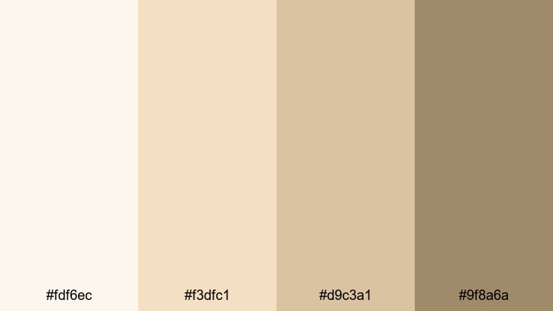
- HEX Codes: #fdf6ec, #f3dfc1, #d9c3a1, #9f8a6a
- Mood: calm, airy, and reassuring
- Use for: Great for serene vlog intros, minimalist title cards, and soft lifestyle thumbnails that feel welcoming but polished.
Coastal Powder Sands feels like waking up in a bright beach house: pale, powdery sand with warmer taupe shadows. The palette stays very light, so your footage looks open and breathable, while the deeper taupe anchors text, icons, and key UI elements.
Use this palette for minimal YouTube intros, calm lifestyle or productivity thumbnails, and branding systems where you want a gentle, sand-inspired base. It also works beautifully for lower thirds, subscribe buttons, and end screens that support your content without stealing the spotlight.
Pro Tip: Enhance Your Soft Sand Visuals With Filmora
When you use a gentle palette like Coastal Powder Sands, consistency is what makes it look intentional instead of flat. In Filmora, you can set your lighter sand tones as background colors for titles and lower thirds, and reuse the deeper taupe for logos, outlines, and buttons across your entire edit.
Save your favorite title and overlay presets with these sand colors applied, so every vlog intro, B-roll label, and social cutdown keeps the same soft, coastal identity. This way, your channel starts to feel like a cohesive sand-toned brand instead of a mix of random styles.
AI Color Palette
If you already have a reference photo of a beach, a sand-toned flat lay, or a brand moodboard, Filmora's AI Color Palette feature can pull those tones into your footage automatically. Just use the image or a color-graded clip as the source, and match the rest of your timeline in a few clicks.
This is perfect for a sand-based aesthetic: your A-roll, B-roll, thumbnails, and Shorts can all share the same warm, powdery sand look without you manually tweaking every clip. It saves time and keeps your visuals on-brand across platforms.
 secure download

HSL, Color Wheels & Curves
To keep sand tones flattering on skin and scenery, use Filmora's HSL and color wheels to gently warm midtones and soften highlights. You can selectively nudge yellows and oranges toward a softer beige while pulling back any harsh saturation that makes sand look too orange.
Curves are ideal for adding a cinematic S-curve to your sand palette: lift the shadows slightly so dark areas feel velvety, and add a gentle contrast bump in the midtones to keep detail in dunes, fabrics, or interiors. For a deeper dive into balancing colors, check out Filmora's color correction and grading tips before you fine-tune your own sand looks.
secure download1000+ Video Filters & 3D LUTs
Once you have your sand palette in place, you can push it toward vintage, cinematic, or editorial looks in seconds using Filmora's filters and LUTs. Filmora's video filters and 3D LUTs make it easy to add grain, glow, or subtle color casts that complement soft sand tones.
Try pairing Coastal Powder Sands with gentle film LUTs or warm, low-contrast filters so your beiges stay creamy and your darker taupes remain rich. Save your favorite combinations as custom presets so every future beach vlog or minimal studio shoot can reuse the same sand-based styling.
secure downloadMorning Dune Haze
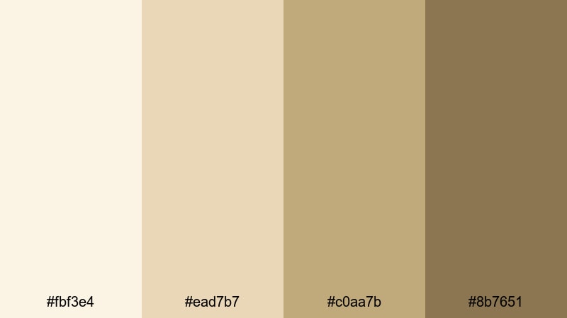
- HEX Codes: #fbf3e4, #ead7b7, #c0aa7b, #8b7651
- Mood: gentle, cozy, and nostalgic
- Use for: Perfect for storytelling edits, journaling reels, or calm tutorial backdrops where you want warmth without harsh contrast.
Morning Dune Haze captures the feeling of early light over dunes, with creamy highlights and gently deepening sand browns. It feels nostalgic and intimate, which makes it ideal for voiceover-driven stories and reflective content.
Use the lighter tones for backgrounds in journaling reels or tutorial slides, and keep the deeper browns for text and accent shapes. In thumbnails and channel banners, this palette gives you warmth and softness without sacrificing legibility.
Desert Linen Calm
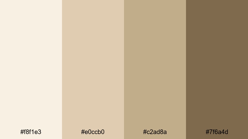
- HEX Codes: #f8f1e3, #e0ccb0, #c2ad8a, #7f6a4d
- Mood: relaxed, organic, and grounded
- Use for: Use for clean educational content, wellness channels, or brand explainers that need a natural, trustworthy feel.
Desert Linen Calm sits between interior design neutrals and natural desert sand. The linen-like off-whites and mid beiges feel very editorial, while the deeper brown adds just enough weight for text, borders, and callouts.
It is a great choice for wellness, self-development, or educational channels that want a calm, grounded visual identity. Apply these hues to your title cards, infographic elements, and motion graphics in Filmora to build a soft but credible look.
Seafoam Sand Whisper
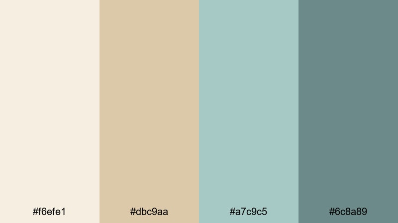
- HEX Codes: #f6efe1, #dbc9aa, #a7c9c5, #6c8a89
- Mood: soothing, coastal, and light
- Use for: Ideal for beach vlogs, spa promos, or calming B-roll overlays where you want soft contrast with a hint of color.
Seafoam Sand Whisper mixes creamy sand with muted green-blue seafoam. The overall effect is coastal and refreshing, but still very gentle, so it never fights with your footage.
Use the warm sand tones as your base and bring in the cooler seafoam shades for buttons, highlight text, or animated accents. This balance works especially well in beach vlogs, spa or skincare promos, and any calming montage where you want subtle color contrast.
Warm & Sunset Sand Palettes
Golden Dune Sundown
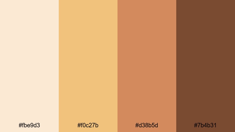
- HEX Codes: #fbe9d3, #f0c27b, #d38b5d, #7b4b31
- Mood: warm, cinematic, and nostalgic
- Use for: Great for travel vlogs, golden hour B-roll, and eye-catching YouTube thumbnails with a sunset glow.
Golden Dune Sundown feels like golden hour captured in a palette: soft peachy sand, glowing gold, and deeper amber browns. It adds instant warmth and nostalgic energy to any scene.
Use the brighter golds for accents in titles and overlays, and lean on the darker browns for text and framing. This combination is perfect for travel vlogs, romantic cityscapes, and any content that leans into sunset shots and lens flares.
Rose Mirage Sands
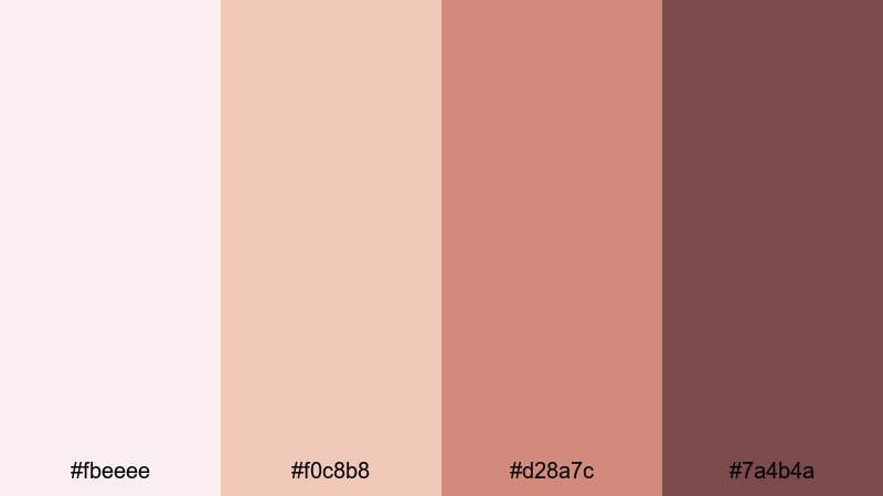
- HEX Codes: #fbeeee, #f0c8b8, #d28a7c, #7a4b4a
- Mood: romantic, dreamy, and intimate
- Use for: Use for wedding highlights, romantic reels, and lifestyle campaigns that lean into soft, emotional storytelling.
Rose Mirage Sands adds a blush undertone to traditional sand, creating a romantic, skin-flattering palette. The mix of rosy beige and deeper rose-browns gives you both softness and emotional depth.
Apply the lighter shades to backgrounds and soft light leaks, while the deeper tones frame faces, titles, and detail shots. It is ideal for wedding highlight films, couple shoots, and dreamy lifestyle content with a gentle pink sand aesthetic.
Amber Shoreline Glow
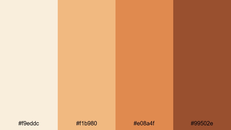
- HEX Codes: #f9eddc, #f1b980, #e08a4f, #99502e
- Mood: energetic, sunlit, and inviting
- Use for: Ideal for bold channel branding, openers, and social ads that need warm energy without neon intensity.
Amber Shoreline Glow brings more energy to the sand theme with amber, copper, and rich shoreline browns. This palette reads as sunny and bold but still natural, like a bright day at the beach just before sunset.
Use these tones in dynamic openers, bold thumbnail typography, or animated call-to-action elements. In Filmora, you can pair this palette with dynamic transitions to create warm, high-impact intros and social ads that stand out in feeds.
Burnished Desert Horizon

- HEX Codes: #f4e3cf, #d8b38a, #b3734c, #553026
- Mood: moody, adventurous, and cinematic
- Use for: Perfect for travel documentaries, cinematic B-roll, and trailers that need depth and warmth in the same frame.
Burnished Desert Horizon combines soft desert sand with burnished rust and deep brown shadows. The result is adventurous and cinematic, suggesting long road trips, campfires, and distant mountain ranges.
Use the lighter sand tones on screens and titles, while reserving the rich rust and dark brown for dramatic typography, letterbox bars, or logo reveals. This palette suits travel documentaries, introspective road trip edits, and cinematic trailers.
Modern & Cinematic Sand Palettes
Urban Concrete Sand
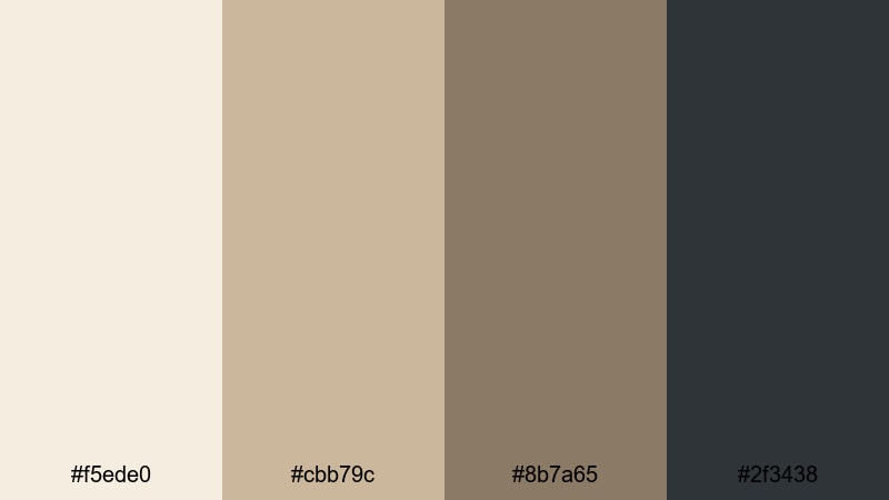
- HEX Codes: #f5ede0, #cbb79c, #8b7a65, #2f3438
- Mood: modern, grounded, and sophisticated
- Use for: Use for tech reviews, design breakdowns, and brand videos that need a clean but non-clinical neutral base.
Urban Concrete Sand pairs soft, creamy sand with a cool charcoal accent. It looks like a minimalist studio set: warm enough to feel human, but structured enough for modern brands and tech content.
Let the lighter sand and mid beiges carry backgrounds and panels, then use the charcoal shade for titles, icons, and logo marks. This is a strong choice for tech reviews, UI breakdowns, and agency-style showreels that need a sleek, editorial aesthetic.
Charcoal Drift Sand
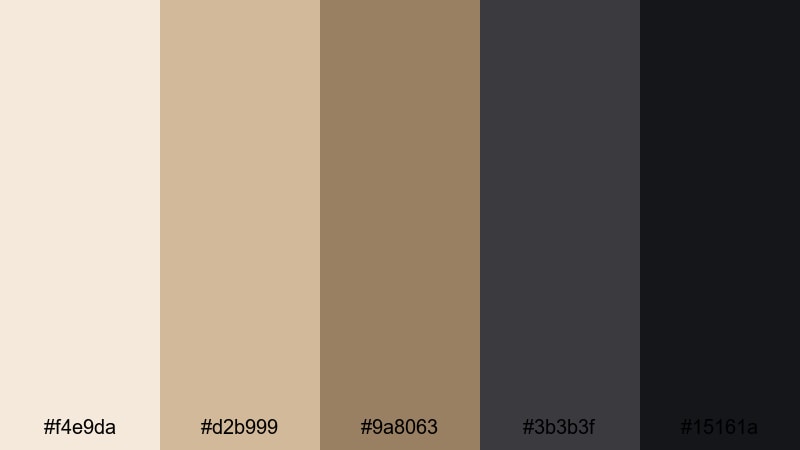
- HEX Codes: #f4e9da, #d2b999, #9a8063, #3b3b3f, #15161a
- Mood: cinematic, moody, and polished
- Use for: Ideal for cinematic LUT-inspired looks, channel rebrands, and dramatic title sequences.
Charcoal Drift Sand takes warm neutrals and fades them into deep charcoal and near-black tones. The contrast feels filmic, with enough warmth to stay inviting and enough darkness to feel stylish and serious.
Use the lighter sand shades in footage and overlays, then build bold titles, frames, and transitions with the charcoal pair. This palette is a great foundation for channel rebrands, cinematic intros, and polished teaser trailers.
Muted Studio Beige
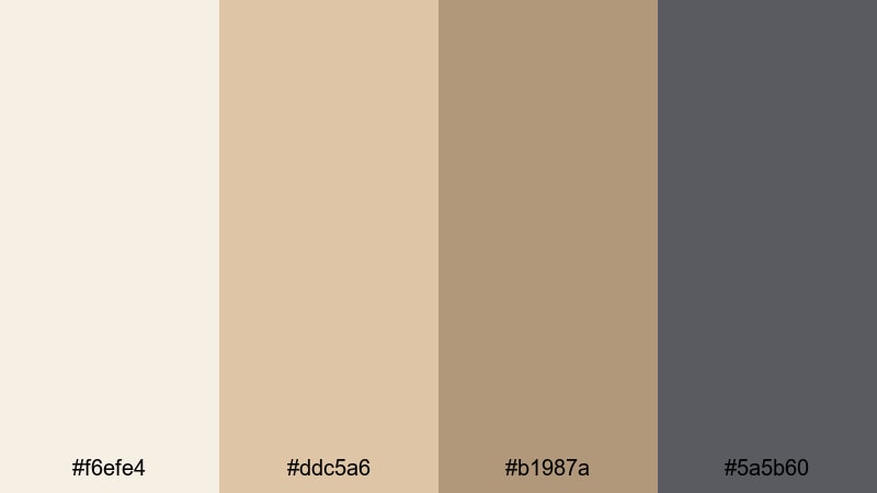
- HEX Codes: #f6efe4, #ddc5a6, #b1987a, #5a5b60
- Mood: professional, understated, and clean
- Use for: Great for tutorials, talking-head videos, and product explainers where clarity and polish matter most.
Muted Studio Beige focuses on balanced beiges with a cool gray accent, giving you a studio-ready palette that never distracts. It is neutral enough for text-heavy explainers but still warmer and more human than pure gray.
Use the beiges for backgrounds and overlay panels, then let the gray handle text, icons, and subtle dividers. This palette works well for regular series content where you want consistent branding across many episodes or modules.
Noir Desert Frame
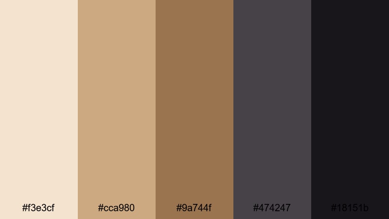
- HEX Codes: #f3e3cf, #cca980, #9a744f, #474247, #18151b
- Mood: dramatic, stylish, and high-contrast
- Use for: Use for trailers, channel bumpers, and reels where you want bold typography and moody framing.
Noir Desert Frame blends warm desert sand with deep noir shadows. The high contrast between light beige and dark near-black makes titles and shapes pop in a dramatic, almost poster-like way.
Use the brightest tones behind logos or key scenes, and frame them with the darkest shades in letterboxes, text, and overlays. This palette is perfect for moody trailers, cinematic bumpers, and stylish reels where impact matters.
Boho & Travel Sand Palettes
Nomad Market Sand
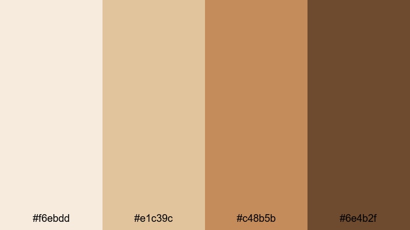
- HEX Codes: #f6ebdd, #e1c39c, #c48b5b, #6e4b2f
- Mood: earthy, lively, and wanderlust-filled
- Use for: Perfect for travel vlogs, market scenes, and handheld adventure edits with a warm, documentary feel.
Nomad Market Sand captures the dust, spices, and warm light of busy markets and side streets. The palette moves from soft sand to deeper, spiced browns that feel earthy and documentary-like.
Use the lighter tones to keep your frames open and breathable, and rely on the richer browns for titles, overlays, and map graphics. It works especially well for handheld travel edits, food tours, and story-driven vlogs set in warm climates.
Boho Shell & Sand
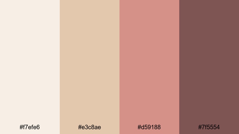
- HEX Codes: #f7efe6, #e3c8ae, #d59188, #7f5554
- Mood: bohemian, artistic, and soft
- Use for: Use for boho fashion lookbooks, cozy lifestyle reels, and brand intros that lean artistic and handmade.
Boho Shell & Sand adds shell pinks to warm sand, creating a soft, handmade feeling. The pinkish sand and muted rose-browns feel intimate and artistic, like a styled boho photoshoot.
Use the creamy tones for backgrounds and overlays, then bring in the deeper shell and rose hues for typography, line art, and accent details. This palette works beautifully for fashion lookbooks, cozy home tours, and creative brand intros.
Wanderlust Beach Camp
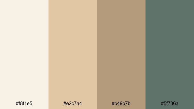
- HEX Codes: #f8f1e5, #e2c7a4, #b49b7b, #5f736a
- Mood: relaxed, adventurous, and free-spirited
- Use for: Great for camping vlogs, road trip recaps, and montage sequences that mix nature with a laid-back vibe.
Wanderlust Beach Camp combines warm beach sand with weathered green tones, evoking tents, camp chairs, and faded canvas gear near the shore. It feels relaxed and grounded, perfect for slow travel content.
Use the sands for sky and sand overlays, text boxes, and minimal UI, while the green shades highlight routes, locations, or key captions. This palette fits camping vlogs, nature montages, and road trip recaps where you want a calm, outdoorsy mood.
Tips for Creating Sand Color Palettes
Sand palettes are versatile, but small decisions in contrast, accent colors, and grading will determine whether your visuals feel calm, cinematic, or flat. Use these tips to build sand color combinations that work beautifully in Filmora and across your brand.
- Pair sand with one darker anchor color (charcoal, deep brown, or muted green) so text and UI elements stay readable on light backgrounds.
- Limit yourself to 3–5 core colors per palette: two light sand tones, one mid shade, and one or two deeper accents for typography and frames.
- Use warmer sand tones (with more orange or pink) for lifestyle, travel, and romantic content; choose cooler or neutral sand for tech and educational videos.
- Test your sand palette on a sample thumbnail and a full-screen title in Filmora to check legibility on both desktop and mobile.
- Match your sand colors to your footage by sampling from real objects (walls, clothing, beaches) and then refining those values with Filmora's HSL controls.
- Keep brand elements consistent: use the same sand tone for your logo background, lower thirds, and end screen panels so viewers recognize your style instantly.
- Add subtle texture or grain over sand backgrounds when you want a more cinematic or tactile feel; keep them flat and clean for modern, UI-focused content.
- Create separate sand palettes for day vs. night or indoor vs. outdoor edits, then save them as presets so you can swap moods quickly while staying on brand.
Sand color palettes can make your videos and designs feel calm, premium, and timeless. Whether you lean into soft minimal tones, sunset warmth, modern cinematic contrasts, or boho travel vibes, sand offers a flexible base that flatters skin tones and keeps attention on your story.
Try applying a few of these palettes inside Filmora: build sand-toned titles, color grade your footage toward warm neutrals, and experiment with different accent colors for your thumbnails and social cuts. Over time, you will develop a signature sand aesthetic that viewers associate with your channel or brand.
With Filmora's AI tools, color controls, and filter library, it is easy to keep your sand combinations consistent from project to project. Start with the HEX codes you like, customize them in your presets, and let your next edit become the foundation of a strong, sand-inspired visual identity.
secure downloadNext: Peach Color Palette
