
 100% Security Verified | No Subscription Required | No Malware


 ChatGPT
 Perplexity
 Gemini
 Claude
 Grok
Grok
Scandinavian color palettes are all about calm balance: soft whites, misty blues, muted woods, and gentle grays that feel fresh but never harsh. This kind of Nordic inspired color psychology puts clarity and comfort first, which is why it works so well for vlogs, productivity channels, aesthetic B-roll, and brands that want a clean, trustworthy look.
Below you will find 15 ready made Scandinavian color combinations with HEX codes, curated for video creators, designers, and Filmora users. Use them for YouTube thumbnails, minimalist intros, UI overlays, branding packs, and color grading references so your entire project feels consistent and thoughtfully Scandinavian.
In this article
Minimalist Scandinavian Color Palettes
Snowdrift Studio Calm
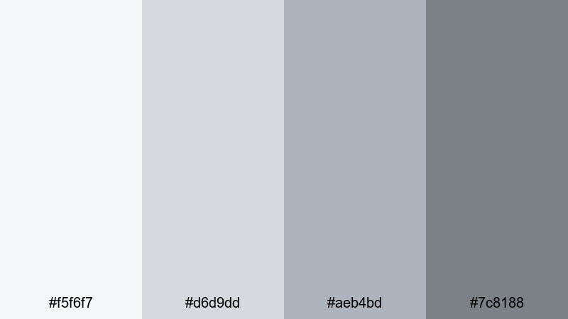
- HEX Codes: #f5f6f7, #d6d9dd, #aeb4bd, #7c8188
- Mood: Airy, quiet, and thoughtfully minimal
- Use for: Ideal for clean tutorial thumbnails, app UI mockups, and modern lower thirds.
Snowdrift Studio Calm is a cool, misty Scandinavian color palette that feels like daylight coming through a frosted window. The soft whites and layered grays keep everything neutral and distraction free, giving your content a silent studio vibe that fits tech, productivity, and minimalist design channels.
Use the lightest tones for backgrounds in your thumbnails or title cards, then reserve the medium and darker grays for text, icons, or lower thirds. This palette works especially well in Filmora when you pair clean motion graphics with subtle gradients, so every frame feels calm, intentional, and easy on the eyes.
Pro Tip: Build a Minimal Scandinavian Look in Filmora
To keep this snowdrift aesthetic consistent, design a simple title template in Filmora using the lightest shade as the background and darker grays for typography and accent lines. Save it as a preset so every new intro, B-roll overlay, or chapter card automatically matches the same Scandinavian color palette.
Combine these tones with slow camera moves, soft transitions, and slightly desaturated footage. Your tutorials or productivity vlogs will feel organized and premium without ever looking cold or clinical.
AI Color Palette
You can turn Snowdrift Studio Calm into a ready to use grading style for your entire video. Import a still frame, thumbnail design, or color card that already uses this palette, then use Filmora's AI Color Palette feature to transfer that look to the rest of your clips.
This is perfect when you shoot on different days or cameras but want your whole series to share the same airy Scandinavian balance. With only a few clicks, your A-roll, B-roll, and cutaway shots all feel like they live in the same carefully designed studio.
 secure download

HSL, Color Wheels & Curves
To fine tune this minimalist Scandinavian scheme, use Filmora's color tools to shape the mood. Slightly lift the shadows with curves to keep grays soft instead of heavy, then use HSL to desaturate any strong colors in your footage so they do not clash with the neutral palette. Color wheels let you cool down highlights for a more wintry studio feel or warm them up if you want a softer, lifestyle look.
Subtle adjustments are key: a small push in the midtones toward blue gray can make your workspace scenes feel more focused and modern, while gentle contrast boosts can help text and UI elements stay crisp on light backgrounds.
secure download1000+ Video Filters & 3D LUTs
If you want to stylize this palette quickly, combine it with Filmora's library of filters and LUTs. Choose soft, low contrast looks that protect your whites and grays, or apply a gentle cool toned LUT to tie together footage from different cameras while staying faithful to the Scandinavian aesthetic.
Filmora's video filters and 3D LUTs make it easy to test several Scandinavian inspired variations: slightly bluer for winter productivity vlogs, or a touch warmer for cozy desk setups and morning routines.
secure downloadNordic White Workspace
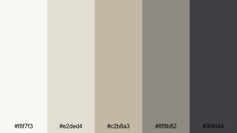
- HEX Codes: #f8f7f3, #e2ded4, #c2b8a3, #8f8b82, #3f4044
- Mood: Focused, neutral, and softly professional
- Use for: Perfect for productivity vlogs, online course visuals, and brand intros for creative agencies.
Nordic White Workspace mixes warm off whites with taupe and charcoal, giving you a balanced, uncluttered base that feels more human than stark white. It suggests natural light on pale wood, laptop screens, and notebooks.
Use the lighter tones for your backgrounds and frame borders, then bring in the charcoal shade for titles, lower thirds, and important calls to action. This Scandinavian color palette is ideal for lesson slides, Notion inspired layouts, and agency showreels where you want calm focus and a polished, premium feel.
Soft Concrete Loft
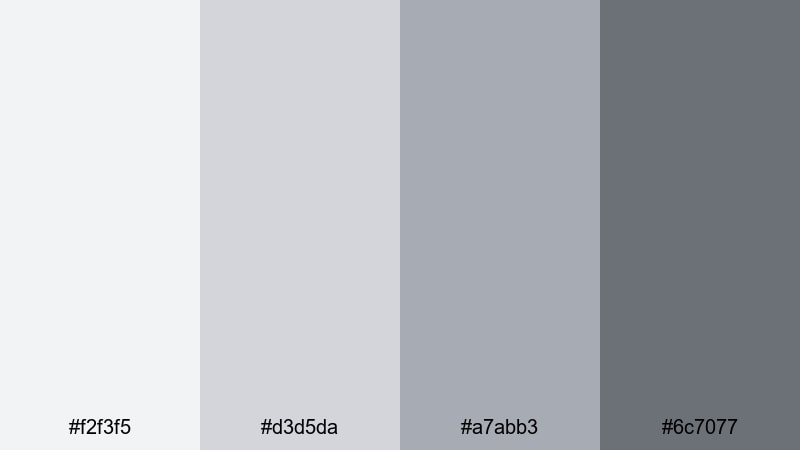
- HEX Codes: #f2f3f5, #d3d5da, #a7abb3, #6c7077
- Mood: Urban, muted, and quietly confident
- Use for: Great for design portfolio reels, software promos, and subtle animated backgrounds.
Soft Concrete Loft leans into cool grays that look like polished concrete and brushed metal. It is urban and modern, but still understated enough to keep the focus on your product or story.
Use it for background plates behind UI animations, product callouts, or typography driven videos. On thumbnails, pair a mid gray background with white text and a darker accent bar to create a stylish, metro Scandinavian look that stands out without shouting.
Pale Birch Minimal
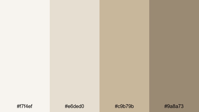
- HEX Codes: #f7f4ef, #e6ded0, #c9b79b, #9a8a73
- Mood: Natural, light, and warmly understated
- Use for: Use for branding kits, lifestyle thumbnails, and subtle title cards with a handcrafted touch.
Pale Birch Minimal brings in soft wood tones and creamy neutrals that feel like birch furniture, paper, and linen. It is still minimalist, but carries a hint of warmth that suits makers, crafters, and eco friendly brands.
Use the lightest shades for clean backgrounds, and the deeper birch tones for borders, logo marks, or icon outlines. In Filmora, this palette works beautifully with close up shots of hands, materials, and textures, giving your channel a crafted Scandinavian identity.
Harbor Mist Interface
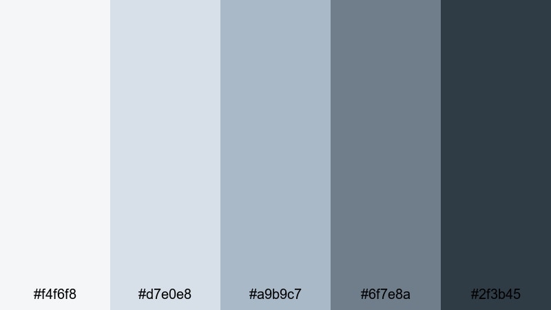
- HEX Codes: #f4f6f8, #d7e0e8, #a9b9c7, #6f7e8a, #2f3b45
- Mood: Cool, structured, and tech forward
- Use for: Excellent for app demos, interface walkthroughs, and modern motion graphics overlays.
Harbor Mist Interface layers pale blue grays over deep steel tones, like fog over a Nordic harbor. It feels precise, digital, and quietly futuristic, which makes it perfect for tech tutorials and SaaS explainers.
Use the lighter hues for dashboards and charts, then bring in the darkest blue gray for key buttons, subtitles, and navigation bars. The result is a clean Scandinavian UI look that still feels approachable for viewers.
Cozy Hygge Scandinavian Color Palettes
Warm Latte Living
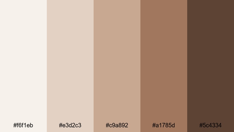
- HEX Codes: #f6f1eb, #e3d2c3, #c9a892, #a1785d, #5c4334
- Mood: Inviting, comforting, and homey
- Use for: Perfect for home vlogs, lifestyle intros, and brand stories around comfort and slow living.
Warm Latte Living wraps your visuals in creamy beige and coffee browns, like a slow morning in a Nordic cafe. It is an instant hygge trigger: soft, welcoming, and relaxed.
Use the lighter latte tones as background washes for titles and chapter cards, then bring in the deeper browns for text, dividers, and call to action badges. This is an excellent Scandinavian color palette for lifestyle vloggers and small home decor brands that want each thumbnail and intro to feel like an invitation into their space.
Candlelight Evening Nook
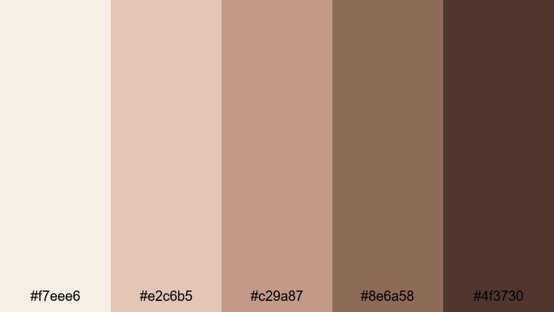
- HEX Codes: #f7eee6, #e2c6b5, #c29a87, #8e6a58, #4f3730
- Mood: Softly glowing, intimate, and nostalgic
- Use for: Use for night routine videos, podcast covers, and cinematic title cards with a warm glow.
Candlelight Evening Nook blends peachy creams with amber browns, echoing flickering candles on wood and stacks of books. It is perfect for late night edits, podcasts, and storytime videos where you want viewers to feel like they are listening in from a cozy corner.
Use the pale peach as a background, and reserve the richer browns for overlays, drop shadows, and key text. In intros and end screens, pair this palette with soft light leaks or vignette effects to support the hygge mood.
Blush Wool Throw
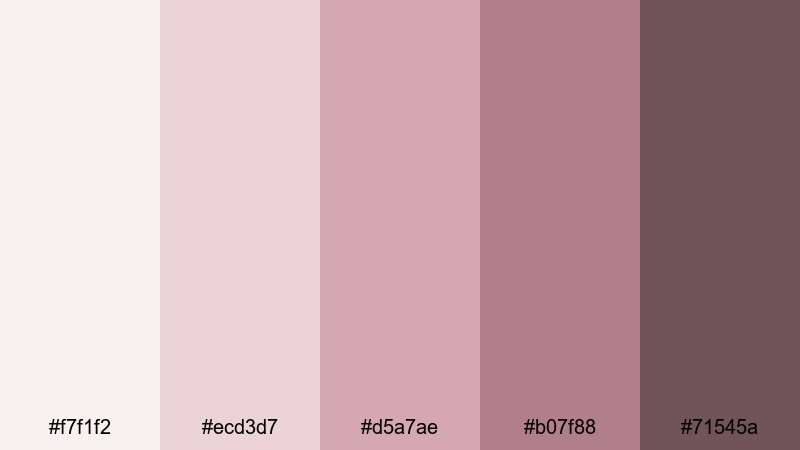
- HEX Codes: #f7f1f2, #ecd3d7, #d5a7ae, #b07f88, #71545a
- Mood: Gentle, romantic, and snug
- Use for: Great for beauty channels, self care edits, and brand kits targeting soft feminine aesthetics.
Blush Wool Throw focuses on dusty rose and muted mauve tones that feel like a folded blanket on a pale sofa. It stays soft and desaturated, so it is romantic without becoming overly sweet.
Use it for beauty routines, skincare content, and self care reels. The palest blush is ideal for backgrounds and negative space, while the mid and deep tones highlight product names, overlays, and callouts without overwhelming your frame.
Muted Hearth Glow
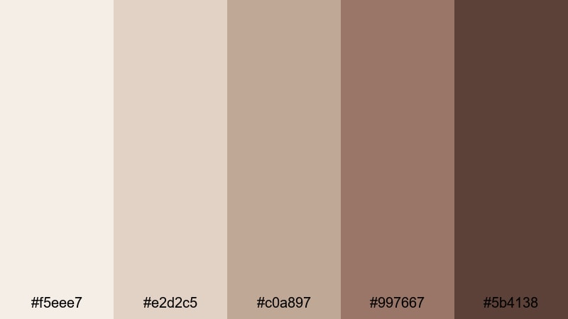
- HEX Codes: #f5eee7, #e2d2c5, #c0a897, #997667, #5b4138
- Mood: Grounded, mellow, and quietly rustic
- Use for: Ideal for cabin vlogs, cooking videos, and storytelling sequences with fireside vibes.
Muted Hearth Glow is all about beige, clay, and ember browns that suggest stone, leather, and warm light. It is slightly rustic but still restrained, making it a great fit for cooking shows, cabin weekends, and slow living storytelling.
Use the mid browns to frame recipe titles or chapter labels, and the lightest shades as a neutral base behind close ups of food, wood, and textiles. On thumbnails, a dark brown title bar over a soft beige background can instantly communicate warmth and comfort.
Soft Sage Hygge
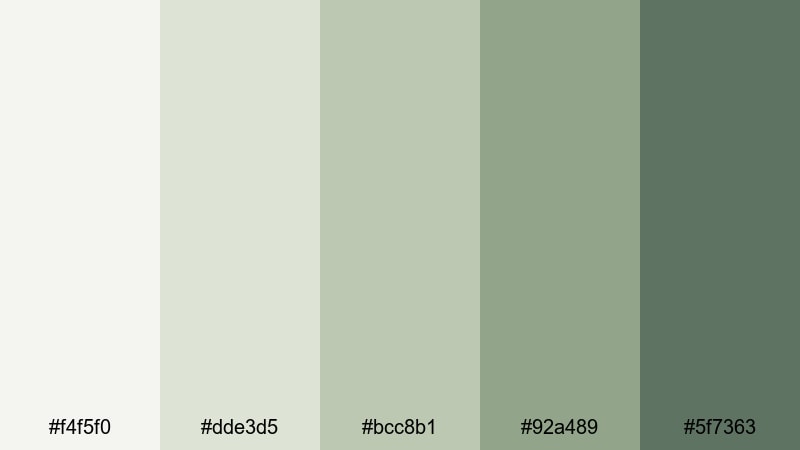
- HEX Codes: #f4f5f0, #dde3d5, #bcc8b1, #92a489, #5f7363
- Mood: Relaxed, herbal, and restorative
- Use for: Use for wellness content, morning routine reels, and eco friendly product showcases.
Soft Sage Hygge brings gentle greens into the Scandinavian mix, like plants against an off white wall. The palette feels fresh, spa like, and slightly herbal, without tipping into bright or neon territory.
Use the lighter greens as accents on icons, buttons, or underline elements in your graphics, while the off whites remain your main background. This palette fits perfectly with yoga sessions, tea rituals, and sustainable product stories where calm and clarity are key.
Nature Inspired Scandinavian Color Palettes
Fjord Morning Haze
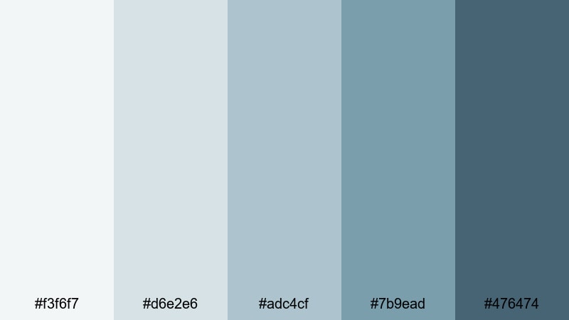
- HEX Codes: #f3f6f7, #d6e2e6, #adc4cf, #7b9ead, #476474
- Mood: Crisp, reflective, and quietly adventurous
- Use for: Great for travel vlogs, cinematic b roll, and title overlays for outdoor documentaries.
Fjord Morning Haze captures misty blues from sky to deep water. It feels crisp and clean, with a quiet sense of exploration that suits hiking, kayaking, and road trip footage.
Use the pale blues for lower thirds and map graphics, and the deeper blue greens behind titles on your outdoor B-roll. This Scandinavian color palette keeps your adventure videos looking cinematic but still calm and natural.
Pine Forest Trail
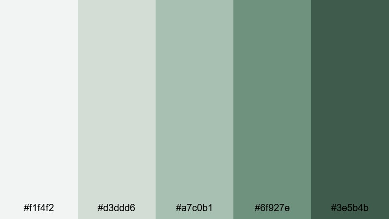
- HEX Codes: #f1f4f2, #d3ddd6, #a7c0b1, #6f927e, #3e5b4b
- Mood: Fresh, grounding, and quietly wild
- Use for: Ideal for hiking edits, outdoor gear promos, and nature based brand storytelling.
Pine Forest Trail layers soft moss and pine greens over gentle neutrals, echoing lichen, needles, and rock. It is a great choice when you want wilderness energy without harsh saturation.
Use the lightest tones for information overlays and logo marks, and the darker greens for badges, labels, and important text. In Filmora, pair this palette with steady, slow camera moves and minimal transitions to let nature footage breathe.
Coastal Pebble Shore
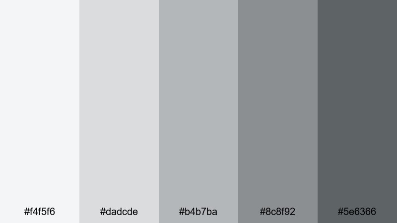
- HEX Codes: #f4f5f6, #dadcde, #b4b7ba, #8c8f92, #5e6366
- Mood: Balanced, cool, and contemplative
- Use for: Perfect for seaside travel videos, product flat lays, and calm cinematic openers.
Coastal Pebble Shore is a set of soft stone grays and cool sky neutrals, like wet pebbles on a Scandinavian beach. It is extremely versatile and gender neutral, ideal for modern brands and thoughtful travel content.
Use the mid grays as a base for titles and product cards, then let the darker shade handle text and UI lines. Because it is so balanced, this palette adapts easily to both footage overlays and clean, static graphics in thumbnails or end cards.
Midsummer Night Sky
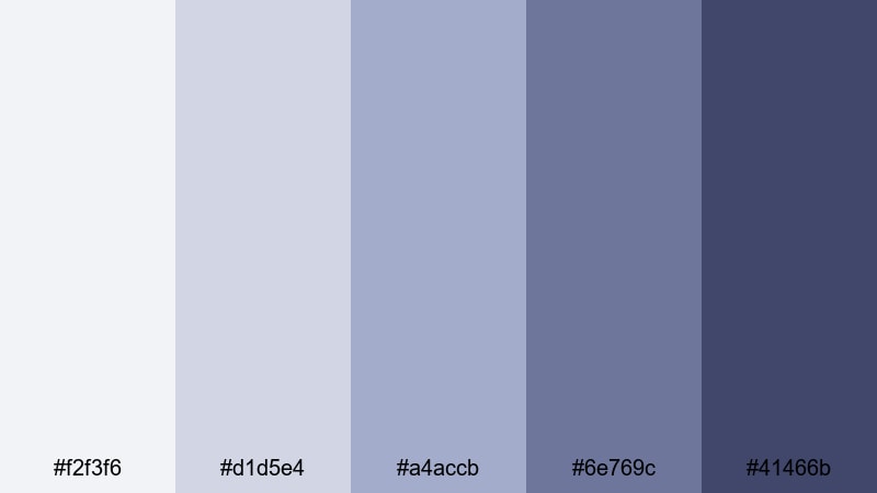
- HEX Codes: #f2f3f6, #d1d5e4, #a4accb, #6e769c, #41466b
- Mood: Dreamy, cinematic, and subtly dramatic
- Use for: Use for intros, title cards, and music videos that need a soft but moody Nordic sky feel.
Midsummer Night Sky gives you desaturated indigos and periwinkles that echo endless northern twilight. It is moody but gentle, making it ideal for cinematic intros, ambient music visuals, and reflective storytelling.
Use the lighter blues for glows, gradients, and soft text backgrounds, then bring in the darkest blue for titles, outlines, and key accents. Subtle animated stars, particles, or light streaks layered over this palette can create a dreamy Nordic atmosphere in Filmora.
Moody Lake Cabin
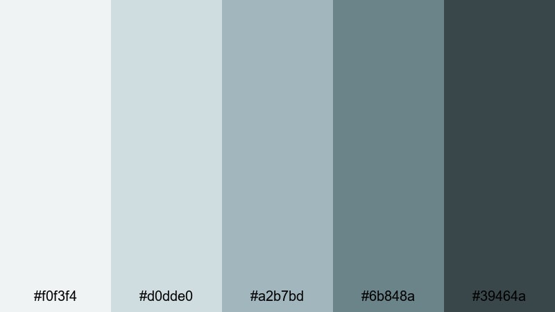
- HEX Codes: #f0f3f4, #d0dde0, #a2b7bd, #6b848a, #39464a
- Mood: Calm, introspective, and slightly rustic
- Use for: Great for slow cinema edits, documentary series branding, and thoughtful talking head setups.
Moody Lake Cabin blends blue gray water tones with weathered wood charcoal. It feels introspective and slightly rustic, perfect for slow living, journaling videos, or documentary style interviews shot indoors.
Use the softer grays as a wash over your footage or as gradients behind titles, while the darkest shade frames your text, logo, or series name. This Scandinavian color palette supports calm pacing, gentle camera movement, and more serious themes without feeling heavy.
Tips for Creating Scandinavian Color Palettes
When you build your own Scandinavian color palette for video or design, focus on soft contrast, restrained saturation, and plenty of breathing room so your message and visuals stay clear.
- Start with 1 to 2 light neutrals (whites, off whites, or pale grays), then add 1 mid tone and 1 dark accent for text and emphasis.
- Keep saturation low to medium; Scandinavian color combinations work best when hues feel natural and slightly muted rather than neon.
- Check text readability by testing thumbnails at small sizes on your phone; adjust contrast if titles become hard to read.
- Choose one main accent color (sage, blush, deep blue, or warm brown) and repeat it consistently across intros, lower thirds, and end screens for strong branding.
- Match your color palette to your shooting style: cooler palettes for tech and winter scenes, warmer palettes for hygge, food, and lifestyle content.
- Use Filmora's color tools to gently align your footage with your chosen HEX codes, especially white balance and saturation controls.
- Leave negative space in your layouts so the clean Scandinavian look has room to breathe; avoid overloading frames with competing colors.
- Create a simple style guide with HEX codes, font choices, and overlay styles so every new video on your channel feels part of the same visual family.
Scandinavian color palettes offer a calm, timeless way to shape mood, storytelling, and brand identity. Whether you lean into minimal whites, hygge warmth, or nature inspired blues and greens, these combinations help your intros, thumbnails, and overlays feel intentional and cohesive.
Use the HEX codes above as ready to go recipes, then refine them inside Filmora until they match your channel or campaign perfectly. By saving your favorite looks as presets and reusing them across series, playlists, and social cutdowns, your audience will start to recognize your visual style at a glance.
The next step is simple: drop a few of these Nordic inspired palettes into your current project, experiment with AI Color Palette, HSL, and filters, and see how quickly your videos take on a calm, Scandinavian signature.
secure downloadNext: Teal Rust Color Palette
