
 100% Security Verified | No Subscription Required | No Malware


 ChatGPT
 Perplexity
 Gemini
 Claude
 Grok
Grok
Violet blue sits between cool blue and romantic purple, so it naturally blends calm focus with a sense of mystery and creativity. In video and digital design, this tone feels modern and cinematic, which is why you see it so often in streaming overlays, tech branding, night cityscapes, and dreamy vlogs. It is bold enough to stand out in thumbnails and titles, but still soft enough for relaxing intros and aesthetic backgrounds.
This guide collects 15 violet blue color palettes with ready-to-use HEX codes, created for thumbnails, titles, lower thirds, intros, and full video looks. Whether you are editing in Filmora or building a consistent creator brand across platforms, you can pick a palette you like and apply it across your entire project.
In this article
Soft & Dreamy Violet Blue Color Palettes
Moonlit Lavender Haze
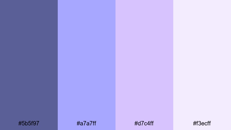
- HEX Codes: #5b5f97, #a7a7ff, #d7c4ff, #f3ecff
- Mood: Calm, nostalgic, and softly romantic.
- Use for: Perfect for romantic vlog overlays, intro cards, and slow-paced story sequences.
Moonlit Lavender Haze blends a grounded violet blue (#5b5f97) with airy lavender and almost-whites to create a soft, cinematic glow. It feels like a quiet evening walk or the last light before sunset, ideal whenever you want viewers to slow down and sink into your story.
Use this palette for storytelling vlogs, aesthetic study videos, gentle transitions, or minimalist lower thirds. In thumbnails and titles, keep violet blue as your main text or accent color, and let the lighter lavenders fill the background for a dreamy, high-contrast look that still feels easy on the eyes.
Pro Tip: Build a Dreamy Violet Blue Aesthetic in Filmora
To keep a Moonlit Lavender Haze vibe consistent, set these colors as your base across all Filmora elements: title presets, lower thirds, and overlay graphics. Use the darkest violet blue for text and icons, the mid lavenders for shapes and borders, and the palest tones for backgrounds and soft vignettes.
When editing a whole vlog or study session, save your color settings as custom presets in Filmora so every intro card, chapter title, and end screen feels like part of the same soft violet blue world. This also helps your channel thumbnails match your video visuals for stronger branding.
AI Color Palette
If you already have a reference image that nails this dreamy violet blue mood, you can let Filmora handle the heavy lifting. Filmora's AI Color Palette feature analyzes that image and automatically applies a similar look across your clips, so your entire edit feels cohesive.
Import a frame from your favorite lavender-toned movie, or a still from your own shoot, then use AI Color Palette to match the colors for all your A-roll, B-roll, and cutaway shots. This gives your vlog a polished, cinematic tone without needing to manually grade every clip.
 secure download

HSL, Color Wheels & Curves
To fine-tune this palette in Filmora, use HSL controls to gently desaturate blues and purples for a softer, pastel feel. In the color wheels, cool down your midtones and lift the shadows slightly toward violet blue to keep the look dreamy instead of dark and heavy.
You can also use curves to lower contrast just a bit, creating a hazy, filmic wash over your footage. For more guidance, you can follow a Filmora color grading tutorial on YouTube and adapt each step to these specific violet blue and lavender tones.
secure download1000+ Video Filters & 3D LUTs
If you want this violet blue mood even faster, Filmora's video filters and 3D LUTs make it easy to push your colors toward pastel, dreamy, or cinematic looks with one click. Start with a soft film LUT, then tweak saturation and temperature until the blues and lavenders match the HEX codes you are using for your graphics.
Combine a gentle filter with a subtle vignette and a bit of blur or glow to make bright whites feel more like soft lavender mist. This is especially effective for romantic intros, night-time B-roll, and aesthetic text overlays on your videos.
secure downloadDusky Orchid Whisper
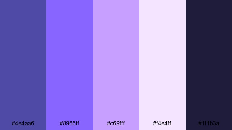
- HEX Codes: #4e4aa6, #8965ff, #c69fff, #f4e4ff, #1f1b3a
- Mood: Softly dramatic with a hint of mystery.
- Use for: Ideal for dreamy b-roll, cinematic travel vlogs, and subtle title screens.
Dusky Orchid Whisper leans into twilight tones: a moody base of deep violet blue and indigo, lifted by orchid highlights and a pale, almost opalescent pink. It feels like the sky just after sunset, where colors are gentle but still dramatic.
Use the darkest shade (#1f1b3a) as a background for titles, then bring in orchid and lavender for accent lines, icons, or subtitle bars. This palette works beautifully in cinematic travel vlogs, romantic city B-roll, and thumbnails where you want softness and intrigue without losing clarity.
Serene Tidal Glow
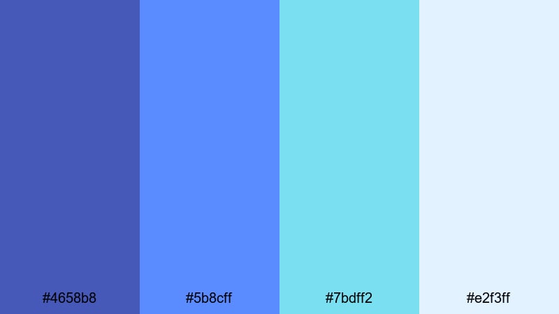
- HEX Codes: #4658b8, #5b8cff, #7bdff2, #e2f3ff
- Mood: Refreshing, peaceful, and airy.
- Use for: Great for travel vlogs, nature montages, and relaxing timelapse edits.
Serene Tidal Glow mixes oceanic violet blues with aqua and soft sky tones. It feels like sea foam under a clear blue sky, making it an excellent match for nature content, drone shots, and minimal, calming intros.
Try using the deeper violet blue (#4658b8) for text or logo marks, the mid-blue for buttons or callouts, and the aqua and off-white as backgrounds. In Filmora, you can apply this palette to animated lower thirds, location tags, and chapter markers in travel vlogs or relaxing timelapses.
Cloudy Violet Morning
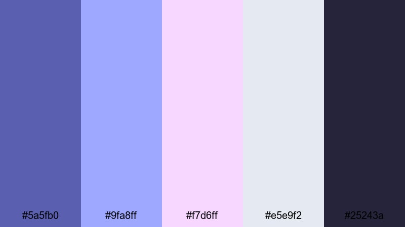
- HEX Codes: #5a5fb0, #9fa8ff, #f7d6ff, #e5e9f2, #25243a
- Mood: Gentle, introspective, and cozy.
- Use for: Best for study-with-me videos, calm lifestyle content, and reflective voiceovers.
Cloudy Violet Morning combines muted violet blues with blush pink and overcast gray, echoing the feel of a soft, rainy morning. It is calm and a bit nostalgic, perfect for slow, reflective content.
Use the darker tone (#25243a) for backgrounds to keep overlays readable, while lighter violets and grays define frames, timers, or to-do lists in your study-with-me layouts. This palette also looks great in thumbnails where you want a cozy, minimalist aesthetic that still includes a recognizable violet blue accent.
Bold & Vibrant Violet Blue Color Palettes
Electric Galaxy Drift
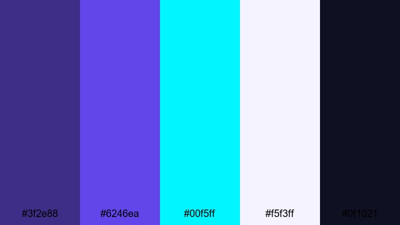
- HEX Codes: #3f2e88, #6246ea, #00f5ff, #f5f3ff, #0f1021
- Mood: High-energy, futuristic, and cinematic.
- Use for: Perfect for tech intros, motion graphics, and sci-fi inspired gaming edits.
Electric Galaxy Drift smashes deep violet blue into neon cyan and inky space black. It has a hyper-modern, digital feel that works well for tech channels, sci-fi game edits, or any intro that needs to look like a cyber galaxy.
Use the darkest color (#0f1021) as your base background, with #6246ea as your main accent and #00f5ff for bright highlights, outlines, and button glows. In thumbnails, this high contrast makes text and icons pop even on crowded screens.
Neon Arcade Nights
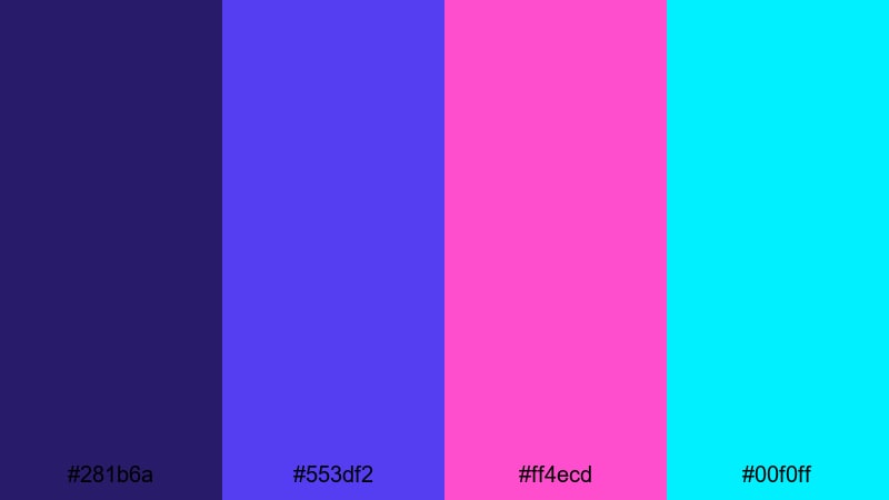
- HEX Codes: #281b6a, #553df2, #ff4ecd, #00f0ff
- Mood: Playful, neon, and retro-futuristic.
- Use for: Ideal for gaming channels, highlight reels, and energetic short-form content.
Neon Arcade Nights is all about 80s arcade vibes: glowing violet blue, hot magenta, and bright cyan. It feels fast, playful, and loud in the best way, ideal for clips, shorts, and gaming montages.
Use the deep violet (#281b6a) as your canvas and layer magenta and cyan accents around key elements like kill counts, scoreboards, or reaction text. For thumbnails, pair bold block fonts in violet blue with magenta outlines and cyan drop shadows to guarantee attention.
Sapphire Stage Lights
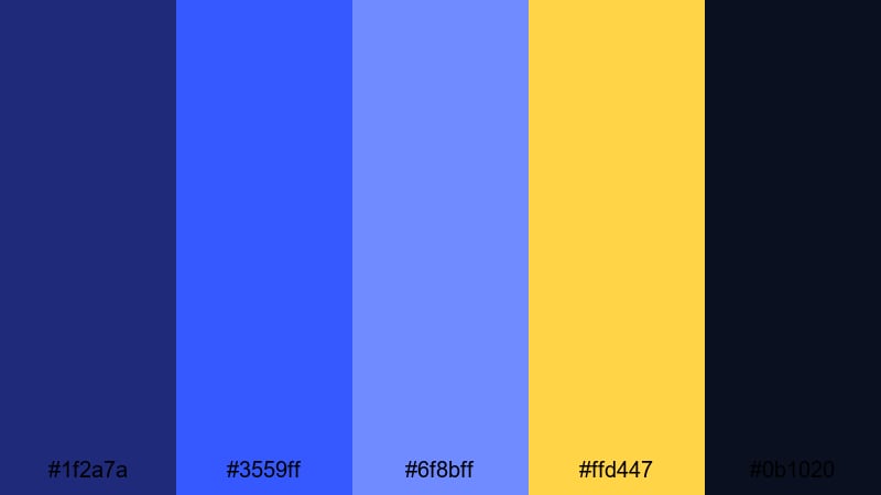
- HEX Codes: #1f2a7a, #3559ff, #6f8bff, #ffd447, #0b1020
- Mood: Dynamic, dramatic, and performance-ready.
- Use for: Perfect for music videos, concert recaps, and creator intro sequences.
Sapphire Stage Lights captures the contrast of cold blue spotlights against warm golden highlights. The deep background blues feel like a dark venue, while the vibrant yellow mimics stage lighting or festival signs.
For performance edits, use the darkest navy (#0b1020) behind your titles, the bright sapphire for outlines, and #ffd447 to highlight names, dates, or call-to-action buttons. This palette is also strong for music thumbnails and channel banners where you want both drama and energy.
Hyper Pop Aurora
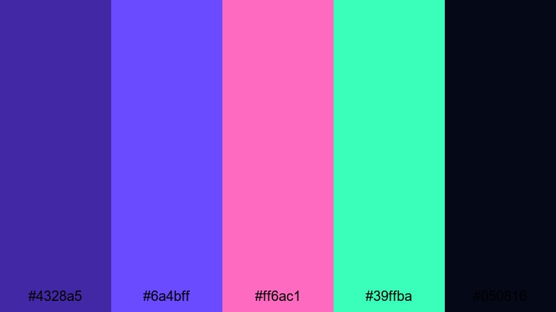
- HEX Codes: #4328a5, #6a4bff, #ff6ac1, #39ffba, #050816
- Mood: Energetic, trendy, and hyper-stylized.
- Use for: Great for pop edits, social media teasers, and bold channel branding.
Hyper Pop Aurora is a high-impact mix of violet blue, neon pink, and mint green over a near-black base. It feels fresh and viral, perfect for TikTok-style edits, shorts, and any creator brand targeting a younger audience.
Place main text or logos in violet blue against the dark #050816 background, then sprinkle pink and mint accents into motion graphics, transitions, and emoji-style stickers. This palette is ideal for fast cuts, beat drops, and exaggerated animations in Filmora.
Elegant & Cinematic Violet Blue Color Palettes
Velvet Premiere Night
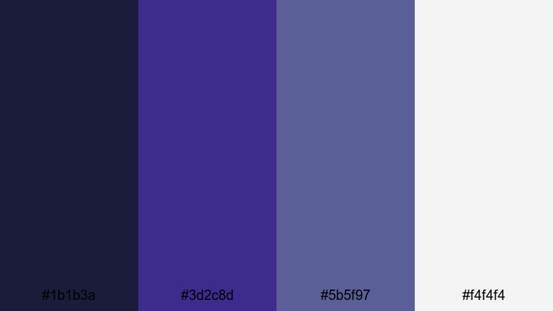
- HEX Codes: #1b1b3a, #3d2c8d, #5b5f97, #f4f4f4
- Mood: Luxurious, cinematic, and understated.
- Use for: Ideal for film-style credits, brand idents, and polished client projects.
Velvet Premiere Night uses layered midnight blues and violet blue, softened by clean white. It feels like a red-carpet evening with a minimalist, editorial twist, making it a great choice for brands, portfolios, and cinematic channel branding.
Use the darkest blue for letterbox bars and backgrounds, the mid violet blue for logo marks and titles, and white for legible text and subtle graphic lines. This palette fits film-style credits, agency reels, and any client-facing work where you want a premium look without neon intensity.
Noir Indigo Spotlight
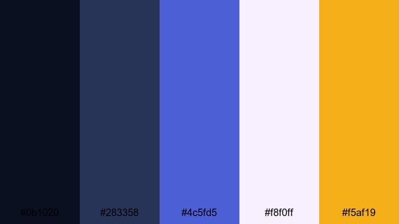
- HEX Codes: #0b1020, #283358, #4c5fd5, #f8f0ff, #f5af19
- Mood: Moody, cinematic, and slightly glamorous.
- Use for: Great for trailers, dramatic narrative edits, and title sequences.
Noir Indigo Spotlight layers deep indigo and violet blue with soft off-white and a warm gold accent. It creates a noir-inspired stage look, halfway between a detective movie and a film premiere.
Use the gold (#f5af19) sparingly to draw the eye to important text or icons, while letting the indigos and violet blue carry the main tone. This palette shines in dramatic trailers, episodic series intros, and narrative short films made in Filmora.
Royal Premiere Gradient
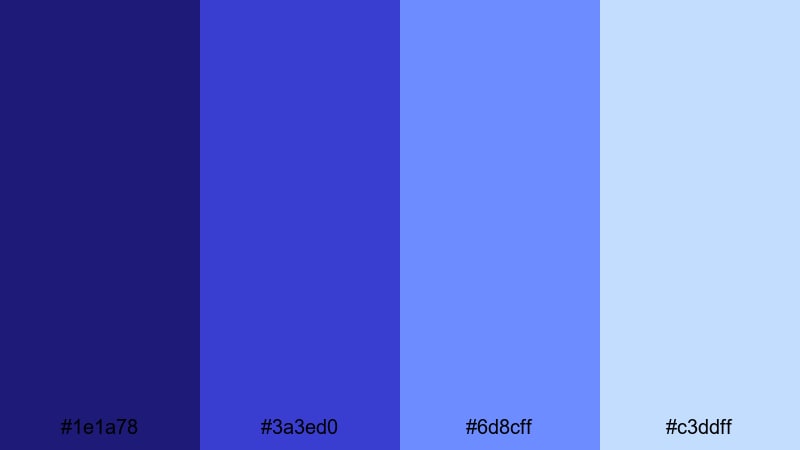
- HEX Codes: #1e1a78, #3a3ed0, #6d8cff, #c3ddff
- Mood: Regal, polished, and inspiring.
- Use for: Perfect for branded lower thirds, logo reveals, and motivational edits.
Royal Premiere Gradient flows from deep royal violet blue through luminous blues into pale sky notes. It feels inspiring and upscale, making it ideal for brands, corporate videos, or motivational edits with a premium touch.
In Filmora, apply this palette as gradient backgrounds for title cards, lower thirds, and key quote screens. Darker tones work best behind logos, while lighter blues highlight text areas, charts, or subtle motion graphics in presentations.
Opulent Midnight Title
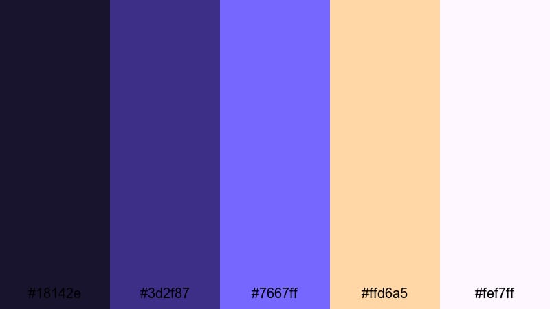
- HEX Codes: #18142e, #3d2f87, #7667ff, #ffd6a5, #fef7ff
- Mood: Opulent, refined, and quietly dramatic.
- Use for: Best for title cards, cinematic openers, and luxury product edits.
Opulent Midnight Title pairs shadowy midnight purples with luminous violet blue and soft peach highlights. It feels expensive and refined, perfect for luxury products, fashion campaigns, and high-end intros.
Let the darkest shades dominate backgrounds and framing, while #7667ff brings attention to titles and logo marks. Use the peach and nearly white tones for delicate accents and small typography. This combination gives title cards a polished, film-trailer quality in Filmora.
Modern Pastel Violet Blue Color Palettes
Soft Stream Overlay
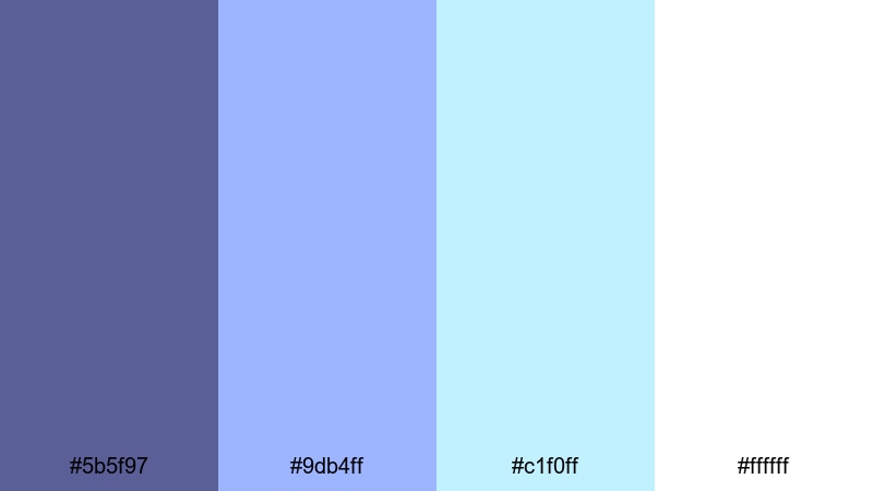
- HEX Codes: #5b5f97, #9db4ff, #c1f0ff, #ffffff
- Mood: Clean, modern, and relaxed.
- Use for: Ideal for streaming overlays, tutorial graphics, and minimal channel branding.
Soft Stream Overlay balances a stable violet blue anchor with fresh pastel blues and bright white. It feels tidy and modern, great for streamers, educators, and tutorial creators who want visuals that support, not distract from, the content.
Use violet blue (#5b5f97) for titles and key icons, while pastel blues define panels, borders, and information cards around your webcam feed. White backgrounds keep everything readable on both desktop and mobile screens.
Dreamy Vlog Opener
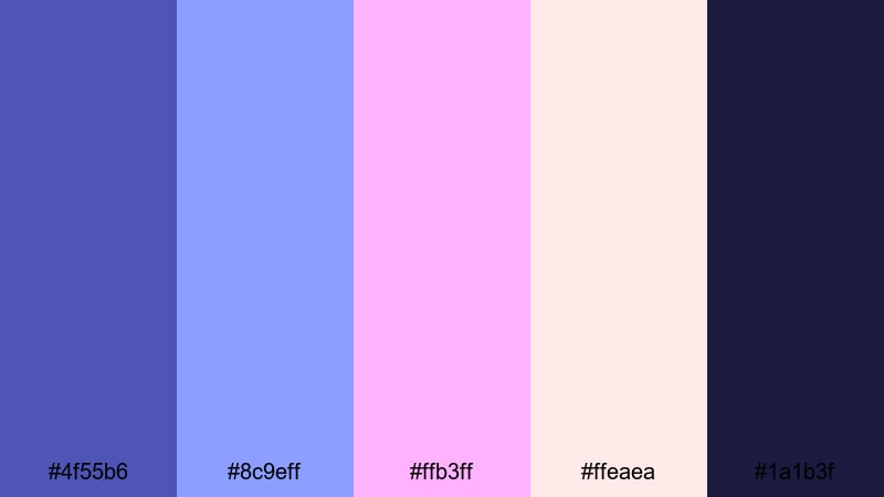
- HEX Codes: #4f55b6, #8c9eff, #ffb3ff, #ffeaea, #1a1b3f
- Mood: Friendly, creative, and welcoming.
- Use for: Great for lifestyle vlog intros, channel banners, and social post covers.
Dreamy Vlog Opener pairs violet blue with soft pinks and a gentle deep navy. It feels friendly and personal, ideal for lifestyle, art, or creator-focused channels that want to look modern but still warm.
Try using #4f55b6 and #1a1b3f for text and outline work, with the pinks as backgrounds or accent blobs behind portraits. This palette is perfect for animated openers in Filmora, Instagram Reels covers, and YouTube channel art.
Studio Chill LoFi
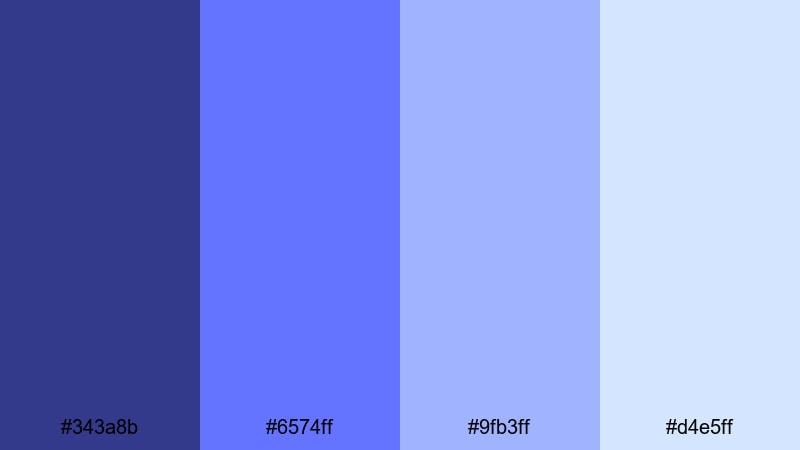
- HEX Codes: #343a8b, #6574ff, #9fb3ff, #d4e5ff
- Mood: Chill, focused, and unobtrusive.
- Use for: Perfect for lo-fi edits, productivity streams, and background-friendly graphics.
Studio Chill LoFi layers desaturated violet blues and powder blues into a calm gradient. It is subtle enough to sit behind music and study content without stealing attention, making it ideal for looped visuals and productivity streams.
Use the darker tones for background blocks and the lighter ones for floating shapes, text boxes, or waveform overlays. This palette works well with minimal animations in Filmora, such as slow zooms, grain, or film dust, to keep your lo-fi visuals engaging but not distracting.
Tips for Creating Violet Blue Color Palettes
Violet blue is versatile, but it really shines when you balance it with supporting colors and smart design choices. Use these tips to build your own palettes or adapt the ones above to your videos and graphics.
- Pair violet blue with a neutral base (dark navy, charcoal, or off-white) so your overlays and text stay readable on any device.
- Add one contrasting accent color (gold, cyan, or soft peach) to draw the viewer’s eye to CTAs, important text, or logo marks.
- Keep brand consistency by using the same violet blue HEX code for your logo, titles, and thumbnail accents across all platforms.
- Test thumbnails on both light and dark YouTube themes to make sure violet blue text and icons remain clear against the UI.
- In Filmora, match your footage to your chosen palette by adjusting white balance and saturation so skin tones stay natural while blues lean toward your target hue.
- For cinematic looks, darken shadows slightly and cool your midtones, keeping highlights warmer or neutral so faces do not look too cold.
- Limit your palette to 3–5 main colors (one base, one primary accent, one secondary accent, and 1–2 neutrals) to avoid a cluttered look.
- Export a few test frames with different text colors and opacity levels to see which violet blue combinations work best on phones.
Violet blue color palettes can instantly define the mood of your content, from cozy lo-fi streams to high-energy gaming edits or premium brand stories. By choosing a set of HEX codes and using them consistently, your channel or brand gains a recognizable visual identity that feels deliberate and professional.
Try dropping these palettes into Filmora as you build intros, transitions, and lower thirds, then use tools like AI Color Palette, HSL, and filters to nudge your footage into the same visual world. Over time, your viewers will associate this specific violet blue aesthetic with your name and content style.
Whether you lean toward soft pastels or neon cyber vibes, experimenting with violet blue is an easy way to modernize your visuals and stand out on social platforms. Open a new project in Filmora, pick one of these palettes, and start building your next cinematic look.
secure download