
 100% Security Verified | No Subscription Required | No Malware


 ChatGPT
 Perplexity
 Gemini
 Claude
 Grok
Grok
Yellow Ochre sits between golden yellow and earthy brown, which makes it feel both warm and grounded. It suggests sunlight, craftsmanship, authenticity, and nostalgia. In color psychology, this tone often reads as trustworthy and human, with more depth and subtlety than a pure bright yellow. That is why you see it often in lifestyle brands, cafes, heritage visuals, and film-inspired designs.
For creators, Yellow Ochre works beautifully in video intros, YouTube thumbnails, channel branding, lower thirds, and even cinematic color grading. It adds warmth without feeling childish, and pairs well with neutrals, terracotta, dark woods, and muted blues. Below you will find ready-made Yellow Ochre color palettes with HEX codes, designed for Filmora users and any creator who wants consistent, stylish visuals.
In this article
Warm & Earthy Yellow Ochre Color Palettes
Sunlit Terracotta Studio
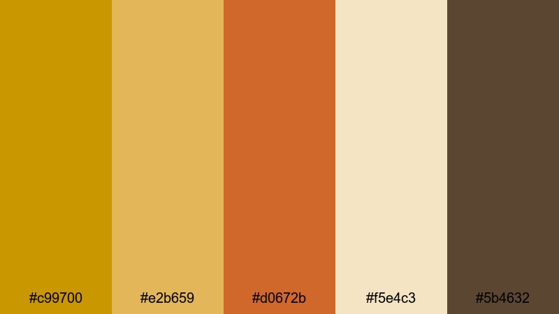
- HEX Codes: #c99700, #e2b659, #d0672b, #f5e4c3, #5b4632
- Mood: Warm, grounded, and creative.
- Use for: Use for lifestyle vlog intros, cozy studio tours, and thumbnail titles that need a sunlit, handcrafted feel.
Sunlit Terracotta Studio mixes strong Yellow Ochre with terracotta and soft cream, giving your visuals the feeling of golden light hitting clay and canvas. The combination feels handmade and tactile, perfect if your brand lives in the worlds of art, crafts, journaling, or homely design.
Use this palette for YouTube thumbnails with warm title blocks, channel banners that feel artisanal, or video intros where you want your name or logo to glow like a late-afternoon sun. In Filmora, you can apply these HEX codes to text, shapes, and overlays to keep your entire sequence consistently warm and approachable.
Pro Tip: Build a Cinematic Yellow Ochre Look in Filmora
To keep this Yellow Ochre and terracotta look consistent across your whole edit, set up a simple visual system inside Filmora. Use Yellow Ochre for key elements like titles, lower thirds, and call-to-action buttons, then support it with terracotta for accents and cream for backgrounds. This keeps your viewer focused on what matters while maintaining a warm, sunlit identity.
You can also save custom colors in Filmora so the same Yellow Ochre appears in your intro, B-roll labels, and social cutdowns. That way your channel feels cohesive, whether someone finds you through a full vlog, a YouTube Short, or a Reels clip.
AI Color Palette
If you have a favorite photo of your studio or a terracotta corner you love, you can turn it into a moving color grade with Filmora's AI Color Palette feature. Import the reference image, let Filmora analyze its Yellow Ochre and clay tones, and then apply that palette to the rest of your clips.
This is a fast way to match your talking-head shots, B-roll, and thumbnails so everything shares the same warm handmade mood. No need to tweak every clip from scratch; the AI brings your reference colors into the whole project in just a few clicks.
 secure download

HSL, Color Wheels & Curves
To refine a Yellow Ochre look, use Filmora's HSL and color wheels to nudge hues and contrast. You can shift yellows slightly toward orange for a deeper terracotta mood, or desaturate the browns for a more minimal aesthetic. Curves let you lift warm highlights while keeping shadows rich and cinematic, which is perfect for cozy studio shots.
For more control, follow the steps shown in this Filmora color grading guide, and then adapt the settings to protect your Yellow Ochre midtones while adding subtle depth to skin tones and backgrounds.
secure download1000+ Video Filters & 3D LUTs
If you want a fast, stylized Yellow Ochre look, Filmora's video filters and 3D LUTs make it easy to push this palette toward vintage film, modern editorial, or dreamy lifestyle aesthetics. Start with a filter that warms the midtones, then fine-tune saturation so the Yellow Ochre accents stay rich but not overpowering.
Once you find a look that fits your brand, save it and use it across all your intros, vlogs, and shorts. That way every video carries the same recognizable Yellow Ochre signature without spending extra time grading from scratch.
secure downloadRustic Harvest Fields
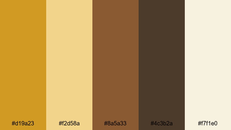
- HEX Codes: #d19a23, #f2d58a, #8a5a33, #4c3b2a, #f7f1e0
- Mood: Organic, nostalgic, and homely.
- Use for: Use for farm-to-table brand videos, seasonal recipe shorts, and documentary-style storytelling with a grounded, rustic aesthetic.
Rustic Harvest Fields layers Yellow Ochre with caramel browns, deep soil tones, and soft cream. It feels like warm sunlight over late-summer crops and worn wooden tables, making it ideal for food content, slow living videos, and countryside storytelling.
Use the lighter tones for backgrounds and lower thirds so text stays readable, and let the deeper browns frame your subject in thumbnails or end screens. In Filmora, this palette works well for recipe videos, farmer profiles, and seasonal B-roll where you want a grounded, organic mood.
Clay Pot Morning
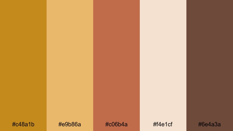
- HEX Codes: #c48a1b, #e9b86a, #c06b4a, #f4e1cf, #6e4a3a
- Mood: Cozy, artisanal, and slow-paced.
- Use for: Use for maker studio reels, pottery or craft tutorials, and calming morning routine content.
Clay Pot Morning balances soft Yellow Ochre with clay reds, milky highlights, and grounded browns. It feels like early light in a ceramics studio, with warm coffee tones and handmade objects in the frame.
Use this palette in tutorial overlays, chapter cards, and branding for creative channels. In Filmora you can add gentle gradients using the cream and Yellow Ochre, then use the clay red for buttons or subscribe prompts so they stand out without breaking the calm mood.
Golden Dune Horizon
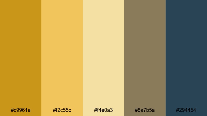
- HEX Codes: #c9961a, #f2c55c, #f4e0a3, #8a7b5a, #294454
- Mood: Expansive, cinematic, and calm.
- Use for: Use for travel vlogs, slow desert landscapes, and cinematic B-roll where you want warmth with a hint of cool contrast.
Golden Dune Horizon captures the feeling of sunlit sand dunes with gentle Yellow Ochre and sand tones, anchored by muted browns and a deep blue accent. The cool blue (#294454) gives you cinematic contrast without killing the warmth.
In your videos, use the warm tones for skies, titles, and overlays, and keep the blue for subtle outlines, drop shadows, or small icons in lower thirds. This is especially powerful for travel thumbnails or cinematic sequences graded in Filmora where you want the scene to feel vast yet peaceful.
Hearthside Storyboards
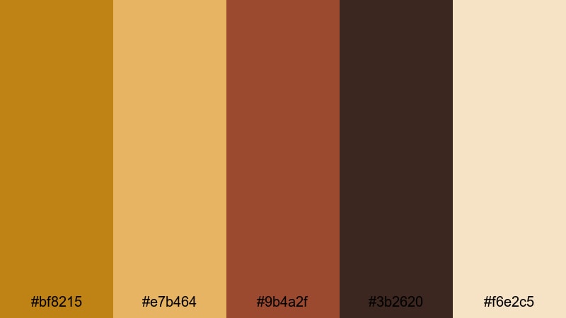
- HEX Codes: #bf8215, #e7b464, #9b4a2f, #3b2620, #f6e2c5
- Mood: Intimate, nostalgic, and storytelling-focused.
- Use for: Use for narrative shorts, family documentaries, and any edit that leans into warmth and emotional storytelling.
Hearthside Storyboards mixes rich Yellow Ochre with ember reds, dark wood, and cream. It feels like scenes lit by firelight or table lamps, ideal when you want your story to feel close, emotional, and timeless.
Apply the lighter cream and Yellow Ochre to subtitles or chapter labels so they glow against darker footage. The deep brown works well for letterbox bars and end screens in Filmora, giving your whole project a cozy, cinematic frame.
Modern Minimal Yellow Ochre Color Palettes
Ochre Accent On White
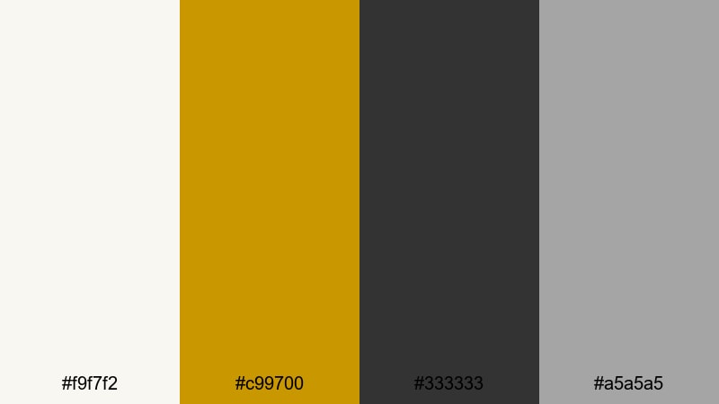
- HEX Codes: #f9f7f2, #c99700, #333333, #a5a5a5
- Mood: Clean, confident, and professional.
- Use for: Use for clean channel branding, UI overlays in tutorials, and minimalist product explainer graphics.
Ochre Accent On White keeps things minimal: crisp near-white, a punchy Yellow Ochre accent, and neutral grays for typography. The result feels modern and editorial, similar to a tech or productivity website.
Use Yellow Ochre sparingly for key buttons, subscribe prompts, or highlighted words in titles. In Filmora, set your backgrounds to the off-white and choose dark gray text to keep everything readable. This palette works especially well for software tutorials, productivity channels, and sleek explainer videos.
Clean Grid Workspace
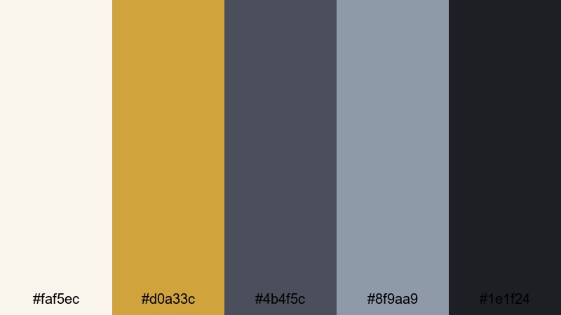
- HEX Codes: #faf5ec, #d0a33c, #4b4f5c, #8f9aa9, #1e1f24
- Mood: Focused, structured, and efficient.
- Use for: Use for screen-record tutorials, productivity tips, and desk setup videos that need a tidy, organized visual language.
Clean Grid Workspace pairs a muted Yellow Ochre with cool, editorial grays and a near-black for strong contrast. It feels like a beautifully arranged desk or a design magazine layout.
In your videos, use the off-white and pale gray as card backgrounds, and reserve Yellow Ochre for progress bars, underlines, or section headers. This palette is perfect for building slide-style layouts directly in Filmora, adding structure to any workflow or how-to video.
Urban Loft Glow
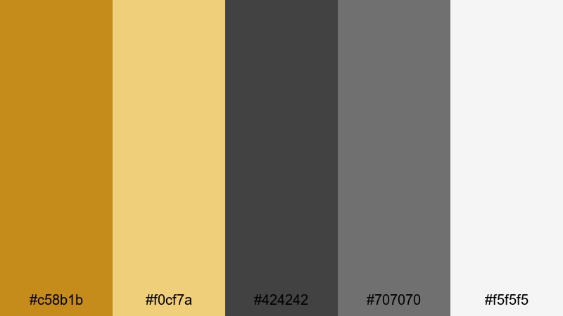
- HEX Codes: #c58b1b, #f0cf7a, #424242, #707070, #f5f5f5
- Mood: Sophisticated, urban, and design-forward.
- Use for: Use for interior tours, design breakdowns, and brand intros that blend industrial cool with warm lighting.
Urban Loft Glow contrasts industrial grays with warm Yellow Ochre, mimicking sunlight streaming through big city windows. It looks refined but welcoming, perfect for interior content and design-focused vlogs.
Use mid-gray for interface-like elements and bring in Yellow Ochre where you want attention: logo reveals, icons, or section titles. In Filmora you can pair this palette with subtle blur and parallax transitions to echo a high-end design studio feel.
Architectural Light Lines
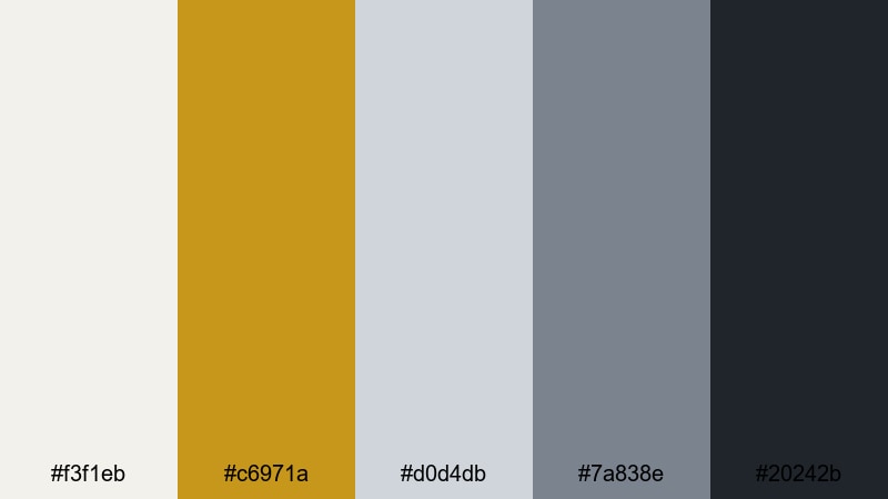
- HEX Codes: #f3f1eb, #c6971a, #d0d4db, #7a838e, #20242b
- Mood: Refined, balanced, and cinematic-modern.
- Use for: Use for architectural walkthroughs, motion graphics lower thirds, and stylish title cards with a restrained palette.
Architectural Light Lines uses soft off-whites and steel blues as a cool foundation, then cuts in Yellow Ochre like a streak of sunlight on concrete. It feels premium and controlled, ideal for real estate, architecture, and design channels.
In your motion graphics, let the dark navy and charcoal handle borders and text, and reserve Yellow Ochre for minimal line accents, icons, or logo marks. When editing in Filmora, this palette gives lower thirds and title cards a subtle, cinematic sophistication.
Matte Branding Block
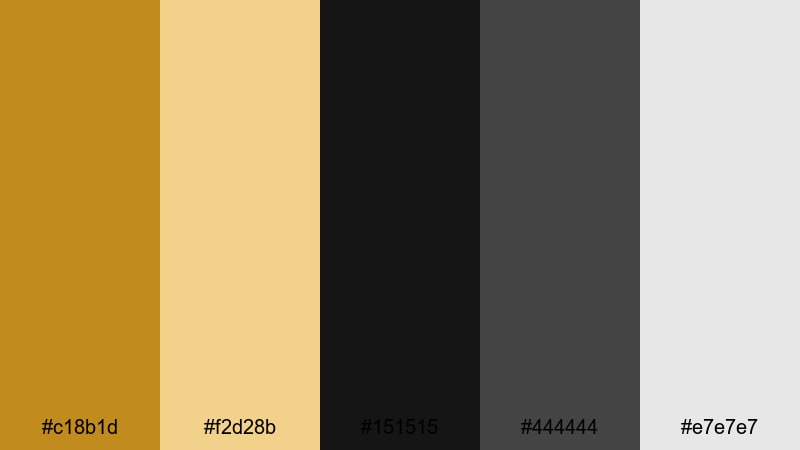
- HEX Codes: #c18b1d, #f2d28b, #151515, #444444, #e7e7e7
- Mood: Bold, branded, and contemporary.
- Use for: Use for logo animations, channel rebrands, and product hero shots where clarity and impact matter.
Matte Branding Block combines strong blacks and grays with bold Yellow Ochre and a soft cream highlight. It feels like a modern brand deck: confident, simple, and memorable.
Use solid blocks of black or dark gray as backdrops in Filmora, then overlay Yellow Ochre shapes for logos, product frames, or call-to-action cards. This palette is powerful for rebrands, hero sections, and thumbnail designs that need to stand out even at small sizes.
Vintage Film Yellow Ochre Color Palettes
Sepia Travel Diary
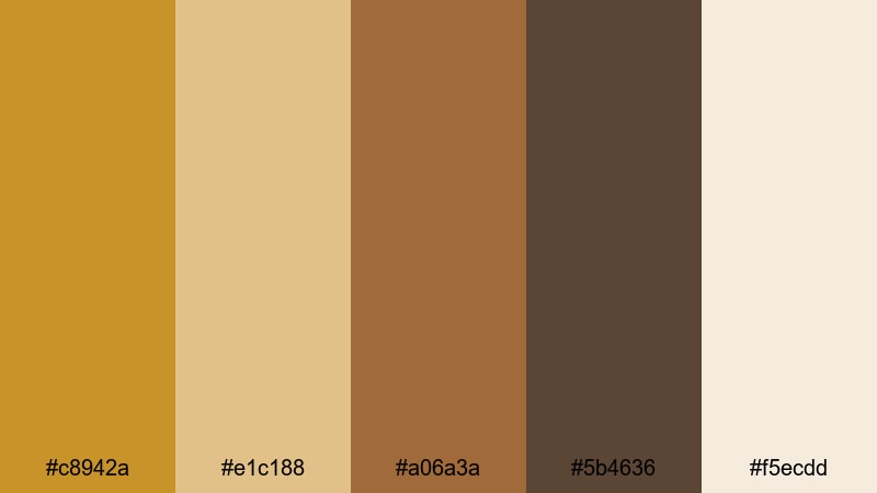
- HEX Codes: #c8942a, #e1c188, #a06a3a, #5b4636, #f5ecdd
- Mood: Dreamy, nostalgic, and reflective.
- Use for: Use for travel montage edits, voice-over diaries, and memory sequences that need a gentle vintage wash.
Sepia Travel Diary blends Yellow Ochre with sepia browns and faded cream, echoing aged film prints and old postcards. It instantly adds a dreamy, reflective quality to travel stories and memory sequences.
In Filmora, use the light cream as a base for handwriting-style titles or date stamps, and keep your Yellow Ochre and brown tones slightly desaturated to reinforce the vintage vibe. This palette is great for montage edits, reflective voice-overs, and highlight reels from longer trips.
Dusty Reel Archives
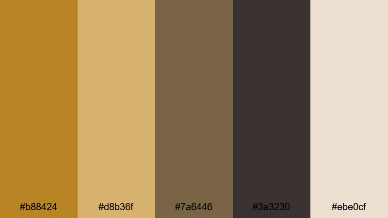
- HEX Codes: #b88424, #d8b36f, #7a6446, #3a3230, #ebe0cf
- Mood: Historic, textured, and introspective.
- Use for: Use for documentary segments, archive-inspired edits, and credits that nod to analog film history.
Dusty Reel Archives leans into muted Yellow Ochre, tobacco browns, and dusted neutrals for a serious, archival look. It feels like film canisters pulled off a shelf or old photographs stored in boxes.
Use this palette in lower thirds for interviews, chapter cards for documentaries, and credits that nod to analog film. In Filmora, pairing it with subtle grain overlays and gentle vignettes will deepen the historic, reflective mood.
Retro Poster Fade
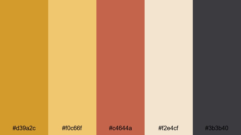
- HEX Codes: #d39a2c, #f0c66f, #c4644a, #f2e4cf, #3b3b40
- Mood: Playful, retro, and bold yet softened.
- Use for: Use for title cards, chapter screens, and graphic overlays that reference mid-century poster design.
Retro Poster Fade combines punchy Yellow Ochre with muted red, creamy paper, and charcoal, echoing mid-century screen-printed posters. It is bold but slightly faded, giving your graphics a retro charm.
Use the cream as a paper-like background in Filmora, then layer large, simple shapes of Yellow Ochre and red for title cards or episode numbers. This palette is perfect for stylized intros, chapter screens, and motion graphics that need a vintage design touch.
Autumn Super 8 Grain
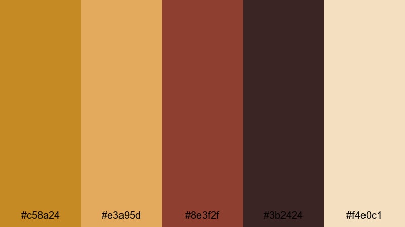
- HEX Codes: #c58a24, #e3a95d, #8e3f2f, #3b2424, #f4e0c1
- Mood: Moody, seasonal, and cinematic.
- Use for: Use for fall lookbooks, moody B-roll sequences, and grainy overlays that lean into Super 8 nostalgia.
Autumn Super 8 Grain brings together autumnal Yellow Ochre, burnt reds, dark browns, and soft cream, like footage from a fall road trip shot on Super 8. The palette feels nostalgic and a little moody.
Use it for seasonal lookbooks, cozy park walks, or coffee shop montages. In Filmora, combine this palette with film grain, slow crossfades, and a slightly softer contrast curve to really sell the analog fall aesthetic.
Classic Documentary Warmth
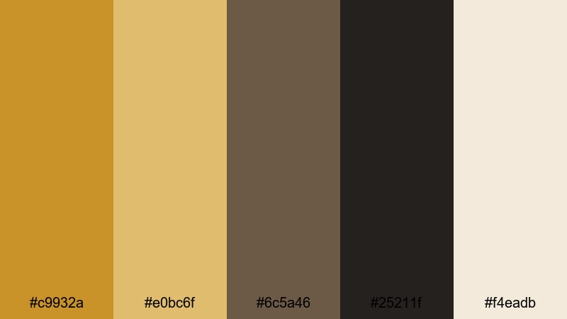
- HEX Codes: #c9932a, #e0bc6f, #6c5a46, #25211f, #f4eadb
- Mood: Serious, warm, and trustworthy.
- Use for: Use for in-depth documentaries, interview setups, and educational content where you want warmth without losing authority.
Classic Documentary Warmth pairs trusted Yellow Ochre tones with neutral browns and a soft off-white. It feels like a polished broadcast grade: serious enough for educational content, but still warm and human.
Use the off-white for clean titles and subtitles, keeping Yellow Ochre for underlines, icons, and key phrases you want viewers to remember. This palette works well in Filmora for interviews, explainer videos, and long-form stories where clarity and authority matter.
Tips for Creating Yellow Ochre Color Palettes
Yellow Ochre is versatile, but it really shines when you balance it with the right neutrals, contrasts, and accent colors. Here are practical tips to design palettes that look great in both video and static graphics.
- Pair Yellow Ochre with soft creams or off-whites to keep your layouts bright and airy while still feeling warm.
- Use deep browns, charcoal, or navy as contrast colors so text and icons stay readable on thumbnails and lower thirds.
- Limit your number of strong accent colors; often one Yellow Ochre plus one supporting accent (like terracotta or muted blue) is enough.
- Check legibility on mobile by viewing your thumbnail or title at a very small size; adjust brightness and contrast if text disappears.
- Keep Yellow Ochre for consistent brand elements like logos, subscribe buttons, or highlight bars so viewers recognize your content instantly.
- When grading footage, reduce saturation in greens and blues slightly so Yellow Ochre skin tones and highlights stand out more naturally.
- Use Filmora's color tools to create presets from your favorite Yellow Ochre look, then apply them across all episodes or playlists.
- Test light and dark versions of the same palette (light backgrounds vs dark backgrounds) to see which better fits your content niche.
Yellow Ochre palettes can make your videos feel warm, cinematic, and consistent, whether you are telling quiet documentary stories or showing bold product shots. With the right combinations of creams, browns, charcoals, and accent hues, this color can define your brand identity and set the emotional tone of every frame.
Use these 15 palettes as starting points: apply the HEX codes to your titles, graphics, and overlays in Filmora, then refine the grade until it matches your style. Once you lock in a look, save it as your channel's visual language so every new upload instantly feels on-brand.
Experiment, tweak, and trust your eye. With Filmora and a thoughtful Yellow Ochre palette, even simple footage can feel polished, intentional, and uniquely yours.
secure download