
 100% Security Verified | No Subscription Required | No Malware


 ChatGPT
 Perplexity
 Gemini
 Claude
 Grok
Grok
People are very visual shoppers, and since there are lots of podcasts available on different platforms, the cover needs to stand out if you want to get more listeners to click on your show. However, it also needs to meet all the format requirements for each streaming platform, and there are a few other details that can help make it pop.
We will go into more detail about the size, quality and design elements, and there will be a great bonus tip at the end on using Filmora to make the design process more efficient.
In this article
A Look at Podcast Thumbnail Size on Different Platforms
There are different sizes for different podcast platforms, so we will list the sizes required by the most popular platforms.
For Apple Podcasts and Spotify, the allowed size ranges from 140.1400 to 300.3000 pixels, while YouTube Music covers can go from 140.1400 to 409.4098 pixels. If you are posting a video on your YouTube channel, the best thumbnail size would be 128.720 pixels and 256.1440 pixels for the channel banner.
You should also consider image quality and simplicity, as you don't want it to look grainy or too busy and difficult to interpret.
Basic Design Tips for the Best Podcast Cover
The cover design will vary depending on your presentation style, format, and the topics you cover, but it's crucial to get it right as it will be the official face of the podcast.
You also need to understand the difference between a Podcast Logo and a Podcast Cover. The logo is a stylized version of your show's title, which you can use on various merchandise, your website, etc. The cover is a piece of art that helps showcase what your show is about and helps people quickly identify the topic matter and tone at a single glance.
Now that we have the basics covered, let's look at some of the main cover design tips that will help you stand out.
Get the Subject Matter and Tone Across
In essence, the main reason for having this little image next to the name of your podcast and the episode is to give potential listeners a glimpse into your unique little universe right off the bat.
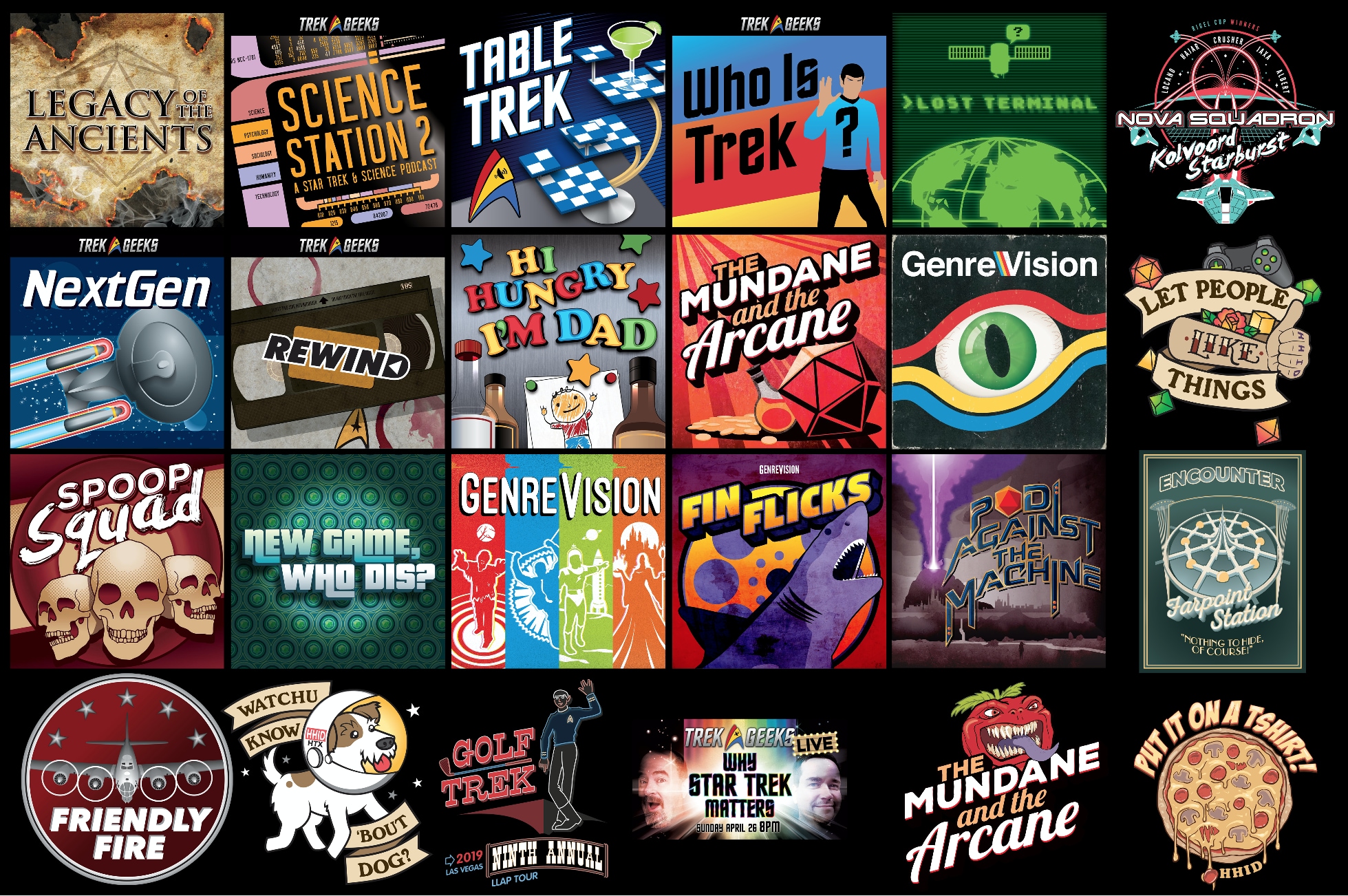
Just remember that this market is highly competitive, and there are thousands of podcasts out there, so avoid cliche design choices like microphones, RSS feed icons, cables and earphones, and the word “podcast”.
Here's a look at some overall design cues and how they relate to the type of content presented.
Casual lifestyle topics vs. formal science and education
With a more formal style, you want something that is subdued, perhaps some muted colors, a non-nonsense font, and graphics that showcase the scientific or educational nature of the show.
A more general lifestyle show with a wide range of topics can be more colorful and bright, with designs that make it seem aloof or fun, perhaps using some clever wordplay or an inside joke.
Personality-driven vs. topic-driven style
Is it a one-man or interview format or a team of hosts chattering about pop culture topics? If it's all centered on the character and presentation style of the host and building a strong personal brand, then you'll want to have your face or silhouette on the cover.
You can also have the faces of 2–3 hosts, but if the main selling points are the topics themselves, e.g., true crime or history, then go for imagery that people associate with those topics.
Business promotional podcasts vs. society and culture commentary
If you will be covering culture, politics, world news, and socio-economic topics, the design will need to be more cerebral and minimalist – a representation of your show as a professional platform with journalistic integrity.
However, if you will be focusing on a specific industry and promoting your business, then you want to make it more personalized and in line with your brand's visual identity.
Pay Attention to the Font and Style of Text
Next, you'll need to find the right font that matches the category, style, and general vibe of a podcast. There is limited space, so don't get too wordy – just the name of the podcast is enough, and you can play around with different fonts, sizes, placement, and colors until you get it just right.
Find a Good Color Scheme and Stay Consistent
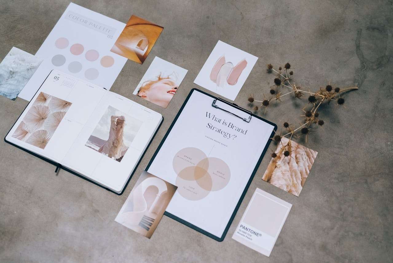
Bear in mind that brighter primary colors and warm tones are associated with fun, comedy, and excitement, while colder and darker colors work well for scientific topics and serious interview shows. A fall palette works well with true crime and philosophical themes, whereas lighter shades and pastels are great for lifestyle and fashion.
If you have an existing brand, e.g., a website and logos for social media accounts, choose a color scheme that will help keep your branding consistent across platforms and mediums.
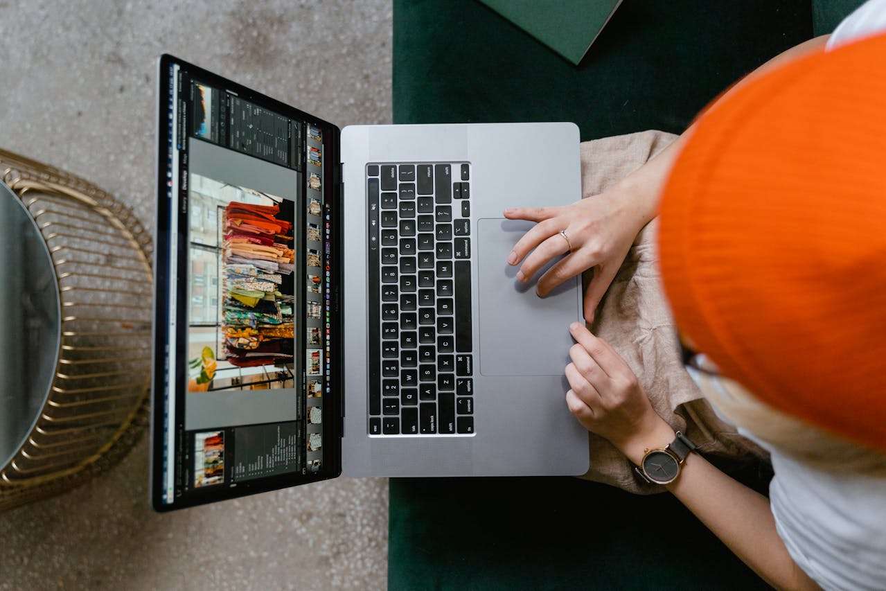
Make Things Easy with a One-stop Solution
If you're looking for an easier way to design your podcast cover, Filmora is an excellent tool! It's an audio and video editor with many useful features that can help you design the perfect cover in minutes, and it is available on macOS and Windows.
You just need to go over the following steps:
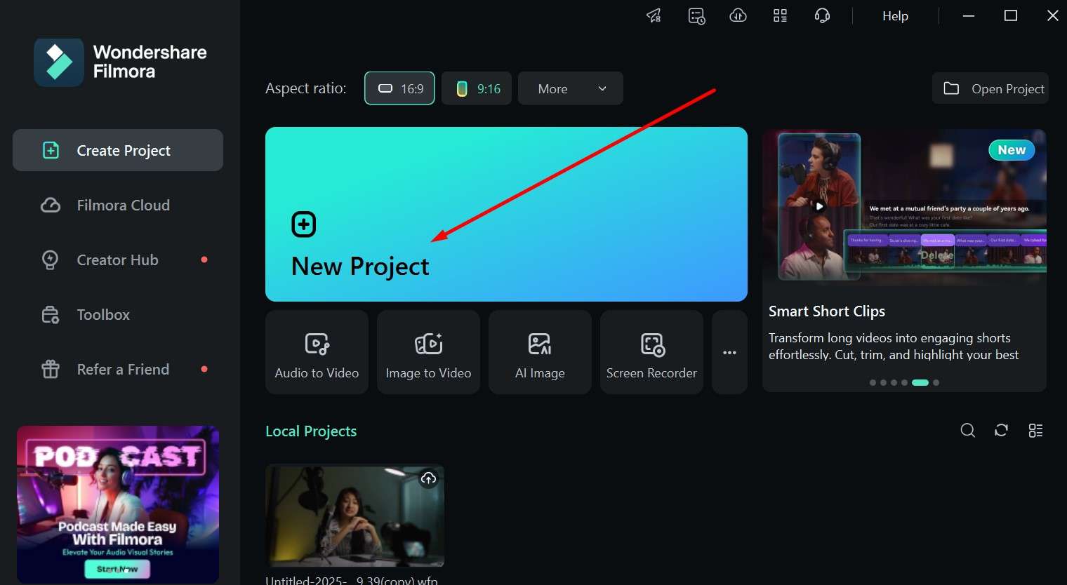
Step 1: Download and run the app, and start a New Project.
 secure download

Step 2: Go to the Stock Media tab and search the library to find something with a great-looking background that will fit your style.
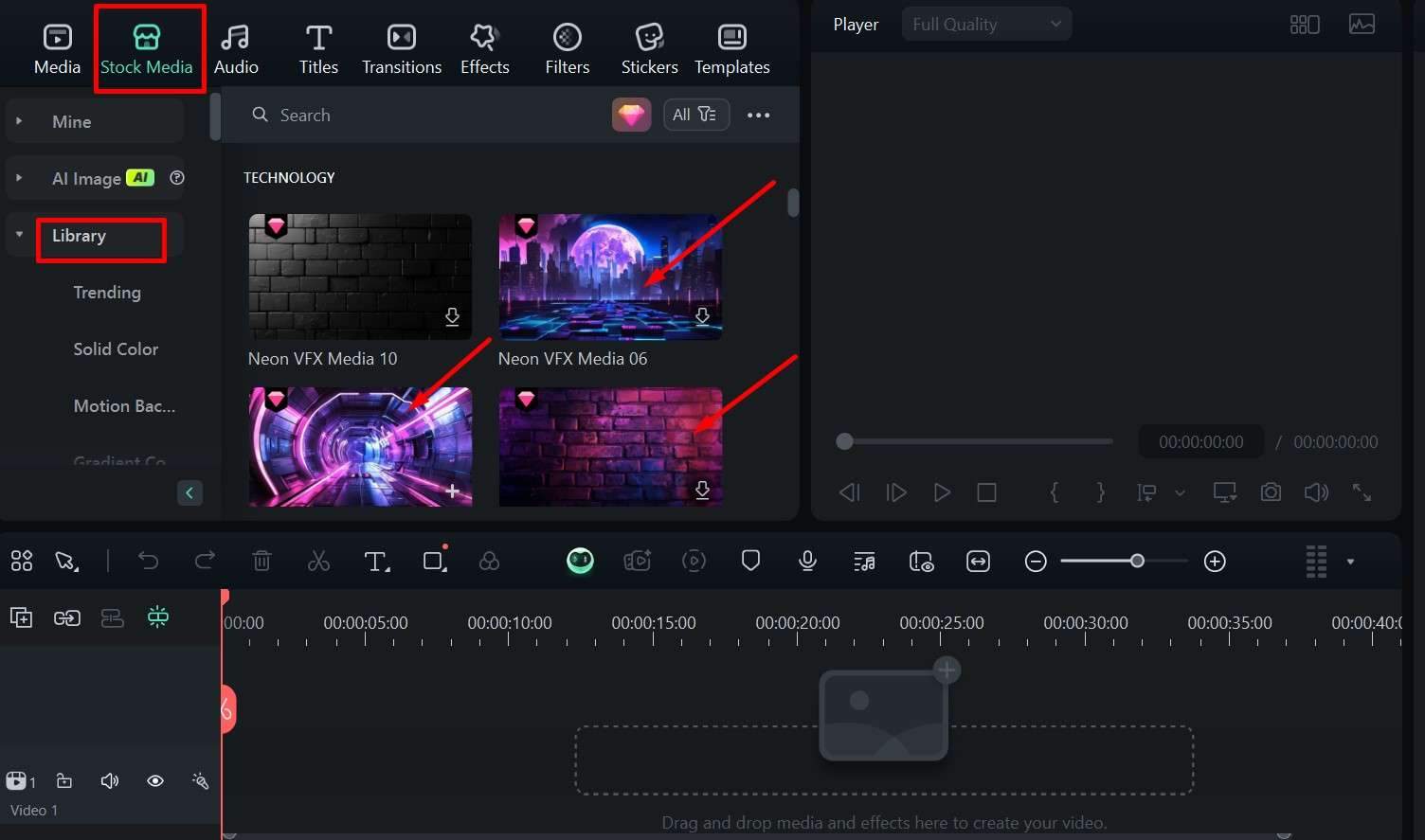
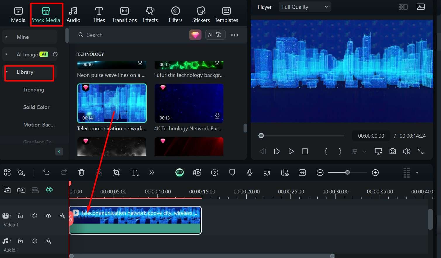
Step 3: Click an option you like and drag it to the timeline. Pause the video at a point that looks like a perfect background.
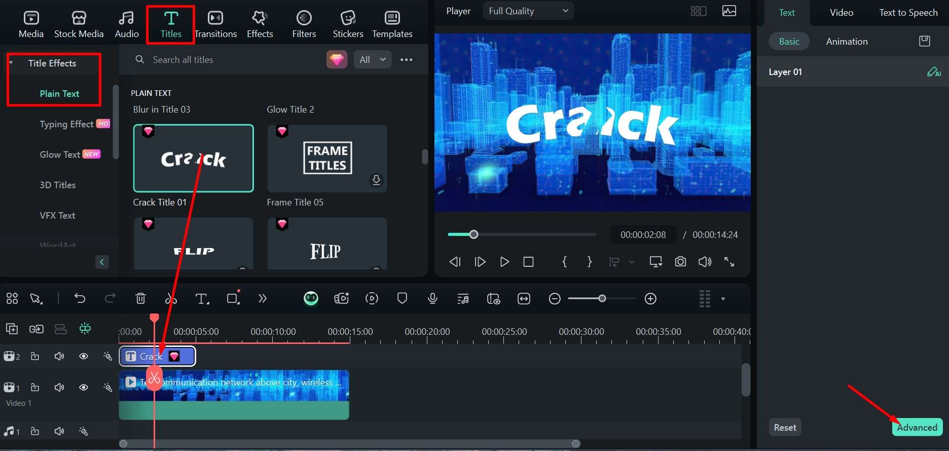
Step 4: Go to the Titles tab and scroll through the effects, then drag the one you like to the timeline above the video. Click Advanced for more options.
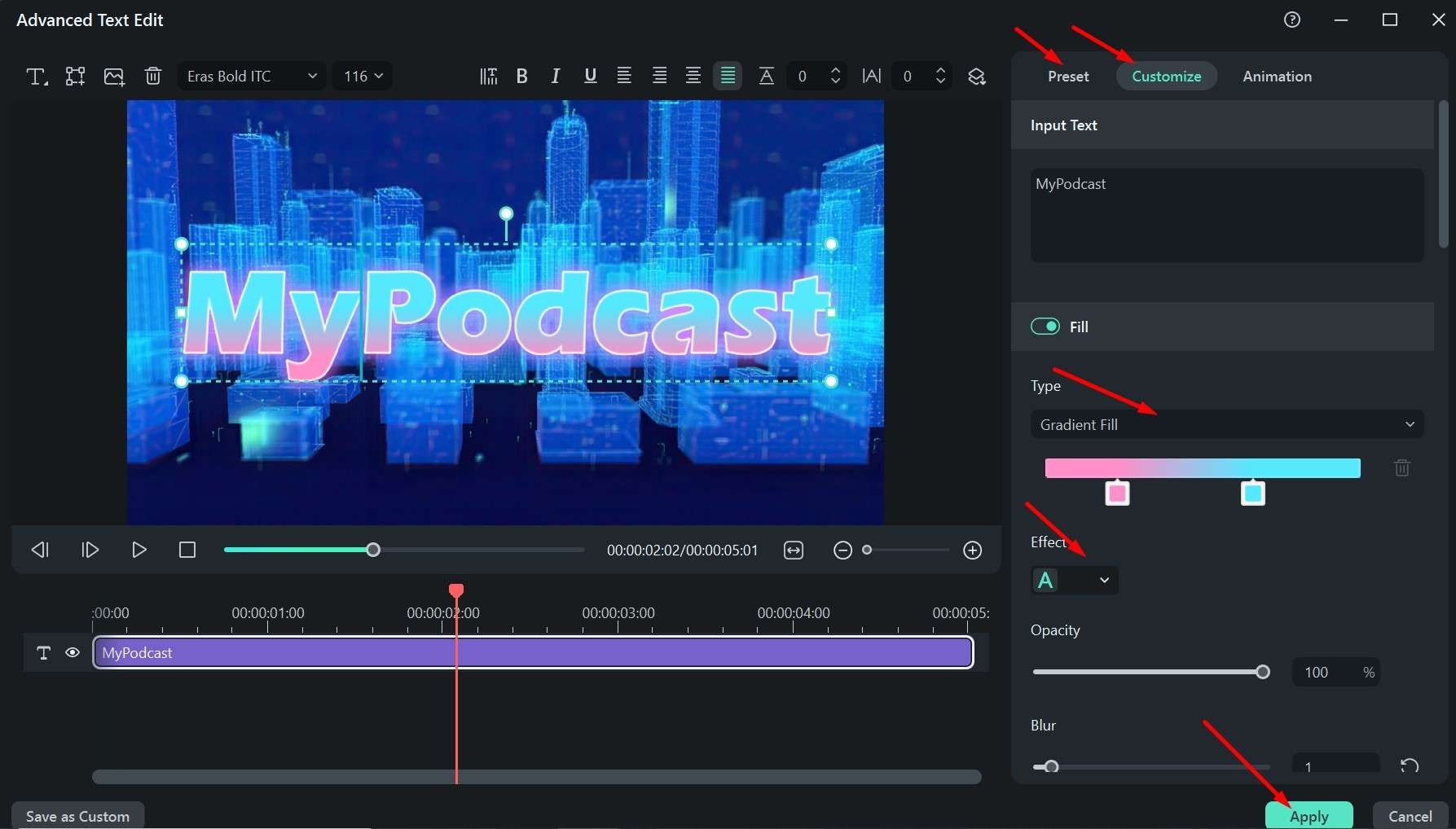
Step 5: In the Customize tab, you can play around with different options, like inputting your text and changing the color, thickness, and opacity or choose a ready-made one in the Preset tab. Click Apply when you are done.
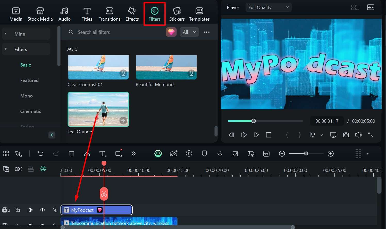
Step 6: You can also go to the Filters tab and drag one down to the timeline above the other elements to give it a different hue.
Step 7: Preview the video by clicking the Play button and pause it at the best moment, then click the full-screen icon.
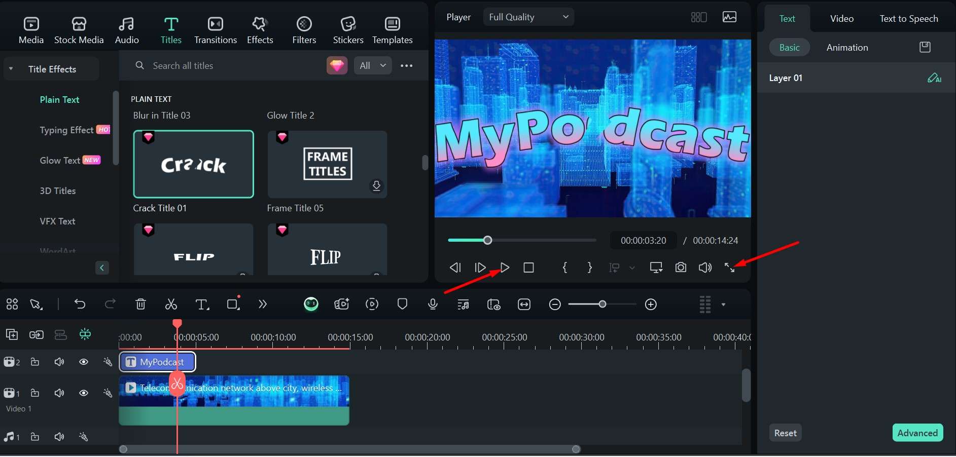
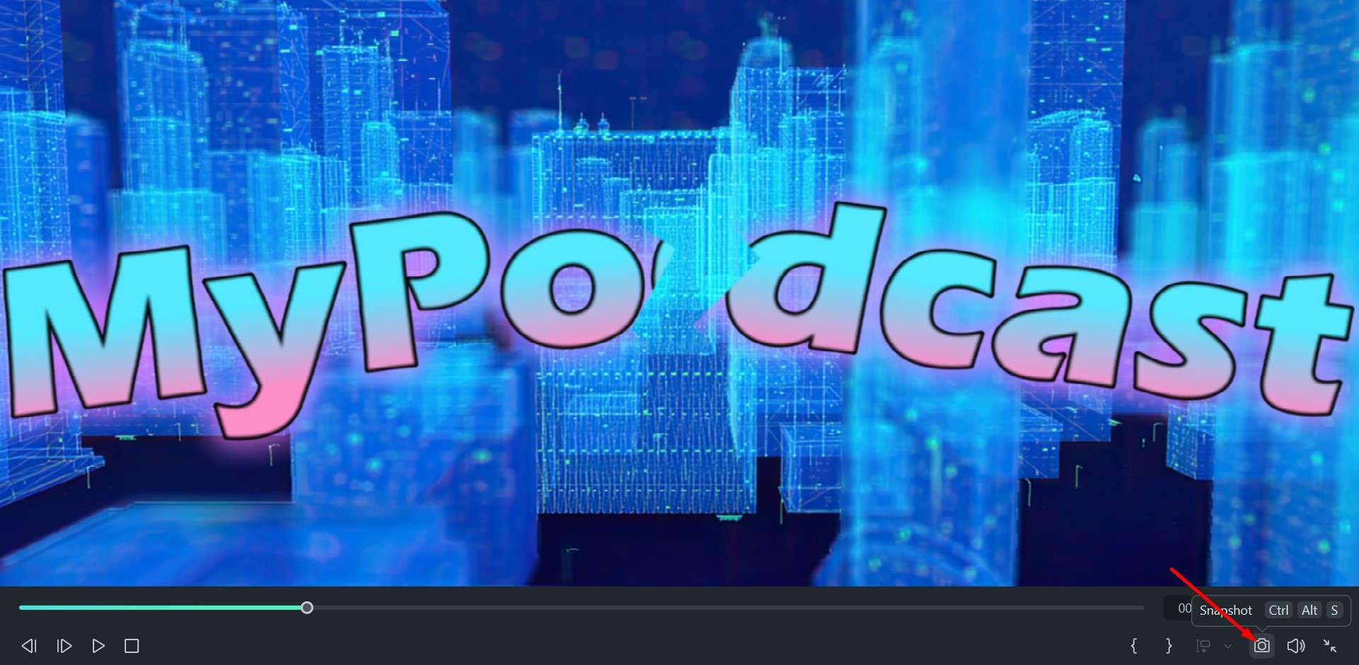
Step 8: In full-screen mode, take a snapshot that you can use for your cover image.
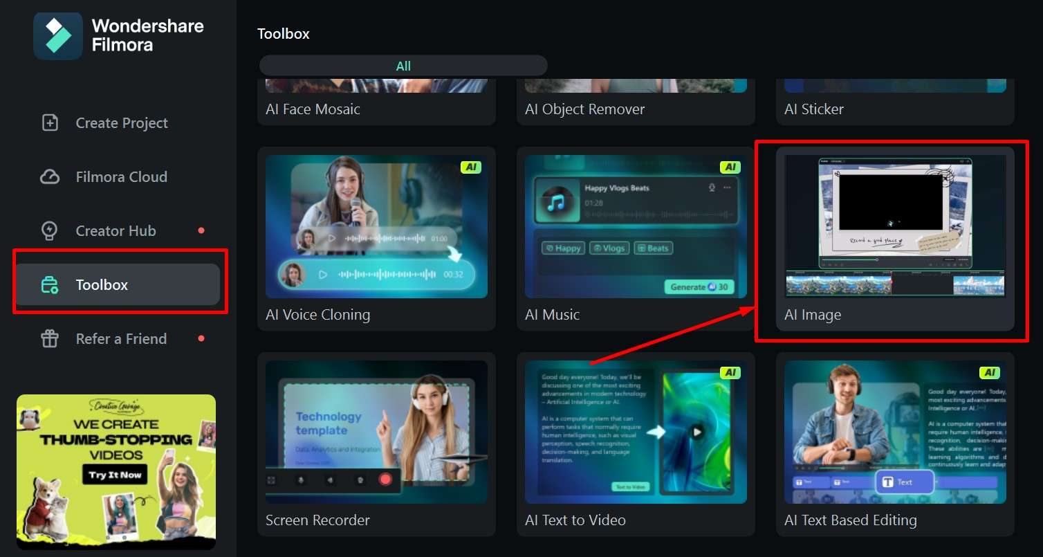
This process will give a solid cover image, but you can also use the AI Image feature to create custom images in any art style and color palette and with any elements you want. You are only limited by your imagination, and you can try a few different prompts to refine the results.
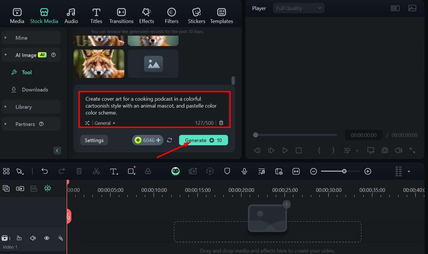
Step 1: In the main menu, go to the Toolbox and click on AI Image.
Step 2: Type in your prompt and click Generate.
Step 3: Pick an image you like from the generated options, and drag it to the timeline.
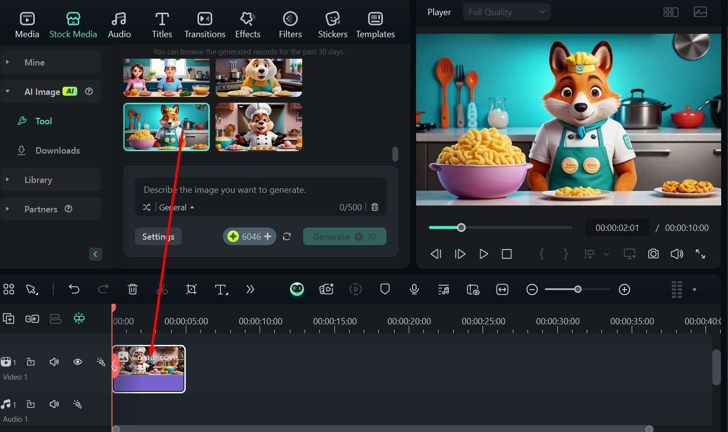
Step 4: Click Export to save the image.
When you have something you like, you can use the same steps as mentioned above to customize the image and add a title with the name of your podcast. The best part is that you can later use Filmora to edit the podcast itself, create promo clips, and add intro music.
Conclusion
We cannot stress the importance of a good podcast cover enough – it's the first impression you impress upon listeners and your last chance to tickle their imagination and get them to click.
Luckily, the points we've covered above can help you make an excellent cover that hooks people in. You can also use tools like Filmora to make the design process a bit easier, as it offers many great features and will also be quite useful for editing your episodes.
In the end, as long as you follow a few simple guidelines, you will be just fine and can focus most of your energy on coming up with cool ideas for new episodes and honing your skills.
