
 100% Security Verified | No Subscription Required | No Malware

Bronze Patina sits between aged metal and cool green, creating a feeling of depth, history, and quiet luxury. It hints at vintage objects, oxidized statues, and weathered architecture, making it perfect for stories that feel grounded, cinematic, or nostalgic. In color psychology, these tones suggest stability, creativity, and sophistication without being loud, which is why they work so well in long-form videos, brand visuals, and any content that needs to look polished.
For creators and Filmora users, a Bronze Patina color palette can tie together intros, lower thirds, thumbnails, and color grading into one consistent look. Below you will find 15 ready-made Bronze Patina color palettes with HEX codes, tailored for vlogs, trailers, social posts, branding, and more, so you can copy the codes directly into your design or color grading workflow.
In this article
Elegant & Modern Bronze Patina Color Palettes
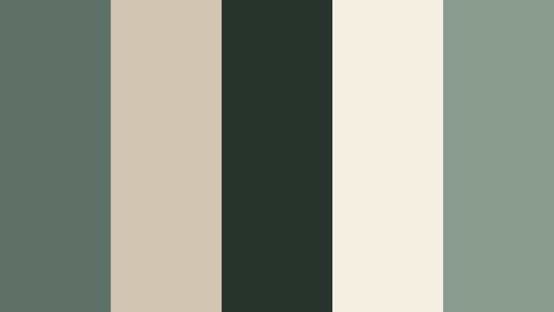
Urban Loft Patina

- HEX Codes: #6e7c6f, #c1b49a, #3f4a43, #e5dfcf, #1f2521
- Mood: Sophisticated, grounded, and slightly industrial.
- Use for: Great for modern tech explainers, app promos, and minimalist brand intros with a refined edge.
Urban Loft Patina blends muted green-bronze with stone neutrals and deep charcoal, echoing concrete, metal, and soft interior light. It feels like a converted warehouse studio: modern, clean, and a little bit gritty in the best way.
Use this palette to design YouTube channel branding, sleek lower thirds, or product overlays that look premium without being flashy. In Filmora, you can apply these HEX codes to titles, icons, and custom graphics, then match your footage using color grading so your b-roll, intros, and thumbnails all share the same Urban Loft Patina identity.
Pro Tip: Build a Cinematic Bronze Patina Look in Filmora
To keep an Urban Loft Patina look consistent, start by sampling the HEX codes for your titles, shapes, and background blocks in Filmora. Then push your footage toward the same muted green-bronze and stone tones by reducing saturation slightly and warming the midtones while keeping shadows deep and neutral.
Create one master adjustment layer with your Bronze Patina style, then reuse it across intros, talking-head clips, and social cutdowns. This way, every asset in your series feels part of the same carefully designed visual world.
AI Color Palette
If you have a reference still or style frame that nails this Urban Loft Patina mood, you can turn it into a consistent grade with Filmora's AI tools. Filmora's AI Color Palette feature lets you analyze that image and apply its Bronze Patina balance to your whole timeline, from A-roll to b-roll.
Import your reference, choose it as the source, and let AI Color Palette match the tones on selected clips. This is especially useful when you are mixing cameras or lighting setups but still want one cohesive Bronze Patina aesthetic across a full video or a series.
 secure download

HSL, Color Wheels & Curves
Once AI has given you a base match, use HSL controls to gently tune greens toward that signature Bronze Patina hue and desaturate any colors that feel too loud. With color wheels, keep shadows neutral or slightly cool, then add a subtle warm lift to midtones and highlights to mimic the soft light you see in loft or studio spaces.
If you want a more stylized look, use curves to crush the deepest blacks a little and raise the shadows, giving your Bronze Patina palette a modern, matte finish. You can see how these grading tools work in practice in Filmora's color correction tutorials on YouTube and apply the same logic to any Bronze Patina combination you choose.
secure download1000+ Video Filters & 3D LUTs
To move even faster, you can stack a curated filter or LUT on top of your Bronze Patina base. Filmora's video filters and 3D LUTs make it easy to add gentle fade, cinematic contrast, or vintage softness that suits this palette, without rebuilding a grade from scratch every time.
Pick a LUT that complements muted greens and warm neutrals, then dial the intensity down so you preserve your carefully chosen HEX codes. Save these settings as a preset and reuse them for future uploads to keep your Bronze Patina brand look tight and recognizable.
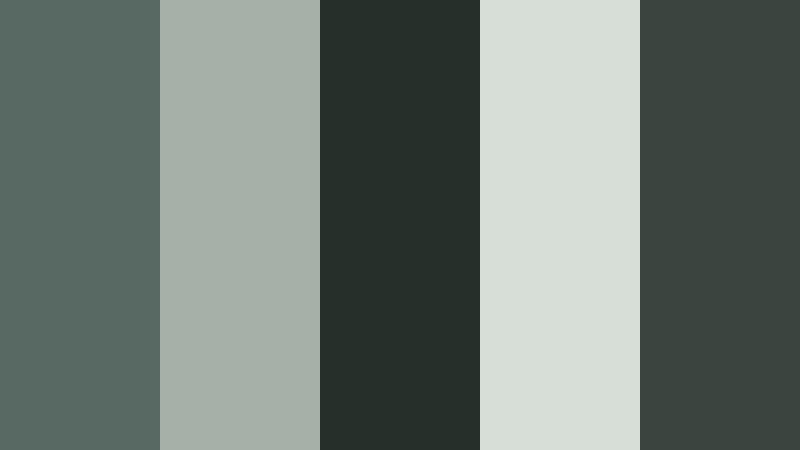
secure downloadGallery Bronze Minimal

- HEX Codes: #716c5b, #b2a68a, #3c3b36, #eae3d3, #938a73
- Mood: Clean, artistic, and quietly luxurious.
- Use for: Ideal for portfolio reels, gallery promos, and title cards that need a museum-like, curated feel.
Gallery Bronze Minimal mixes soft Bronze Patina tones with creamy ivory and smoky taupe, echoing gallery walls, frames, and calm lighting. It feels curated and deliberate, like a private viewing room rather than a loud exhibition hall.
Use these HEX codes for intro slates, elegant lower thirds, and subtle gradients behind typography. In thumbnails and channel art, the restrained palette makes your imagery stand out while keeping everything cohesive and premium.
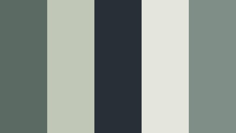
Architectural Patina Lines
- HEX Codes: #5e7067, #d1c6b2, #28342e, #f4efe3, #8c9b90
- Mood: Structured, modern, and calmly creative.
- Use for: Perfect for architectural walkthroughs, motion graphics, and design case studies with clean typography.
Architectural Patina Lines pairs cool Bronze Patina greens with bone white and graphite accents. The combination suggests crisp blueprints, poured concrete, and glass reflections, all softened by calm, neutral light.
Use this palette to define UI mockups in your explainer videos, diagram overlays in walkthroughs, and chapter cards in design case studies. The strong darks (#28342e) are perfect for text, while the pale tones (#f4efe3, #d1c6b2) make refined backgrounds for titles and infographics.
Modern Heritage Bronze

- HEX Codes: #746757, #cbb89a, #33302a, #efe4cf, #98806a
- Mood: Timeless, refined, and warm with a modern twist.
- Use for: Use for brand documentaries, origin-story videos, and luxury product showcases that mix old and new.
Modern Heritage Bronze leans into warm Bronze Patina browns combined with heritage cream and deep espresso tones. It recalls antique books, leather, and polished wood, but with enough lightness to feel current.
Apply this palette when telling brand origin stories or showcasing craftsmanship. Use the darkest shade for typography, mid-tones for product frames, and the lightest creams for backgrounds in titles and end screens, keeping everything rich but readable.
Moody & Cinematic Bronze Patina Color Palettes
Industrial Rain Patina
- HEX Codes: #586863, #a4b0a8, #272f2b, #d7ded8, #3b4540
- Mood: Moody, cinematic, and atmospheric like a rainy city alley.
- Use for: Great for short films, music videos, and cinematic B-roll where you want tension and texture.
Industrial Rain Patina is full of stormy greens, foggy grays, and deep Bronze Patina shadows. It feels like wet asphalt, misted windows, and neon reflections bouncing off old metal.
Use it to grade night city footage, dramatic music videos, or thriller intros. Build titles in the pale gray (#d7ded8) over the near-black greens (#272f2b, #3b4540) and your type will stand out while still feeling part of the same cinematic world.
Forgotten Harbor Bronze
- HEX Codes: #5b6b64, #c0c7b7, #273034, #e4e6dd, #7f8e86
- Mood: Nostalgic, weathered, and quietly dramatic.
- Use for: Ideal for travel vlogs, historical edits, and narrative sequences set by the sea or old ports.
Forgotten Harbor Bronze captures sea-worn teals and muted Bronze Patina metals. It evokes old docks, rusted railings, and fog that softens the horizon, creating a gentle but dramatic seascape mood.
Apply this palette to travel vlogs set by the water, melancholic montage sequences, or history-focused pieces. Use the lighter tones (#e4e6dd, #c0c7b7) for subtitles and navigation graphics so they remain legible over darker footage.
Noir Patina Nightfall

- HEX Codes: #404843, #8f9a8b, #161b18, #d2d5cc, #636f63
- Mood: Dark, mysterious, and cinematic with a subtle green cast.
- Use for: Perfect for thrillers, title sequences, and moody podcast visuals needing a noir-inspired grade.
Noir Patina Nightfall leans into shadowy greens and soft highlights, with deep blacks that never look flat. It feels like a classic noir film filtered through a modern, slightly desaturated Bronze Patina lens.
Use this palette to grade interviews with strong contrast, build striking opener graphics for true crime or mystery podcasts, and design thumbnails that mix the pale highlight (#d2d5cc) with inky backgrounds (#161b18) for strong readability.
Library Dust And Bronze

- HEX Codes: #6f6555, #cbbfa7, #2d2923, #e9e0cf, #8b7b65
- Mood: Bookish, introspective, and vintage cinematic.
- Use for: Use for study-with-me videos, essay films, and thoughtful documentary segments.
Library Dust And Bronze combines dusty Bronze Patina browns, parchment creams, and deep ink-like shadows. It feels like late-night reading under a warm lamp, with pages that have already lived a life.
Apply this palette to commentary videos, video essays, or educational content. Use the lighter parchment tones for notes, chapter markers, and quote overlays, and keep your footage slightly softened and warm to match the vintage academic vibe.
Soft & Romantic Bronze Patina Color Palettes
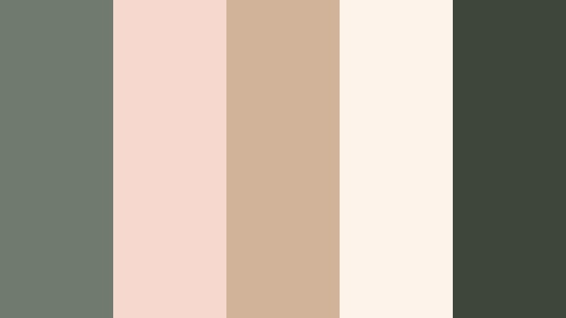
Sunlit Courtyard Patina

- HEX Codes: #7a8576, #f3e3cf, #b89b7a, #fff7ea, #4f5a52
- Mood: Warm, inviting, and softly nostalgic.
- Use for: Great for wedding films, lifestyle vlogs, and cozy home tours with gentle natural light.
Sunlit Courtyard Patina mixes airy neutrals with soft Bronze Patina greens and warm stone browns. It captures the feeling of a late afternoon patio, dappled light, and relaxed conversations.
Use it as a base for wedding titles, lifestyle channel branding, or gentle product promos. The light shades (#f3e3cf, #fff7ea) give you bright yet soft backgrounds for text, while the deeper greens and browns define accents, lines, and icons.
Blush Garden Bronze
- HEX Codes: #6f7b6e, #f6d8cf, #d1b39a, #fdf3eb, #3e463c
- Mood: Romantic, tender, and organic.
- Use for: Ideal for engagement films, beauty content, and soft product shoots with floral details.
Blush Garden Bronze softens patina greens with rosy blush and latte neutrals. The palette feels like a styled garden shoot, with petals, linen, and natural textures all living in the same gentle color space.
Use the blush tones (#f6d8cf, #d1b39a) for call-to-action buttons or highlight text in thumbnails, while the deeper greens and charcoals add structure around frames and borders. It is perfect for channels focused on beauty, wellness, or handmade products.
Vintage Postcard Patina

- HEX Codes: #758477, #f1e0c3, #c39b77, #fff8e4, #4a564d
- Mood: Dreamy, nostalgic, and travel-inspired.
- Use for: Perfect for travel diaries, memory montages, and vintage-styled holiday edits.
Vintage Postcard Patina blends soft patina greens with faded tan and postcard ivory. It looks sun-washed and slightly faded, like old photos that have traveled in actual mail.
Use this palette to design travel title cards, date stamps, and map overlays. In Filmora, you can pair these HEX codes with subtle grain and a light vignette so your edits instantly feel like cherished memories.
Coffeehouse Patina Glow

- HEX Codes: #6a7165, #e7d2bf, #ae8660, #f8efe5, #3a3f38
- Mood: Cozy, intimate, and relaxed.
- Use for: Use for cafe vlogs, lo-fi music loops, and sit-down chats that feel warm and inviting.
Coffeehouse Patina Glow combines creamy latte tones and Bronze Patina greens with a hint of coppery warmth. It feels like soft jazz, steamed milk, and rainy-day reflections on a cafe window.
Use the lighter coffees (#e7d2bf, #f8efe5) behind text and the deeper green and copper for titles, icons, and lower thirds. This palette works beautifully for cozy streams, lo-fi edits, or any content that invites viewers to relax and stay a while.
Bold & Vibrant Bronze Patina Color Palettes
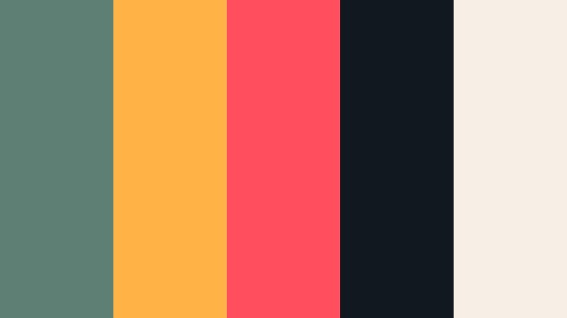
Digital Retro Patina

- HEX Codes: #6c897c, #ffd97a, #ff8b6a, #1e2730, #f4f1e7
- Mood: Playful, retro-futuristic, and energetic.
- Use for: Great for YouTube intros, motion graphics, and channel branding that needs a fresh retro edge.
Digital Retro Patina collides punchy yellows and corals with cool Bronze Patina greens and deep slate. It feels like an 80s computer interface redesigned for modern social content.
Use the bright accent colors (#ffd97a, #ff8b6a) for buttons, progress bars, and key icons, while the greens and dark slate handle backgrounds and large shapes. This palette can make your intros and motion graphics look bold without losing that slightly aged patina charm.
Street Art Bronze Pop
- HEX Codes: #5e7f73, #ffb347, #ff4f5e, #101820, #f5efe5
- Mood: Edgy, urban, and high-impact.
- Use for: Perfect for streetwear promos, dance videos, and energetic social edits needing graphic punch.
Street Art Bronze Pop pairs urban Bronze Patina greens with inky black and explosive coral and amber. It feels like a graffiti wall under city lights, full of movement and contrast.
Use the bold accents (#ffb347, #ff4f5e) sparingly to highlight key words, calls to action, or beat-synced graphics in your edits. The dark base (#101820) makes a great canvas for strong typography in thumbnails and end cards.
Festival Lights Patina

- HEX Codes: #5f8076, #ffcf5c, #ff7f7a, #242933, #f9f4e8
- Mood: Festive, cinematic, and colorful with a night-sky vibe.
- Use for: Ideal for festival recaps, concert edits, and upbeat travel reels with neon-style energy.
Festival Lights Patina mixes glowing Bronze Patina greens and night blues with spotlight yellows and pinks. It captures the mood of a music festival after dark, where lights and crowds blur together.
Use this palette for high-energy montages, event recaps, or party promos. The deep blue-gray (#242933) serves as a rich base, while the bright accents trace movement, transitions, and titles so your edit feels alive but still visually consistent.
Tips for Creating Bronze Patina Color Palettes
Bronze Patina is versatile enough to feel modern, vintage, or bold, depending on how you combine it with neutrals and accent colors. When you build your own palette or adapt one of these, keep both mood and practical readability in mind for video and design.
- Pair Bronze Patina greens with warm creams or ivories to keep the look soft and cinematic instead of cold and clinical.
- Always choose one or two darker shades for text and UI elements so titles and subtitles stay easy to read on mobile screens.
- Use high-saturation accent colors sparingly against mostly muted Bronze Patina tones for thumbnails and CTAs that still feel on brand.
- Match your footage to your graphics: if your titles use a Bronze Patina palette, nudge your grade toward similar greens and browns so nothing feels disconnected.
- Check contrast in grayscale to make sure your main text stands out against backgrounds even for viewers in bright environments.
- Create variations of the same palette for different content types, for example, slightly brighter for social posts and more subdued for long-form films.
- Save your favorite Bronze Patina combinations as presets or templates in Filmora so you can reuse them across series, seasons, and platforms.
- Test your palette on both desktop and phone screens before committing, as muted patina tones can look darker on small displays.
Bronze Patina color palettes can instantly give your videos and designs a sense of depth, story, and character. Whether you lean into sleek modern loft tones, moody cinematic greens, or soft romantic neutrals, consistent use of these palettes will shape your brand identity and make your content instantly recognizable.
Experiment with the HEX codes above in Filmora, combine them with your own footage, and build presets that match your style. Over time, your Bronze Patina aesthetic can become a visual signature across intros, thumbnails, reels, and full-length edits.
The more you refine your palettes and apply them consistently, the easier it becomes to stand out on crowded platforms while still keeping a cohesive, professional look that your audience trusts.
secure download