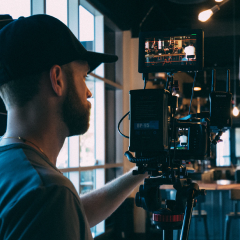
Charcoal sits between soft black and deep gray, carrying a sense of stability, subtle drama, and modern elegance. It feels reliable and grown up, but less harsh than pure black, which makes it a favorite for cinematic grading, luxury branding, and clean UI design. In video, charcoal backgrounds and overlays help colors pop without overwhelming the viewer, and they naturally draw attention to faces, text, and key details.
For creators and Filmora users, a well planned charcoal color palette makes it easier to design cohesive thumbnails, intros, lower thirds, and channel branding. Below are 15 ready made charcoal color combinations with HEX codes you can copy directly into your design tools or match in Filmora for a consistent look across entire edits.
In this article
Elegant Charcoal Color Palettes
Midnight Studio Glow
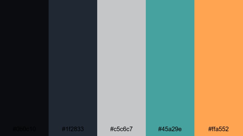
- HEX Codes: #0b0c10, #1f2833, #c5c6c7, #45a29e, #ffa552
- Mood: sleek, polished, and cinematic with a subtle studio glow
- Use for: Ideal for polished YouTube intros, tech explainers, and professional brand trailers where you want a cinematic yet approachable feel.
This palette balances deep charcoal shadows (#0b0c10, #1f2833) with cool steel and teal accents (#c5c6c7, #45a29e) and a single warm glow (#ffa552). It feels like stepping into a modern studio with controlled lighting and a hint of color contrast on LED panels.
Use the darker tones for full frame backgrounds and overlays, then reserve teal and the warm highlight for buttons, call to action text, and logo reveals. It works beautifully for channel intros, tech reviews, and thumbnails where you want a cinematic base that still feels clean and professional.
Pro Tip: Build a Cinematic Charcoal Look in Filmora
To keep a Midnight Studio Glow vibe across an entire video, build a simple style system in Filmora. Use the darkest charcoal as your background for title cards, the mid charcoal for lower thirds, and apply the teal and warm accent to icons, outlines, and key text.
Once you create one polished scene using this palette, save it as a template or reuse the same titles and elements in Filmora. This keeps your intros, tutorials, B roll captions, and end screens visually consistent, so your brand always feels intentional and cinematic.
AI Color Palette
You can capture this charcoal palette from a single reference frame and pass it to the rest of your timeline. Filmora's AI Color Palette feature reads the color mood from one clip or image and intelligently matches other shots to it.
Import a still of your favorite charcoal layout or thumbnail, apply AI Color Palette to a hero clip, then sync that look to interviews, screen recordings, and B roll. This keeps the deep charcoals, soft teal, and warm glow consistent without manually tweaking every shot.
HSL, Color Wheels & Curves
To perfect charcoal based footage, use Filmora's HSL controls to slightly desaturate backgrounds while protecting skin tones, then lean on the color wheels to cool your shadows and warm your highlights. Curves let you deepen the low end for richer charcoals without crushing detail in dark hair or clothing.
If you want a deeper dive into this workflow, explore Filmora's guides on using color correction tools for cinematic grading. A few subtle HSL and curves adjustments are often enough to unify mixed camera sources into one smooth charcoal studio style.
1000+ Video Filters & 3D LUTs
Once your charcoal base is dialed in, you can speed up styling with ready made looks. Filmora's video filters and 3D LUTs make it easy to add cinematic contrast, soft bloom, or subtle film grain on top of your palette.
Try a teal and orange LUT over this palette for a blockbuster feel, or pick a minimal, low contrast filter to maintain a clean studio atmosphere for tutorials. Because your HEX based colors stay the same, filters simply enhance the mood without breaking your brand consistency.
Smoky Loft Minimal
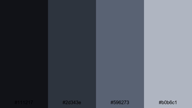
- HEX Codes: #111217, #2d343e, #596273, #b0b6c1
- Mood: calm, modern, and understated like a high-end loft
- Use for: Use for minimalist title sequences, product demos, and UI overlays where clarity and sophistication matter.
Smoky Loft Minimal combines soft charcoals with muted steel blues for a calm, design forward look. It feels like polished concrete, cool shadows, and frosted windows, which makes it ideal when you want focus on content rather than flashy color.
Use the darkest tones for backgrounds and sidebars, the mid blues for dividers and icons, and the lightest gray for text boxes or captions. It works especially well for UI demos, app walkthrough thumbnails, and on screen tutorials where legibility and sophistication are key.
Charcoal Champagne Soiree
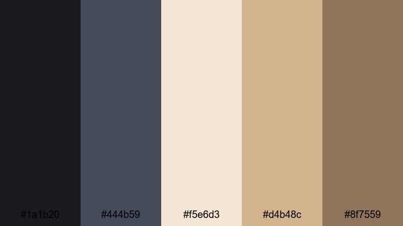
- HEX Codes: #1a1b20, #444b59, #f5e6d3, #d4b48c, #8f7559
- Mood: luxurious, warm, and celebratory
- Use for: Great for wedding films, lifestyle vlogs, and brand promos that need a premium yet cozy atmosphere.
This palette mixes rich charcoals with champagne and soft gold, creating a sense of evening light, candles, and polished glassware. The dark base keeps everything grounded while the warm neutrals feel inviting and upscale.
Try using charcoal as your canvas for titles and overlays, then highlight names, dates, and key phrases in the champagne and gold tones. It is a natural fit for wedding titles, event highlight reels, luxury product thumbnails, and elegant Instagram Stories exported from Filmora.
Pearl Ash Refinement
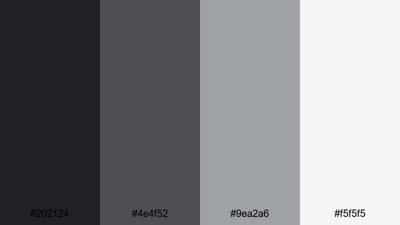
- HEX Codes: #202124, #4e4f52, #9ea2a6, #f5f5f5
- Mood: clean, refined, and quietly confident
- Use for: Best for corporate videos, portfolio reels, and slides that need a timeless neutral scheme.
Pearl Ash Refinement uses layered charcoals and pearl grays topped with an off white highlight. The result is crisp and editorial, like a high end magazine layout translated into motion.
Lean on the darker tones for lower thirds and frame elements, the mid grays for charts or infographics, and the off white as a backdrop for text. It suits corporate intros, pitch decks built as video, LinkedIn content, and portfolio reels where you want your work, not the colors, to do the talking.
Moody Cinematic Charcoal Color Palettes
Rain Slicked Neon
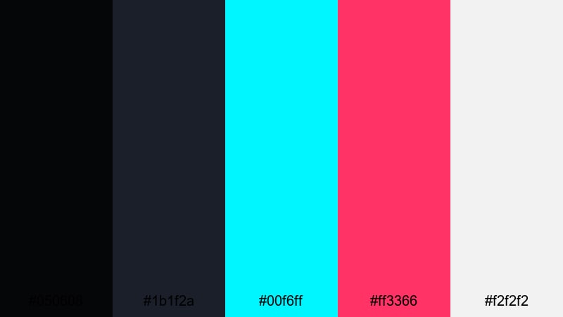
- HEX Codes: #050608, #1b1f2a, #00f6ff, #ff3366, #f2f2f2
- Mood: futuristic, edgy, and dramatic like a rainy city at night
- Use for: Perfect for gaming intros, cyberpunk edits, and music videos that need high-contrast neon energy.
Rain Slicked Neon pushes deep charcoal shadows against electric cyan and hot pink highlights, with a light neutral to balance everything. It instantly suggests glowing billboards, wet streets, and digital reflections.
Use the dark shades for full screen backgrounds and vignettes, then punch in the neon colors for titles, HUD elements, and glitch transitions. It is ideal for gaming thumbnails, EDM visualizers, and cyberpunk style sequences where you want strong contrast and a clearly modern, digital feel.
Noir Alley Monochrome
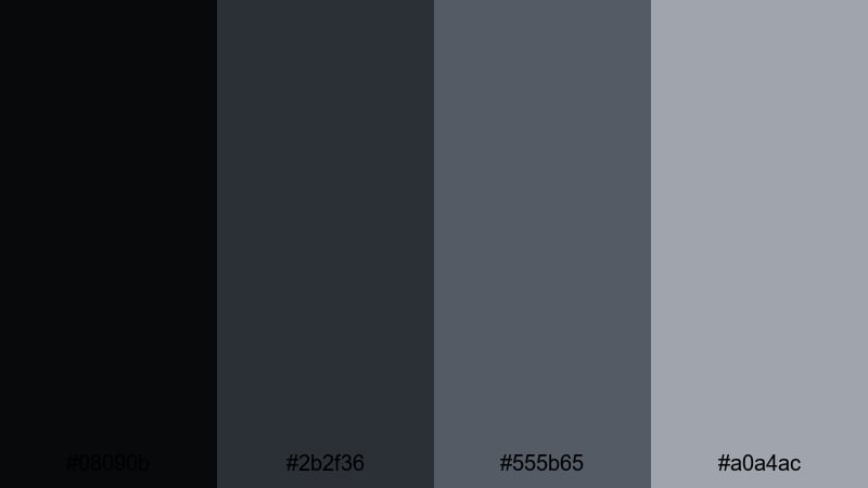
- HEX Codes: #08090b, #2b2f36, #555b65, #a0a4ac
- Mood: mysterious, classic, and film noir inspired
- Use for: Use for trailers, true crime content, and narrative shorts where you want a moody monochrome look without pure black and white.
Noir Alley Monochrome stacks soft blacks and cool grays for a restrained, shadowy look. It gives you all the drama of black and white cinema but with more nuance and room to show detail in shadows.
Grade your footage into this range, then keep titles and graphics within the same palette for a unified noir aesthetic. It works well for true crime episodes, mystery vlogs, dramatic cold opens, and any thumbnail that needs suspense without bright colors.
Stormframe Drama
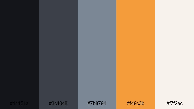
- HEX Codes: #14151a, #3c4048, #7b8794, #f49c3b, #f7f2ec
- Mood: tense, atmospheric, and story driven with a warm accent
- Use for: Ideal for travel films, documentaries, and cinematic b roll that move from tension to warmth.
Stormframe Drama combines stormy charcoals and misty blues with a single soft amber and a pale neutral. It feels like watching clouds part after a heavy rain, with a warm light slowly cutting through.
Use the cool tones for opening scenes, establishing shots, and intros, then let the amber accent appear on key titles, map pins, or location names as the story brightens. This palette suits travel films, documentary story arcs, and cinematic vlogs that move from challenge to resolution.
Ember Fade Horizon
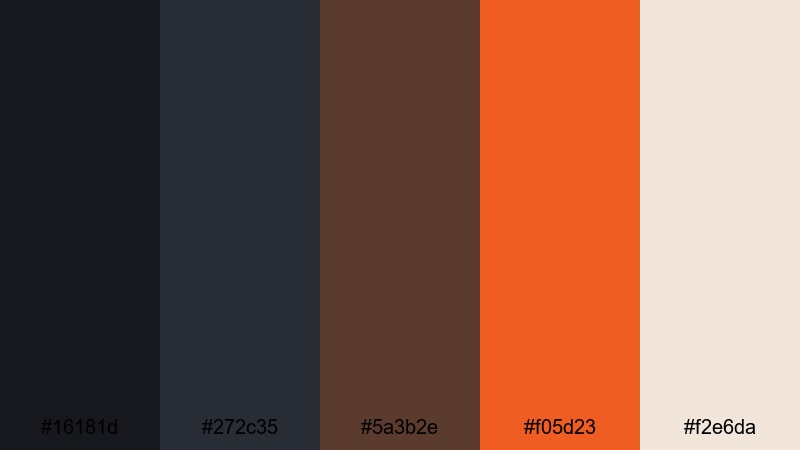
- HEX Codes: #16181d, #272c35, #5a3b2e, #f05d23, #f2e6da
- Mood: brooding with a slow burning sense of warmth and hope
- Use for: Great for storytelling edits, outdoor adventures, and logo reveals that fade from dark to glowing warm tones.
Ember Fade Horizon mixes night sky charcoals with ember oranges and soft sand. It feels like the last light over a dark landscape, hinting at both danger and comfort.
Start your edits in the deeper charcoals and browns, then slowly introduce the bright orange and pale neutral for reveals, chapter titles, or outro screens. It is powerful for outdoor adventures, emotional storytime videos, and logo animations that rise from the dark into a warm glow.
Minimal Charcoal Color Palettes
Graphite Wireframe
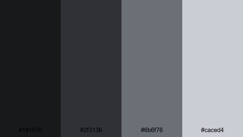
- HEX Codes: #18191b, #2f3136, #6b6f76, #caced4
- Mood: structured, technical, and quietly focused
- Use for: Use for UI mockups, tutorial overlays, and motion graphics where you want clarity without distraction.
Graphite Wireframe uses a tight range of charcoals and cool grays that feel like lines on a dark blueprint. It keeps attention on layout and structure rather than on color accents.
Apply the darkest tones to your background, the mid grays to panels and containers, and the lightest for labels or icons. It works well for screen recording overlays, coding tutorials, and minimalist thumbnails that need to feel technical but still approachable.
Soft Slate Interface
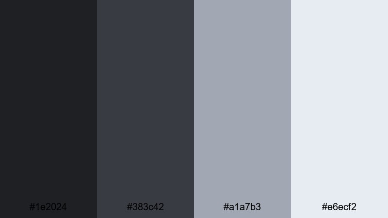
- HEX Codes: #1e2024, #383c42, #a1a7b3, #e6ecf2
- Mood: friendly, techy, and approachable
- Use for: Perfect for app demos, SaaS explainers, and channel branding that leans modern but not harsh.
Soft Slate Interface softens charcoal with light, clouded blues and pale panels. It feels like a modern dashboard UI with plenty of white space, translated into a dark theme.
Use the two darkest colors for backgrounds and sidebars, the light blue gray for cards and feature blocks, and the palest tone for main content areas and text. It is great for software explainers, startup intros, and branding where you want tech vibes without a cold or intimidating feel.
Paper Ink Contrast
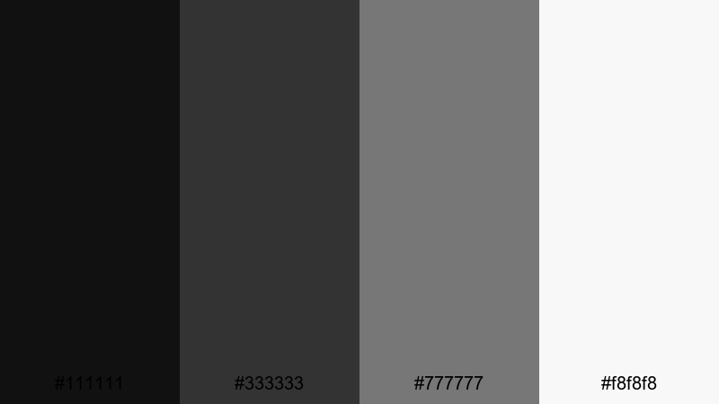
- HEX Codes: #111111, #333333, #777777, #f8f8f8
- Mood: simple, editorial, and print inspired
- Use for: Ideal for typography driven videos, quote cards, and minimalist thumbnails with strong legibility.
Paper Ink Contrast is pure and minimal: three ink like charcoals over a paper white base. It is inspired by classic print design, where the hierarchy comes from type rather than color.
Use the near black for headlines and main icons, the mid grays for secondary text, and the off white as your background. This palette is perfect for quote videos, listicle thumbnails, podcast cover art, and any content where clean, high contrast typography is the star.
Frosted Console Grid
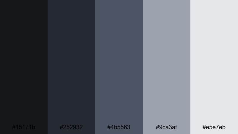
- HEX Codes: #15171b, #252932, #4b5563, #9ca3af, #e5e7eb
- Mood: cool, digital, and controlled like a game console UI
- Use for: Great for HUD designs, tech breakdowns, and any video that overlays data or stats on darker footage.
Frosted Console Grid layers charcoals with frosted blue grays, evoking a subtle grid or heads up display. The tones are restrained enough to sit over footage without fighting your images.
Use the darker colors to frame gameplay or B roll, then draw a grid or panel system with the mid and light grays. It is ideal for on screen stats, progress bars, technical diagrams, and thumbnail layouts where you want a controlled, digital feel.
Bold Accent Charcoal Color Palettes
Electric Teal Carbon
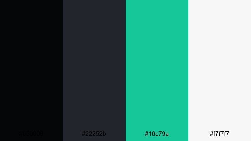
- HEX Codes: #050608, #22252b, #16c79a, #f7f7f7
- Mood: sharp, energetic, and confident
- Use for: Use for edgy channel branding, product launches, and kinetic typography where teal needs to punch through the dark.
Electric Teal Carbon sets up a dense charcoal base and then cuts through it with a vivid teal and a clean white. The accent immediately grabs attention, especially against tight, dark compositions.
Use charcoal for backgrounds and overlays, teal for logos, buttons, and highlight text, and white for main copy to keep everything readable. This combination is strong for tech channels, hardware announcements, launch trailers, and kinetic type sequences where bold, modern energy matters.
Solar Flare Charcoal
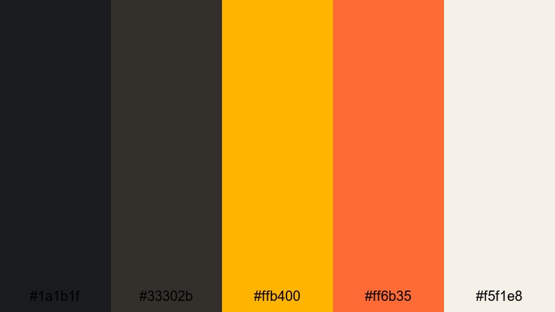
- HEX Codes: #1a1b1f, #33302b, #ffb400, #ff6b35, #f5f1e8
- Mood: bold, warm, and high impact like a burst of sunlight
- Use for: Perfect for announcement cards, sale graphics, and dynamic intros where you want warm energy over dark footage.
Solar Flare Charcoal anchors your design with solid darks, then blasts through with amber and orange accents softened by a pale neutral. It feels like spotlights or sunrise hitting a dark surface.
Let charcoal dominate the frame, then use the bright yellows and oranges for price tags, limited offer badges, and animated callouts. It suits promo videos, sales campaigns, livestream announcements, and any thumbnail where you want warm urgency that still looks premium.
Magenta Signal Noise
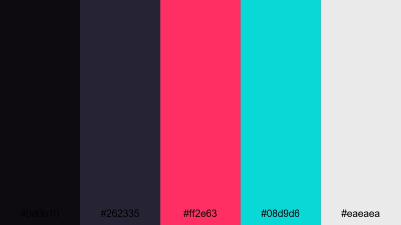
- HEX Codes: #0d0b10, #262335, #ff2e63, #08d9d6, #eaeaea
- Mood: rebellious, digital, and glitchy
- Use for: Best for music videos, fashion edits, and experimental vlogs where neon accents over charcoal feel bold and memorable.
Magenta Signal Noise throws inky charcoals against hot magenta and aqua, with a light gray to balance text and UI elements. The palette instantly suggests glitch art, digital noise, and nightlife.
Keep the darks for backgrounds and frames, then splash magenta and aqua onto titles, shapes, and transition elements. It is especially effective for fast cut edits, reels, experimental vlogs, and cover art where you want your content to stand out in a crowded feed.
Tips for Creating Charcoal Color Palettes
Charcoal is versatile enough to feel luxurious, minimal, or edgy, depending on how you combine it with accents. Use these tips to design your own palettes and apply them cleanly in video and design work.
- Pair charcoal with one main accent color and, at most, one secondary accent to avoid cluttered thumbnails or intros.
- Check text readability by testing white, light gray, and a single accent color over your charcoal background before finalizing a palette.
- Use slightly softer charcoals (not pure black) to keep gradients smoother and preserve detail in dark footage when grading in Filmora.
- Keep brand consistency by reusing the same HEX codes for logos, lower thirds, and end screens across all your videos and social posts.
- Balance warm and cool tones; for cinematic looks, try cool charcoal shadows with warm highlights or accents on skin tones and lights.
- When adding neon or bright accents, limit their use to key elements like titles and CTAs so the dark base still dominates.
- Match your charcoal palette to footage by sampling colors from existing frames and then refining them in Filmora with HSL and curves.
- Export a few style frames and thumbnails using the same palette to confirm that the look holds up on phones, tablets, and desktops.
Charcoal palettes are powerful tools for shaping the tone of your videos and strengthening your visual identity. From minimal interfaces to neon drenched intros, the right combination of dark bases and targeted accents can make your channel or brand feel instantly more polished.
Experiment with the HEX codes in this guide, test different balances of charcoal, neutrals, and accents, and then bring everything together inside Filmora. With color tools, filters, and templates, you can turn a single palette into an entire visual system for thumbnails, titles, and full edits.
Whether you lean toward elegant champagne tones or bold magenta neon, let charcoal be the backdrop that keeps your visuals cohesive, cinematic, and easy to recognize across every platform.


 100% Security Verified | No Subscription Required | No Malware
