
 100% Security Verified | No Subscription Required | No Malware
Classic Olive is an earthy, grounded green that instantly feels natural, cinematic, and timeless. It suggests stability, maturity, and a quiet kind of confidence, which makes it perfect for storytelling videos, thoughtful vlogs, and brands that want to feel rooted rather than flashy. Paired with neutrals or warm metallics, Classic Olive can feel luxurious; mixed with charcoal and off-whites, it leans modern and minimal.
In video editing, thumbnails, channel intros, and branding systems, Classic Olive works as a flexible base color that supports both moody and clean looks. Below you will find ready-made Classic Olive color palettes with HEX codes designed for creators and Filmora users, so you can quickly match your overlays, text, backgrounds, and footage and keep everything visually consistent.
In this article
Earthy And Cinematic Classic Olive Color Palettes
Cinematic Forest Olive
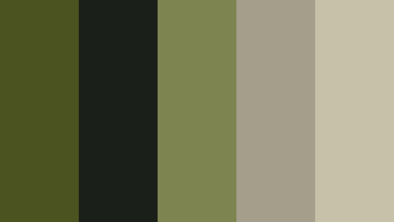
- HEX Codes: #4b5320, #1b1f1a, #7d8450, #a39f8b, #c6c2aa
- Mood: Moody, grounded, and cinematic like a dusk forest scene.
- Use for: Ideal for cinematic B-roll sequences, documentary title cards, and moody YouTube thumbnails.
This palette revolves around a deep forest Classic Olive (#4b5320), supported by almost-black charcoal (#1b1f1a) and softened with misty neutrals (#a39f8b, #c6c2aa). It feels like walking through a dense forest at dusk, where shadows are long and details are subtle but rich.
Use it when you want your videos to feel atmospheric and story-driven: think documentary-style intros, travel B-roll, commentary channels, and serious topic thumbnails. Olive can be your main background or accent color, while the darker tones frame text and the lighter neutrals make lower thirds, chapter markers, and title cards easy to read.
Pro Tip: Build a Cinematic Classic Olive Look in Filmora
For a consistent forest-inspired aesthetic, pick Classic Olive as your anchor color in Filmora and reuse it across overlays, text, and motion graphics. Use the dark charcoal for backgrounds and drop shadows, and keep the lighter neutrals for subtitles and UI-style elements so your video feels cohesive from intro to end screen.
You can also create a simple template in Filmora with Classic Olive as your default text outline or background color. Then reuse that template for episode titles, series intros, and community posts so your channel feels like one unified brand rather than separate uploads.
AI Color Palette
Filmora's AI Color Palette feature makes it easy to transfer this Cinematic Forest Olive look from one clip or reference image to an entire edit. Grab a still frame that already has the balance you like, or use a custom color card with these HEX values and let Filmora analyze the tones for you.
Once the palette is detected, you can apply it to other shots so your A-roll, B-roll, and cutaway clips all share the same Classic Olive mood. This saves time compared to manually matching color and keeps your video thumbnails, intros, and reels locked to the same earthy style.
 secure download

HSL, Color Wheels & Curves
To refine your Classic Olive tones, use HSL controls in Filmora to slightly desaturate greens and yellows for a more cinematic look, and darken the luminance of greens to keep them grounded. With color wheels, cool down shadows toward a greenish teal, keep midtones neutral, and add a touch of warmth to highlights for a balanced forest mood.
Curves adjustments can deepen contrast in the shadows without crushing detail, while gently lifting the highlight curve stops skin tones from looking too flat against earthy backgrounds. For a step-by-step breakdown of creative grading, you can refer to Filmora's tutorials that demonstrate advanced color wheels and curves workflows on real-world footage.
secure download1000+ Video Filters & 3D LUTs
Filmora's video filters and 3D LUTs make it easy to stylize your Classic Olive palettes without starting from scratch. You can layer a filmic LUT over your graded footage to add subtle fade, grain, or vintage contrast that fits the Cinematic Forest vibe.
Combine LUTs with gentle filters like vignettes, glow, and light leaks to push your Classic Olive aesthetic toward dreamy, nostalgic, or gritty depending on your story. This is especially helpful for series branding, where every episode needs to share the same overall mood but still feel fresh.
secure downloadOlive Desert Dusk

- HEX Codes: #6b8e23, #c2a878, #f2e3c6, #8b6b4a, #2e3024
- Mood: Warm, adventurous, and slightly nostalgic like a sunset over dry landscapes.
- Use for: Works well in travel vlogs, desert-inspired reels, and gradient overlays for cinematic intros.
Olive Desert Dusk combines Classic Olive (#6b8e23) with sand-toned beige (#c2a878), soft cream (#f2e3c6), clay brown (#8b6b4a), and a deep earthy shadow (#2e3024). Together they feel like warm sun on old stone, with a hint of dust in the air and long sunset shadows.
This palette is ideal for travel storytellers and adventure vloggers. Use the cream and sand shades for text blocks and lower thirds, then let the darker brown and shadow color frame your footage in borders, overlays, or cinematic bars. It also works beautifully in thumbnail backgrounds for road trips, desert hikes, and nostalgic vacation edits.
Urban Moss Noir

- HEX Codes: #556b2f, #121212, #424b54, #a0a083, #d7d2c5
- Mood: Edgy, modern, and grounded with a subtle urban grit.
- Use for: Great for tech reviews, city b-roll sequences, and modern channel branding with a grounded feel.
Urban Moss Noir sets Classic Olive (#556b2f) against deep black (#121212) and a cool steel blue gray (#424b54), then balances everything with muted neutrals (#a0a083, #d7d2c5). The overall feel is fresh yet tough, like concrete walls with small patches of mossy green.
Use this palette in tech review layouts, city cinematics, gear breakdowns, or startup-style branding. The near-black gives you a strong base for contrasty titles, while the neutrals make perfect panels for specs, pricing, and callouts. Olive becomes the signature accent on icons, buttons, and thumbnail frames that tie your series together.
Olive Trail Adventure

- HEX Codes: #5f6f3a, #314029, #f2efe4, #c49b63, #7f5539
- Mood: Adventurous, outdoorsy, and warm like a hiking trail at golden hour.
- Use for: Use for outdoor gear promos, hiking vlogs, and lifestyle intros that highlight nature and exploration.
Olive Trail Adventure layers Classic Olive (#5f6f3a) and deep green brown (#314029) with a gentle off white (#f2efe4), golden tan (#c49b63), and warm chestnut (#7f5539). It feels like worn leather boots, sunlit grass, and a campfire just starting to crackle.
Apply this palette to gear review titles, hiking vlog thumbnails, and lower thirds that label locations or trail names. Use off white for text to keep things legible, tan and chestnut for badges or logo marks, and the darker greens for overlays on landscape shots in your Filmora timelines.
Olive Vintage Grain

- HEX Codes: #6e7c3b, #3c3a32, #b8a97f, #e1d9c5, #a06646
- Mood: Nostalgic, textured, and filmic with a retro warmth.
- Use for: Perfect for retro edits, analog-style LUT overlays, and nostalgic channel branding.
Olive Vintage Grain uses Classic Olive (#6e7c3b) with a dark, slightly faded charcoal (#3c3a32), warm beige and camel (#b8a97f, #e1d9c5), and muted rust (#a06646). It feels like old photo prints, soft film grain, and vintage cameras on a shelf.
Use this palette for retro title cards, memory montages, and vlog episodes that look back on older footage. In Filmora, combine these colors with grain overlays and slight blur transitions to enhance the analog feel, and keep your logo in olive or rust to make your brand part of the story.
Soft And Minimal Classic Olive Color Palettes
Soft Olive Breeze
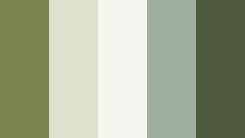
- HEX Codes: #7a8450, #dde2cf, #f7f5ef, #9fb0a1, #4f5a3c
- Mood: Light, airy, and calming with a gentle natural touch.
- Use for: Best for clean YouTube channel art, minimalist intros, and productivity vlog overlays.
Soft Olive Breeze pairs a gentle Classic Olive (#7a8450) with light, airy neutrals (#dde2cf, #f7f5ef) and a muted sage note (#9fb0a1). A deeper olive green (#4f5a3c) anchors the palette so it does not feel washed out. The result is calm, simple, and very easy on the eyes.
This palette is ideal for productivity channels, minimal lifestyle content, and any vlog that aims for focus and clarity. Use the light tones as page-like backgrounds in your Filmora layouts, then bring in olive for headings, bullet icons, and subtle frames. Thumbnails built with this scheme will feel soft yet professional on crowded feeds.
Olive Linen Studio

- HEX Codes: #808000, #f0ede3, #ccc4a3, #a3b18a, #5b6142
- Mood: Neutral, refined, and creative like a sunlit studio wrapped in linen.
- Use for: Great for studio tours, DIY and craft channels, and clean motion graphics backgrounds.
Olive Linen Studio uses a true Classic Olive (#808000) alongside warm linen neutrals (#f0ede3, #ccc4a3), soft sage (#a3b18a), and a slightly darker olive gray (#5b6142). The palette feels tactile and cozy, like woven fabrics and sketchbooks on a wooden table.
Use it for studio tour overlays, DIY step labels, and simple, clean title screens. Let the light linen tones act as your background in Filmora, then add olive as an accent for section titles, timings, or call to action buttons. It works especially well when you show hands-on work like painting, sewing, or crafting.
Muted Olive Workspace

- HEX Codes: #6b713b, #e6e1d3, #c5c8b5, #9da593, #3f4630
- Mood: Organized, productive, and understated with a natural edge.
- Use for: Ideal for productivity vlogs, Notion-style UI screens, and tutorial lower thirds.
Muted Olive Workspace softens Classic Olive (#6b713b) with warm off whites and grays (#e6e1d3, #c5c8b5, #9da593) and grounds everything with a deeper olive gray (#3f4630). It feels like an organized desk, tidy notes, and a calm workflow.
This palette is a natural fit for tutorial videos, screen recordings, and Notion or planner style content. Use the light neutrals for mock UI backgrounds, Olive for key buttons or highlights, and the darkest shade for text. In thumbnails, this palette keeps information clean and readable while still giving your brand a recognizable color identity.
Calm Garden Morning

- HEX Codes: #748c3b, #edf4e3, #b7c9a8, #f9f7f1, #566235
- Mood: Peaceful, fresh, and optimistic like an early morning garden.
- Use for: Use in wellness vlogs, plant care videos, and gentle social content templates.
Calm Garden Morning combines Classic Olive (#748c3b) with fresh leaf greens and bright creamy whites (#edf4e3, #f9f7f1) plus a soft green neutral (#b7c9a8) and a slightly darker foliage tone (#566235). It captures the feeling of dew on leaves and light filtering through a window.
Use this palette for wellness, plant care, routines, and gentle lifestyle content. Light tones are perfect for quote cards and affirmations in your videos, while olive shades can highlight key steps or important tips. Thumbnails using this palette will stand out with a fresh but not overly saturated green look.
Olive Clay Minimal
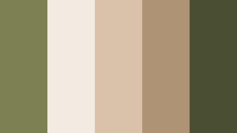
- HEX Codes: #7d8050, #f3ebe2, #d9c2aa, #af9375, #4a4e32
- Mood: Warm, minimal, and tactile with a handcrafted touch.
- Use for: Excellent for branding packs, logo animations, and subtle product showcase backdrops.
Olive Clay Minimal pairs a quiet Classic Olive (#7d8050) with creamy off white (#f3ebe2) and clay tones (#d9c2aa, #af9375), anchored by a deep earthy green (#4a4e32). The palette feels handcrafted yet minimal, like pottery in a clean gallery space.
It is great for product promos, small business branding, and logo animations. Use the creamy tones as background plates behind products in Filmora, with olive accents on text and clay colors on badges or price tags. This palette delivers earthy sophistication without visual clutter.
Bold And Modern Classic Olive Color Palettes
Olive Neon Contrast

- HEX Codes: #6b8e23, #111111, #00ffc3, #f5f5f5, #ffb347
- Mood: Energetic, bold, and high-contrast with a modern digital edge.
- Use for: Great for high-impact thumbnails, gaming intros, and bold text animations.
Olive Neon Contrast puts Classic Olive (#6b8e23) next to pure near-black (#111111), crisp white (#f5f5f5), electric teal (#00ffc3), and neon orange (#ffb347). It is loud, fast, and digital, while Olive keeps things from feeling too synthetic.
This palette is perfect for gaming channels, reaction videos, and any creator who wants scroll stopping thumbnails. Use black as your base, let olive and neon colors highlight text or streaks in motion graphics, and keep white for key text to ensure readability. In Filmora, combine this color combo with glitch or strobe transitions to emphasize the energetic feel.
Streetwear Olive Pop

- HEX Codes: #708238, #1a1a1a, #f4f4f4, #ff5a5f, #ffc857
- Mood: Trendy, urban, and confident with streetwear energy.
- Use for: Perfect for fashion lookbooks, hype edits, and bold channel idents.
Streetwear Olive Pop uses Classic Olive (#708238) with deep street black (#1a1a1a), bright white (#f4f4f4), and punchy coral and yellow (#ff5a5f, #ffc857). It feels like bold graphics on hoodies and posters pasted across city walls.
Use this palette for fashion edits, hype reels, and channel intros. Let black and white do most of the layout work, then use olive, coral, and yellow as bold graphic accents for text blocks, borders, and animated shapes in Filmora. Thumbnails built with this combo can highlight outfits, sneakers, or bold headlines.
Digital Camo Olive

- HEX Codes: #556b2f, #2b2f33, #8fa68a, #d9dccf, #f7f7f2
- Mood: Techy, tactical, and modern with a subtle military nod.
- Use for: Use in tech reviews, gear breakdowns, and esports branding that needs a tactical twist.
Digital Camo Olive merges Classic Olive (#556b2f) with cool grays (#2b2f33) and soft off whites (#d9dccf, #f7f7f2), plus a desaturated green neutral (#8fa68a). It has a tactical, gear heavy personality that still feels clean and modern.
Apply this palette in tech reviews, gear loadout breakdowns, or esports content where you want a strategic vibe. Use the darker gray for backgrounds, the lighter off whites for spec cards, and olive for emphasis on key stats or callouts. It works particularly well with clean line icons and HUD style overlays in Filmora.
Olive Spotlight Stage

- HEX Codes: #7b8b3a, #101018, #f6f2e8, #f2b705, #e4572e
- Mood: Dramatic, high-energy, and performance-ready like a lit stage.
- Use for: Great for music videos, performance clips, and event highlight reels.
Olive Spotlight Stage casts Classic Olive (#7b8b3a) against a deep stage black-blue (#101018), bright spotlight cream (#f6f2e8), and vivid accents of gold and orange (#f2b705, #e4572e). It looks like colored lights cutting through darkness.
Use this palette for concert highlights, dance performances, music videos, or event recaps. Build lower thirds and titles in cream with olive outlines, then use gold and orange for energetic accents in transitions and animated elements. In thumbnails, a dark background with pops of these warm colors helps featured artists or performers stand out.
Elegant And Vintage Classic Olive Color Palettes
Olive Gold Heritage

- HEX Codes: #6d7a33, #b08d57, #eae0cf, #5a4a3f, #c9b79c
- Mood: Elegant, historic, and refined with a touch of old-world charm.
- Use for: Ideal for heritage brands, title cards, and elegant wedding or history-themed edits.
Olive Gold Heritage blends Classic Olive (#6d7a33) with antique gold (#b08d57), soft cream (#eae0cf), deep brown (#5a4a3f), and warm beige (#c9b79c). The palette suggests heirloom books, brass details, and old architecture.
It is a strong choice for documentary intros, family history videos, elegant wedding films, or heritage brand promos. Use cream and beige for titles and chapter cards, olive and gold as accent bars or frames, and the deep brown to ground text or overlays. In Filmora, combine this palette with subtle film grain and slower transitions for a timeless, refined finish.
Olive Library Noir

- HEX Codes: #5f6b35, #2a2420, #cbb89a, #f0e6d7, #8a6e4f
- Mood: Intellectual, cozy, and cinematic like an old library at night.
- Use for: Use for essay videos, commentary channels, and narrative series that lean into a thoughtful mood.
Olive Library Noir brings together Classic Olive (#5f6b35), a dark wood like brown-black (#2a2420), parchment creams (#cbb89a, #f0e6d7), and a warm leather brown (#8a6e4f). It feels like reading by a lamp among tall bookshelves.
This palette is perfect for essay-style videos, commentary channels, and narrative storytelling. Use the dark tone as your background, parchment shades as panels for quotes or key points, and olive for subtle highlights and branding elements. In Filmora, this creates an intimate, intellectual atmosphere that suits long-form content.
Tips for Creating Classic Olive Color Palettes
Classic Olive is versatile, but it works best when you balance its earthy depth with the right neutrals, accents, and contrast. Keep these practical tips in mind when building palettes for video, thumbnails, and branding.
- Pair Classic Olive with warm neutrals (cream, beige, tan) for friendly, approachable branding; use cooler grays for a more modern, techy feel.
- Always test text readability: place white or light cream text on the darkest olive or charcoal tones, and avoid mid-toned backgrounds that make titles hard to read in small thumbnails.
- Choose one or two accent colors (like gold, rust, or teal) and reuse them consistently across intros, lower thirds, and end screens to build a clear brand identity.
- When grading footage in Filmora, nudge greens toward Classic Olive and slightly desaturate other colors so overlays, titles, and footage feel unified.
- For cinematic looks, keep your olive and dark tones dominant and let bright colors appear only in small areas such as icons, progress bars, or key callouts.
- Match your palette to content mood: softer olives work for wellness and productivity, while high contrast olive-neon combos fit gaming and hype edits.
- Save your favorite combinations as presets or templates in Filmora so future thumbnails, title cards, and captions automatically use your Classic Olive branding.
- Check how your palette looks on mobile by exporting a test thumbnail; adjust brightness and contrast if olive areas look too dark or muddy on small screens.
Classic Olive color palettes can do a lot for your brand, from making travel footage feel cinematic to giving tutorials a calm, trustworthy look. By combining Olive with carefully chosen neutrals, metallics, and accent colors, you can shape how viewers feel before they even press play.
Use these 15 Classic Olive palettes as starting points, then refine them inside Filmora until they match your channel personality. Whether you lean into earthy and nostalgic or bold and modern, consistent color will make your intros, thumbnails, and edits look like they all belong to the same story.
Experiment, save your favorite looks, and keep reusing them across new projects. The more you work with Classic Olive in Filmora, the faster you will build a recognizable visual identity that stands out online.
secure download
