
 100% Security Verified | No Subscription Required | No Malware

Driftwood Gray sits between warm taupe and cool slate, echoing weathered wood, sea-washed piers, and soft concrete. It feels calm, grounded, and cinematic, which makes it perfect for creators who want a neutral base that still carries emotion. In color psychology, muted grays like this suggest stability, maturity, and subtle sophistication rather than flat neutrality.
Because of that, Driftwood Gray works beautifully in video color grading, YouTube thumbnails, intros, lower thirds, and branding systems. It lets your subject and story shine while giving your visuals a cohesive, premium look. Below you will find ready-made Driftwood Gray color palettes with HEX codes, tailored for Filmora users and visual creatives who want reliable, aesthetic color combinations they can drop straight into their edits.
In this article
Calm And Coastal Driftwood Gray Color Palettes
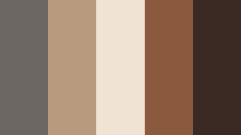
Tidewashed Boardwalk Glow
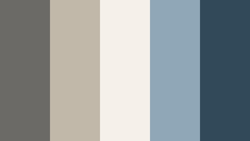
- HEX Codes: #6b6a66, #c2b8aa, #f5f0e8, #8fa8b8, #314a5a
- Mood: Calm, nostalgic, and breezy like a late afternoon by the shore.
- Use for: Ideal for travel vlogs, seaside B-roll, or relaxed lifestyle thumbnails that need a soft coastal feel.
Tidewashed Boardwalk Glow combines weathered Driftwood Gray with sand beige, off white, and muted sea blues. It feels like walking a quiet pier at golden hour, where everything is softened by salt air and gentle light. The contrast is subtle, so your visuals stay easy on the eyes and emotionally warm.
Use this palette to grade beach vlogs, coastal travel edits, or slow-living lifestyle videos. In thumbnails and intro cards, the pale sand and off white tones can carry your text, while the deeper blue (#314a5a) frames key elements or icons. It is especially effective for channels that want a calm seaside identity without overly bright tropical colors.
Pro Tip: Build a Cinematic Driftwood Gray Coastal Look in Filmora
To keep this soft coastal Driftwood Gray mood consistent from intro to end screen, treat the palette as your global visual language inside Filmora. Use the darker gray and blue shades for overlays, lower thirds, and background panels, then repeat the lighter beige and off white tones for titles, callouts, and subscribe graphics.
Save a few key color values in Filmora as custom swatches and reuse them across different projects. That way your B-roll, talking-head shots, and Shorts all feel like they belong to the same driftwood inspired brand, whether you are editing a full travel episode or a 15-second teaser.
AI Color Palette
You can capture this exact Tidewashed Boardwalk Glow palette from a reference still or moodboard and spread it across your entire edit using Filmora's AI driven tools. Filmora's AI Color Palette feature analyzes the colors from a hero clip or image and automatically matches other shots to that same Driftwood Gray coastal vibe.
Import your best shoreline shot, let the AI detect the tones, and apply the result to timeline clips such as B-roll, cutaways, and even talking-head footage. This keeps sky, sand, and driftwood tones aligned, avoiding jarring shifts between scenes filmed on different days or cameras.
 secure download

HSL, Color Wheels & Curves
Once your overall look is matched, refine the Driftwood Gray mood using Filmora's HSL, color wheels, and curves controls. Slightly lowering saturation in the blues and pushing shadows toward a cool Driftwood Gray will make your harbor scenes feel more cinematic. Lifting the midtones and highlights can keep skin tones natural while the background stays soft and coastal.
If you want a more stylized result, adjust the curves to add gentle contrast while protecting detail in clouds and water. You can see how these advanced color controls work in Filmora's video on HSL, color wheels, and curves, then adapt the same techniques to your own gray based palettes.
secure download1000+ Video Filters & 3D LUTs
To move even faster, start from Filmora's built in looks and then nudge them toward your Driftwood Gray palette. Filmora's video filters and 3D LUTs make it easy to add filmic contrast, soft fades, or teal and orange variations that still respect your neutral gray base.
Apply a LUT to your entire sequence, then fine-tune using HSL so that the driftwood tones, sea blues, and sandy highlights stay balanced. This approach gives your channel a recognizable signature while saving time on every edit, from travel episodes to short form reels.
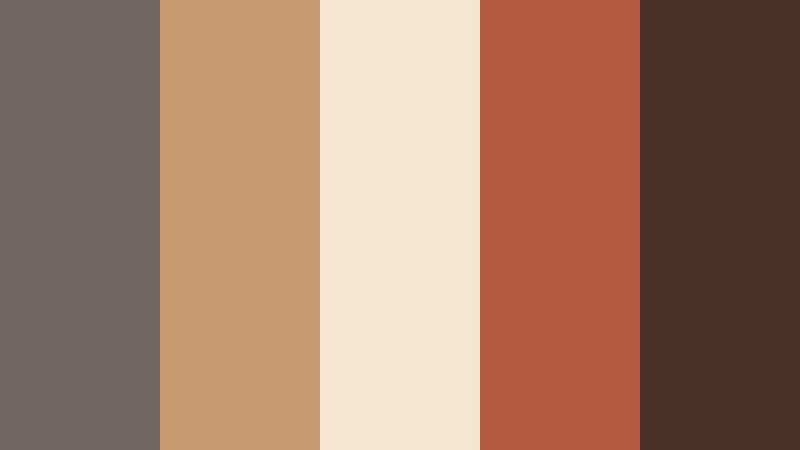
secure downloadHarbor Mist Morning
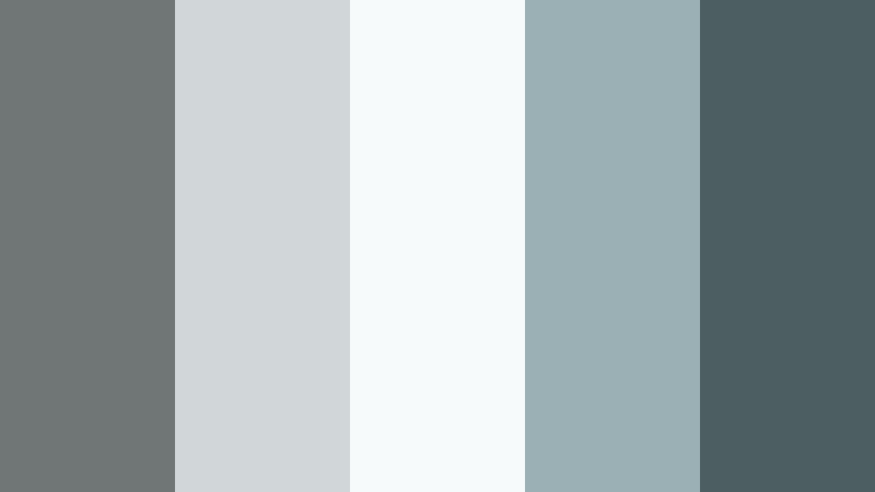
- HEX Codes: #707575, #d1d7d8, #f7fafb, #9ab0b5, #4c5e62
- Mood: Soft, foggy, and reflective with a cinematic chill.
- Use for: Perfect for cinematic b-roll sequences, minimalist channel trailers, or calm productivity videos.
Harbor Mist Morning leans into cool grays and pale teal, like a quiet marina wrapped in fog. The light tones (#d1d7d8, #f7fafb) keep the palette airy, while the deeper blue gray (#4c5e62) adds just enough depth for text, icons, or accent shapes.
Use it to grade reflective b-roll, city waterfronts, or slow productivity montages. In thumbnails and intro slates, pair the soft gray background with clean, high contrast typography in the darkest shade to maintain readability while preserving that misty, cinematic feel.
Salt Air Neutral Drift

- HEX Codes: #6c6b69, #b9b2a6, #e6ded0, #b3c6c7, #465055
- Mood: Understated, airy, and balanced between warm and cool.
- Use for: Works well for channel branding, lower thirds, and tutorial graphics that should feel neutral yet premium.
Salt Air Neutral Drift mixes Driftwood Gray with warm sand and soft seafoam, giving you a neutral palette that never feels flat. The warm beige tones keep things friendly, while the cooler accents and deep gray blue (#465055) add a polished, modern edge.
This combination is excellent for tutorial channels and educational content where visuals should support the information without overpowering it. Use the lighter hues as panel backgrounds and the darker gray for labels, code blocks, or key stats in your overlays and end screens.
Dune Path Horizon

- HEX Codes: #726e67, #c7b79f, #f3e6d3, #9fbaa3, #365142
- Mood: Warm, grounded, and quietly adventurous.
- Use for: Great for nature vlogs, hiking recaps, and outdoor brand reels needing earthy yet polished tones.
Dune Path Horizon brings together earthy Driftwood Gray, dune beige, soft sage, and a rich green (#365142). It feels like walking along a windswept path lined with grasses and low shrubs, with a soft, cinematic glow over everything.
Use this palette for outdoor channels, eco brands, and storytelling edits that celebrate nature. The greens and beiges grade landscape footage beautifully, while Driftwood Gray is ideal for titles, maps, and simple motion graphics in your intros and outros.
Rainy Pier Reverie

- HEX Codes: #5e6365, #a9b2b8, #e3e7ea, #7f96a3, #27303a
- Mood: Moody, introspective, and slightly cinematic.
- Use for: Ideal for storytelling shorts, emotional montage edits, and reflective commentary videos.
Rainy Pier Reverie leans into stormy blues and soft Driftwood Gray, creating a gentle, melancholic tone. The darkest shade (#27303a) is almost inky, perfect for subtle vignettes, overlays, or title bars that do not distract from the story.
This palette works well for personal narratives, reflective commentary, or moody montage edits. Grade your footage toward the cooler grays, then use the lighter tones for captions and chapter markers so that everything feels cohesive and cinematic.
Minimal And Modern Driftwood Gray Color Palettes
Editorial Concrete Studio
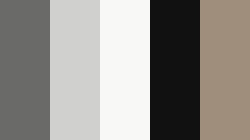
- HEX Codes: #6a6a69, #d0d0cf, #f8f8f7, #111111, #9e8e7b
- Mood: Sleek, editorial, and fashion forward.
- Use for: Best for tech reviews, lookbooks, or cinematic product shots with a minimalist aesthetic.
Editorial Concrete Studio is all about high contrast neutrals. Driftwood Gray meets crisp whites, deep black, and a soft taupe accent (#9e8e7b). The result feels like a gallery or photo studio set, clean enough for premium brands and tech products.
Use the white and light gray as negative space in thumbnails and product overlays, reserving pure black for text and logo marks. The taupe accent is ideal for subtle buttons, rating badges, or small icons that hint at luxury without breaking the minimalist look.
Monochrome Loft Frame

- HEX Codes: #5f6162, #8b8e90, #c7c9cb, #f4f5f7, #20252a
- Mood: Urban, refined, and quietly confident.
- Use for: Perfect for design portfolios, UI walkthroughs, and modern brand intros needing a clean tech feel.
Monochrome Loft Frame layers several gray tones from charcoal to cloud white. It feels like a well lit loft apartment, minimal but warm enough for human stories. The darkest shade (#20252a) grounds the palette and provides solid contrast for titles and key UI elements.
Use this for channels that focus on design, development, or modern lifestyle. Because there is no strong accent color, thumbnails and lower thirds will look timeless and let screenshots, mockups, or footage become the focus.
Silicon Skyline Fade

- HEX Codes: #666a6e, #aeb5bd, #e3e7ec, #3b4b5a, #f2f2f4
- Mood: Techy, futuristic, and polished.
- Use for: Great for app demos, startup explainers, and software UI overlays with a subtle futuristic vibe.
Silicon Skyline Fade combines cool Driftwood Gray with steel blue (#3b4b5a) and very light off whites. It recalls glass towers, dashboards, and device screens, giving your content a clean, future facing finish.
Use the off whites and pale grays for UI panels and annotation boxes in your screen recordings, reserving the deeper blue and gray for headers, buttons, and progress indicators. This palette works especially well in Filmora when you are layering motion graphics over desktop captures or app demos.
Nordic Slate Workspace

- HEX Codes: #696d6a, #bcc2ba, #f5f6f1, #d8a46f, #373b37
- Mood: Minimal, cozy, and productive.
- Use for: Ideal for productivity channels, desk setups, and coding timelapses needing soft focus neutrals.
Nordic Slate Workspace balances cool Driftwood Gray with pale olive, off white, and a warm caramel accent (#d8a46f). It feels like a tidy Nordic desk setup with wood, plants, and soft morning light.
Use the caramel as a sparing highlight color on call-to-action buttons, timers, or timeline markers, while keeping most of the UI and titles in the neutral gray and off white tones. This palette is perfect for clean overhead shots, study-with-me videos, and coding sessions.
Gallery Wall Neutral Code
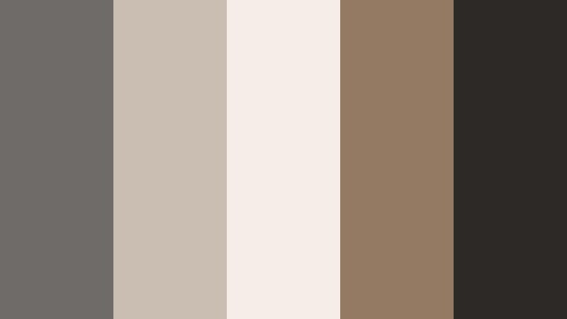
- HEX Codes: #6e6b68, #c9beb1, #f4eee7, #947a63, #2c2926
- Mood: Curated, artistic, and understatedly luxe.
- Use for: Works for channel rebrands, cinematic credits, and typography focused thumbnails.
Gallery Wall Neutral Code feels like an art book: Driftwood Gray paired with ivory, tan, and espresso brown (#2c2926). It is warm without going rustic, more like a curated loft gallery than a cozy cabin.
Use it for rebranding your channel, especially if your content focuses on photography, illustration, or interior design. The deep brown works well for logo locks and credit rolls, while the lighter neutrals provide elegant backgrounds for quotes, titles, and end cards.
Warm And Rustic Driftwood Gray Color Palettes
Cabin Hearth Storyline
- HEX Codes: #6c6763, #b89a7f, #f1e3d3, #8b5a3c, #3b2a23
- Mood: Warm, nostalgic, and story driven.
- Use for: Perfect for documentaries, storytelling podcasts, and cozy home DIY videos.
Cabin Hearth Storyline wraps Driftwood Gray in caramel, clay, and mocha tones. It immediately suggests firelight, wood textures, and quiet conversations, making it ideal for narrative content and intimate storytelling.
Use the warm browns for background panels, chapter markers, and thumbnail frames, with the soft beige (#f1e3d3) as a reading friendly backdrop for captions and subtitles. This palette pairs well with footage shot indoors under warm lighting, helping everything feel cohesive and inviting.
Autumn Dock Reflections
- HEX Codes: #6f6863, #c79a72, #f6e5cf, #b45b3f, #4a3026
- Mood: Earthy, cinematic, and seasonal.
- Use for: Great for fall lookbooks, scenic b-roll, and cinematic travel edits with warm grading.
Autumn Dock Reflections blends burnt orange (#b45b3f), amber, and Driftwood Gray into a rich fall palette. It feels cinematic, like a late afternoon at a lakeside dock when the trees are at peak color.
Use this for fall themed lookbooks, cozy travel videos, or seasonal channel graphics. Let the warm oranges and ambers dominate in footage and accents, while Driftwood Gray keeps text, frames, and overlays readable and balanced.
Barnwood Camera Roll

- HEX Codes: #6a6560, #a48a76, #e8d9cc, #74513d, #241a16
- Mood: Vintage, grounded, and tactile.
- Use for: Ideal for analog inspired edits, wedding films, and rustic brand promos.
Barnwood Camera Roll combines barnwood browns, cream tones, and Driftwood Gray for a vintage, filmic feel. The darkest shade (#241a16) is perfect for letterboxing or subtle matte overlays that give digital footage an analog mood.
Use this palette for rustic weddings, heritage brands, or lifestyle content focused on craft and slow living. Grade your footage with gentle warmth, then use the lighter cream as background for titles, date stamps, or handwritten style graphics.
Soft And Romantic Driftwood Gray Color Palettes
Rose Veil Over Driftwood

- HEX Codes: #6b6867, #d3c2c0, #f9f1f1, #c59aa4, #805865
- Mood: Soft, romantic, and dreamy.
- Use for: Perfect for wedding highlights, engagement reels, and romantic storytelling edits.
Rose Veil Over Driftwood sits at the intersection of muted gray and dusty rose. Blush tones and romantic mauves float over a stable Driftwood Gray base, giving your visuals a dreamy softness without losing structure.
Use this palette for weddings, proposals, and emotional storytelling. The off white and blush hues are ideal for lower thirds and title cards, while the gray and deeper rose (#805865) keep your typography legible in thumbnails and end credits.
Mauve Drift Daydream

- HEX Codes: #6d696b, #c1b3c0, #f4edf7, #a384ad, #3a313e
- Mood: Whimsical, cinematic, and slightly nostalgic.
- Use for: Great for aesthetic vlogs, dreamy fashion edits, and soft focus thumbnails.
Mauve Drift Daydream blends lavender mauve, lilac, and Driftwood Gray into a gentle, cinematic palette. It feels nostalgic and slightly surreal, like a memory sequence or a slow, dreamy montage.
Use this palette for aesthetic diaries, soft fashion content, and mood-based edits. Grade your clips lightly toward the mauves, then rely on the deeper gray (#3a313e) for titles, timestamps, and interface elements so the dreamy vibe stays coherent across your whole video.
Tips for Creating Driftwood Gray Color Palettes
Driftwood Gray is a flexible base that can swing warm or cool, so it pairs well with many accent colors. When you build your own palettes for video and design, keep both mood and practicality in mind.
- Decide on a temperature first: pair Driftwood Gray with blues and teals for cool, coastal moods, or with browns and ambers for warm, rustic looks.
- Always include at least one light shade for backgrounds and one dark shade for text to keep thumbnails and lower thirds readable at small sizes.
- Limit bright accent colors to one or two hues so your gray base remains the star and your brand feels consistent.
- Test your palette on actual frames from your footage in Filmora, not just on a static card, to see how it behaves with skin tones and real lighting.
- Use opacity and overlays (for example, a semi-transparent Driftwood Gray rectangle behind text) to improve contrast without changing your color choices.
- Save HEX codes and export them as a simple style guide so you can reuse the same Driftwood Gray palette across thumbnails, channel banners, and social cuts.
- Check your designs in both light and dark mode contexts if you share on multiple platforms, adjusting contrast so the palette stays legible everywhere.
- When in doubt, desaturate accent colors slightly; muted tones tend to blend better with Driftwood Gray and feel more cinematic.
Driftwood Gray color palettes can quietly transform your channel or brand, giving your videos a cohesive mood that feels calm, premium, and cinematic. Whether you choose coastal blues, modern neutrals, rustic ambers, or soft romantic mauves, this gray base keeps everything tied together.
Try dropping these HEX codes into Filmora, save them as your go to swatches, and experiment with grading your footage toward Driftwood Gray. With AI Color Palette, HSL controls, and LUTs, it is easy to test variations until you find a signature look that fits your story and audience.
As you refine your visual identity, keep coming back to the palettes that feel most like your brand. Over time, viewers will start to recognize your Driftwood Gray aesthetic instantly, across intros, thumbnails, and every edit you publish.
secure download