
 100% Security Verified | No Subscription Required | No Malware


 ChatGPT
 Perplexity
 Gemini
 Claude
 Grok
Grok
Monochrome color palettes strip visuals down to light, shadow, and subtle tone shifts. This makes them powerful for storytelling: they feel focused, cinematic, and timeless. Grays, blacks, and off-whites can create moods ranging from soft and dreamy to sharp and investigative, which is why monochrome is so popular in film posters, brand identities, thumbnails, and editorial-style intros.
For video creators and Filmora users, a well-chosen monochrome palette keeps your channel, thumbnails, and edits visually consistent without feeling boring. Below are 15 ready-to-use monochrome color palettes with HEX codes you can apply to intros, vlogs, cinematic b-roll, YouTube thumbnails, social clips, and more.
In this article
Soft Cinematic Monochrome Palettes
Foggy Morning Frames
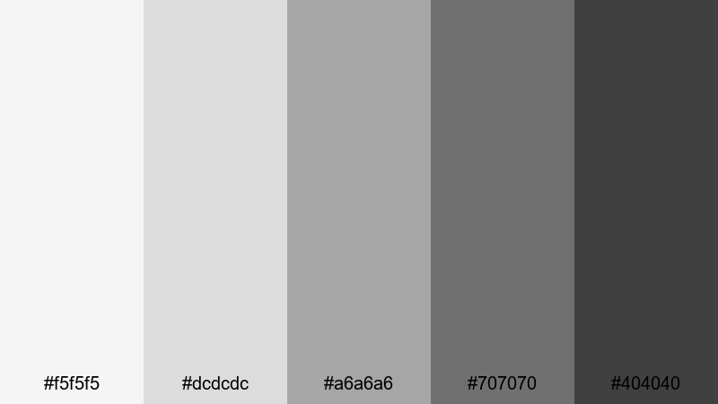
- HEX Codes: #f5f5f5, #dcdcdc, #a6a6a6, #707070, #404040
- Mood: Calm, introspective, and softly cinematic.
- Use for: Ideal for vlog b-roll, soft travel montages, and reflective voiceover scenes where you want gentle depth without harsh contrast.
This palette moves from misty near-white to soft charcoal gray, giving your footage the feeling of early morning fog. It smooths out distractions in the frame while keeping enough depth in the darker tones to feel cinematic and emotional rather than flat.
Use Foggy Morning Frames for reflective vlogs, moody talking-head segments, or aesthetic thumbnails that promise a quiet, thoughtful story. In Filmora, it works beautifully for cohesive channel branding across intros, lower thirds, and end screens when you want a gentle black-and-white look that still feels modern.
Pro Tip: Build a Soft Monochrome Film Look in Filmora
When you work with a gentle monochrome palette like Foggy Morning Frames, the key is consistency from shot to shot. In Filmora, start by applying the same basic color adjustments to all your clips, then refine exposure and contrast so that your highlights sit in the lighter grays and your shadows rest in the mid to dark grays instead of pure black.
Use adjustment layers for your intros, b-roll, and social cutdowns so the same monochrome style follows your viewer everywhere. That way, your brand feels unified, whether someone sees your YouTube thumbnail, Instagram Reel, or full video edit.
AI Color Palette
If you already love how this palette looks in a reference image or style frame, you can use Filmora's AI Color Palette feature to copy that look across your entire timeline. Import a still frame or photo that represents your ideal Foggy Morning Frames grading, then let AI match the tones and contrast on other clips.
This is especially helpful for travel vlogs and cinematic montages where lighting changes constantly. Instead of grading each shot manually, AI Color Palette quickly harmonizes exposure and grayscale balance so your video feels like one continuous, dreamy sequence.
 secure download

HSL, Color Wheels & Curves
Even in a grayscale look, you can use Filmora's HSL, color wheels, and curves to fine-tune contrast and mood. Push your midtones slightly brighter for a softer, hopeful feeling, or deepen shadows for more drama while keeping highlights under control. For a quick overview of tonal correction techniques, you can study Filmora's color correction tools and workflows and adapt them to a monochrome style.
Use RGB curves to gently roll off highlights so whites stay soft instead of harsh, and tweak the color wheels to subtly cool or warm the grayscale. This helps match clips from different cameras or lighting setups while maintaining your Foggy Morning Frames aesthetic.
secure download1000+ Video Filters & 3D LUTs
To move faster, you can combine this monochrome palette with Filmora's ready-made filters and LUTs. Start with a black-and-white or cinematic LUT, then adjust contrast and exposure to match the Foggy Morning Frames HEX tones. Filmora's video filters and 3D LUTs make it easy to apply a polished grayscale style to intros, titles, and entire edits with just a few clicks.
Try stacking a subtle film-look filter on top of your monochrome grade to add softness, grain, or halation. This layering helps thumbnails, YouTube banners, and teaser clips feel more premium without spending hours in manual grading.
secure downloadSoft Studio Portrait
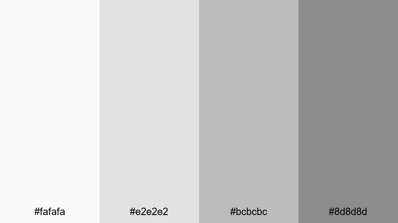
- HEX Codes: #fafafa, #e2e2e2, #bcbcbc, #8d8d8d
- Mood: Polished, flattering, and intimate.
- Use for: Great for beauty videos, talking-head interviews, and studio portraits where you need flattering skin tones in a neutral, modern frame.
Soft Studio Portrait uses light grays and soft midtones to create a gentle, studio-like backdrop. It keeps contrast low enough to flatter faces and product shots while still giving your video a clean, editorial edge.
Use it for beauty content, podcasts, review videos, or channel trailers where the subject is front and center. For thumbnails and channel art, lean on the lighter HEX codes as backgrounds and reserve the mid gray for text, icons, and borders.
Silver Screen Whisper
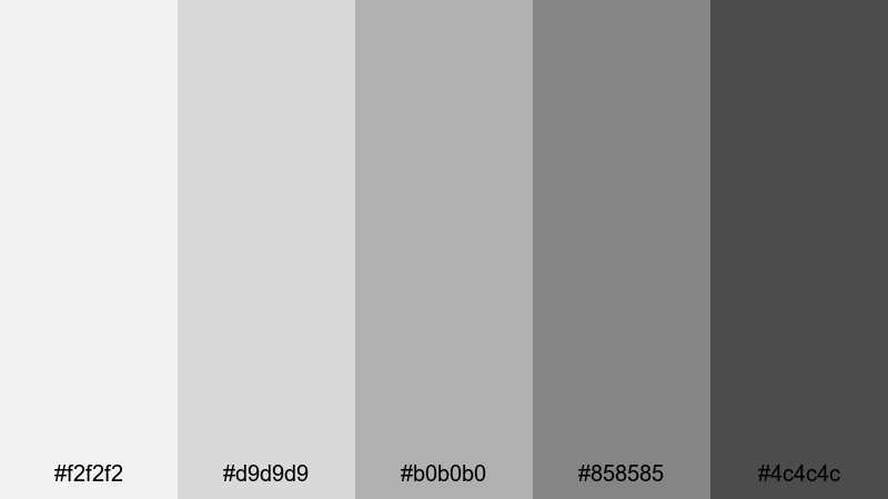
- HEX Codes: #f2f2f2, #d9d9d9, #b0b0b0, #858585, #4c4c4c
- Mood: Nostalgic yet refined, like classic cinema.
- Use for: Perfect for film essay channels, classic movie reviews, or narrative shorts with a timeless, understated look.
Silver Screen Whisper is inspired by old silver film stock, shifting from pale silver to deep pewter. It adds a quiet elegance to your frames, capturing the feeling of classic black-and-white movies without going all the way to harsh black.
Apply this palette to movie analysis videos, story-driven shorts, or titles that need a refined, cinephile mood. In thumbnails, combine the mid and dark grays for typography while using the pale tones as a subtle backdrop, just like a vintage poster.
Cloudlight Drift
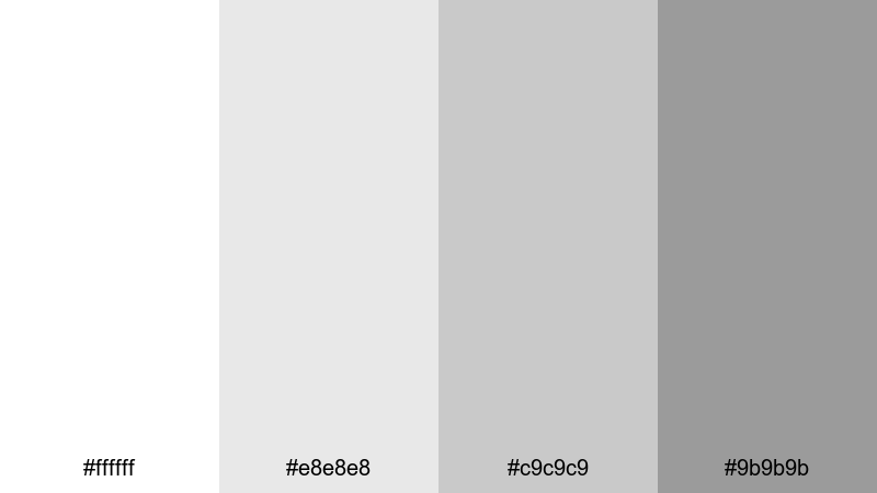
- HEX Codes: #ffffff, #e8e8e8, #c9c9c9, #9b9b9b
- Mood: Airy, optimistic, and minimalist.
- Use for: Use in lifestyle vlogs, aesthetic desk setups, and ambient loops where you want light, spacious visuals.
Cloudlight Drift uses bright whites and floating grays to mimic diffused daylight through clouds. It keeps your image feeling light and open, perfect for minimal desk setups, productivity vlogs, or room tours.
On YouTube and social platforms, this palette is great for aesthetic background cards, clean lower thirds, and uncluttered thumbnails. Keep text and icons in the darker grays so they stay readable over white or pale gray footage.
Bold High-Contrast Monochrome Palettes
Noir Title Sequence
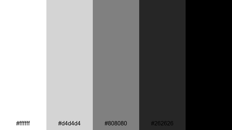
- HEX Codes: #ffffff, #d4d4d4, #808080, #262626, #000000
- Mood: Dramatic, edgy, and story-forward.
- Use for: Ideal for opening titles, trailers, and thriller edits where impact and readability are crucial.
Noir Title Sequence runs from pure white to inky black, delivering the punchy contrast associated with classic noir films and modern thrillers. Bright highlights and deep blacks make your frames feel bold and intentional.
Use this palette for high-impact intros, horror or mystery trailers, and thumbnails where you want text and silhouettes to jump off the screen. In Filmora, combine stark white typography with black or dark gray backgrounds, then accent with mid grays for subtitles and minimal graphics.
Midnight Metro Lines
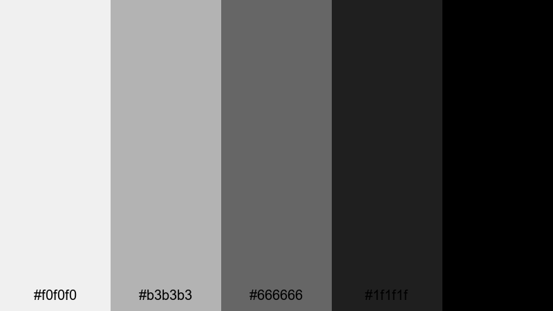
- HEX Codes: #f0f0f0, #b3b3b3, #666666, #1f1f1f, #000000
- Mood: Urban, energetic, and modern.
- Use for: Great for street-style edits, music videos, and fast-cut reels featuring cityscapes and nightlife.
Midnight Metro Lines captures the contrast of neon-lit platforms and deep subway shadows. The brighter grays evoke streetlights and reflections, while the darker tones add grit and intensity.
Apply this palette to music videos, skate edits, and urban travel reels. For social media graphics, use the darkest shades as backgrounds and the light grays for bold, blocky text that mirrors transit signage or club posters.
Ink on Ivory
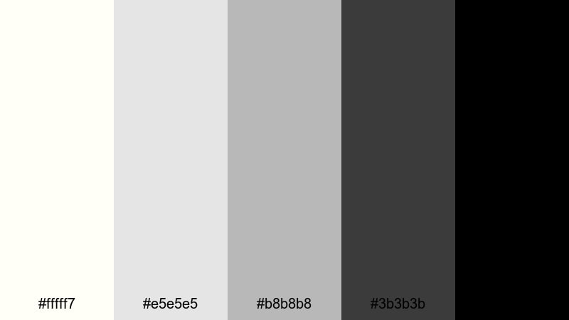
- HEX Codes: #fffff7, #e5e5e5, #b8b8b8, #3b3b3b, #000000
- Mood: Editorial, intellectual, and crisp.
- Use for: Use for educational content, explainer videos, and channel branding that needs a clean, print-like feel.
Ink on Ivory pairs soft off-whites with dense blacks, echoing a premium magazine or book page. It feels serious and intelligent, making it ideal for channels where clarity and authority matter.
Use the ivory tones as your background for slides, charts, and document overlays, then bring in the deep black and dark gray for headlines and body text. This palette is perfect for course thumbnails, explainer intros, and branded lower thirds that feel like they belong in a high-end publication.
Gritty Alley Shadows
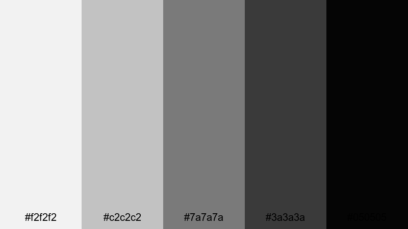
- HEX Codes: #f2f2f2, #c2c2c2, #7a7a7a, #3a3a3a, #050505
- Mood: Raw, tense, and cinematic.
- Use for: Best for action edits, short films, and gaming highlights that need toughness and atmosphere.
Gritty Alley Shadows leans into rugged mid grays and near-black shadows. It emphasizes texture, grain, and atmosphere, making every frame feel like a still from a tense action scene or a moody game cinematic.
Use this palette when editing fight sequences, car chases, or intense gaming highlights. In thumbnails, combine a bright gray background with dark character cutouts and almost-black text to convey impact and suspense at a glance.
Vintage Film Monochrome Palettes
Dusty Darkroom Fade
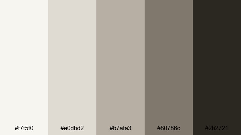
- HEX Codes: #f7f5f0, #e0dbd2, #b7afa3, #80786c, #2b2721
- Mood: Warmly nostalgic and slightly faded.
- Use for: Use for memory sequences, family archives, and retro travel stories that need a gentle sepia tint.
Dusty Darkroom Fade softens pure grayscale with creamy highlights and smoky brown shadows. It mimics the gentle fading of old photo prints, adding instant emotional weight to your footage.
Try it for family videos, throwback vlogs, or travel stories that look like rediscovered film rolls. Use the lighter tones for text boxes and date stamps, and rely on the deeper browns for titles and frames that suggest warmth and history.
Archive Reel Grain
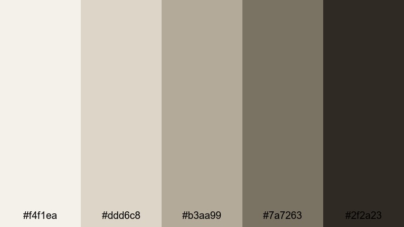
- HEX Codes: #f4f1ea, #ddd6c8, #b3aa99, #7a7263, #2f2a23
- Mood: Documentary, archival, and textured.
- Use for: Perfect for historical docs, case studies, and timeline explainers with old photos or scanned footage.
Archive Reel Grain uses desaturated beiges and deep brown-grays to echo aged film stored in metal cans. It feels slightly dusty and textured, which suits serious, documentary-driven storytelling.
Use it in timeline explainer videos, historical breakdowns, or case studies where you mix original footage with scans, documents, and screenshots. For graphics and lower thirds, keep backgrounds in the lighter beiges and reserve the darkest tones for clean, legible typography.
Silent Era Frame
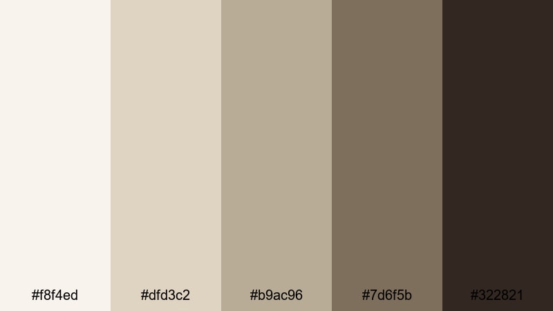
- HEX Codes: #f8f4ed, #dfd3c2, #b9ac96, #7d6f5b, #322821
- Mood: Romantic, theatrical, and classic.
- Use for: Great for period pieces, costume tests, and creative shorts referencing early cinema.
Silent Era Frame combines soft ivory with deep cocoa shadows to recreate the warmth of early film frames. It feels romantic and theatrical, perfect for costume tests, period-inspired shorts, and title cards that reference silent movies.
Use the mid-browns for intertitle-style cards, chapter screens, or stylized subtitles. For thumbnails, frame characters in the darker tones and let the ivory or light beige backgrounds keep the design readable and vintage without looking yellowed or dirty.
Newspaper Clipping
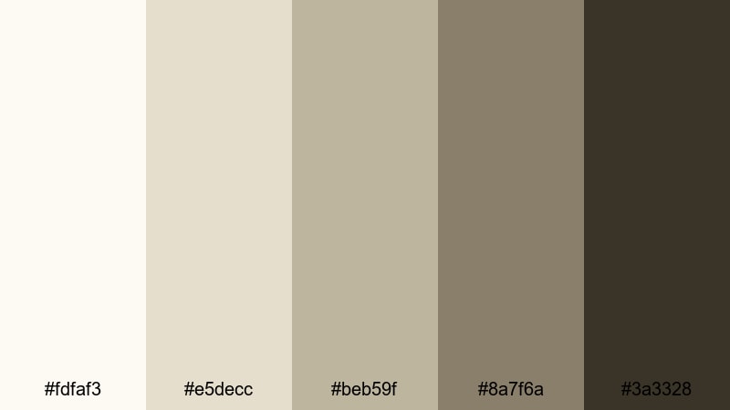
- HEX Codes: #fdfaf3, #e5decc, #beb59f, #8a7f6a, #3a3328
- Mood: Investigative, analog, and gritty.
- Use for: Ideal for true crime videos, investigative pieces, and text-heavy timelines with headlines and documents.
Newspaper Clipping pulls from aged paper and muted ink tones. Creams, taupes, and dark browns give your edit the feeling of working through an old case file or archive box.
This palette is perfect for true crime channels, investigative breakdowns, and journalism-style explainers. Use the lighter colors as backgrounds for screenshots and scanned documents, and highlight key names or dates with the darker browns to keep everything readable and cohesive.
Minimal Modern Monochrome Palettes
Clean UI Wireframe
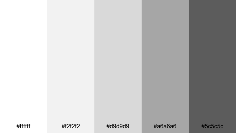
- HEX Codes: #ffffff, #f2f2f2, #d9d9d9, #a6a6a6, #5c5c5c
- Mood: Structured, neutral, and product-focused.
- Use for: Use for app demos, UX walkthroughs, and SaaS promos where clarity and hierarchy matter.
Clean UI Wireframe looks like a polished design mockup: bright whites, subtle grays, and one stronger dark gray for key information. It is built to keep interfaces and overlays clear and easy to read.
Use this palette for product tutorials, UX walk-throughs, or dashboard explainers. In thumbnails, place app screens or UI elements on white or light gray backgrounds, and use the darker gray for titles, icons, and call-to-action buttons.
Studio Loft Concrete
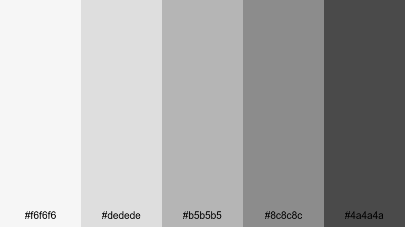
- HEX Codes: #f6f6f6, #dedede, #b5b5b5, #8c8c8c, #4a4a4a
- Mood: Industrial, stylish, and balanced.
- Use for: Great for design portfolios, architecture reels, and behind-the-scenes studio content.
Studio Loft Concrete channels the look of gallery walls and polished concrete floors. Its neutral grays create an understated stage where your artwork, models, or products can stand out.
Use it for creative portfolios, architecture walk-throughs, or behind-the-scenes studio content. For branding, apply the mid and dark grays to logo stings and text, and reserve the lightest tones for clean backgrounds and negative space.
Monochrome Brand Grid
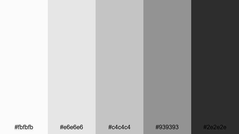
- HEX Codes: #fbfbfb, #e6e6e6, #c4c4c4, #939393, #2e2e2e
- Mood: Professional, cohesive, and brand-ready.
- Use for: Perfect for logo stings, brand intro sequences, and channel style guides that rely on strong layout and typography.
Monochrome Brand Grid is a versatile system of light to dark grays that works across every part of your brand. It feels neutral but not flat, with enough tonal steps to structure text, backgrounds, and dividers.
Use this palette to build a full visual language for your channel: intros, lower thirds, transitions, and end screens. On thumbnails and banners, alternate between light backgrounds and darker text blocks so your titles remain legible on any device.
Tips for Creating Monochrome Color Palettes
Monochrome palettes may look simple, but small decisions about contrast, warmth, and brightness can dramatically change how your video or design feels. Use these tips to refine your own monochrome color combinations for thumbnails, intros, and full edits.
- Decide on contrast first: soft, low-contrast palettes feel calm and introspective, while high-contrast black-and-white schemes feel bold and dramatic.
- Choose a temperature: slightly warm grays suggest nostalgia and analog texture, while cooler grays feel high-tech, minimal, and modern.
- Protect readability: always test your text over the lightest and darkest tones to make sure titles, subtitles, and UI labels stay clear on phones and small screens.
- Limit your steps: 4 to 5 distinct tones (from light to dark) are usually enough to build backgrounds, midtones, borders, and text without clutter.
- Match your footage: adjust exposure and contrast so your video clips roughly align with your chosen HEX values, then refine in Filmora using curves and color wheels.
- Use one anchor tone: pick a signature gray (often a mid or dark shade) for logos, recurring text, or icons to help viewers instantly recognize your brand.
- Check different devices: preview your monochrome graphics on bright and dim screens to avoid crushed blacks or blown-out whites.
- Blend with subtle color if needed: a tiny hint of color in overlays, logos, or accent text can make a monochrome base feel unique without breaking the theme.
Monochrome color palettes are a powerful way to shape mood, focus attention, and give your channel a recognizable visual identity. From soft cinematic grays to gritty archival tones, each palette above can anchor a distinct storytelling style for your videos, thumbnails, and social posts.
Try dropping a few of these HEX codes into your next project and build matching looks in Filmora. With AI Color Palette, HSL and curves tools, and ready-made filters and LUTs, you can turn simple black-and-white into a polished signature aesthetic that carries across every video you publish.
Experiment, save your favorite presets, and refine them over time. A well-crafted monochrome look can make even everyday content feel cinematic, cohesive, and instantly recognizable as yours.
secure downloadNext: Museum Color Palette
