
 100% Security Verified | No Subscription Required | No Malware


 ChatGPT
 Perplexity
 Gemini
 Claude
 Grok
Grok
Mountain inspired color palettes lean on cool blues, misty greens, and grounded neutrals that feel calm, stable, and cinematic. They echo rock, snow, pine, and sky, so they instantly suggest adventure, freedom, and fresh air. In video and design, these tones help you build trust and focus, making them perfect for travel vlogs, outdoor brands, and any channel that wants a peaceful yet powerful mood.
This guide brings you 15 ready to use Mountain color palettes with HEX codes so you can grade your footage, design thumbnails, intros, and branding more easily. Each palette is described for practical use in Filmora, from subtle dawn scenes to bold summit adventures and minimalist snowfield aesthetics.
In this article
Serene Mountain Dawn Color Palettes
Alpine Sunrise Mist
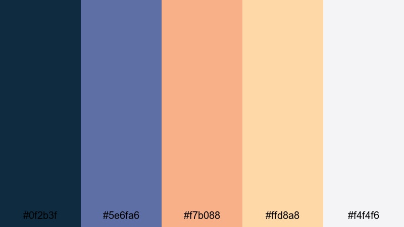
- HEX Codes: #0f2b3f, #5e6fa6, #f7b088, #ffd8a8, #f4f4f6
- Mood: Calm, hopeful, and airy like the first light over alpine peaks.
- Use for: Perfect for cinematic travel intros, meditative vlogs, or soft title cards that need a gentle dawn feeling.
Alpine Sunrise Mist mixes deep mountain blue with soft lavender tones and warm peach highlights. It feels like standing above the clouds while the sky slowly turns from night to day. The brighter peach and cream shades add a gentle glow that keeps the palette from feeling cold or heavy.
Use this palette for reflective openings, slow drone passes, or calm storytelling edits. The darker blue works well for text and logo shapes, while the peach and light cream are perfect for YouTube thumbnail backgrounds, chapter cards, and on screen graphics in Filmora that hint at a fresh, new beginning.
Pro Tip: Build a Cinematic Mountain Dawn Look in Filmora
To keep a soft dawn feeling across your whole edit, start by setting Alpine Sunrise Mist as your reference in Filmora. Use the deep blue for lower thirds and captions, then repeat the peach and cream tones in overlays, frame borders, and title screens. This repetition ties together intros, b roll, and social cutdowns so every asset looks like part of the same morning on the mountain.
When you grade your footage, gently cool the shadows toward the #0f2b3f blue and warm the highlights toward the peach tones. In Filmora, subtle adjustments like this give even mixed camera clips one unified, cinematic Mountain look.
AI Color Palette
You can turn Alpine Sunrise Mist into a complete grade for your whole video with Filmora's AI Color Palette. Take a still frame or reference image that uses these HEX colors, then let the tool analyze it and transfer the mood to the rest of your clips. This keeps skin tones natural while shadows, mids, and highlights shift toward your chosen Mountain palette.
Filmora's AI Color Palette feature is especially useful for travel vlogs and reels where lighting changes quickly. Instead of grading each shot by hand, you match everything to one key frame and get consistent, airy dawn tones in minutes.
 secure download

HSL, Color Wheels & Curves
To fine tune Mountain dawn tones, use Filmora's HSL, color wheels, and curves controls. You can push blues slightly more teal for a modern travel feel, or lean them deeper and moodier for a documentary look. Lift the highlight curve gently to keep skies bright, while lowering shadows just a bit to hold detail in rocky ridges and tree lines.
If you want a step by step breakdown of grading tools, follow this Filmora color correction tutorial while you experiment with your own clips. Small tweaks in HSL or the midtone wheel go a long way toward keeping your Alpine Sunrise Mist palette clean and cinematic.
secure download1000+ Video Filters & 3D LUTs
Once you have your base Mountain look, Filmora's filters and LUTs can push it toward different storytelling styles. Add a soft fade for nostalgic sunrise memories, or a clean modern LUT for crisp drone footage over alpine lakes. With one click, you can test variations without losing your original grade.
Filmora's video filters and 3D LUTs make it easy to stack creative looks on top of your Mountain palette. Save your favorite combinations so you can reuse the same visual identity for future episodes, shorts, and channel promos.
secure downloadCloudline Pastel Peaks
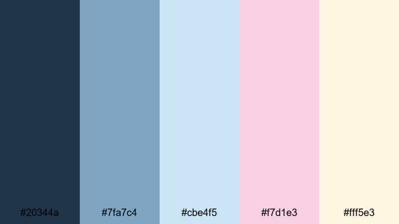
- HEX Codes: #20344a, #7fa7c4, #cbe4f5, #f7d1e3, #fff5e3
- Mood: Soft, nostalgic, and uplifting with gentle pastels above cool ridges.
- Use for: Ideal for lifestyle vlogs, romantic travel reels, and channel branding that needs a light, dreamy touch.
Cloudline Pastel Peaks blends cool ridge blues with milky pinks and creamy light tones. It feels dreamy and nostalgic, like a quiet morning when the sky is full of soft clouds and barely there sunlight. The contrast is gentle, so nothing looks harsh on screen.
Use the darker blue for text and icons, and let the pastel pinks and creams carry your backgrounds in thumbnails, lower thirds, and intro frames. This palette works especially well for couples travel videos, cozy cabin weekends, and any Mountain content where you want romance and calm to stand out.
Quiet Valley Morning
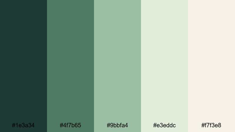
- HEX Codes: #1e3a34, #4f7b65, #9bbfa4, #e3eddc, #f7f3e8
- Mood: Grounded, peaceful, and restorative like mist in a forested valley.
- Use for: Works well for wellness content, hiking diaries, and minimalist thumbnails that feel natural and calm.
Quiet Valley Morning centers on muted greens and soft neutrals that feel grounded and honest. The darker forest tones give you a strong base, while the pale greens and creams suggest mist, dew, and clean air.
It is a great choice for mindfulness edits, hiking and camping diaries, or channel art where you want viewers to feel relaxed. In Filmora, use the darkest green for clear typography and the lightest tones for panel backgrounds, chapter cards, and end screens that do not distract from your story.
Frosted Summit Glow
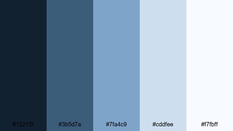
- HEX Codes: #12212f, #3b5d7a, #7fa4c9, #cddfee, #f7fbff
- Mood: Cool, crisp, and optimistic with icy blues touched by early light.
- Use for: Great for drone footage of snowy peaks, winter sports montages, and clean title screens.
Frosted Summit Glow is all about sharp, icy blues and clean whites. The gradient from deep navy to near white gives you plenty of room for contrast, but the overall feel stays fresh and optimistic rather than harsh.
Use it when you want to highlight snow, glaciers, or cold air in your shots. In thumbnails, pair the darker blue with bold sans serif fonts to cut through bright white backgrounds. For intros and lower thirds, overlay subtle blue gradients in Filmora to echo the cool summit light across your whole edit.
Vibrant Mountain Adventure Color Palettes
Trailblazer Wild Sky
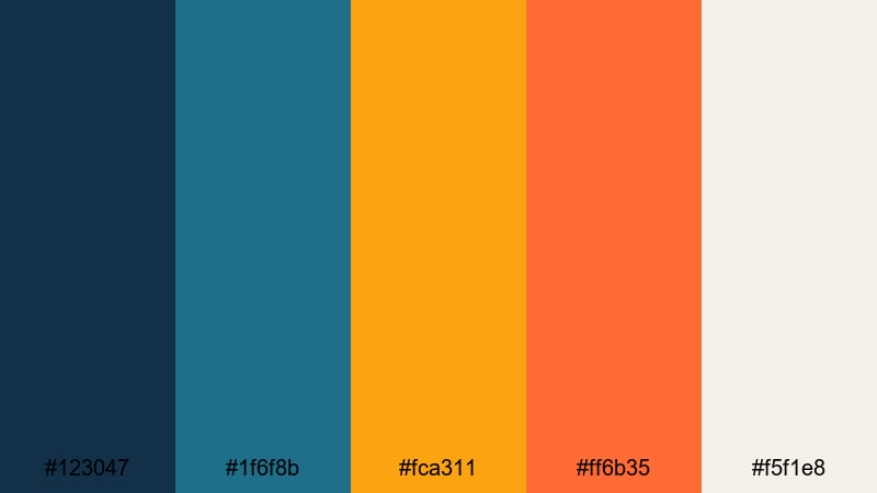
- HEX Codes: #123047, #1f6f8b, #fca311, #ff6b35, #f5f1e8
- Mood: Bold, adventurous, and high-energy like a fast climb under a blazing sky.
- Use for: Perfect for dynamic intros, adventure sports edits, and YouTube thumbnails that must pop in the feed.
Trailblazer Wild Sky throws deep mountain blues against blazing amber and orange accents. The result feels loud and fearless, like a fast ascent or a high speed trail run. The warm tones grab attention immediately, while the blues keep the palette grounded in the Mountain theme.
This combination is ideal for high energy trailers, sports reels, and bold channel art. Use the orange and amber for call to action buttons, subscribe graphics, and animated titles in Filmora, while the blues support your backgrounds and stroke lines around text to keep everything readable.
Glacier Lake Pop
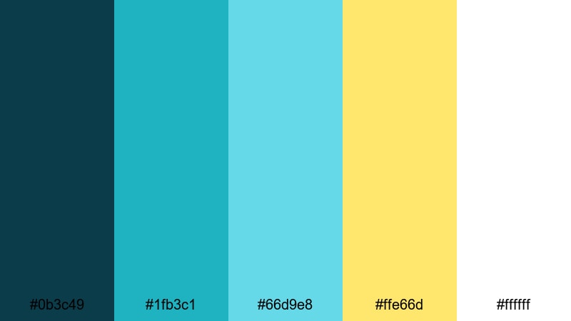
- HEX Codes: #0b3c49, #1fb3c1, #66d9e8, #ffe66d, #ffffff
- Mood: Refreshing, playful, and bright like sun striking a turquoise glacier lake.
- Use for: Great for travel channels, summer hiking reels, and eye-catching lower thirds or overlays.
Glacier Lake Pop captures that striking turquoise water you see in glacier lakes, backed by deep teal and hit with bright yellow sunlight. It feels playful and refreshing, with high contrast that reads really well on phones and small screens.
Use the darker teal for text and outlines, and reserve the brightest turquoise and yellow for key highlights like arrows, badges, and motion graphics. In Filmora, this palette works beautifully for upbeat summer treks, paddle boarding clips, or any Mountain content where you want clean, fun energy.
Summit Festival Lights
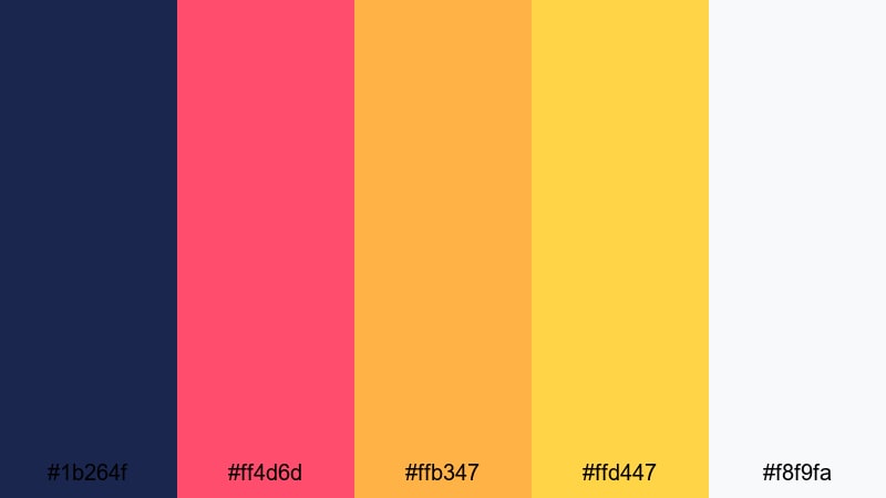
- HEX Codes: #1b264f, #ff4d6d, #ffb347, #ffd447, #f8f9fa
- Mood: Festive, energetic, and social like lanterns and campfires at high elevation.
- Use for: Use for event recaps, group trips, or travel festival videos that mix night shots with warm highlights.
Summit Festival Lights combines deep midnight blue with neon pink and glowing golds. It feels like a mountain music festival or a campsite full of lanterns and firelight. The contrast between cool background blue and hot accent colors gives you instant visual drama.
Apply this palette to group trip recaps, party scenes at altitude, or night hikes with headlamps. Let the blue drive your frames and overlays, while the pink and yellows highlight people, titles, and animated stickers in your Filmora edits and thumbnails.
High Altitude Energy
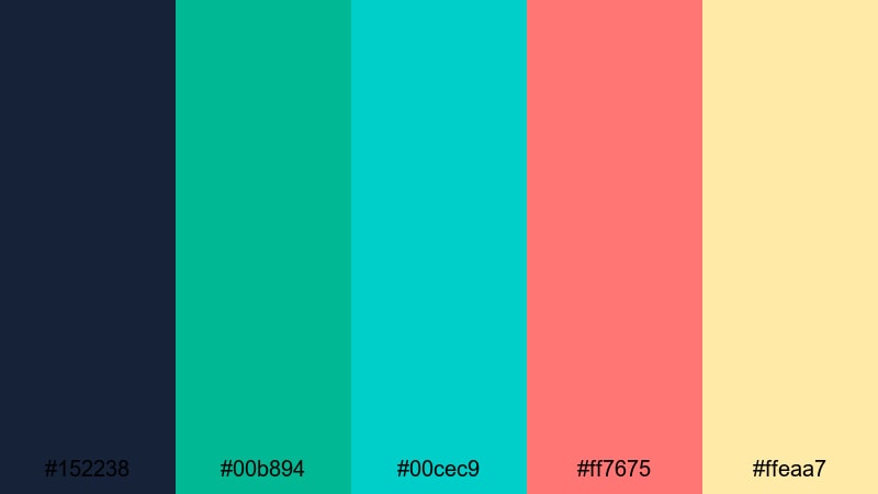
- HEX Codes: #152238, #00b894, #00cec9, #ff7675, #ffeaa7
- Mood: Lively, modern, and energetic with punchy teals and corals.
- Use for: Ideal for energetic channel branding, sporty transitions, and kinetic typography over mountain footage.
High Altitude Energy is a punchy mix of deep navy, electric teals, and warm coral tones. It feels modern and youthful, like a techy outdoor brand or a fast paced action vlog. The colors stand out strongly against both dark and light backgrounds.
Use this palette when you want your Mountain content to feel bold and contemporary. In Filmora, pair the dark navy with white or cream text for legibility, then use the teals and corals as accent bars, motion graphics, and caption backgrounds for shorts and reels.
Moody Mountain Twilight Color Palettes
Storm Over The Ridge
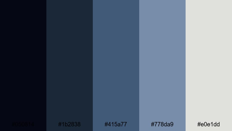
- HEX Codes: #050814, #1b2838, #415a77, #778da9, #e0e1dd
- Mood: Dramatic, cinematic, and tense like a storm building over distant peaks.
- Use for: Perfect for trailers, time-lapse storm sequences, and serious documentary intros.
Storm Over The Ridge layers inky blues and slate grays to create a brooding, cinematic sky. It feels tense and powerful, like the minutes before heavy rain or lightning. The soft light gray gives you just enough contrast for text and UI elements without breaking the mood.
Use this palette for serious narratives, weather focused time lapses, or any Mountain film that leans dramatic. Deep blues make strong backgrounds for bold white or pale gray titles in Filmora, while the mid blues are great for subtle overlays and vignette effects.
Pine Shadow Dusk
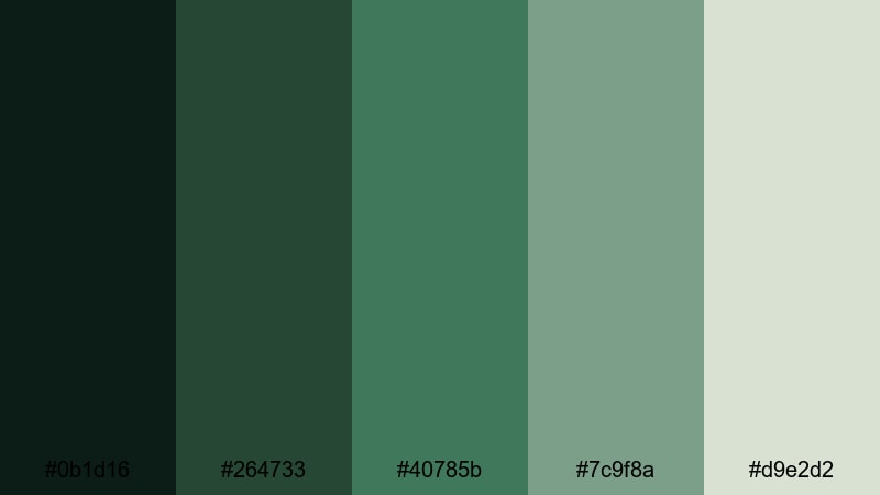
- HEX Codes: #0b1d16, #264733, #40785b, #7c9f8a, #d9e2d2
- Mood: Quiet, mysterious, and earthy like dark pines at blue hour.
- Use for: Great for narrative shorts, calm camping scenes, and atmospheric channel idents.
Pine Shadow Dusk focuses on deep pine greens fading into soft, misty tones. It feels grounded and mysterious, perfect for scenes where you want viewers to lean in and pay attention. The lighter greens and off whites give you room for text and interface elements without losing the forest atmosphere.
Use this palette for calm camping stories, slow narrative projects, or cinematic b roll in wooded valleys. In Filmora, you can tint your shadows toward the darkest green and let your titles sit in the lighter tones, creating a gentle but readable contrast in thumbnails and opening sequences.
Ember Peaks After Dark
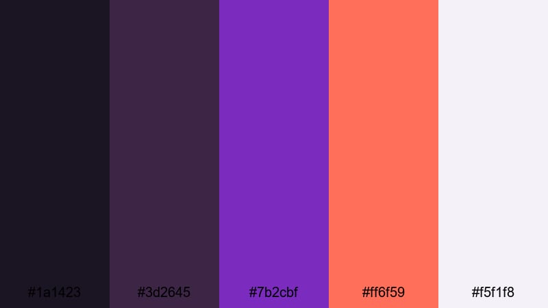
- HEX Codes: #1a1423, #3d2645, #7b2cbf, #ff6f59, #f5f1f8
- Mood: Smoldering, dramatic, and slightly surreal like coals glowing under a night sky.
- Use for: Use for stylized night scenes, title cards, or music videos set in rugged landscapes.
Ember Peaks After Dark mixes rich violets with burning ember oranges. It feels intense and artistic, perfect when you want your Mountain scenes to feel less literal and more stylized. The dark purples provide depth, while the orange accent slices right through with heat.
Apply this palette to music videos, experimental travel edits, or night sequences lit by fire or neon. In Filmora, use the purple tones for gradients, overlays, and backgrounds, then let the orange highlight key words, logos, and animated shapes in your intros and outros.
Thunderhead Horizon
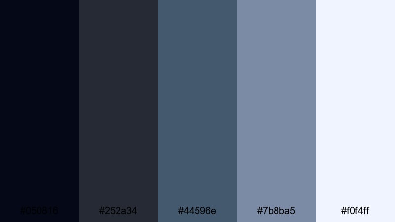
- HEX Codes: #050816, #252a34, #44596e, #7b8ba5, #f0f4ff
- Mood: Tense yet expansive, with the calm before a storm stretching across ridges.
- Use for: Ideal for cinematic openings, dramatic b-roll, and serious docu-style content.
Thunderhead Horizon is built from charcoal blues and soft steel tones that feel both heavy and open. It captures the feeling of watching big weather move in from a distance, with subtle color shifts instead of loud contrasts.
Use it for cinematic openers, ridge line panoramas, and serious documentaries. The darker colors make strong letterbox bars and title backplates in Filmora, while the lightest blue white makes clean, readable text against your moody Mountain footage.
Minimal Mountain Neutral Color Palettes
Granite Ridge Minimal
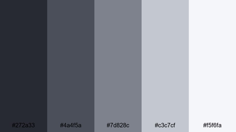
- HEX Codes: #272a33, #4a4f5a, #7d828c, #c3c7cf, #f5f6fa
- Mood: Modern, understated, and professional like polished granite and mist.
- Use for: Perfect for techy outdoor brands, UI overlays on footage, and clean lower thirds.
Granite Ridge Minimal uses cool grays and soft off whites that mirror stone faces in overcast light. It feels sleek and professional, without losing the rugged inspiration behind Mountain visuals. The palette stays neutral so your footage and products can stand out.
Use this palette for outdoor tech, gear reviews, or brand explainers where clarity matters. In Filmora, set the darkest gray as your main text color and keep backgrounds in the lighter tones for clean lower thirds, info panels, and animated UI graphics over your mountain shots.
Cedar Cabin Calm
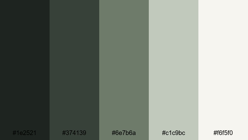
- HEX Codes: #1e2521, #374139, #6e7b6a, #c1c9bc, #f6f5f0
- Mood: Cozy, grounded, and organic like a small cabin tucked into the trees.
- Use for: Great for slow living vlogs, cabin tours, and branding that leans rustic yet clean.
Cedar Cabin Calm blends muted greens with warm neutrals to suggest wood, stone, and soft indoor light. It feels homey and timeless, more about comfort than drama. The overall contrast is gentle, which works well for long form viewing.
Use this palette for slow living vlogs, tiny home and cabin tours, or nature inspired brands. In Filmora, pair the mid greens with serif or handwritten fonts for titles, and keep backgrounds in the lightest beige and cream for YouTube thumbnails, end cards, and channel banners.
Snowfield Clean Slate
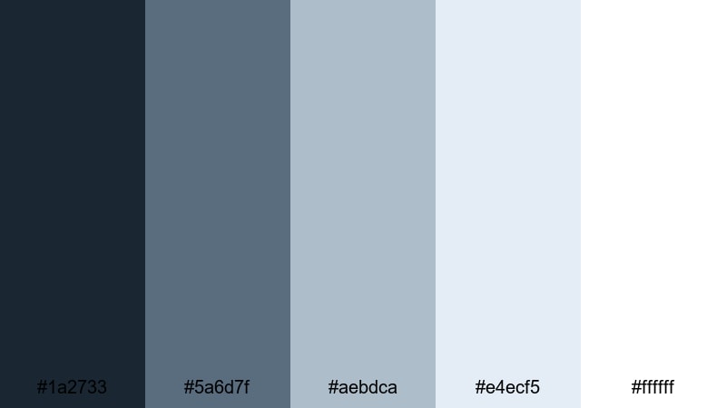
- HEX Codes: #1a2733, #5a6d7f, #aebdca, #e4ecf5, #ffffff
- Mood: Pure, minimal, and contemplative like untouched snowfields under a pale sky.
- Use for: Ideal for minimalist openers, product shots in outdoor brands, and clean title screens.
Snowfield Clean Slate is a refined mix of steely blues and layered whites that evokes quiet snowfields and pale skies. It feels minimal and reflective, perfect when you want your visuals to breathe without clutter.
Use it for opening titles, brand reveals, or product shots against simple backgrounds. In Filmora, rely on the darkest blue for crisp text and logo marks, and let the whites and pale blues wash across your frames as gradients, borders, and clean overlay panels.
Tips for Creating Mountain Color Palettes
When you build your own Mountain color palette, combine cool earth tones with a few well chosen accents so your videos stay cinematic, readable, and on brand across thumbnails, intros, and social edits.
- Pick one dominant Mountain base color (deep blue, pine green, or stone gray) and use it consistently for titles, borders, and brand elements.
- Balance cool shades (blues, greens, grays) with one warm accent (amber, coral, or soft peach) to highlight buttons, key words, and important subjects.
- Check contrast for readability by testing your text colors directly over dark forests, bright snow, and cloudy skies from your footage.
- Limit yourself to 3 to 5 main colors per project so your YouTube thumbnails and channel graphics stay clean and recognizable.
- Sample colors directly from your best frame in Filmora, then save them as presets so your grading, captions, and overlays all share the same palette.
- Use slightly desaturated Mountain tones for long videos to avoid eye fatigue, and keep the most saturated colors for short highlights or call to action graphics.
- Match your palette to the story: soft dawn tones for reflective content, vibrant contrasts for action, and moody blues for serious or documentary projects.
- Test how your colors look on mobile by exporting a frame or thumbnail from Filmora and checking it on a phone at small size.
Mountain color palettes are powerful storytelling tools. Cool blues, muted greens, and clean neutrals can make your channel feel calm and trustworthy, while brighter accents bring energy to climbs, trails, and summit moments. With the 15 palettes above, you can quickly give each video a clear mood and a consistent visual identity.
Try dropping these HEX codes into your overlays, text, and filters in Filmora to see how they transform your footage. Once you find a Mountain combination that fits your style, save it as your personal brand look and reuse it for intros, b roll, thumbnails, and shorts.
Whether you lean toward serene dawns, vibrant adventures, moody twilights, or minimal snowfields, Filmora makes it easy to apply, tweak, and reuse your favorite Mountain palettes across every edit.
secure downloadNext: Cyberpunk Color Palette
