
 100% Security Verified | No Subscription Required | No Malware

Polished Copper sits between warm metal and earthy clay, making it one of the most versatile colors for visual storytelling. It feels premium without being cold, and nostalgic without looking dated. In color psychology, copper tones suggest warmth, reliability, handiwork, and subtle luxury. On screen, that translates into cinematic coziness, artisan branding, and high-end but human visuals that feel approachable.
For video creators, YouTubers, and designers using Filmora, Polished Copper works beautifully in thumbnails, intros, lower thirds, logo reveals, overlays, and even full color grades. Below you will find ready-made Polished Copper color palettes with HEX codes so you can match your branding, keep your uploads visually consistent, and design cohesive cinematic looks directly in Filmora or your favorite design tool.
In this article
Warm Cinematic Polished Copper Color Palettes
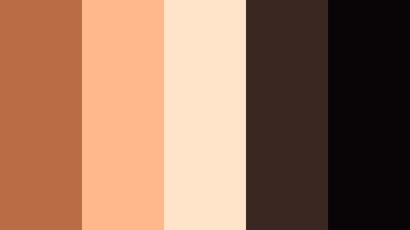
Sunset Foundry Glow

- HEX Codes: #b6653b, #ffb381, #ffd8a8, #46332a, #120f10
- Mood: Cinematic, nostalgic, and warmly dramatic.
- Use for: Perfect for cinematic travel vlogs or narrative short films that need a warm, molten-metal mood.
Sunset Foundry Glow wraps your frame in molten Polished Copper, pastel sunset peach, and inky charcoal shadows. It feels like golden hour on a city rooftop, or firelight reflecting off metal surfaces in a workshop, with deep contrast that instantly adds drama.
Use this palette to grade travel vlogs, short-film scenes, or emotional storytelling pieces where you want warmth and depth. In Filmora, it works especially well for YouTube thumbnails with bright copper highlights against dark backgrounds, intro titles that glow like metal, and cohesive lower thirds that mirror your color-graded footage.
Pro Tip: Build a Cinematic Polished Copper Look in Filmora
To keep a Sunset Foundry Glow mood across your whole edit, pick one accent shade of Polished Copper for text and UI elements, and one darker brown for backgrounds. In Filmora, you can reuse these exact HEX codes in titles, shapes, and overlays so your thumbnails, intros, b-roll, and end screens all share the same copper signature.
Combine the brighter peach tones for call-to-action buttons and subscribe reminders, then keep your deep charcoal and near-black colors for panels and frames. This makes your channel feel branded and cinematic without needing complex design work on every upload.
AI Color Palette
Have a still frame or mood board that perfectly captures your Polished Copper atmosphere? Filmora's AI Color Palette feature can analyze that reference and apply the same warm copper balance across your timeline. This lets you keep skin tones flattering while pushing shadows toward rich brown and highlights toward soft peach.
Simply pick a frame graded with your preferred Polished Copper look, then use AI Color Palette to match the rest of your clips. It is ideal for travel vlogs and cinematic reels where lighting changes quickly, but you still want a unified, polished copper aesthetic.
 secure download

HSL, Color Wheels & Curves
Once your base palette is matched, use Filmora's HSL, color wheels, and curves to refine your Polished Copper tones. Gently push oranges and reds toward a deeper copper using HSL, then cool down greens or blues so your subject and copper accents stand out more. Midtones can be nudged warm for skin, while shadows stay neutral or slightly brown for a more cinematic feel.
In the color wheels, add a touch of copper warmth to midtones and highlights while anchoring shadows with neutral dark browns. Subtle S-curves in the RGB curves can boost contrast while preserving detail in coppery highlights, helping you protect texture in metal objects or warm light sources across your video.
secure download1000+ Video Filters & 3D LUTs
If you want a quick polished copper mood without manual grading, Filmora's video filters and 3D LUTs make it easy to stylize your footage. Start with a warm cinematic LUT, then fine-tune saturation and contrast so the copper hues stay rich but not oversaturated.
Layer subtle filters for grain, glow, or vignettes to complete the Sunset Foundry Glow feel. This approach is perfect for creators who want consistent copper aesthetics across shorts, Reels, and long-form edits while saving time on each upload.
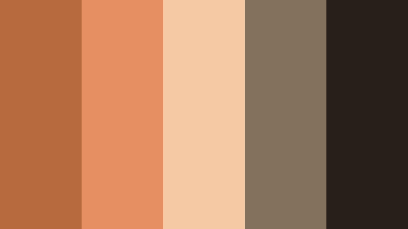
secure downloadIndustrial Hearth Light

- HEX Codes: #ad6037, #f39a63, #fce0c6, #4d3a30, #1f140f
- Mood: Cozy yet industrial, like a loft lit by firelight.
- Use for: Great for documentary intros or maker-channel videos featuring workshops, coffee, wood, or craftsmanship.
Industrial Hearth Light blends Polished Copper with ember orange, creamy highlights, and dark wood tones. It feels like a creative loft or workshop at night, where warm task lights carve out little pockets of glow in a deeper, industrial space.
This palette fits maker channels, coffee shop vlogs, woodworking tutorials, and behind-the-scenes content. Use the bright ember and cream for titles and UI, while the darker browns sit behind your subject as backgrounds in thumbnails, end cards, and lower thirds for a handcrafted, intimate brand identity.
Molten Dusk Studio

- HEX Codes: #b96a40, #ffb27c, #f3e0cf, #3f2c29, #0f0b0b
- Mood: Moody, dramatic, and softly glamorous.
- Use for: Ideal for fashion lookbooks, dance films, or moody studio portraits with spotlight lighting.
Molten Dusk Studio pairs glowing Polished Copper and peach lights with creamy neutrals and rich espresso shadows. It creates a moody, softly glamorous look that feels at home in fashion editorials and studio-based storytelling.
Use this palette in Filmora for lookbooks, choreography clips, or portrait reels. Copper and peach can highlight subject names, while deep browns frame your thumbnails and intro slates. A subtle vignette in these darker hues pushes attention to the center of the frame while keeping everything on-brand.
Vintage Copper Reel

- HEX Codes: #a55933, #e39b71, #f4d5b8, #554139, #161013
- Mood: Retro, filmic, and slightly desaturated.
- Use for: Use in retro travel reels, film emulation grades, or nostalgic family videos.
Vintage Copper Reel takes Polished Copper and mutes it slightly with dusty peach, soft beige, and faded browns. It echoes the character of vintage film stocks, with less saturation and more nostalgic softness.
Apply this palette when editing travel memories, heritage stories, or family archives. In Filmora, combine the copper and dusty peach in titles and date stamps, and use the muted browns for film frame overlays or subtle borders. It keeps your visuals warm and sentimental without feeling overly saturated or modern.
Candlelit Copper Drama
- HEX Codes: #ba6c44, #ffb88b, #ffe4c9, #3a2722, #090506
- Mood: Intimate, theatrical, and warmly romantic.
- Use for: Great for romantic short films, wedding highlight reels, or moody talking-head setups.
Candlelit Copper Drama glows with Polished Copper, candlelight creams, and deep stage-like shadows. The palette feels like a quiet theater or a dinner by candlelight, with strong contrast between warm faces and dark backgrounds.
Use it in wedding highlight films, poetry videos, or intimate interviews. In your thumbnails and titles, let copper and peach tones highlight key words, while near-black browns form a clean, dramatic backdrop. This contrast makes text pop on YouTube and social feeds while preserving a soft, romantic atmosphere.
Elegant & Modern Polished Copper Color Palettes
Copper Marble Lobby

- HEX Codes: #b86b42, #f4f1ec, #d1c5b8, #3f3b37, #171616
- Mood: Luxurious, modern, and minimal.
- Use for: Ideal for real estate tours, hotel promos, and premium brand intros or logo stings.
Copper Marble Lobby mixes refined Polished Copper with marble whites, soft taupes, and charcoal accents. It captures the feeling of a high-end hotel lobby or gallery entrance: calm, clean, and quietly luxurious.
Use this palette in Filmora for real estate walk-throughs, hospitality branding, or polished corporate intros. Put copper on logo outlines and key icons, keep text mostly in deep charcoal, and reserve marble whites for backgrounds and panels to maintain readability and a premium finish.
Modern Copper Interface

- HEX Codes: #c06f47, #ffffff, #e4ded6, #222426, #0c0d0f
- Mood: Sleek, digital, and product-focused.
- Use for: Great for app UI demos, tech explainers, or SaaS promo videos needing a warm metallic accent.
Modern Copper Interface keeps things sleek and digital by pairing crisp whites and charcoals with Polished Copper accents. It feels like high-end tech hardware or a design-led dashboard with a warmer twist than typical blue or teal interfaces.
Use copper as your highlight color for buttons, progress bars, and callouts in screen recordings or explainers. White and light beige backgrounds keep UI text readable, while dark charcoals give structure to your thumbnails, chapter cards, and info panels inside Filmora.
Art Gallery Copper

- HEX Codes: #b2693f, #f6eee4, #c7c0b4, #505057, #18181c
- Mood: Curated, artistic, and understated.
- Use for: Use for gallery walkthroughs, portfolio reels, or design studio branding packages.
Art Gallery Copper balances Polished Copper with gallery whites, stone grays, and almost-black accents. It feels like a minimalist exhibition where the space is calm enough to let the work shine, but still has rich, warm details.
This palette is ideal for portfolio reels, showreels, and design studio promos. Use copper sparingly on logos, separators, and hover states in motion graphics. Keep most type in dark gray or black for clarity, with soft off-whites as the canvas for your content.
Executive Copper Suite

- HEX Codes: #a45d37, #ddb08e, #f5ebe0, #333136, #0e0d10
- Mood: Corporate, confident, and quietly opulent.
- Use for: Perfect for executive interviews, corporate overviews, and financial brand idents.
Executive Copper Suite combines soft neutrals, champagne beige, and Polished Copper with grounded dark grays. The result is corporate but not cold, conveying confidence and subtle luxury.
In Filmora, apply this palette to executive interviews, investor decks turned into video, and financial explainers. Use beige and cream as lower-third panels and slide backgrounds, save copper for key figures or headlines, and rely on dark grays for body text and data labels so everything stays readable and refined.
Minimal Copper Branding

- HEX Codes: #b5673e, #faf7f3, #d0c8bf, #383636, #111112
- Mood: Clean, airy, and brand-focused.
- Use for: Ideal for logo reveals, brand kits, and social templates that need a timeless, upscale touch.
Minimal Copper Branding softens Polished Copper with warm off-whites, muted grays, and clean dark accents. It feels light and breathable, ideal for timeless, upscale branding where you do not want too many competing colors.
Use the creamy tones for background plates in intros and vertical reels, while copper becomes your signature accent on logos, icons, and key phrases. Dark charcoal handles text and UI lines, giving you a neat, consistent look across banners, thumbnails, and template packs you build in Filmora.
Earthy & Organic Polished Copper Color Palettes
Forest Forge Retreat

- HEX Codes: #b3623a, #f0b07a, #6f7b54, #2d3b2f, #131612
- Mood: Grounded, outdoorsy, and restorative.
- Use for: Great for cabin vlogs, hiking content, eco brands, or wellness retreats.
Forest Forge Retreat pairs glowing Polished Copper with mossy greens and deep forest shadows. It feels like sitting in a cabin with a fire going after a day exploring the woods, balancing comfort and the rugged outdoors.
This palette works perfectly for nature vlogs, retreat promos, eco-friendly product launches, and mindfulness content. In Filmora, let copper highlight titles and key icons while greens and deep browns shape frames, backgrounds, and gradient overlays that echo the forest feeling.
Copper Terracotta Courtyard
- HEX Codes: #b86a3f, #e58f63, #f4c9a4, #84715b, #27201a
- Mood: Mediterranean, sunbaked, and relaxed.
- Use for: Use for travel diaries, lifestyle reels, and cafe or interiors content in warm climates.
Copper Terracotta Courtyard blends Polished Copper with terracotta oranges, sunlit peach, and dusty stone neutrals. It feels like wandering through a Mediterranean courtyard, where weathered walls and late-afternoon light set the tone.
Use this palette for travel diaries, slow-living content, and lifestyle interiors in warm cities. In Filmora, apply the lighter tones to background blocks and the stone neutrals to subtitle bars. Copper and terracotta can accent map animations, location tags, and chapter headings across your edit.
Harvest Copper Fields

- HEX Codes: #af623a, #e3a25d, #f7d18b, #6a5a3a, #261e16
- Mood: Rustic, pastoral, and optimistic.
- Use for: Perfect for farm-to-table brands, autumn vlogs, or cozy cooking channels.
Harvest Copper Fields surrounds Polished Copper with harvest golds, amber grains, and earthy browns. The palette feels like late-summer fields or autumn markets, full of warmth and comfort.
It fits perfectly with food content, countryside vlogs, and seasonal branding. In Filmora, let the golden tones wash over your footage with a warm grade and use copper on titles and badges, while the darker browns ground recipe cards, overlay blocks, and chapter titles for cozy readability.
Rainwashed Copper Stone

- HEX Codes: #a55c37, #cf916b, #9aa09c, #4e585d, #181b1f
- Mood: Earthy, calm, and weathered.
- Use for: Ideal for slow living vlogs, nature documentaries, or moody product closeups.
Rainwashed Copper Stone softens Polished Copper with muted clay, cool slate, and stone greens. It feels like old architecture or tools left out in the rain, with a balance of warm metal and cool, weathered surfaces.
Use this palette for slow living vlogs, moody product films, or documentary clips about craft and landscape. In Filmora, lean on the cool grays for background shapes and text boxes, letting copper and clay stand out in titles, icons, and subtle glows over key moments.
Soft & Romantic Polished Copper Color Palettes
Blush Copper Romance

- HEX Codes: #b8653e, #f6b29a, #ffe2d6, #f6f1ea, #3a3130
- Mood: Romantic, gentle, and inviting.
- Use for: Great for wedding films, engagement announcements, or lifestyle reels aimed at a predominantly female audience.
Blush Copper Romance combines Polished Copper with blush pinks, airy creams, and soft charcoal. It creates a tender, flattering glow that is especially kind to skin tones and delicate details like flowers, lace, or stationery.
Use it for wedding highlight reels, engagement announcements, or soft lifestyle content on YouTube, Instagram, and TikTok. In Filmora, keep backgrounds very light and pastel, let copper trace titles and outlines, and reserve the darker gray for subtle text so your visuals stay light and romantic while still easy to read.
Rose Latte Copper

- HEX Codes: #b66a44, #f3b3a3, #f9ded4, #e3cbbf, #3c3433
- Mood: Cozy, sweet, and cafe-inspired.
- Use for: Perfect for cafe vlogs, baking channels, cozy book content, or aesthetic study reels.
Rose Latte Copper softens Polished Copper with rosy latte tones and creamy neutrals. It feels like sitting in a warm cafe with a book and a fresh pastry, wrapping your visuals in a cozy and comforting glow.
Use this palette for cafe vlogs, baking tutorials, productivity or study reels, and aesthetic lifestyle content. In Filmora, let pale creams and rose-beige form your background cards and frames, while copper accents emphasize chapter titles, timestamps, and call-to-action lines so your content looks curated and cohesive across platforms.
Tips for Creating Polished Copper Color Palettes
Polished Copper is flexible enough to work with neutrals, earth tones, pastels, and even cool grays. A few practical rules help you mix it into video, thumbnails, and branding without losing clarity or mood.
- Pair Polished Copper with soft neutrals (off-white, beige, taupe) to keep the overall design clean while letting the metal tone stand out as an accent.
- Use deep browns, charcoals, or near-black tones behind copper text or icons to increase contrast and keep thumbnails readable on small screens.
- Limit your palette to 3 to 5 main colors: one copper accent, one light background, one dark text color, and one or two supporting hues for variety.
- Match your grade to your graphics in Filmora by using similar warmth: if your titles lean copper and peach, push midtones slightly warm in the footage for a unified feel.
- For branding, pick a consistent HEX value for your main copper and reuse it across all titles, logos, lower thirds, and end cards to build recognition.
- Balance warm copper with cooler grays or greens when you want a more grounded, documentary or outdoor vibe rather than a purely luxurious look.
- Check your designs in grayscale screenshots to confirm there is enough contrast between copper elements and their backgrounds, especially for text.
- Use Filmora templates and presets as a base, then customize the color accents to your chosen Polished Copper codes so every edit starts on-brand.
Polished Copper color palettes can transform your videos and designs from plain to memorable by adding warmth, texture, and a sense of crafted quality. Whether you lean into cinematic shadows, minimalist interfaces, earthy retreats, or soft romance, the right combination of copper, neutrals, and supporting hues will define your mood and brand identity.
Test a few of these palettes inside Filmora, using HEX codes to keep your titles, overlays, and grades consistent. Save favorite looks as presets or export stills as references so every new project can quickly adopt the same polished copper aesthetic.
As you build your channel or brand, a signature Polished Copper scheme across thumbnails, intros, and social edits will make your content instantly recognizable and visually cohesive.
secure download