
 100% Security Verified | No Subscription Required | No Malware

Powdered Mint is a soft, pastel green that feels fresh without being loud. It carries calm, clean, and optimistic energy, which is why it appears so often in wellness branding, minimalist interfaces, and gentle lifestyle visuals. The color suggests clarity and lightness, making it perfect for creators who want their content to feel soothing yet modern.
In video editing and design, Powdered Mint works beautifully for YouTube thumbnails, vlog intros, overlay graphics, lower thirds, and Instagram Reels covers. Below you will find ready made Powdered Mint color palettes with HEX codes, tailored for Filmora users and visual creators. Use them to color grade footage, design titles, build cohesive branding, and keep your entire edit visually consistent from the first frame to the final card.
In this article
Soft And Airy Powdered Mint Color Palettes
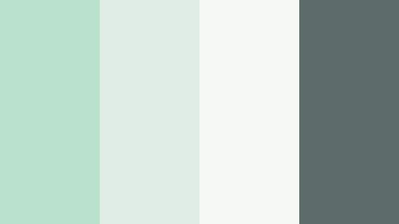
Morning Dew Whisper

- HEX Codes: #bfe7d2, #cceee0, #f3faf6, #ffffff
- Mood: Calm, weightless, and refreshing like early morning air.
- Use for: Perfect for minimalist vlog titles, wellness channel intros, and clean product explainer slides.
Morning Dew Whisper is a feather light blend of Powdered Mint and soft whites that feels almost like fog on a bright window. The subtle gradient from mint to near white creates a breathable, airy backdrop that never competes with your footage or on screen text.
Use this palette when you want a calm, spa like atmosphere for morning routines, meditation content, skincare tutorials, or minimal app explainers. In Filmora, it works well for lower thirds, text frames, and thumbnail backgrounds that need to stay clean while still having a fresh hint of color.
Pro Tip: Keep Your Powdered Mint Aesthetic Consistent with Filmora
Once you choose Morning Dew Whisper as your base, keep it consistent from intro to end screen. In Filmora, you can save custom color values for titles, shapes, and overlays using the exact HEX codes from this palette so every lower third, subtitle bar, and callout shares the same Powdered Mint tone.
Build a simple brand kit inside your project: set one color for main titles (#bfe7d2), one lighter shade for backgrounds (#f3faf6), and pure white for clean text. Reusing these settings across cuts keeps your wellness vlogs, aesthetic edits, and social clips instantly recognizable.
AI Color Palette
If you already created a Powdered Mint graphic or mood board, you can use it to drive the look of your entire edit. Filmora's AI Color Palette feature lets you grab the color mood from a single reference frame or image and apply it across your timeline.
Import a still using Morning Dew Whisper, select it as your reference, and let AI Color Palette harmonize the tones in your b roll, close ups, and cutaways. This keeps greens soft, whites gentle, and everything aligned with that dreamy morning glow, even if clips came from different cameras or shooting days.
 secure download

HSL, Color Wheels & Curves
Even with a gentle palette like Morning Dew Whisper, small color tweaks can completely change the feeling of your edit. With Filmora's HSL controls and color wheels, you can push greens slightly toward blue for a cooler, tech friendly mint, or warm them closer to yellow for a cozy lifestyle vibe. You can also refine highlights and shadows with curves so whites stay soft instead of harsh.
Use the color wheels to add a hint of mint into midtones while keeping shadows more neutral for a cinematic balance. If you need help mastering these tools, check Filmora's YouTube tutorials on advanced color correction for a step by step breakdown of how to shape Powdered Mint into a signature look.
secure download1000+ Video Filters & 3D LUTs
Once your Powdered Mint base is in place, Filmora's presets can speed up styling. Filmora's video filters and 3D LUTs make it easy to add a soft matte finish, pastel warmth, or subtle film grain that supports the Morning Dew Whisper mood without washing it out.
Try a pastel or cinematic LUT on top of your graded footage, then lower the intensity so your original Powdered Mint accents still read clearly in titles, frames, and overlays. This gives thumbnails and reels a polished, professional look while preserving that light, airy character.
secure downloadCoastal Mist Breeze

- HEX Codes: #b8e1cc, #9fc5d5, #f2f8fb, #edf7f1
- Mood: Breezy, coastal, and softly uplifting.
- Use for: Use in travel vlogs, beach holiday recaps, and airy slideshow templates to suggest sea breeze and fresh escapes.
Coastal Mist Breeze combines Powdered Mint with pale sea glass blues and soft off whites, echoing a hazy shoreline at sunrise. It feels bright and oxygen filled, but still gentle enough to let your footage stay in focus.
This palette is ideal for travel vlogs, beach B roll, spa promos, and any content that should feel like a light escape. Use the deeper blue (#9fc5d5) for accent text or icons, keep #f2f8fb as a background for titles, and let #b8e1cc tinted shapes frame your thumbnails and intro cards.
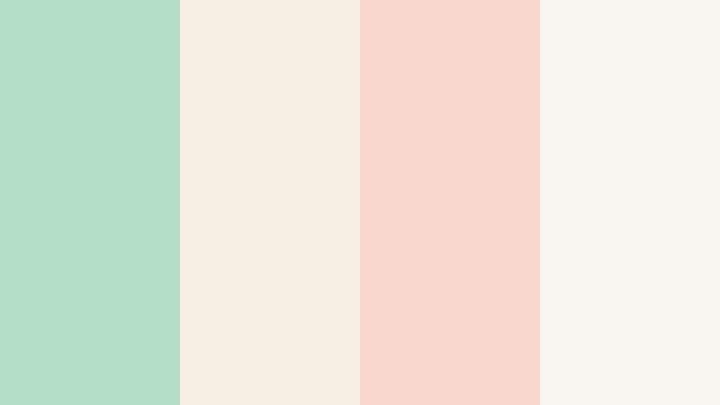
Matcha Cloud Latte

- HEX Codes: #b4dec6, #e9f5e9, #f6efe6, #fdfaf5
- Mood: Cozy, creamy, and softly energizing.
- Use for: Great for cafe vlogs, cozy study videos, and aesthetic B roll title cards.
Matcha Cloud Latte wraps Powdered Mint in creamy neutrals and off whites, like a matcha latte under soft window light. The palette feels warm but still fresh, perfect when you want calming visuals that quietly motivate focus or slow living.
Use the mint tones on frames and highlight text, with the cream shades as background cards behind captions, timers, or playlist thumbnails. In Filmora, combine this palette with subtle grain and a warm LUT to give your study with me, coffee shop tours, or lo fi edits a comforting atmosphere.
Serene Workspace Glow

- HEX Codes: #bae3cf, #e5f3ee, #f7fbfa, #d3dbe4
- Mood: Focused, clean, and thoughtfully balanced.
- Use for: Ideal for productivity tutorials, app walkthroughs, and clean UI overlays in explainer videos.
Serene Workspace Glow pairs Powdered Mint with cool grays and nearly white tones, giving a focused, distraction free feeling. It has the clarity of a tidy digital workspace, with just enough color to feel human and inviting.
Use #bae3cf and #e5f3ee for interface like elements in your videos, such as faux windows, sidebars, or callouts. The gray #d3dbe4 works well for icons and body text over pale backgrounds, especially in app demos, productivity tips, or course intros where readability matters.
Snowy Green Orchard

- HEX Codes: #b9e4cf, #e4f5ee, #ffffff, #f2ede6
- Mood: Quiet, soft, and slightly nostalgic.
- Use for: Use in winter lookbooks, soft spoken vlogs, and delicate brand openers.
Snowy Green Orchard brings together chilled orchard greens, snow whites, and a hint of warm neutral. It feels like a winter garden scene: peaceful, cinematic, and subtly nostalgic.
Choose this palette for slow vlogs, ASMR voiceovers, or seasonal brand clips. Use the powdery mint shades for subtle frames and dividers, pure white for backgrounds, and the warm beige #f2ede6 for type and logo marks to keep everything soft yet legible.
Elegant And Modern Powdered Mint Color Palettes
Minted Marble Luxe

- HEX Codes: #b4dfcb, #e7f4f0, #d3d7de, #2f3a45
- Mood: Luxurious, polished, and modern.
- Use for: Perfect for premium brand intros, logo reveals, and upscale product promos.
Minted Marble Luxe contrasts soft Powdered Mint and marble inspired grays with a deep charcoal anchor. The overall result feels high end and editorial, ideal for brands that want to be calm but clearly premium.
Use the darkest shade #2f3a45 for key text, outlines, and logo reveals, while #b4dfcb and #e7f4f0 provide gentle color fields behind scenes or product shots. This palette translates well into sleek openers, on screen captions, and pitch deck style slides built directly inside Filmora.
Gallery Atrium Light

- HEX Codes: #bfe6d3, #f5faf8, #f0ebe5, #3c4a5a
- Mood: Artful, minimal, and quietly sophisticated.
- Use for: Use in portfolio reels, architecture reels, and minimal title cards.
Gallery Atrium Light feels like natural daylight pouring into a modern museum. Powdered Mint sits beside warm stone neutrals and a deep slate accent, creating a balanced, sophisticated color story.
Use this palette in creative portfolios, architecture shorts, photography reels, and minimal case study videos. Let #bfe6d3 color accent bars or hover style lines under titles, while #3c4a5a carries headlines and logo text for crisp contrast over pale backgrounds.
Urban Botanical Minimal

- HEX Codes: #b6ddc9, #e8f4ec, #f4f1ec, #181f24
- Mood: Contemporary, grounded, and chic.
- Use for: Great for sustainable brand stories, eco startup explainers, and urban lifestyle edits.
Urban Botanical Minimal puts subtle Powdered Mint next to warm off white and inky black, giving a clean, editorial attitude. It feels like green living in a modern city: conscious but stylish.
Use #181f24 for bold typography and key icons, then soften the screen with #b6ddc9 and #e8f4ec in side panels, subtitle backgrounds, and infographics. This palette is perfect for eco products, sustainability explainers, or brand story films that need to look sharp and professional.
Nordic Calm Studio
- HEX Codes: #b9e0cd, #dfece6, #f5f7f4, #5c6c68
- Mood: Scandi calm with a design studio edge.
- Use for: Use for design tutorials, motion graphics titles, and minimalist course thumbnails.
Nordic Calm Studio captures Scandinavian minimalism with muted mint, soft grays, and a grounded graphite tone. It looks clean and intentional, like a well lit creative studio or careful UI mockup.
Apply this palette to educational content, design tips, or online course branding. Use #5c6c68 for clear, modern typography and #b9e0cd for sleek accent shapes behind your subject name, chapter titles, or portfolio labels in Filmora.
Editorial Mint Monochrome

- HEX Codes: #a9d3be, #bfe6d3, #e0f3eb, #f3fbf7
- Mood: Refined, cohesive, and gently styled.
- Use for: Ideal for fashion reels, lookbooks, and sophisticated social carousels.
Editorial Mint Monochrome layers multiple tones of Powdered Mint into a single hue story with depth and nuance. Without any strong contrast colors, everything feels unified, soft, and highly branded.
Use the darker mint #a9d3be for text and logo marks over the lightest base #f3fbf7. This palette is great for fashion, beauty, and aesthetic reels where your color identity should be instantly recognizable across all thumbnails, intros, and outro screens.
Fresh And Playful Powdered Mint Color Palettes
Sorbet City Pop

- HEX Codes: #b5e0cc, #ffd2e2, #ffe9b8, #ffffff
- Mood: Playful, poppy, and sweet like city dessert shops.
- Use for: Use in vlog thumbnails, lifestyle shorts, and fun brand intros for young audiences.
Sorbet City Pop combines Powdered Mint with strawberry pink and mango sherbet for a candy bright look. It is lighthearted and energetic, perfect when you want your content to feel cute and clickable.
Use mint and pink as your main brand accents on titles and buttons, with #ffe9b8 as a soft highlight color on badges and stickers. This palette shines on YouTube thumbnails, TikTok cover frames, and fast paced lifestyle intros made inside Filmora.
Pastel Arcade Dream

- HEX Codes: #b2ddca, #c2d8ff, #ffc7da, #fff4c9
- Mood: Retro, dreamy, and slightly nostalgic.
- Use for: Perfect for gaming highlights, retro inspired motion graphics, and playful channel art.
Pastel Arcade Dream throws Powdered Mint into a mix of pastel blue, pink, and yellow, reminiscent of vintage arcade cabinets and soft neon. It feels retro but gentle, making it a great fit for fun edits that are still easy on the eyes.
Use the blue and pink for highlight text and score counters, while mint and yellow form background blocks or frames. This palette is ideal for gaming highlight reels, nostalgic meme edits, or animated titles where you want a playful, lofi aesthetic.
Garden Picnic Story

- HEX Codes: #b9e2cf, #f7f1da, #ffdfc7, #fbe9f0
- Mood: Lighthearted, sunny, and wholesome.
- Use for: Great for family vlogs, picnic reels, and cottagecore aesthetic edits.
Garden Picnic Story pairs Powdered Mint with buttercream yellow, peach, and blush, creating a soft outdoor storybook mood. It feels sunny and friendly without harsh saturation.
Use the mint as your grounding color in overlays and frames, then let the warm tones highlight key words, stickers, and icons. Family vlogs, weekend recap reels, and cottagecore aesthetic videos all benefit from this palette when designed in Filmora.
Boba Bar Aesthetic
- HEX Codes: #b4dec7, #f8efe4, #f9d7cf, #f9f5f0
- Mood: Trendy, cozy, and social feed ready.
- Use for: Use in cafe reviews, food vlogs, and aesthetic reels with text overlays.
Boba Bar Aesthetic mixes Powdered Mint with creamy browns and blushy neutrals for a trendy cafe look. It feels cozy and Instagram ready, like latte art and pastel straws.
Use mint on your main accent shapes and progress bars, with the warm tones handling background panels and captions. Food vlogs, cafe tours, and lifestyle reels all gain a soft, shareable polish when you apply this palette to titles, callouts, and end screens in Filmora.
Cinematic Nature Inspired Powdered Mint Color Palettes
Forest Stream Fade

- HEX Codes: #b8e3cf, #7da894, #445f55, #1f2e2a
- Mood: Cinematic, grounded, and quietly dramatic.
- Use for: Perfect for travel films, hiking reels, and moody landscape sequences.
Forest Stream Fade places Powdered Mint highlights over deeper forest greens and shadowy teal blacks. It feels rich and cinematic, like light glancing off river water inside a dense forest.
Use the light mint #b8e3cf for subtle title accents and interface lines, while #445f55 and #1f2e2a anchor text, letterboxing bars, or logo marks. This palette is excellent for outdoor travel films, nature B roll, and moody hiking reels that you grade directly within Filmora.
Foggy Cliff Horizon

- HEX Codes: #b2ddc8, #cedfd9, #88979b, #222931
- Mood: Misty, introspective, and filmic.
- Use for: Use in cinematic travel intros, slow drone shots, and reflective storytelling edits.
Foggy Cliff Horizon blends Powdered Mint with coastal fog grays and rugged slate, capturing the feeling of a misty headland. It is calm but dramatic, perfect for slower, reflective storytelling.
Use the lighter tones for backgrounds and semi transparent overlays, and rely on #222931 for titles and chapter headings that sit over drone shots or long landscape scenes. This palette works especially well for cinematic openers, reflective voiceover pieces, and documentary style reels edited in Filmora.
Tips for Creating Powdered Mint Color Palettes
Powdered Mint is versatile, but it looks best when balanced with the right neutrals, contrasts, and accent colors. Use these tips to design your own palettes for video edits, branding, and thumbnails.
- Pair Powdered Mint with soft off whites or light grays to keep the overall mood airy and readable for text overlays.
- Add one darker anchor color (charcoal, deep slate, or inky green) for headlines, logos, and UI elements that must stay legible on small screens.
- Use warm neutrals (cream, beige, soft blush) when you want cozy lifestyle or cafe vibes, and cooler neutrals (blue gray, slate) for tech or productivity content.
- Limit bright accent colors to one or two hues so Powdered Mint remains the star of your brand and does not get lost in the mix.
- Test your palettes on real frames from your footage inside Filmora, checking that subtitles and buttons remain readable in both light and dark scenes.
- Save frequently used HEX codes in your Filmora title and graphic presets so your YouTube thumbnails, intros, and lower thirds always match.
- When color grading, protect skin tones and only gently push greens toward your Powdered Mint hue using HSL, to keep people looking natural on screen.
- Create separate versions of your palette for light mode and dark mode designs, slightly adjusting brightness and contrast to suit each background.
Powdered Mint color palettes can completely reshape the mood of your content, from calm productivity spaces to cinematic landscapes and playful lifestyle reels. By choosing a palette that fits your message, you give your channel or brand a clear visual identity that audiences remember.
Experiment with these 15 Powdered Mint combinations in Filmora, building custom titles, gradients, and overlays with the provided HEX codes. Once you find a look you love, turn it into a repeatable style for intros, thumbnails, and social cutdowns so every piece of content feels part of the same visual world.
Whether you are editing wellness vlogs, wedding highlights, or lofi study reels, Powdered Mint offers a soft, modern base you can adapt with a few careful tweaks in color grading. Use Filmora's tools to keep that look consistent and polished across all your projects.
secure download