
 100% Security Verified | No Subscription Required | No Malware


 ChatGPT
 Perplexity
 Gemini
 Claude
 Grok
Grok
Professional color palettes lean on confident blues, cool grays, and balanced neutrals that signal trust, stability, and clarity. In video and branding, these tones often frame leaders, highlight data, and support serious messages without feeling cold or dull. Small accents of brighter color help guide the viewer to calls to action, key stats, or important moments in your story.
This guide brings together 15 professional color palette ideas with HEX codes you can use for videos, YouTube thumbnails, logos, channel branding, intros, and office presentations. Each palette is ready to drop into your workflow, and Filmora users can quickly apply and refine these looks across full edits, B-roll, and social cutdowns.
In this article
Corporate & Clean Professional Color Palettes
Boardroom Blue Steel
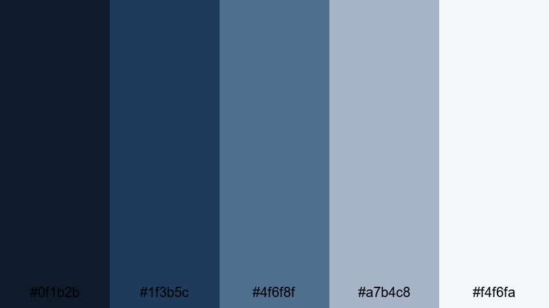
- HEX Codes: #0f1b2b, #1f3b5c, #4f6f8f, #a7b4c8, #f4f6fa
- Mood: confident, stable, and trustworthy
- Use for: Ideal for corporate intros, pitch videos, and business channel branding where reliability is key.
This palette mixes deep navy and steel blue with soft, almost airy neutrals to give your visuals a polished and dependable feel. The darkest tones (#0f1b2b, #1f3b5c) work well for backgrounds, title cards, and lower thirds, while the mid and light blues help frame people and products without distraction.
Use the brightest shade (#f4f6fa) for slide-style layouts, graphs, and YouTube thumbnail backgrounds, then layer darker blues for text and accents. For intros, try a navy background with soft blue outlines around your logo to create a serious but modern professional presence.
Pro Tip: Enhance Consistent Professional Visuals with Filmora
When you build a clean corporate look like Boardroom Blue Steel, consistency is what makes it feel truly professional. In Filmora, you can set your navy and steel blue as brand colors for titles, shapes, and lower thirds, then reuse them across intros, B-roll overlays, and end screens so your whole video feels unified.
Create a simple style guide inside your project: one navy for backgrounds, one steel blue for key lines and icons, and one light neutral for text blocks. Save your favorite title templates and graphic presets in Filmora so every new video for your brand automatically matches this palette.
AI Color Palette
If you already have a brand slide, website screenshot, or logo that uses this professional palette, you can let Filmora handle the heavy lifting. Filmora's AI Color Palette feature analyzes a reference image and applies that color mood to other clips in your timeline.
Import your reference frame with the exact blues and neutrals you like, then match the rest of your footage so interview shots, office B-roll, and screen recordings all share the same cool, confident tone. This speeds up branding work and keeps your videos looking like part of the same professional system.
 secure download

HSL, Color Wheels & Curves
Even inside a strict professional palette, you may need to tweak skin tones, office lighting, or screen captures. With HSL and color wheels in Filmora, you can nudge blues slightly toward teal for a fresher feel, deepen shadows for a more cinematic boardroom look, or lift highlights so charts and text stay crisp.
Use the curves panel to gently increase contrast in the midtones and add a subtle S-curve, then refine individual color ranges so your navy and steel blue stay clean instead of drifting toward purple. For a full walkthrough of grading tools, check out Filmora's color correction guide and apply the same logic to your own professional palettes.
secure download1000+ Video Filters & 3D LUTs
Once your base colors are in place, Filmora can push the style further with ready-made filters and LUTs. A subtle corporate LUT can add gentle contrast and cool down highlights, while a clean presentation filter can brighten whites without blowing out your steel blue branding.
Explore Filmora's video filters and 3D LUTs to quickly test different professional looks: glossy tech, muted documentary, or high-key presentation. Apply them to adjustment layers so you can switch entire looks on and off without re-grading every single clip.
secure downloadExecutive Navy Neutral
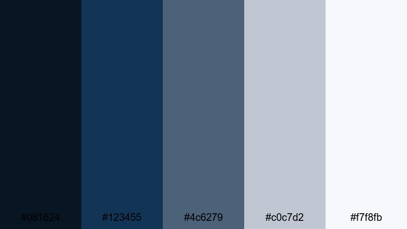
- HEX Codes: #081624, #123455, #4c6279, #c0c7d2, #f7f8fb
- Mood: formal, composed, and strategic
- Use for: Well suited to executive interviews, financial explainers, and LinkedIn video assets.
Executive Navy Neutral leans into classic boardroom style: deep navy foundations, softened by cool grays and off white. The darkest tones create a sense of gravitas for backgrounds behind CEOs, analysts, or keynote speakers, while the lighter grays and whites keep on-screen graphics easy to read.
Use #081624 or #123455 for full-screen title cards and lower thirds, then reserve #c0c7d2 and #f7f8fb for text panels, overlays on B-roll, and clean thumbnail layouts. This palette excels on LinkedIn covers, corporate podcast visuals, and any professional-themed video that needs to feel composed and deliberate.
Crisp Presentation Whites
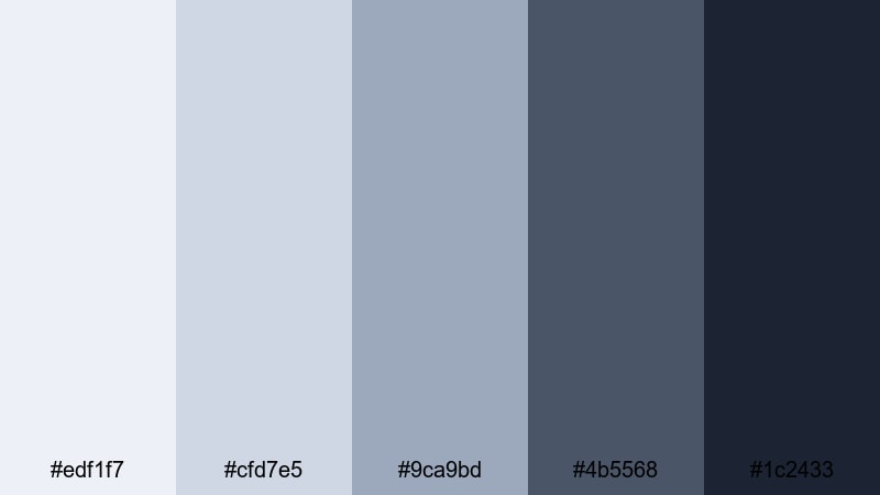
- HEX Codes: #edf1f7, #cfd7e5, #9ca9bd, #4b5568, #1c2433
- Mood: clean, organized, and insightful
- Use for: Great for slide-style videos, tutorial overlays, and product walkthroughs with lots of text.
This palette puts light, almost paper-like whites and soft blues at the center, backed by slate accents. It feels like a modern presentation deck brought to life: uncluttered, data friendly, and easy on the eyes even with a lot of on-screen information.
Use #edf1f7 or #cfd7e5 as your main slide and thumbnail backgrounds to keep everything bright but not harsh. The darker shades (#4b5568 and #1c2433) provide strong contrast for titles, labels, and callouts around charts or UI walkthroughs. It is ideal for how-to videos, SaaS tutorials, and any content where clarity and structure matter.
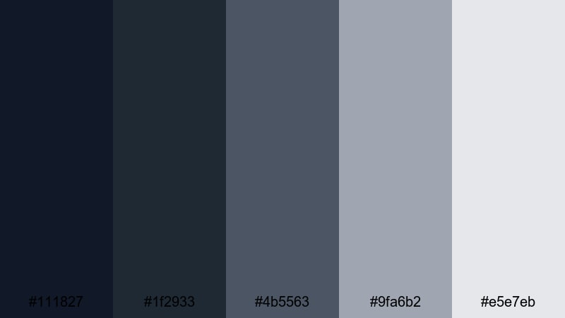
Tech Startup Slate
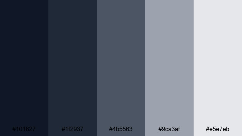
- HEX Codes: #101827, #1f2937, #4b5563, #9ca3af, #e5e7eb
- Mood: modern, focused, and understated
- Use for: Perfect for SaaS demos, app promos, and UX focused explainers.
Tech Startup Slate gives you layered cool grays and charcoals that suggest modern interfaces and product dashboards. It avoids bright colors, which keeps attention on your app screen or feature walkthrough rather than flashy backgrounds.
Use the lighter grays (#9ca3af, #e5e7eb) behind screen captures and UI overlays, then frame them with darker tones for header bars, navigation strips, and captions. For YouTube thumbnails, a dark slate base with a lighter card for text looks both techy and professional, especially when you overlay minimal icons or mockup devices.
Consulting Trust Tones
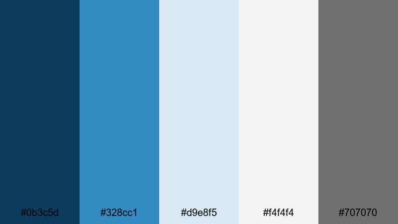
- HEX Codes: #0b3c5d, #328cc1, #d9e8f5, #f4f4f4, #707070
- Mood: approachable, knowledgeable, and calm
- Use for: Use in consulting reels, coaching videos, and service based brand intros.
Consulting Trust Tones combines dependable blue hues with gentle neutrals, giving your content the feel of a friendly yet expert advisor. The medium and light blues are inviting without being too playful, which works well for coaches, consultants, and service businesses.
Let #0b3c5d act as your anchor for logos and key text, while #328cc1 and #d9e8f5 highlight steps, frameworks, or transformation graphics in your videos. Use the neutrals (#f4f4f4, #707070) for backgrounds, bullet lists, and lower thirds, especially in case study videos and webinar intros where you want viewers to feel both reassured and engaged.
Elegant & Minimal Professional Color Palettes
Monochrome Studio Focus
- HEX Codes: #111827, #1f2933, #4b5563, #9fa6b2, #e5e7eb
- Mood: minimal, focused, and editorial
- Use for: Ideal for talking head videos, course content, and high end portfolio reels.
This monochrome palette moves smoothly from deep charcoal to soft gray, creating a neutral stage that never competes with your subject. It has an editorial feel, like a modern magazine layout or studio portrait set, which immediately lifts the perceived quality of your content.
Use the darker shades (#111827, #1f2933) for backgrounds behind presenters and title slides, then keep text and UI elements in the mid and lighter tones for subtle contrast. It is a strong choice for online courses, knowledge hubs, and portfolio reels where you want the work or the speaker to be the star, not the colors.
Soft Ivory Office
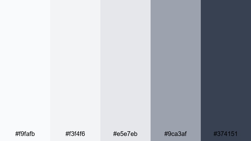
- HEX Codes: #f9fafb, #f3f4f6, #e5e7eb, #9ca3af, #374151
- Mood: light, calm, and organized
- Use for: Great for workspace tours, productivity videos, and lifestyle focused business content.
Soft Ivory Office feels like a clean, well-lit workspace: plenty of light neutrals, gentle grays, and a reserved charcoal accent. It gives content a breathable, organized look that fits productivity channels, digital planning content, and behind-the-scenes office vlogs.
Use the lightest tones for backgrounds, checklists, and whiteboard-style graphics. Bring in #374151 sparingly for headings, icons, and lower thirds so your layouts stay minimal but readable. This palette translates beautifully into YouTube thumbnails featuring desks, laptops, and planners, especially when you want a professional yet lifestyle-friendly aesthetic.
Graphite Portfolio
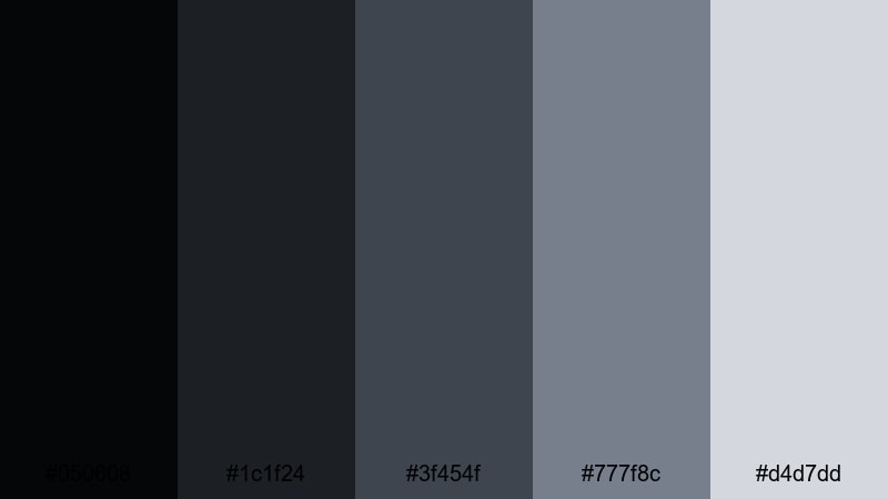
- HEX Codes: #050608, #1c1f24, #3f454f, #777f8c, #d4d7dd
- Mood: sleek, serious, and refined
- Use for: Perfect for motion graphics portfolios, cinematography reels, and brand identity showcases.
Graphite Portfolio layers rich charcoals and soft metallic grays to create a cinematic yet understated vibe. It works especially well when showcasing creative work, since the muted tones frame your clips or designs without pulling focus.
Use #050608 and #1c1f24 for dark, immersive backgrounds in showreels and portfolio intros. Let #777f8c and #d4d7dd highlight project titles, credits, and subtle interface elements. This palette is a strong option if you want your channel or portfolio site to feel like a design studio or production house without relying on bright color pops.
Warm Espresso Workspace
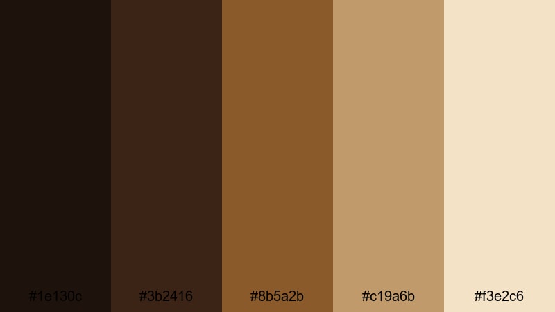
- HEX Codes: #1e130c, #3b2416, #8b5a2b, #c19a6b, #f3e2c6
- Mood: warm, grounded, and sophisticated
- Use for: Use for office b roll, consulting intros, and cozy but premium brand visuals.
Warm Espresso Workspace swaps cool corporate blues for rich browns and latte neutrals. It evokes coffee shops, leather notebooks, and wood desks, which can make consulting or coaching content feel more human and relatable while still polished.
Use the darker browns (#1e130c, #3b2416) for background plates, frames, and overlays on office B-roll. Accent with #c19a6b and #f3e2c6 in titles and thumbnail backgrounds to create a cozy glow. This palette suits personal brand intros, podcast visuals, and behind-the-scenes content where you want viewers to feel invited into your workspace.
Muted Brand Neutral
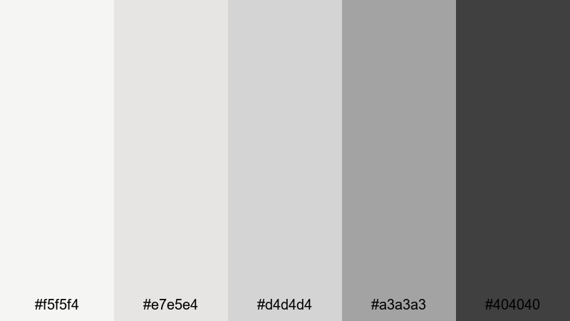
- HEX Codes: #f5f5f4, #e7e5e4, #d4d4d4, #a3a3a3, #404040
- Mood: balanced, flexible, and timeless
- Use for: Great as a base palette for logos, lower thirds, and clean UI elements in videos.
Muted Brand Neutral is a flexible system of soft beiges and grays that plays nicely with almost any accent color. On its own, it gives your content a calm, timeless look; paired with a strong brand accent, it becomes an elegant canvas.
Use the light tones as default backgrounds for overlays, info boxes, and callouts. Let #404040 handle text, icons, and visual anchors. Once this neutral base is in place, you can introduce your brand accent color (teal, lime green, blue, etc.) in Filmora for buttons, arrows, and key highlights without overwhelming the frame.
Bold & Dynamic Professional Color Palettes
Pitch Deck Impact
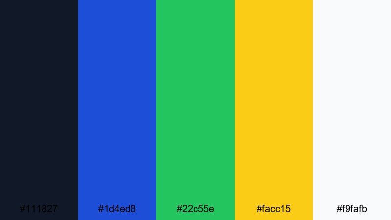
- HEX Codes: #111827, #1d4ed8, #22c55e, #facc15, #f9fafb
- Mood: energetic, persuasive, and smart
- Use for: Ideal for pitch decks turned into video, startup launches, and keynote style content.
Pitch Deck Impact builds on a dark, serious base and adds sharp accents of blue, green, and yellow. It still looks corporate, but the energy level is higher, perfect for founders and teams trying to sell a vision and stand out in a crowded feed.
Anchor your layouts with #111827 for backgrounds and title slides. Use #1d4ed8 for primary headers and key stats, #22c55e for growth metrics or success markers, and #facc15 to emphasize CTAs and critical numbers. For thumbnails, a dark background with one or two bold accent shapes and white text feels both professional and high impact.
Analyst Dashboard Clarity
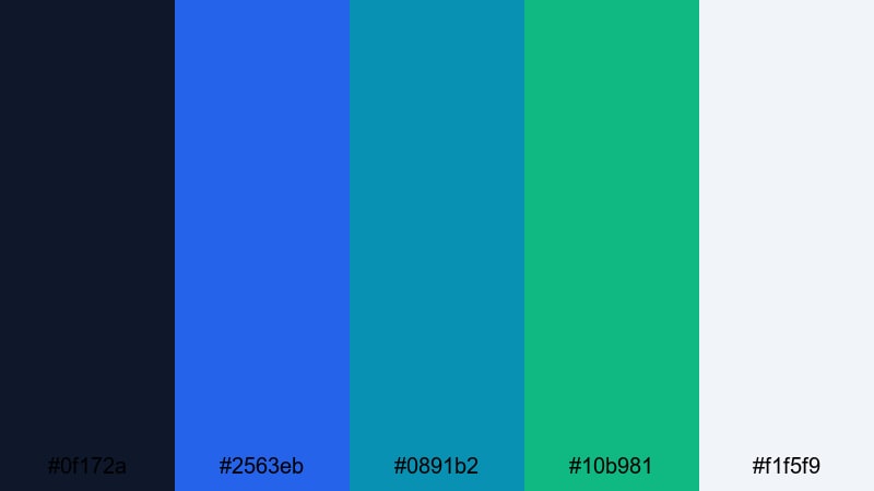
- HEX Codes: #0f172a, #2563eb, #0891b2, #10b981, #f1f5f9
- Mood: analytical, modern, and clear
- Use for: Perfect for data explainers, dashboard walkthroughs, and KPI focused presentations.
Analyst Dashboard Clarity pairs deep navy with intense but controlled blue, teal, and green accents. It mimics the look of modern analytics dashboards, making it an ideal fit for KPI reviews, SaaS reporting, and finance or marketing breakdowns.
Use #0f172a as your backdrop for charts and interface screenshots. Then assign #2563eb, #0891b2, and #10b981 to specific data series or categories so viewers can easily track them across slides and scenes. #f1f5f9 works perfectly as a base for infographics, milestone cards, and summary slides, especially in YouTube or webinar thumbnails that promise clear, data-driven insights.
Modern Fintech Surge
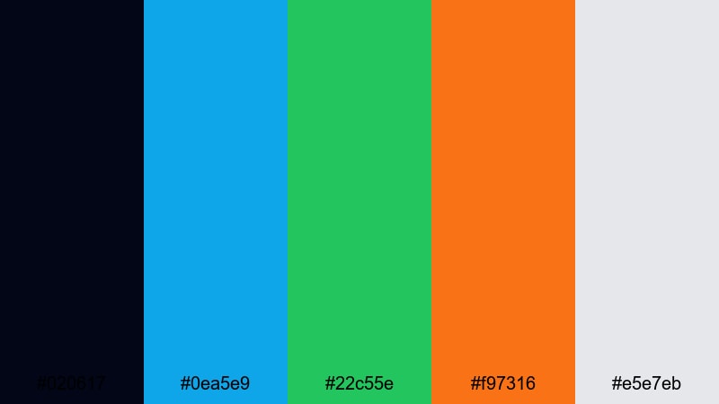
- HEX Codes: #020617, #0ea5e9, #22c55e, #f97316, #e5e7eb
- Mood: innovative, fast paced, and confident
- Use for: Great for fintech promos, crypto explainers, and modern product teasers.
Modern Fintech Surge leans on an inky black blue base with electric cyan, green, and orange highlights. It feels like trading terminals, neon cityscapes, and live market feeds, which is ideal for financial tech brands that want to communicate speed and innovation.
Use #020617 for dramatic backgrounds and transitions, then light up key numbers, charts, and CTAs with #0ea5e9 and #22c55e. #f97316 works as a powerful warning or highlight color for risks, alerts, or limited-time offers. In thumbnails and intros, this contrast-heavy palette instantly signals tech-forward finance content.
Creative Agency Accent
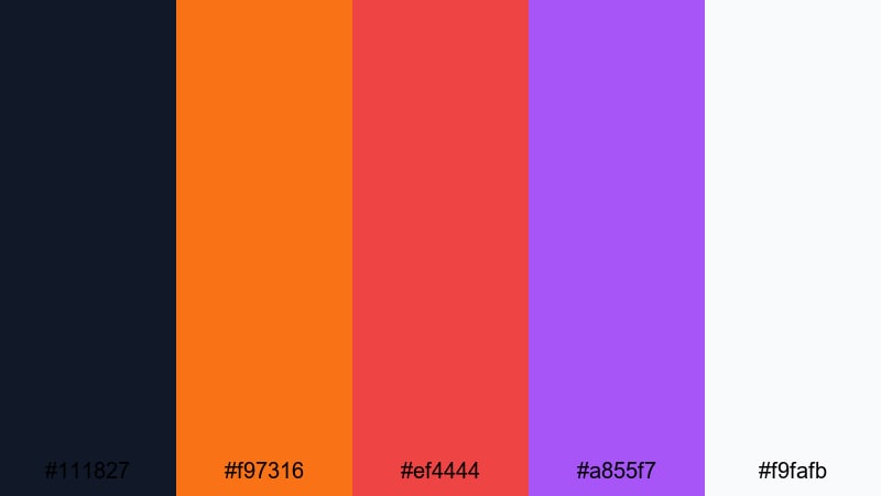
- HEX Codes: #111827, #f97316, #ef4444, #a855f7, #f9fafb
- Mood: bold, creative, and memorable
- Use for: Use for agency reels, showreels, and brand refresh announcements.
Creative Agency Accent anchors your design in a deep neutral, then adds punchy orange, red, and purple to express creativity and confidence. It is the kind of palette that looks at home on design agency websites, concept boards, and energetic showreels.
Reserve #111827 and #f9fafb for background and text pairings, ensuring strong readability. Then alternate #f97316, #ef4444, and #a855f7 for section markers, badges, and animated shapes in your videos. This approach keeps the overall feel professional while still giving you room to show off a bold, creative personality in thumbnails, intro stings, and portfolio pieces.
Webinar Highlight Glow
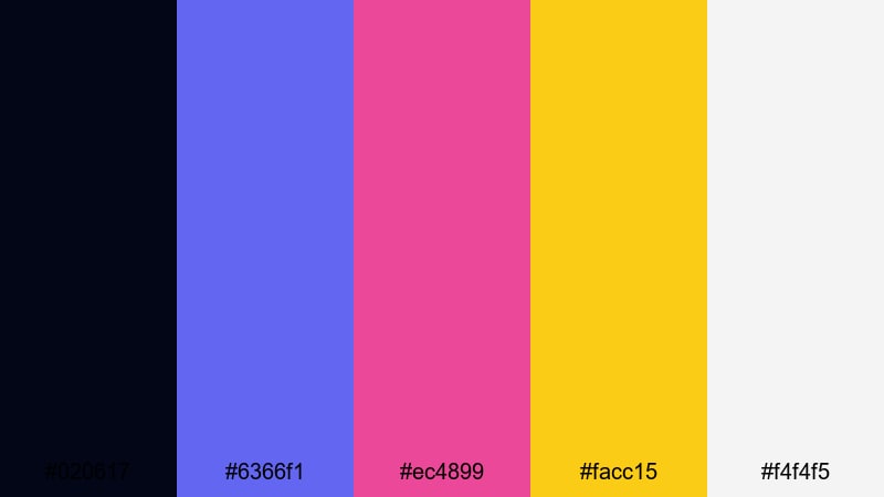
- HEX Codes: #020617, #6366f1, #ec4899, #facc15, #f4f4f5
- Mood: engaging, high energy, and polished
- Use for: Perfect for webinars, live stream overlays, and event promos that must stand out in feeds.
Webinar Highlight Glow balances dark midnight tones with bright indigo, pink, and yellow accents. It immediately feels like an event or live moment, which is perfect for making your promos and stream overlays catch attention on crowded platforms.
Use #020617 as your base for lower thirds, frames, and countdown timers. Apply #6366f1 and #ec4899 for buttons, badges, and topic tags, while #facc15 spotlights times, dates, and registration CTAs. The soft neutral #f4f4f5 is useful for text blocks, agenda slides, and email thumbnail graphics where you still want high readability along with a polished professional glow.
Tips for Creating Professional Color Palettes
When you build your own professional color palette for video or design, focus on clarity, trust, and consistency across every asset: intros, B-roll, slides, thumbnails, and social cuts.
- Pick one dark anchor color for backgrounds and one light neutral for text areas, then add one or two accent colors for highlights and CTAs.
- Check contrast between text and background with simple tests: if a thumbnail is readable at small size, your palette is working.
- Limit bright accent colors to key information (numbers, buttons, important phrases) so professional layouts do not feel noisy.
- Match your palette to real-world footage: if your office or brand uses certain colors, sample them and build around those tones.
- Stay consistent across platforms by reusing the same HEX codes in your website, slides, channel art, and Filmora title presets.
- Balance cool and warm tones: cool blues and grays communicate logic and structure, while small warm accents can add approachability.
- Test palettes on both light and dark backgrounds to see how they behave in night-mode UIs, slide decks, and social media feeds.
- Create a simple style guide (primary, secondary, neutral, and alert colors) and keep it on hand when designing new video elements.
Professional color palettes do more than look tidy; they shape how viewers perceive your expertise, your brand values, and the seriousness of your message. Calm blues, structured grays, and deliberate accents can quickly turn simple content into something that feels premium and trustworthy.
Use these 15 palettes as ready-made starting points, then fine-tune them inside Filmora to match your logo, office, and footage. Whether you are designing thumbnails, pitch videos, or full course series, a clear palette will keep your visuals aligned and on brand.
Open a new project in Filmora, pick one palette, and try applying it to titles, overlays, and filters across a full edit. Small, consistent color choices will make every frame look more intentional and more professional.
secure download