
 100% Security Verified | No Subscription Required | No Malware

Silver Screen Gray is the color of movie projectors, studio lights bouncing off metal, and classic black-and-white frames. It feels calm, trustworthy, and refined, which makes it ideal for creators who want a cinematic, professional look without loud colors taking over the screen. In video editing, this tone helps frame your subject, support contrast, and keep attention on faces, products, or text.
For branding, YouTube thumbnails, intros, and lower thirds, Silver Screen Gray works as a neutral backbone that can lean either cool and modern or warm and nostalgic. Below are 15 Silver Screen Gray color palettes with ready-to-use HEX codes, tailored for creators and Filmora users who want cohesive visuals across videos, social posts, and channel identities.
In this article
Cinematic Neutrals Silver Screen Gray Color Palettes
Studio Spotlight Neutrals

- HEX Codes: #9fa2a7, #cfd2d6, #6b6e73, #f5f5f6, #2f343b
- Mood: Calm, polished, and cinematic with a subtle studio-lit feel.
- Use for: Great for channel intros, film breakdowns, and professional YouTube banners where you want a clean, cinematic base.
This palette layers soft silvery grays with deeper charcoal to mimic the look of a real studio set. The lighter tones (#cfd2d6, #f5f5f6) feel like bounced light on white walls, while #6b6e73 and #2f343b ground the frame with strong contrast.
Use it for cinematic review thumbnails, title cards, and on-screen graphics where you want clarity without harsh whites or true black. It works especially well for talking head videos with neutral backdrops, subtle motion graphics for intros and outros, and branding that needs a filmic yet business-ready tone.
Pro Tip: Build a Cinematic Silver Screen Gray Look in Filmora
To keep a Studio Spotlight Neutrals vibe across your entire project, start by setting a basic color correction on one hero shot in Filmora and save it as a preset. Apply this same preset to intros, b-roll, and end screens so your Silver Screen Gray tones stay consistent from scene to scene.
You can then design simple lower thirds and subscribe buttons using the light grays for backgrounds and the deeper charcoal for text. By repeating these tones across your timeline, your channel immediately feels more cohesive and cinematic.
AI Color Palette
If you have a reference still that perfectly captures your Silver Screen Gray studio mood, you can turn it into a look for your whole video. Filmora's AI Color Palette feature analyzes that frame and applies its tones to other clips, helping you balance grays, highlights, and shadows automatically.
Import your reference image, match it to your key shots, and let AI handle the heavy lifting. This is ideal when you want all of your footage, thumbnails, and social edits to carry the same Silver Screen Gray signature without manual tweaking on every clip.
 secure download

HSL, Color Wheels & Curves
Once your base look is matched, fine-tune your Silver Screen Gray mood with HSL, color wheels, and curves. In Filmora, gently lower saturation in the midtones to keep grays clean, then use the color wheels to cool your shadows and slightly warm your highlights for a subtle studio contrast.
If your footage feels flat, add a slight S-curve to deepen charcoals without crushing detail, and lift highlights so text overlays remain readable. You can follow along with Filmora's YouTube tutorials on advanced color grading to refine these micro-adjustments step by step.
secure download1000+ Video Filters & 3D LUTs
If you want to push this Silver Screen Gray palette toward a specific style fast, Filmora's video filters and 3D LUTs make it easy. You can start with a neutral or film-inspired LUT, then dial it back to keep grays clean while adding subtle texture or contrast.
Combine your chosen LUT with light vignettes or soft highlight glows to enhance that studio spotlight feel. This workflow works well for batch-stylizing intros, outros, and short clips for social media so everything carries the same polished gray signature.
secure downloadMonochrome Premiere Frame

- HEX Codes: #a3a5a9, #dcdde1, #7b7e83, #50535a, #1c1f24
- Mood: Sophisticated, editorial, and slightly dramatic like a black-and-white film still.
- Use for: Perfect for minimalist lower thirds, documentary credits, and sleek UI overlays in edit tutorials.
Monochrome Premiere Frame leans into a full grayscale spectrum, from soft Silver Screen Gray midtones to near-black #1c1f24. It feels like a frame lifted from an art-house film or premium documentary.
Use this palette when you want your footage to carry the color, and your graphics to stay timeless and unobtrusive. It is ideal for subtle lower thirds, end credits, timeline graphics in tutorials, and minimalist thumbnails that still grab attention through contrast, not color.
Soft Focus Studio Mist

- HEX Codes: #b5b8bc, #e5e7ea, #8e9297, #f8f8fa, #44474d
- Mood: Airy and gentle with a soft-focus, slightly dreamy studio atmosphere.
- Use for: Use for lifestyle channels, talking-head setups, and subtle LUT-inspired graphics that should feel modern but not stark.
Soft Focus Studio Mist is all about lifted midtones and diffused light. The pale grays (#e5e7ea, #f8f8fa) create a floating, airy feeling, while #44474d anchors key text and icons so nothing looks washed out.
This works well for lifestyle vlogs, productivity content, and channel branding that wants neutrality without feeling cold. Apply these tones to backgrounds, frames, and callouts in Filmora to make your subject feel softly lit and easy on the eyes during long watch sessions.
Retro Reel Grain

- HEX Codes: #979aa0, #c3c4c8, #6b6d72, #3d4045, #111317
- Mood: Nostalgic, moody, and textured like vintage film grain.
- Use for: Best for film essays, classic movie tributes, and thumbnail text blocks with a retro cinema edge.
Retro Reel Grain mixes smoky Silver Screen Gray with deeper charcoals to echo old projectors and celluloid frames. The near-black #111317 and deep #3d4045 introduce a gritty, analog edge while still feeling controlled.
Use this palette for film analysis channels, retro title cards, and overlays paired with grain and vignette effects in Filmora. It works beautifully for thumbnails built around large, bold text, still frames from classic movies, and countdown graphics for screenings or live premieres.
Silver Screen Title Card

- HEX Codes: #a7aaaf, #f1f2f4, #7a7d83, #d0d2d6, #26292f
- Mood: Classic Hollywood elegance with a clean and timeless feeling.
- Use for: Ideal for opening titles, credit rolls, and branded bumpers that need an iconic film look.
Silver Screen Title Card balances bright, refined silvers with strong charcoal for a true cinema intro aesthetic. The interplay between #f1f2f4 and #26292f mirrors traditional black-and-white title slates while staying softer and more modern.
Use this palette for animated opening sequences, lower thirds with subtle motion, and intermission cards between segments. It also adapts nicely into logos and watermarks for film-inspired channels that want a lasting, classic identity.
Modern Minimal Silver Screen Gray Color Palettes
Urban Lens Minimal
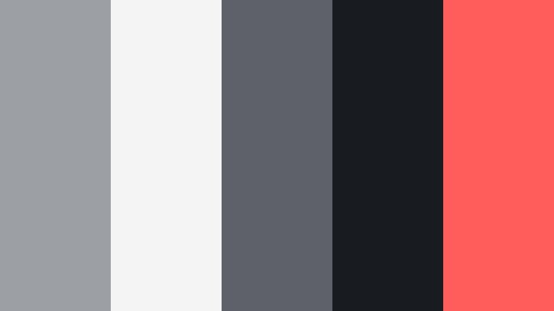
- HEX Codes: #9c9fa4, #f4f4f5, #5e6268, #181b20, #ff5c5c
- Mood: Contemporary and sleek with a bold urban accent.
- Use for: Perfect for tech reviews, street photography vlogs, and thumbnails that need one strong pop of color.
Urban Lens Minimal pairs cool Silver Screen Gray shades with a punchy red accent (#ff5c5c). The grayscale tones set a restrained backdrop, while the red acts like a neon sign or recording light in the frame.
Use grays for backgrounds, frames, and panels, then reserve #ff5c5c for buttons, arrows, and key text in your thumbnails and titles. This approach keeps everything feeling modern and tech-savvy while telling viewers exactly where to look first.
Clean Edit Workspace

- HEX Codes: #b8bbc0, #ffffff, #909399, #4a4d53, #4bb4ff
- Mood: Fresh, organized, and productive like a neatly arranged editing desk.
- Use for: Use in tutorial lower thirds, software UI mockups, and productivity-focused vlogs.
Clean Edit Workspace is bright and structured, combining Silver Screen Gray midtones with crisp white and a precise blue accent (#4bb4ff). It feels like a refined software interface or a minimalist desk setup.
Use the blue for highlights on key information, chapters, and call-to-action buttons, while the grays shape panels and borders around screen captures. This palette fits productivity vlogs, editing tutorials, and any content where you want viewers to feel focused and organized.
Minimal Slate Overlay

- HEX Codes: #a0a3a8, #e9eaec, #74777c, #31343a, #ffb547
- Mood: Balanced and minimal with a warm design accent.
- Use for: Great for overlay frames, chapter markers, and thumbnail badges that need clarity and warmth.
Minimal Slate Overlay uses a structured set of cool grays, then adds a soft amber accent (#ffb547) to avoid looking too clinical. The darker #31343a gives you a strong base for type, while the lighter tones keep overlays feeling light.
In practice, this palette works great when you build chapter cards, lower thirds, or badges in Filmora. Use amber for icons and small shapes that guide the viewer, leaving most backgrounds in Silver Screen Gray so your footage still takes center stage.
Graphite Grid Interface

- HEX Codes: #8e9196, #d7d8dc, #5b5e63, #202329, #3cd6b4
- Mood: Technical, clean, and a bit futuristic with a clear interface feel.
- Use for: Best for motion graphics, HUD overlays, and app-style lower thirds in video explainers.
Graphite Grid Interface takes Silver Screen Gray into a digital, HUD-inspired direction. The range of graphite tones makes strong grids and panels, while the minty teal #3cd6b4 feels like an active status light or data highlight.
Apply these colors to motion graphics, step-by-step explainers, and any tech content where interfaces are part of the story. In thumbnails, use teal for progress bars, KPI numbers, or notification icons to instantly communicate a modern, app-like experience.
Warm & Moody Silver Screen Gray Color Palettes
Backstage Warm Glow

- HEX Codes: #9e9fa3, #f2e6dd, #6d6b70, #3b3635, #c28a5a
- Mood: Intimate, backstage, and warmly cinematic.
- Use for: Use for behind-the-scenes reels, studio tour vlogs, and cozy podcast visuals.
Backstage Warm Glow mixes cool Silver Screen Gray with latte and bronze tones to recreate the feeling of warm bulbs against neutral curtains. The palette feels personal and cinematic, like you are just offstage or in a dressing room.
Use the warm shades (#f2e6dd, #c28a5a) on lamps, borders, and badges, while the grays frame hosts or guests in podcast setups. It is especially strong for behind-the-scenes content, studio tours, and creator talks where you want viewers to feel invited into your space.
Twilight Theater Seats

- HEX Codes: #8c8f95, #dedfe3, #5a5d64, #2b2a35, #a8544f
- Mood: Cinematic, moody, and dramatic like a quiet theater before the film starts.
- Use for: Perfect for film commentary, dramatic storytimes, and suspense-oriented thumbnails.
Twilight Theater Seats layers ashy grays and deep plum-charcoal with a muted red-brown accent (#a8544f). It feels like velvet seats, dim aisle lights, and the hush before the opening credits roll.
Use this palette to add drama to storytime thumbnails, reaction video frames, and commentary title cards. Let the darker hues dominate backgrounds, then use the red-brown for key titles or small accents that hint at tension or emotion.
Director Lounge Ember
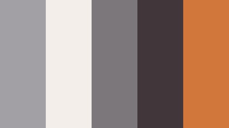
- HEX Codes: #a2a0a4, #f3eee9, #7b777a, #413639, #d0773b
- Mood: Luxurious, relaxed, and creative like a director lounge by the fireplace.
- Use for: Great for branding creative agencies, portfolio reels, and cinematic podcast covers.
Director Lounge Ember softens Silver Screen Gray into taupes, then adds a glowing ember tone (#d0773b) for warmth and luxury. It feels like leather chairs, soft conversation, and a quiet brainstorm after a shoot.
This palette is ideal for creative studios or personal brands that want to look premium without feeling stiff. Use the ember hue on logos, key lines, and buttons, keeping most of your UI and overlays in neutral grays to maintain elegance.
Rainy Set Backlot

- HEX Codes: #91949a, #cfd3d8, #5c5f66, #25282e, #5f7b8c
- Mood: Brooding, atmospheric, and quietly emotional like a rainy movie set.
- Use for: Ideal for travel vlogs on overcast days, emotional b-roll sequences, and moody cinematic LUT previews.
Rainy Set Backlot blends stormy blues and deep charcoals with Silver Screen Gray for a reflective, cinematic mood. The cool blue-gray #5f7b8c hints at wet streets and overcast skies.
Use it when editing rainy-day travel footage, emotional montages, or reflective talking heads. In thumbnails, combine the darker tones with a single lighter gray or white title for a strong, moody contrast that still reads clearly on mobile.
Soft & Romantic Silver Screen Gray Color Palettes
Soft Cinema Romance

- HEX Codes: #a9acb0, #f7f4f5, #8b8b91, #f3c6c9, #e29aa9
- Mood: Gentle, romantic, and airy with a cinematic love-story glow.
- Use for: Use for wedding films, engagement announcement thumbnails, and dreamy lifestyle edits.
Soft Cinema Romance adds blush and rose tones to a base of Silver Screen Gray, creating a gentle but cinematic love-story palette. The pinks (#f3c6c9, #e29aa9) feel emotional and warm without overpowering the frame.
Use it for wedding highlight reels, save-the-date slides, or romantic vlogs. Bring the grays into your backgrounds and overlays, and reserve the pinks for names, dates, and key phrases so they stand out with warmth and intention.
Matinee Daydream Pastels

- HEX Codes: #b3b5b9, #ffffff, #9ba8c5, #f7dfe5, #f5f0d9
- Mood: Light, whimsical, and hopeful like an afternoon matinee.
- Use for: Perfect for aesthetic vlogs, productivity diaries, and soft educational explainer graphics.
Matinee Daydream Pastels sits Silver Screen Gray alongside pastel blue, blush, and cream. The result is light, dreamy, and easy to read, ideal for calming, hopeful content.
Use white and cream as backgrounds, keep gray for text or interface lines, and sprinkle in pastel blue and blush for icons, progress markers, or scene dividers. It is a strong choice for aesthetic study vlogs, journaling content, and kid-friendly explainers.
Velvet Curtain Whisper

- HEX Codes: #9d9fa3, #e9e6ee, #7d7a89, #f1ced8, #b48fbf
- Mood: Softly dramatic and romantic, like velvet curtains and quiet dialog scenes.
- Use for: Best for fashion lookbooks, beauty channels, and moody yet feminine thumbnails.
Velvet Curtain Whisper combines Silver Screen Gray with dusty mauves and lavender to create a plush, intimate mood. It feels like diffused light falling on velvet curtains and carefully styled sets.
Use the grays as your structural base for backgrounds and frames, then layer mauve and lavender on typography, icons, and borders. This palette is especially effective for beauty channels, fashion lookbooks, and any storytelling content that leans feminine and atmospheric.
Tips for Creating Silver Screen Gray Color Palettes
Silver Screen Gray is flexible enough to support cool tech looks, warm cinematic moods, and soft romantic stories. A few practical guidelines will help you combine it with accent colors in a way that stays readable and on-brand in your videos and designs.
- Always test text contrast: pair lighter Silver Screen Gray tones with deep charcoals or black for copy, and check legibility on both desktop and phone screens.
- Limit accent colors to one or two hues so the neutral gray structure stays dominant and your brand feels consistent across thumbnails and intros.
- Match palette temperature to your footage: cooler grays for tech reviews and city b-roll, warmer grays for storytelling, podcasts, and lifestyle videos.
- Use the darkest gray in your palette for key titles and callouts; reserve mid-grays for panels, bars, and frames so the hierarchy stays clear.
- Save color presets in Filmora so you can quickly apply your chosen Silver Screen Gray treatment to new clips without rebuilding the look for every video.
- When adding overlays or lower thirds, drop opacity slightly so underlying footage shows through, keeping the overall frame cohesive.
- For YouTube thumbnails, exaggerate contrast a bit more than in the actual edit so small screens and crowded feeds still show clear shapes and text.
- Revisit your palettes periodically and adjust HEX codes slightly if you change lighting style, camera, or niche to keep your brand visuals aligned.
Silver Screen Gray color palettes can quietly define your entire visual identity. Whether you lean into cinematic neutrals, modern minimal contrasts, warm backstage tones, or soft romance, these combinations shape how viewers experience your stories before they even press play.
Try a few of the palettes above in Filmora by building matching titles, lower thirds, and overlays, then save your favorite looks as presets for future edits. Over time, repeating the same Silver Screen Gray language in your videos, thumbnails, and social clips will make your channel feel intentional, cohesive, and unmistakably yours.
Use Filmora's color tools, AI features, and LUTs to refine each palette so it fits your footage, then keep experimenting with small shifts in warmth, contrast, and accent colors until you land on a signature cinematic style that works across platforms.
secure download