
 100% Security Verified | No Subscription Required | No Malware

Stormy Graphite sits between charcoal gray and soft slate, giving it a grounded, cinematic presence that feels modern rather than flat or dull. Psychologically, it suggests focus, maturity, and quiet confidence, making it ideal when you want your visuals to feel serious, stylish, or tech forward without being harsh. Used well, Stormy Graphite can frame brighter accent colors, guide the viewer’s eye, and create a cohesive mood across your entire visual brand.
In video editing, branding, thumbnails, and intro sequences, Stormy Graphite works as a powerful base tone for overlays, typography, and backgrounds. Below you will find ready to use Stormy Graphite color palettes with HEX codes, designed for creators and Filmora users who want consistent color stories for cinematic vlogs, YouTube thumbnails, channel branding, social edits, and more.
In this article
Cinematic & Moody Stormy Graphite Color Palettes
Midnight Harbor Storm

- HEX Codes: #2b2f36, #55606e, #8893a0, #c7d0da
- Mood: Moody, cinematic, and quietly intense, like a calm harbor before a storm.
- Use for: Ideal for cinematic B-roll sequences, travel vlogs, and dramatic film-style thumbnails.
This palette builds a deep coastal gradient around Stormy Graphite, moving from dark harbor shadows to soft, misty blue grays. It feels atmospheric and cinematic, perfect when you want your visuals to carry tension, quiet drama, or a reflective late night mood.
Use Midnight Harbor Storm for travel vlogs with overcast skies, story driven B roll, title cards, and YouTube thumbnails that should look serious and polished. In Filmora, you can keep your footage grounded in the darkest tone while using the lighter grays for lower thirds, text boxes, and subtle gradients behind your titles.
Pro Tip: Build a Cinematic Stormy Graphite Look in Filmora
To keep a strong Midnight Harbor Storm mood across your entire edit, treat Stormy Graphite as your anchor for backgrounds, overlays, and shadows. In Filmora you can set your text panels, intro screens, and end cards to the darkest HEX, then layer the mid grays for shapes, borders, and minimalist frames. This gives your channel a recognizable cinematic identity while still letting your footage shine.
For thumbnails and title sequences, sample the lighter blues from this palette for accent text or icons, while keeping your main background near Stormy Graphite. This contrast makes small UI elements and calls to action stand out without breaking the moody look.
AI Color Palette
If you already have a still frame, moodboard, or color card based on Midnight Harbor Storm, you can turn it into a look for your entire video in a few clicks. Filmora's AI Color Palette feature analyzes your reference colors and automatically applies the same Stormy Graphite balance, contrast, and toning to the rest of your clips.
Import your reference image, pick it as the source, and let AI Color Palette map those deep grays and misty tones onto your whole timeline. This is especially useful for matching B roll, A roll, and thumbnails so everything shares the same cinematic Stormy Graphite mood.
 secure download

HSL, Color Wheels & Curves
After matching your overall palette, refine Stormy Graphite with Filmora's HSL, color wheels, and curves. Slightly lowering saturation in the blues and lifting the shadows can push the look toward a soft, cinematic fog. Meanwhile, nudging the midtone color wheel toward cool blue gives your footage a consistent harbor like atmosphere.
For more advanced grading ideas, you can follow Filmora's guidance on using curves and tonal controls in their color grading tutorials on YouTube. Adjusting the RGB curves lets you deepen Stormy Graphite in the shadows while keeping skin tones and highlights natural, so your video stays moody without feeling muddy.
secure download1000+ Video Filters & 3D LUTs
If you want to stylize your Stormy Graphite look even faster, Filmora's video filters and 3D LUTs make it easy to test different cinematic treatments. You can start with a base LUT that leans cool and moody, then fine tune it so your Stormy Graphite shadows, misty blues, and highlights match the HEX palette.
Apply filters to intros, B roll, and thumbnails to keep everything cohesive. Once you have a Stormy Graphite grade you love, save it as a custom preset in Filmora and reuse it across episodes so your channel always feels like it lives in the same visual world.
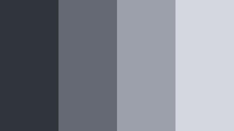
secure downloadUrban Overcast Frames

- HEX Codes: #343841, #5b6068, #9da3aa, #e1e3e6
- Mood: Cool, urban, and introspective with the clarity of a city after rain.
- Use for: Great for tech explainers, cityscape b-roll, and minimalist urban documentary titles.
Urban Overcast Frames wraps Stormy Graphite in cooler city grays and airy off white. It feels like concrete, glass, and sky right after rainfall, with clean contrast and a calm, reflective tone.
Use this palette for tech videos, productivity content shot in city apartments, or minimalist urban documentaries. In Filmora, drop your backgrounds and borders in the darker tones and reserve the lightest shade for text, icons, and UI overlays so everything stays legible and modern.
Fogbound Mountain Trail

- HEX Codes: #2e333a, #4e585f, #7a858b, #b8c0c5, #edf1f3
- Mood: Quiet, reflective, and adventurous with a hint of mystery.
- Use for: Perfect for outdoor travel vlogs, hiking intros, and storytelling title cards with a reflective tone.
Fogbound Mountain Trail layers heavy rock like dark grays with pale fog whites, giving Stormy Graphite an outdoor, rugged, yet peaceful spirit. The gradient from deep charcoal to soft mist captures the feeling of hiking through low clouds.
Apply this palette to travel intros, map animations, and sequence titles in your hiking or camping vlogs. Let the darkest tones support your lower thirds, mid grays frame your footage, and the brightest whites carry clean, easy to read typography.
Thunderline Neon Streets
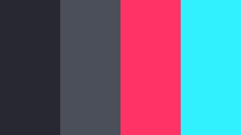
- HEX Codes: #262932, #4a4f59, #ff3366, #30f2ff
- Mood: Edgy, electric, and high-energy with a nocturnal cyberpunk flair.
- Use for: Use for music videos, gaming intros, and high-impact social media promos and thumbnails.
Thunderline Neon Streets combines deep Stormy Graphite shadows with punchy neon pink and cyan. The result feels like a cyberpunk alley or a city lit by LED signs, full of energy and movement against a dark backdrop.
Use the gray tones for backgrounds and frames, then deploy the neon HEX colors sparingly for titles, progress bars, buttons, and key thumbnail text. In Filmora, this palette is perfect for gaming overlays, music visualizers, and social media promos that need to grab attention in a split second.
Rainy Window Reflections
- HEX Codes: #30343b, #646974, #9ba0ab, #d4d7df
- Mood: Softly melancholic, cozy, and nostalgic like watching rain from indoors.
- Use for: Works beautifully for reflective vlogs, diary-style storytelling, and lo-fi music visuals.
Rainy Window Reflections surrounds Stormy Graphite with softly blurred blue grays, evoking wet glass, clouded skies, and gentle indoor light. It is melancholic and cozy, perfect for slow paced storytelling.
Use this palette for lo fi music videos, study with me edits, and diary style vlogs. Keep text and UI elements in the mid to light grays for readability, and let the darker graphite live in your overlays, frames, and intro backgrounds.
Elegant & Modern Stormy Graphite Color Palettes
Sleek Studio Monochrome
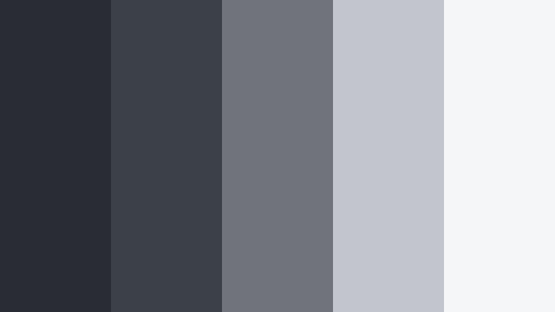
- HEX Codes: #292c33, #3c4047, #70737a, #c2c5cb, #f5f6f8
- Mood: Minimal, polished, and professional with a studio-quality sheen.
- Use for: Best for software walkthroughs, studio setups, and premium course branding.
Sleek Studio Monochrome is a clean gray scale built around Stormy Graphite, stepping gradually from deep charcoal to near white. It feels like a modern studio backdrop, free of distractions and visual noise.
Use this palette to keep tutorials, courses, and SaaS explainers clean and professional. In thumbnails, let the darkest tones frame your subject while the palest tones serve as background for key text, ensuring strong readability on any device.
Graphite Gold Edition

- HEX Codes: #2f3238, #474b53, #d9b25f, #f3e4c4, #ffffff
- Mood: Luxurious, confident, and high-end with subtle warmth.
- Use for: Ideal for brand intros, premium product reveals, and elegant lower thirds.
Graphite Gold Edition pairs Stormy Graphite with warm gold and soft ivory, giving your visuals a premium, boutique feel. The gray base keeps things grounded, while the gold accents instantly signal luxury and confidence.
Use gold for logo marks, accent lines, and key headings, while keeping backgrounds and large shapes in the graphite and mid grays. This works beautifully for product promos, course trailers, and elegant channel branding in Filmora.
Nordic Workspace Calm

- HEX Codes: #32353a, #5d6166, #a5aaae, #dde1e4, #fafbfc
- Mood: Calm, organized, and airy with Scandinavian-inspired clarity.
- Use for: Great for productivity content, desk setups, and minimalist lifestyle channels.
Nordic Workspace Calm takes Stormy Graphite into a Scandinavian direction with soft, airy grays and nearly white tones. It feels orderly and bright but still grounded enough for a serious, focused channel identity.
Apply darker grays for subtle drop shadows and frames, while using the pale tones for backgrounds in desk setup shots, Notion tutorials, and productivity vlogs. Thumbnails using this palette will stay readable and fresh without loud colors.
Digital Slate Interface

- HEX Codes: #252932, #3e4450, #6b7280, #a1a7b3, #e5e7ee
- Mood: Tech-forward, clear, and trustworthy with a product UI focus.
- Use for: Perfect for app demos, SaaS explainers, and dashboard-style graphics or overlays.
Digital Slate Interface stacks cool, slatey grays around Stormy Graphite to mimic modern UX design. It feels like a trustworthy dashboard, perfect for any content where clarity and professionalism matter.
Use this palette to design lower thirds that look like UI elements, on screen callouts, and overlay cards in Filmora. The lightest tone makes excellent backgrounds for text-heavy slides, while the darkest tones are ideal for header bars and navigation like elements.
Marble Loft Luxe

- HEX Codes: #2f3339, #555b63, #c7ccd3, #f0f2f5, #e0c9aa
- Mood: Chic, airy, and aspirational with a designer apartment feel.
- Use for: Use for interior design reels, modern lifestyle branding, and aesthetic b-roll sequences.
Marble Loft Luxe merges Stormy Graphite and marble like grays with a warm beige accent that feels like wood or leather in a designer apartment. The palette is chic, soft, and aspirational.
In lifestyle content, use this palette for room tour overlays, price tags, and mood board style thumbnails. The beige tone is great for highlighting key words, while the graphite and lighter grays keep everything looking neat and upscale.
Soft & Atmospheric Stormy Graphite Color Palettes
Overcast Pastel Coast

- HEX Codes: #31353d, #68717a, #9fb7c6, #d7e2eb, #f8fbff
- Mood: Soft, wistful, and coastal with gentle pastel airiness.
- Use for: Great for soft travel vlogs, calming montage sequences, and dreamy photo slideshows.
Overcast Pastel Coast anchors airy sea blues and soft whites with Stormy Graphite, creating a shoreline mood on a cloudy day. It feels calm and slightly nostalgic rather than bright or tropical.
Use this for calm travel edits, beach walks, and slow motion B roll. In Filmora, apply the darkest shade to frames and titles, the mid blues to subtle gradients, and the lightest tones behind text for soothing, easy to read overlays.
Smoky Lavender Drift
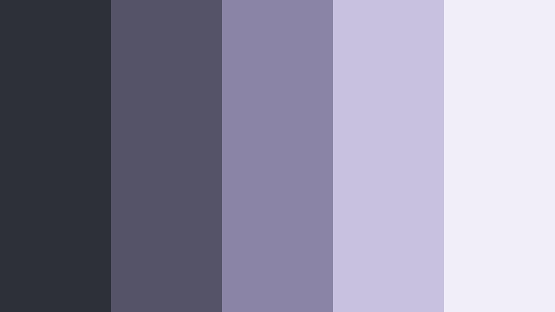
- HEX Codes: #2e3038, #555368, #8a84a6, #c8c1e0, #f1edf9
- Mood: Dreamy, introspective, and slightly mystical.
- Use for: Perfect for poetry visuals, ambient music videos, and soft-focus lifestyle reels.
Smoky Lavender Drift wraps Stormy Graphite in dusty violets and pale lavender mist. It feels dreamy and introspective, like twilight scenes or abstract art visuals.
Use this palette when you want your edit to feel soft and artistic. In thumbnails, let graphite and deep purple define the background, while pale lavender highlights call to action text, logos, or playlist labels.
Graphite Rose Haze
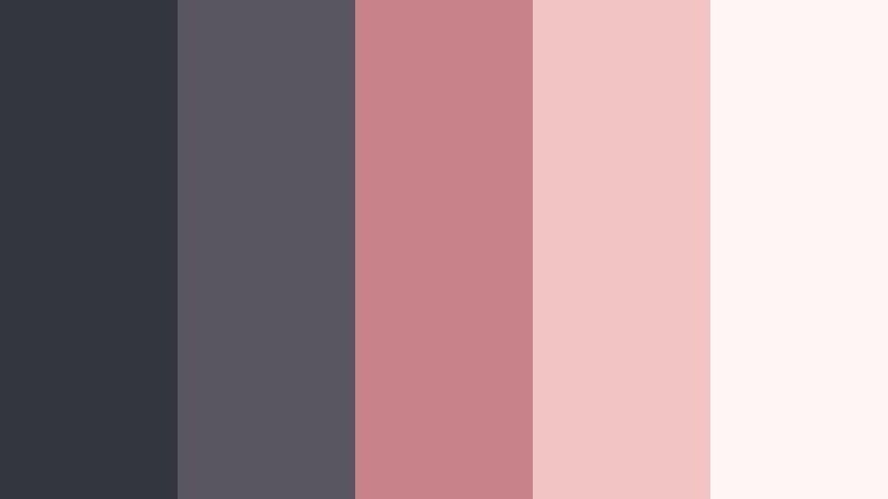
- HEX Codes: #34363d, #5a5660, #c8838a, #f0c5c4, #fff5f4
- Mood: Romantic, nostalgic, and soft with a cinematic blush.
- Use for: Use for wedding highlights, engagement stories, and gentle romantic branding.
Graphite Rose Haze blends Stormy Graphite with dusty rose and blush tones, balancing emotional warmth with grounded depth. It feels ideal for romance and memory focused storytelling.
Use the rose colors for accents on names, dates, and key phrases, while letting graphite and muted grays hold the main layout. Wedding highlight reels, engagement teasers, and romantic shorts all benefit from this combination in Filmora thumbnails and title cards.
Cloudline Morning Brief

- HEX Codes: #2f343a, #6b7076, #aeb3b9, #dde1e6, #ffffff
- Mood: Fresh, clear-headed, and subtly optimistic like a quiet morning sky.
- Use for: Ideal for morning routines, productivity tips, and calm educational content.
Cloudline Morning Brief offers a clean gradient from Stormy Graphite through soft grays into bright white. It feels like a clear morning sky that is just starting to brighten, perfect for content that should feel focused but not heavy.
In Filmora, use this palette to design simple, legible layouts for tutorials, how tos, and talking head videos. The darkest tone works well for titles, while the mid and light tones are perfect for full frame backgrounds and slide style graphics.
Bold & Vibrant Stormy Graphite Color Palettes
Graphite Ember Pulse
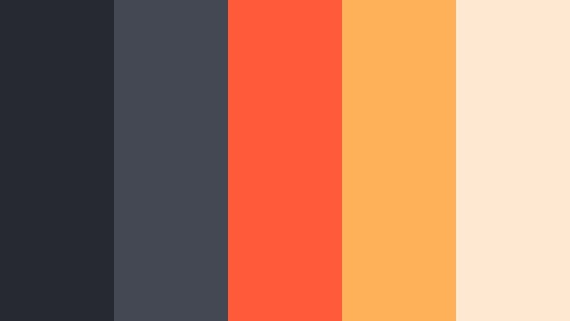
- HEX Codes: #262930, #444852, #ff5b3a, #ffb15a, #ffe9d2
- Mood: Dynamic, bold, and fiery with strong contrast and energy.
- Use for: Great for attention-grabbing thumbnails, call-to-action screens, and high-energy promos.
Graphite Ember Pulse injects fiery oranges and corals into a Stormy Graphite base, creating strong, high contrast visuals. It feels like glowing embers against a dark hearth, energetic but controlled.
Use the warm tones for buttons, arrows, and key phrases in your thumbnails and end screens, while the graphite grays hold your backgrounds and frames. This palette is excellent for promos, sales campaigns, and hype trailers edited in Filmora.
Electric Teal Skyline

- HEX Codes: #252831, #3f4650, #00b3b0, #45e0d8, #e7fbfa
- Mood: Fresh, futuristic, and confident with a sleek tech edge.
- Use for: Perfect for startups, fintech explainers, and modern channel rebrands.
Electric Teal Skyline pairs deep Stormy Graphite with crisp teal accents and a cool, bright highlight. It feels like a futuristic skyline or fintech dashboard, confident and forward looking.
Use the teal shades to emphasize numbers, graphs, and CTAs, with graphite acting as the structural background. For channel rebrands, build your logo lockups, intro animations, and lower thirds around this palette in Filmora to create a strong, tech focused identity.
Tips for Creating Stormy Graphite Color Palettes
Stormy Graphite is flexible enough to go cinematic, soft, or vibrant depending on what you pair it with. These tips will help you combine it with other colors for video, design, and branding while keeping everything clear and consistent.
- Balance dark and light: Always pair Stormy Graphite with at least one very light tone (near white or soft pastel) so text and UI elements stay readable in thumbnails and lower thirds.
- Use accents sparingly: Limit bright accent colors (neon, teal, coral, gold) to 1 or 2 per palette and reserve them for calls to action, logos, or key words to avoid visual clutter.
- Think in roles: Assign each HEX a role, such as background, text, highlight, or accent, and keep those roles consistent across intros, titles, and end screens.
- Match footage temperature: If your footage is warm, pair Stormy Graphite with golds and beiges; for cooler footage, use blues, teals, or lavenders so the grade looks natural.
- Check thumbnail readability: Zoom your thumbnail down to mobile size and make sure text over Stormy Graphite still pops; adjust brightness or switch to the lightest tone if needed.
- Use gradients subtly: Soft gradients from Stormy Graphite to a mid gray or pastel can add depth behind titles without distracting from your subject.
- Stay on brand: Pick one or two Stormy Graphite palettes for your channel and reuse them in Filmora presets so your viewers instantly recognize your style.
- Test on different screens: Preview your colors on phone, tablet, and desktop; adjust contrast in Filmora if Stormy Graphite looks too dark or washed out on any device.
Stormy Graphite color palettes give you a strong, modern foundation for cinematic vlogs, tech explainers, lifestyle edits, and polished branding. Whether you go moody with misty grays, soft with pastels, or bold with neon accents, this deep neutral keeps your visuals grounded and consistent.
Try importing these HEX codes into your design tools and then recreating the same mood in Filmora with AI Color Palette, HSL controls, and LUTs. Saving your favorite Stormy Graphite looks as presets will help you keep a cohesive style across thumbnails, intros, and long form videos.
As you experiment, pay attention to how small tweaks in highlights, accent color, and saturation change the mood. Filmora makes it easy to iterate quickly so you can lock in the Stormy Graphite aesthetic that best fits your story and your brand.
secure download