
 100% Security Verified | No Subscription Required | No Malware


 ChatGPT
 Perplexity
 Gemini
 Claude
 Grok
Grok
Topaz sits between gold and amber, a warm gemstone hue that feels optimistic, confident, and inviting. In color psychology, Topaz tones often suggest sunlight, creativity, and success, which makes them perfect for thumbnails, channel branding, and on screen text that needs to stand out without feeling harsh. Used well, Topaz can make your video look more cinematic and polished, especially when it is paired with deeper shadows or cool accent colors.
This guide brings you 15 Topaz color palettes with ready to use HEX codes so you can drop them straight into your thumbnails, intros, lower thirds, overlays, and full color grades. Whether you edit in Filmora or are planning a wider brand refresh, these Topaz color combinations will help you keep a consistent, memorable look across YouTube, TikTok, Instagram, and beyond.
In this article
Warm & Luminous Topaz Color Palettes
Golden Desert Mirage
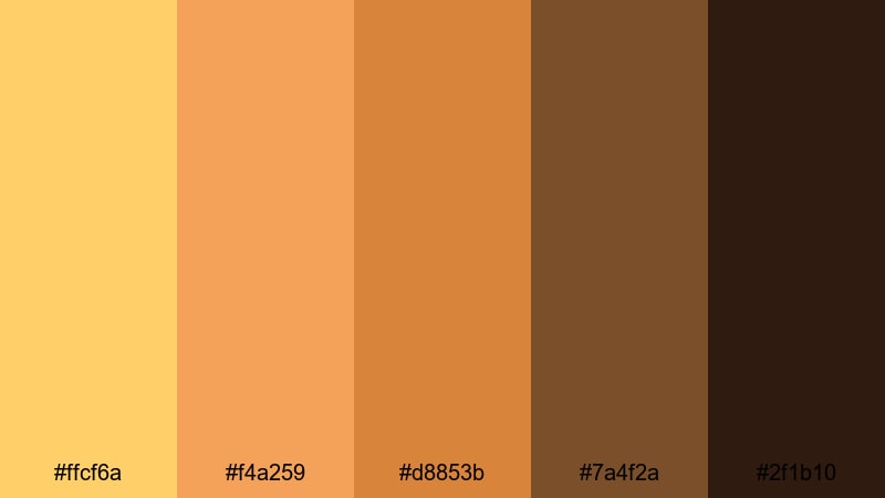
- HEX Codes: #ffcf6a, #f4a259, #d8853b, #7a4f2a, #2f1b10
- Mood: Sun drenched, adventurous, and cinematic with a rich golden glow.
- Use for: Perfect for travel vlogs, cinematic B-roll, or adventure thumbnails where you want warm, story-rich visuals.
Golden Desert Mirage is a sun baked blend of Topaz gold, toasted amber, and deep desert browns that feels both bold and organic. It immediately suggests heat, dust, and late afternoon light stretching across a landscape, which makes it powerful for storytelling and cinematic sequences.
Use this palette to grade desert hikes, road trips, or exploration vlogs, and to design thumbnails with warm, high impact titles against darker browns. In Filmora, you can echo these tones in your intro animations, lower thirds, and end screens so your entire travel series shares the same golden Topaz signature.
Pro Tip: Build a Cinematic Topaz Desert Look in Filmora
When you work with a palette like Golden Desert Mirage, consistency is everything. Try using the lighter HEX codes for titles, icons, and UI elements, while the deeper browns sit in your backgrounds and frames. In Filmora, set up a simple style guide using custom colors in your text, shape, and background presets so that every new sequence uses the same Topaz values automatically.
For B roll, create one desert grade using warm midtones and slightly crushed shadows, then save it as a custom preset. Apply it across your whole project so your drone shots, closeups, and talking head segments all share the same sun drenched Topaz atmosphere.
AI Color Palette
Instead of guessing your grade every time, let Filmora mirror this palette for you. Import a reference frame or a still image that uses Golden Desert Mirage, then use Filmora's AI Color Palette feature to transfer that look across your entire timeline. The AI reads the warm Topaz highlights and darker bronze shadows, then applies a similar color balance to each clip.
This is especially handy if you shot on different cameras or across different days. A single AI Color Palette pass can bring all the footage together so your thumbnails, intros, B roll, and outro cards share the same cohesive Topaz look.
 secure download

HSL, Color Wheels & Curves
To refine a Topaz heavy palette, use Filmora's color tools to control where the warmth lives. With HSL, you can push yellows slightly toward orange for a richer desert glow, while desaturating greens to avoid clashing tones. In the color wheels, lift highlights to keep skin looking healthy, and use the shadow wheel to steer blacks slightly toward deep brown instead of pure gray.
Curves are ideal for adding contrast without crushing detail. A gentle S curve can make the Topaz highlights sparkle while still preserving texture in sand, skin, and fabric. If you want a step by step walkthrough, Filmora's color correction tools guide shows how HSL, wheels, and curves work together for cinematic grading.
secure download1000+ Video Filters & 3D LUTs
If you want the feel of Golden Desert Mirage without building a grade from scratch, start with Filmora's presets. Many of Filmora's video filters and 3D LUTs are already tuned toward warm, cinematic looks, so you can test different styles in one click, then adjust HSL to match the exact HEX codes in this palette.
Stack a subtle warm LUT with a light vignette or film style filter, then save that combination as your go to Topaz look. Reusing the same preset across intros, mid roll segments, and end screens helps your channel feel branded and professional with minimal effort.
secure downloadHoneyglass Sunset Glow
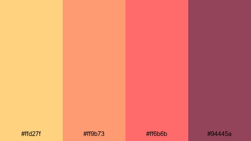
- HEX Codes: #ffd27f, #ff9b73, #ff6b6b, #94445a
- Mood: Dreamy, romantic warmth with a sunset softness and gentle contrast.
- Use for: Ideal for lifestyle vlogs, couple reels, and cozy storytelling edits that need a flattering golden pink atmosphere.
Honeyglass Sunset Glow melts soft honey Topaz into coral and rosy pink, with a darker wine accent to add depth. It feels like golden hour on skin, flattering for faces and closeups where you want warmth without looking too orange.
Use the lighter tones for background blocks, story subtitles, and title cards, and let the darkest shade carry outlines or button shapes in your thumbnails. In Filmora, this palette works beautifully for romantic intros, wedding highlight reels, and cozy day in the life vlogs where you want everything to feel gentle and inviting.
Amber Market Lights
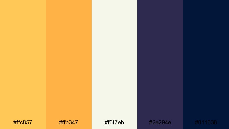
- HEX Codes: #ffc857, #ffb347, #f6f7eb, #2e294e, #011638
- Mood: Lively and bustling, with a cozy festival charm under evening lights.
- Use for: Great for street food videos, night markets, or city travel montages where you want golden highlights and deep blues.
Amber Market Lights pairs bright Topaz amber with creamy off white and deep indigo shadows, echoing strings of lanterns glowing against a night sky. The mix of warm highlights and cool blues instantly suggests movement, crowds, and city energy.
Use the ambers for your text, icons, and callouts, while the blues form a rich backdrop in frames or overlay shapes. In thumbnails and title screens, this palette helps food, neon signs, and faces pop while keeping the overall look cinematic and rich.
Solar Flare Highlight
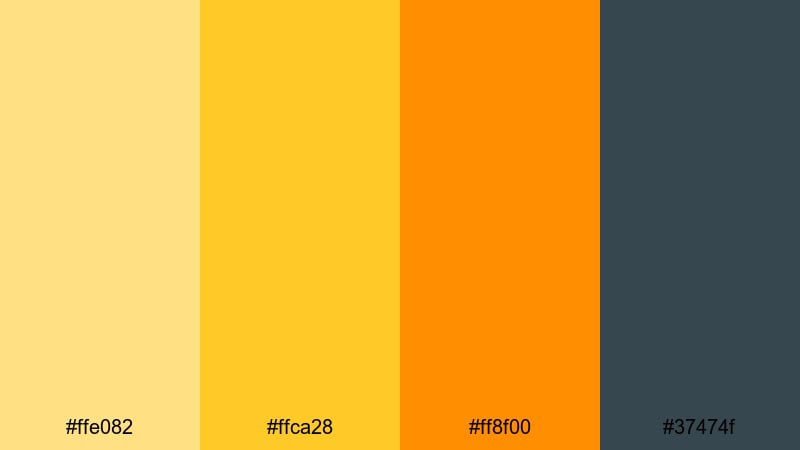
- HEX Codes: #ffe082, #ffca28, #ff8f00, #37474f
- Mood: High energy and radiant, with punchy highlights and confident contrast.
- Use for: Use in thumbnails, motion titles, and callout graphics where you want instant attention and a bold golden punch.
Solar Flare Highlight is a punchy trio of Topaz yellows and orange anchored by a cool charcoal gray. It behaves like a built in spotlight, pulling eyes directly toward your titles, CTAs, or important overlay elements.
Use it to design bold YouTube thumbnails, short form vertical cover frames, and dynamic motion titles inside Filmora. The charcoal tone is ideal for text shadows, backgrounds, or borders that keep the bright Topaz tones readable on both light and dark footage.
Calm & Coastal Topaz Color Palettes
Tidewashed Topaz Shore
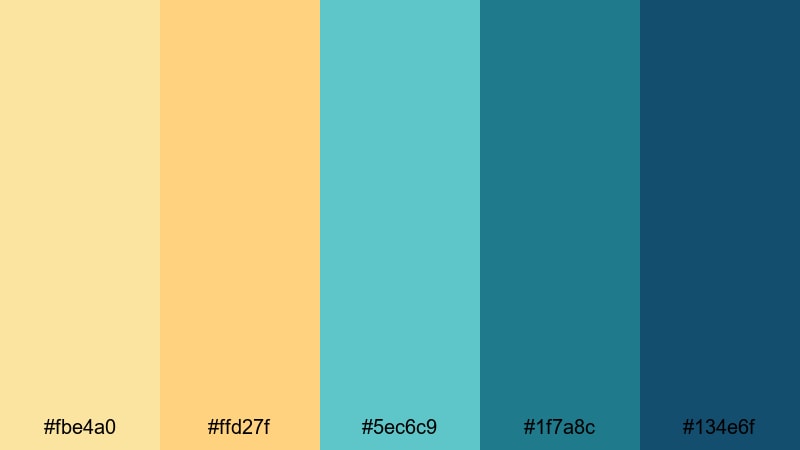
- HEX Codes: #fbe4a0, #ffd27f, #5ec6c9, #1f7a8c, #134e6f
- Mood: Relaxed and coastal, mixing warm sand Topaz with cool ocean blues.
- Use for: Perfect for beach vlogs, surf edits, and travel reels where you want a fresh, airy mood without losing warmth.
Tidewashed Topaz Shore balances soft sandy Topaz with turquoise and deep sea blue, capturing both the warmth of the shore and the cool of the water. It feels relaxed and fresh, ideal for content that aims to be calming yet visually engaging.
Use the lighter shades for backgrounds, lower thirds, and info cards in your beach or surf videos, while the darker blues can frame text or serve as overlay gradients. This palette works especially well for travel channel branding where you want a recognizable, beachy Topaz accent that still feels modern.
Sea Glass Drift

- HEX Codes: #fdf5c9, #cbe8e0, #7fc7d9, #2c699a
- Mood: Gentle, breezy, and soothing like polished sea glass on pale sand.
- Use for: Ideal for minimal travel edits, calming tutorials, and background graphics that need a soft, ocean inspired palette.
Sea Glass Drift is pale and airy, combining a Topaz cream with soft aqua and muted teal for a gentle, almost pastel coastline effect. It avoids heavy contrast, which makes it perfect when you want visuals that support your message without overpowering it.
Apply this palette to tutorial graphics, background cards, and subtle chapter markers. In Filmora, it pairs nicely with clean sans serif fonts and slow motion B roll, helping meditation content, study with me videos, and peaceful travel diaries feel light and soothing.
Harbor Mist Morning
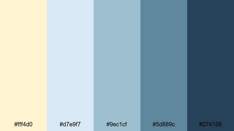
- HEX Codes: #fff4d0, #d7e9f7, #9ec1cf, #5d889c, #274156
- Mood: Soft, misty, and reflective with a hint of early morning chill.
- Use for: Great for travel storytelling, documentary style edits, and cinematic openers where you want calm depth and subtle color separation.
Harbor Mist Morning drifts from creamy Topaz into layers of muted blue, like fog lifting over docks and boats. It is calm and slightly introspective, with enough contrast to separate foreground and background elements.
Use the warm cream for titles and subtle icons, while the mid blues sit behind your text in panels or lower thirds. This palette works well in narrative travel films, reflective monologues, and cinematic openers where you want to guide the viewer into a quiet, thoughtful space.
Lagoon Sparkle
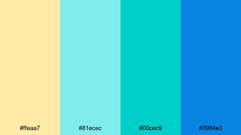
- HEX Codes: #ffeaa7, #81ecec, #00cec9, #0984e3
- Mood: Fresh, tropical, and bright with a playful lagoon shimmer.
- Use for: Use for island travel, pool party edits, and upbeat vacation recaps that need sunny, saturated water tones.
Lagoon Sparkle mixes golden Topaz sand with bright lagoon aquas and electric blue, instantly evoking tropical postcards and poolside fun. It is saturated, lighthearted, and works brilliantly for fast paced edits.
Use the aqua and blue tones for animated titles and transitions, keeping the soft Topaz as a background or accent color. For vacation recaps and party highlight reels, this palette gives your overlays, stickers, and text a cohesive water inspired vibe that looks great on social feeds.
Modern & Luxurious Topaz Color Palettes
Gilded Minimal Studio
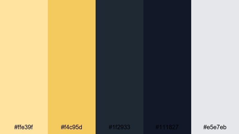
- HEX Codes: #ffe39f, #f4c95d, #1f2933, #111827, #e5e7eb
- Mood: Sophisticated and minimal with refined golden accents on deep neutrals.
- Use for: Perfect for tech reviews, productivity channels, and premium brand intros where you want a clean yet luxurious frame.
Gilded Minimal Studio combines muted Topaz golds with deep charcoal and soft gray, giving a modern editorial feel. The gold acts as a subtle accent rather than a loud highlight, which keeps your design clean and professional.
Use the dark neutrals as backgrounds and frames in your thumbnails, screenshare overlays, and talking head setups, then pick out buttons, icons, or key words in the Topaz tones. This palette suits productivity and tech channels that want a minimal yet high end identity, especially when used consistently across intros, title cards, and channel banners.
Topaz Noir Branding
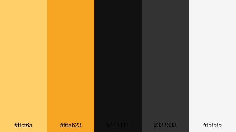
- HEX Codes: #ffcf6a, #f6a623, #111111, #333333, #f5f5f5
- Mood: Bold and high contrast with luxury Topaz accents against deep noir blacks.
- Use for: Great for channels building a strong brand identity, especially intros, end screens, and logo stings.
Topaz Noir Branding is all about contrast: vivid Topaz and amber highlights against matte black and cool gray. It immediately reads as premium and confident, ideal for channels that want a strong graphic presence.
Use black or dark gray as your dominant background, then let the Topaz tones highlight your logo, subscribe buttons, and core message. This palette translates beautifully into lower thirds, intro animations, and end screens in Filmora where you want a bold, consistent brand system.
Champagne Penthouse Glow
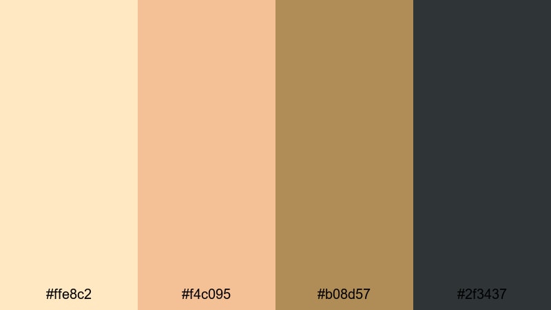
- HEX Codes: #ffe8c2, #f4c095, #b08d57, #2f3437
- Mood: Softly glamorous, like evening light in a high rise with champagne tones.
- Use for: Ideal for fashion lookbooks, luxury product promos, and lifestyle reels that need a plush, upscale feel.
Champagne Penthouse Glow blends creamy champagne Topaz with warm beige and brushed metal bronze over a charcoal base. It feels plush and refined, like a softly lit studio or a rooftop bar at sunset.
Use the lighter shades as backgrounds for product shots or fashion portraits, and reserve the charcoal and bronze for borders, typography, and logo marks. In Filmora, this palette adds an instant luxe feel to lookbooks, jewelry promos, and lifestyle reels with elegant transitions and smooth text reveals.
Art Deco Jewel Lines
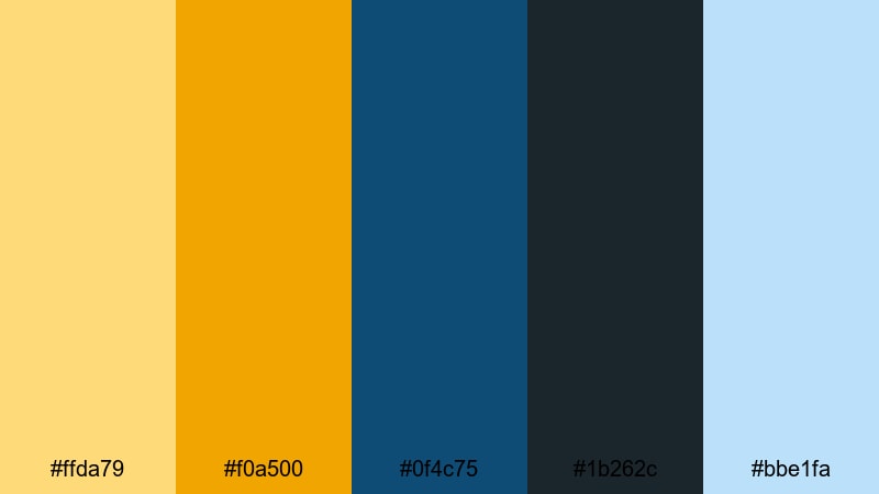
- HEX Codes: #ffda79, #f0a500, #0f4c75, #1b262c, #bbe1fa
- Mood: Vintage luxe with geometric Art Deco energy and jewel toned depth.
- Use for: Use for title sequences, chapter cards, and graphics in documentaries or brand stories needing a classic cinematic flair.
Art Deco Jewel Lines fuses rich Topaz golds with deep teal blues and pale ice highlights, evoking classic cinema posters and geometric Art Deco patterns. It feels both nostalgic and sophisticated, perfect when you want a sense of heritage or timeless style.
Use this palette for bold title sequences, chapter transitions, and animated frames that feature clean lines and strong typography. In Filmora, a combination of this color set with simple shape animations can create a striking opening for documentaries, brand stories, or retro influenced content.
Playful & Artistic Topaz Color Palettes
Retro Pop Topaz
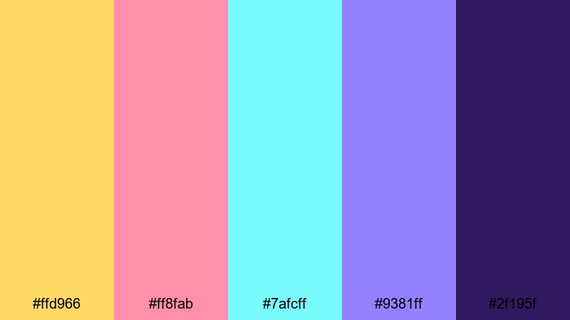
- HEX Codes: #ffd966, #ff8fab, #7afcff, #9381ff, #2f195f
- Mood: Funky, nostalgic, and energetic with a bright retro poster feel.
- Use for: Perfect for YouTube intros, gaming channels, and pop culture edits that need bold, clickable thumbnails.
Retro Pop Topaz anchors candy bright pink, aqua, and violet with a sunny Topaz yellow and a deep indigo base. It has a poster like, slightly 80s or 90s energy that reads instantly fun and high energy.
Use the bright shades for kinetic text, sticker style overlays, and motion graphics, while the darkest color grounds your layouts and keeps text readable. This palette is ideal for gaming channels, reaction videos, and pop culture edits where you want thumbnails and titles that viewers cannot scroll past.
Storybook Treasure Map
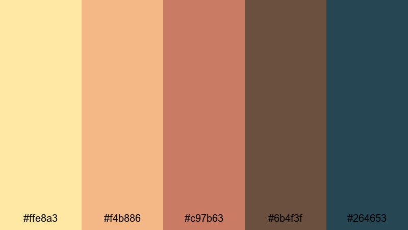
- HEX Codes: #ffe8a3, #f4b886, #c97b63, #6b4f3f, #264653
- Mood: Whimsical and adventurous, like an illustrated map on aged parchment.
- Use for: Great for kids content, educational videos, and narrative intros with a fantasy or adventure theme.
Storybook Treasure Map layers soft Topaz parchment tones with warm browns and a muted teal accent, creating a cozy illustrated feel. It looks like pages from an old book or a hand drawn treasure map, which sparks a sense of play and discovery.
Use the lighter shades as backgrounds for fact cards, character names, or map overlays, then bring in the darker browns and teal for borders, icons, and arrows. In Filmora, this palette is perfect for animated story intros, kids educational content, and any narrative sequence that needs a hint of fantasy.
Festival Confetti Glow
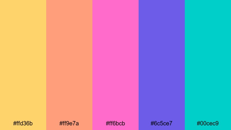
- HEX Codes: #ffd36b, #ff9e7a, #ff6bcb, #6c5ce7, #00cec9
- Mood: Joyful and high impact, like confetti under stage lights at a festival.
- Use for: Use for event recaps, dance edits, and social media promos that need loud, celebratory color.
Festival Confetti Glow brings together vibrant Topaz gold, hot pink, violet, and teal for a neon confetti explosion. It feels like lights, music, and movement all at once, which is ideal for event and performance content.
Use the brightest pinks and blues for animated countdowns, lower thirds, and title cards, and let the Topaz tone highlight dates, locations, or key calls to action. In short form edits and social media promos, this palette helps your graphics feel like an extension of the party on screen.
Tips for Creating Topaz Color Palettes
Topaz works beautifully as a hero color, but it really shines when paired with the right neutrals, shadows, and accent tones. These tips will help you design Topaz color palettes that stay readable, consistent, and flattering on video.
- Balance warmth with cool tones: pair Topaz yellows and ambers with blues or teals to avoid a flat, overly warm frame and to create cinematic contrast.
- Protect text readability: when using bright Topaz for typography, place it over deep charcoals, navy, or blurred footage, and add subtle shadows or outlines in Filmora.
- Use one main Topaz shade: choose a single primary Topaz HEX for your brand and let other yellows or oranges act as supporting accents, not equal leads.
- Anchor with neutrals: combine Topaz with blacks, dark grays, or soft creams to give the eye places to rest, especially in dense thumbnails or info heavy screens.
- Match your footage: sample colors from your actual clips, like sand, city lights, or skin tones, and then adjust them toward your chosen Topaz palette using Filmora's color tools.
- Keep skin tones natural: when grading with strong Topaz warmth, use HSL to protect reds and oranges so faces do not become too yellow or saturated.
- Plan for multiple platforms: test your palette on both light and dark backgrounds and in different aspect ratios (16:9, 9:16, 1:1) to ensure it works for YouTube, Instagram, and TikTok.
- Create a reusable style preset: once you settle on a Topaz palette, save color settings, fonts, and filter combinations as presets in Filmora so every new project looks on brand.
Topaz color palettes can instantly shape how viewers feel about your content, from cozy sunset storytelling to high end product showcases or bold, festival style edits. By choosing the right mix of Topaz, shadows, and accent tones, you build a visual identity that people recognize before they even read your channel name.
Use the HEX codes in this guide as a starting point for your thumbnails, intros, overlays, and full color grades. Then rely on Filmora's AI tools, color controls, and filters to keep those Topaz tones consistent across entire series, playlists, and brand campaigns.
The more regularly you use your chosen Topaz palette, the more your audience will associate those colors with your style. Experiment with a few of these combinations inside Filmora, save your favorites as presets, and build a signature look that feels both professional and uniquely yours.
secure downloadNext: Graffiti Color Palette
