
 100% Security Verified | No Subscription Required | No Malware

Turquoise green sits between calming blue and refreshing green, so it naturally suggests clarity, balance, and renewal. It feels like clean water and fresh air in a single hue, which makes it ideal for creators who want their videos and graphics to feel modern, optimistic, and easy on the eyes. On screens, turquoise green also stands out just enough without feeling harsh, especially when paired with soft neutrals or gentle grays.
In video editing and branding, turquoise green works beautifully for YouTube thumbnails, vlog intros, channel banners, lower thirds, and logo reveals. It instantly adds a fresh, contemporary look to travel, lifestyle, tech, and wellness content. Below you will find 15 turquoise green color palettes with HEX codes, tailored for creators and Filmora users so you can drop them directly into your thumbnails, overlays, titles, and full video edits.
In this article
Soft And Serene Turquoise Green Color Palettes
Coastal Morning Calm
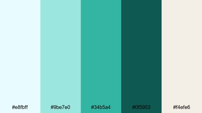
- HEX Codes: #e8fbff, #9be7e0, #34b5a4, #0f5953, #f4efe6
- Mood: Calm, airy, and refreshing.
- Use for: Ideal for relaxing travel vlogs, spa promos, and wellness channel branding.
Coastal Morning Calm feels like a quiet walk along the beach before the crowds arrive. Soft sky blue (#e8fbff), pale aqua (#9be7e0), and sandy cream (#f4efe6) create a bright, gentle base, while turquoise green (#34b5a4) and deep teal (#0f5953) add just enough contrast. The overall effect is soothing but still crisp enough for modern digital designs.
Use the lighter tones for backgrounds in YouTube thumbnails or title cards, and reserve #34b5a4 for call-to-action buttons, logo accents, and lower-third highlights. The darker teal (#0f5953) works well for body text over light backgrounds, or as a subtle border around frames in Filmora when you want your spa, wellness, or travel content to look peaceful and premium.
Pro Tip: Enhance Soft Turquoise Green Visuals with Filmora
To keep this serene turquoise green look consistent across an entire project, save your key HEX values (for example #34b5a4 and #0f5953) inside Filmora and reuse them for titles, shapes, and graphic overlays. Matching your thumbnail text color with your intro titles and lower thirds makes your channel feel intentional and trustworthy.
You can also build a simple brand kit inside Filmora by duplicating project templates that already use this palette. Swap in new clips and text, but keep the same turquoise green accent colors so your travel vlogs, spa promos, and social edits all share one coherent visual identity.
AI Color Palette
If you already have a moodboard, brand board, or screenshot featuring this Coastal Morning Calm palette, you can turn it into a full video look using Filmora. Filmora's AI Color Palette feature analyzes the colors of a reference image or clip and automatically transfers that style onto other shots in your timeline.
Import a frame that showcases your favorite mix of light turquoise green and sandy neutrals, then use AI Color Palette to match your A-roll, B-roll, and cutaway shots. This keeps your spa, wellness, or beach footage aligned in tone, even if it was filmed in slightly different lighting conditions.
 secure download

HSL, Color Wheels & Curves
Once your footage is roughly matched, refine your turquoise green tones using Filmora's HSL, color wheels, and curves controls. With HSL, you can gently shift the aqua range toward a softer green for a spa-like feel, or push it slightly more blue for crisp travel content. Subtle tweaks to luminance can keep skin tones natural while your turquoise greens stay bright and airy.
Use the color wheels and curves to control contrast: lift the shadows a little for a hazy morning look, or deepen them to add cinematic depth while preserving the calm turquoise mood. If you want extra guidance, explore Filmora's tutorials on color correction tools in Filmora so you can dial in highlights, midtones, and shadows with confidence.
secure download1000+ Video Filters & 3D LUTs
To speed up your grading, you can start from Filmora's built-in filters and LUTs and then adjust your turquoise green accents from there. Filmora's video filters and 3D LUTs make it easy to apply a cohesive cinematic tone, like a soft film wash, across your whole timeline in just a few clicks.
Pick a subtle pastel or daylight LUT, then fine-tune saturation so your turquoise hues stay fresh but not neon. This is especially useful when you are editing series content such as weekly vlogs or a spa campaign, where every video needs to share the same calm turquoise green signature.
secure downloadMinted Daydream
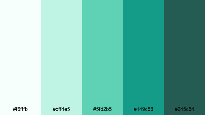
- HEX Codes: #f6fffb, #bff4e5, #5fd2b5, #149c88, #245c54
- Mood: Softly optimistic and comforting.
- Use for: Great for lifestyle intros, minimal product demos, and aesthetic productivity or study videos.
Minted Daydream drifts from near-white mint (#f6fffb) into richer turquoise green shades like #5fd2b5 and #149c88, anchored by deep teal #245c54. It feels dreamy, clean, and reassuring, like a bright studio filled with plants and morning light.
Use the palest tones as background blocks behind your text or UI-style graphics, then layer in #5fd2b5 for headings and icons. The darker greens are perfect for buttons, progress bars, or subtle outlines around elements in Filmora titles. This palette suits productivity vlogs, desk setups, and modern brand promos where you want calm energy rather than high drama.
Lagoon Mist Pastels
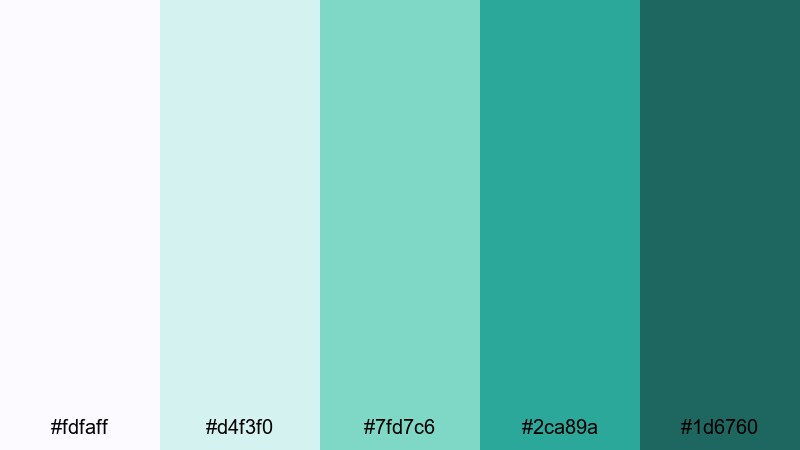
- HEX Codes: #fdfaff, #d4f3f0, #7fd7c6, #2ca89a, #1d6760
- Mood: Airy, ethereal, and slightly nostalgic.
- Use for: Use for dreamy B-roll overlays, romantic travel edits, and soft branding packages.
Lagoon Mist Pastels feels like a foggy morning over calm water. Soft lilac-white (#fdfaff) and pastel aqua (#d4f3f0) keep everything gentle, while turquoise green accents #7fd7c6 and #2ca89a bring in clarity. Deep teal #1d6760 adds depth for titles or border elements.
Apply the pastel shades as gradient backgrounds behind text, then use #2ca89a to highlight keywords in your on-screen captions. In Filmora, this palette works beautifully for light leak overlays, romantic B-roll sequences, and cinematic travel titles that lean into nostalgia without feeling old-fashioned.
Sea Glass Whispers
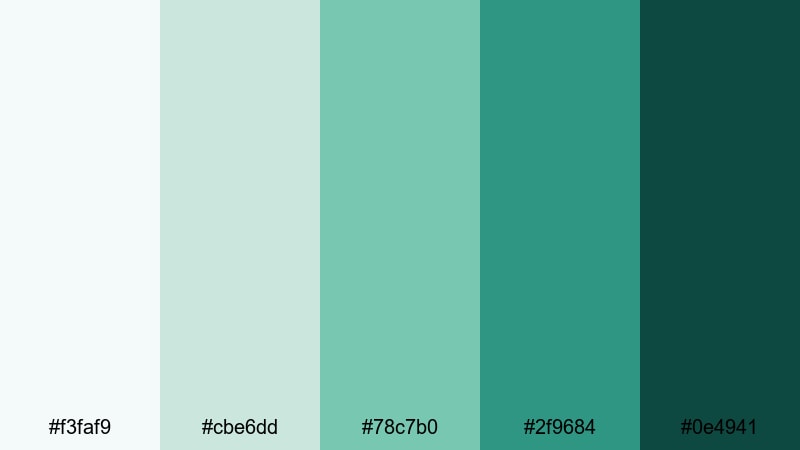
- HEX Codes: #f3faf9, #cbe6dd, #78c7b0, #2f9684, #0e4941
- Mood: Peaceful, organic, and grounded.
- Use for: Perfect for nature documentaries, eco brand videos, and slow living content.
Sea Glass Whispers takes inspiration from tumbled glass on the shore. Hazy white-green (#f3faf9) and soft jade (#cbe6dd) form a calm base, while #78c7b0 and #2f9684 give you fresh turquoise accents. The dark sea green #0e4941 grounds everything, echoing wet stones and deep water.
Use the lighter tones for full-frame backgrounds or lower-third panels in Filmora, then reserve the deeper hues for logos, icons, and section dividers. This palette is ideal for slow living, sustainability, and nature-focused videos where you want a clean but organic aesthetic across thumbnails, intros, and end screens.
Bold And Tropical Turquoise Green Color Palettes
Tropical Surf Pop
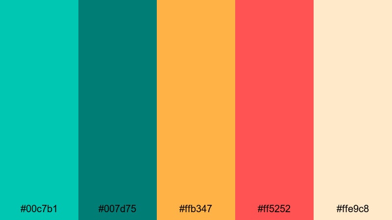
- HEX Codes: #00c7b1, #007d75, #ffb347, #ff5252, #ffe9c8
- Mood: Energetic, sunny, and playful.
- Use for: Ideal for summer travel vlogs, festival recaps, and upbeat brand intros.
Tropical Surf Pop throws bright turquoise green (#00c7b1) together with mango yellow (#ffb347) and coral red (#ff5252) for a loud, summery vibe. Deep teal #007d75 and warm sand #ffe9c8 keep things readable and versatile.
Use #00c7b1 for big title text or thumbnail borders, and let #ffb347 and #ff5252 handle stickers, emojis, and animated call-outs in Filmora. The sandy neutral is great as a background color so your colorful elements stay legible. This palette is made for high-energy edits, festival recaps, and beach vlogs where you want viewers to feel the heat and fun from the first frame.
Neon Reef Rush
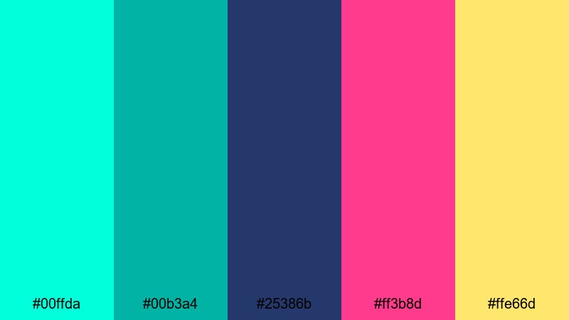
- HEX Codes: #00ffda, #00b3a4, #25386b, #ff3b8d, #ffe66d
- Mood: High-contrast, electric, and futuristic.
- Use for: Use for gaming intros, music videos, and kinetic typography edits that need extra punch.
Neon Reef Rush feels like an underwater nightclub. Hyper-bright aqua (#00ffda) and turquoise green (#00b3a4) glow against deep indigo (#25386b), while hot pink (#ff3b8d) and lemon yellow (#ffe66d) act as accent sparks.
Place #25386b as your background color for titles and end cards, then layer neon text in #00ffda or #ff3b8d for maximum contrast. These tones are perfect for glitch transitions, neon outlines, and animated equalizer graphics in Filmora. Use sparingly in long videos, but lean in hard for intros, outros, and ads where you want instant scroll-stopping impact.
Jungle Pool Party
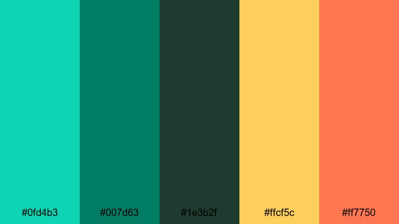
- HEX Codes: #0fd4b3, #007d63, #1e3b2f, #ffcf5c, #ff7750
- Mood: Adventurous, lush, and festive.
- Use for: Great for outdoor event recaps, resort promos, and energetic montage sequences.
Jungle Pool Party combines a saturated pool turquoise (#0fd4b3) with jungle greens (#007d63, #1e3b2f) and warm tropical accents (#ffcf5c, #ff7750). It feels like a weekend getaway filled with palm trees, cocktails, and sunlit water.
Use the deep green #1e3b2f for overlay panels or drop shadows, and let #0fd4b3 highlight main titles and logo marks. Yellow and orange accents work great for animated stickers or countdown timers in Filmora. This palette shines in resort promos, party highlight reels, and any montage where you want nature and nightlife to blend together.
Electric Tiki Sunset
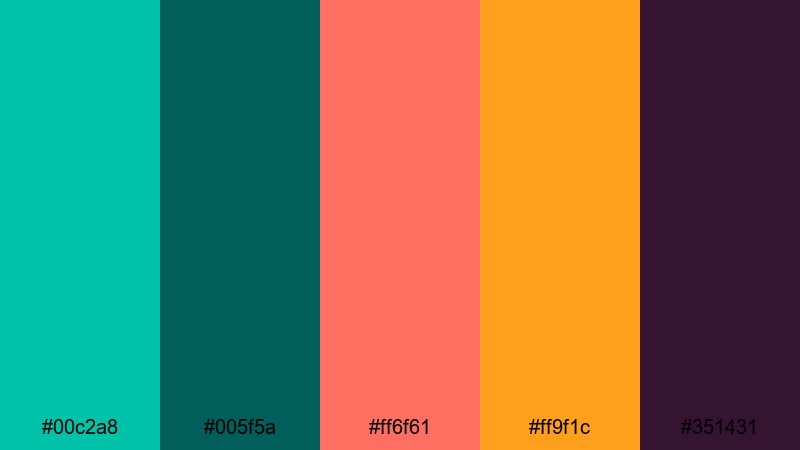
- HEX Codes: #00c2a8, #005f5a, #ff6f61, #ff9f1c, #351431
- Mood: Vibrant, dramatic, and nightlife-ready.
- Use for: Perfect for cocktail promos, nightlife reels, and bold creator intros.
Electric Tiki Sunset mixes a fresh turquoise green (#00c2a8) with cocktail coral (#ff6f61), sunset orange (#ff9f1c), and deep plum (#351431). The result is intense, moody, and ideal for transitions from day to night scenes.
Use #00c2a8 in your logo stingers and lower thirds, then pair it with plum (#351431) as a background for club or bar footage. Coral and orange are great for highlighting prices, event dates, or call-to-action text in your Filmora titles. This palette instantly gives nightlife and bar content a stylized, cinematic glow.
Modern And Minimal Turquoise Green Color Palettes
Tech Aqua Interface
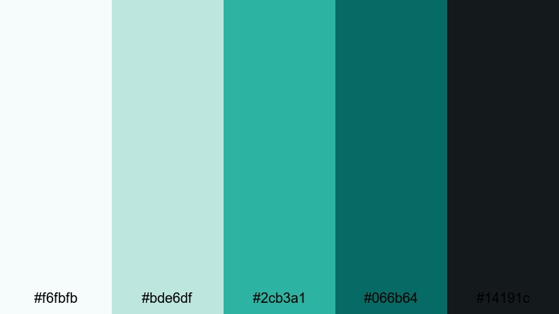
- HEX Codes: #f6fbfb, #bde6df, #2cb3a1, #066b64, #14191c
- Mood: Clean, high-tech, and confident.
- Use for: Ideal for app promos, SaaS explainers, and motion graphics UIs.
Tech Aqua Interface feels like a sleek dashboard. Cool white (#f6fbfb) and soft aqua gray (#bde6df) form a neutral surface, while turquoise green #2cb3a1 and deep teal #066b64 become your main accent colors. Charcoal #14191c adds contrast and a modern, tech-forward edge.
Use the light tones as backgrounds for UI mockups or screen recordings, then highlight buttons, charts, or callouts with #2cb3a1. Charcoal is ideal for text, icons, and status bars. In Filmora, this palette works well for animated infographics, app demo overlays, and clean explainer titles that feel professional without being boring.
Studio Loft Aqua
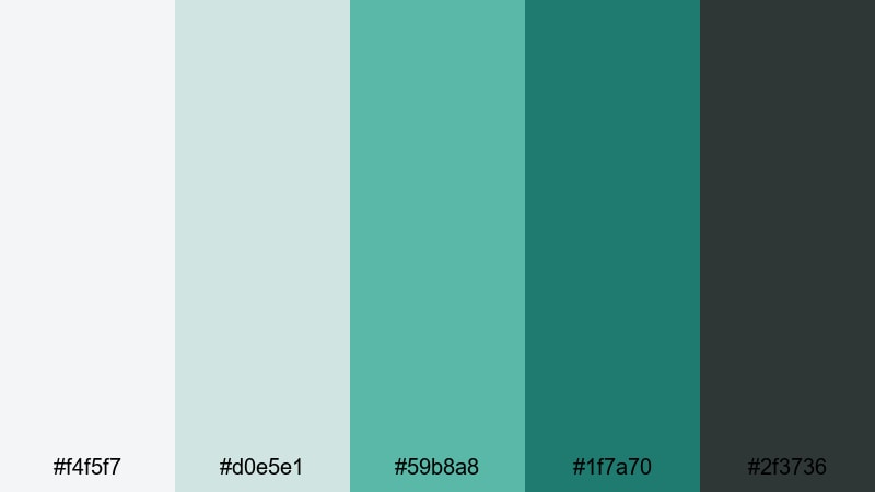
- HEX Codes: #f4f5f7, #d0e5e1, #59b8a8, #1f7a70, #2f3736
- Mood: Refined, creative, and understated.
- Use for: Use for design portfolio reels, studio tour videos, and modern brand kits.
Studio Loft Aqua pairs soft grays (#f4f5f7) with muted aqua (#d0e5e1) and sophisticated turquoise (#59b8a8, #1f7a70). A dark slate #2f3736 adds a grounded, architectural feel, like exposed beams and polished concrete.
Use the pale tones for full-bleed backgrounds in your portfolio reels, and let #59b8a8 handle section titles and logo marks. The dark slate gives you a stylish choice for captions or menus. In Filmora, this palette is ideal for creators who want their channel to feel like a curated studio brand rather than a casual vlog.
Clean Grid Turquoise
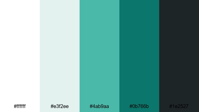
- HEX Codes: #ffffff, #e3f2ee, #4ab9aa, #0b766b, #1e2527
- Mood: Structured, modern, and professional.
- Use for: Perfect for business explainers, minimalist titles, and UI-style lower thirds.
Clean Grid Turquoise builds a crisp framework with pure white (#ffffff) and soft aqua gray (#e3f2ee). Turquoise accents #4ab9aa and #0b766b bring focus to key information, while dark gray #1e2527 keeps text clear and serious.
Use white and #e3f2ee as your main canvas for charts and bullet points, and let #4ab9aa spotlight figures or keywords. In Filmora, this palette excels in corporate explainers, startup pitch videos, and any minimal layout where clarity and professionalism are your priorities.
Vintage And Cinematic Turquoise Green Color Palettes
Retro Motel Pool
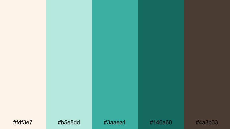
- HEX Codes: #fdf3e7, #b5e8dd, #3aaea1, #146a60, #4a3b33
- Mood: Nostalgic, sun-faded, and cinematic.
- Use for: Great for stylized travel edits, retro title cards, and narrative shorts.
Retro Motel Pool feels like an old roadside postcard. Creamy beige (#fdf3e7) and faded aqua (#b5e8dd) set a sun-washed base, while turquoise green #3aaea1 and deep teal #146a60 echo vintage pool tiles. Warm brown #4a3b33 adds a touch of film grain and shadow.
Use the warm neutral for backgrounds and frames, and let #3aaea1 color your titles, subtitles, and graphic shapes. Brown works well for small details such as date stamps, location tags, or film-style overlays in Filmora. This palette is ideal for retro travel edits and stylized story pieces that blend turquoise freshness with mid-century charm.
Teal Noir Frames
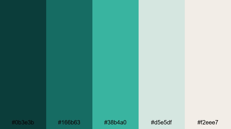
- HEX Codes: #0b3e3b, #166b63, #38b4a0, #d5e5df, #f2eee7
- Mood: Moody, cinematic, and sophisticated.
- Use for: Use for moody intros, story-driven edits, and cinematic LUT-inspired grading.
Teal Noir Frames layers inky teal shadows (#0b3e3b) with smoky turquoise (#166b63, #38b4a0) and pale highlights (#d5e5df, #f2eee7). It nods to modern teal-and-orange grading but with a more refined, monochrome twist.
Use the darkest teal as a letterbox bar or background in Filmora, then paint titles and graphic shapes in #38b4a0 for a stylish contrast. The soft off-whites are perfect for subtle captions, credits, and overlay panels. This palette works especially well for narrative shorts, cinematic travel pieces, and intros where you want drama without sacrificing color richness.
Old Film Coastline
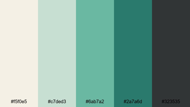
- HEX Codes: #f5f0e5, #c7ded3, #6ab7a2, #2a7a6d, #323535
- Mood: Weathered, gentle, and reflective.
- Use for: Ideal for memory montages, documentary segments, and poetic travel stories.
Old Film Coastline captures the feel of faded seaside footage. Warm paper white (#f5f0e5) and muted seafoam (#c7ded3) mix with subdued turquoise (#6ab7a2, #2a7a6d), grounded by charcoal #323535.
Use the lighter tones for soft background mats behind interview titles or chapter markers, then add #6ab7a2 for accents that gently highlight names and locations. Charcoal is ideal for timecodes, captions, and documentary-style supers in Filmora. This palette adds quiet nostalgia and emotional weight to memory pieces and reflective travel edits.
Faded Harbor Postcard
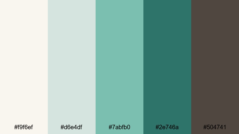
- HEX Codes: #f9f6ef, #d6e4df, #7abfb0, #2e746a, #504741
- Mood: Romantic, timeless, and mellow.
- Use for: Perfect for wedding highlights, heartfelt vlogs, and documentary-style branding.
Faded Harbor Postcard blends soft ivory (#f9f6ef) and dusty gray-green (#d6e4df) with muted turquoise (#7abfb0, #2e746a). A warm brown-gray (#504741) adds depth and a slightly vintage edge, like an old harbor photograph.
Use ivory and #d6e4df for delicate title cards or photo frames, then highlight names, dates, or key words in #7abfb0. The darker tones are great for lower-thirds and outro screens in Filmora, especially in wedding films or intimate vlogs. This palette brings a gentle, storytelling feel that still looks clean and contemporary.
Tips for Creating Turquoise Green Color Palettes
When you build your own turquoise green combinations for video and design, it helps to think about contrast, legibility, and mood across every frame, from thumbnails to end screens.
- Pair turquoise green with soft neutrals (ivory, light gray, sand) to keep your layouts calm and readable while still highlighting key elements like titles and buttons.
- Always test text contrast: place white or very light text over dark turquoise, and dark gray or charcoal over pale turquoise backgrounds to keep thumbnails and subtitles easy to read on mobile.
- Use one main turquoise accent and one darker companion shade; re-use these two consistently across your logo, lower thirds, and title cards to create a recognizable brand identity.
- Balance warm and cool tones: combine turquoise green with a warm accent (coral, soft orange, or gold) when you want more energy, or stick to cool blues and grays for a minimal, techy mood.
- Match your palette to your footage: if your clips already have strong greens or blues, nudge your turquoise toward that direction so overlays, text, and UI graphics feel integrated rather than pasted on.
- Limit bright neons to small elements like icons, outlines, or call-to-action badges; keep backgrounds softer so your overall frame does not feel overwhelming.
- Create light and dark variants of your palette for daytime and nighttime scenes so you can adapt while still staying within the same turquoise green family.
- Save your HEX codes inside Filmora project templates or notes so you can quickly reapply the exact same turquoise tones across different episodes or campaigns.
Turquoise green color palettes can completely reshape how your viewers feel about your content, from calm and reflective to energetic and bold. Whether you pick a soft coastal mix, a neon reef look, or a cinematic teal noir palette, using the same turquoise accents across thumbnails, intros, and overlays helps your channel look cohesive and on-brand.
Try dropping a few of these HEX codes into Filmora for your next project. Build simple title cards, lower thirds, and graphics using one of the palettes above, then use Filmora's color tools, AI Color Palette, and filters to align your footage to that same mood. Over time, your audience will start to recognize your turquoise green signature even before they read your channel name.
Experiment, tweak, and save your favorite combinations as reusable presets in Filmora so that every new edit feels consistent, professional, and unmistakably yours.
secure download