
 100% Security Verified | No Subscription Required | No Malware

Walnut Brown is a warm, grounded color that instantly feels natural and reassuring. It is the color of aged wood, leather journals, and cozy cafes, which is why it works so well for storytelling content, lifestyle branding, and cinematic edits. In color psychology, Walnut Brown suggests stability, trust, and quiet confidence, making it ideal for channels that want to feel reliable yet personal.
For video creators, Walnut Brown is a powerful base tone for thumbnails, intros, lower thirds, and color grading. It softens harsh lighting, flatters skin tones, and pairs beautifully with creams, beiges, and muted oranges. Below you will find curated Walnut Brown color palettes with HEX codes, created for editors, designers, and Filmora users who want consistent, stylish visuals across vlogs, podcasts, reels, and brand assets.
In this article
Cozy Cinematic Walnut Brown Color Palettes
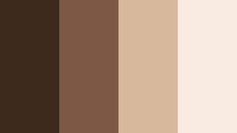
Autumn Lodge Glow

- HEX Codes: #4a3321, #8b5a2b, #c58a5b, #f3d7b6
- Mood: Warm, rustic, and nostalgic, like a weekend retreat in a wood cabin.
- Use for: Ideal for cinematic vlog intros, travel diaries, and storytelling thumbnails that need a cozy fall atmosphere.
Autumn Lodge Glow blends deep Walnut Brown with amber wood and toasted beige, creating a palette that feels like sitting by a fire after a long day outside. The darker shades (#4a3321, #8b5a2b) work beautifully for text, frames, and lower thirds, while the lighter tones (#c58a5b, #f3d7b6) keep faces warm and inviting.
Use this palette for fall travel vlogs, cottagecore storytelling, or channel branding that leans into warmth and nostalgia. In thumbnails and intros, let Walnut Brown anchor the background, then highlight call to action text with the lighter beige so it stays readable while still feeling soft and cinematic.
Pro Tip: Build a Cinematic Walnut Brown Look in Filmora
To keep an Autumn Lodge Glow mood across your whole edit, start by picking a reference frame or still image that shows the palette at its best. In Filmora, you can color match b roll, talking head clips, and even social cutdowns so the Walnut Brown shadows and creamy highlights feel consistent from start to finish.
Use overlays and titles in the darker Walnut Brown hex, then sample the lighter beige for text backgrounds and outlines. This way, your intros, chapter cards, and end screens all feel like they belong to the same cozy cinematic world without needing complex manual grading on every clip.
AI Color Palette
If you already have a favorite Autumn Lodge Glow photo or mood board, Filmora's AI Color Palette feature can translate that look into your entire video. Import your reference image, let Filmora analyze the tones, and then apply the palette to multiple clips in one step.
This is especially helpful for Walnut Brown looks, where subtle differences in warmth can change the mood. AI Color Palette helps you keep skin tones flattering, wood textures rich, and highlights creamy, even when your footage comes from different cameras or lighting setups.
 secure download

HSL, Color Wheels & Curves
Once the overall palette is in place, fine tune your Walnut Brown tones with HSL, color wheels, and curves. Slightly deepen the shadows to make #4a3321 feel more cinematic, then warm up midtones so wood and skin do not drift into dull gray. A gentle S curve can add contrast while keeping highlights soft and candle like.
You can also isolate oranges and yellows in the HSL panel to control how intense your amber browns and beige highlights appear. This is a powerful way to maintain a consistent Walnut Brown aesthetic even under mixed lighting, as shown in many Filmora color grading tutorials on YouTube.
secure download1000+ Video Filters & 3D LUTs
To speed up your Walnut Brown workflow, you can build on Filmora's presets instead of grading from scratch. Filmora's video filters and 3D LUTs make it easy to sharpen the contrast, add subtle film grain, or introduce a golden hour wash over your existing palette.
Combine a warm cinematic LUT with your Autumn Lodge Glow HEX codes in titles and graphics to tie everything together. Filters can give you that soft, storybook feel, while your custom Walnut Brown colors keep your thumbnails, intros, and end screens on brand across episodes and platforms.
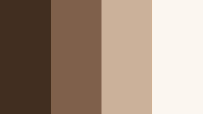
secure downloadVintage Cafe Stories
- HEX Codes: #3e2a1d, #7a5842, #d7b79b, #f7ebdf
- Mood: Soft, intimate, and nostalgic, like quiet afternoons in a sunlit cafe.
- Use for: Great for lifestyle vlogs, studio podcasts, and channel banners that want a warm, approachable feel.
Vintage Cafe Stories mixes muted Walnut Brown with latte creams and soft beige for a palette that feels gentle and timeless. The darkest shade gives you enough depth for overlays and text, while the lighter tones create a bright, airy background without going stark white.
Use this palette for long form conversations, Q and A videos, or cozy podcast setups. Design thumbnails with #3e2a1d as a frame or border, then use #d7b79b and #f7ebdf for text boxes, timestamps, and chapter labels, so everything is soft yet still readable on mobile.
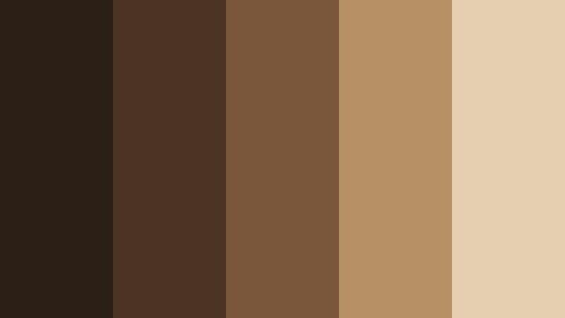
Fireside Documentary

- HEX Codes: #2f2116, #5c3c27, #b0794b, #e7c9a3
- Mood: Grounded, reflective, and cinematic, perfect for serious yet human stories.
- Use for: Use in documentaries, interview setups, and title cards that require depth and emotional weight.
Fireside Documentary leans into smoky Walnut Brown shadows with copper and sand highlights. The combination feels serious and grounded without becoming cold or clinical, ideal for storytelling that deals with real people and real emotions.
Use #2f2116 and #5c3c27 for backgrounds behind text, then let #b0794b and #e7c9a3 highlight names, subtitles, and pull quotes in your titles and lower thirds. This palette gives interviews and mini documentaries a cinematic gravitas while keeping faces warm and approachable.
Rustic Cabin Vlog

- HEX Codes: #3b2719, #6a4426, #a66f48, #f0d1a2
- Mood: Adventurous yet homey, evoking log cabins, campfires, and road trips.
- Use for: Perfect for outdoor vlogs, camping series, and travel thumbnails with a warm, adventurous tone.
Rustic Cabin Vlog combines earthy Walnut Brown with sunlit wood and toasted sand tones. It strikes a balance between exploration and comfort, echoing road trips, hikes, and evenings by the fire.
Apply this palette to map graphics, route animations, and episode thumbnails. Use the darker browns for map outlines or frames, and the lighter #f0d1a2 for text banners and location tags so viewers can quickly read information even on small screens.
Candlelit Journal

- HEX Codes: #412b1c, #7b4f30, #c89a6b, #f6e4cf
- Mood: Calm, reflective, and intimate, like writing by candlelight.
- Use for: Use for study-with-me videos, journaling reels, and YouTube channel art aimed at slow living and mindfulness.
Candlelit Journal softens Walnut Brown with caramel and velvety cream tones to create a gentle, introspective feeling. It is ideal for content focused on reflection, planning, and slow living routines.
In your edits, use #412b1c and #7b4f30 as accents around screens, timers, or progress trackers, then rely on #c89a6b and #f6e4cf to keep backgrounds light and soothing. This palette suits hand written title cards, planner overlays, and subtle transition screens between journaling segments.
Modern Minimal Walnut Brown Color Palettes
Walnut Workspace Clean

- HEX Codes: #3a2819, #6e4a32, #d1b496, #f5f1ea
- Mood: Focused, minimal, and productive with a hint of warmth.
- Use for: Great for productivity channels, tech reviews, and UI overlays that need a neat, modern brown base.
Walnut Workspace Clean keeps the warmth of wood tones but pares everything down for a tidy, modern look. The lightest shade, #f5f1ea, works perfectly as a near white background that still feels soft and human.
Use this palette for clean tutorial overlays, keyboard shortcuts graphics, and channel banners. Let #3a2819 and #6e4a32 handle key text and icons, while #d1b496 adds subtle emphasis for buttons, tags, or progress bars in your Filmora layouts.
Studio Shelf Aesthetic
- HEX Codes: #422e20, #7d6048, #cbb19a, #faf5ee
- Mood: Curated, stylish, and minimal, like a perfectly styled bookshelf backdrop.
- Use for: Ideal for talking head videos, set design planning, and minimalist brand kits.
Studio Shelf Aesthetic uses Walnut Brown as a stable anchor, surrounded by clay and porcelain like tones. The palette feels curated and intentional, ideal for creators who shoot against shelves, plants, and framed art.
In graphics, use #422e20 for logos and main text, then bring in #cbb19a and #faf5ee for lower thirds and subtle watermark designs. This keeps your branding soft and studio ready without distracting from your face or products on screen.
Neutral Brand Grid

- HEX Codes: #3b291c, #85644d, #ddbfa3, #f8f3ec
- Mood: Balanced, professional, and brand friendly with warm neutrality.
- Use for: Perfect for logo reveals, lower thirds, and Instagram grids where a timeless neutral brand look is key.
Neutral Brand Grid offers a polished set of Walnut Brown neutrals that can easily become a long term brand system. The colors are warm enough to be inviting but neutral enough to work across niches and content types.
Use #3b291c for logotypes and strong text, #85644d for secondary labels, and #ddbfa3 or #f8f3ec as tile backgrounds in Instagram grids, YouTube thumbnails, and title screens. This palette keeps everything consistent when you export vertical, square, and horizontal edits from Filmora.
Muted Walnut Monochrome
- HEX Codes: #2c1f15, #4b3424, #7a563b, #b89066, #e6cfb0
- Mood: Softly dramatic and refined, with a monochrome designer feel.
- Use for: Use for sleek intros, UI mockups, and portfolios that want a strong yet subtle brown identity.
Muted Walnut Monochrome gives you a full ladder of Walnut Brown tones, from deep espresso to pale sand. Because it stays within one hue family, it feels refined and designer friendly, perfect for clean motion graphics.
Layer these tones in gradients, animated backgrounds, and UI mockups for app demos or portfolio reels. Use the darkest shades for typography and the lightest for panels, buttons, and hover effects, so everything feels cohesive without introducing extra colors.
Editorial Walnut Layout

- HEX Codes: #35231a, #6b4b35, #c9ae94, #ffffff
- Mood: Editorial, crisp, and magazine like with clear contrast.
- Use for: Great for title cards, chapter screens, and thumbnail text that needs to stand out cleanly.
Editorial Walnut Layout combines rich Walnut Brown tones with clean white to create a high contrast, magazine style look. The palette feels polished and easy to read, even at smaller sizes.
Use #35231a for bold titles and #ffffff for body text against midtone panels like #6b4b35 or #c9ae94. This setup is ideal for chapter cards, list based thumbnails, and content where information density and legibility are key.
Earthy Lifestyle Walnut Brown Color Palettes
Nature Trail Walnut
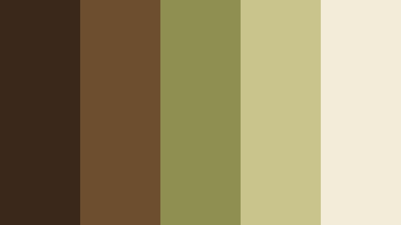
- HEX Codes: #3a291b, #6d4f2f, #8f8f52, #c9c48c, #f2edd8
- Mood: Organic, grounded, and outdoorsy, inspired by forest paths and dry leaves.
- Use for: Ideal for hiking vlogs, sustainability content, and wellness brand visuals.
Nature Trail Walnut ties Walnut Brown with mossy olive and straw tones to echo forest paths, dried leaves, and natural fabrics. The greens keep the palette feeling eco friendly and grounded.
Use the deeper browns for text and icons on maps or activity summaries, and #8f8f52 or #c9c48c for accent badges like distance, altitude, or eco tips. The lightest #f2edd8 works as a soft background for end screens and info cards in your wellness or outdoor series.
Boho Loft Morning

- HEX Codes: #4b3322, #91684c, #d8b590, #f2e1cf
- Mood: Relaxed, bohemian, and sun soaked with cozy textures.
- Use for: Perfect for home decor tours, lifestyle reels, and creator brands with a boho aesthetic.
Boho Loft Morning brings together sunlit Walnut Brown with terracotta beige and cream, evoking woven rugs, plants, and open windows. It feels airy and lived in, ideal for lifestyle creators.
Use #4b3322 for logo marks and key text, while #91684c and #d8b590 can color accent lines, dividers, and small icons. The light #f2e1cf keeps Pinterest style thumbnails and Reels covers bright without losing the warm, boho character.
Slow Living Pantry

- HEX Codes: #3c2819, #7a5434, #cda77e, #efe0cf
- Mood: Simple, wholesome, and calm, like glass jars and wooden shelves.
- Use for: Use for cooking channels, pantry organization shorts, and calm routine videos.
Slow Living Pantry centers on grounded Walnut Brown with honey and oatmeal shades that feel wholesome and hand crafted. Think glass jars, linen bags, and wooden spoons lined up in order.
Apply this palette to recipe cards, labels, and on screen ingredient lists. Use #3c2819 or #7a5434 for typography, and place it on #cda77e or #efe0cf panels so viewers can quickly read measurements and steps during cooking segments.
Sunlit Market Stroll

- HEX Codes: #4a331f, #9a693b, #f0b35a, #f6e4c5
- Mood: Lively yet grounded, like walking through an open air market at golden hour.
- Use for: Great for travel vlogs, city diaries, and upbeat lifestyle thumbnails with warmth and energy.
Sunlit Market Stroll pairs Walnut Brown with sunlit ochre and cream, creating an energetic but still earthy palette. It suggests movement, crowds, and colorful stalls lit by golden hour light.
Use #4a331f for outlines and bold labels, #9a693b for secondary text, and #f0b35a as a punchy accent on price tags, location pins, or call to action buttons. The pale #f6e4c5 keeps busy thumbnails from feeling overstuffed by providing soft negative space.
Coffee Shop Study Session

- HEX Codes: #2e1f15, #5a3a26, #8f5f3a, #d9b38b, #f7efe4
- Mood: Focused, cozy, and creative, with the hum of a favorite coffee shop.
- Use for: Perfect for study vlogs, productivity livestreams, and lo fi music cover art.
Coffee Shop Study Session blends espresso Walnut Brown with latte, caramel, and foam white tones. It recreates the feel of working in a quiet corner cafe surrounded by books and ambient music.
Use the deeper hues for clocks, timers, and progress bars in study with me videos, and the lighter shades for overlays behind text and playlist titles. This palette works especially well for lo fi cover art, stream overlays, and recurring series thumbnails where you want viewers to recognize the cozy, focused vibe at a glance.
Tips for Creating Walnut Brown Color Palettes
Walnut Brown is incredibly flexible, but it really shines when combined thoughtfully with neutrals, warm highlights, and clear contrast. Use the tips below to adapt these palettes to your own footage, brand, and editing style.
- Pair Walnut Brown with soft off whites or creams instead of pure white to keep your visuals warm and inviting.
- Use the darkest Walnut Brown in your palette for key text and icons, and test legibility on mobile thumbnails before finalizing.
- Add one accent color (such as ochre, mossy green, or terracotta) for buttons and callouts so viewers know where to look first.
- Match your color palette to your footage by sampling from real objects (wood, coffee, fabrics) and then applying those HEX codes in Filmora titles and graphics.
- Keep brand consistency by reusing the same 3 to 5 HEX codes across intros, lower thirds, end screens, and social covers.
- When grading video, avoid pushing Walnut Brown too far into red or gray; use HSL sliders to keep browns neutral to slightly warm.
- Increase contrast slightly when designing for YouTube thumbnails so Walnut Brown elements do not look muddy on smaller screens.
- Save your Walnut Brown presets and LUTs in Filmora so you can apply the same mood quickly to new projects and spin off formats.
Walnut Brown color palettes can subtly transform your videos, from cozy vlogs and studio podcasts to product demos and slow living reels. With the right mix of deep browns, soft neutrals, and carefully chosen accents, you can shape a visual identity that feels warm, trustworthy, and cinematic.
Try using these HEX codes directly in your Filmora titles, overlays, and brand elements, then refine the look with color grading tools, filters, and LUTs. Once you lock in a Walnut Brown palette that matches your story, you can carry it across thumbnails, shorts, community posts, and more, so your audience recognizes your style instantly.
Experiment with a couple of palettes, save your favorites as presets, and let Walnut Brown become the thread that ties all your creative projects together inside Filmora.
secure downloadNext: Claystone Color Palette
