
 100% Security Verified | No Subscription Required | No Malware

Beige sits between white, brown, and soft gold, which makes it one of the most versatile colors in design. Psychologically, Beige feels calm, trustworthy, and inviting. It softens bright visuals, adds warmth without shouting for attention, and creates a clean, minimal backdrop that works across many niches. That is why you see Beige everywhere in modern branding, from lifestyle vlog covers and cozy thumbnails to luxury product packaging and website layouts.
For video creators and Filmora users, Beige is perfect for thumbnails, titles, intros, and neutral color grading that looks aesthetic but still professional. The Beige color palettes below come with ready-to-use HEX codes, so you can match your brand, design YouTube covers, or build consistent looks across reels, Shorts, and long-form videos with ease.
In this article
Soft Minimalist Beige Color Palettes
Sunlit Linen Calm
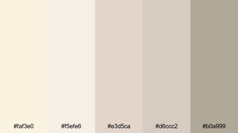
- HEX Codes: #faf3e0, #f5efe6, #e3d5ca, #d6ccc2, #b0a999
- Mood: Airy, gentle, and uncluttered, like morning light through sheer curtains.
- Use for: Ideal for lifestyle vlog intros, morning routines, and calm productivity montages.
Sunlit Linen Calm is a bright, breathable palette built from layers of soft cream and powdery Beige. It feels like freshly washed sheets and open windows, which makes it perfect when you want your visuals to look clean, relaxed, and thoughtfully curated.
Use this palette for YouTube intros, title cards, and thumbnails where you want the focus to stay on your subject or text instead of on loud colors. In Filmora, you can match your lower thirds, channel logo, and background elements to these HEX codes so your lifestyle or productivity brand feels cohesive across every upload.
Pro Tip: Enhance Your Beige Visuals with Filmora
Once you pick a Beige palette you love, Filmora makes it easy to keep that look consistent from intro to outro. You can sample colors from Sunlit Linen Calm for titles, shapes, and overlays, then save them as custom presets to reuse in future projects. This helps your channel thumbnails, reels, and main videos all share the same soft Beige identity.
Combine these tones with simple transitions and minimal typography in Filmora to protect the airy feeling. Avoid overly saturated overlays; instead, lean on subtle vignettes and light grain so your Beige stays gentle and modern.
AI Color Palette
If you have a reference image for Sunlit Linen Calm, such as a photo of your studio or a flat lay, Filmora can automatically pull those Beige tones into your entire edit. Filmora's AI Color Palette feature analyzes the colors from one clip or image and applies that same mood to the rest of your timeline.
This is especially useful for creators who shoot on different days or cameras. By matching everything back to your Beige reference, you avoid jarring color shifts between A-roll, B-roll, and thumbnails, and you end up with one seamless, sunlit aesthetic.
 secure download

HSL, Color Wheels & Curves
Even within a soft Beige palette, tiny shifts in warmth and contrast can completely change the mood. In Filmora, you can use HSL, color wheels, and curves to gently separate skin tones from backgrounds, deepen shadows for a more cinematic feel, or brighten highlights to keep that fresh morning look. The color correction tips in Filmora help you understand how each tool shapes your Beige tones.
Try lowering saturation in the yellows and increasing brightness in the highlights for a lighter, linen-inspired style. Then, with color wheels, add a touch of warmth into midtones while keeping shadows slightly cooler to avoid a muddy or flat Beige look.
secure download1000+ Video Filters & 3D LUTs
If you want to move faster, you can start from a Beige-friendly preset instead of grading from scratch. Filmora’s video filters and 3D LUTs make it easy to test different moods: vintage paper, matte film, or clean daylight. Once you find a filter that suits Sunlit Linen Calm, you can fine-tune it with HSL so your HEX codes still match your brand.
Apply one LUT to your entire sequence to build a uniform tone, then adjust opacity so your Beige remains soft rather than overly stylized. This way, your feed looks intentional and aesthetic, without losing the gentle calm that makes Beige so appealing.
secure downloadQuiet Studio Neutrals
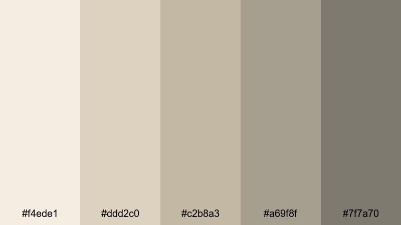
- HEX Codes: #f4ede1, #ddd2c0, #c2b8a3, #a69f8f, #7f7a70
- Mood: Thoughtful, grounded, and creative with a subtle artistic edge.
- Use for: Great for studio tour videos, tutorial backgrounds, and channel branding that feels focused.
Quiet Studio Neutrals layers soft Beige with muted taupes and gray-browns, creating a calm, creative workspace vibe. It feels grounded and thoughtful, without tipping into harsh contrast.
Use these HEX codes in Filmora for title bars, background shapes, and lower thirds around your tutorial or design content. The deeper accent shades (#a69f8f, #7f7a70) are ideal for text and icons, while the lighter ones keep your frames uncluttered for screen recordings, art breakdowns, or studio tours.
Blush Sand Whisper
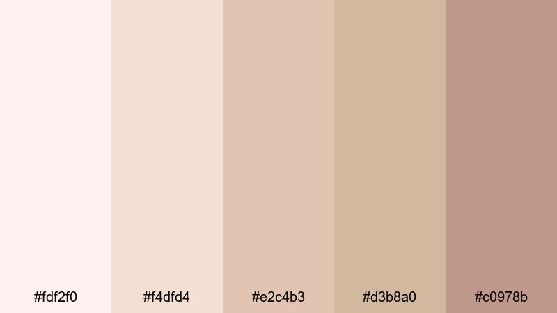
- HEX Codes: #fdf2f0, #f4dfd4, #e2c4b3, #d3b8a0, #c0978b
- Mood: Romantic, gentle, and feminine with a warm blush undertone.
- Use for: Perfect for beauty tutorials, lookbooks, and thumbnail titles that feel soft and inviting.
Blush Sand Whisper mixes airy pink creams with sandy Beige for a dreamy, romantic vibe. It feels flattering on skin and instantly adds a hint of softness to any frame.
Apply the lightest tones as backgrounds for product shots, and use the deeper blush (#c0978b) for call-to-action buttons or key headline text in your thumbnails. In Filmora, this palette works beautifully with slow transitions, soft focus overlays, and gentle light leaks to amplify that feminine, whisper-soft energy.
Morning Oat Latte
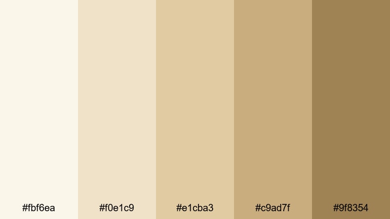
- HEX Codes: #fbf6ea, #f0e1c9, #e1cba3, #c9ad7f, #9f8354
- Mood: Cozy, slow, and comforting like a quiet breakfast at home.
- Use for: Use for cafe vlogs, recipe videos, and reels that highlight cozy textures and warm light.
Morning Oat Latte channels the look of creamy coffee, oatmeal, and soft sunlight. The palette is warm but still neutral, so it fits both lifestyle and food content without feeling heavy.
Use the lighter tones as your general background color for recipe steps or text overlays, and lean on the deeper caramels for section titles and icons. In thumbnails or Instagram covers, this palette makes latte art, pastries, and wooden textures feel especially inviting.
Cloudy Loft Daylight
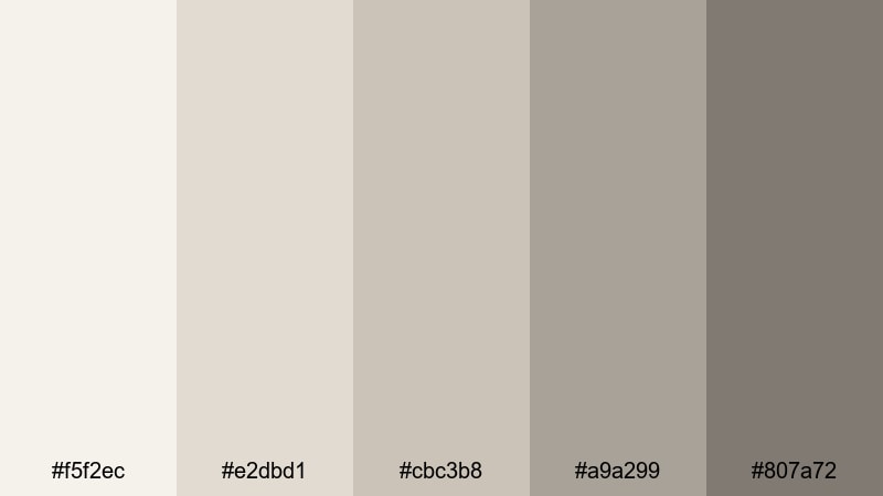
- HEX Codes: #f5f2ec, #e2dbd1, #cbc3b8, #a9a299, #807a72
- Mood: Softly muted, introspective, and calm like an overcast city afternoon.
- Use for: Best for talking head videos, productivity content, and cinematic B-roll in small spaces.
Cloudy Loft Daylight leans into cooler Beige and greige tones, mirroring the look of soft daylight on concrete or city walls. It is calm, introspective, and perfect when you want an understated, mature atmosphere.
Use the mid and dark tones (#a9a299, #807a72) for readable text against the brighter Beiges, and keep your overall saturation low in Filmora to stay within that cloudy, thoughtful mood. This combination works especially well for productivity channels, chill working sessions, or cinematic desk B-roll.
Warm Cozy Beige Color Palettes
Fireplace Glow Beige
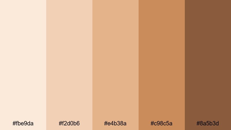
- HEX Codes: #fbe9da, #f2d0b6, #e4b38a, #c98c5a, #8a5b3d
- Mood: Warm, nostalgic, and intimate like sitting by a crackling fire.
- Use for: Ideal for storytime videos, cozy night routines, and seasonal content with a warm vibe.
Fireplace Glow Beige is full of caramel, honey, and ember-like browns. It instantly makes your visuals feel intimate and nostalgic, as if everything is lit by a soft fire.
This palette is perfect for candle-lit scenes, storytime videos, and autumn or winter vlogs. Use the richer browns (#c98c5a, #8a5b3d) for text, borders, or frames, and let the lighter tones wash over your backgrounds for an even, glowing warmth.
Autumn Knit Comfort
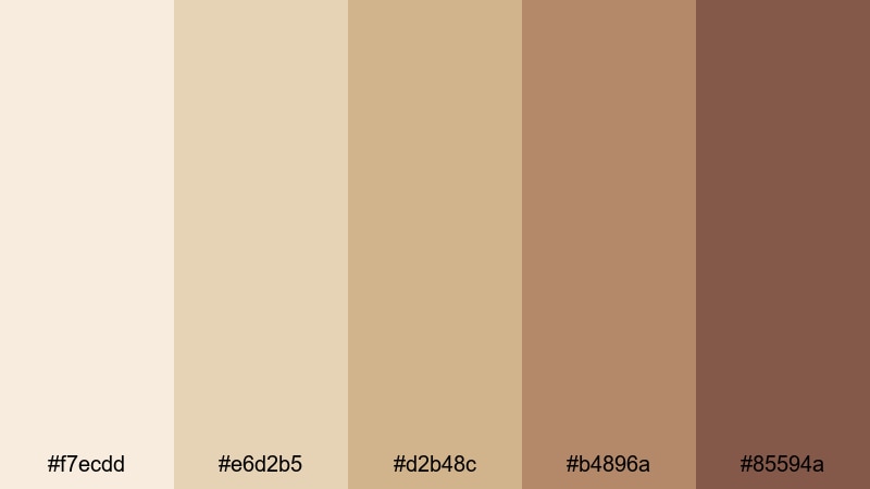
- HEX Codes: #f7ecdd, #e6d2b5, #d2b48c, #b4896a, #85594a
- Mood: Earthy, snug, and seasonal, evoking chunky sweaters and fall walks.
- Use for: Perfect for fall vlogs, bookish content, and cinematic outdoor scenes with foliage.
Autumn Knit Comfort blends creamy Beiges with warm browns that echo fallen leaves and knitted scarves. It is earthy and nostalgic without being too dark.
Use the mid-tone Beige (#d2b48c) as your main brand color for overlays, and the deeper browns for accent lines, chapter markers, or end-screen designs. It looks great paired with outdoor footage, cozy reading shots, and seasonal product features.
Caramel Shortbread Mood
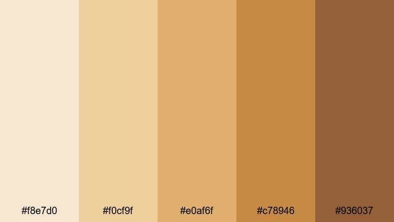
- HEX Codes: #f8e7d0, #f0cf9f, #e0af6f, #c78946, #936037
- Mood: Sweet, indulgent, and cheerful, like dessert after a long day.
- Use for: Great for food videos, baking shorts, and product shots that need a warm, appetizing glow.
Caramel Shortbread Mood is a delicious mix of buttery Beige and golden caramel. It instantly makes food look richer, more appetizing, and full of texture.
Use the lighter tones for clean background plates under on-screen text, and the saturated caramel accents (#e0af6f, #c78946) for key buttons, price labels, or recipe step titles. In Filmora, pair this palette with a slight contrast lift and subtle vignette to make dishes pop without losing the warm, friendly feel.
Dusk Cafe Corner
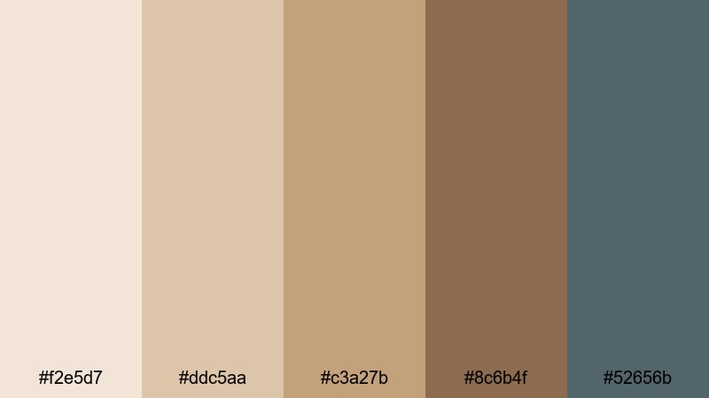
- HEX Codes: #f2e5d7, #ddc5aa, #c3a27b, #8c6b4f, #52656b
- Mood: Moody yet warm, like journaling in a corner cafe at dusk.
- Use for: Use for cinematic cafe vlogs, travel diaries, and moody title cards.
Dusk Cafe Corner mixes toasty Beiges with a muted teal accent, creating a cinematic contrast between warmth and coolness. It feels like late-afternoon light slowly fading outside a cozy cafe.
Use the teal shade (#52656b) for subtle highlights in your titles, icons, or progress bars to break up the warmth and make designs more dynamic. This palette works beautifully on travel vlogs, moody B-roll, and reflective journaling content.
Vintage Book Pages
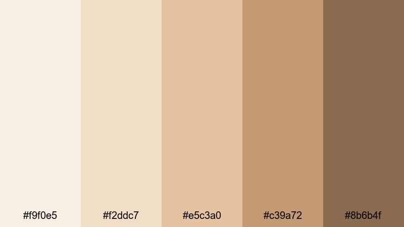
- HEX Codes: #f8f1e3, #ebddc4, #d6c3a1, #b29b7a, #8a6f54
- Mood: Nostalgic, intellectual, and softly aged like old paper.
- Use for: Ideal for study vlogs, reading content, and educational channels aiming for a warm, scholarly tone.
Vintage Book Pages looks like sun-aged paper and soft sepia ink. It carries a gentle, academic nostalgia that suits study, reading, and educational content.
The lighter Beiges make ideal backgrounds for quotes, definitions, and infographics, while the deeper browns can be used for headings, dividers, or icons. In Filmora, you can combine this palette with subtle grain and a hint of vignette to mimic the feel of old film or scanned book pages.
Modern Elegant Beige Color Palettes
Urban Stone Luxe
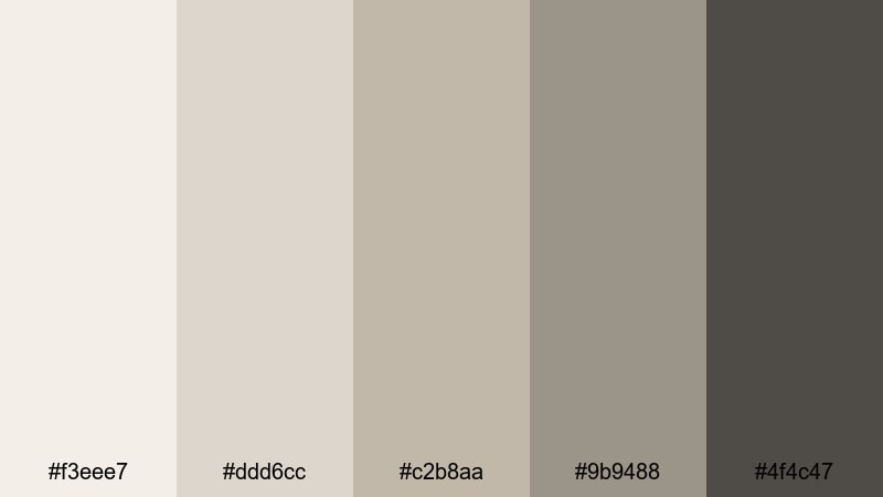
- HEX Codes: #f3eee7, #ddd6cc, #c2b8aa, #9b9488, #4f4c47
- Mood: Polished, modern, and metropolitan with a luxe edge.
- Use for: Great for tech reviews, office tours, and brand intros that should feel sleek and premium.
Urban Stone Luxe is inspired by stone, concrete, and polished interior spaces. It is neutral and minimal but has enough depth to feel premium and editorial.
Use the darker tones (#9b9488, #4f4c47) for typography and interface elements in your overlays, while the paler Beiges form clean, magazine-like backgrounds. This palette works well for tech, business, and modern lifestyle brands that want elegance without bright colors.
Champagne Lobby Lights
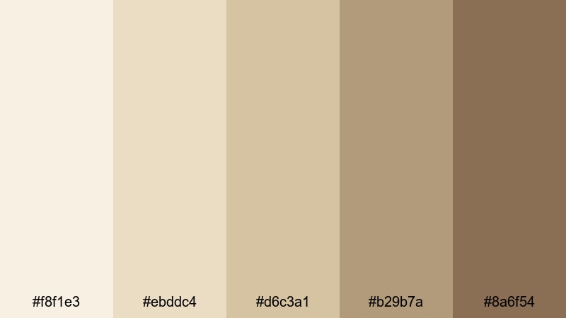
- HEX Codes: #f9f0e5, #f2ddc7, #e5c3a0, #c39a72, #8b6b4f
- Mood: Glamorous, warm, and refined like a hotel lobby at golden hour.
- Use for: Perfect for fashion lookbooks, luxury product showcases, and elegant channel branding.
Champagne Lobby Lights combines soft champagne Beiges with warm gold and caramel accents. It gives your content a subtle luxury feel, like soft lighting bouncing off marble and brass.
Use the richer tones for product frames, logo marks, and call-to-action buttons, while letting the lighter shades carry your backgrounds. This palette elevates fashion, skincare, jewelry, and high-end lifestyle clips in a way that feels warm, not flashy.
Gallery Wall Neutrals
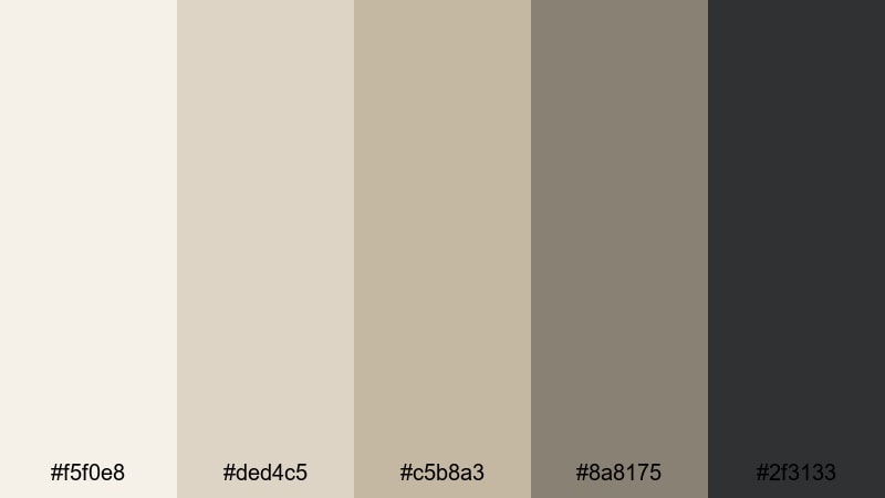
- HEX Codes: #f5f0e8, #ded4c5, #c5b8a3, #8a8175, #2f3133
- Mood: Curated, artistic, and balanced, like a modern gallery space.
- Use for: Use for portfolio reels, editing breakdowns, and any content that highlights visuals or artwork.
Gallery Wall Neutrals mixes creamy walls, framed art tones, and a deep charcoal accent. It is clean and artistic, designed to keep the focus on your visuals rather than on your UI or text.
Use the dark charcoal (#2f3133) for text and borders around your work, while the mid-tone Beiges add subtle structure behind timelines, captions, or split screens. This palette is ideal for portfolio reels, design showcases, or any channel built around visual storytelling.
Cinematic Desert Frame
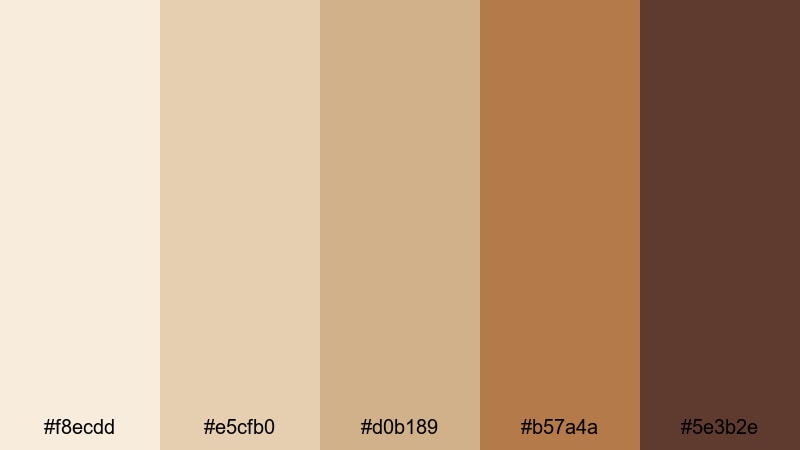
- HEX Codes: #f8ecdd, #e5cfb0, #d0b189, #b57a4a, #5e3b2e
- Mood: Expansive, dramatic, and sun-soaked like a desert landscape shot on film.
- Use for: Ideal for travel films, drone shots, and cinematic sequences needing warmth and drama.
Cinematic Desert Frame captures the look of desert sand, sun-baked rock, and rich amber shadows. It feels wide and cinematic, ideal for storytelling and travel edits.
Use the lighter Beiges as your base grade across all clips, then enhance depth with the darker ambers in overlays, frames, or letterbox bars. Paired with gentle film grain and slower cuts in Filmora, this palette turns everyday landscapes into story-driven visuals.
Minimal Office Edit
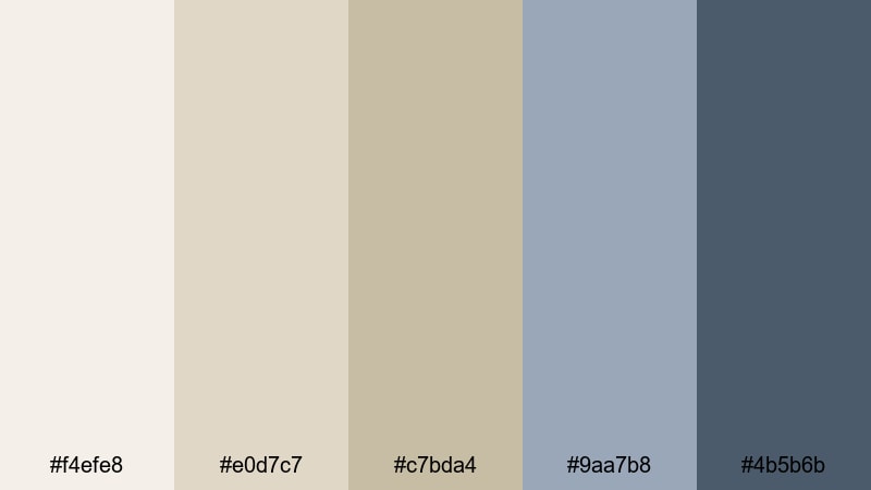
- HEX Codes: #f4efe8, #e0d7c7, #c7bda4, #9aa7b8, #4b5b6b
- Mood: Productive, clean, and contemporary with a subtle corporate polish.
- Use for: Best for productivity content, SaaS explainers, and workspace tours with a modern brand feel.
Minimal Office Edit pairs soft Beige with muted blue-grays, echoing modern workspaces, laptops, and clean desks. It sends a clear, professional message without feeling cold.
Use Beiges for your backgrounds and info panels, then bring in the blues (#9aa7b8, #4b5b6b) for headings, icons, and progress graphics. This palette is a strong match for explainers, Notion-style setups, productivity dashboards, and SaaS product demos.
Tips for Creating Beige Color Palettes
Beige works best when you balance warmth, contrast, and supporting accent colors. Here are practical tips to build Beige color combinations that stay readable, on-brand, and flattering on video.
- Decide on a temperature: choose warmer Beiges for cozy, lifestyle content, and cooler greige tones for modern, tech, or minimal brands.
- Add a dark anchor: include at least one deep shade (charcoal, espresso, or muted teal) for text and icons so your Beige backgrounds stay readable.
- Limit accent colors: stick to one or two accent hues (like blush, teal, or soft blue) so your Beige palette does not start to feel chaotic.
- Test on thumbnails first: drop your HEX codes into a thumbnail mockup and check legibility at small sizes on both light and dark YouTube or app themes.
- Match your footage: in Filmora, lightly adjust white balance and saturation so your recorded clips sit naturally inside the Beige palette you designed.
- Keep skin tones natural: avoid pushing Beige grades too far into orange or gray; use HSL to protect skin tones while still tinting backgrounds.
- Use hierarchy with tints: reserve the richest or darkest colors for titles and CTAs, mid-tones for panels, and lightest Beiges for background areas.
- Save presets for consistency: once you dial in a Beige grade and text style in Filmora, save them as presets so every new upload stays on-brand.
Beige color palettes are powerful because they quietly shape mood and brand identity without overwhelming the viewer. Whether you lean into soft minimalist creams, cozy caramel tones, or chic urban neutrals, a well-chosen Beige range can make your videos, thumbnails, and social graphics look instantly more intentional.
With Filmora, you can turn these HEX codes into real-world visuals: match your footage to a Beige reference, keep your titles and overlays consistent, and experiment with filters and LUTs until you find a signature style. Try a few of the palettes above on your next vlog, product video, or intro sequence and see how much more cohesive your channel feels.
As you iterate, keep saving your favorite Beige setups as presets in Filmora. Over time, that consistent, warm-neutral look becomes part of what viewers recognize and remember about your brand.
secure downloadNext: Cowboy Color Palette
