
 100% Security Verified | No Subscription Required | No Malware


 ChatGPT
 Perplexity
 Gemini
 Claude
 Grok
Grok
Blue Maroon is a powerful pairing: blue brings trust, depth, and calm, while maroon adds passion, elegance, and a hint of drama. Together they create a cinematic contrast that feels both modern and timeless, perfect for thumbnails, channel branding, streaming overlays, podcast covers, and cinematic intros that need to look premium without feeling too cold.
This guide rounds up 15 Blue Maroon color palettes with ready-to-use HEX codes so you can color-grade footage, design YouTube thumbnails, build titles, and polish brand visuals with confidence. Every palette works beautifully in Filmora, whether you are styling a vlog, a wedding highlight, a gaming intro, or a minimalist brand video.
In this article
Soft & Romantic Blue Maroon Color Palettes
Twilight Harbor Blush
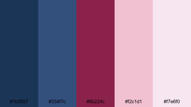
- HEX Codes: #1b3557, #334f7c, #8b224c, #f2c1d1, #f7e6f0
- Mood: Calm, romantic, and quietly cinematic.
- Use for: Ideal for dreamy vlog sequences, wedding highlight videos, and soft storytelling thumbnails.
Twilight Harbor Blush blends deep harbor blues with gentle maroon and blush tones, creating the feeling of a seaside sunset that is slowly fading into night. The darker blue (#1b3557) and muted navy (#334f7c) give you visual depth, while the maroon (#8b224c) and light pinks (#f2c1d1, #f7e6f0) add warmth and softness.
Use this palette for romantic wedding highlight films, aesthetic travel vlogs, or reflective storytelling edits where you want emotion without harsh contrast. In thumbnails and titles, place text over the lighter blush shades to keep it readable, and reserve the deepest blue for borders, lower thirds, or logo accents.
Pro Tip: Build a Cinematic Blue Maroon Look in Filmora
To keep a Twilight Harbor Blush look consistent, start by sampling your key colors inside Filmora and saving them as custom swatches. Use the deepest blue for backgrounds and overlays, the maroon for important accents like call-to-action buttons, and the blush tones for shapes behind text or lower-third panels.
As you cut your video, duplicate these color choices across intros, B-roll transitions, and end screens. This helps thumbnails, titles, and social cutdowns all feel like they belong to the same soft, cinematic Blue Maroon world.
AI Color Palette
If you have a still frame or reference image that perfectly captures your Twilight Harbor Blush tones, you can let Filmora do the heavy lifting. Filmora's AI Color Palette feature analyzes your reference and applies the same color style across your entire edit, from A-roll to B-roll.
Import the clip or image with your ideal Blue Maroon mood, run AI Color Palette, and match the rest of your footage to it. This keeps skin tones natural while unifying blues and maroons, so your vlogs, wedding films, and reels look professionally color graded with just a few clicks.
 secure download

HSL, Color Wheels & Curves
Once you match the overall mood, use Filmora's HSL, color wheels, and curves to fine-tune your Blue Maroon tones. Slightly desaturate blues in the shadows and lift maroon in the midtones to keep skin flattering while preserving that twilight atmosphere. Filmora's dedicated color correction tools help you control each color range precisely.
On the curves panel, add a soft S-curve to deepen contrast without crushing detail, then nudge the blue shadow curve upward for a gentle cool tint. Use color wheels to warm highlights toward blush, so titles, faces, and key details stand out against cooler backgrounds and feel more cinematic.
secure download1000+ Video Filters & 3D LUTs
If you want an instant stylized look, Filmora's video filters and 3D LUTs make it easy to lean your Blue Maroon palette toward dreamy, vintage, or high-contrast cinematic styles. Start with a LUT that complements cool tones, then dial back the intensity so your custom maroon and blush accents still feel natural.
For intros and thumbnails, stack subtle filters to add glow, grain, or vignette, which enhances the twilight mood of this palette. Save your favorite combinations as custom presets so every new video on your channel keeps the same Blue Maroon identity with a single click.
secure downloadRose Velvet Nightfall
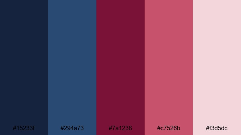
- HEX Codes: #15233f, #294a73, #7a1238, #c7526b, #f3d5dc
- Mood: Lush, intimate, and slightly mysterious.
- Use for: Great for lyrical music videos, cinematic reels, and dramatic podcast cover art.
Rose Velvet Nightfall mixes inky midnight blues with velvety maroon and rose tones for a lush, intimate mood. The deep navy shades frame your scene with mystery, while the rose and maroon suggest emotion and romance.
Use the darker blues as backgrounds in lower thirds or full-screen titles, then bring in the lighter rose (#f3d5dc) as a soft text or button color. This palette works beautifully for lyrical music videos, poetry reels, or podcast art where you want depth, mood, and a hint of drama.
Moonlit Cranberry Waves
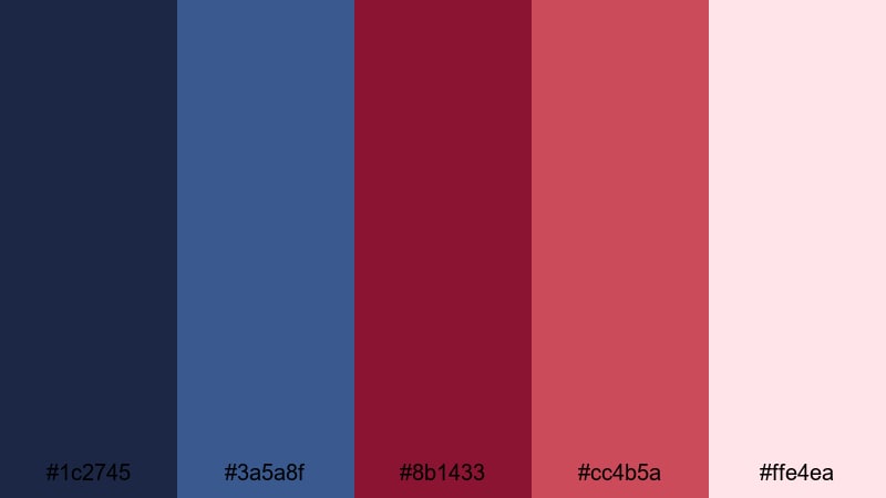
- HEX Codes: #1c2745, #3a5a8f, #8b1433, #cc4b5a, #ffe4ea
- Mood: Dreamy, nostalgic, and softly energetic.
- Use for: Use for romantic travel vlogs, B-roll montages, and YouTube channel banners with a heartfelt tone.
Moonlit Cranberry Waves layers soft oceanic blues with cranberry maroon and a pale blush highlight. It feels like standing by the sea under moonlight, with a touch of bittersweet nostalgia from the red accents.
Apply the medium blues (#1c2745, #3a5a8f) to graded footage and overlays, then use the cranberry tones for callouts, map pins, or animated shapes in travel vlogs. The pale blush (#ffe4ea) is ideal for titles and channel banner backgrounds where you want gentle contrast that still reads clearly on mobile.
Serene Dusky Petals
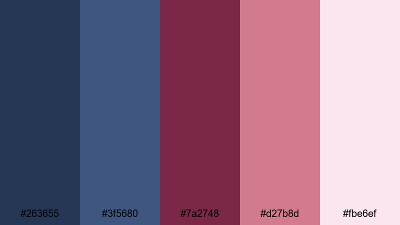
- HEX Codes: #263655, #3f5680, #7a2748, #d27b8d, #fbe6ef
- Mood: Gentle, uplifting, and feminine without being overly sweet.
- Use for: Perfect for lifestyle vlogs, beauty content, and soft brand intros or lower thirds.
Serene Dusky Petals balances cool, slightly dusky blues with petal-like maroon and pinks. The result is soft and uplifting, but still grounded enough to feel modern and clear rather than sugary.
Use the deeper blues for backgrounds and drop shadows in your titles, then bring in the maroon and warm pinks for product highlights, beauty shots, and lower-third name cards. This palette is excellent for lifestyle vlogs, beauty channels, and personal brands that want a polished feminine aesthetic across intros, thumbnails, and Instagram reels.
Bold & Cinematic Blue Maroon Color Palettes
Neon Noir Premiere
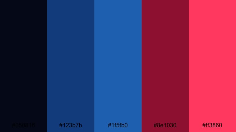
- HEX Codes: #050816, #123b7b, #1f5fb0, #8e1030, #ff3860
- Mood: Edgy, high-contrast, and unmistakably cinematic.
- Use for: Best for trailers, gaming intros, and bold streaming overlays that need to pop on any screen.
Neon Noir Premiere pushes Blue Maroon into an electric, high-contrast direction. The almost-black blue (#050816) and saturated blues create a dark, cinematic base, while the hot maroon and neon pink (#ff3860) slash across the frame with energy.
Use the darkest tone as your background for titles, alerts, and panels, then reserve the neon accent for key buttons, subscribe prompts, and kill-streak or alert animations. This palette is perfect for gaming intros, hype trailers, and overlays that need to stand out on crowded streaming platforms and mobile feeds.
Crimson Tide Overture
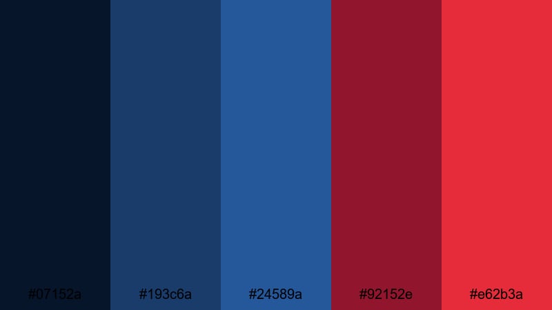
- HEX Codes: #07152a, #193c6a, #24589a, #92152e, #e62b3a
- Mood: Intense, heroic, and action-driven.
- Use for: Excellent for sports edits, cinematic B-roll reels, and impactful title cards.
Crimson Tide Overture pairs deep ocean blues with crashing crimson maroons for a trailer-ready, heroic intensity. The blues carry strength and focus, while the bold red tones feel like a rising tide of action.
Use the mid-blues for jerseys, motion graphics, or background gradients in sports edits, then flash the red tones on impact frames, score updates, or bold kinetic titles. This combination is great for sizzle reels, event promos, and any sequence that needs to feel like a climax from start to finish.
Midnight Stadium Lights
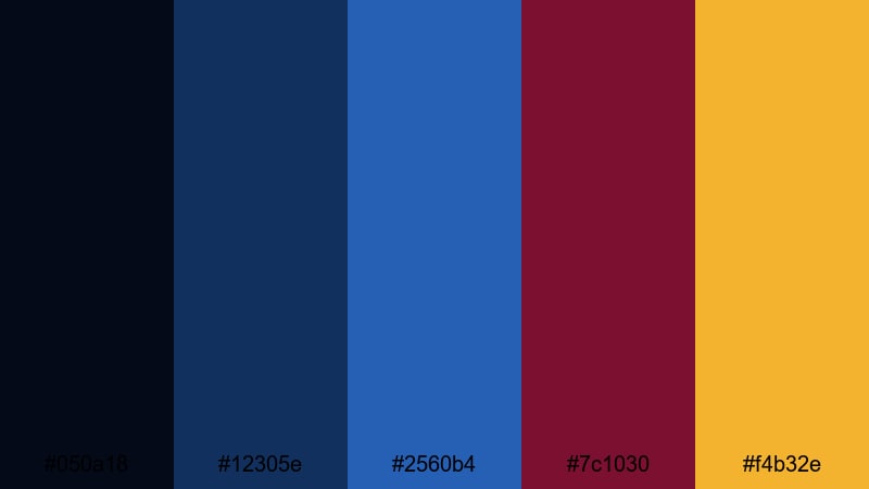
- HEX Codes: #050a18, #12305e, #2560b4, #7c1030, #f4b32e
- Mood: Energetic, competitive, and larger than life.
- Use for: Designed for sports highlight videos, esports streams, and hype promo graphics.
Midnight Stadium Lights combines deep midnight blues and maroon with a striking golden accent, echoing bright stadium floodlights against a dark sky. The palette feels competitive, energetic, and built for motion.
Let the blues anchor your backgrounds and footage grade, while the maroon highlights teams, key players, or scorelines. Use the gold (#f4b32e) sparingly on badges, transitions, and animated flares to mimic stadium lights and draw attention to big moments in your edit or thumbnail.
Electric Royal Clash
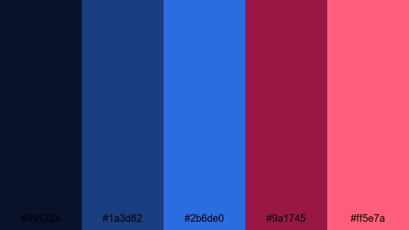
- HEX Codes: #09122a, #1a3d82, #2b6de0, #9a1745, #ff5e7a
- Mood: Vibrant, youthful, and strikingly modern.
- Use for: Great for bold YouTube thumbnails, product launches, and kinetic typography sequences.
Electric Royal Clash pits royal blues against vibrant maroon and pink for a modern, energetic look. The saturated blue tones feel authoritative and tech-forward, while the pink-maroon accents inject bold personality.
Use this palette when you want your YouTube thumbnails, product launch graphics, or app promos to stand out instantly in search results. Set backgrounds in deep or medium blues, then use the maroon and pink tones in text outlines, badges, and motion graphics for maximum click-grabbing contrast.
Modern & Minimal Blue Maroon Color Palettes
Clean Studio Contrast
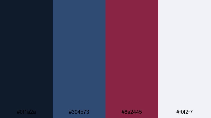
- HEX Codes: #0f1a2a, #304b73, #8a2445, #f0f2f7
- Mood: Sleek, professional, and design-forward.
- Use for: Use for tech explainers, SaaS landing pages, and minimal logo animations.
Clean Studio Contrast uses disciplined cool blues, a focused maroon accent, and a crisp off-white (#f0f2f7) to build a sleek, professional look. It feels like a well-lit studio: clean, confident, and distraction-free.
Use the off-white as your main background for titles, slides, or landing-page style scenes, then add blue for headings and UI shapes. Introduce maroon sparingly for call-to-action buttons, logo highlights, or important stats in explainers and pitch videos so viewers know exactly where to look.
Nordic Script Titles

- HEX Codes: #151c28, #32445c, #6f7b91, #7a2948, #f6f7fb
- Mood: Calm, editorial, and quietly confident.
- Use for: Perfect for title cards, educational videos, and documentary lower thirds.
Nordic Script Titles leans into soft slate blues, a muted maroon accent, and a near-white highlight for an editorial, Scandinavian-inspired feel. It is calm and confident, ideal when you want the content to lead and the design to support.
Use the lightest shade (#f6f7fb) for your main backgrounds or text panels, then stack the different blues in headings, subheads, and subtle dividers. The maroon works best as a small but strong accent on key words in titles, or as a line under your logo in documentary-style intros and educational videos.
Tech Noir Interface
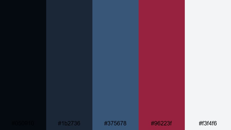
- HEX Codes: #050910, #1b2736, #375678, #96223f, #f3f4f6
- Mood: Futuristic, focused, and slightly dark.
- Use for: Great for UI mockups, app promo videos, and motion-graphics dashboards.
Tech Noir Interface combines shadowy blues with precise maroon accents and a clean light gray. It feels like a futuristic dashboard, serious and data-driven but still visually engaging.
Use the darker blues for full-screen backgrounds and HUD-style overlays, while the light gray (#f3f4f6) keeps text panels readable. Add maroon as a signal color for notifications, progress bars, and key metrics in motion-graphics dashboards or app walkthrough videos.
Editorial Grid Depth
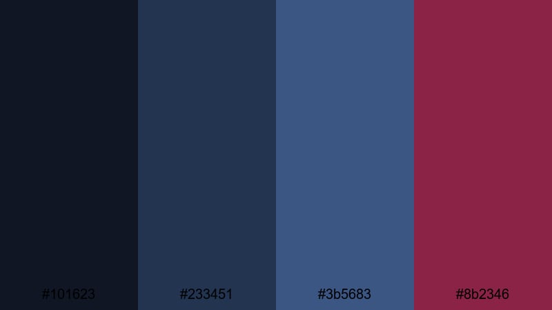
- HEX Codes: #101623, #233451, #3b5683, #8b2346
- Mood: Structured, intellectual, and design-savvy.
- Use for: Ideal for YouTube essays, portfolio sites, and clean intro templates.
Editorial Grid Depth stacks layered blues with a single deep maroon accent to create a refined, structured aesthetic. It feels like a thoughtfully designed magazine layout translated into motion.
Use the three blues to build depth in background blocks, sidebars, and content containers, keeping your typography clean and central. Drop in maroon for subtle but deliberate touches, such as highlighted pull quotes, chapter markers, or logo marks in YouTube essays and showreels.
Vintage & Moody Blue Maroon Color Palettes
Retro Vinyl Midnight
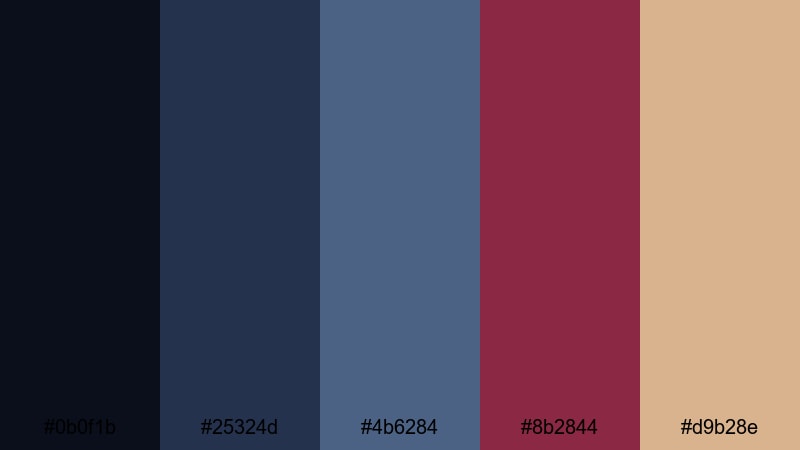
- HEX Codes: #0b0f1b, #25324d, #4b6284, #8b2844, #d9b28e
- Mood: Nostalgic, soulful, and richly textured.
- Use for: Perfect for retro-inspired music videos, vinyl-themed podcasts, and analog-style title sequences.
Retro Vinyl Midnight blends muted blues and worn-in maroon with a warm tan highlight reminiscent of old record sleeves and dim studios. The palette immediately adds a sense of history and texture to your visuals.
Grade your footage toward the deeper blues for a moody base, then use the tan (#d9b28e) for type or frames that mimic aged paper or vintage labels. The maroon accent is perfect for logo marks, track titles, or subtitles in music videos, vinyl podcasts, and analog-inspired title sequences.
Baroque Theater Curtain
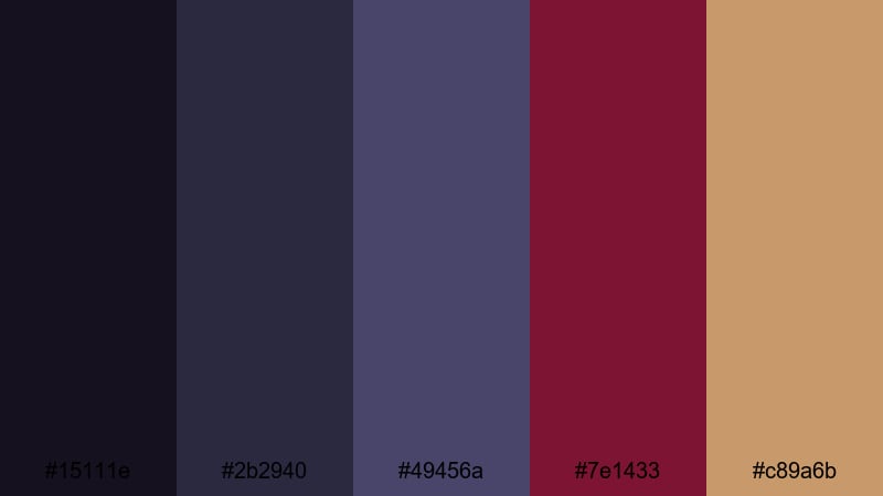
- HEX Codes: #15111e, #2b2940, #49456a, #7e1433, #c89a6b
- Mood: Dramatic, historic, and luxuriously moody.
- Use for: Use for period-piece edits, theater promos, and dramatic storytelling openers.
Baroque Theater Curtain pairs stage-like blues and curtain maroon with an antique gold highlight. It recalls old theaters and opera houses, giving your edit a lavish, story-rich atmosphere.
Use the darker blues as a velvet-like backdrop for titles and opening credits, then add maroon on key shapes and typography. The antique gold (#c89a6b) works beautifully for serif titles, ornamental dividers, and logo animations in theater promos, trailers, and dramatic storytelling videos.
Cabernet Jazz Lounge
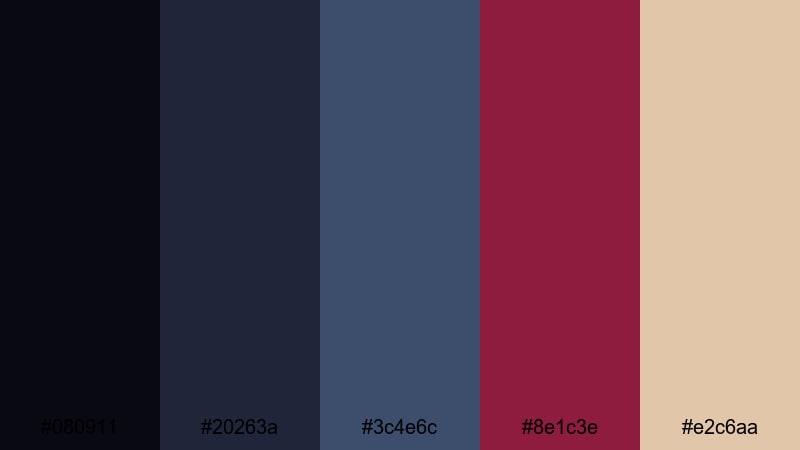
- HEX Codes: #080911, #20263a, #3c4e6c, #8e1c3e, #e2c6aa
- Mood: Warm, smoky, and intimately cinematic.
- Use for: Great for jazz sessions, cafe vlogs, and late-night storytelling videos with a cozy vibe.
Cabernet Jazz Lounge weaves smoky blues with deep cabernet maroon and a creamy highlight. It feels like candlelight reflecting off instruments in a small club, warm and intimate but still sophisticated.
Grade your footage toward the cooler blues for the shadows, then let maroon and cream live in your highlights, titles, and overlays. This palette is ideal for jazz sessions, cafe vlogs, late-night storytimes, or any sequence where you want viewers to feel like they have stepped into a cozy, cinematic space.
Tips for Creating Blue Maroon Color Palettes
Blue Maroon palettes can swing from soft romance to bold cinema, depending on how you balance contrast, saturation, and supporting colors. Use these practical tips to adapt the palettes above to your own footage, branding, and design work in Filmora.
- Decide your mood first: softer, desaturated blues and maroons work for romance and nostalgia, while saturated, high-contrast tones suit trailers, gaming, and sports edits.
- Protect readability by placing text over the lightest shade in your palette (often blush, off-white, or tan) and using the darkest blue or maroon for text itself.
- Use one main background color (usually a blue) and keep maroon as an accent for buttons, important words, progress bars, or key icons so the design does not feel heavy.
- Introduce a neutral or soft support color, such as an antique white or pale gray, to give your layout breathing room in thumbnails, lower thirds, and end screens.
- Match your footage to the palette by gently shifting shadows toward blue and adjusting midtones toward maroon, then fine-tuning skin tones with HSL controls in Filmora.
- Keep branding consistent: reuse the same HEX codes for titles, overlays, and channel graphics so viewers instantly recognize your Blue Maroon aesthetic across platforms.
- Test on multiple devices by checking how your palette looks on phone, tablet, and desktop, then tweak contrast or brightness so details are clear even on small screens.
- Save presets in Filmora for color settings, text styles, and overlays that match your chosen palette, so every new video can adopt your signature look in a few clicks.
Blue Maroon color palettes bring together trust and intensity, calm and drama, making them perfect for creators who want visuals that feel cinematic and brandable at the same time. Whether you favor romantic blush tones, bold neon clashes, or vintage lounge moods, there is a palette here that can anchor your entire visual identity.
Experiment with these HEX codes inside Filmora, adapting them to your footage using AI Color Palette, HSL tools, filters, and LUTs. As you refine your favorite combinations, you will build a recognizable Blue Maroon style that carries through thumbnails, intros, streaming overlays, and social cutdowns.
The more consistently you apply your palette, the more your audience will feel that every frame belongs to your world. Start with one or two of the palettes above, customize them in Filmora, and let Blue Maroon become a signature part of your storytelling.
secure download