
 100% Security Verified | No Subscription Required | No Malware


 ChatGPT
 Perplexity
 Gemini
 Claude
 Grok
Grok
Burnished Copper is a rich, earthy metallic that sits between warm orange, brown, and soft red. It feels grounded and handcrafted, but also polished enough for modern brands. Psychologically, Burnished Copper suggests warmth, reliability, and quiet luxury, without the coldness of steel or the flashiness of bright gold. It can make visuals feel nostalgic and cinematic, like light catching an old lens or afternoon sun across vintage hardware.
For creators, this makes Burnished Copper a powerful anchor color for intros, cinematic B-roll, thumbnails, lower thirds, and branding systems. It pairs beautifully with warm neutrals, deep charcoals, forest greens, and moody blues, giving you endless options for vlogs, tutorials, reels, and channel branding. Below you will find curated Burnished Copper color palettes with HEX codes, designed for video editors, designers, and Filmora users who want consistent, cinematic color across their projects.
In this article
Warm Cinematic Burnished Copper Color Palettes
Sunlit Foundry Glow

- HEX Codes: #8b4e32, #c97a4a, #f0c28b, #3c2b2c, #f7e6d0
- Mood: Warm, nostalgic, and cinematic like late afternoon light on aged metal.
- Use for: Great for cinematic vlogs, travel films, and moody B-roll where you want a nostalgic sunlit tone.
Sunlit Foundry Glow wraps your frame in warm Burnished Copper shadows, honeyed midtones, and velvety soft highlights. The rich copper browns combine with creamy light tones to feel like golden hour catching dust and texture on metal or brick.
Use this palette for storytelling intros, memory-driven vlogs, romantic travel sequences, and thumbnails where you want warmth without going overly orange. It works especially well for slow pans over details, lifestyle B-roll, and channel branding that leans into a nostalgic cinematic look.
Pro Tip: Build a Cinematic Burnished Copper Look in Filmora
To keep this Sunlit Foundry Glow aesthetic consistent, start by using Burnished Copper as your accent color across titles, lower thirds, and overlays. In Filmora, you can set custom color values using the HEX codes from this palette and save them as branded presets for future projects.
Apply the same copper tone to your intro animation, subscribe buttons, and end screen frames so every part of the edit feels like it belongs to the same world. Subtle color blocks, gradients, and text highlights in Burnished Copper will make even simple vlogs look more cinematic and cohesive.
AI Color Palette
If you have a still frame or mood board that already nails this Burnished Copper glow, you can turn it into a reference for your whole timeline. Filmora's AI Color Palette feature lets you sample the colors from one clip or image and automatically apply a similar grade to other shots.
Import a frame that shows your ideal copper warmth, then use AI Color Palette to match the rest of your B-roll, A-roll, and cutaways. This keeps skin tones, copper highlights, and shadows feeling consistent across travel sequences, intros, and social edits without manual tweaking on every clip.
 secure download

HSL, Color Wheels & Curves
To perfect a Burnished Copper grade, use Filmora's HSL controls to subtly deepen oranges and reds while desaturating yellows to avoid an artificial look. In the color wheels, push midtones slightly warmer and cool the shadows to introduce gentle contrast that still feels cinematic.
You can also use curves to lift the darkest shadows just a touch while compressing the highlights, creating that filmic, soft roll-off that suits copper tones. For a step-by-step walkthrough, Filmora's tutorials on using color wheels and curves creatively can help you refine the mood without crushing detail.
secure download1000+ Video Filters & 3D LUTs
Once your Burnished Copper base is set, you can push the style further with Filmora's filters and LUTs. Subtle film emulation, vignette, and fade effects will all amplify the nostalgic foundry feeling without overwhelming your original tones.
Filmora's video filters and 3D LUTs make it easy to test different cinematic looks on top of your copper palette. Apply a LUT to an adjustment layer, then fine-tune opacity and color intensity until it perfectly matches your brand or series.
secure downloadIndustrial Sunset Frame
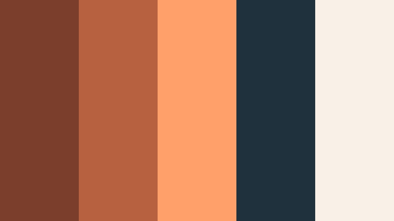
- HEX Codes: #7a3f2c, #b8613f, #ff9f6a, #20313e, #f9f1e8
- Mood: Edgy yet inviting, like an urban sunset reflected on steel and glass.
- Use for: Perfect for urban B-roll sequences, title cards, and tech-inspired thumbnails with a warm twist.
Industrial Sunset Frame combines Burnished Copper with punchy sunset orange, ink blue, and soft ivory. The palette balances gritty city energy with a welcoming warmth, ideal for tech or productivity content that still wants a human touch.
Use the deeper blues for backgrounds or drop shadows, then reserve the copper and bright orange accents for UI elements, text, and motion graphics in your intros and lower thirds. It works especially well in thumbnails where you want your subject to pop against a cooler, urban backdrop.
Candlelit Studio Mood

- HEX Codes: #6b3825, #a45b3a, #d49b71, #f3d8b8, #2b2420
- Mood: Cozy, intimate, and handcrafted, like a creative loft lit by candles.
- Use for: Use for behind-the-scenes videos, home studio tours, and cinematic talking head setups.
Candlelit Studio Mood leans into deep Burnished Copper shadows, creamy highlights, and a dark, nearly black brown that feels like a studio corner at night. It is ideal for content that is personal and craft-focused.
Use the lighter beige tones for text and UI so everything stays readable over darker footage. Add copper accents to frames, logo animations, and callout graphics in your Filmora timelines to give your studio tours or gear breakdowns a warm, handcrafted signature.
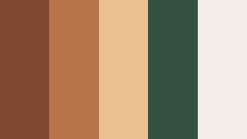
Desert Ember Horizon

- HEX Codes: #8f4f33, #c47647, #efb582, #fbe1c3, #31424a
- Mood: Expansive and cinematic, evoking desert sunsets and faraway horizons.
- Use for: Great for travel vlogs, landscape montages, and inspirational brand reels.
Desert Ember Horizon blends Burnished Copper with sandy peach, soft beige, and a cool slate blue accent. It feels wide and cinematic, like watching the sky change colors over a desert ridge.
In video, use the warm tones for sunlit shots and skin, then let the slate blue carry your shadows, overlays, or typography. This mix works beautifully for travel intros, cinematic reels, inspirational quotes, and channel trailers that lean into adventure and freedom.
Vintage Lens Patina

- HEX Codes: #6a3a2b, #9b5e3e, #c2936a, #e5cfb3, #1f2524
- Mood: Muted and nostalgic, like faded film stills and old camera gear.
- Use for: Ideal for documentary-style edits, photo slideshows, and retro brand aesthetics.
Vintage Lens Patina softens Burnished Copper into dusty, desaturated tones paired with gentle neutrals and deep charcoal. It feels like a well-loved print or an old camera sitting on a wooden shelf.
Apply this palette to docu-style edits, history pieces, and personal stories. Use the light beige for captions and lower thirds, keep copper for accents and overlays, and let charcoal backgrounds subtly frame archival photos, titles, and end cards.
Elegant And Modern Burnished Copper Color Palettes
Copper Loft Minimal

- HEX Codes: #8a4e35, #b67852, #f0e1d2, #f7f5f2, #222326
- Mood: Clean, modern, and refined with a warm metallic accent.
- Use for: Perfect for logo animations, channel branding, and UI for creative portfolios.
Copper Loft Minimal uses Burnished Copper as a refined accent against airy off-whites and deep charcoal. It feels like a stylish studio apartment or gallery space with exposed brick and clean lines.
Use the light tones as your main backgrounds for websites, intros, and title cards, then drop in copper for logos, buttons, and key text highlights. This palette is ideal for creative portfolios, course branding, and professional YouTube channels wanting a grown-up but warm visual identity.
Editorial Copper Noir

- HEX Codes: #7a422f, #c07a55, #f3d0b0, #101015, #3a3a40
- Mood: Sophisticated and dramatic, like a high-end magazine spread.
- Use for: Use in luxury product videos, fashion lookbooks, and premium course intros.
Editorial Copper Noir sets Burnished Copper against inky blacks and soft nude tones, instantly reading as high-end and dramatic. The contrast is strong but elegant, ideal for premium content.
Let the darkest colors carry your backgrounds and overlays, then use copper for keylines, typography, and subtle glows behind products or subjects. This palette fits fashion lookbooks, cinematic product shots, premium course branding, and thumbnails that need a luxe, editorial edge.
Gallery Wall Neutral Copper

- HEX Codes: #865038, #bf845b, #e2c3a4, #f5eee6, #63666a
- Mood: Calm, curated, and gallery-ready with a warm focal tone.
- Use for: Great for design case studies, interior reels, and branding for lifestyle channels.
Gallery Wall Neutral Copper places soft Burnished Copper within a mix of gentle creams and cool gray. It has the calm, curated feeling of a design studio or art gallery.
Use this palette when you want your footage or designs to be the star, with color quietly supporting. It is great for interior reels, before-and-after design breakdowns, and lifestyle branding where you pair neutral backgrounds with occasional copper accents in titles, icons, and logo marks.
Modern Hearth Contrast

- HEX Codes: #733d29, #b06644, #f3b890, #fdf7f1, #1f3137
- Mood: Welcoming yet sharp, blending cozy warmth with modern contrast.
- Use for: Perfect for brand intros, podcast covers, and homepage hero sections needing warmth and edge.
Modern Hearth Contrast mixes Burnished Copper and peachy highlights with soft ivory and a teal-tinted dark. The result is a palette that feels both cozy and contemporary.
Use the ivory and peach for backgrounds and main text, then anchor layouts with the dark teal and copper accents. It works particularly well for podcast cover art, homepage hero sections, and YouTube intros that want to feel friendly but still sharp and professional.
Sculpted Metal Monochrome

- HEX Codes: #5f3325, #8f5338, #ba7a54, #e1b890, #f5e6cf
- Mood: Polished, sculptural, and minimalist within a warm metallic range.
- Use for: Use in logo stings, product mockups, and minimalist motion graphics with a metallic edge.
Sculpted Metal Monochrome explores Burnished Copper from deep shadows to light metallic highlights. Because it is monochrome, it feels very intentional and minimal, like a sculpture rendered in one metal.
Use this palette for logo animations, product reveals, and minimalist lower thirds. By sticking to one hue family, you can create elegant gradients, bevel effects, and metallic sheens in Filmora, while keeping all your branding aligned and recognizable.
Rustic And Organic Burnished Copper Color Palettes
Forest Forge Retreat
- HEX Codes: #7f4931, #b9754a, #e9c190, #34503e, #f3efe6
- Mood: Grounded and restorative, merging cabin warmth with forest calm.
- Use for: Great for outdoor vlogs, cabin tours, and eco-friendly brand stories.
Forest Forge Retreat pairs Burnished Copper with deep forest green and soft cream, evoking a cabin tucked between trees. It feels grounded and peaceful, perfect for nature-forward storytelling.
In your edits, let green dominate the backgrounds and natural footage, then bring in copper for text, badges, and logo elements. This mix works well for outdoor vlogs, eco brands, slow-living content, and thumbnails featuring cabins, trails, or forest scenes.
Harvest Table Story

- HEX Codes: #8a4f33, #c57f4c, #f1c47f, #8e9b63, #f8f3e5
- Mood: Abundant, cozy, and communal like a shared harvest dinner.
- Use for: Use for cooking channels, lifestyle reels, and warm brand storytelling around gatherings.
Harvest Table Story layers toasty Burnished Copper with golden ochre, olive green, and soft cream. It calls to mind shared meals, wooden tables, and seasonal produce.
Use this palette to color your cooking videos, lifestyle reels, and brand assets around food or gatherings. Copper and ochre can highlight call-to-action text and key titles, while olive serves as a gentle accent in dividers, labels, or icons on screen.
Clay Studio Daylight

- HEX Codes: #874c35, #c6815a, #f2c6a1, #f7eee5, #70716a
- Mood: Creative, tactile, and softly sunlit like a pottery studio.
- Use for: Perfect for maker channels, DIY tutorials, and behind-the-scenes creative process videos.
Clay Studio Daylight blends earthy Burnished Copper with clay peach, light beige, and soft gray. It feels tactile and creative, like your hands are in the clay while sunlight filters through the window.
Apply this palette to DIY tutorials, maker channels, behind-the-scenes reels, and Etsy-style branding. Use the lighter tones to keep backgrounds clean and inviting, then use copper and clay hues for controls, buttons, captions, and overlays in Filmora.
Ember Cabin Nightfall

- HEX Codes: #6b3a29, #9b5c3b, #c88a59, #e4c9a3, #22232a
- Mood: Intimate and cinematic, like firelight in a remote cabin at night.
- Use for: Use in moody travel diaries, story-driven intros, and cinematic title sequences.
Ember Cabin Nightfall combines smoldering Burnished Copper and ember tones with creamy highlights and deep charcoal. It is intimate and cinematic, like storytelling by a fire.
Use the darkest shade for letterboxed bars, backgrounds, and title cards, then bring copper into frames, glows, and animated accents. This palette is perfect for narrative vlogs, cinematic openers, and any video that leans into campfire or cozy-night storytelling.
Bold And Vibrant Burnished Copper Color Palettes
Neon Copper Skyline

- HEX Codes: #8c4f32, #ff8e4f, #ffd28a, #226f7a, #12151c
- Mood: Electric and bold, mixing vintage metal with neon city lights.
- Use for: Perfect for energetic intros, tech reviews, and high-impact thumbnails.
Neon Copper Skyline throws Burnished Copper into the city at night, with neon orange, bright teal, and deep midnight tones. It is loud, stylish, and perfect for standing out in crowded feeds.
Use dark navy as your base for thumbnails and title screens, then hit viewers with neon orange and teal streaks, shapes, and text. Copper acts as a bridge between vintage and modern, great for tech reviews, gaming overlays, and dynamic intro animations.
Festival Lantern Copper
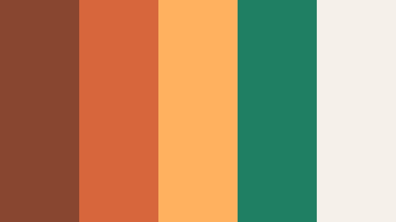
- HEX Codes: #88462f, #d7673b, #ffb15f, #1f7f63, #f5f1e9
- Mood: Festive, joyful, and energetic like lanterns at a night market.
- Use for: Use for event promos, festival recaps, and upbeat social edits.
Festival Lantern Copper mixes lively Burnished Copper and tangerine with jade green and soft cream. It feels like string lights, night markets, and summer festivals.
In Filmora, use cream backgrounds for readability, then layer in copper and orange for energetic titles and motion graphics. Jade adds a fresh twist to buttons, badges, and small accents in your event promos, recap videos, and upbeat social content.
Tips for Creating Burnished Copper Color Palettes
Burnished Copper is versatile, but it really shines when paired thoughtfully with supporting colors, contrast, and clear hierarchy. Here are practical tips to build palettes that work in both video and design.
- Balance warmth with cool accents. Pair Burnished Copper with Midnight Plum, deep navy, teal, or slate gray to keep the palette from feeling overly orange or flat.
- Protect readability. When using copper for text, place it over dark backgrounds; for light backgrounds, keep key text in near-black or deep charcoal and reserve copper for highlights.
- Limit accent colors. Choose one or two accent hues (like forest green or teal) so Burnished Copper remains the star of your brand and is easy to recognize.
- Match your footage. Sample colors directly from your scenes in Filmora, then adjust them to sit near your chosen HEX values so overlays, titles, and footage feel unified.
- Use value contrast, not just hue. Make sure there is enough light-dark contrast between text and background, especially for YouTube thumbnails viewed on mobile.
- Create theme variations. Build light, dark, and high-contrast versions of your Burnished Copper palette for intros, lower thirds, and end screens while keeping the same core hues.
- Test across devices. Export frames and check them on phones, tablets, and monitors to ensure copper tones do not skew too red or too yellow.
- Save presets. In Filmora, save your favorite copper color values and effects as presets so you can apply them instantly to future videos and maintain a consistent brand look.
Burnished Copper color palettes can transform your videos and designs from generic to cinematic, whether you are telling intimate stories, showcasing products, or building a recognizable channel identity. By pairing this warm metallic tone with the right neutrals, darks, and accents, you can guide mood, emotion, and focus in every frame.
Use the HEX codes above as a starting point, then refine them inside Filmora to fit your footage and style. Once you lock in a Burnished Copper look you love, carry it through your intros, lower thirds, B-roll, thumbnails, and social edits so your audience instantly recognizes your work.
Download Filmora, experiment with these palettes, and turn Burnished Copper into a signature element of your visual storytelling.
secure download