
 100% Security Verified | No Subscription Required | No Malware

Burnt Cinnamon is a deep, warm brown with a hint of orange that instantly feels grounded, nostalgic, and cinematic. It sits between earthy terracotta and rich copper, which makes it perfect for stories about travel, lifestyle, food, and cozy interiors. Psychologically, Burnt Cinnamon suggests warmth, comfort, honesty, and a touch of vintage charm, so it works well whenever you want your audience to feel relaxed and drawn into your world.
In video and design, Burnt Cinnamon is a powerful base color for thumbnails, intros, lower thirds, and branding. It pairs beautifully with creams, soft neutrals, and dusk blues to create a warm cinematic look that grades well across different cameras. Below you will find ready made Burnt Cinnamon color palettes with HEX codes that you can drop straight into your thumbnails, title cards, logo systems, and Filmora color grading workflows.
In this article
Warm Cinematic Burnt Cinnamon Color Palettes
Desert Ember Glow
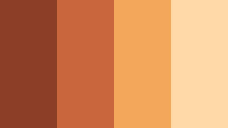
- HEX Codes: #8a3f26, #c6663a, #f2a65a, #ffd8a6
- Mood: Cinematic, sunbaked, and dramatic with a warm storytelling feel.
- Use for: Ideal for narrative film titles, travel vlogs, and dramatic B-roll overlays that need a warm desert tone.
Desert Ember Glow feels like standing in warm air at golden hour, with Burnt Cinnamon shadows melting into sunlit sand and amber highlights. The palette moves from deep rust to pale desert beige, giving you a natural gradation that is perfect for cinematic storytelling.
Use the darker tones for title text, logo marks, and frame borders, while the lighter shades work beautifully as backgrounds for intros, lower thirds, and end screens. In thumbnails and video overlays, this palette can make travel footage, landscape sequences, and narrative vlogs feel cohesive and intentional, even when they were shot at different times of day.
Pro Tip: Build a Cinematic Burnt Cinnamon Look in Filmora
To keep your Desert Ember Glow palette consistent from intro to final scene, build a simple color recipe inside Filmora and reuse it across your project. Start by adjusting temperature and tint to lean slightly warmer, then nudge saturation so skin tones still look natural while the Burnt Cinnamon areas feel rich and deep.
Save this grade as a preset inside Filmora so your A-roll, B-roll, titles, and social cutdowns all share the same warm desert tone. This makes your channel and brand look intentional, even when you mix camera sources or shoot across different locations.
AI Color Palette
You can quickly translate this Burnt Cinnamon palette from a mood board, LUT card, or reference still into your edit with Filmora. Filmora's AI Color Palette feature lets you pick a single reference clip or image and apply its tones to the rest of your timeline, so every shot inherits the same sunbaked glow.
Import a still that shows off your Desert Ember Glow colors, then use AI Color Palette to match your other clips. This saves time compared with manual tweaking and helps keep your warm browns, sands, and highlights balanced across vlogs, reels, and longer cinematic projects.
 secure download

HSL, Color Wheels & Curves
Once your main look is in place, fine tune your Burnt Cinnamon tones with Filmora's HSL, color wheels, and curves controls. In HSL, gently boost saturation in the orange and red ranges to deepen the Burnt Cinnamon, while slightly desaturating yellows to avoid overly bright sand tones. Use midtone color wheels to push your footage toward warm amber, and the shadow wheel to anchor the darker rust shades.
For extra drama, add a subtle S curve so your shadows feel thicker and your highlights glow without clipping. Filmora's color tools and tutorials, such as the ones that demonstrate advanced color correction with curves on YouTube, can guide you toward a more polished, cinematic result while keeping the palette cohesive.
secure download1000+ Video Filters & 3D LUTs
If you want a finished Burnt Cinnamon look without building it from scratch, Filmora's video filters and 3D LUTs make it easy to get there fast. Start with a warm cinematic LUT or vintage film filter, then tweak intensity so the rust and sand tones from Desert Ember Glow stay readable and flattering.
You can stack subtle filters for texture, like grain or soft bloom, to give your Burnt Cinnamon footage an analog feel. This is especially useful for intros, trailers, and B-roll montages where you want strong mood and consistency across multiple shots and formats.
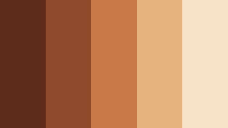
secure downloadRustic Campfire Nights

- HEX Codes: #7b341f, #b25232, #e57b4c, #f7c59f, #2b1a16
- Mood: Cozy, nostalgic, and intimate like stories shared around a fire.
- Use for: Perfect for cinematic vlogs, campfire recap reels, and podcast cover art needing a warm, intimate mood.
Rustic Campfire Nights layers deep Burnt Cinnamon shadows with glowing ember oranges and creamy firelight. The dark brown (#2b1a16) adds movie like contrast, while the mid oranges and soft beige feel like skin lit by candle or campfire.
This palette is ideal for night vlogs, camp content, or any storytelling scene where the audience should feel close to the subject. Use the darkest tone for backgrounds and overlays, reserve the light cream for text and UI elements, and lean on the mid oranges for thumbnail accents, waveform tints on podcast art, and warm gradients in your Filmora titles.
Terracotta Street Stories

- HEX Codes: #8f4528, #c86b3a, #f49a5c, #fbd5a4, #373133
- Mood: Urban, artsy, and documentary-style with a warm analog feel.
- Use for: Great for street vlogs, lifestyle B-roll, and thumbnail frames that need an earthy yet modern warmth.
Terracotta Street Stories mixes Burnt Cinnamon with terracotta walls, peach highlights, and a muted charcoal anchor. It feels like handheld street footage shot during late afternoon, with an analog, almost filmic softness.
For thumbnails and title cards, use the charcoal (#373133) for typography against the lighter peach and cream for high readability. The mid terracotta tones are excellent for borders, callout shapes, and color blocks in your Filmora lower thirds, helping lifestyle and street content feel artistic but still modern and clean.
Sunset Cinder Skies

- HEX Codes: #733320, #bf5c33, #f28b54, #ffc38a, #1b2638
- Mood: Dramatic, romantic, and slightly moody like a fading sunset.
- Use for: Use for cinematic titles, travel montage sequences, and romantic highlight reels with a fiery sky feel.
Sunset Cinder Skies contrasts smoky Burnt Cinnamon with glowing oranges and a deep blue dusk. The combination delivers a cinematic, slightly moody mood perfect for emotional travel scenes or romantic B-roll.
In design, let the navy (#1b2638) be your background for titles and end cards, with the oranges and Burnt Cinnamon used as accent lines, gradient overlays, and icon colors. In Filmora, this palette works well as a color grading reference for sunset timelapses, couples shoots, or city skylines bathed in golden light.
Cozy Lifestyle Burnt Cinnamon Color Palettes
Autumn Chai Afternoon

- HEX Codes: #7c3b22, #b45b35, #e79a63, #ffe3c4, #faf5ef
- Mood: Comforting, relaxing, and homely like a slow fall afternoon.
- Use for: Ideal for lifestyle vlogs, cozy study videos, recipe content, and YouTube channel branding with a warm home aesthetic.
Autumn Chai Afternoon blends Burnt Cinnamon with milky creams and soft caramel, capturing the feeling of a latte on a quiet fall day. The palette is warm but gentle, with off whites and soft beige that keep your visuals light and soothing.
Use the deep Burnt Cinnamon for headlines, buttons, and logo marks, then build your layouts on the pale cream (#faf5ef) for thumbnails, cover images, and channel banners. In Filmora, you can apply these tones to text styles, background plates, and overlays to give study with me, journaling, or recipe videos a calm, inviting identity.
Cinnamon Loft Morning

- HEX Codes: #844125, #c46c3b, #e8a26d, #fbe0c3, #d2cbc3
- Mood: Bright, airy, and warm with a modern loft feel.
- Use for: Great for home tours, productivity vlogs, and minimalist lifestyle thumbnails that still feel inviting.
Cinnamon Loft Morning feels like sunlight flooding into a modern apartment. Burnt Cinnamon accents are softened by greige and light peach, giving you a palette that is both contemporary and cozy.
For branding, let the muted greys and creams carry your backgrounds, while the Burnt Cinnamon and warm orange tones highlight buttons, key text, and icons. In Filmora, this palette is perfect for clean overlays, minimalist title animations, and smart home tour graphics that need warmth without clutter.
Baked Spice Kitchen

- HEX Codes: #7a341e, #ad5430, #e07c47, #f1b184, #ffe8cf
- Mood: Homemade, delicious, and welcoming like fresh pastries.
- Use for: Perfect for cooking videos, baking shorts, and food channel covers that need warmth without oversaturation.
Baked Spice Kitchen layers rich Burnt Cinnamon with caramel, butter, and cream tones that immediately feel edible. The palette is warm enough to make food look appetizing but still soft enough to avoid harsh, oversaturated oranges.
Use the lightest cream (#ffe8cf) as a backdrop for recipe titles, ingredient lists, and chapter cards, then accent with Burnt Cinnamon for headings and icons. In Filmora, this palette works well in lower thirds, timers, and step by step overlays in baking shorts or longer cooking tutorials.
Cabin Hearth Glow
- HEX Codes: #5e2b1b, #8f4a2b, #c97945, #e6b27d, #f7e4c6
- Mood: Rustic, grounded, and soothing like a weekend in a forest cabin.
- Use for: Use in nature vlogs, slow living content, and retreat promos where you want warmth and calm.
Cabin Hearth Glow is built around woodsy browns and soft Burnt Cinnamon highlights, creating a palette that feels like firelight on timber walls. The deeper browns add stability, while the lighter creams and golds provide a gentle glow.
Design your slow living or cabin retreat branding with the deeper tones as backgrounds and the lighter tones as text and detail colors. In Filmora, apply this palette to chapter cards, map overlays, and intro animations for camping trips, nature retreats, or mindful living content.
Modern Brand Burnt Cinnamon Color Palettes
Minimal Clay Studio

- HEX Codes: #7d3f25, #b6663a, #e6a270, #f6ddc3, #f3f0ea
- Mood: Clean, artistic, and contemporary with a handcrafted touch.
- Use for: Ideal for brand kits, logos, lower thirds, and minimalist product promos on social platforms.
Minimal Clay Studio marries Burnt Cinnamon clay tones with soft beige and off white for a gallery like atmosphere. The palette is warm enough to feel human and handmade but muted enough to stay sophisticated and minimalist.
Use the pale neutrals as your primary canvas for thumbnails, lookbooks, and product closeups, then apply the Burnt Cinnamon shades to key titles, logo marks, and UI elements. In Filmora, this palette makes it easy to build clean lower thirds, product labels, and text overlays that match a modern studio or creative brand.
Cinnamon Tech Contrast

- HEX Codes: #843f24, #c26a3b, #f29b5f, #f3f6f9, #1a2530
- Mood: Sleek, confident, and bold with a warm tech edge.
- Use for: Perfect for SaaS explainers, startup promos, and UI mockups where you want warmth with professional contrast.
Cinnamon Tech Contrast fuses warm Burnt Cinnamon tones with cool whites and a midnight navy, creating a tech ready palette with personality. The dark blue (#1a2530) brings structure and clarity, while the warm accents keep things approachable.
It works especially well for dashboards, app demos, and product explainers. Use the navy and soft white background for charts or screens, then highlight key metrics, buttons, and title bars with the Burnt Cinnamon and orange accents inside Filmora overlays and motion graphics.
Editorial Spice Block

- HEX Codes: #6d331f, #a85334, #df7a47, #f4b281, #f7f2eb
- Mood: Bold, editorial, and polished like a fashion magazine layout.
- Use for: Great for YouTube banners, lookbook edits, and title cards that need strong color blocking.
Editorial Spice Block is built for bold layouts. It combines structured Burnt Cinnamon blocks with peach and cream for a high impact, magazine inspired look that still feels warm.
Use this palette to create strong color blocks behind text, full width banners, and cutaway cards in Filmora. It suits fashion, beauty, and design commentary channels especially well, where you want your thumbnails and titles to feel like spreads from a modern print magazine.
Spiced Neutral Grid

- HEX Codes: #744029, #a86847, #d89b70, #e9cfb0, #f5f2ee
- Mood: Balanced, versatile, and calm with a warm professional tone.
- Use for: Use across full channel branding, slide decks, and evergreen tutorial thumbnails.
Spiced Neutral Grid anchors soft neutrals with a steady Burnt Cinnamon, creating a palette that is dependable and timeless. It is designed to work across many content types without drawing attention away from the message.
Use the lighter neutrals for backgrounds on slides, tutorials, and educational thumbnails, then add Burnt Cinnamon to highlight key points, icons, and CTA buttons. In Filmora, this palette provides a subtle but professional base that you can reuse for series branding or evergreen educational content.
Vintage & Retro Burnt Cinnamon Color Palettes
Retro Vinyl Ember

- HEX Codes: #6a311d, #9b5030, #d27a49, #f1c28a, #2e2a2a
- Mood: Nostalgic, analog, and slightly gritty like worn record sleeves.
- Use for: Perfect for music videos, podcast visuals, and retro title sequences with a warm grainy vibe.
Retro Vinyl Ember pairs Burnt Cinnamon with mustarded beige and charcoal, echoing the look of old record sleeves and vintage posters. It feels slightly gritty and analog, which is great for content that celebrates music history, retro culture, or lo fi aesthetics.
Use the charcoal (#2e2a2a) for backgrounds, then let the warm tones color your typography, badges, and graphic shapes. In Filmora, combine this palette with subtle grain overlays and film burn transitions to give your intros, titles, and lyric videos a nostalgic glow.
70s Cafe Booth

- HEX Codes: #7f3e23, #b9673a, #dfa461, #f7d9a3, #3f3a33
- Mood: Playful, nostalgic, and cozy like an old diner snapshot.
- Use for: Great for storytime vlogs, lifestyle edits, and nostalgic reels with a subtle retro filter feel.
70s Cafe Booth combines Burnt Cinnamon seating tones with butterscotch highlights and cola browns, calling back to vintage diners and family snapshots. It is playful yet cozy, ideal for lighthearted storytelling and lifestyle content.
Use the lighter yellows and creams for backgrounds and frames, then bring in the Burnt Cinnamon and dark browns for titles, badges, and overlay shapes. In Filmora, this palette pairs nicely with a slight fade or vignette to create a subtle retro filter over storytime vlogs and memory themed edits.
Faded Cine Spice

- HEX Codes: #6c3521, #9f5a34, #cf8652, #f0bc89, #e5ddcf
- Mood: Soft, filmic, and dreamy like aged cinema frames.
- Use for: Use for film emulation LUTs, wedding highlight reels, and emotional storytelling pieces.
Faded Cine Spice softens Burnt Cinnamon with hazy creams and gentle oranges to mimic aged film prints. The overall feel is dreamy and emotional, with lower contrast and a subtle washed edge.
It is especially strong for wedding highlights, personal documentaries, or nostalgic montage edits. In Filmora, use this palette as a reference when you build soft film LUTs, match titles and overlays, and design intro cards that support emotional storytelling without overwhelming the footage.
Tips for Creating Burnt Cinnamon Color Palettes
Burnt Cinnamon is versatile, but it works best when balanced with the right neutrals, contrasts, and accent shades. Here are practical tips for combining it with other colors in video and design so your edits feel polished and on brand.
- Pair Burnt Cinnamon with light creams or off whites for clean readability on thumbnails, titles, and lower thirds.
- Add a dark anchor shade (navy, charcoal, or deep brown) to create contrast in cinematic looks and to frame text or logos.
- Use one or two bright accent colors (such as peach or soft gold) sparingly to draw attention to CTAs, buttons, or key scenes.
- For skin tone friendly grades, keep oranges and reds slightly desaturated so Burnt Cinnamon feels rich without making faces look too red.
- Test your palette in grayscale inside your design or editing tool to check contrast and ensure text remains legible at mobile thumbnail size.
- Build a small hierarchy: darkest color for text and edges, mid Burnt Cinnamon for accents, and light neutrals for backgrounds and breathing space.
- In Filmora, save your preferred Burnt Cinnamon settings as presets or LUTs so you can apply the same look across series, playlists, and social cutdowns.
- Match your palette to your content mood: more contrast and deep blues for drama, softer neutrals and low contrast for cozy, lifestyle, or nostalgic edits.
Burnt Cinnamon color palettes can completely change how your videos feel, from sunbaked cinematic travel logs to cozy kitchen vlogs and polished brand explainers. Thoughtful combinations of rust, cream, and supporting tones help you tell clearer stories and build a recognizable visual identity.
Use these 15 palettes as ready to go starting points for your thumbnails, intro cards, overlays, and LUT ideas. Then refine them inside Filmora so your color grading, motion graphics, and channel branding all work together.
Whether you lean into dramatic desert tones or soft vintage spice, experimenting with Burnt Cinnamon in Filmora makes it easier to keep your visuals consistent across YouTube, Instagram, TikTok, and beyond.
secure download