
 100% Security Verified | No Subscription Required | No Malware


 ChatGPT
 Perplexity
 Gemini
 Claude
 Grok
Grok
Crimson is one of the most emotional reds you can use. It instantly suggests passion, power, and urgency, but it can also feel luxurious or romantic depending on what you pair it with. In video and design, crimson often becomes the focal color: the accent on your titles, the pop in your thumbnail, or the hero tone in cinematic lighting.
This guide brings together 15 ready-to-use crimson color palettes with HEX codes so you can design consistent visuals for intros, thumbnails, LUT-like grades, channel branding, and social edits. Whether you are editing in Filmora or planning a full visual identity, these crimson color combinations will help you set a clear mood and style.
In this article
Bold & Dramatic Crimson Color Palettes
Neon Stage Crimson
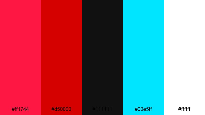
- HEX Codes: #ff1744, #d50000, #111111, #00e5ff, #ffffff
- Mood: High-energy, electric, and intense with a modern nightlife vibe.
- Use for: Use this palette for gaming intros, concert promos, or high-impact YouTube thumbnails that need to pop on dark backgrounds.
Neon Stage Crimson is all about impact. The blazing crimson tones (#ff1744, #d50000) burn against inky near-black (#111111), while the electric cyan (#00e5ff) and clean white (#ffffff) add a sharp digital glow. It feels like stage lights and LED screens in a dark arena.
Use this palette for esports openings, music promos, glitchy transitions, and thumbnails where you want your title text and call-to-action buttons to scream for attention. In Filmora, combine bold red titles with cyan outlines or neon strokes, then grade your footage slightly darker so the crimson accents become the brightest elements on screen.
Pro Tip: Build Electric Crimson Scenes in Filmora
To keep a neon crimson look consistent, treat crimson as your hero accent in every scene. In Filmora, start with a darker exposure on your clips, then use titles, shapes, and overlays in #ff1744 and #00e5ff to highlight player names, kill counts, or headline text. This makes your UI elements feel like part of the same world as your thumbnail and intro.
For social cutdowns, reuse the same crimson and cyan HEX values in lower thirds, subscribe buttons, and end screens. Filmora lets you save custom titles and color presets, so you can drag the same electric crimson style onto every new video without rebuilding it from scratch.
AI Color Palette
If you have a screenshot, poster, or color card that captures your perfect neon crimson mood, you can turn it into a full video grade. Filmora's AI Color Palette feature analyzes the reference and applies a matching color style to your entire timeline.
Import your neon reference, match it to your sequence, and watch your clips take on the same deep blacks, vivid crimson, and cyan accents. This is ideal for gaming montages, live-set recaps, or channel trailers where you want every shot to feel like it lives under the same neon stage lights.
 secure download

HSL, Color Wheels & Curves
Once your neon crimson base is set, you can fine-tune it with Filmora's HSL sliders, color wheels, and curves. Shift reds slightly toward magenta for a more futuristic look, or desaturate background blues so the cyan accent remains crisp. A gentle S-curve will deepen blacks (#111111) and make crimson highlights stand out even more.
If you want a deeper dive into creative grading, Filmora's color correction tools show how to balance shadows, midtones, and highlights without crushing detail. This helps you keep skin tones natural while everything else leans into your electric crimson theme.
secure download1000+ Video Filters & 3D LUTs
You can also shortcut your way to a polished crimson style using Filmora's presets. Filmora's video filters and 3D LUTs make it easy to add glow, contrast, or a cinematic finish while keeping your crimson tones intense and controlled.
Stack a cool-toned LUT under your neon crimson accents, or use glow and vignette filters to create the feeling of spotlights and arena haze. Save your favorite combination as a custom preset so every future gaming highlight or concert recap instantly matches your established crimson brand.
secure downloadMidnight Inferno Glow
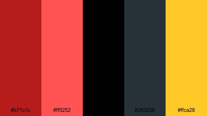
- HEX Codes: #b71c1c, #ff5252, #000000, #263238, #ffca28
- Mood: Smoldering, suspenseful, and cinematic with a hint of heat.
- Use for: Use this palette for movie-style trailers, thriller teasers, and dramatic title cards that need a fiery focal point.
Midnight Inferno Glow turns crimson into a slow burn. Deep red (#b71c1c) and hot highlights (#ff5252) sit on pure black (#000000) and steel blue-gray (#263238), with a spark of golden amber (#ffca28) that feels like flames breaking through the dark.
This palette works brilliantly for cinematic trailers, thriller edits, and story-driven shorts. Use black and blue-gray for backgrounds and letterbox bars, then reserve crimson and amber for key text, flares, and light leaks. In thumbnails and opening frames, a single golden highlight against deep red instantly hints at danger and heat.
Crimson Esports Energy
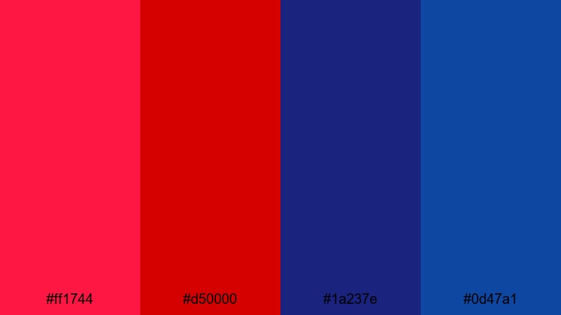
- HEX Codes: #ff1744, #d50000, #1a237e, #0d47a1
- Mood: Competitive, fast-paced, and futuristic.
- Use for: Use this palette for esports branding, team logos, overlays, and high-intensity highlight reels.
Crimson Esports Energy combines fierce crimson accents (#ff1744, #d50000) with deep competitive blues (#1a237e, #0d47a1). The result is a sharp, digital look that feels right at home in HUD graphics, score overlays, and glitch transitions.
Use crimson for kill markers, timers, and subscribe CTAs, while the navy and royal blues underpin panels, sidebars, and UI shapes. For thumbnails, a crimson hero subject cut out over blue gradients instantly communicates gaming, tech, or cyber themes.
Blockbuster Hero Crimson

- HEX Codes: #c62828, #ff8f00, #37474f, #ffffff, #212121
- Mood: Heroic, powerful, and action-packed.
- Use for: Use this palette for action trailers, sports edits, and superhero-style openings that need a strong main character feel.
Blockbuster Hero Crimson mixes a confident red (#c62828) with bold amber highlights (#ff8f00) on a foundation of cinematic gray-blues (#37474f) and charcoal (#212121), anchored by white text. It immediately recalls action posters and superhero trailers.
Design your titles in white or amber over dark backgrounds, then use crimson for logo reveals, jersey accents, and slow-motion replays. In Filmora, pair this palette with dramatic sound design and speed ramping to give your intros and sports highlight reels a trailer-worthy impact.
Rock Concert Crimson Lights
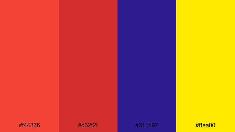
- HEX Codes: #f44336, #d32f2f, #311b92, #ffea00
- Mood: Loud, rebellious, and full of stage-light energy.
- Use for: Use this palette for music videos, tour promos, and festival recaps that should feel loud and alive.
Rock Concert Crimson Lights is built on hot scarlet (#f44336, #d32f2f), deep violet stage shadows (#311b92), and piercing spotlight yellow (#ffea00). It feels like standing in front of an amp wall with strobes in your face.
Use crimson and yellow for typography, lens flares, and animated light streaks, while violet can grade your shadows for a moody venue feel. In thumbnails, combine a desaturated crowd photo with bright crimson and yellow titles to make the event name and date impossible to miss.
Soft & Romantic Crimson Color Palettes
Blush Petal Crimson
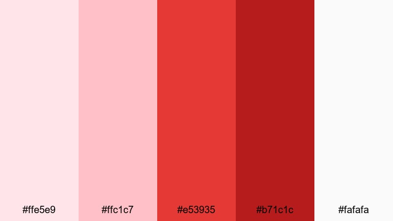
- HEX Codes: #ffe5e9, #ffc1c7, #e53935, #b71c1c, #fafafa
- Mood: Gentle, affectionate, and dreamy.
- Use for: Use this palette for wedding films, engagement reels, and romantic lifestyle vlogs.
Blush Petal Crimson surrounds rich crimson (#e53935, #b71c1c) with soft blush pinks (#ffe5e9, #ffc1c7) and airy white (#fafafa). It feels like petals, lace, and natural light through a window, with the deeper reds adding emotional weight.
Use the pale tones for backgrounds, frames, and lower thirds, then bring in crimson for meaningful moments like ring close-ups, vows, or text overlays. This balance keeps your romantic edits light and elegant while still giving you a strong accent color for titles and cover images.
Golden Hour Crimson Kiss

- HEX Codes: #ffcc80, #ff8a65, #e53935, #6d4c41
- Mood: Warm, nostalgic, and softly passionate.
- Use for: Use this palette for sunset vlogs, travel montages, and romantic B-roll set in natural light.
Golden Hour Crimson Kiss blends honeyed orange (#ffcc80), warm coral (#ff8a65), and earthy brown (#6d4c41) with a kiss of crimson (#e53935). It captures the warmth of late-afternoon sunlight with a subtle romantic edge.
Use the warm oranges and browns for overall grading so your footage glows, then save crimson for lips, flowers, signage, and key typography. This palette is perfect for travel couples, cozy cabin videos, or any story that lives in golden sunlight.
Rosy Linen Crimson

- HEX Codes: #fbe9e7, #f8bbd0, #c2185b, #8d6e63, #f5f5f5
- Mood: Delicate, intimate, and calm.
- Use for: Use this palette for lifestyle content, home decor tours, and aesthetic reels with a soft, curated look.
Rosy Linen Crimson combines pale linen neutrals (#fbe9e7, #f5f5f5) with soft rose (#f8bbd0), a muted berry crimson (#c2185b), and a grounded taupe brown (#8d6e63). It feels curated and editorial, like a well-styled home or boutique feed.
Use the light neutrals and rose for backgrounds and overlays, then introduce berry crimson sparingly in titles, callouts, and product highlights. This is ideal for Instagram Reels, room makeovers, fashion lookbooks, and any content that blends lifestyle and design.
Twilight Wedding Crimson
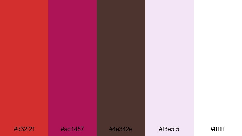
- HEX Codes: #d32f2f, #ad1457, #4e342e, #f3e5f5, #ffffff
- Mood: Elegant, intimate, and slightly mysterious.
- Use for: Use this palette for evening wedding films, proposal stories, and luxury event trailers.
Twilight Wedding Crimson pairs rich red (#d32f2f) and plum (#ad1457) with deep chocolate brown (#4e342e), softened by pale mauve (#f3e5f5) and white. It evokes candlelit receptions and dusk ceremonies, where everything feels a bit more intimate.
Grade your shadows slightly cooler or darker, then let crimson and plum come through in florals, decor, and title cards. Use white and pale mauve for elegant lower thirds and date/location tags so your text stays readable against dimmer backgrounds.
Modern & Minimal Crimson Color Palettes
Crimson Grid Minimal
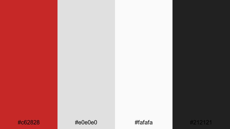
- HEX Codes: #c62828, #e0e0e0, #fafafa, #212121
- Mood: Clean, assertive, and design-forward.
- Use for: Use this palette for channel branding, minimalist intros, and UI-style motion graphics.
Crimson Grid Minimal uses a single strong red (#c62828) against cool light grays (#e0e0e0, #fafafa) and deep charcoal (#212121). The result is stripped-back and modern, with crimson acting as a precise accent rather than a flood of color.
Use white and light gray backgrounds with charcoal for body text, then reserve crimson for logos, subscribe buttons, progress bars, and key titles. This palette is perfect for tech explainers, productivity content, and clean brand intros where clarity and readability come first.
Monochrome Studio Crimson
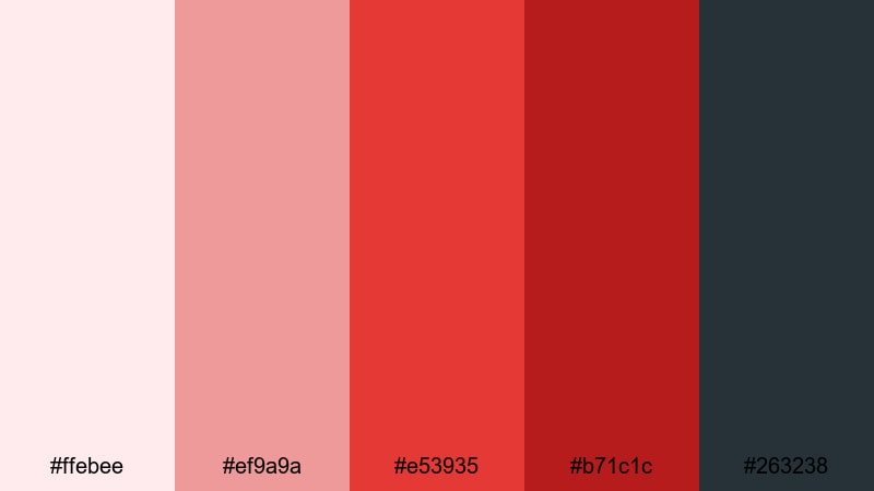
- HEX Codes: #ffebee, #ef9a9a, #e53935, #b71c1c, #263238
- Mood: Stylish, controlled, and studio-polished.
- Use for: Use this palette for product showcases, studio shoots, and brand explainers with a refined red theme.
Monochrome Studio Crimson steps through a gradient of reds, from pale blush (#ffebee) and soft red (#ef9a9a) to strong crimson (#e53935) and deep wine (#b71c1c), grounded by a cool slate gray (#263238). It is cohesive and controlled, like a studio set built around one main hue.
Use lighter reds as backgrounds and highlight blocks, mid-crimson for titles and product labels, and the deepest shade for shadows and accents. This approach makes your content look intentionally branded, especially for product demos, beauty reviews, or fashion hauls that lean into a signature red tone.
Soft Tech Crimson Accent
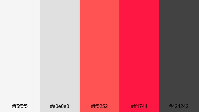
- HEX Codes: #f5f5f5, #e0e0e0, #ff5252, #ff1744, #424242
- Mood: Sleek, techy, and confident.
- Use for: Use this palette for app promos, startup explainers, and UI mockups where a bold accent color is needed.
Soft Tech Crimson Accent relies on neutral light grays (#f5f5f5, #e0e0e0) and dark gray (#424242), with bright crimson accents (#ff5252, #ff1744). It feels like a clean app interface where red draws your eye to the most important actions.
Use grays for backgrounds, device frames, and most typography, then drop in crimson only for buttons, progress indicators, and key stats. In Filmora, you can match this with simple motion graphics and subtle transitions so the design feels modern and professional without visual noise.
Vintage & Cinematic Crimson Color Palettes
Retro Noir Crimson
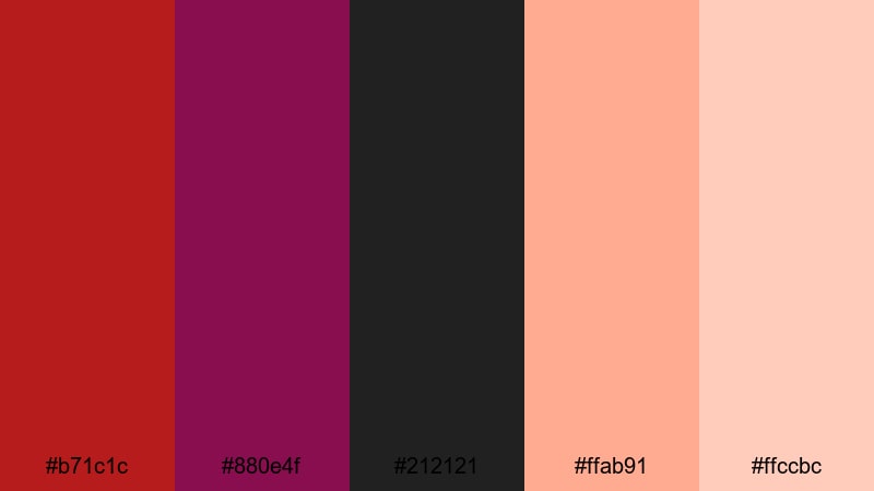
- HEX Codes: #b71c1c, #880e4f, #212121, #ffab91, #ffccbc
- Mood: Moody, vintage, and slightly decadent.
- Use for: Use this palette for noir-style edits, story-driven shorts, and retro title sequences.
Retro Noir Crimson mixes dark red (#b71c1c) and plum (#880e4f) with deep charcoal (#212121), softened by creamy peach highlights (#ffab91, #ffccbc). It feels like an old cinema poster or a smoky jazz club under dim lights.
Grade your footage with more contrast and slightly muted saturation, then use crimson and plum for key wardrobe pieces, props, and titles. The warmer highlights keep faces flattering while the dark palette preserves a stylish, mysterious tone for narrative shorts and retro intros.
Old Film Scarlet Fade

- HEX Codes: #8e0000, #c62828, #fbe9e7, #a1887f, #3e2723
- Mood: Faded, nostalgic, and story-rich.
- Use for: Use this palette for vintage travel diaries, family archives, and memory-style edits.
Old Film Scarlet Fade uses dusty scarlet (#8e0000, #c62828) with soft off-white (#fbe9e7), worn taupe (#a1887f), and deep brown (#3e2723). It mimics the look of aged prints and slightly faded film stock while keeping a clear crimson thread.
Pair this palette with grain, subtle film burns, and gentle vignettes in Filmora. Use crimson in old signage, maps, or handwritten titles, while the neutrals handle backgrounds and overlays. It is ideal for slideshow-style edits of family photos, heritage stories, or retro travel vlogs.
Baroque Velvet Crimson
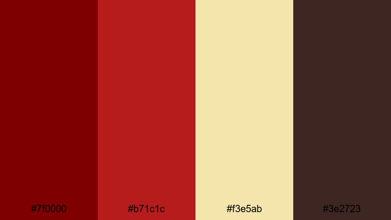
- HEX Codes: #7f0000, #b71c1c, #f3e5ab, #3e2723
- Mood: Luxurious, dramatic, and old-world.
- Use for: Use this palette for period pieces, costume videos, and luxury brand content with a classic feel.
Baroque Velvet Crimson leans into dark velvet reds (#7f0000, #b71c1c), antique gold (#f3e5ab), and rich brown (#3e2723). It feels regal and theatrical, like heavy curtains and gilded frames in a historic theater.
Use crimson and gold for ornate titles, logo reveals, and costume details, while the deep brown supports backgrounds and frames. This palette works beautifully for historical content, luxury product stories, and dramatic trailers that want to feel timeless and grand.
Tips for Creating Crimson Color Palettes
Crimson is powerful, so the way you combine it with neutrals, shadows, and highlights will decide whether your video feels energetic, romantic, or cinematic. These tips will help you build and apply crimson palettes more effectively in Filmora and other creative tools.
- Use crimson as an accent, not a flood. Keep most of your frame in neutrals or muted tones and reserve crimson for titles, buttons, and key details so it always draws attention.
- Check readability on thumbnails. Place crimson text over darker backgrounds or pair it with a stroke/drop shadow so it stands out clearly in small YouTube and mobile previews.
- Balance warm and cool tones. If your crimson is very warm, consider cooler shadows (blue or slate gray) to avoid the entire image feeling overheated or muddy.
- Create a hierarchy of reds. Use one main crimson, one lighter supporting red, and one deeper shade for shadows so your palette has depth but still feels unified.
- Match your footage to your graphics. In Filmora, adjust white balance, saturation, and contrast so the colors in your clips do not clash with your chosen crimson HEX codes in titles and overlays.
- Stay consistent across platforms. Reuse the same crimson color codes in your channel banner, intro, lower thirds, and social posts to build a recognizable brand identity.
- Test in both light and dark modes. If you design overlays or UI elements, preview crimson on light and dark backgrounds to make sure it remains legible and does not vibrate against other colors.
- Use curves and HSL for subtle shifts. Instead of pushing saturation to the max, gently nudge reds with curves and HSL controls so skin tones stay natural while crimson accents stay rich.
Used well, crimson can define your entire visual identity. From electrifying gaming intros to soft wedding films and vintage cinematic edits, the right crimson palette sets the tone before a single word is spoken.
Try these 15 crimson color palettes as starting points: drop the HEX codes into your titles, shapes, and overlays, then match your footage using Filmora's color tools, AI Color Palette, and LUTs. With a consistent set of reds, your thumbnails, intros, and full-length videos will all feel like part of the same strong brand.
Experiment, save your favorite looks as presets, and refine them over time. The more intentionally you use crimson, the more memorable and professional your content will appear.
secure downloadNext: Orchid Color Palette
