
 100% Security Verified | No Subscription Required | No Malware

Faded Bronze sits between warm earth tones and muted metallics, giving your visuals a grounded, nostalgic, and cinematic feel. It suggests warmth, reliability, and a touch of vintage luxury without looking flashy. In color psychology, this kind of soft bronze is associated with stability, craftsmanship, and timeless style, which is why it works so well for channels that want to feel mature and trustworthy.
For video creators, designers, and Filmora users, Faded Bronze is a versatile base for intros, lower thirds, YouTube thumbnails, vlogs, and brand kits. Below you will find ready-made Faded Bronze color palettes with HEX codes you can plug straight into your thumbnails, overlays, titles, and LUT-inspired color grading so your whole project looks cohesive from the first frame to the end screen.
In this article
Cinematic & Dramatic Faded Bronze Color Palettes
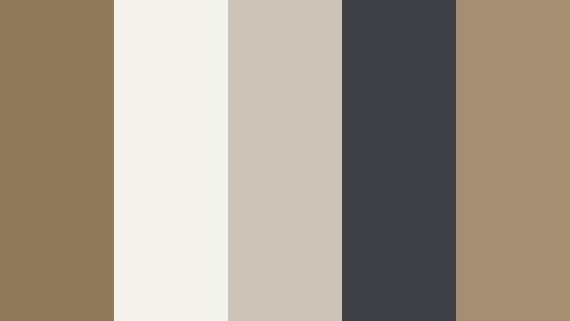
Twilight Bronze Cinema

- HEX Codes: #8c7851, #2b2f3a, #c8b693, #f3ede0, #795548
- Mood: Moody, cinematic, and quietly intense.
- Use for: Perfect for narrative short films, dramatic travel vlogs, and title cards that need a subtle movie-poster feel.
This palette blends a core of Faded Bronze (#8c7851) with deep charcoal blues (#2b2f3a) and creamy highlights (#c8b693, #f3ede0) for a high-contrast, filmic look. The darker tones frame faces and subjects, while the lighter colors keep your titles and lower thirds readable and elegant.
Use the darker shades as background gradients for YouTube thumbnails and intro slates, then let the lighter neutrals carry your typography, logos, and key graphics. In Filmora, this palette is perfect for cinematic letterbox overlays, dramatic story beats, and cohesive grading across b-roll, talking-head shots, and end-screen designs.
Pro Tip: Build a Cinematic Faded Bronze Look in Filmora
To keep a Twilight Bronze Cinema look consistent, start by setting your titles, lower thirds, and overlays to the palette colors, then grade your footage toward those same warm bronzes and cool charcoals. In Filmora, you can create a custom color preset using your preferred contrast and warmth, then apply it across intros, b-roll, and outros for a unified cinematic mood.
Accent shots like sunsets, night cityscapes, and interior scenes can all be nudged toward Faded Bronze by slightly warming the midtones and softening saturation. Save these settings as presets in Filmora so every video in a series shares the same twilight bronze signature style.
AI Color Palette
If you have a reference frame or graphic that nails this Faded Bronze aesthetic, you can turn it into a look for your whole video. Filmora's AI Color Palette feature analyzes the colors in a reference clip and automatically matches your other shots to that style.
Import your chosen Twilight Bronze Cinema reference, then use AI Color Palette to harmonize all your footage with those bronzy midtones and dark teal shadows. This saves time on manual color grading while keeping your intros, main content, and end screens visually connected.
 secure download

HSL, Color Wheels & Curves
To refine your Faded Bronze tones even further, use Filmora's color tools to guide the viewer's eye. On the HSL panel, gently desaturate overpowering blues or greens so your bronze midtones stand out. In the color wheels, warm the midtones while keeping shadows slightly cool for a cinematic teal-and-bronze balance, then use curves to deepen contrast without crushing detail.
You can follow along with Filmora's YouTube tutorials on advanced color grading and apply the same steps to your Faded Bronze palettes, adjusting highlights to stay creamy, not pure white, so your shots keep that signature soft, movie-poster glow.
secure download1000+ Video Filters & 3D LUTs
Sometimes you want a Faded Bronze mood without doing every adjustment by hand. Filmora's video filters and 3D LUTs make it easy to add instant warmth, vintage fades, or dramatic contrast that aligns with your palette.
Stack a subtle vintage LUT with a warm filter to push your footage toward bronze while keeping skin tones natural. Save your favorite combination as a preset so every new video in your series keeps that same Faded Bronze identity, from cold opens to outro cards.
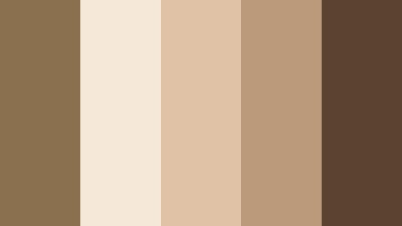
secure downloadDesert Relic Noir

- HEX Codes: #927b55, #1c1c1f, #c0a98a, #e6dbc7, #4b3b30
- Mood: Vintage, mysterious, and archival.
- Use for: Works well in documentary intros, history themed channels, and title slates that need an aged but polished tone.
Desert Relic Noir combines dusty Faded Bronze (#927b55) with deep espresso blacks (#1c1c1f, #4b3b30) and bone beige highlights (#c0a98a, #e6dbc7). The overall effect feels like an old film reel or a carefully preserved archive box.
Use the light tones for readable titles and captions over darker footage, and apply the warm bronzes to frames, borders, and watermark-style logos. This palette supports serious storytelling, so it is ideal for documentary openings, historical timelines, and moody chapter cards in long-form content.
Bronze Ember Frames

- HEX Codes: #8a6a48, #342224, #f3c9a9, #fbeee0, #5e3b31
- Mood: Smoldering, intense, and nostalgic.
- Use for: Ideal for slow-motion sequences, emotional montage edits, and hero text in dramatic trailers.
Bronze Ember Frames leans into glowing ember oranges (#f3c9a9) and rich wine-browns (#342224, #5e3b31) wrapped around a core of Faded Bronze (#8a6a48). It feels like the last light of a campfire or the warmth of an old projector bulb.
Use the brightest shades for key callouts, hero titles, and CTA buttons in your thumbnails, contrasted against the deep browns as background plates. In video, it works beautifully for emotional montage sequences, where you can grade highlights a bit warmer to echo the ember glow and use subtle vignette overlays to frame the action.
Urban Patina Streets

- HEX Codes: #8f7a59, #26282c, #9fb1b9, #e2ddd4, #4a545a
- Mood: Gritty, modern, and grounded.
- Use for: Great for street vlogs, cityscape b-roll, and urban lifestyle channel branding.
Urban Patina Streets mixes weathered Faded Bronze (#8f7a59) with steel blue-greys (#9fb1b9, #4a545a) and concrete neutrals (#26282c, #e2ddd4). The result feels like sun-worn buildings, asphalt, and cloudy skies captured on a stylish street photography feed.
Use the bronze as a signature accent color for your logo, subscribe buttons, and lower thirds, while letting the cool greys dominate backgrounds and overlays. This palette is ideal for gritty city vlogs, skate edits, and urban lifestyle reels that need to feel grounded but still visually polished.
Rustic Spotlight Stage

- HEX Codes: #8b6f4f, #1b1010, #f2d1a0, #f6f0e6, #703c2c
- Mood: Theatrical, intimate, and warm.
- Use for: Suited for music videos, performance reels, and podcast set designs filmed on camera.
Rustic Spotlight Stage brings together warm Faded Bronze (#8b6f4f), creamy spotlight tones (#f2d1a0, #f6f0e6), and deep wine shadows (#1b1010, #703c2c). It feels like a wooden stage under soft amber lights, with the audience fading into darkness.
Use the darkest shades as backgrounds for performance titles and lyric overlays, and let the lighter creams back your main text and logo to keep them legible. This palette is perfect for acoustic sessions, cozy podcast sets, or studio performance videos where you want the talent to feel close and warmly lit.
Elegant & Modern Faded Bronze Color Palettes
Minimal Bronze Studio
- HEX Codes: #8f7b5a, #f5f3ee, #cbc5b8, #3f4045, #a58f72
- Mood: Clean, upscale, and editorial.
- Use for: Perfect for channel branding, tech explainers, and minimalist product showcases.
Minimal Bronze Studio balances elegant Faded Bronze (#8f7b5a, #a58f72) with airy whites and beiges (#f5f3ee, #cbc5b8) plus a cool slate accent (#3f4045). It has a refined, editorial quality that suits modern brands and sleek workspaces.
Use the lighter neutrals for backgrounds in your thumbnails and explainer slides, then apply the bronze tones to icons, UI-style overlays, and key text. This palette helps tech videos, productivity content, and product demos feel premium without looking too flashy.
Bronze Marble Lobby

- HEX Codes: #8a7452, #efe9e2, #d6ccc2, #3c3b3d, #b89a7a
- Mood: Luxury, calm, and corporate-chic.
- Use for: Best for brand films, real estate tours, and luxury service promos.
Bronze Marble Lobby pairs rich Faded Bronze (#8a7452, #b89a7a) with marble off-whites and soft greys (#efe9e2, #d6ccc2), anchored by a dark graphite accent (#3c3b3d). It echoes the look of a high-end hotel lobby or gallery space.
Use the marble-inspired tones as clean canvases for text and overlays, and let the bronze shades highlight logos, buttons, and section dividers. This palette is ideal for real estate walkthroughs, brand storytelling videos, and premium service promos where you want quiet sophistication.
Soft Loft Bronze

- HEX Codes: #8c7454, #f4ede4, #e0d1c3, #6a6d73, #c09c7b
- Mood: Cozy, modern, and welcoming.
- Use for: Great for lifestyle channels, interior design content, and brand videos that want a soft modern edge.
Soft Loft Bronze mixes warm Faded Bronze (#8c7454, #c09c7b) with creamy off-whites (#f4ede4, #e0d1c3) and a gentle grey accent (#6a6d73). It feels like a bright loft apartment with soft textiles and natural light.
Use the light tones as backgrounds for room tours, makeover before-and-after graphics, and lifestyle overlay text. Reserve the bronze for key accents like subscribe prompts, chapter markers, and logo reveals. This palette works especially well for home, wellness, and everyday lifestyle branding.
Bronze Glass Interface

- HEX Codes: #8d7856, #12141a, #2c3b47, #e6e5e9, #96a4b4
- Mood: Sleek, futuristic, and professional.
- Use for: Perfect for app promos, UI explainers, and motion graphics for SaaS or fintech brands.
Bronze Glass Interface anchors a soft Faded Bronze (#8d7856) against inky darks (#12141a), glassy blues (#2c3b47, #96a4b4), and a clean near-white (#e6e5e9). It feels like a modern dashboard or OS theme with a warm metallic twist.
Use the dark tones for backgrounds in screen recordings and app demos, overlaying bright UI callouts in the lighter blues and white. Introduce Faded Bronze in logos, interface highlights, and animated icons to give your tech content a unique, premium signature color.
Editorial Bronze Monochrome

- HEX Codes: #7c6747, #a48b63, #d3c0a0, #f5efe5, #4e3f2d
- Mood: Refined, neutral, and timeless.
- Use for: Great for fashion lookbooks, brand identity reveals, and subtle lower thirds.
Editorial Bronze Monochrome takes you from deep espresso bronze (#4e3f2d, #7c6747) through mid bronzes (#a48b63) to pale sand (#d3c0a0, #f5efe5). It is a purely bronze-based spectrum that feels calm, balanced, and editorial.
Use the darker shades behind portraits and product shots for fashion and beauty content, and place typography on the lighter tones for maximum legibility. This palette shines in lookbooks, minimal brand intros, and elegant lower thirds where you want a single, cohesive color family.
Soft & Romantic Faded Bronze Color Palettes
Bronze Rose Afternoon

- HEX Codes: #8a6f52, #f6e3d7, #f2c2b3, #c1927d, #6a4b3a
- Mood: Romantic, nostalgic, and gentle.
- Use for: Perfect for wedding highlight films, engagement reels, and soft lifestyle vlogs.
Bronze Rose Afternoon melts blush pinks (#f6e3d7, #f2c2b3) into warm Faded Bronze (#8a6f52, #c1927d) and a grounded brown (#6a4b3a). It evokes late-afternoon sun, flowers, and soft-focus lenses.
Use the blush tones for titles, date stamps, and handwritten-style captions on wedding and couple videos, then ground the frames with Bronze accents in borders and logo animations. This palette is ideal for romantic highlight films, engagement reels, and cozy storytelling vlogs.
Sepia Love Letters
- HEX Codes: #8b7050, #f5e8d8, #e0c3a6, #ba9a7a, #5c4330
- Mood: Sentimental, vintage, and warm.
- Use for: Great for memory montages, family story videos, and retro journal-style vlogs.
Sepia Love Letters recreates the warmth of old paper and photographs with Faded Bronze (#8b7050, #ba9a7a), sepia creams (#f5e8d8, #e0c3a6), and a deep brown (#5c4330). It instantly adds nostalgia to any project.
Apply this palette to photo slideshow backgrounds, scrapbook-style frames, and journal overlays in Filmora. It suits family documentaries, anniversary videos, and memory reels where you want every frame to feel like a cherished keepsake.
Morning Latte Bronze

- HEX Codes: #8f7656, #f7efe6, #e1cfbf, #c29f7f, #6a5240
- Mood: Cozy, soft, and comforting.
- Use for: Ideal for cafe vlogs, slow living content, and ASMR or study-with-me videos.
Morning Latte Bronze brings latte creams (#f7efe6, #e1cfbf), caramel Faded Bronze (#8f7656, #c29f7f), and a mocha accent (#6a5240) into one comforting mix. It feels like a quiet morning at your favorite cafe.
Use the lightest creams as backgrounds for chapter cards and timers in study-with-me videos, while the bronzes and browns highlight key text like video titles or cozy call-to-action bars. This palette is ideal for slow living, coffee shop vlogs, and any content meant to calm and relax viewers.
Bronze Dusk Garden

- HEX Codes: #87724f, #f3e4d3, #c4b89b, #71836d, #435043
- Mood: Earthy, tender, and tranquil.
- Use for: Works well for nature vlogs, cottagecore edits, and soft brand reels focused on wellness.
Bronze Dusk Garden wraps earthy Faded Bronze (#87724f, #c4b89b) with muted greens (#71836d, #435043) and soft petal creams (#f3e4d3). It captures the quiet of a garden at dusk or a misty forest path.
Use the greens as backgrounds for nature footage titles and wellness affirmations, while the creams and bronzes carry your main text and simple icons. This palette is perfect for cottagecore edits, plant care videos, and calm wellness content that still feels grounded and natural.
Bold & Creative Faded Bronze Color Palettes
Neon Bronze Contrast
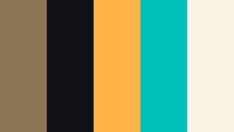
- HEX Codes: #8b7554, #101017, #ffb347, #00c2ba, #faf3e5
- Mood: Bold, edgy, and high-energy.
- Use for: Great for YouTube gaming thumbnails, dynamic channel banners, and eye-catching call-to-action slides.
Neon Bronze Contrast pits grounded Faded Bronze (#8b7554) and deep ink (#101017) against electric amber (#ffb347), neon teal (#00c2ba), and a soft neutral (#faf3e5). The mix is loud, modern, and attention-grabbing.
Use the inky dark as your main background color, then drop in neon accents for arrows, outlines, and subscribe buttons. Let Faded Bronze bridge the gap between bold neons and softer text backgrounds. This palette works perfectly for gaming thumbnails, bold creator intros, and any content where you want immediate clicks.
Sunset Bronze Pop

- HEX Codes: #8d704f, #ff8a5c, #ffc46b, #ffe9c8, #3b2b2a
- Mood: Energetic, warm, and optimistic.
- Use for: Perfect for travel vlogs, creator intros, and upbeat brand campaigns.
Sunset Bronze Pop turns up the energy with vivid sunset oranges and golds (#ff8a5c, #ffc46b, #ffe9c8) wrapped around a grounding Faded Bronze (#8d704f) and deep brown (#3b2b2a). It feels like golden hour captured in a frame.
Use the darker brown as a base for thumbnails and intro cards, then layer bright sunset tones for titles, stamps, and highlight text. Faded Bronze helps tie everything together in logos and recurring graphic elements, making this palette ideal for upbeat travel edits, summer campaigns, and fun creator branding.
Tips for Creating Faded Bronze Color Palettes
When you build your own Faded Bronze color combinations for video and design, aim for a balance between warmth, contrast, and readability, so your mood feels intentional and your message stays clear on every screen.
- Pair Faded Bronze with at least one dark and one light neutral to keep text readable on thumbnails, intros, and lower thirds.
- Decide on your mood first: cool greys and blues make Faded Bronze feel modern and cinematic, while pinks and creams make it romantic and soft.
- Limit your accent colors to one or two bold tones so Faded Bronze can stay the hero shade of your brand or channel.
- Test your palette on both mobile and desktop to ensure contrast is strong enough for headlines, subtitles, and UI-style buttons.
- In Filmora, use one Faded Bronze tone for recurring elements like frames, subscribe buttons, and logo reveals to build instant brand recognition.
- Match your footage to your palette by gently adjusting white balance and saturation instead of over-stylizing; this keeps skin tones natural.
- Create a separate palette variant for dark mode (darker backgrounds, lighter text) if your content often includes screen recordings or UI demos.
- Save your HEX codes and Filmora color presets in a simple brand board so you can quickly reuse the same look across series and platforms.
Faded Bronze is a flexible base color that can feel cinematic, luxurious, romantic, or bold depending on the colors you pair with it. Whether you are crafting a vintage-style documentary, a modern tech intro, or warm lifestyle vlogs, these palettes give you ready-made combinations and HEX codes that translate beautifully into video and design.
Try applying a Faded Bronze palette to your next project in Filmora: start with your overlays and titles, then guide your color grading toward those same tones. With presets, AI tools, and LUTs, you can keep the mood consistent across thumbnails, intros, main edits, and social cutdowns.
As you experiment, adjust each palette to your own footage and branding so your channel develops a signature Faded Bronze look that viewers recognize instantly in their feed.
secure downloadNext: Worn Ochre Color Palette
