
 100% Security Verified | No Subscription Required | No Malware


 ChatGPT
 Perplexity
 Gemini
 Claude
 Grok
Grok
Worn Ochre sits between earthy brown and muted gold. It feels sun-aged, warm, and quietly confident. Psychologically, it suggests stability, heritage, and handcrafted quality, which makes it a powerful base color for brands that want to feel grounded yet creative. On screen, Worn Ochre reads as cozy and cinematic rather than loud, so it works beautifully for long-form content where you want viewers to relax and stay a while.
In video, Worn Ochre is often used for cinematic titles, subtle overlays, and skin tone friendly grading. In thumbnails and intros, it can pull your visual identity together across platforms, especially when combined with complementary neutrals and accent tones. Below you will find curated Worn Ochre color palettes with HEX codes tailored for creators and Filmora users, so you can quickly translate these combinations into thumbnails, lower thirds, transitions, and full video color grades.
In this article
Warm Cinematic Worn Ochre Color Palettes
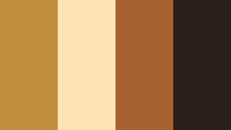
Dusty Reel Nostalgia

- HEX Codes: #b88746, #f3e0c7, #7b5a3d, #342725
- Mood: Nostalgic, cinematic, and gently dramatic.
- Use for: Ideal for narrative short films, retro travel vlogs, and moody title cards.
Dusty Reel Nostalgia wraps classic Worn Ochre (#b88746) in soft cream and deep, analog browns. It feels like leafing through old film strips where every frame carries a story. The warm highlight shade (#f3e0c7) keeps the look from becoming too heavy, while the richer browns (#7b5a3d and #342725) add a subtle, cinematic drama.
Use this palette for story driven openings, character introductions, and thumbnails that hint at memory and emotion. In Filmora, you can build lower thirds and title cards using Worn Ochre for the main blocks, cream for background or margins, and the darkest tone for text or shadow accents. It is especially effective for creators who lean into vintage travel, film photography, or diary style content.
Pro Tip: Build a Cinematic Worn Ochre Look in Filmora
To keep Dusty Reel Nostalgia consistent across an edit, set up a simple style system inside Filmora. Use Worn Ochre as your primary color for titles, subtitles, and key shapes, then reserve the deepest brown for text strokes, drop shadows, and overlays. Save these as custom presets so every intro, b roll sequence, and YouTube Short carries the same warm, analog mood.
You can also create a base color grade that leans slightly toward warm midtones and soft contrast, then apply it across your whole timeline. That way your footage, graphics, and thumbnail captures all share the same worn, cinematic character without having to tweak each clip manually.
AI Color Palette
If you have a still frame or mood board featuring Dusty Reel Nostalgia, you can turn it into a cohesive grade in a few clicks. Filmora's AI Color Palette feature lets you sample the look from a reference image and apply those tones and contrasts to the rest of your clips. It is perfect for matching your hero shot with all your cutaways and reaction shots.
Import your reference frame, pick it as the source, then apply AI Color Palette to any clip that should share the same Worn Ochre atmosphere. Adjust the intensity slider to blend the effect gently if your footage was shot under different lighting conditions.
 secure download

HSL, Color Wheels & Curves
To fine tune this Worn Ochre look, use Filmora's HSL controls to gently desaturate yellows and oranges so they feel more worn and cinematic, not neon. Then adjust the color wheels to warm the midtones while keeping highlights slightly creamy and shadows neutral or a touch cooler for contrast. In curves, lower the blacks just a little and add a soft S curve for that filmic fade.
You can combine these adjustments with guidance from Filmora's color correction tutorials on YouTube, then save the result as a custom LUT or preset. That way, every project that uses Worn Ochre can keep the same emotional tone from title card to end screen.
secure download1000+ Video Filters & 3D LUTs
If you want to stylize Dusty Reel Nostalgia even faster, Filmora's video filters and 3D LUTs make it easy to test different vintage and cinematic looks on top of your Worn Ochre palette. Start with a warm film LUT, then reduce intensity so your brand colors stay recognizable but gain extra texture and depth.
You can stack light leaks, vignettes, and grain filters to mimic aged film without losing clarity in your titles or faces. Once you find a combination you love, save it as a custom preset and reuse it across intros, outros, and platform specific edits like Reels or Shorts.
secure downloadSun-Baked Storyframe
- HEX Codes: #c18d3f, #ffe4b3, #a4612d, #2b2019
- Mood: Sunlit, storytelling focused, and earthy.
- Use for: Great for documentary intros, interview lower thirds, and storytelling thumbnails.
Sun-Baked Storyframe leans into golden afternoon light. Bright Worn Ochre (#c18d3f) and pale sand (#ffe4b3) give your frames a sun kissed glow, while the richer clay and espresso tones (#a4612d and #2b2019) ground the palette in realism. It feels like a day in the field with a camera, capturing honest stories.
Use the lighter tones for backgrounds behind interview titles or quote cards, and the darker browns for legible text. In thumbnails, a Worn Ochre frame around your subject makes the whole video feel warm, human, and approachable, especially for documentaries, social impact content, and educational series.
Terracotta Film Grain

- HEX Codes: #b77935, #f2c89b, #865334, #211915
- Mood: Raw, tactile, and slightly gritty.
- Use for: Perfect for indie film posters, festival bumpers, and textured title sequences.
Terracotta Film Grain brings a dusty, handcrafted edge to Worn Ochre (#b77935). The supporting colors, from warm beige (#f2c89b) to earthy browns (#865334 and #211915), feel like sun dried clay and darkroom shadows. It suits indie filmmakers and storytellers who want a tactile, imperfect vibe.
In Filmora, you can combine this palette with grain overlays and slight vignette effects to create festival style bumpers or title cards. Use the terracotta shade for bold blocks behind white or cream text, then bring the deepest brown into subtle borders, transitions, or logo marks for a cohesive identity across posters, thumbnails, and credits.
Golden Alley Twilight

- HEX Codes: #bf8a3a, #f7ddaa, #5a4b3a, #131015
- Mood: Urban, twilight cozy, and cinematic.
- Use for: Use for cityscape b-roll sequences, cinematic vlog openings, and channel banners.
Golden Alley Twilight mixes the glow of Worn Ochre (#bf8a3a) with twilight creams and deep city shadows (#5a4b3a and #131015). The contrast between warm highlights and near black accents gives a modern, cinematic street feel without losing coziness.
Apply this palette to urban vlogs and night in the city sequences. Try Worn Ochre for lower thirds and subscribe buttons, cream for soft backgrounds, and the darkest shade for overlay gradients or text. Thumbnails with a dark frame and a Worn Ochre title line will immediately signal moody, cinematic content in crowded feeds.
Desert Frame Chronicle

- HEX Codes: #c49142, #f1d7a4, #8b6a44, #3a2d23
- Mood: Expansive, contemplative, and documentary-like.
- Use for: Great for travel documentaries, outdoor adventure recaps, and cinematic title overlays.
Desert Frame Chronicle captures widescreen landscapes: sunlit Worn Ochre (#c49142), soft dunes (#f1d7a4), and weathered earth tones (#8b6a44 and #3a2d23). It feels expansive and contemplative, ideal for long form travel narratives or quiet adventure stories.
Use this palette for map graphics, location tags, and chapter cards in your travel videos. The lightest tone works for full frame backgrounds behind titles, while the darkest brown is perfect for readable text and icons. Capture a key desert or sunset frame, then design your thumbnail borders and typography in matching shades so everything feels like part of one cinematic chronicle.
Soft Rustic Worn Ochre Color Palettes
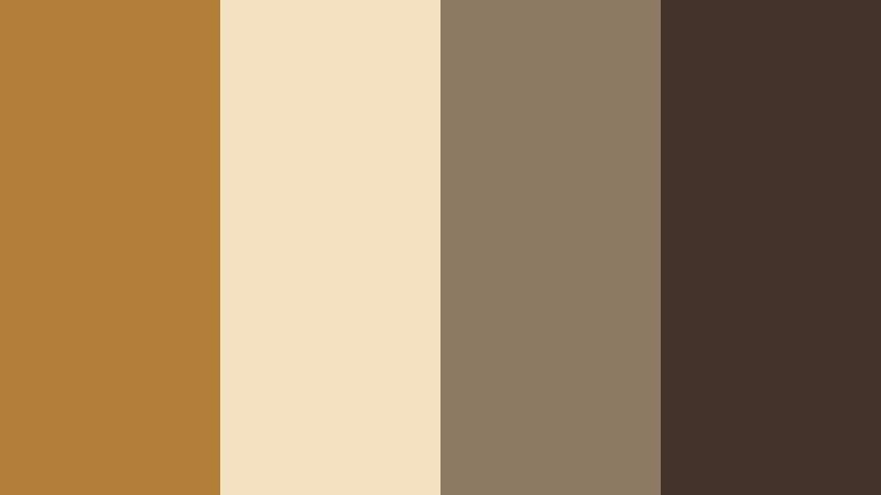
Harvest Journal Calm

- HEX Codes: #b8863f, #f7ecda, #b0a07c, #6e5a3a
- Mood: Calm, thoughtful, and rustic.
- Use for: Ideal for lifestyle vlogs, cozy sit-down videos, and quiet channel branding.
Harvest Journal Calm brings together mellow Worn Ochre (#b8863f) with parchment-like cream (#f7ecda), olive beige (#b0a07c), and a gentle brown (#6e5a3a). It feels like a handwritten notebook on a wooden table, perfect for reflective content.
This palette suits lifestyle vlogs, journaling sessions, and slow living channels. Use the cream and olive tones as backgrounds for on screen notes or chapter titles, and reserve Worn Ochre for key callouts like subscribe prompts or section headers. It keeps your visuals soft and inviting without sacrificing clarity.
Clay Mug Morning

- HEX Codes: #bf8c44, #f8e9d4, #d2b89a, #70523b
- Mood: Cozy, homely, and inviting.
- Use for: Perfect for coffee chats, how-to videos, and warm product close-ups.
Clay Mug Morning pairs a rich Worn Ochre (#bf8c44) with milky neutrals (#f8e9d4, #d2b89a) and a medium roast brown (#70523b). It feels like a calm morning over coffee, ideal for intimate, conversational content.
In thumbnails and intros, use the soft neutrals as backdrops for your face or hands, then add Worn Ochre for title bars or badges. Product shots, recipe videos, and tutorials gain warmth and trustworthiness when framed in these clay inspired tones, especially when you keep typography simple and clean.
Barnwood Echo
- HEX Codes: #b27f39, #f3e1c1, #8d7a62, #43332a
- Mood: Down-to-earth, nostalgic, and textured.
- Use for: Use for DIY builds, cabin tours, and rustic title cards or end screens.
Barnwood Echo mixes Worn Ochre (#b27f39) with creamy beige (#f3e1c1) and two wood inspired browns (#8d7a62, #43332a). The palette is grounded and sturdy, perfect for creators who document builds, renovations, or country life.
Design title cards that mimic wooden signs by using the darker brown as a background and Worn Ochre for bold, simple lettering. End screens with cream panels and ochre buttons feel inviting and on brand, tying together time lapses, voiceovers, and tutorial steps into a consistent rustic aesthetic.
Vintage Sketch Desk

- HEX Codes: #c4924b, #f7e4c6, #b4a58b, #5b4a33
- Mood: Artistic, reflective, and softly aged.
- Use for: Great for art timelapses, stationery reels, and creator brand kits.
Vintage Sketch Desk blends golden Worn Ochre (#c4924b) with paper and pencil tones (#f7e4c6, #b4a58b, #5b4a33). It channels an artist's desk illuminated by afternoon light, making it perfect for creative process content.
Use the softer neutrals as canvas for speed painting overlays or sketch notes in your videos. Worn Ochre can highlight key tools, step numbers, or call to action elements in thumbnails and channel banners, giving your brand a thoughtful, crafted personality.
Cozy Loft Pages

- HEX Codes: #bb8740, #f3e6d2, #c6b49c, #6a5240
- Mood: Bookish, intimate, and warm.
- Use for: Ideal for study vlogs, book reviews, podcast visuals, and chapter cards.
Cozy Loft Pages surrounds Worn Ochre (#bb8740) with page-like neutrals (#f3e6d2, #c6b49c) and a soft brown (#6a5240). It feels like a reading nook under string lights, making it an excellent choice for academic, literary, or podcast content.
Create chapter cards and timestamps using the light neutrals as panels and Worn Ochre for headings or icons. In thumbnails, a simple ochre bar with your series title over a muted background keeps things readable in small sizes while reinforcing your cozy, intellectual brand.
Modern Minimal Worn Ochre Color Palettes
Ochre Line Edit

- HEX Codes: #b78139, #f6f3ed, #3f4045, #18181b
- Mood: Minimal, editorial, and sharp.
- Use for: Perfect for channel rebrands, sleek lower thirds, and motion graphics overlays.
Ochre Line Edit uses Worn Ochre (#b78139) as a strong accent against clean off white (#f6f3ed) and cool charcoals (#3f4045, #18181b). The result is editorial and minimal, suitable for tech reviews, productivity channels, and design led brands.
Use the neutral background for most of your frames and let Worn Ochre appear in thin lines, buttons, or key text blocks. The darkest gray is ideal for main text and icons. This palette keeps your visuals modern while still feeling warm and human, especially effective for rebrands and new series launches.
Muted Grid Studio

- HEX Codes: #c18a3f, #ece7de, #8e8f96, #26272b
- Mood: Structured, calm, and contemporary.
- Use for: Use for tutorial layouts, UI-style overlays, and tech or productivity content.
Muted Grid Studio balances warm Worn Ochre (#c18a3f) with off white (#ece7de) and cool grays (#8e8f96, #26272b). It feels like a clean design studio with a hint of warmth, ideal for tutorials, app breakdowns, and productivity workflows.
Design screen overlays that mimic interface panels using the off white and gray tones, then use Worn Ochre only for focus elements like progress bars, highlighted steps, or callouts. This keeps your visuals calm and organized while giving viewers a clear visual hierarchy.
Ochre Accent Interface

- HEX Codes: #ba8135, #ffffff, #c2c5cc, #1f252e
- Mood: Clean, digital-friendly, and confident.
- Use for: Ideal for app mockups, UI explainer videos, and crisp thumbnail text blocks.
Ochre Accent Interface puts Worn Ochre (#ba8135) against pure white (#ffffff) and cool, slate like grays (#c2c5cc, #1f252e). It is bright, legible, and digital ready, making it excellent for software demos and explainer content.
Use white and light gray for most backgrounds and interface mockups, then highlight important buttons, numbers, or arrows in Worn Ochre. The darkest gray works well for bold headlines and body text, ensuring great readability on small screens when viewers browse on mobile.
Editorial Spine Highlight

- HEX Codes: #b67e37, #f4efe6, #a4a1a0, #302f33
- Mood: Magazine-like, polished, and subtle.
- Use for: Great for cinematic essays, brand lookbooks, and clean credit sequences.
Editorial Spine Highlight treats Worn Ochre (#b67e37) like a book spine color surrounded by refined neutrals (#f4efe6, #a4a1a0, #302f33). It feels like a magazine layout, polished but not loud.
Use the soft off white as your base, then place vertical or horizontal Worn Ochre bars as design anchors behind titles or section labels. The mid and dark grays handle text and subtle dividers, giving your cinematic essays and brand lookbooks a professional, editorial finish.
Boho Travel Worn Ochre Color Palettes
Nomad Market Trail
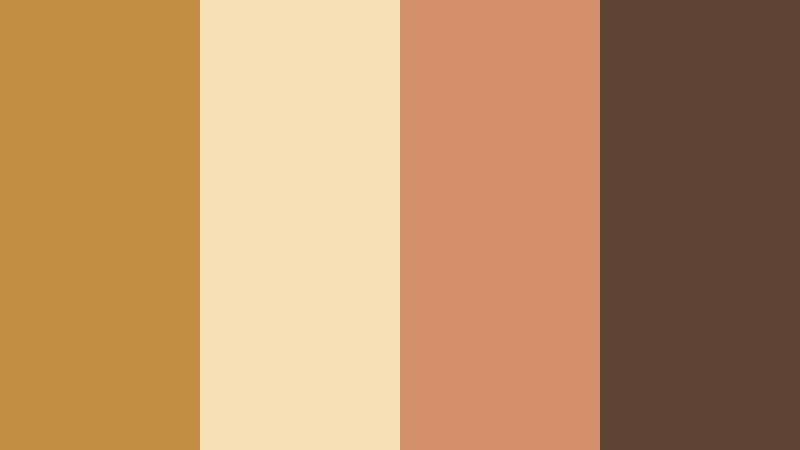
- HEX Codes: #c28e42, #f6dfb3, #d38f6a, #5f4334
- Mood: Wanderlust filled, colorful, and textured.
- Use for: Perfect for travel vlogs, street photography reels, and dynamic intro slates.
Nomad Market Trail combines vibrant Worn Ochre (#c28e42) with sunlit cream (#f6dfb3), warm coral (#d38f6a), and a dusty brown (#5f4334). It feels like walking through a busy market full of spices, fabrics, and voices.
Use the coral and Worn Ochre together for energetic titles and locator graphics, while the lighter cream keeps background panels easy on the eyes. In thumbnails, pair a travel portrait with a Worn Ochre block and coral accent lines to instantly communicate movement, culture, and story.
Sunrise Rooftop Stay

- HEX Codes: #bf8740, #ffd8a2, #f29f7b, #3b3141
- Mood: Dreamy, boho, and slightly romantic.
- Use for: Great for airbnb tours, vacation highlight reels, and dreamy title cards.
Sunrise Rooftop Stay pairs soft Worn Ochre (#bf8740) and peachy light (#ffd8a2) with a warm coral highlight (#f29f7b) and a deep plum gray (#3b3141). It feels dreamy and boho, like early morning on a rooftop with city views.
Use the light peach for full screen intro backgrounds, Worn Ochre for main titles, and coral for subtle accents like underlines or icons. The dark plum is perfect for readable text and subtle borders. This palette gives airbnb tours, couples travel vlogs, and romantic highlight reels a coherent, sun kissed charm.
Tips for Creating Worn Ochre Color Palettes
Worn Ochre is versatile, but it really shines when combined thoughtfully with neutrals, accent colors, and good on screen contrast. These tips will help you turn it into a consistent visual language for your videos and designs.
- Pair Worn Ochre with light neutrals (creams, off whites) to keep your frames airy and readable, especially for text heavy intros or overlays.
- Use one dark supporting color (charcoal, deep brown, or plum) to guarantee high contrast for titles and UI elements over footage.
- Limit yourself to 4 main colors per palette (like the swatches above) to avoid cluttered, confusing thumbnails and lower thirds.
- Check mobile readability by previewing your thumbnail or title design at very small sizes and adjusting contrast or font weight if it feels weak.
- Keep Worn Ochre as the hero color across your brand (logos, end screens, lower thirds) while letting secondary colors change by series or playlist.
- Sample colors directly from your footage (walls, clothing, props) and nudge them toward Worn Ochre so your grade and graphics feel naturally connected.
- Use slightly desaturated versions of Worn Ochre for cinematic looks, and more saturated versions for upbeat, high energy content like travel montages.
- Create and save color presets or custom LUTs in Filmora so every new project can reuse your Worn Ochre palette with minimal setup time.
Worn Ochre sits in a sweet spot between earthy and elegant, making it ideal for cinematic stories, cozy vlogs, and modern minimal branding. With the palettes above, you can match the mood of your project, from quiet journals and rustic builds to boho travel reels and editorial essays.
As you experiment in Filmora, try building a few reusable templates: intro titles, lower thirds, and end screens in your favorite Worn Ochre palette. Over time, this consistent color language will make your channel instantly recognizable while keeping your videos warm, inviting, and professional.
Open a new project, drop in your footage, and start testing these HEX codes in your text, shapes, and color grading. With Filmora's tools, you can turn Worn Ochre from a single shade into a signature look that carries across every frame.
secure downloadNext: Old Gold Color Palette
