
 100% Security Verified | No Subscription Required | No Malware

Low Light Amber sits between golden hour sunlight and candle flame. It feels warm, grounded, and a little mysterious, which makes it perfect for drawing the eye without shouting. In color psychology, amber tones suggest comfort, nostalgia, and warmth, but when used in low light, they also bring cinematic depth and drama.
For creators, Low Light Amber is a powerful choice for video intros, thumbnails, channel branding, title cards, and overlays. It works especially well in moody edits, cozy vlogs, and storytelling content. Below you will find 15 ready-made Low Light Amber color palettes with HEX codes tailored for Filmora users and visual creators who want consistent, cinematic looks across videos, social posts, and design assets.
In this article
Cinematic Low Light Amber Color Palettes
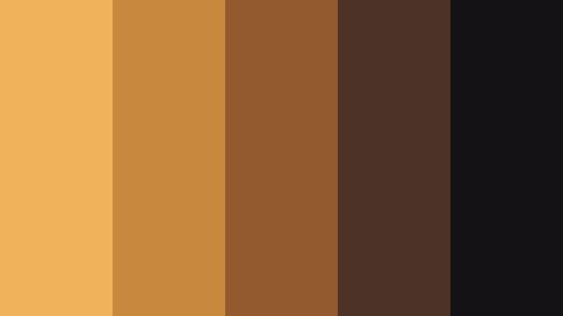
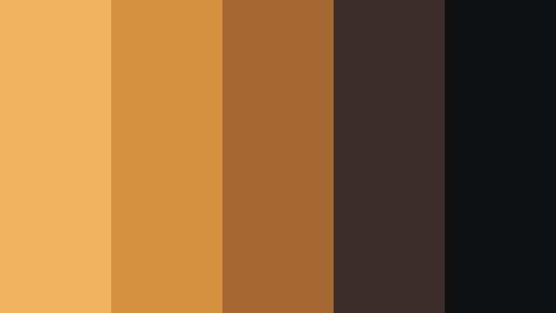
Midnight Studio Glow
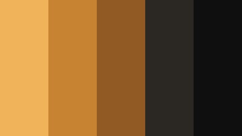
- HEX Codes: #f0b35a, #c88332, #8f5a24, #2b2723, #0f0f10
- Mood: Moody, cinematic, and dramatic with a warm spotlight feel.
- Use for: Ideal for narrative short films, dramatic vlog intros, and cinematic title cards that need a subtle but intense glow.
Midnight Studio Glow feels like a single warm spotlight cutting through a dark soundstage. The brightest amber (#f0b35a) sits against deep browns and near-black shadows, creating a focused, theatrical frame that naturally guides the viewer toward your subject.
Use this palette for intense openings, dramatic talking-head scenes, or minimalist thumbnails with bold typography over dark backgrounds. In branding, it works for creators who want a premium, film-inspired identity with clear contrast between text, subject, and background across YouTube banners, intros, and end screens.
Pro Tip: Build a Cinematic Low Light Amber Look in Filmora
To keep a Midnight Studio Glow style consistent, start by grading your hero shots in Filmora, then use that clip as a visual reference. Match the warmth in the highlights and protect the rich shadows so your Low Light Amber never turns orange or washed-out. Apply similar contrast and saturation settings to all intros, b-roll, and end screens so the whole edit feels like it takes place in the same studio space.
For thumbnails and title cards, export still frames from your timeline, then bring them back into Filmora for graphics and text. That way, your Low Light Amber grading stays identical between video and static branding assets.
AI Color Palette
If you have a reference still or mood board that already nails this Low Light Amber tone, you can turn it into a global look. Filmora's AI Color Palette feature analyzes your reference colors and applies the same mood across multiple clips in just a few clicks.
Drop a graded shot or a color card with your chosen ambers onto the timeline, let AI Color Palette read its tones, and then match the rest of your footage. This keeps your highlights warm, midtones rich, and shadows deep, so your entire project shares the same cinematic amber glow.
 secure download

HSL, Color Wheels & Curves
To fine-tune your Low Light Amber look, use Filmora's color tools to sculpt the image. Gently push the orange and yellow sliders in HSL to lock in the exact amber you want, then use the color wheels to warm the midtones while keeping shadows neutral and inky for a strong cinematic contrast. If you need guidance, Filmora's tutorials on advanced color controls show how to balance warmth without blowing out highlights.
With curves, you can build a subtle S-curve to deepen blacks and add a soft bloom to the brightest ambers. This keeps skin tones natural while your key light still feels like a focused studio lamp, perfect for cohesive grading across all your scenes.
secure download1000+ Video Filters & 3D LUTs
If you want a fast starting point for your Low Light Amber grades, Filmora's video filters and 3D LUTs make it easy to test different cinematic moods. Stack a warm LUT with a vignette or glow filter to intensify that midnight studio feel in just a few seconds.
Once you find a combination that suits your brand, save it as a custom preset and apply it across intros, b-roll, shorts, and social cutdowns. This keeps your Low Light Amber aesthetic recognisable wherever your content appears.
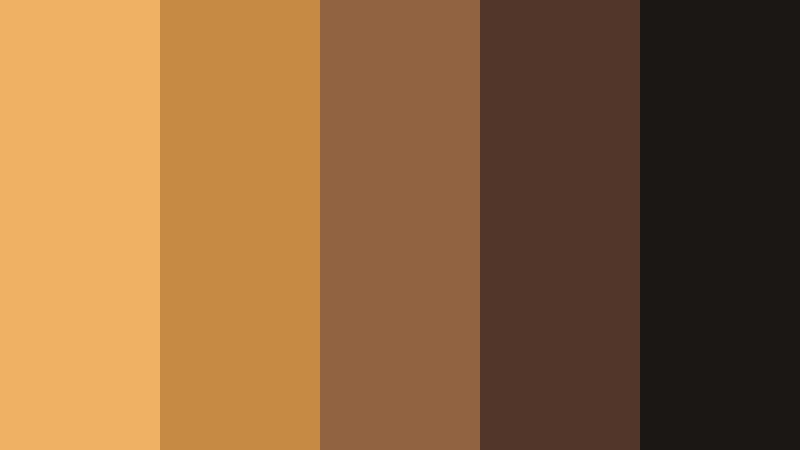
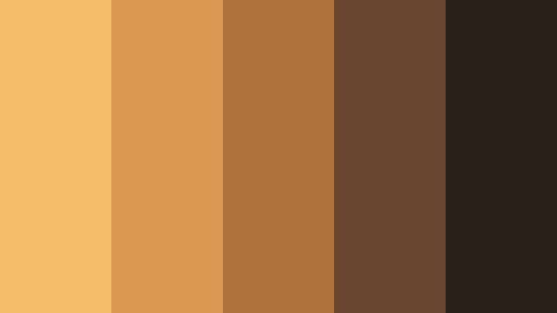
secure downloadProjector Room Haze

- HEX Codes: #f2b867, #d1943c, #a16828, #413126, #151219
- Mood: Nostalgic and hazy, like an old projector in a dim room.
- Use for: Works well for retro movie reviews, analog-style transitions, and grainy b-roll sequences.
Projector Room Haze mixes dusty ambers with soft browns and deep plum shadows to imitate film light cutting through dust. It instantly suggests nostalgia, memory, and analog textures.
Use it for classic cinema review thumbnails, retro title cards, and overlays with film grain or frame burns. For branding, pair the lighter ambers for logo accents with the darkest tones as background plates, so your text remains sharp while the overall vibe stays vintage and cinematic.
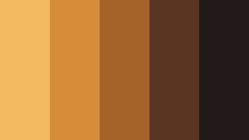
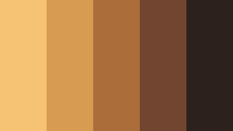
Backstage Tungsten Fade

- HEX Codes: #f0ae55, #d08033, #a45a23, #4b3023, #181518
- Mood: Intimate, warm, and theatrical, like backstage lights before a show.
- Use for: Great for behind-the-scenes content, concert recaps, and performance highlight reels.
Backstage Tungsten Fade feels like the glow from dressing-room bulbs reflecting off dark curtains and wood. The gradation from bright amber to deep brown and near-black makes your subjects feel close and human, as if we are sharing a private moment before the show.
Apply this palette to performance vlogs, concert recap titles, or BTS reels where you want low light to feel intentional rather than noisy. In thumbnails, use the mid ambers for typography and keep the deepest shades behind silhouettes of musicians, hosts, or speakers.
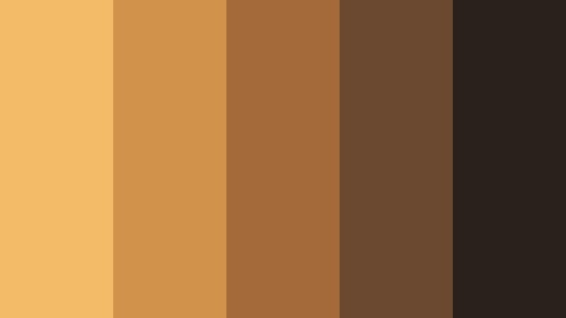
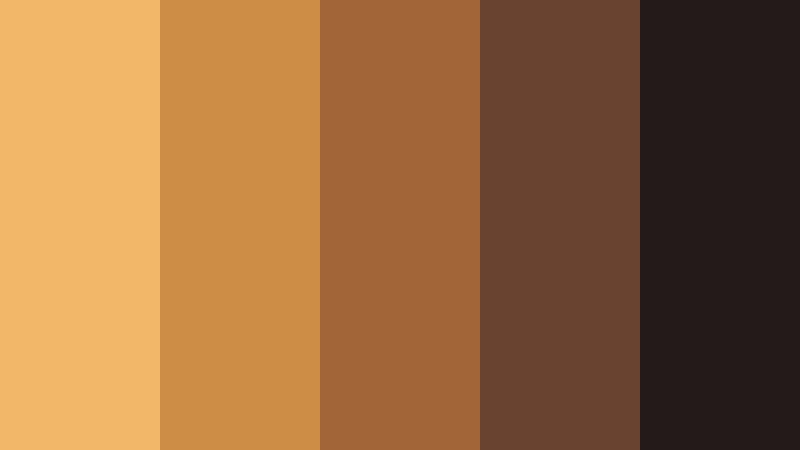
Dusty Cinema Lobby
- HEX Codes: #efb264, #c78a44, #926341, #52362a, #1b1715
- Mood: Cozy and nostalgic, like waiting in a dim cinema lobby lined with posters.
- Use for: Use for channel branding around movie reviews, podcast cover art, and commentary thumbnails.
Dusty Cinema Lobby combines caramel ambers with poster-like browns and muted shadows. It feels like faded movie posters under soft lamps, setting the stage for discussions, opinions, and long-form commentary.
It is ideal for review channels, commentary podcasts, and film-analysis videos. Use the brighter amber as an accent for titles or badges, the mid browns for UI elements and frames, and the darkest tone as a neutral backdrop for faces, making your content easy to read on any device.
Lantern Alley Scenes
- HEX Codes: #f3b960, #d58d3a, #a66327, #5a3521, #211817
- Mood: Story-driven and atmospheric, like walking through lantern-lit alleys at night.
- Use for: Perfect for travel vlogs, city-night b-roll, and narrative sequences with a warm urban mood.
Lantern Alley Scenes captures the glow of hanging lanterns against brick and asphalt. The palette balances strong ambers with reddish browns and almost-black shadows, making night footage feel rich instead of flat.
Use it on travel edits, food street stories, and city-night sequences shot under mixed lighting. In thumbnails and titles, combine the brightest amber for focal text with the near-black background to make your message readable even when the scene is full of detail.
Cozy & Intimate Low Light Amber Color Palettes
Candlelit Coffee Corner
- HEX Codes: #f3ba67, #d1924c, #a56a3a, #6a4930, #2a211c
- Mood: Warm, intimate, and comforting, like a quiet coffee shop at dusk.
- Use for: Great for study vlogs, cozy lifestyle channels, and podcast video backdrops.
Candlelit Coffee Corner blends creamy amber with coffee-brown tones and soft, dark neutrals. It instantly makes a space feel smaller and more personal, like a corner table in a dim cafe.
Choose this palette for study-with-me videos, soft-spoken podcasts, or lifestyle vlogs focused on routines and reflection. Use the mid ambers on lower thirds and timestamps, while keeping the deepest brown for background panels behind text, so your overlays remain readable while the vibe stays relaxed and cozy.
Golden Vinyl Night
- HEX Codes: #f1b25c, #c8893e, #935b2d, #4d3327, #151215
- Mood: Retro, soulful, and relaxed, like spinning vinyl under a single lamp.
- Use for: Works well for music sessions, chill beats channels, and lo-fi background loops.
Golden Vinyl Night is all about that warm lamp glow reflecting off a record surface. The combination of amber, chestnut, and deep espresso tones makes sound-focused content feel tangibly warm.
Use it as your go-to palette for lo-fi loops, live sessions, or lyric videos. In visual branding, keep the bright amber for waveform highlights or play buttons, while using the darker shades as backdrops for track titles and channel logos, giving your feed a consistent late-night studio mood.
Amber Reading Nook
- HEX Codes: #f4be6c, #d6994f, #b0723d, #6b4630, #281e1a
- Mood: Quiet, thoughtful, and bookish with a golden-hour warmth.
- Use for: Ideal for educational content, book reviews, and productivity videos with a soft, inviting tone.
Amber Reading Nook feels like a reading lamp shining over wooden shelves at the end of the day. The palette ranges from golden amber to woody browns and muted darks, which keeps the frame calm and focused.
It works beautifully for long-form educational content, book recaps, and note-taking tutorials. Use the lighter amber for headers and chapter markers in your videos, and the deeper browns for title cards, allowing your text and diagrams to stand out without breaking the soft, intellectual mood.
Soft Hearth Glow
- HEX Codes: #f6c273, #d89b52, #ab6e3b, #714530, #2d211c
- Mood: Homey and nostalgic, like gathering around a low fire with friends.
- Use for: Use in family vlogs, holiday recaps, and memory-driven edit sequences.
Soft Hearth Glow is inspired by embers, wood, and warm brick. It turns even simple footage into something that feels like a cherished memory, perfect for emotional storytelling.
Use this palette for holiday recaps, family gatherings, or montage sequences about traditions and home. For titles and text, lean on the soft amber and middle browns, reserving the darkest shade for edges and vignettes that frame your memories without distracting from faces.
Studio Desk Sundown
- HEX Codes: #f2b767, #ce8d47, #a26537, #6a4330, #221b1a
- Mood: Focused yet calm, like editing at your desk as the sun slips away.
- Use for: Perfect for editing tutorials, workspace tours, and productivity montages.
Studio Desk Sundown combines sunset ambers with desk wood tones and soft shadowy browns. It is calm and productive, making your workspace look like a place where ideas actually get finished.
Use this palette in editing walkthroughs, gear reviews, and desktop setups. The brighter amber works well as a highlight for cursors, callouts, and text boxes, while the darker hues keep UI overlays grounded, ensuring your viewers focus on the tutorial steps, not on distracting colors.
Modern & Stylish Low Light Amber Color Palettes
Urban Loft Filmmaker
- HEX Codes: #f0b45f, #d4923f, #a56832, #3c2f2b, #101112
- Mood: Modern, creative, and slightly industrial with a warm edge.
- Use for: Great for filmmaker portfolios, channel branding, and sleek title cards.
Urban Loft Filmmaker pairs industrial charcoals with focused amber accents, echoing exposed brick, metal, and studio lights. It has a premium, urban feel that suits professionals and aspiring filmmakers alike.
Use it to design channel intros, lower thirds, and portfolio reels. Reserve the strongest amber for key text and logo marks, while the deep grays and blacks carry backgrounds and frames. This keeps your brand modern and clean without losing warmth.
Minimal Desk Ember
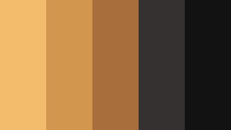
- HEX Codes: #f3bc6b, #d2964e, #a86e3b, #343130, #121213
- Mood: Clean, minimal, and warm with a focus-friendly glow.
- Use for: Use in UI overlays, lower thirds, and minimalist thumbnails for productivity or tech content.
Minimal Desk Ember keeps things stripped back: two deep neutrals, a couple of controlled ambers, and nothing extra. It feels like a tidy workspace where every item has a purpose.
This palette is perfect for productivity, tech, or coding videos where you want warmth but still need a minimal, premium interface. Use the lightest amber for key labels and progress bars, while the dark neutrals frame your screen recordings and motion graphics to keep the focus on information.
Night Market Neon Tint
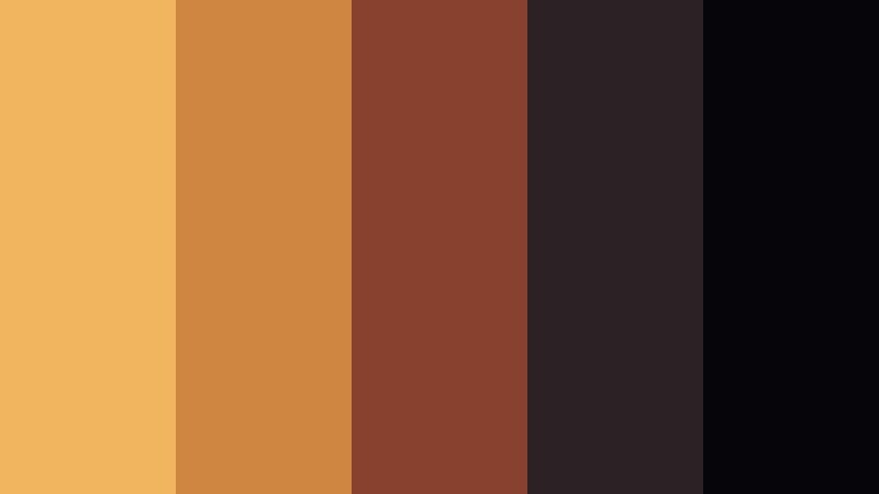
- HEX Codes: #f2b55f, #cf8640, #87412e, #2b2226, #05050a
- Mood: Edgy and dynamic, like a night market lit by warm signs and deep shadows.
- Use for: Perfect for travel edits, street photography reels, and fast-paced city montages.
Night Market Neon Tint captures the energy of crowded streets under neon signs and warm lamps. The punchy ambers stand out against inky blacks and smoky purples, giving your frames a gritty, energetic feel.
Use this palette in quick-cut edits, street photography slideshows, and urban travel reels. In your titles and transitions, let the brightest amber streak across dark backgrounds like light trails, reinforcing motion and speed while keeping your branding unified.
Cinematic Workspace Amber

- HEX Codes: #f1b664, #d08e4b, #9e633a, #44302a, #141316
- Mood: Productive and cinematic, like a colorist bay lit by warm panels.
- Use for: Ideal for tutorial intros, editing breakdowns, and software demos with a premium feel.
Cinematic Workspace Amber fuses warm panel light with dark, neutral surroundings, mimicking a professional grading suite. It suggests both creativity and precision.
Use it for Filmora tutorials, editing breakdowns, or course intros. Give key UI callouts the soft amber, while relying on the darker tones for backgrounds and frame lines. The palette keeps instructional content stylish without sacrificing clarity.
After Hours Studio Line

- HEX Codes: #f0b35f, #cc8748, #9b5f3c, #3a2c29, #101016
- Mood: Sleek, late-night, and professional with a creative twist.
- Use for: Best for brand bumpers, end screens, and stylish motion graphics packages.
After Hours Studio Line feels like an agency studio lit after dark: mostly deep neutrals with a clean, sharp streak of amber cutting through. It is sleek and professional, but still has personality.
Use it for channel idents, animated logos, and end screens where you want a confident sign-off. The pale amber is ideal for progress bars, subscribe buttons, and logo accents, while the darker shades give you plenty of room for legible text and icons.
Tips for Creating Low Light Amber Color Palettes
Low Light Amber works best when it balances warmth with enough shadow and contrast to stay readable. Here are some practical ways to combine it with other tones for video and design.
- Pair Low Light Amber with deep neutrals (charcoal, espresso, aubergine) so highlights glow without overwhelming the frame.
- Keep text on the brightest amber at high contrast: use near-black or very light off-white for titles and calls to action.
- Limit the number of accent colors. One strong amber plus 2 to 3 supporting neutrals usually feels more cinematic than a busy spectrum.
- Match your grade to the actual light on set. If you shoot under tungsten bulbs, shift your highlights slightly toward amber instead of pure yellow.
- For thumbnails, exaggerate the contrast: deepen shadows and slightly boost amber saturation so the image stands out in small sizes.
- Use vignettes and gradients that fade from amber to dark neutral to guide the eye toward faces, titles, or key objects.
- Create separate palettes for day and night content that share the same core amber and logo colors to keep your brand consistent.
- Save your favorite looks as LUTs or presets in Filmora so every new project starts with a consistent Low Light Amber base grade.
Low Light Amber palettes can transform your visuals from flat to cinematic, shaping how viewers feel about your stories and brand. Whether you lean into cozy reading nooks, edgy street scenes, or sleek studio setups, the right combination of amber highlights and deep shadows gives your work a signature warmth.
Experiment with these 15 palettes in Filmora, then adjust HSL, color wheels, and filters until the mood matches your channel identity. Once you find a look you love, save it and reuse it across intros, b-roll, shorts, and thumbnails so your audience recognizes your style instantly.
With consistent Low Light Amber grading and Filmora's color tools, you can build a visual language that feels polished, cinematic, and uniquely yours.
secure download