
 100% Security Verified | No Subscription Required | No Malware

Mountain Clay is a grounded neutral that sits between warm brown and soft terracotta. It feels calm, cozy, and reassuring, like sun-warmed clay or a favorite ceramic mug. In color psychology, these earthy tones signal stability, trust, and authenticity, which is why they work so well for creators who want their visuals to feel human and approachable instead of overly polished or cold.
In video editing and design, Mountain Clay is perfect for cinematic vlogs, lifestyle thumbnails, subtle intros, and brand systems that need warmth without being too colorful. Below are 15 curated Mountain Clay color palettes with HEX codes you can use in Filmora and other tools to build cohesive looks for your YouTube channel, social content, title cards, and on-screen graphics.
In this article
Warm Minimalist Mountain Clay Color Palettes
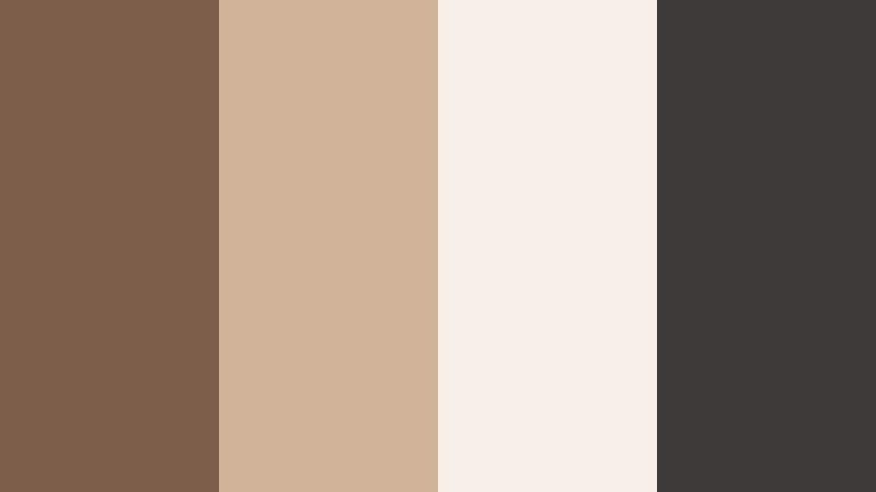
Sunbaked Studio Neutrals

- HEX Codes: #8a6a55, #c9a58a, #f3e1d2, #6b5748
- Mood: Calm, creative, and grounded with a sunlit studio vibe.
- Use for: Ideal for minimalist talking-head videos, design tutorials, and subtle YouTube banners.
Sunbaked Studio Neutrals mixes rich Mountain Clay with sandy beige and soft cream, giving your visuals a warm, handcrafted feeling without losing that modern, minimal edge. The deeper browns anchor the frame, while the lighter tones act as clean backgrounds for text, graphics, and UI elements.
Use this palette for talking-head setups, desk shots, and title cards where you want the focus on your story or tutorial. It works especially well for YouTube banners, thumbnails, and intro screens where you combine a light cream base (#f3e1d2) with darker clay accents (#8a6a55, #6b5748) for overlays, borders, and typography that stay readable across devices.
Pro Tip: Build a Cinematic Mountain Clay Look in Filmora
To keep a Sunbaked Studio Neutrals vibe consistent across an entire edit, set up a base Mountain Clay look in Filmora and reuse it. Start with warm white balance and slightly lifted shadows to match the soft cream and sandy tones, then save this as a custom preset. Apply it to your A-roll, B-roll, and social cut-downs so your channel always feels cohesive, even when you shoot at different times of day.
You can also mirror the palette in your graphic elements. Use the lightest shade as background for titles, a mid-tone clay for lower-thirds, and the darkest brown for text or icons. In Filmora, create and save these title templates so every new video instantly matches your Mountain Clay brand style.
AI Color Palette
If you have a reference photo of your real studio, desk, or brand mood board in these Mountain Clay tones, you can turn it into a video-wide look with Filmora. Filmora's AI Color Palette feature reads the color balance and contrast from that image and applies a similar mood to your clips in just a few clicks.
Import your reference, pick a frame that feels closest to your ideal Sunbaked Studio Neutrals look, and let AI remap the colors of the rest of your footage. This keeps your intros, cutaways, and thumbnails visually aligned, even if they come from different cameras or locations.
 secure download

HSL, Color Wheels & Curves
Once you have a base Mountain Clay look, fine-tune it with Filmora's HSL, color wheels, and curves. Slightly desaturate oranges and yellows to keep skin tones soft, then nudge the midtone color wheel toward warm brown to echo the main clay shade. If your creams look too gray, use curves to gently lift the highlights and add a subtle S-curve for contrast without losing that airy studio feeling.
For a deeper dive into shaping cinematic tones, you can explore Filmora's advanced color grading controls and see how pros balance warm neutrals and contrast for polished edits on YouTube-style content.
secure download1000+ Video Filters & 3D LUTs
To speed up your color workflow, combine your Mountain Clay palette with Filmora's presets. Filmora's video filters and 3D LUTs make it easy to build different variations of the same neutral look, from clean daylight to moody evening, while keeping your browns and creams consistent.
Choose warm cinematic LUTs to intensify the clay tones in B-roll or pick softer lifestyle filters for thumbnails and intros. Apply them on adjustment layers so you can quickly toggle styles, then refine with HSL to be sure your Mountain Clay shades still match your chosen HEX codes.
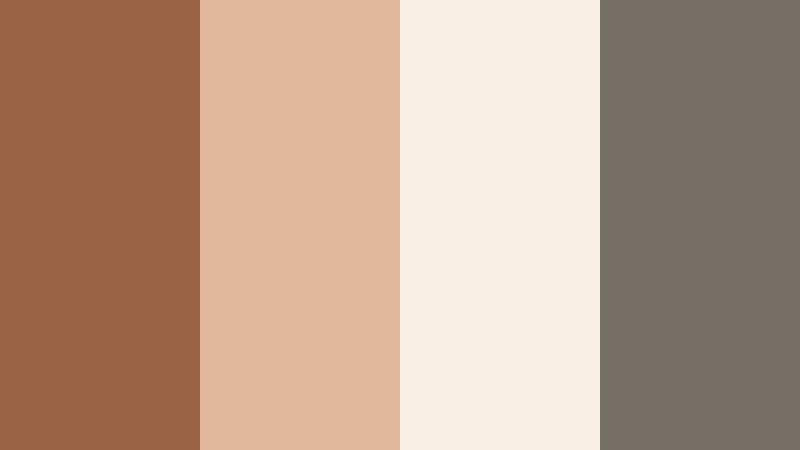
secure downloadClay Loft Workspace
- HEX Codes: #7c5e4b, #d0b49a, #f6efe7, #3e3a39
- Mood: Productive, modern, and slightly urban with cozy warmth.
- Use for: Great for productivity vlogs, workspace tours, and tech channels that want a softer edge.
Clay Loft Workspace blends warm clay browns with creamy whites and charcoal, giving your setup an urban, studio-apartment feel that still feels friendly. The darker gray (#3e3a39) adds a techy, modern touch, helping devices, gear, and typography stand out against the lighter neutrals.
Use the softer tones for backgrounds in your channel banner or YouTube thumbnails, then highlight key text or subscribe CTAs with the deep clay or charcoal. In workspace tours and productivity vlogs, this palette adds warmth to metal, glass, and screen reflections, softening the overall look without losing clarity.
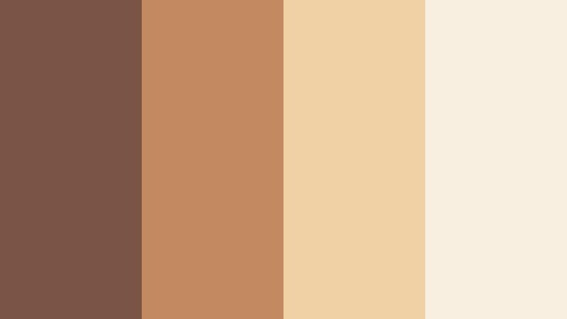
Terracotta Desk Essentials
- HEX Codes: #9a6346, #e1b89b, #f8eee4, #756f66
- Mood: Organized, tactile, and slightly nostalgic.
- Use for: Perfect for stationery reels, planning content, and lifestyle thumbnails with a crafted look.
Terracotta Desk Essentials leans into rich terracotta (#9a6346) paired with pastel beige and soft off-white, evoking notebooks, paper, and handmade ceramics. The muted gray (#756f66) keeps the palette balanced and prevents it from feeling too vintage or orange.
Apply this scheme to planning content, journaling reels, and desk flat-lays. Use the pale tones as clean negative space for text overlays, and bring attention to titles, timestamps, or chapter markers with the deeper terracotta. It is a great option for branding around productivity apps, stationery shops, and lifestyle channels focused on analog tools.
Neutral Edit Suite

- HEX Codes: #73594a, #b28e76, #e9d4c3, #faf5f0
- Mood: Professional, cinematic, and softly illuminated.
- Use for: Use for editing tutorials, app walkthroughs, and polished brand intros.
Neutral Edit Suite flows from mid-tone clay into creamy highlights and soft white, creating a smooth gradient ideal for overlays and UI-heavy content. It feels intentionally cinematic but not overly stylized, which is perfect when you want the software interface or on-screen tutorial steps to be the hero.
Use the two lightest shades as backgrounds for lower-thirds, pop-up tips, and callouts in your edits. The darker browns work well for logo locks, navigation bars, and chapter titles in intros and outros. This palette keeps things polished for brand collabs, course material, and professional channel rebrands.
Cozy Cinematic Mountain Clay Color Palettes
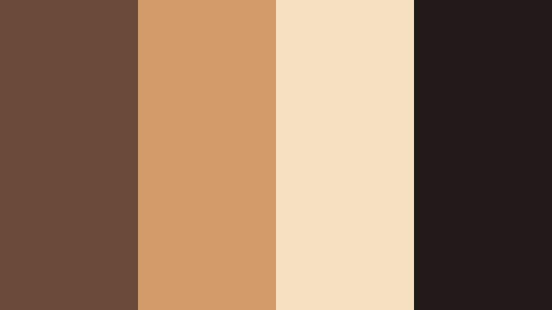
Fireside Storytime

- HEX Codes: #714837, #b36a4d, #e8c3a4, #2e2825
- Mood: Intimate, nostalgic, and storytelling-focused.
- Use for: Amazing for narrative vlogs, documentary-style intros, and podcast cover art.
Fireside Storytime mixes deep clay and ember-like oranges with soft, toasty highlights and almost-black shadows. It mimics the glow of a fireplace, making talking-heads and storytelling setups feel closer and more emotional.
Use the darkest shade (#2e2825) as a backdrop for titles, end cards, and podcast covers, then let the warm mid-tones color your footage through grading. This palette works beautifully for reflective vlogs, slow storytelling sequences, and intimate B-roll where you want viewers to lean in and listen.
Autumn Cabin Evening

- HEX Codes: #7a5240, #c97f4f, #f1d2a9, #45332c
- Mood: Warm, cinematic, and seasonal with cozy drama.
- Use for: Use in fall lookbooks, travel vlogs, and cinematic b-roll sequences.
Autumn Cabin Evening combines rich clay browns with golden apricot and deep shadows to capture the feeling of being indoors at dusk while the world outside cools down. The contrast between light and dark adds drama while staying inviting.
Apply this to fall travel vlogs, fashion lookbooks, or any seasonal edit where you want leaves, wood, and skin tones to glow. Use the bright apricot for accent elements in thumbnails and intro text, while the darkest brown supports legible typography and logo treatments.
Candlelit Caf Scenes
- HEX Codes: #6c4a3a, #d09b68, #f6e0c0, #201917
- Mood: Romantic, intimate, and softly glamorous.
- Use for: Great for date-night vlogs, lifestyle shorts, and food cinematography overlays.
Candlelit Caf Scenes features moody clay shadows, latte foam highlights, and candlelight golds anchored by inky near-black. The result is a soft, cinematic palette that flatters skin tones and makes food look rich and indulgent.
Use the lighter beige and cream for text panels or recipe cards layered over footage, while the deep brown and near-black set the tone in your color grading. It is ideal for reels and shorts filmed in restaurants, coffee shops, and cozy interiors where you want to enhance the existing warm light.
Vintage Travel Postcards

- HEX Codes: #8b5a46, #c4895b, #edd3b0, #f8f1e6
- Mood: Adventurous, nostalgic, and sun-faded.
- Use for: Perfect for travel montages, film-style LUT ideas, and retro thumbnail designs.
Vintage Travel Postcards uses Mountain Clay browns and desert-like oranges combined with postcard creams to recreate the look of faded film prints. It instantly adds a memory-like quality to your travel content.
In thumbnails and titles, pair the off-white (#f8f1e6) background with bold clay lettering for a retro card effect. For video, apply a slightly desaturated grade and lifted blacks to echo old film, using this palette as a guide. It works well for travel diaries, road trips, and throwback edits.
Modern Earthy Mountain Clay Color Palettes
Urban Clay Contrast

- HEX Codes: #6a5144, #f1c27a, #f7efe6, #141416
- Mood: Edgy, modern, and high-contrast yet grounded.
- Use for: Ideal for tech reviews, cinematic city vlogs, and bold channel branding.
Urban Clay Contrast merges grounded Mountain Clay with bright golden beige and crisp charcoal. The near-black (#141416) gives your compositions strong outlines and contrast, while the warm neutrals keep the look approachable and less sterile than pure grayscale.
Use this palette for tech-heavy thumbnails, channel art, or city B-roll where you want bold separation between subject and background. Light tones make excellent panels for specs and pricing details, with the clay brown used for icons and buttons that feel less harsh than pure black.
Studio Apartment Glow

- HEX Codes: #855e4a, #ddb392, #ffe6cc, #2f2722
- Mood: Cozy yet modern, with soft evening glow.
- Use for: Great for home makeovers, aesthetic routines, and lifestyle branding packages.
Studio Apartment Glow wraps earthy clay in peachy light and soft shadows, recalling golden hour in a small city flat. The palette feels aspirational but still lived-in, making it a strong fit for channels built around everyday aesthetics.
Use the peach and light beige for before-and-after cards, room labels, and product callouts, while the dark brown grounds your typography. In Filmora, push your highlights slightly warmer and keep shadows deep but soft to echo the HEX values in your footage and graphics.
Clay And Concrete Blend

- HEX Codes: #7b5b49, #b6a190, #ded4c9, #4b4b4f
- Mood: Architectural, grounded, and clean.
- Use for: Use for architecture reels, design portfolios, and UI overlays with an earthy twist.
Clay And Concrete Blend marries warm browns with concrete-like grays, creating a palette that feels both natural and industrial. The mid-gray (#4b4b4f) keeps compositions sophisticated, while the clay tones prevent them from feeling cold or corporate.
Use this scheme to present interiors, exteriors, and design mockups. Light grays serve as neutral stages for floor plans or UI overlays, while clay accents highlight key details like measurements, labels, or navigation buttons in your edits and web thumbnails.
Soft Lifestyle Mountain Clay Color Palettes
Morning Clay Latte

- HEX Codes: #8a6855, #d9b59c, #f6e6d6, #fffaf4
- Mood: Gentle, calm, and morning-fresh.
- Use for: Perfect for morning routines, wellness content, and calming intro screens.
Morning Clay Latte layers soft coffee browns with milky creams and near-white foam, capturing the ease of a slow, sunny morning. It is soothing and airy, ideal for content where you want to lower visual stress and feel approachable.
Use the lightest shade (#fffaf4) as a clean backdrop in intros and title cards, with the mid-tone clay for gentle typography and icons. This palette is perfect for wellness vlogs, journaling routines, and meditation channel branding that relies on warm, friendly minimalism.
Powdered Clay Blush

- HEX Codes: #8b6253, #dca79d, #f7d9cf, #fef5f2
- Mood: Soft, romantic, and slightly feminine.
- Use for: Great for beauty channels, lookbooks, and dreamy Instagram-style edits.
Powdered Clay Blush softens earthy browns into blush pinks and milky whites, creating a romantic palette that still feels grounded in nature. The pink tones flatter skin and beauty products, making everything look slightly diffused and dreamy.
Use the blush shades in your product frames, swatch graphics, and Instagram-style titles, while the deeper clay supports contrast in text and borders. This palette works especially well for lookbooks, GRWMs, and campaign-style thumbnails in the beauty and fashion niche.
Handmade Market Day
- HEX Codes: #7a5444, #c28a60, #f0d1a6, #f9efe0
- Mood: Artisanal, friendly, and sunlit.
- Use for: Ideal for small business promos, craft tutorials, and maker storytelling content.
Handmade Market Day brings together clay, caramel, and parchment tones that feel like handwritten labels, wooden stalls, and sunlight on handmade goods. It has an artisanal warmth that is perfect for makers and small brands.
Use the lighter tones as backgrounds for pricing cards, product names, or Etsy-style banners. The richer caramel (#c28a60) can highlight discount badges, buttons, and important CTAs in your videos and thumbnails. This palette helps your brand feel handcrafted, honest, and welcoming.
Clay Garden Picnic

- HEX Codes: #7c5b4a, #c99e7b, #f3e2c9, #7e8b6a
- Mood: Relaxed, outdoorsy, and wholesome.
- Use for: Use in picnic vlogs, slow-living content, and nature-inspired channel art.
Clay Garden Picnic pairs warm clay and wicker tones with muted garden green (#7e8b6a), creating a palette that feels grounded in both earth and foliage. It suggests slow days, homemade food, and time spent outside.
Use the warm neutrals for titles and overlays while reserving the green for accents like buttons, icons, and section labels in your channel art. This palette is a strong choice for slow-living creators, homesteading channels, and any nature-based content where you want visuals to feel calm and organic.
Tips for Creating Mountain Clay Color Palettes
Mountain Clay works best when you balance its warmth with thoughtful contrast and clear hierarchy. Use the HEX codes above as starting points, then adapt them to your footage, branding, and platform needs.
- Pair Mountain Clay with one deep anchor color (charcoal, near-black, or deep brown) to keep text and UI elements readable on thumbnails and titles.
- Introduce one light shade (cream or soft beige) as your main background so overlays, captions, and icons sit on clean, uncluttered space.
- Use subtle accent hues like muted greens, blush pinks, or golds sparingly for buttons, highlights, and key timeline markers so the palette stays cohesive.
- Check skin tones after grading: if faces look too orange, reduce saturation in the orange range in Filmora and pull shadows slightly toward neutral to keep Mountain Clay from overpowering.
- Create separate palettes for light mode and dark mode graphics using the same clay mid-tone, then invert your use of light and dark neutrals for consistency across platforms.
- Keep brand elements like logos and lower-thirds locked to the same 2 to 3 HEX codes so they remain instantly recognizable across different video series.
- Test your palette on mobile first: shrink thumbnails down and ensure text in clay tones against cream or dark backgrounds is still clearly legible.
- Save your chosen Mountain Clay colors as presets or custom LUT-inspired looks in Filmora so you can apply them in one click to future projects.
Mountain Clay color palettes can quietly transform how your channel feels, turning basic footage into visuals that communicate warmth, trust, and a clear brand identity. Whether you lean minimalist, cinematic, or soft lifestyle, these HEX combinations help you design thumbnails, intros, and overlays that all feel like they belong to the same story.
Try a few of these palettes in Filmora by matching your color grading to the HEX codes and syncing your titles, lower-thirds, and end screens. Small, consistent choices around Mountain Clay and its supporting tones will make your channel more recognizable and your edits feel more intentional.
As you experiment, save your favorite looks as presets and combine them with Filmora's creative tools to keep your workflows fast while your visuals stay uniquely yours.
secure download