
 100% Security Verified | No Subscription Required | No Malware


 ChatGPT
 Perplexity
 Gemini
 Claude
 Grok
Grok
Prussian Blue is a deep, inky blue that feels both serious and poetic. It is often associated with intelligence, reliability, night-time cityscapes, and ocean depths. In visual storytelling, this color can instantly make a frame look more cinematic, grounded, and intentional, whether you are grading a moody short film or creating a professional YouTube intro.
Because Prussian Blue (#003153) is so versatile, it works beautifully in video thumbnails, channel branding, motion graphics, and intro sequences. Below you will find ready-made Prussian Blue color palettes with HEX codes designed for creators and Filmora users, so you can build consistent visuals across your edits, social posts, and design assets.
In this article
Moody Cinematic Prussian Blue Palettes
Harbor Night Cinematic

- HEX Codes: #003153, #02101f, #0b3a5d, #6fa3c8, #f4f5f7
- Mood: Dramatic, introspective, and quietly intense.
- Use for: Use for moody short film intros, thriller trailers, and atmospheric YouTube documentaries.
This palette feels like standing at a quiet harbor at midnight, with deep water shadows, glints of reflected light, and a faint glow on the horizon. Prussian Blue anchors the look, while the near-black and steel blues add depth, and the pale highlights keep your visuals from becoming too heavy.
Use this combination to grade thriller footage, create cinematic YouTube intros, or design minimalist thumbnails with bold titles against soft light tones. The contrast between the dark base and the brighter accent blues is perfect for lower thirds, chapter cards, and channel branding that aims for an art-house, documentary-style aesthetic.
Pro Tip: Build a Cinematic Prussian Blue Look in Filmora
To keep a Harbor Night style look consistent, build one Prussian Blue grade in Filmora and then reuse it across your intro, b-roll, and end screen. Start by slightly lowering saturation in the overall image, then push the midtones and shadows toward Prussian Blue so skin tones and highlights still feel natural while the scene leans moody and filmic.
Save this grade as a custom preset so every new clip in your project instantly matches the same harbor-at-night atmosphere. This helps your thumbnails, title sequences, and full-length videos share one unified visual identity, especially if your channel leans into noir, travel, or documentary content.
AI Color Palette
You can take a single still frame or color card that uses this Harbor Night Cinematic palette and apply it to an entire timeline. Filmora's AI Color Palette feature analyzes your reference image and transfers its Prussian Blue tones, contrast, and overall mood to all selected clips.
This is ideal when you want your A-roll, b-roll, and thumbnail stills to all share the same deep blue harbor mood without manually tweaking every shot. The AI keeps things fast and consistent, so you spend more time storytelling and less time matching colors.
 secure download

HSL, Color Wheels & Curves
Once the base palette is in place, fine-tune your Prussian Blue tones with HSL, color wheels, and curves in Filmora. Use the HSL panel to tighten the range of blues so they feel more unified; then nudge the shadow color wheel toward Prussian Blue while leaving highlights slightly warmer, so faces remain inviting against a moody background.
If needed, use a gentle S-curve on the RGB curves to deepen the dark harbor water and lift the soft light reflections. This guide to color correction in Filmora can help you understand how these tools work together to create a clean, cinematic look.
secure download1000+ Video Filters & 3D LUTs
If you want to stylize your Prussian Blue harbor look even faster, start from Filmora's built-in presets. Filmora's video filters and 3D LUTs make it easy to add subtle film grain, soft glow, or more dramatic teal-and-orange contrast on top of your base palette.
Combine these filters with your custom color settings to quickly build a recognizable style for your channel. You can keep one version for your main videos, one slightly brighter for YouTube thumbnails, and another softer variation for Instagram Reels and TikTok edits.
secure downloadStormbound Coastline
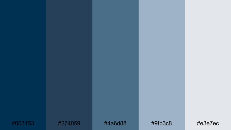
- HEX Codes: #003153, #274059, #4a6d88, #9fb3c8, #e3e7ec
- Mood: Brooding yet expansive, like a storm rolling in.
- Use for: Use for narrative travel vlogs, poetic voiceover videos, and melancholic music visuals.
Stormbound Coastline layers Prussian Blue with slate and misty ocean blues, creating a brooding but open feeling. The darker tones feel like wet rocks and deep water, while the pale gray-blue highlights suggest distant haze and soft spray.
This palette works well for narrative travel vlogs, drone shots over rough seas, or acoustic performance videos where you want emotion without over-saturation. Use the lighter tones for text, overlays, and YouTube thumbnail titles, while the darker blues carry your footage and background graphics.
Midnight City Noir

- HEX Codes: #001324, #003153, #39485e, #c2a878, #f5f1e6
- Mood: Urban noir with a subtle vintage elegance.
- Use for: Use for tech reviews, urban b-roll sequences, and narrative shorts set at night.
Midnight City Noir mixes deep Prussian Blue with charcoal shadows, muted gold, and warm ivory. The result feels like an old detective film updated for a modern city: moody yet slightly glamorous.
Apply this palette to tech reviews shot in low light, urban street b-roll, or narrative shorts set at night. Use the muted gold for accent lines, call-to-action buttons, or logo details in your lower thirds, while the ivory tone keeps text legible on thumbnails and title cards.
Deep Ocean Odyssey
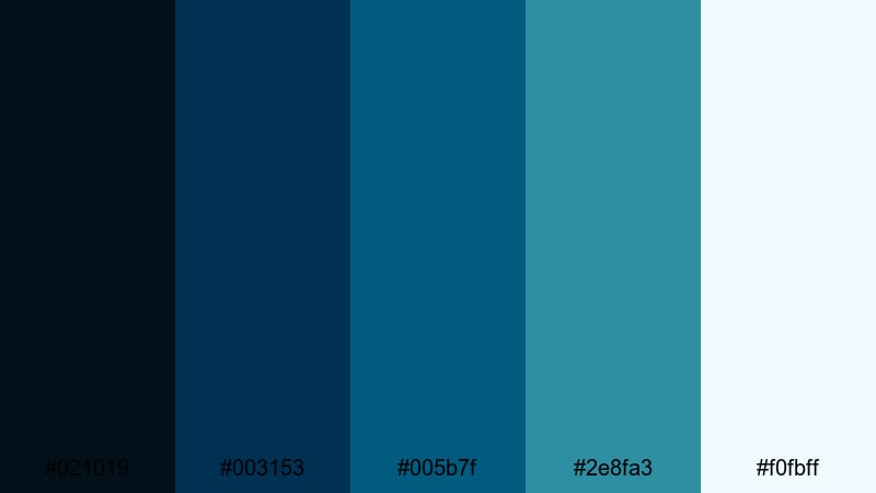
- HEX Codes: #021019, #003153, #005b7f, #2e8fa3, #f0fbff
- Mood: Immersive, mysterious, and exploratory.
- Use for: Use for underwater footage, sci fi motion graphics, and immersive explainer videos.
Deep Ocean Odyssey builds from near-black depths to bright, foamy light, with Prussian Blue at its core. The teal and aqua notes suggest exploration, making the whole palette feel like a dive into unknown waters or space.
Use this for underwater GoPro footage, science explainers, or futuristic motion graphics. The darkest shades are perfect for full-screen backgrounds or cinematic letterboxing, while the bright aqua and white work well for icons, HUD graphics, and readable titles on thumbnails.
Minimal & Modern Prussian Blue Palettes
Nordic Blueprint
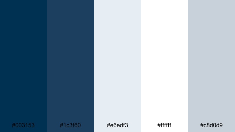
- HEX Codes: #003153, #1c3f60, #e6edf3, #ffffff, #c8d0d9
- Mood: Clean, structured, and quietly confident.
- Use for: Use for channel branding, minimalist logo stings, and modern portfolio reels.
Nordic Blueprint pairs strong Prussian Blue with crisp whites and soft cool grays. It feels like a modern studio or architect office: minimal, bright, and structured.
Use this palette for channel rebrands, sleek logo reveals, and UI overlays in app demos. Prussian Blue and the deeper blue handle headings, icons, and frames, while the light grays and white keep thumbnails and end screens clean and easy to scan.
Gridline Interface
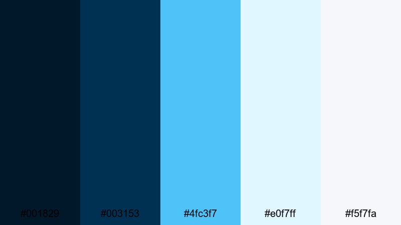
- HEX Codes: #001829, #003153, #4fc3f7, #e0f7ff, #f5f7fa
- Mood: Tech forward, precise, and futuristic.
- Use for: Use for app demos, SaaS product videos, and HUD style motion graphics.
Gridline Interface feels like a clean dashboard at night: dark Prussian Blue foundations with bright cyan accents and airy whites. It is sharp, digital, and perfect for tech-focused content.
Apply this palette to software walkthroughs, data visualizations, and HUD graphics in your videos. Use the neon cyan for key metrics, buttons, and highlight text on thumbnails, while the off-whites keep backgrounds light and readable on web and mobile.
Clean Studio Branding
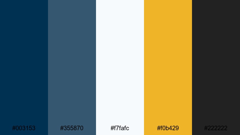
- HEX Codes: #003153, #355870, #f7fafc, #f0b429, #222222
- Mood: Modern, polished, and brand ready.
- Use for: Use for channel intros, branded lower thirds, and sponsor reads that need a premium feel.
Clean Studio Branding adds a precise yellow accent and deep charcoal to a refined Prussian Blue base. The overall effect is premium and contemporary, ideal for creators building a professional brand.
Use Prussian Blue and charcoal for your logo, strap lines, and frame borders, while the pale background tone keeps layouts spacious. The yellow accent is perfect for subscribe buttons, sponsor logos, and thumbnail badges that need to stand out without feeling cheap.
Architect Sketchbook
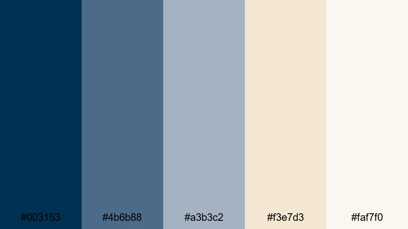
- HEX Codes: #003153, #4b6b88, #a3b3c2, #f3e7d3, #faf7f0
- Mood: Thoughtful, conceptual, and design driven.
- Use for: Use for design breakdown videos, architecture reels, and educational content.
Architect Sketchbook softens the power of Prussian Blue with pencil grays and warm drafting-paper creams. It feels calm, analytical, and creative at the same time.
This palette suits design explainers, architecture walkthroughs, productivity tutorials, and any content with diagrams or annotations. Use the warm creams as background blocks behind text, Prussian Blue for titles and lines, and the mid grays for secondary labels or callouts on your thumbnails and slides.
Soft & Atmospheric Prussian Blue Palettes
Foggy Harbor Morning

- HEX Codes: #003153, #1f3e55, #7b8fa3, #c6d2dd, #f7fafc
- Mood: Calm, reflective, and cinematic soft focus.
- Use for: Use for reflective vlogs, slow travel montages, and piano backed storytelling.
Foggy Harbor Morning wraps Prussian Blue in layers of misty grays and muted blues. It feels calm and reflective, like an early walk by the water before the day really begins.
Use this palette for slow travel edits, reflective voiceover videos, or study-with-me content. The softer blues work well for blurred overlays, gradient backgrounds, and gentle text animations, while Prussian Blue keeps your titles and key elements grounded and legible.
Winter Storybook
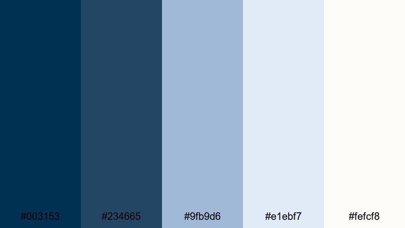
- HEX Codes: #003153, #234665, #9fb9d6, #e1ebf7, #fefcf8
- Mood: Cozy winter calm with a hint of nostalgia.
- Use for: Use for holiday content, cozy reading vlogs, and gentle product showcases.
Winter Storybook lightens Prussian Blue with powder blues and almost-snow whites, creating a cozy but fresh winter feeling. It is nostalgic without being overly vintage.
Use it for holiday videos, festive vlogs, or gentle product showcases like candles, books, and stationery. The brighter blues and whites are ideal for illustrated intros, animated snow overlays, and family-friendly thumbnails with clear, soft-edged typography.
Misty Railway Journey
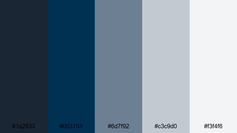
- HEX Codes: #1a2633, #003153, #6d7f92, #c3c9d0, #f3f4f6
- Mood: Wistful, wandering, and slightly nostalgic.
- Use for: Use for travel diaries, train journey films, and lyrical edits with voiceover.
Misty Railway Journey combines steel grays, layered fog tones, and a deep Prussian Blue core. It feels like watching the world slide past a train window on a rainy day, with just a bit of nostalgia.
This palette is ideal for slow travel diaries, cinematic montages, or lyric videos. Use the darker tones for letterboxing and background shapes, and the light grays for subtitles and captions so they stay readable even on detailed footage.
Dusk Window Light
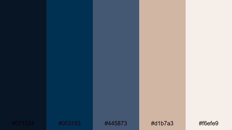
- HEX Codes: #071524, #003153, #445873, #d1b7a3, #f6efe9
- Mood: Intimate, warm against cool, end of day quiet.
- Use for: Use for home vlogs, study with me content, and intimate acoustic sessions.
Dusk Window Light balances cool Prussian Blue shadows with warm beige and soft cream highlights. The contrast between warm and cool creates a feeling of being indoors at golden hour, with the blue evening outside.
Use this for home vlogs, cozy desk setups, and acoustic music videos. Let the warm tones handle skin, lamps, and interior details, while the blues define backgrounds, shadows, and lower thirds. It also works well for thumbnails that need both warmth and depth without oversaturated color.
Vibrant Contrast Prussian Blue Palettes
Electric Neon Harbor
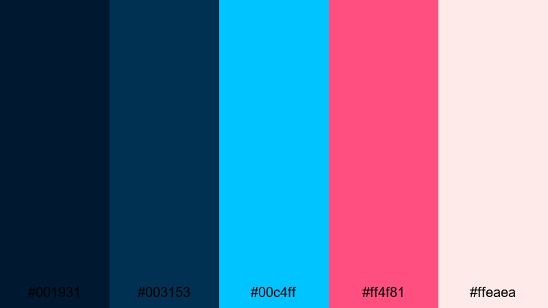
- HEX Codes: #001931, #003153, #00c4ff, #ff4f81, #ffeaea
- Mood: Energetic, bold, and eye catching.
- Use for: Use for energetic channel intros, gaming overlays, and high impact thumbnails.
Electric Neon Harbor slams neon cyan and magenta lights against a deep Prussian Blue night base. It feels fast, loud, and full of motion, like a city harbor lit by signs and reflections.
Use this palette for gaming intros, electronic music visuals, or highly clickable thumbnails. Let Prussian Blue cover most of the background while neon cyan and magenta highlight key text, health bars, or glitch elements so they pop immediately in YouTube and social feeds.
Sunrise Against Steel
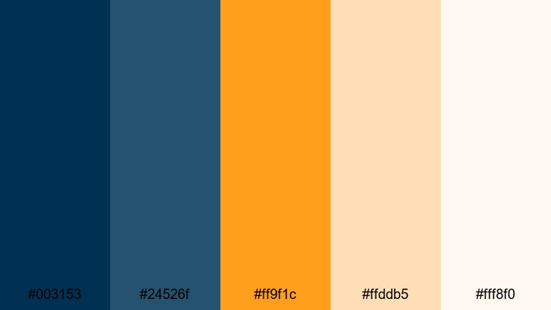
- HEX Codes: #003153, #24526f, #ff9f1c, #ffddb5, #fff8f0
- Mood: Hopeful, cinematic contrast of warm and cool.
- Use for: Use for inspirational reels, productivity vlogs, and channel trailers.
Sunrise Against Steel contrasts solid Prussian Blue with glowing sunrise oranges and soft creams. It feels like the first light hitting a city skyline or ocean horizon, hopeful and cinematic.
This palette is great for motivational content, productivity vlogs, and uplifting channel trailers. Use the warm orange for progress bars, call-to-action text, and key thumbnail phrases, while the Prussian Blue and blue steel tones provide a sturdy, professional backdrop.
Festival Lights Reflected
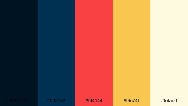
- HEX Codes: #001322, #003153, #f94144, #f9c74f, #fefae0
- Mood: Festive, cinematic, and full of motion.
- Use for: Use for event recaps, concert videos, and nightlife montages.
Festival Lights Reflected throws bold reds and golden yellow highlights onto deep Prussian Blue shadows. It feels like concert lights bouncing off water or droplets in the air, energetic and slightly chaotic.
Use this palette for event highlight reels, party recaps, and nightlife montage videos. The bright red and yellow tones are perfect for animated titles, countdowns, and social teaser graphics, while the blues hold your footage together and prevent the frame from feeling too busy.
Tips for Creating Prussian Blue Color Palettes
Prussian Blue is powerful, so combining it thoughtfully with supporting colors will help you design thumbnails, intros, and full edits that look intentional and on-brand.
- Pair Prussian Blue with soft neutrals (off-white, light gray, cream) to keep layouts clean and readable, especially for text-heavy thumbnails and end cards.
- Use one bright accent color (yellow, orange, cyan, or magenta) against Prussian Blue rather than many different accents, so CTAs and key elements stand out clearly.
- Check text readability by testing your palette at small sizes; make sure titles on thumbnails still pop when viewed on a phone in YouTube or TikTok feeds.
- Match your footage to your palette by gently shifting shadows toward Prussian Blue in Filmora, while keeping skin tones natural in the midtones and highlights.
- Stay consistent across platforms: use the same 3 to 5 HEX codes for your channel banner, intro, lower thirds, and social posts to build a recognizable brand.
- Balance mood with exposure; darker Prussian Blue palettes look cinematic but can become too dim, so lift highlights slightly to keep detail on faces and key subjects.
- Create variations of one palette (dark, neutral, bright) and save them as presets in Filmora so you can quickly adapt the same Prussian Blue identity for different series or campaigns.
- When in doubt, start with monochrome blues based on Prussian Blue, then gradually introduce one warm tone to add emotional contrast without losing cohesion.
Prussian Blue can make your videos feel cinematic, trustworthy, and thoughtfully designed, whether you are filming city nights, ocean journeys, cozy interiors, or high-energy events. With curated palettes and precise HEX codes, it becomes easy to translate that mood into thumbnails, overlays, and brand elements that all speak the same visual language.
Try these palettes directly in Filmora: sample the colors for your titles and graphics, then grade your clips so the footage supports the same Prussian Blue mood. Once you lock in a look that matches your niche, save it as a preset and use it across every new upload to build a strong, memorable identity.
Over time, viewers will start recognizing your content at a glance just from the deep blues and complementary tones you choose. Experiment, refine, and let Prussian Blue become a signature part of your visual storytelling toolkit.
secure downloadNext: Lava Color Palette
