
 100% Security Verified | No Subscription Required | No Malware

Smoky Amber sits between warm amber and deep neutral brown, carrying the glow of candlelight with the calm of muted charcoal. It feels cinematic, grounded, and quietly luxurious. Psychologically, this family of hues suggests warmth, depth, and trust, which is why it works so well for storytelling brands, cozy vlogs, and moody visual identities.
In video, thumbnails, intros, and branding, a Smoky Amber color palette can make your channel look intentional instead of random. It softens harsh contrast, adds a subtle vintage or cinematic vibe, and keeps skin tones flattering. Below you will find ready-to-use Smoky Amber color combinations with HEX codes, designed for creators and Filmora users who want consistent aesthetics across edits, titles, overlays, and social posts.
In this article
Cinematic & Moody Smoky Amber Color Palettes
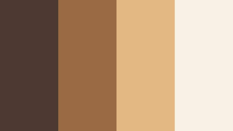
Twilight Ember Fade

- HEX Codes: #5b4636, #b47a4e, #f2e0c9, #2b2930
- Mood: Cinematic, introspective, and quietly intense.
- Use for: Ideal for dramatic film-style intros, narrative short films, and serious documentary thumbnails.
Twilight Ember Fade blends a grounded brown (#5b4636) and rich amber (#b47a4e) with a soft cream highlight (#f2e0c9) and a charcoal accent (#2b2930). Together, they create the feeling of a dusky scene lit by the last light of day, perfect when you want drama without neon or oversaturation. The palette feels intimate and thoughtful, ideal for reflective stories and cinematic edits.
Use these colors for lower thirds, title cards, and thumbnail backgrounds that need to feel serious but still warm. Smoky Amber tones work beautifully as color grading references in Filmora: push your shadows toward charcoal, keep midtones warm amber, and let cream highlights guide text, logos, and UI elements.
Pro Tip: Build a Cinematic Smoky Amber Look in Filmora
To keep a Twilight Ember Fade style across an entire project, start by setting your neutral base in Filmora. Use the darker brown and charcoal tones for backgrounds, frames, and letterboxing, then bring the amber and cream shades into text, overlays, and callouts. This maintains a cinematic mood while still guiding the viewer to what matters on screen.
You can save this palette as a reference for future projects by reusing titles, presets, and color-grading settings in Filmora. That way, your intros, b-roll sequences, and social cuts all share the same Smoky Amber language and feel like part of one unified brand.
AI Color Palette
If you have a still frame or mood board that captures your ideal Smoky Amber look, Filmora's AI Color Palette feature can match that style across your entire edit. Import your reference shot with rich browns and glowing amber, then let the tool automatically apply similar tones to your clips.
This is especially useful when you shoot in mixed lighting or on different days. AI Color Palette helps keep skin tones consistent, shadows subtly smoky, and highlights warm, so your intro, main video, and outro all feel like they belong to the same Twilight Ember Fade universe.
 secure download

HSL, Color Wheels & Curves
Once your Smoky Amber base is in place, use Filmora's HSL, color wheels, and curves tools to refine the look. Shift oranges and yellows slightly toward amber for a cohesive grade, deepen shadows with the color wheels to bring in charcoal depth, and use curves to soften contrast for that filmic, low-crunch feel. If you want a step-by-step look at this process, you can follow along with Filmora's YouTube tutorial embedded below.
Fine-tuning with curves also helps you protect skin tones. Keep midtones gentle while letting highlights roll off softly into the creamy end of the palette, rather than harsh whites. This is what gives Smoky Amber grading its polished, cinematic finish.
secure download1000+ Video Filters & 3D LUTs
If you want a fast way to stylize your Smoky Amber palette, Filmora's video filters and 3D LUTs make it easy to add cinematic contrast, soft haze, or vintage film grain on top of your color choices. You can stack warm-toned filters with your Twilight Ember Fade grading to push your footage toward a specific look, like retro, indie, or luxury.
Browse the LUTs library to find cinematic or warm film presets that complement amber and brown tones, then tweak intensity to taste. This gives you a polished, movie-inspired grade in a few clicks, perfect for YouTube intros, trailers, and social campaigns that need to stand out.
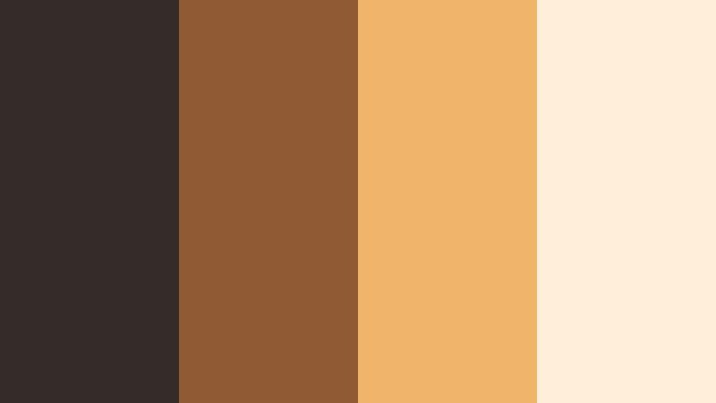
secure downloadSmokehouse Noir

- HEX Codes: #3c312b, #8a5e3c, #d7b38a, #141217
- Mood: Dark, smoky, and luxuriously vintage.
- Use for: Great for noir-style title cards, luxury product reveals, and dramatic brand trailers.
Smokehouse Noir leans into inky browns and deep charcoal (#141217), set off by a muted amber (#8a5e3c) and soft beige highlight (#d7b38a). The palette feels like a dim speakeasy or old-world cigar lounge, giving your visuals a tactile, premium edge without bright color distractions.
Use the darkest tones for backgrounds, frames, and letterbox bars, while the amber and beige handle logos, key text, and glow effects. It is ideal for fashion lookbooks, luxury tech promos, or podcast thumbnails where you want a noir sensibility that still feels warm and approachable.
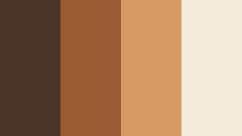
Cinderlit Stories

- HEX Codes: #4a3a31, #a66e40, #f3d2a4, #2a2524
- Mood: Warm, narrative, and fireside cozy with a cinematic edge.
- Use for: Use for storytelling vlogs, cozy documentary series, and podcast cover art.
Cinderlit Stories mixes smoky browns (#4a3a31), glowing amber (#a66e40), and a sand-toned highlight (#f3d2a4) with a subtle dark accent (#2a2524). It feels like camera footage captured by a fireplace, inviting viewers into intimate conversations, slow travel diaries, or behind-the-scenes content.
Use this palette when you want your thumbnails and titles to promise warmth and depth. In Filmora, you can grade your footage toward these tones, then use the sand color for legible captions and the amber for key buttons or subscribe prompts, keeping everything visually cohesive.
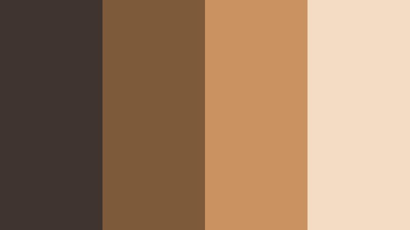
Urban Soot and Amber

- HEX Codes: #2f2e31, #70503a, #c8945b, #f1e2d3
- Mood: Modern, gritty, and gently industrial with a warm core.
- Use for: Perfect for city b-roll edits, tech reviews with a warm twist, and cinematic reels.
Urban Soot and Amber balances asphalt-like greys (#2f2e31) with rich amber browns (#70503a, #c8945b) and a soft pearl highlight (#f1e2d3). It captures the tension between cool city structures and the warmth of streetlights, making your footage feel contemporary but human.
Try this palette for urban travel vlogs, tech-channel branding, or Instagram reels shot at golden hour. Let the Pearl tone handle UI elements and text, while the darker shades frame your content and the amber hues pull focus to products, faces, or movement in the frame.
Vintage Film Hearth

- HEX Codes: #43332a, #966441, #d7a56f, #f6e7d4
- Mood: Nostalgic, analog, and softly romantic.
- Use for: Use for retro film emulations, memory montages, and wedding highlight reels.
Vintage Film Hearth pairs muted browns (#43332a) with golden amber (#966441, #d7a56f) and creamy highlights (#f6e7d4), mimicking the gentle fade of old film stock. The effect is romantic and timeless, perfect for emotional storytelling.
Apply these colors to lower thirds, overlays, and titles in Filmora, then grade your clips slightly warm with lowered contrast to match. This palette is especially strong for wedding videos, family montages, or nostalgic recap reels where you want viewers to feel like they are looking back through cherished memories.
Cozy & Lifestyle Smoky Amber Color Palettes
Coffeehouse Glow

- HEX Codes: #4b3629, #8f5d3a, #d0a174, #f3e3cc
- Mood: Inviting, cozy, and laid-back.
- Use for: Ideal for lifestyle vlogs, cafe-style b-roll, and cozy productivity thumbnails.
Coffeehouse Glow brings together espresso brown (#4b3629), latte amber (#8f5d3a, #d0a174), and cream foam (#f3e3cc). It feels like sunlight through a cafe window, encouraging viewers to sit, relax, and stay with your content a bit longer.
Use this palette for lifestyle channel branding, productivity setups, and talking-head videos filmed in warm interiors. In thumbnails, pair the darker espresso for backgrounds with cream for text, then use mid-tone amber accents for buttons, arrows, or subtle highlights around your subject.
Autumn Loft Morning

- HEX Codes: #5c4333, #a46b40, #e0b684, #f7efe1
- Mood: Softly energizing, creative, and seasonal.
- Use for: Perfect for fall lookbooks, studio tours, and morning routine videos.
Autumn Loft Morning combines burnt chestnut (#5c4333) and toasty amber (#a46b40, #e0b684) with a pale cream background (#f7efe1). It instantly reads as fall, without relying on overly bright oranges, making it ideal for seasonal content that still looks professional.
Use the lighter tone for clean, breathable thumbnails and title cards, then weave in amber for line art, icons, and headings. This palette works especially well for creative studios, planners, and morning routines, where you want both warmth and a sense of calm productivity.
Caramel Knit Weekend

- HEX Codes: #6a4c37, #b47a4e, #e5bc89, #f6ebdb
- Mood: Relaxed, comforting, and homey.
- Use for: Use for weekend vlog series, home decor tours, and slow living edits.
Caramel Knit Weekend layers caramel brown (#6a4c37), honey amber (#b47a4e, #e5bc89), and a soft beige base (#f6ebdb). The effect is like wrapping your channel in a knitted blanket, inviting viewers into a slower, more intentional pace.
Use the light beige as your default background color for overlays and end screens, then let the caramel shade define frames, borders, and key text. For slow living or home-decor content, grade your footage slightly warmer in Filmora and keep saturation moderate so the palette feels gentle, not overpowering.
Campfire Storyline

- HEX Codes: #3f3027, #914c2f, #d88e55, #f5e0c8
- Mood: Adventurous, nostalgic, and warm-hearted.
- Use for: Great for travel vlogs, camp or cabin content, and outdoor storytelling intros.
Campfire Storyline plays with charred wood browns (#3f3027), ember orange-amber (#914c2f, #d88e55), and toasted sand (#f5e0c8). It instantly evokes late-night talks around a fire and open-air adventures with friends.
Use the brighter amber to add energy to titles and transitions, while the dark wood hue anchors frames and overlays. It is ideal for outdoor channels, hiking vlogs, or van-life edits where you want warmth and nostalgia without losing clarity and legibility in your graphics.
Honeyed Workspace Calm
- HEX Codes: #4c3a30, #9a6a45, #e3b881, #f8f1e6
- Mood: Focused, calm, and productive with a soft glow.
- Use for: Perfect for study-with-me videos, productivity channels, and desk setup showcases.
Honeyed Workspace Calm uses soft browns (#4c3a30), glowing honey (#9a6a45, #e3b881), and a gently off-white background (#f8f1e6). It feels like a tidy, sunlit desk with warm lighting, designed to keep viewers watching for long, relaxed sessions.
Use this palette for long-form productivity streams, study sessions, and tutorials. Keep text on the lightest shade for readability, then thread honey amber through progress bars, timers, or chapter markers in Filmora so your brand remains recognizable, even on smaller mobile screens.
Elegant & Modern Smoky Amber Color Palettes
Amber Quartz Minimal

- HEX Codes: #2f2926, #846047, #d0aa7c, #f4ebde
- Mood: Clean, refined, and upscale.
- Use for: Use for modern brand intros, product demos, and portfolio websites.
Amber Quartz Minimal combines muted charcoal (#2f2926) with refined amber tones (#846047, #d0aa7c) and pale stone (#f4ebde). This palette feels modern and premium, without being cold or overly corporate.
Use it for creator logos, channel rebrands, or product demo overlays where you want an elevated but friendly tone. The stone shade makes a strong base for minimalist thumbnails, while amber accents draw attention to key elements like product features, headlines, or CTAs on screen.
Smoky Amber Marble

- HEX Codes: #262225, #6d4e3b, #c79b71, #f2e8dd
- Mood: Luxurious, polished, and editorial.
- Use for: Perfect for beauty brands, jewelry promos, and high-end thumbnail designs.
Smoky Amber Marble pairs deep charcoal (#262225) with marbled amber browns (#6d4e3b, #c79b71) and a creamy base (#f2e8dd). It feels like a magazine spread or a boutique store interior, lending immediate sophistication to your visuals.
Use the charcoal tone as a backdrop for product shots, then let the amber and cream shades highlight text, prices, or feature lists. This palette is ideal for beauty channels, jewelry showcases, and luxury service promos that need a strong, editorial identity across thumbnails, intros, and stories.
Studio Spotlight Amber
- HEX Codes: #332c29, #905a35, #f0b56b, #ffeeda
- Mood: Contemporary, spotlighted, and confident.
- Use for: Great for creator branding, channel banners, and social ad campaigns.
Studio Spotlight Amber grounds your visuals in neutral darks (#332c29) while pushing a bright, studio-light amber accent (#f0b56b) and soft backdrop (#ffeeda). It feels bold and confident, like a spotlight on a clean studio set.
Use the bright amber for hero elements: your name, logo, or main hook text in thumbnails. The darker brown can frame your footage in Filmora with simple shapes or minimal borders, making your content instantly recognizable in crowded feeds.
Earthy & Organic Smoky Amber Color Palettes
Foraged Spice Market
- HEX Codes: #4a3528, #9a5c33, #d79a63, #f5ebd9
- Mood: Earthy, artisanal, and warmly energetic.
- Use for: Ideal for food content, cooking channels, and handmade product visuals.
Foraged Spice Market mixes cinnamon browns (#4a3528), turmeric-like amber (#9a5c33, #d79a63), and soft cream (#f5ebd9). It feels like walking through a spice stall or artisan market, full of rich textures and tactile warmth.
Use this palette for recipe videos, cafe branding, or craft-business promos. Let the light cream handle text overlays for ingredient lists and steps, while the deeper amber shades highlight key frames, product packaging mockups, or logo marks in your Filmora templates.
Desert Smoke Horizon
- HEX Codes: #3e332e, #7c5a3a, #c7925e, #f4dcc3
- Mood: Expansive, calm, and naturally cinematic.
- Use for: Use for travel reels, desert or landscape footage, and atmospheric b-roll sequences.
Desert Smoke Horizon layers dusty browns (#3e332e), sunbaked amber (#7c5a3a, #c7925e), and hazy sand (#f4dcc3). It captures the feeling of long horizons and soft, dry air, lending a calm and organic mood to your footage.
Use this palette to brand landscape travel content, drone shots, and atmospheric b-roll. In Filmora, nudge your white balance slightly warm and soften contrast to echo the hazy sand tone, then use the darker brown for clean, minimal captions and timeline markers that never distract from the scenery.
Tips for Creating Smoky Amber Color Palettes
Smoky Amber works best when it balances warmth with depth, and when supporting colors protect readability and brand clarity. Use these practical tips to adapt and expand the palettes above for your own videos and designs.
- Pair Smoky Amber with a clear light neutral (cream or soft beige) for text and UI so your titles stay readable on mobile thumbnails.
- Use the darkest brown or charcoal in each palette for framing elements like borders, letterboxing, or lower thirds, to give a cinematic structure to your shots.
- Keep bright accents rare and intentional: use the strongest amber shade only for CTAs, key words, or important icons so they naturally draw the eye.
- Match your color grading to your graphics by pushing shadows slightly toward charcoal and midtones toward amber, avoiding overly cool, blue-heavy looks.
- For branding consistency, pick one palette and stick with it for your logo, end screens, and thumbnails across at least a full season of content.
- Test contrast by viewing your thumbnail at very small sizes; if text blends into the background, lighten the base or darken the text color within the same palette.
- When mixing footage from different cameras or days, grade toward your chosen palette first, then add graphic elements in matching HEX colors for a unified look.
- Balance mood and clarity: if your Smoky Amber grade feels too dark, raise midtones slightly and let only the deep shadows stay smoky so details remain visible.
Smoky Amber color palettes give your videos and designs a grounded, cinematic warmth that can instantly shape mood and brand identity. Whether you lean into cozy lifestyle tones, elegant minimalism, or earthy organic mixes, staying within a consistent palette makes your content feel more professional and intentional.
Use the HEX codes above as starting points for your intros, lower thirds, and thumbnails, then refine your look with Filmora's color tools, filters, and LUTs. By treating color as part of your storytelling, you can turn simple clips into cohesive visual narratives that viewers recognize at a glance.
Experiment with a few of these palettes in Filmora, save your favorite combinations as reusable presets, and let Smoky Amber become a signature part of your creative style across YouTube, Reels, TikTok, and beyond.
secure downloadNext: Ashen Teal Color Palette
